Can your WordPress website not be zoomed on mobile? This article explains how to easily add support for viewport scaling on your WordPress site for improved mobile accessibility.
How to Fix Zooming and Scaling Disabled Errors in WordPress
If your website doesn’t allow users to zoom or scale pages on mobile, this can be easily fixed without writing code using the WordPress Accessibility Checker plugin.
Step 1
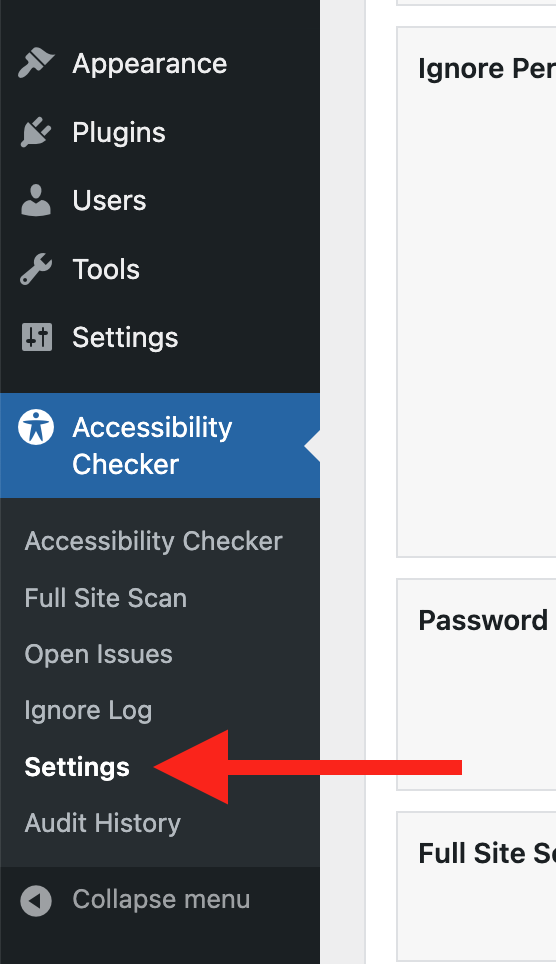
Click into the Accessibility Checker plugin settings in your WordPress dashboard (you must be logged in with an administrator account to access these settings).

Step 2
Go to the “Fixes” tab in the Settings Tabs navigation.

Step 3
Check the box for Make Viewport Scalable, then scroll to the bottom of the page and click the “Save Changes” button.

Note: Automated accessibility fixes use JavaScript or other methods to modify how your website functions. Occasionally, a WordPress theme or extension may conflict with or prevent our fixes from working as expected. We recommend testing these fixes on a local or staging copy of your website first.
Not seeing the fix?
When enabled, the Make Viewport Scalable fix should start working immediately; however, if you don’t see the fix, it could be because you’re seeing a cached version of your website. Try clearing the cache in any caching plugins and on your hosting account, then look at your site in an incognito window to confirm the fix worked.
Note: Turning on a fix will not instantly remove related issues from Accessibility Checker reports. After turning on a fix, you can clear issues from reports by running a full site scan in Accessibility Checker Pro or by saving any individual post/page to trigger a rescan of that post/page only.
What This Fix Does
When enabled, the Make Viewport Scalable fix checks if each page on your website has a viewport meta tag and ensures that it is not restricting users’ ability to zoom or scale the page. If it identifies a restrictive meta viewport tag, the tag will be removed and replaced with a non-restrictive version.
This is what a restrictive meta viewport tag might look like in code:
<meta name="viewport" content="width=device-width, initial-scale=1.0, user-scalable=no">In the restrictive code example above, any scaling or zooming by the user is disabled. If this example is used on a web page with this fix enabled, it would be replaced with a non-restrictive version of the meta viewport tag.
This is what a non-restrictive meta viewport tag might look like in code:
<meta name="viewport" content="width=device-width, initial-scale=1.0">In the non-restrictive example code above, the scaling/zooming restriction has been removed, and the remaining parameters only define the initial content scale and width, which the user is free to modify.
Impact on Accessibility
Restricting a user’s ability to scale or zoom a webpage negatively impacts accessibility for many people.
For example, it can hinder users who have low-vision, as they may rely on zooming to read and interact with content comfortably. Such restrictions on zoom/scaling also affect users with motor impairments who need to adjust the size of interactive elements (links, buttons, etc.).
Responsive and scalable interfaces are expected to be standard features by most modern web users. Disabling these features intentionally diminishes the overall user experience for everyone, not just individuals with disabilities. The Make Viewport Scalable fix ensures your website can be zoomed on mobile for everyone who visits it.
Associated Checks
The following checks in Accessibility Checker are associated with this fix: