Accessibility Checker is here to help you make your website more accessible, whether you’re new to website accessibility or a seasoned pro. If you’ve installed the plugin for the first time, follow these steps to get started checking your content:
- Visit the Settings Page in your admin dashboard to configure checking settings and simplified summary position. You can find the settings page by:
- going to
https://yourwebsite.com/wp-admin/admin.php?page=accessibility_checker_settings(replace ‘yourwebsite.com’ with your website URL). - or you can look for Accessibility Checker in your left side menu:

- going to
- Go to the edit screen for the post or page that you would like to check; in the free version of Accessibility Checker, scan results are only visible on post and page edit screens.
- Find the Accessibility Checker meta box on your edit screen. It is typically located below your content.

- Note: If you are using a front-end page builder, you will need to visit the backend edit screen to view Accessibility Checker results as they are not visible on the front end.
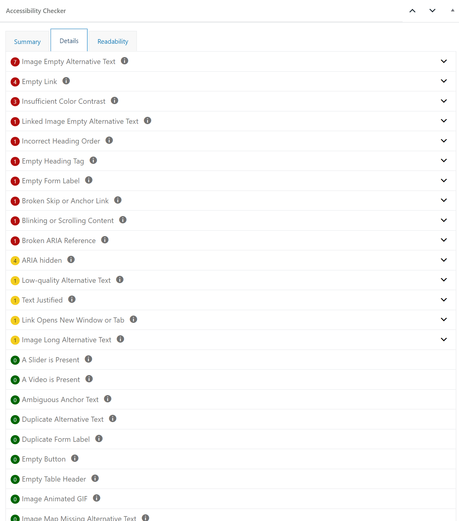
- If there are errors or warnings present on your page or post, open the details tab in Accessibility Checker to see more information about those errors or warnings and how to find them on the page.

- On the details tab, you can expand each item to see the code that triggered the error or warning. If you don’t know what an error or warning means, click the “i” icon to link over to our documentation for additional information about the problem and how to fix it.

- After you have fixed or ignored each open error or warning, update your page or post to see the accessibility report change. Your goal is to get every page to say 100% Passed Tests.
Video Tutorial of Accessibility Checker
Watch the video if you would like to see an overview of how to get started with Accessibility Checker in video format and an example of how to assess and error.
Video Transcript
Hi, my name is Amber Hinds. I’m the CEO of Equalize Digital. And I’m going to walk you through some of the features for our Accessibility Checker plugin for WordPress. Alright, so we are here in the WordPress admin, I have a page that has been built out in the block editor. And if I scroll down below the content, I can see a Accessibility Checker report. I can see right here that this has 81% passed tests for the tests that we’ve checked. There are 12 errors, 10 contrast errors, 9 warnings, and nothing has been ignored or dismissed. If I click over on the Details tab, I can then get a look at – there’s 10 insufficient color contrast, 7 improper use of link, 2 image missing alternative text, 2 ambiguous anchor text, 1 incorrect heading order, 6 things with ARIA hidden, 2 images alternative with empty alternative text, and 1 low quality alternative text on this page.
Now if I’m a content editor, I can expand these and go through them, I can maybe start at the bottom with this warning of one. And I can see that there’s an image, it shows the affected code, it actually shows me a little thumbnail of the image. And then I could choose to go work on that image. So, for example, this is flagging, because the alt is “image of student,” but I’m not sure what low quality alternative text means I could click on the “I” icon that is next to that title. And that would link over to documentation on the Equalize website. If I know where this image is, I could scroll up in the page and find it oh, I scroll up. And here’s my gallery. And if I click on the image, indeed, I could see that so I could say, Okay, – let’s give a better alternative text for this.
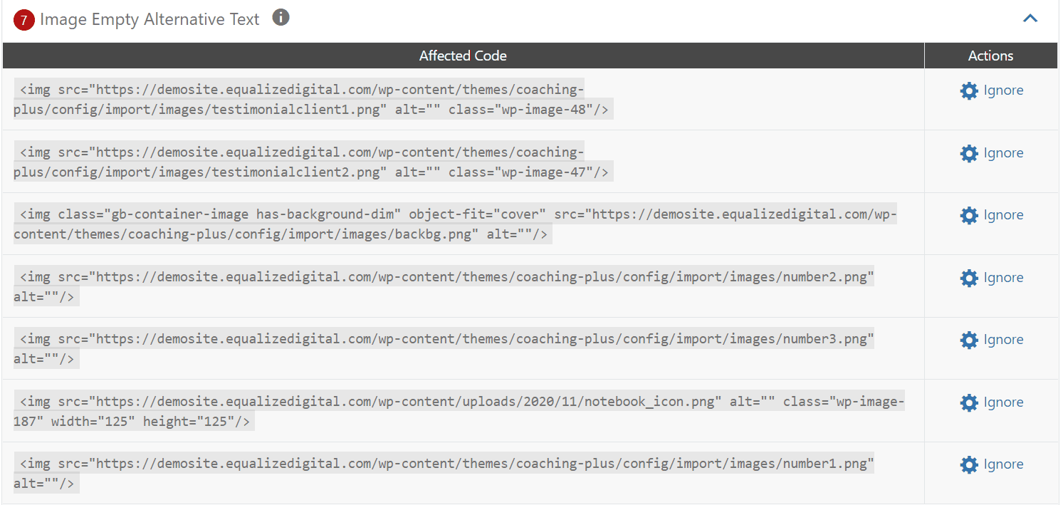
I’ve typed out “young female Asian student working on laptop in class.” Because this is a much more descriptive alternative text that describes the image. Rather than just saying image of students, we’re on a college website, almost every image is an image of students. So I’ve entered that in, I could then move on to my next one. And I can see oh, look, both of these images are actually missing, they have image empty alternative text, I could move through those and go find those images, and then correct them. Let’s see, this is a picture of Fort Collins, Colorado, so I’m just gonna say “Fort Collins, Colorado, from the sky.”
Maybe there’d be a better “drone photo” or something. But anyways, you can see what I do. I can work through all of these issues. If I hit update, then you’ll notice that it will rescan my page. All the scans run on the server. So there’s no API calls, no fee, or API cost every time you are running a scan. So once it rescans, then you’ll see this section reloads. And now I can see that “low quality image alternative text” went away. I also now only have one image with empty because I’ve fixed those two. And I could go through and I could fix all of these. But let’s say I get to something like there’s 6 ARIA hidden, and I expand this. And I can see social media links. They have little icons for Facebook, Twitter, Instagram, YouTube, TikTok, and LinkedIn. And these are all hidden.
This is a warning, this particular warning means Hey, this is hidden from screen readers, is this correct or not? And if I scroll up in my page, boy, I don’t see those. So what I’m going to do is I can use this view on page link, if I click view on page, it will load the front end of the website, and it will jump me down to that section. It’ll find it on the page, and it highlights it. So now I can see oh, this is where the icon is. It’s in my footer. It’s not actually in my page. So if my footer was built with widgets, or something else, I could go to that section to fix it. But I’m actually going to just take a look at the code right here. And I’m inspecting this element. What I want to know is this SVG, the icon is hidden. But is there any text that explains to someone that this link goes to LinkedIn and indeed I see that there’s text here that goes from LinkedIn, so it’s actually correct for this to be hidden. Now, this is an example when I might use the “Ignore” feature.
I can ignore right here on this page, I can click ignore. And I can say “screen reader text is present.” As my comment, I can also ignore without a comment. But a comment helps other people know, I can see, okay, I was the one who ignored it. And this would make it in my summary, it would remove that warning. And it would show that there’s one ignored item. But boy, I know from looking on the front in the website that this is on every page. Well, in Accessibility Checker Pro, we have an “Open Issues” view, if you go to open issues, you can see all of the issues across your entire site on this particular site doesn’t have a lot. It’s a faked site. But I’ll give you a peek in just a second. And what this would look like on a site that has a lot of content. And not just two pages, this only has two pages. But we also have the “Fast Track” View. So I could go to fast track.
And I could find, let’s see where we have the ARIA hidden. So these are one of those SVGs. If I review, it’s ARIA hidden, I think compare we’re working on we’re gonna get an image of these here soon. And I could actually hit a global ignore. And what that would do is that would say, I know that this SVG is correctly hidden, so I’m going to ignore it on all of the pages of my entire site. So once I do that, then if I were to go back here and I were to refresh, we should see that we have two ignored items.
So now we have two ignored items. And I don’t have to do it on every individual page, I can actually do it on a global site-wide basis. So if you’re installing this on a website for the first time, we always recommend coming to the Open Issues tab, I’ll show you a peek. Now this is an old copy of one of our websites that we had built for ourselves long before we knew about accessibility, we installed this plugin, and you can see we’re getting 7,395 links that open in a new window or tab warnings. There’s 677 instances of incorrect headings. So there’s kind of a larger number. And this might give you a feel for what it’s like on a larger website. And however many things might have issues, we always recommend if you have Accessibility Checker Pro to come here. You can really dive into issues better and get a feel for where to find them.
So for example, if I were to just go into let’s look at, let’s say I wanted to find all of the links with ambiguous text, by clicking on this, I can see there’s 39 of them. So once what this does is it takes me to a report that shows the detail view just for those 39. I can see there’s 39 ambiguous anchor text errors, there’s an explanation that explains what it is. And it says how to fix it, “To resolve this error change the link text to be less generic so that it has meaning if heard on its own.” There’s a link to more detailed documentation. And then I can scroll down and I can see exactly where this exists. So on post title, “CSU lecture WordPress development in 43 minutes,” I can see that it’s a post, this is the issue. This is the specific link and I can see like it’s the word “here” has been linked. So I could again, I could view it and that would take me to the front end and it would highlight it, I could edit it, which would take me to the edit page.
So I can then edit or I can click ignore. If I wanted to ignore just for this one instance. But again, of course I could go to the fast track and I could add a global ignore there. Another feature that we recently added is the ability to go through a website completely on the front end. So you’ll notice when you’re logged in, if you have Accessibility Checker either the free or the pro version installed, there is a button – for a screen reader user, it’s pretty high up in the DOM, but it is, for a sighted person, in the bottom right hand corner. If I click this, this will open our Accessibility Checker report. And it will show the issues that exist on the page and we can actually toggle through them on specific page. So I can I can jump right through every issue that exists. Here’s an image with our alternative text. Here is an icon up in the header where it is a link, even though it’s functioning as a button. Here’s something that has an incorrect heading level, it’s not following the correct heading structure of the page, and so on. And so we can move through in this visual way and start to see the issues that exist on the page. I hope you found this quick walkthrough helpful.
If you have any questions, please don’t hesitate to reach out. If you’re using the free version of the plugin, you can contact us on the wordpress.org support forum. Or if you have a paid version of the plugin, you get personalized email support, and you can contact us via your plugin dashboard. Thanks so much and happy accessibility testing.