Did an “Insufficient Color Contrast” error appear in an Accessibility Checker audit of one of your WordPress posts or pages? Read on below for an explanation of this error, how it impacts your website’s accessibility, and how to fix it.
Table of Contents
- About the Insufficient Color Contrast Error
- Impact on Accessibility
- How to Fix an Insufficient Color Contrast Error
About the Insufficient Color Contrast Error
What is color contrast?
Color contrast is the measure of the perceived luminance or brightness between background and foreground colors. In web design, the foreground color usually refers to the color of text or icons that are overlaid on a colored background, button, or background image.
The measure of brightness is expressed as a ratio of the foreground color to the background, which ranges from 1:1 (white text on a white background) to 21:1 (black text on a white background). The greater difference between the foreground color, the easier it is to read and vice versa. For example, black text is much easier to read on a white background than is very light gray text.
In this screenshot from a website, you can see that there are two main elements where color contrast can impact readability – the black text on the pink background and the white text on the darker pink button.

What degree of color contrast is needed for accessibility?
The ratio of foreground to background color that is needed to be accessible depends upon the size of the text and the level of conformance with Web Content Accessibility Guidelines (WCAG) you are seeking to meet (AA or AAA).
The minimum acceptable contrast ratio for WCAG 2.1 AA compliance is 4.5:1 for body text or any smaller font sizes 18 pixels and below. Text larger than 18 pixels or fonts that are 14 pixels and bold can have a contrast ratio of 3:1 and still be compliant. For reference, here are examples of text with a contrast ratio of 4.5:1:
- Gray (#767676) on a white background
- Blue (#4D29DB) on a teal background (#83D1D8)
- Orange (#BE551D) on a black background
These examples meet the minimum contrast requirements, but you can see that they are not the easiest to read and would be even more challenging if a long paragraph was written this way. That’s why the 4.5:1 contrast ration is considered the minimum. Ideally, you want to achieve the highest contrast ratio that still meets your brand’s colors.
The contrast ratios for AAA compliance are 7:1 for small text and 4.5:1 for large text. Here are the same three color combinations adjusted to be AAA compliant with a ratio of 7:1
- Darker Gray (#595959) on a white background
- Darker Blue (#2F188C) on the teal background (#83D1D8) or
Blue (#4D29DB) on a lighter blue background (#E4F6F6) - Lighter Orange (#E27940) on a black background
With the greater contrast ratio, these examples are much easier to read. Where possible, we recommend that everyone strive to meet AAA compliance for color contrast, even if the other parts of your website are only AA compliant.
What does the Insufficient Color Contrast error mean?
If you see the “Insufficient Color Contrast” error in an Accessibility Checker audit of your WordPress site, that means that we have identified that one or more of the color combinations on your post or page do not meet the minimum color contrast ratio of 4.5:1.
How does Accessibility Checker test for insufficient color contrast?
While auditing your page or post content, Accessibility Checker looks for the foreground and background colors and compares the two with a mathematical formula to calculate the contrast ratio.
Accessibility Checker attempts to determine color contrast in the following way:
- Accessibility Checker looks for inline styles in
- your HTML,
- colors added by any CSS files, and
- colors added via JavaScript.
- Accessibility Checker looks for both ‘background’ and ‘background-color’ to determine the background; if no background color can be found, Accessibility Checker assumes that the background is white (#FFF).
- All colors using HSL and HEX codes are converted to RGB.
- The 147 standard HTML color names (which can be written in your styles as words, e.g. ‘red’ or ‘blue’) are converted to HEX then RGB.
- The standard formula for calculating color contrast is used: (L1 + 0.05) / (L2 + 0.05), where
- L1 is the relative luminance of the lighter of the colors, and
- L2 is the relative luminance of the darker of the colors.
If the difference between the foreground and background’s relative luminance is less than 4.5, then an Insufficient Color Contrast error will be flagged.
Important notes about Accessibility Checker’s color contrast test
Checking for color contrast is a complicated endeavor. There are a few things you should know about this test:
- Currently, Accessibility Checker does not include a font size component in its test, which means that it may flag very large text as having insufficient contrast when the contrast ratio is actually sufficient given the size of the text. This may change in future releases.
- Accessibility Checker uses the AA ratio of 4.5 as a minimum threshold for flagging insufficient contrast. Testing for AAA compliance is not yet available.
You must still check your website manually for color contrast for these reasons:
- Accessibility Checker tests for color contrast between text and its container’s background color, not any images that may be behind the text.
All standard color contrast analyzers and accessibility scanners on the web ignore background images when checking for contrast. This is because (1) there needs to be sufficient contrast between the text and its container if the image fails to load and (2) it is impossible to get a single background color for a photograph or image which likely has hundreds or thousands of colors in it.
This means that if you set the background of the container to create sufficient contrast you may not see an error even if the photograph and text do not have sufficient contrast and the text over the photo is hard to read. - While Accessibility Checker does a great job of flagging color contrast errors in most situations, there may be instances when a contrast issue is missed if you have a complexly nested section built with a front end page builder or if there is text added to a slider, video, or embedded in an image.
To fully ensure your website has adequate color contrast, particularly in sections with text overlaid on images in sliders, or included in a video or embedded graphic, you need to visit the website on the front end and carefully assess the readability and contrast as a user would see the website. Learn more about manual accessibility testing.
Impact on Accessibility
Why is color contrast important?
Color contrast is important for all users. Without enough contrast between the foreground and background colors, users may find it difficult to read the text. This is especially true for users with low vision or color blindness, and becomes more common as people age.
Having inadequate color contrast may cause a user to miss out on key information or stop them from being able to take the actions that you want them to take which could result in lost sales or lower conversions. Ensuring that the elements on your website have a proper color contrast ratio is good for everyone.
Color contrast in images of text
Color contrast requirements also apply to graphics or any images with text added to them in a graphics editor like Photoshop, Illustrator, or Canva. This includes graphics like graphs and charts, infographics, posters or brochures, and memes.
As much as possible, you should avoid putting images with text on your website. If a developer can achieve the same visual effect using only text and CSS styling, the best practice is to present the information as text, rather than a graphic or image of text. If the desired visual effect cannot be achieved with text only, an image of text can be used however the text in the graphic must contrast appropriately with the graphic’s background.
Color contrast in links
For links that are styled with color only (I.e., they do not have an underline), the color of the linked text should have a ratio of 4.5:1 with the background and with the text around it. If, for example, you have body text that is black, and your linked text is navy blue with no underline, users may have a hard time realizing that there is a link.
This also applies to hover states and visited link text. If you hover a cursor over a link, and it changes color, that new color must also have a contrast ratio of 4.5:1 with the background and the text surrounding it. Additionally, if you click on a link that takes you to a new page, and then revisit the original page, that link text may be a different color than it was before. This is showing you that you have already visited that link. The visited link text color must have a contrast ratio of 4.5:1 between the background and the text surrounding it as well.
It is best to always have a visible underline below your links but if your website does not include underlined links, you need to ensure that your links sufficiently “pop” on the page otherwise people may not even know that links are present.
Color contrast in user interface components
Aside from text, you also want to make sure that any clickable graphics (like social media sharing icons), interactive elements such as form fields (radio buttons, checkboxes, etc.), or accordion toggles also have sufficient color contrast. This applies to elements in their normal states and also other states like activated, inactivated, or error states.
Here’s an example of a common problem caused by insufficient color contrast in an alternate state:
Many plugins use the HTML color word “red” to define the color for error states (for example, text that shows up when a required field is missed on a form). However standard red (#FF0000) only has a contrast of 4:1 when put on a white background. This means that many people will have a hard time reading the error message and knowing why the form did not submit.
It goes without saying that if people have a hard time seeing the elements on your form they are going to have a hard time filling out and submitting the form.
Color contrast in branding
While WCAG does not require logos to meet the 4.5:1 color contrast ratio, it is important to consider the consequences of inaccessible branding that expand beyond the web. If, for example, you want to print your logo on brochures or showcase it on a billboard, but it has an insufficient color contrast, it may be hard for a large segment of the population to read and your marketing will have decreased efficacy.
When creating a logo, you can use a color contrast checker to help you find a color combination that will be accessible on the web and in print. If your logo is hard to read or has insufficient color contrast, it may be worth considering recoloring it or changing the font.
Relevant WCAG 2.1 Success Criteria
There are a number of Web Content Accessibility Guidelines that apply to color contrast.
1.4.3 Contrast (Minimum) – Level AA
The visual presentation of text and images of text has a contrast ratio of at least 4.5:1, except for the following:
1.4.5 Images of Text – Level AA
If the technologies being used can achieve the visual presentation, text is used to convey information rather than images of text except for the following:
- Customizable: The image of text can be visually customized to the user’s requirements.
- Essential: A particular presentation of text is essential to the information being conveyed.
1.4.6 Contrast (Enhanced) – Level AAA
The visual presentation of text and images of text has a contrast ratio of at least 7:1, except for the following:
- Large Text: Large-scale text and images of large-scale text have a contrast ratio of at least 4.5:1.
- Incidental: Text or images of text that are part of an inactive user interface component, that are pure decoration, that are not visible to anyone, or that are part of a picture that contains significant other visual content, have no contrast requirement.
- Logotypes: Text that is part of a logo or brand name has no contrast requirement.
1.4.9 Images of Text (No Exception) – Level AAA
Images of text are only used for pure decoration or where a particular presentation of text is essential to the information being conveyed.
1.4.11 Non-Text Contrast – Level AA
The visual presentation of the following have a contrast ratio of at least 3:1 against adjacent color(s):
- User Interface Components: Visual information required to identify user interface components and states, except for inactive components or where the appearance of the component is determined by the user agent and not modified by the author.
- Graphical Objects: Parts of graphics required to understand the content, except when a particular presentation of graphics is essential to the information being conveyed.
How to Fix an Insufficient Color Contrast Error
What to do (in short)
To fix an Insufficient Color Contrast error, you will need to ensure that flagged elements meet the minimum required ratio of 4.5:1. To do so, you will need to find the hexadecimal codes of your foreground and background color, and test them in a color contrast checker. If these color codes have a ratio of 4.5:1 or greater, or you can confirm that they meet one of three exceptions, you can “Ignore” this error. If the color codes do not have a ratio of at least 4.5:1, you will need to make adjustments to your colors.
How to find elements with insufficient color contrast on your WordPress post or page
First, install the free Accessibility Checker WordPress plugin.
For any pages or posts that have the Insufficient Color Contrast error in the WordPress editor, you can open the details tab in the Accessibility Checker meta box, then expand the Insufficient Color Contrast error to see a list of code that caused the error to appear.
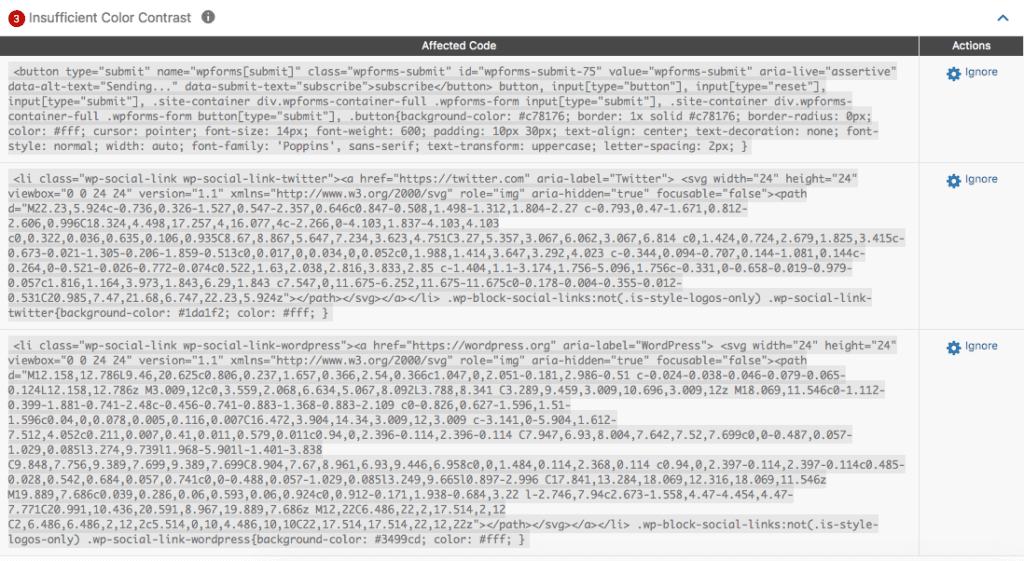
In the example above, there are three different elements on the page that are being flagged for insufficient color contrast. Here is an explanation of how to interpret these errors and find what needs fixing on your page. Hopefully, you will find this helpful if you’re not used to reading and interpreting code.
Error 1
This is the code for the first error:
<button type="submit" name="wpforms[submit]" class="wpforms-submit" id="wpforms-submit-75" value="wpforms-submit" aria-live="assertive" data-alt-text="Sending..." data-submit-text="subscribe">subscribe</button> button, input[type="button"], input[type="reset"], input[type="submit"], .site-container div.wpforms-container-full .wpforms-form input[type="submit"], .site-container div.wpforms-container-full .wpforms-form button[type="submit"], .button{background-color: #c78176; border: 1x solid #c78176; border-radius: 0px; color: #fff; cursor: pointer; font-size: 14px; font-weight: 600; padding: 10px 30px; text-align: center; text-decoration: none; font-style: normal; width: auto; font-family: 'Poppins', sans-serif; text-transform: uppercase; letter-spacing: 2px; }The first section of code shows the HTML element that is being flagged, which is a button. You can see this because the code uses a <button> tag:
<button type="submit" name="wpforms[submit]" class="wpforms-submit" id="wpforms-submit-75" value="wpforms-submit" aria-live="assertive" data-alt-text="Sending..." data-submit-text="subscribe">subscribe</button>The class tells us this is a WP Forms button and you can see that the text on the button is the word “subscribe”.
The next part of the code is the CSS which controls the background color and text color for buttons. Learn more about CSS.
button, input[type="button"], input[type="reset"], input[type="submit"], .site-container div.wpforms-container-full .wpforms-form input[type="submit"], .site-container div.wpforms-container-full .wpforms-form button[type="submit"], .button{background-color: #c78176; border: 1x solid #c78176; border-radius: 0px; color: #fff; cursor: pointer; font-size: 14px; font-weight: 600; padding: 10px 30px; text-align: center; text-decoration: none; font-style: normal; width: auto; font-family: 'Poppins', sans-serif; text-transform: uppercase; letter-spacing: 2px; }You can see in this code that the background color (CSS selector background-color) is #c78176 and the text color (CSS selector color) is #fff (white). This is what that button looks like on the front end of the website:

Error 2
The second color contrast error comes from a Twitter link. This should be relatively quick to identify by reviewing the code and seeing the references to Twitter.
<li class="wp-social-link wp-social-link-twitter"><a href="https://twitter.com" aria-label="Twitter"> <svg width="24" height="24" viewbox="0 0 24 24" version="1.1" xmlns="http://www.w3.org/2000/svg" role="img" aria-hidden="true" focusable="false"><path d="M22.23,5.924c-0.736,0.326-1.527,0.547-2.357,0.646c0.847-0.508,1.498-1.312,1.804-2.27 c-0.793,0.47-1.671,0.812-2.606,0.996C18.324,4.498,17.257,4,16.077,4c-2.266,0-4.103,1.837-4.103,4.103 c0,0.322,0.036,0.635,0.106,0.935C8.67,8.867,5.647,7.234,3.623,4.751C3.27,5.357,3.067,6.062,3.067,6.814 c0,1.424,0.724,2.679,1.825,3.415c-0.673-0.021-1.305-0.206-1.859-0.513c0,0.017,0,0.034,0,0.052c0,1.988,1.414,3.647,3.292,4.023 c-0.344,0.094-0.707,0.144-1.081,0.144c-0.264,0-0.521-0.026-0.772-0.074c0.522,1.63,2.038,2.816,3.833,2.85 c-1.404,1.1-3.174,1.756-5.096,1.756c-0.331,0-0.658-0.019-0.979-0.057c1.816,1.164,3.973,1.843,6.29,1.843 c7.547,0,11.675-6.252,11.675-11.675c0-0.178-0.004-0.355-0.012-0.531C20.985,7.47,21.68,6.747,22.23,5.924z"></path></svg></a></li> .wp-block-social-links:not(.is-style-logos-only) .wp-social-link-twitter{background-color: #1da1f2; color: #fff; }The Twitter icon is a white version of Twitter’s bird emblem on a blue background (#1da1f2). This blue is likely Twitter’s brand blue which, unfortunately, fails color contrast checks.
Error 3
The code in the third error should look relatively similar to the second one, as it is a WordPress emblem with a link to WordPress.
<li class="wp-social-link wp-social-link-wordpress"><a href="https://wordpress.org" aria-label="WordPress"> <svg width="24" height="24" viewbox="0 0 24 24" version="1.1" xmlns="http://www.w3.org/2000/svg" role="img" aria-hidden="true" focusable="false"><path d="M12.158,12.786L9.46,20.625c0.806,0.237,1.657,0.366,2.54,0.366c1.047,0,2.051-0.181,2.986-0.51 c-0.024-0.038-0.046-0.079-0.065-0.124L12.158,12.786z M3.009,12c0,3.559,2.068,6.634,5.067,8.092L3.788,8.341 C3.289,9.459,3.009,10.696,3.009,12z M18.069,11.546c0-1.112-0.399-1.881-0.741-2.48c-0.456-0.741-0.883-1.368-0.883-2.109 c0-0.826,0.627-1.596,1.51-1.596c0.04,0,0.078,0.005,0.116,0.007C16.472,3.904,14.34,3.009,12,3.009 c-3.141,0-5.904,1.612-7.512,4.052c0.211,0.007,0.41,0.011,0.579,0.011c0.94,0,2.396-0.114,2.396-0.114 C7.947,6.93,8.004,7.642,7.52,7.699c0,0-0.487,0.057-1.029,0.085l3.274,9.739l1.968-5.901l-1.401-3.838 C9.848,7.756,9.389,7.699,9.389,7.699C8.904,7.67,8.961,6.93,9.446,6.958c0,0,1.484,0.114,2.368,0.114 c0.94,0,2.397-0.114,2.397-0.114c0.485-0.028,0.542,0.684,0.057,0.741c0,0-0.488,0.057-1.029,0.085l3.249,9.665l0.897-2.996 C17.841,13.284,18.069,12.316,18.069,11.546z M19.889,7.686c0.039,0.286,0.06,0.593,0.06,0.924c0,0.912-0.171,1.938-0.684,3.22 l-2.746,7.94c2.673-1.558,4.47-4.454,4.47-7.771C20.991,10.436,20.591,8.967,19.889,7.686z M12,22C6.486,22,2,17.514,2,12 C2,6.486,6.486,2,12,2c5.514,0,10,4.486,10,10C22,17.514,17.514,22,12,22z"></path></svg></a></li> .wp-block-social-links:not(.is-style-logos-only) .wp-social-link-wordpress{background-color: #3499cd; color: #fff; }How to determine if an Insufficient Color Contrast error needs to be fixed or ignored
Once you have reviewed the code and identified the flagged elements, you will need to manually test the color contrast, unless you can confirm that the element meets one of these three exceptions:
Large Text
Large-scale text (font sizes greater than 18 pixels or 14 pixels and bold) and images of large-scale text are allowed to a contrast ratio of at least 3:1.
If the flagged element has large text, you will still need to test it to make sure the contrast is greater than 3:1. In this case, proceed to the section below to learn how to manually test color contrast.
Incidental Elements
Text or images of text that are part of an inactive user interface component, that are pure decoration, that are hidden and not visible to anyone, or that are part of a picture that contains significant other visual content, have no contrast requirement.
If the flagged element is “incidental” by this definition then you can safely ignore the Insufficient Color Contrast error in Accessibility Checker.
Logotypes
Text that is part of a logo or brand name has no contrast requirement.
If the flagged item is a logo, then you can ignore the Insufficient Color Contrast error in Accessibility Checker.
For social media sharing icons, like two of the errors flagged in our examples above, we recommend that you not count them as logos. True, they are the emblem of that company, however, they are also important user interface elements that you want people to interact with – you want them to visit your social media account or share your blog posts on social media. Because you want them to take that action, it is more important for these elements to have accessible contrast with the background color than it is for them to be overlayed on their brand color.
How to manually test color contrast
To manually test color contrast, you need to check the hexadecimal color codes against one another. You can find the hexadecimal in the code presented in Accessibility Checker, as explained above.
Alternatively, on the front end of your website in Chrome or Firefox browsers, by right-clicking an element (in this case, we are inspecting the “get started here button”) and selecting “inspect” in the pop-up menu.

The color codes will then be visible in the styles box on the right-hand side of the page.
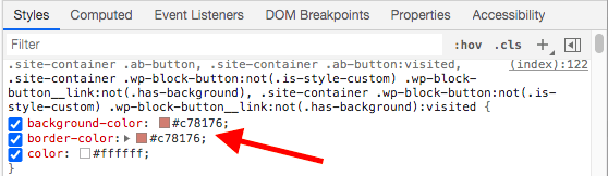
Once you’ve found the color codes, check their ratio in a color contrast checker. The checker will tell you whether these two colors meet the recommended minimum ratio.
Here is the contrast ration for the white test on the dark pink buttons included in the examples above:
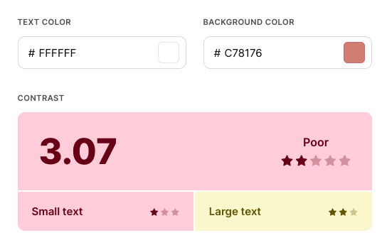
The contrast between these two colors, #ffffff and #c78176, is only 3.07 and thus does not meet the minimum ratio and will need to be adjusted.
It is worth repeating that just because a certain color contrast ratio meets the minimum standard, that does not mean it is really accessible. For example, the color contrast of purple (#CC21CC) on white (#FFFFFF) is almost exactly 4.5:1.
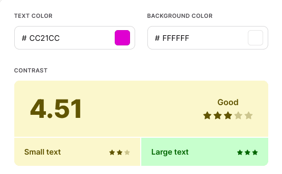
However, for many people, purple text on a white background is not the most readable. It is best to choose a color combination that has a ratio higher than the minimum of 4.5:1 for accessibility.
How to fix insufficient color contrast
Once you have identified the elements on your page or post that need to have their colors changed, there are a number of ways that you can make those changes depending upon how the elements are being added to your website and your proficiency with code.
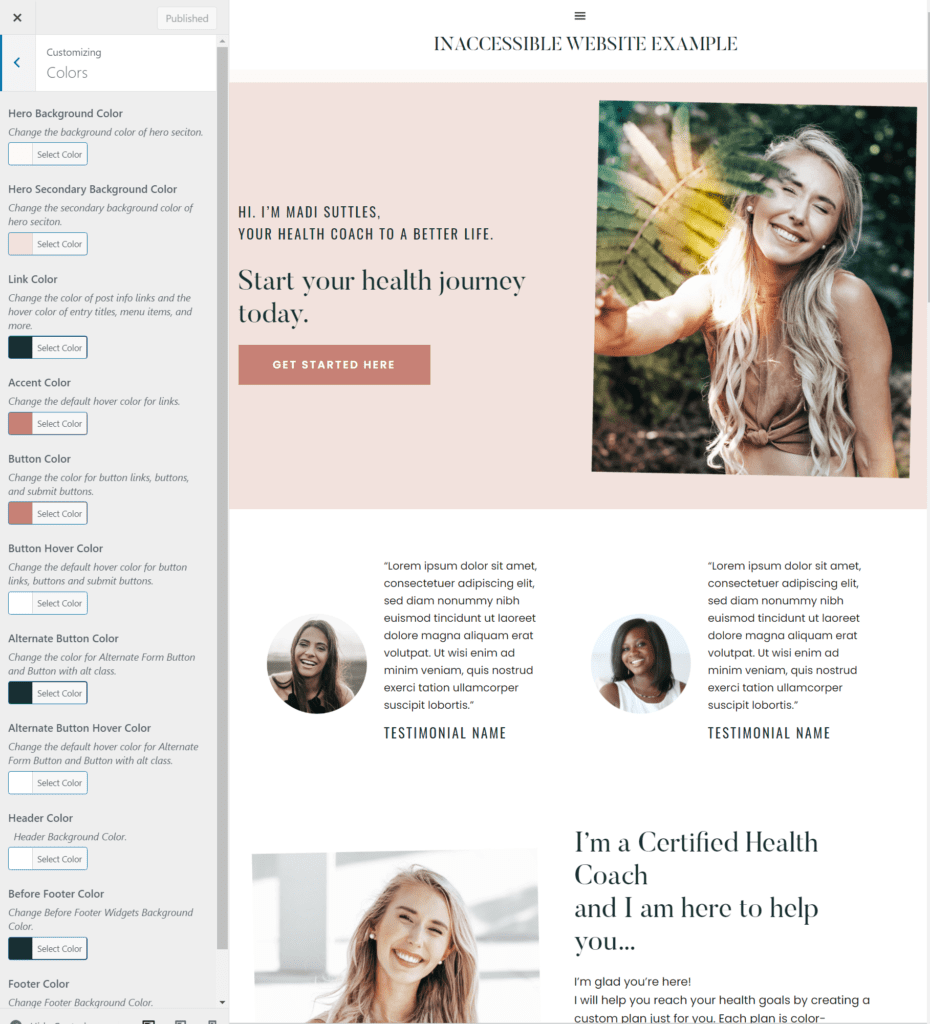
If buttons, icons, or text are added by your theme or a plugin, you might first check the theme or plugin settings page(s) to see if the colors can be edited with a color picker and without editing code. The theme that is used in our testing website, above, has settings in the WordPress customizer, for example, that would allow you to easily change the button color to one that meets contrast requirements.
If color pickers or color settings are not available, you can recolor any element with CSS. If you’re not a developer, the best place to add CSS to your website is in the Customizer’s “Additional CSS” section by selecting Appearance > Customize. Here are some helpful resources to get you started:
If you don’t feel comfortable editing the code yourself or are not able to figure out how to target the element that needs to be fixed, please review our article What to do if there are Accessibility Errors in Your Theme for some ideas on how to proceed. You may also be interested in purchasing a remediation plan, which gives you direct access to accessibility specialists and developers and includes custom coding to fix errors on your website.