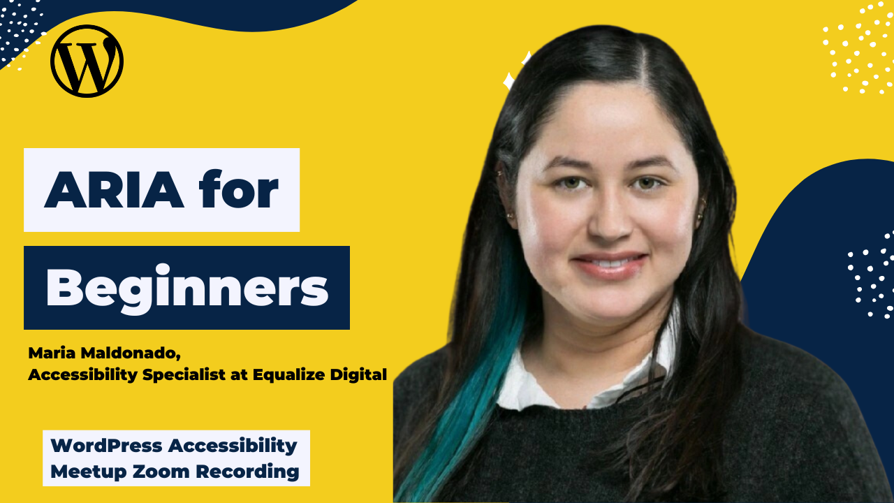
This is a beginner-friendly session where Maria explored ARIA, when to use it (and when not to), and best practices for ensuring an inclusive digital experience.
Thanks to Our Sponsor
Kinsta provides managed hosting services for WordPress. It is powering 120,000 businesses worldwide and based on the user reviews it is the highest-rated managed WordPress host on G2. It has everything you need, including an unbeatable combination of speed, security, and expert support.
Powered by Google Cloud and the fastest C3D and C2 servers combined with CDN and Edge Caching. Your sites are secured with Cloudflare Enterprise, protecting you from DDoS attacks. All plans include free migrations, and the first month of the starter plans is completely free, so you can try the service risk-free.
Watch the Recording
Read the Transcript
>> PAOLA GONZALEZ: Welcome, everyone, to WordPress Accessibility Meetup, ARIA for Beginners with Maria Maldonado. I have a few announcements. You can join our Facebook group to connect between meetups. That’s where you can ask and answer any questions related to accessibility, be it WordPress accessibility or regular web accessibility. You can join our Facebook on facebook.com/groups/wordpress.accessibility. You can also find upcoming events and past recordings in one place.
Yes, this meetup is being recorded, and we’re going to have the recording up in about two weeks. You can find all of our recordings at equalizedigital.com/meetup. You can also join our email list to get news and events announcements. You can do that at equalizedigital.com/focus-state. We send an email every Thursday, and we also send quick reminders for our meetup. That’s a great way to stay up-to-date in web accessibility news. You can also tune in to the audio version of the meetup and our conversations about accessibility on our podcast. You can find that at accessibilitycraft.com.
The WordPress Foundation does not give us a stipend for captions or transcripts, or ASL interpretations. We’re always looking for additional sponsors for the meetup. Also, if you have any suggestions for the meetup or need any additional accommodations to make the meetup work for you, you can always contact us at meetup@equalizedigital.com, and that goes to both me and Amber. Amber is usually here, so I’m pretty sure that you know her.
Yes, if you ever need to contact us, that’s the best way to do it. Who are we? We are the organizers of meetup. We are Equalize Digital. We are a mission-driven organization and a corporate member of the IAAP focused on WordPress accessibility. Our WordPress plugin, Accessibility Checker, scans for accessibility problems and provides reports on the post-edit screen to make building accessible websites easier. You can find us at equalizedigital.com.
We would like to thank our live captioning sponsor for today, Kinsta. Kinsta provides managed hosting services for WordPress. It is powering 120,000 businesses worldwide, and based on the user reviews, it is the highest-rated managed WordPress host on G2. It has everything you need, including an unbeatable combination of speed, security, and expert support. Powered by Google Cloud and the fastest C3D and C2 servers combined, with CDN and edge caching, your sites are secured with Cloudflare Enterprise, protecting you from DDoS attacks.
All plans include free migrations, and the first month of the starter plans is completely free, so you can try the service risk-free. Their website is www.kinsta.com, and we do encourage all our attendees, anyone if you are able to find them on their social media, you can find them at Kinsta. Gve them thanks for sponsoring our meetup, so that they know that we did our job. Just a quick announcement of our upcoming events.
We are going to have From Conference to Industry Association with Bri Norton, Ricky Onsman, and Amanda Mace, and that’s going to be on Monday, June 16, at 7:00 PM US Central. We are also going to have at this same time, it’s going to be on the second Thursday of July, because we have the American holiday, July 4th, on the first Thursday as usually, so we’re just going to be moving that to July 10th. We’re going to be having Elementary Accessibility with Angela Bowman and David Denedo. That’s going to be on Thursday, July 10th at 10:00 AM US Central.
I’m very glad to welcome our speaker today, Maria Maldonado. María José Maldonado is a seasoned web accessibility professional with a strong foundation in education. Since transitioning to the field in 2018, she has been dedicated to advancing accessibility testing and fostering digital inclusivity. Holding CPACC, WAS, and CPWA certifications, she possesses a comprehensive understanding of WCAG standards and legal requirements. With that, I am just going to switch over, stop sharing, and let Maria share her slides. If you have any questions during the presentation, please pop them up in the Q&A box in the chat. Let me just make sure that you have a spotlight, Maria.
>> MARIA MALDONADO: Can you please confirm that my slides are sharing?
>> PAOLA: Yes.
>> MARIA: Okay, perfect. We can start. Again, thank you for inviting me. My name is María José Maldonado. I’m a CPWA. I work as an accessibility specialist. I’ve been around in this field for eight years now. I just want to give you a little bit of context on the topic. Basically, I’ve been doing testing, auditing, monitoring, helping developers and clients to remediate their sites. Something that I have noticed in this time is that ARIA is not used in a proper way. I don’t want to be mean. That’s why I decided to talk about ARIA.
My objective today is that you, at the end of this session, can define what is ARIA, know how the accessibility API and screen readers work, also the most common attributes and roles, the required ARIA for custom components. I also prepared a very short screen reader demo so you can experience in real practice how these attributes and roles are announced by a screen reader. At the end, we are going to have some time for questions and comments.
All right. Before we start with the technical, I just want to share this. When I was starting or learning about ARIA a few years ago, something that I read was that the first rule about ARIA is to not use ARIA. I created this image that is on the screen that is an AI image that references the Fight Club movie. It has the same guy face-to-face repeating that sentence: The first rule about ARIA is to not use ARIA. Now, the same documentation that I read, it has a softer sentence. It says, “No ARIA is better than bad ARIA.”
It’s basically the same in the essence because the bad use of ARIA brings a lot of issues to screen readers. We try to avoid the use of ARIA if we have HTML because ARIA can bring more issues than benefits sometimes. The idea is that after today, you have a better understanding of ARIA and you can use it properly when building your sites. I’ve been repeating ARIA so many times and I haven’t said what does it mean. ARIA means Accessible Rich Internet Applications and is a set of attributes that enhance accessibility of dynamic web content.
It’s part of the WAI, which is the Web Accessibility Initiative by the W3C, which stands for World Wide Web Consortium, which is basically those people that manage the internet. It’s designed to work with HTML to provide additional content to assistive technologies. It helps screen readers understand widgets, states, roles, and properties. It’s especially useful for common user interface components that don’t exist in native HTML. Last but not least, this is very important, ARIA is not a replacement for semantic HTML.
In summary, ARIA is not a programming language because it doesn’t include logic, control structures, or the ability to execute code. It’s a set of HTML attributes that describe roles, states, and properties to assistive technologies. Unlike programming languages, ARIA is fully declarative. It enhances accessibility but doesn’t create behavior or functionality on its own.
Having said that, let me tell you how the accessibility app works with screen readers. It bridges the gap between the browser and assistive technologies. Basically, the browsers expose the content, which is HTML, CSS, and ARIA, to the screen readers. The screen readers query the accessibility API to retrieve elements, roles, names, states, and relationships and announce the content updates and interactions. For example, dynamic changes. In order to be announced, those must be coded correctly to reflect in the accessibility tree. The best practice is to use semantic HTML first and then ARIA to fill in accessibility gaps. The accessibility tree is supported by major platforms, so Windows, macOS, Linux, they all support it.
Now that we know how the accessibility API works, let’s see how the accessible name is determined. I see that there is a hand raised, but let’s keep the questions to the end so we can continue the follow-up, because maybe your question is something that I’m going to mention during the presentation. I’m going to answer all the questions at the end. Thank you. We’re going to talk about the name computation process. First, what is an accessible name? The label or description an assistive technology like a screen reader announces for an element.
It is crucial for buttons, links, form fields, and interactive components. The name computation process follows the accessibility name and description computation algorithm. That sounds very complicated, but it is basically this. First, it looks for an aria-labelledby if present, so it has the highest priority. Then looks for an aria-label. This is used if aria-labelledby is not present. Then we have labels for elements, basically used for form inputs, alt attributes for images, and the element that’s contents. For example, that’s inside a button. The last one is a title attribute. This is only used if nothing else is found. The best practices for giving a name is use aria-labelledby for reference visible labels, use aria-label for invisible but necessary naming, and avoid redundant or conflicting labels. Always test with a screen reader to confirm what is announced.
Let’s see some essential ARIA. I chose a couple of common attributes and roles, and I’m going to talk in detail about them. First, aria-label versus aria-labelledby. Aria-labels provides a custom, invisible label for an element, versus the aria-labelledby that references one or more visible elements that serves as a label. Aria-label is useful when there is no visible text to label the element, and Aria-labelledby is preferred when you have existing on-screen text. The aria-label overrides any visible text or native label, and the aria-labelledby is more dynamic and maintains the visible and the invisible consistency.
I have two examples here. The first one for aria-label is a button. You can see it’s an HTML button with the tags, and it has the aria-label=”Search”. This is very common, because most of the times the search button is a magnifier icon. It doesn’t have text. It needs an invisible name. That’s why you use ARIA-label=”Search” so the screen readers can listen to the name and have an accessible name for that icon. Website users understand that the magnifier icon represents search.
Then the second example that I have is also HTML, but it’s for aria-labelledby. You have an h2, which is a heading level 2, with an ID, section-title that says “Settings.” Then you have the div that contains that region and has the aria-labelledby referencing the ID that is above, section-title. The best practices for aria-label and aria-labelledby are use aria-labelledby when referencing visible text, use aria-label when no label is visually present, and do not use both on the element, because aria-labelledby takes precedence. Again, always test with a screen reader to confirm proper announcement.
Now, aria-describedby. What it does. It associates an element with additional descriptive text. It helps the screen readers provide more content beyond the accessible name, and is commonly used for form fields, buttons, and complex widgets. How it works. The same as aria-labelledby, it references the ID of another element that contains the description. The screen reader reads the description after the element’s name. We have an example here.
There is an input with the ID email, and the aria-describedby=”email-help”. Below the input, we have a span with the ID “email-help”, which has been referenced by the aria-describedby, and it says, “We’ll never share your email with anyone else.” How is this going to be announced by the screen reader? First, it’s going to look by the name, which is email, then it’s going to say fill, because it’s an input, and then it’s going to read the instructions, which are, “We’ll never share your email with anyone else.”
The best practices for aria-describedby are, use it for supplemental help text, hints, or status messages. Ensure the described element is visible and meaningful, and do not use for labeling. Use aria-labelledby or use aria-label instead. Why? Because as we saw before in the computation name, the accessibility API doesn’t look for aria-describedby as a name. It doesn’t consider this attribute as a name. If you provide the accessible name of the element using aria-describedby, basically, the element is going to be read as empty or unlabeled, because technically, for the API, it doesn’t have a name.
The idea is that you use aria-describedby for extra information, information that is going to be helpful for the screen reader, and instructions on a form, or how to use a component that is very complex, but not as a name. Something else about the aria-describedby is that you can use multiple IDs to reference. The only thing is that you have to use a space between each ID. You can concatenate information in this using this attribute.
Now, let’s go with the roles. These two roles are used because we have a lot of status and alerts in the sites. What is the difference between the role status and the role alert? The role status announces important but non-critical updates, while the alert announces urgent, high-priority messages. The role status is polite by default, this means that it waits for the screen reader to finish speaking, while the alert is assertive by default. It interrupts current screen reader output. The status is commnly used for from feedback, like updates or system messages, while the alert is ideal for errors, warnings, or time-sensitive notifications.
The role status is used for content updates that are announced automatically, and it doesn’t need focus. Then, the alert is for content that must be dynamically injected or updated to be announced. The best practices for these two roles is to use status for routine feedback, for example, “Save successfully” or “Add it to your cart,” and then use alert for critical issues, like, for example, an error email. If you are filling a sign-in and you have an invalid password, that’s a critical error, so you can use an alert for that.
Something that I like to say is avoid overusing alert to prevent excessive interruptions, because, as I said before, the status role is polite, so the screen reader is going to wait until the announcement that is in progress finishes, and then it’s going to announce the status. Then, the alert is going to interrupt whatever the screen reader is announcing. It can be a little bit annoying. The idea is to use it only if it is necessary. For the rest of the cases, we use the status.
Let’s understand what is aria-hidden. This is another one that is very used in the sites, and that is a little bit tricky. What it does. It controls visibility to assistive technologies, for example, screen readers. When you have aria-hidden=”true”, it hides the element from the accessibility tree, and when you have aria-hidden=”false”, it ensures that the element is exposed to assistive technology. What are the common use cases? To hide decorative or redundant content, for example, icons, or duplicate text. It is used to temporarily hide modal background content when a dialog is opened, and it’s used to prevent announcements of visual-only elements that are not meant for screen readers.
Please keep in mind the following. Aria-hidden doesn’t affect visual rendering. It is only the accessibility exposure. If you want something to be hidden for sighted users and also screen reader users, use display: none in the CSS style, and in that way, you are going to ensure that it’s hidden for all users. Then, use it with care because hiding critical information can break accessibility. Please avoid using it on focusable or interactive elements because if you use it in something that has a functionality, this is not going to be exposed to the screen reader. Thus, the screen reader is not going to be able to use the element, activate it, or even find it.
We have now a basic idea of the most common rules and attributes. Now, let’s talk about the must-have ARIA for custom components. I have said before that ARIA was created to bridge that gap that existed between the browsers and the web content. When something doesn’t exist in HTML as a native element, we have to build it from scratch. That is what is called custom components. We use ARIA for that.
I compiled a few components that I think are the most common, and I’m going to tell you what are the required ARIA rules or attributes for each one. The first component is the accordion. The roles and attributes that this component must have is the role=”button” on the accordion header, if not using the <button>. You’re going to see that I’m going to repeat a lot this. If you’re not using the native, use the ARIA. In this case, as we have an equivalent, use the <button> tag. Why? Because native elements are accessible by default.
A <button> tag is going to have the role, the name, and the functionality that is expected. An element that has the role=”button”, you need JavaScript to make it more functional. You need to work more. Again, the first is the role of <button>. Then, this is very important. Aria-expanded either true or false. This indicates whether the panel is open or collapsed. Then we have aria-controls, referencing the panel ID. This links the header to the corresponding content panel. They have the ID. In this case, the panel should have a unique ID that is referenced by the aria-controls.
Optionally, we can have the role=”region” on the panel because it enhances the semantics and allows the screen reader navigation. This is not something that I have seen a lot. I would say that most people don’t use it. Then we have the aria-labelledby referencing the header ID on the panel. It associates the panel with the header. The best practices for an accordion are, again, I’m sorry if I repeated this too much, but use native button where possible for better accessibility. Keep headers keyboard focusable and allow Enter or Space to toggle. Manage that binders for focus and keyboard navigation as needed, and announce dynamic state changes clearly with aria-expanded.
The next component that I have is the dialog. The required roles and attributes for a dialog are the role=”dialog” or role=”alertdialog”. Dialog is for general use and alertdialog for urgent prompts. Another attribute that we need is the aria-modal=”true”. This is going to indicate the dialog is a modal and is going to disable interaction with the background content. What this mean is that when you have a modal or a dialog, visually you have that in front, and the rest is gray or disabled.
For a screen reader users, that distinction doesn’t exist. If you don’t apply the aria-modal=”true” and the proper focus management, the screen reader is going to be able to get out of the modal, which is incorrect and is confusing. The focus should be trapped within the modal while it is open. Then you have to add an aria-labelledby referencing the title ID. This is the dialog’s heading or title for a screen reader. The best practices for a dialog are focus should move to the dialog when it opens and should return to the triggering element when it closes. Use a visible heading with an ID for aria-labelledby and hide the background content from screen readers with aria-hidden=”true” or remove it from the accessibility tree.
Now, menu components. This is also very, very common. The key roles and attributes for the menus are the role of menu. This is applied to the container element of the menu. Then we have the role=”menuitem”, which is used on each interactive item inside the menu. We have aria-haspopup=”true”. This indicates that the element, for example, a button opens a menu or a submenu. I want to pause here for a moment. I know that we all have experience or maybe know how a menu or a navigation menu is.
It’s basically sometimes it has links, sometimes it just this toggle more information. Something that I have noticed that happened is that most of the times is the same element that opens a link and also displays or toggle the submenu or the options. That’s good for most users because they can click the element and go or be directed to the site where the link directs. Then when they hover, they can have all the options in there. For a screen reader user or a keyboard user, that doesn’t work the same way because the screen reader or the keyboard user reaches that element and press Enter instead of toggle the information or expand the menu. It’s going to direct them to the link.
What we usually recommend or suggest to co-developers is to use a separate button. You have most of the times a down arrow button that opens the menu, so it receives focus separately. This is the one that is going to have the aria-haspopup=”true” assigned. Also, aria-expanded “true” or “false” that is going to reflect the menu’s visibility state, even if it is expanded or if it is collapsed. We can optionally use aria-controls with a menu ID. It’s going to reference the ID of the associated menu element.
We also can use the role=”menuitemcheckbox” or menuitemradio for checkable or menu items. The best practices for a menu are to trigger like a button, should be keyword focusable, and toggle the menu. Use arrow keys for navigating between the menu items. Keep the menu in the DOM while hidden to maintain screen reader access and set appropriate focus management, and ensure that the escape key closes the menu, or that when I go to the next one or the focus leaves the element, it closes automatically. It’s not confusing, and it’s not covering other information.
Now we have the slider component. The essential roles and attributes for a slider are obviously the role=”slider” that is going to identify the element as a slider to assist the technologies. The aria-value min-max-now. This defines the slider’s numeric range current value. The aria-value-text, this is optional, and it provides a human-readable version of the current value. For example, low, high. Also, the aria-orientation, horizontal or vertical.
This is optional and, honestly, is barely used, but this indicates the direction of the slider. Keep in mind the default orientation of a slider is horizontal. Last, the aria-labelledby that references the label ID. It associates the slider with a visible label. The best practices for a slider are ensure the slider is keyboard accessible with our keys and update aria-valuenow dynamically as the value changes, include visible labels or instructions for contents, and provide visible focus indicators and clear interaction feedback.
The last one is tabs components. The required roles and attributes for our tabs is the role of tablist that is applied to the container that holds all the tabs. Then we have the role=”tab” that is assigned to each individual tab element. The role=”tabpanel” is assigned to the content container associated with each tab. Aria-selected “true” or “false.” This indicates which tab is currently active. We have aria-controls=”panel-id”, which references the ID of its associated tab panel.
Aria-labelledby referencing the tab ID. It means that each tab panel references the ID of its corresponding tab. The best practices for tabs are only one tab and one panel should be active at the time. Tabs should be focusable with arrow key navigation, left, right or up, up, down. Active tab panels should be visible, and inactive panels should be hidden from both sides and assistive technologies. We should maintain clear focus, management, and visual indication of the active tab.
Now I have a demo with NVDA. I prepared a video for you. This is a demo site that Amber created for a training. It has some of the components that I just talked about. Now we are going to observe in action those attributes. We are going to try to understand how they are announced and what is the impact for assistive technologies of these attributes and these roles, and how they are announced. I think I’m going to first just play the video, it is like two minutes, and then maybe we can go over and I can comment on what we are seeing, because it can be really fast.
On the screen, you are going to observe the webpage and depending on the location of the component, you are going to have the speech viewer, which is a small window that has in text everything that is being announced by the screen reader, but you are also going to have the output, the sound of the video. It means the real experience of a screen reader. I have to clarify something because I’m not a native user of a screen reader. I have to use it for educational purposes.
The screen reader user is going to use it faster, and it’s going to be more, I don’t know, like a pro. It’s going to have it very fast. It’s going to navigate skipping things. In this case, I’m just going to navigate very slowly for the components and try to show you the states and how they are announced, the roles, the names, et cetera. Let’s go to the video. Please confirm that you can listen to the audio. It’s okay? I see it. I’ll start over. You have there the NVDA speech viewer. It’s just in the middle right now. I’m going to play it.
>> SPEAKER: Desktop, Primary navigation landmark. Good Page link current. Bad page. Equalize digital link. Equalize digital submenu button collapsed.
>> MARIA: In this case, we have a menu, and it has been read as equalize digital submenu button collapsed. That’s because it has the aria-expanded assigned. It’s announcing the state of that submenu. Before, it says, “Good Page link current page.” That’s also something that ARIA is used for, to indicate what is the current page. This is basically aria-current applied to that link to indicate the user that they are located in this page, or that’s the page that is selected.
Great. Let’s continue.
>> SPEAKER: Expanded.
>> MARIA: Now it says collapsed, expanded. It’s going to name the list.
>> SPEAKER: List with 4 items About Us link. Accessibility Checker link. Link Courses. Meetup link. Desk .
>> MARIA: Hanna, do you have a question about the video? I see a raised hand and I’m wondering if there is something wrong with the video– or not. I continue. Now we are going to– [Inaudible 00:40:10]
>> SPEAKER: Main landmark Example Components. Navigation. Accordion visited link. Out of list heading level 2 accordion.
>> MARIA: Now the accordion. I talked to you about it.
>> SPEAKER: Accessible web page demo document. Heading level 3 button collapsed. Why should accordions be accessible? Why should accordions be accessible? Expanded. Collapsed. Do accordions need? Expanded. Collapsed. Do accordions need headings? Expanded. Collapsed.
>> MARIA: For the accordion, as you can observe and also listen, it’s announcing the title, which is the heading level 3. For example, the first one, once your accordions be accessible, then the bottom, which is the role, and it tells you the state. In this case, collapse or expand depending on if it is, in fact, toggle or not.
Speaker: Desk
>> MARIA: Now we have tabs. This is a tabs example.
>> SPEAKER: Tabs example tab control. WCAG tab selected 1 of 3. ATAG tab 2 of 3. UAAG tab 3 of 3.
>> MARIA: Here I’m navigating with arrow keys. As you can see, the WCAG tab, which is the current one, is the only one that is expanded with that panel. Then the other ones are just hidden from view, but you can navigate those. The screen reader is announcing which one is selected because it says, “WCAG tab.” WCAG is a name. Tab is a role. Selected is a status. It tells you that is 1 of 3 because you have three tabs. Then it goes to ATAG tab 2 of 3 and UAAG tab 3 of 3. You have a focus indicator in there for the arrow keys. You have this yellow and black focus indicator around the one that has the keyboard focus on it. Let’s see again.
>> SPEAKER: ATAG tab 2 of– WCAG tabs. ATAG tab 2 of 3.
>> MARIA: In this case, I just chose another one. I chose ATAG tab. Now this is the one that is visually presented and is announced as selected because it has that ARIA attribute implemented.
>> SPEAKER: AG tab selected 2 of 3. ATAG property page list with 3 items. ATAG ATAG ATAG 2.0 Standard link.
>> MARIA: I was just playing around with the items that were inside the tab panel. Now I’m back to the tab panels just to show you that it lets you know again which tab is selected and the other tabs are hidden.
>> SPEAKER: Tabs Example tab control. ATAG tab selected 2 of 3. UAAG tab 3 of 3. Desk .
>> MARIA: I think this is the last example, the model. Remember that I told you that a model has certain ARIA rules, like aria-haspopup, and then when the dialogue or the model opens, it has to announce the title, which is referenced using aria-labelledby, and then aria-dialog. The screen reader and also the keyboard focus is maintained within the model and doesn’t go to the content behind. Then when it’s closed, it should go to the open model button, which is the one that triggers the model. Let’s go.
>> SPEAKER: Example modal. Open modal.
>> MARIA: First, this button is announced correctly because it says open model, which is the name, button, which is the role, and then opens dialog. It’s telling you that it has aria-haspopup implemented in there, and it’s going to open a component. In this case, a dialog.
>> SPEAKER: Model button opens dialog. Accessible model title dialog.
>> MARIA: Then we have the dialog open. It says, “Accessible model title.” That’s a title that is visible there, but it’s also a title that is referenced by using aria-labelledby. It’s announced accessible model title heading level 2. Then I’m going to navigate a little bit using the keyboard. You are going to observe that the focus moves through the elements and doesn’t leave the model.
>> SPEAKER: NVDA accessible modal title dialog. This is an accessible modal dialog. It follows WCAG 2.2 guidelines. The form close modal button. Your Name edit blank. Your Email edit blank. Submit button. Cancel button. Close modal button. Your Name edit blank. Your Email edit. Submit button. Your Name edit blank.
>> MARIA: As you can observe, the focus is trapped and it’s cyclic. It goes from the close button to the inputs and then to submit and cancel it. It follows ARIA structure. Top to bottom, left to right. It’s announcing the names and the roles of each element.
>> SPEAKER: Close. Cancel button. DesktopWindowXaml. DesktopWindowXamlSource.
>> MARIA: Wow. That’s all. I think that’s all that I have.
It started over. Let’s move to the questions and comments then. I’m going to stop sharing, I think.
>> PAOLA: Yes. You can stop sharing. That was a great presentation, Maria. That was very thorough, and we learned a lot about ARIAs. I do see a couple of questions in the Q&A box. And if any other questions came in, in the chat, please make sure to put them in the Q&A so that we can get through them. Yana asks, “When using a builder like Elementor, do the elements need ARIA added, or is it built into the widget code? Such as using accordion widgets or menu widgets?”
>> MARIA: It depends. It depends on the plugin. I don’t really know Elementor so deep. That’s a question maybe for Amber. We are going to make sure that answer you with the details that question later. In general, some plugins are accessible and, by default, they include the correct ARIA attributes and rules, and sometimes they don’t. Sometimes you have two options. You can even customize it yourself, adjusting the code in the backend, or you can report that to the plugin owner and tell them that there is an accessibility bug that is breaking access criteria and they should fix it. This is something that we can go deeper with Amber because she’s the expert in WordPress. Next question.
>> PAOLA: Yes. What is the best resource or course to go from zero to hero regarding ARIA and semantic HTML?
>> MARIA: I’m going to talk about my experience. Basically, there are some resources already. There is documentation that is written by the W3C that has all this information in there. Personally, I learned about ARIA when I was preparing to take the WAS. I took a DQ training about ARIA. I know that we are preparing some courses. Maybe we, as Equalize, can also create some content. I would say go and be patient and read all the documentation, and practice a lot.
I know it’s a very technical subject. I was afraid that maybe it was going to be too heavy or maybe too difficult to explain because it definitely is just technical stuff. Once that you understand the basics and the taxonomy, you are going to be able to implement it. Because you have to respect the rules that are already there and see how something is compatible or not. What are the child or the children elements that a component needs? That’s it. I would say that is a question of practice as well.
>> PAOLA: Similar to that question, do you have a best practice reference?
>> MARIA: I am going to try to find the URL. There is ARIA patterns website that is written by the W3C, where you can go and you can look for– I am going to write it basicaly in the chat. You can go there– Yes, exactly. That one. The one that Rosalinda put there. That is the one that I use for practice. Also, there is another one that we sometimes recommend, that is on design systems. I am going to place the accordion one. Design system by the United States government. We also sometimes use that for examples. There you have another resource where you can see examples of custom components built and how to use, not only ARIA but also all the interactions and the standard for navigation, focus, et cetera. What else?
>> PAOLA: Thank you. I need to paste that again in the chat because you posted it to host and panelists. Hold on. Let me [Inaudible 00:51:58] second. It’s done. For anyone that’s going to be looking for the recap, this is all the links that we’re sharing in the chat today are going to be in the recap as well. Going on to the next question, is it advisable to use ARIA for image-heavy funnel pages like a shopper page?
>> MARIA: Bernard, can you elaborate a little bit more about your question? I think you can unmute yourself.
>> PAOLA: Oh, no, you cannot– [crosstalk] [Inaudible 00:52:34]
>> MARIA: No? You cannot?
>> PAOLA: Bernard, you can type in the chat and give us more info.
>> MARIA: I need more context. Basically, for images, you do not use ARIA. You use alt text, which is an HTML attribute. You are going to use ARIA for interactive components like buttons, links, widgets, but not for images, unless you are talking about SVG. Give us more context, and we’re going to try to answer the question.
>> PAOLA: Then Paul asks, “JAWS has market share, but it’s very expensive. Can I use NVDA to learn ARIA?”
>> MARIA: You can use NVDA to test your implementation, but I guess not for learning because learning is more like documentation. NVDA is great. I think in the statistics, it’s the most used screen reader, basically because it’s free. The interaction between the different screen readers has slight changes, but it should really not impact the experience for ARIA. Yes, I recommend you to use NVDA. Just download that in your computer and use it. If you are a Mac user, use VoiceOver. You have it as well. It’s already by default in your computer or you can download NVDA as well, I think.
>> PAOLA: Another question. Also, any tips for ARIA use for visual images, complex as well?
>> MARIA: What do you mean? Let me see. “Also, any tips for ARIA use for visual images, complex images as well?” No, again, images are not going to use ARIA. They are going to use alt text. If you have a complex image, I would recommend to use a brief description in the alt text and then use a description in text just below or near the image, even with a dropdown or a model that has a bigger description. I guess you are referring to graphics or charts that really have complex visual representations and cannot be described in 100 characters. My advice is to use alt text just to briefly reference the visual representation, but then provide a table or real text, a paragraph, with the description for the users.
>> PAOLA: That’s a good answer. Bernard gave us a little bit more context. Bernard said, “For a funnel page, we have several options per product, like color, size.”
>> MARIA: You are saying you have a lot of components, like check boxes, radio buttons.
>> PAOLA: That’s what it sounds like, yes.
>> MARIA: Yes. I think for those one, it’s useful to use ARIA because it’s going to give context to the user. Most of the times, in an e-commerce, for example, to choose a color, it’s just a circle with a color. You should give it more context. Avoid those kinds of names, there are fantasy color names like Lagoon of– I do not know, or something like that. Just try to be more descriptive, like blue or red. I know that is fancy and it sounds good, but it is not saying anything to the screen reader user. Let’s avoid that.
>> PAOLA: There’s this one question. Do you have a solution for a menu with links? My problem is that one main menu element is an empty link but has several submenu items. I think it’s an accessibility issue to have an empty link in the menu. Can I solve this problem with ARIA elements, the pages created with WordPress?
>> MARIA: We actually have a video that Steve, which is our dev, created for navigation menus. You can look for it.
>> PAOLA: [Inaudible 00:57:37] Yes.
>> MARIA: We can give you that reference. Basically, an empty link is an issue because you should not have empty links. In that case, you should use a button because that’s the correct functionality and the correct role. Also, you must use ARIA to give the user that context of the state of the element and give information that is an expandable element and which one is selected. I hope this helps you, but it’s a complex implementation. I recommend you to see Steve’s video. Then, if you have more questions, you can always contact us or go to our Facebook page, as Paola mentioned at the beginning, and post your question there. We are going to answer you, and maybe you can share the code there, or the page, or the URL, and we can help you with the analysis and then with the remediation.
>> PAOLA: There’s another question. Do you have tips for a non-programmer who reviews web accessibility reports that include ARIA errors? For example, how to best determine if the errors require action?
>> MARIA: Where is that question? I want to read it.
>> PAOLA: It’s in the webinar chat.
>> MARIA: Oh.
>> PAOLA: It was by Jen.
>> MARIA: How to best determine if the error requires action? Okay. Well, I’m not a programmer or a developer, so I’m in your team, [chuckles] but I guess you learn how to read the code, even when you don’t really know how to implement. What you can do is to use an automatic tool, like the checker, for example, for WordPress, or maybe other tools like the ones that are free, like apps, and those are going to let you know if ARIA is breaking something, because the way that it works is that it’s going to locate those ARIA that has, for example, invalid attributes or that are using attributes that are not allowed.
Then the way that I validate if one automatic error is valid or not is testing that with a screen reader. If it works well with the screen reader and it’s announced properly, it means that it’s not hidden. It’s giving me the name, the role, and the state, I would say that maybe it’s a warning, but I always recommend the client or the developer to fix the error, because it is always going to be marked as an automatic error, even when it’s not impacting a screen reader user. It’s still an error of that [unintelligible 01:00:56]. I hope that answers your question.
>> PAOLA: Yes, and then in the Q&A, Anne asks, “With regards to links, to keep the button text to a minimum for spacing issues, is it okay to expand the text in the ARIA?”
>> MARIA: Yes, correct. That’s a good use. Just remember that the ARIA label is going to replace the text in the bottom, so make sure that you include the text in the link or in the button in the ARIA label, because it’s going to replace all. For example, if you have a Read More, this is very common, this is something that we always do. You have articles in a page and you have Read More visually there, but for the screen reader, Read More doesn’t have a lot of content.
Because if a screen reader is just navigating with a tab key, navigating through links, it’s going to be Read More, Read More, Read More, but doesn’t have content. For a visual or sighted users, they can relate the Read More with the title of the article. What we do is to add an ARIA label that says read more about the title of the article. In that case, that ARIA label is going to replace the Read More that is alone without context, and it’s going to give the user the whole information of where this link is redirecting to.
>> PAOLA: Craig raises a good point. Craig says in the chat, “If the link were more descriptive to begin with, ARIA is not necessary.”
>> MARIA: Exactly. I know that sometimes for a space and also for the design, you cannot use a lot of text in a link. For example, the Read More, the Learn More, those are very common, but I know sometimes you cannot avoid them for a design perspective because already the visual relationship is there, but you can use the ARIA label to fix that. It’s a good practice.
>> PAOLA: Yes, that makes sense. Ahmed asks, “Is there any browser extensions for the screen reader? Any recommendations?”
>> MARIA: I would say use the screen reader software instead of a browser extension because it’s going to give you a better experience. I don’t really recommend a browser extension. Just use the screen reader that is more compatible with your system. For example, NVDA for Windows, VoiceOver for Safari.
>> PAOLA: Using a screen reader at the beginning can be a little bit intimidating, but if you have a course or something that accompanies you along the way, it starts to become second nature and becomes easier. I’m saying that as a non-developer, by the way.
>> MARIA: Yes, and we also can say that Amber just created that course for VoiceOver, so we have that training for you. For the moment, it’s only for VoiceOver. We’re planning to create one for NVDA as well, for Windows users. I would recommend you, if you’re starting using a screen reader, make sure that you know how to turn it off, because once you turn it on, it’s going to read all that you have on the screen, so it may be challenging. That’s my advice. Know how to turn it off. What is the shortcut to turn it off? It’s going to be interesting.
>> PAOLA: I’m going to the next question. “If I’m using semantic HTML, do I still need to use the document structure roles?”
>> MARIA: You mean if you need to use ARIA, even if you’re using semantic HTML? If it’s that, no, because HTML has implicit. It has all the roles, standard navigation, and announcements by default, so you don’t need to use ARIA. You are going to use ARIA when there is not a native equivalent in HTML or when there is extra information that you need to give, and there is not an alternative using native HTML. That’s why I said the first rule about ARIA is do not use ARIA. Always try to use native because HTML is accessible by default.
>> PAOLA: The next question. “People say to use semantic HTML, but it seems that track status and things like that, ARIA is needed. For example, ARIA expanded. Is there a way to just do this with HTML and no ARIA?”
>> MARIA: No. The short answer is no. It doesn’t exist. It doesn’t have an equivalent in HTML for the states, so you have to use ARIA expanded.
>> PAOLA: The next question. “I have seen numerous nav menus that work with tab but not with arrow keys. Ideally, should this work with arrow keys as well, or are tabs sufficient?”
>> MARIA: I think that it depends, but I would say because the standard navigation for the options is arrow keys, but if you provide an alternative, that’s not a big issue because you still can access those, but I will always recommend trying to use a standard keyword interaction in your widgets or your custom components. Otherwise, you need to let the user know with instructions how your component works, but in terms of subsets criteria, it’s still keyword operable, so it’s compliant, but the best practice is to use a standard.
>> PAOLA: Martin asks, “Do ARIA labels have any impact on SEO?”
>> MARIA: I’m not really sure about that, but I would suppose that they do because the browser engine, the search engines look for the accessible names as keywords. If you have good linked or good ARIA labels, good alt text, that’s going to impact the SEO and your positioning in the search engines as well. That’s my answer.
>> PAOLA: Another question is, “We have a back button that takes the use to the previous page. We notify the AT user about where this back button takes them, but visually, from a design perspective, we are not able to add lengthy text to that button. Do you think it is an accessibility issue?”
>> MARIA: No, I think it’s clear. As long as you are managing the focus properly and the back button leads to the section and the screen reader has that information, I think it’s not an accessibility issue. If you want me to give you a more detailed assessment, you can send me the URL or post it on the Facebook chat and we can just review it in detail. For what you are saying, I think it has context and it’s clear that what’s the functionality of the button. If the focus is there programmatically and visually aligned in the same place, it’s okay.
>> PAOLA: We do have a question about, “If someone has Linux, what could be one screen reader that they could use?”
>> MARIA: I think Linux has its own screen reader built in. It’s called Orca. You have a screen reader. Windows also has one, it’s Narrator, but we don’t use it. I don’t know if people use Orca, but you can use Orca because that’s built into your OS.
>> PAOLA: I think with that, we have answered all the questions. Maria, do you want to let anyone know where they can find you?
>> MARIA: Yes, you can search me on LinkedIn, Maria Jose Maldonado, and also, I’m in that Facebook group that Paola mentioned at the beginning, so you can contact me through Facebook because I’m one of the, how do you say the people monitoring the group?
>> PAOLA: Oh, yes, you’re one of the monitors there. Yes, so thank you so much, Maria. This was a great presentation, very thoughtful, very insightful, and we’ll see everyone on our next meetup on the third Monday of the month. Thank you, everyone. Bye.
>> MARIA: Thank you. Bye-bye.
>> [01:11:30] [END OF AUDIO]
Links Mentioned
- Webinar Chat
- WAI-ARIA Overview
- WAI-ARIA 1.2 Cheat Sheet
- ARIA Authoring Practices Guide (APG)
- Screen Reader Keyboard Shortcuts and Gestures
- Patterns
- Accordion
- Anatomy of an Accessible Navigation: Steve Jones
- Accessibility Checker
- Screen Reader Courses (VoiceOver and NVDA)
About the Meetup
The WordPress Accessibility Meetup is a global group of WordPress developers, designers, and users interested in building more accessible websites. The meetup meets twice per month for presentations on a variety of topics related to making WordPress websites accessible to people of all abilities. Meetups are held on the 1st Thursday of the month at 10 AM Central/8 AM Pacific and on the 3rd Monday of the month at 7 PM Central/5 PM Pacific.
Learn more about WordPress Accessibility Meetup.
Article continued below.
Stay on top of web accessibility news and best practices.
Join our email list to get notified of changes to website accessibility laws, WordPress accessibility resources, and accessibility webinar invitations in your inbox.
Summarized Session Information
In this session, accessibility specialist Maria José Maldonado guided attendees through the foundational concepts of ARIA accessibility. Drawing from her eight years of experience in auditing, testing, and remediating websites, Maria shared real-world insights into how ARIA is often misused—and how it can be applied correctly to improve digital experiences for assistive technology users.
ARIA, or Accessible Rich Internet Applications, is a powerful toolset that allows developers to add meaningful labels, roles, and properties to custom UI components. But as Maria emphasized, ARIA should be used carefully and only when semantic HTML falls short. Using humorous references (like the “first rule of ARIA”), she made it clear that poor ARIA implementation can cause more harm than good.
Throughout the session, Maria explained how the accessibility API interacts with ARIA, walked through how accessible names are computed, and demonstrated essential attributes and roles. She also shared practical ARIA use cases for custom components like modals, accordions, sliders, and tab panels—culminating in a live screen reader demo that brought everything to life.
This presentation is a must-read for anyone new to ARIA accessibility or looking to improve their understanding of how to use it correctly. It provides the foundational knowledge needed to build more inclusive websites and avoid common pitfalls in accessible development.
Session Outline
- What is ARIA?
- How the accessibility API works
- Name computation process
- Key ARIA attributes
- Key ARIA roles
- ARIA in custom components
- Screen reader demonstration
- Final thoughts
What is ARIA?
ARIA (Accessible Rich Internet Applications) is a set of HTML attributes designed to enhance the accessibility of dynamic content on the web. Specifically, ARIA provides extra information to assistive technologies—like screen readers—so they can better interpret and announce user interface components that are not natively accessible.
ARIA is part of the Web Accessibility Initiative (WAI), developed by the World Wide Web Consortium (W3C)—the same group responsible for maintaining internet standards. ARIA works alongside HTML and is not intended to replace it. Instead, it supplements HTML by adding semantic meaning to elements, particularly custom or interactive components that HTML alone does not adequately define—such as tabs, accordions, sliders, and modals.
Not a programming language
ARIA is not a programming language. It doesn’t include logic, control flow, or executable code. Instead, it is entirely declarative, meaning it is used only to describe interface elements’ structure, state, and properties to assistive technologies. For example, ARIA can be used to identify a role (like a button or dialog), define its state (expanded or collapsed), or associate it with additional descriptions or labels.
The rule of ARIA: use with caution
ARIA should be used cautiously. Improper or unnecessary use of ARIA can actually create barriers for users who rely on screen readers. This is why one of the earliest lessons about ARIA is often summed up with the phrase: “The first rule of ARIA is to not use ARIA.” Bad ARIA is worse than no ARIA at all. Today, documentation takes a slightly softer approach, saying, “No ARIA is better than bad ARIA,” but the warning remains the same.
Native HTML first
Semantic HTML elements should always be the first choice when building accessible web content. Elements like <button>, <input>, <label>, and others come with built-in accessibility support. Browsers and assistive technologies inherently understand these native elements. If developers attempt to replicate their functionality with ARIA alone, they risk introducing accessibility issues or inconsistencies.
When to use ARIA
The true value of ARIA lies in addressing situations where native HTML falls short—such as with custom components or advanced user interfaces. In these cases, ARIA can bridge the accessibility gap, providing crucial context that enables screen reader users to navigate and interact with content more effectively.
How the accessibility API works
Connecting the browser to assistive technology
The accessibility API acts as a communication bridge between web browsers and assistive technologies like screen readers. When a user visits a website, the browser processes the web content—HTML, CSS, and ARIA attributes—and exposes that information through the accessibility API. This enables screen readers to retrieve and announce meaningful details about the page content, structure, and interactive elements.
The role of the accessibility tree
Central to this process is the accessibility tree, a structured representation of the accessible elements on a webpage. Unlike the DOM (Document Object Model), which contains all elements regardless of their relevance to accessibility, the accessibility tree includes only those elements that are meant to be read or interacted with by assistive technologies. This includes information such as element roles (e.g., button, heading), names, states (e.g., expanded, disabled), and relationships (e.g., which label is associated with which input).
For example, if a component on a webpage updates dynamically—like a form error appearing after a failed submission—that change must be coded in a way that is reflected in the accessibility tree. Otherwise, screen readers won’t detect or announce it.
How screen readers use the API
Screen readers query the accessibility API to understand what’s on the page and how to announce it to the user. They use this API to gather data such as the type of element, its accessible name, its current state, and how it relates to other elements. This data helps screen readers construct meaningful audio descriptions for users who rely on them to navigate the web.
As an example, if a screen reader encounters a button with an aria-expanded attribute, it will announce both the button’s label and its current state (expanded or collapsed) based on what is available through the API.
If you want to learn more about how to use a screen reader for accessibility testing, check out our online courses. These courses include detailed instructions on how to use a screen reader, key keyboard shortcuts to know, recommended settings for testing, and examples of both good and bad components, so you know what to listen for.
Best practices: start with semantic HTML
It’s important to use semantic HTML first. Native HTML elements like <button>, <label>, and <form> are automatically recognized by the browser and included in the accessibility tree without additional work. These elements already have built-in roles and behaviors that are correctly communicated to screen readers.
ARIA should only be used when semantic HTML is insufficient, such as when creating custom components that don’t have a native HTML equivalent. In those cases, ARIA can help fill the accessibility gaps by explicitly defining roles and relationships—but developers must ensure these elements are properly coded so they’re represented accurately in the accessibility tree.
Broad platform support
The accessibility tree is supported across major operating systems, including Windows, macOS, and Linux. This cross-platform support helps ensure that accessible websites will work consistently for screen reader users regardless of the system they use.
Name computation process
What is an accessible name?
An accessible name is the label or description that a screen reader announces for a particular element. Accessible names are especially important for interactive components like buttons, links, and form fields. Without an accessible name, users who rely on screen readers might not understand what an element does or how to interact with it.
The accessible name is essential to provide clarity, context, and direction for users. Without it, the user experience can become confusing or completely inaccessible.
How accessible names are determined
To explain how a screen reader figures out what name to announce for an element, we have the accessibility name and description computation algorithm. Although it might sound complex, we have a straightforward priority list that screen readers follow when searching for an element’s name:
aria-labelledby
This has the highest priority. If the element has anaria-labelledbyattribute that references one or more element IDs, the screen reader will use the visible text from those referenced elements as the name. This method is ideal when you want the accessible name to come from existing visible content.aria-label
If noaria-labelledbyis present, screen readers look foraria-label. This attribute provides a custom, invisible name, useful when there is no visible text label. However, because it’s hidden visually, it should be used with care.- Native Label Elements and Attributes
For form inputs and other native HTML elements, screen readers check for associated<label>elements,altattributes (for images), and the text content inside elements (like buttons). These are standard HTML labeling methods and are preferred for their built-in accessibility. titleAttribute
This has the lowest priority and is only used if no other naming method is found. Because it’s often overlooked or not announced consistently across screen readers, Maria recommended avoidingtitleattributes as the sole method for naming.
Best practices for naming
Several best practices to help you apply this naming logic correctly:
- Use
aria-labelledbywhen referencing visible labels or headings. This maintains consistency between what sighted users see and what screen reader users hear. - Use
aria-labelwhen a visible label is not possible (e.g., icon-only buttons like a magnifying glass for “Search”). - Do not use both
aria-labelandaria-labelledbyon the same element. If both are present,aria-labelledbytakes precedence, and thearia-labelwill be ignored. - Avoid redundant or conflicting labels, which can confuse users or result in elements being announced incorrectly.
- Always test with a screen reader to confirm that the expected name is being announced. What appears correct visually may not be interpreted correctly by assistive technology.
Why naming matters
Proper naming is not just about code correctness—it’s about usability. For example, a search button that only contains a magnifying glass icon might make sense visually, but without an accessible name, a screen reader user may not understand its purpose. Applying aria-label="Search" makes the button meaningful to everyone.
By understanding how the name computation process works and using ARIA attributes thoughtfully, developers can create web interfaces that are truly inclusive and navigable for all users.
Key ARIA attributes
aria-label vs. aria-labelledby
These two attributes serve the purpose of labeling elements: aria-label and aria-labelledby. While both provide accessible names, they serve different use cases.
aria-labelallows you to assign an invisible, custom label directly on an element. It’s useful when no visible text is available—for example, an icon-only button such as a magnifying glass used for search. In this case, a screen reader wouldn’t understand the purpose of the icon unless you provided a label likearia-label="Search".aria-labelledbyreferences the ID of a visible element (or multiple elements) that serve as the visible label. For example, if you have a heading or text on screen that clearly labels a region or section, you can usearia-labelledbyto associate that text with the interactive component. This ensures consistency between what sighted users see and what screen reader users hear.
Best practices:
- Use
aria-labelledbywhen you already have visible, meaningful text on the page. - Use
aria-labelwhen no visible label exists. - Do not use both on the same element—
aria-labelledbytakes precedence. - Always test with a screen reader to confirm that the element is announced as intended.
aria-describedby
aria-describedby is an attribute used to provide additional descriptive information beyond the element’s accessible name. It is especially useful for form inputs, buttons, and complex widgets that need extra context.
For example, an email input might include helper text like “We’ll never share your email with anyone else.” This content can be referenced using aria-describedby to ensure that it is read after the input’s name by screen readers.
How it works:
- The attribute references the ID of another element (e.g., a
<span>) that contains the descriptive text. - The screen reader will announce the input’s label first, then the description.
- You can reference multiple IDs separated by spaces to provide compound descriptions.
Best practices:
- Use for hints, instructions, or supplementary information—not as a label.
- Ensure the referenced content is visible and meaningful.
- Do not rely on
aria-describedbyto provide the main label. The accessibility API does not include it in the name computation. If you use it incorrectly, the element may appear unnamed to screen readers.
aria-hidden
The aria-hidden attribute is often misunderstood. This controls whether an element is exposed to assistive technologies.
aria-hidden="true"hides the element from the accessibility tree. This means it will be completely invisible to screen readers, even though it may still be visible on the screen.aria-hidden="false"ensures the element is exposed to assistive technologies, even if it’s hidden visually using CSS.
This attribute is helpful for:
- Hiding decorative icons or duplicate text that would otherwise be announced unnecessarily.
- Temporarily removing background content from screen readers when a modal dialog is open.
Important cautions:
aria-hiddenonly affects assistive technologies—it does not visually hide content. To hide content for all users, usedisplay: nonein CSS.- Avoid using
aria-hiddenon focusable or interactive elements (like buttons or links), as this will make them completely inaccessible to screen reader users. - Misuse can result in critical information being skipped entirely, so it must be used with intention.
Summary and key takeaways
ARIA attributes are essential tools for enhancing accessibility and should be applied with care. It’s critical to understand what each attribute does, how it impacts the accessibility tree, and how it affects screen reader output.
Overall best practices include:
- Prioritize native HTML whenever possible.
- Use ARIA attributes to supplement, not replace, semantic structure.
- Always test with a screen reader to verify what users will actually hear.
- Avoid combining attributes that may conflict or override each other.
Key ARIA roles
ARIA doesn’t just provide attributes—it also defines roles that tell assistive technologies what type of UI component an element represents. These are two particularly important roles for dynamic content: status and alert.
role="status"
The status role is used to communicate important but non-critical updates to users via screen readers. A common example might be feedback from a form submission, like “Your changes have been saved.”
- This role is polite by default, meaning it waits until the screen reader has finished reading the current content before announcing the status update.
- It does not require focus to be moved to it. The message is announced automatically when the content inside the element changes.
Typical use cases:
- Confirmation messages like “Added to cart” or “Settings updated successfully.”
- Informational system messages that don’t require immediate attention.
Best practices:
- Use
role="status"for routine, non-urgent updates. - Ensure the element containing the message is updated dynamically in the DOM so that assistive technologies detect the change.
- Keep the message clear, concise, and relevant.
role="alert"
The alert role is used for critical or time-sensitive messages—such as errors in form fields or warnings that require immediate attention.
- Unlike
status, thealertrole is assertive by default. This means it interrupts the screen reader’s current output to announce the message right away. - This role is designed for situations where it’s essential that the user hears the message immediately—like when a login form fails or required information is missing.
Typical use cases:
- Error messages in forms (e.g., “Invalid email address”).
- Urgent system notifications (e.g., “Session expired” or “Payment failed”).
Best practices:
- Use
role="alert"sparingly and only when the message requires urgent user awareness. - Avoid overusing it, as repeated interruptions can be disorienting and frustrating for users.
- Ensure that the alert text is updated programmatically so screen readers will pick it up and announce it without requiring focus changes.
Choosing between status and alert
It’s important to know when to choose the right role for the type of message being conveyed:
- Use
role="status"for messages that are helpful but don’t need immediate user attention. - Use
role="alert"when the message is urgent and needs to interrupt other content to be heard right away.
Overusing alerts can reduce their effectiveness and harm the user experience. Since alerts interrupt current screen reader output, using them unnecessarily can overwhelm or confuse users.
RIA roles are powerful tools—but they must be used intentionally. Developers should always consider how urgent a message is, how it will be delivered to users, and whether it will be disruptive or helpful. Choosing the correct ARIA role ensures users receive important feedback at the right time, without unnecessary interruptions.
ARIA in custom components
One of the primary reasons ARIA exists is to bridge the accessibility gap in situations where native HTML doesn’t offer a suitable element or behavior. These gaps commonly appear when developers build custom interactive components such as accordions, modals, sliders, or tab panels—components that require keyboard support, dynamic updates, and screen reader announcements but don’t have built-in HTML equivalents.
In such cases, ARIA is used to replicate and communicate the roles, states, and relationships that assistive technologies need to understand and interact with these components correctly.
These are the ARIA roles and attributes required to make some of the most common custom components accessible.
Accordion
An accordion is a UI component that expands or collapses sections of content. These are the ARIA requirements for making a custom accordion accessible:
- Use
role="button"on the accordion header if not using a native<button>element. Ideally, developers should use native<button>elements because they are accessible by default and handle keyboard interaction out of the box. - Add
aria-expanded="true"or"false"to indicate whether the content panel is currently open or collapsed. - Use
aria-controls="panel-id"to associate the button or header with the content panel it toggles. This ties the interactive control to the content region. - Optionally, apply
role="region"to the content panel for better semantic structure, especially if it contains important content. - Include
aria-labelledby="header-id"on the panel so the screen reader knows which heading or label describes the content.
Best practices:
- Prefer native
<button>elements whenever possible. - Keep headers keyboard-focusable.
- Allow toggling with Enter or Space keys.
- Manage keyboard focus and announce state changes dynamically.
Dialog (Modal)
Modal dialogs are used to present information or request input in a way that overlays the main content and requires user interaction.
Required ARIA roles and attributes:
role="dialog"orrole="alertdialog"depending on urgency. Usedialogfor general use andalertdialogfor urgent prompts.aria-modal="true"to indicate that the dialog is modal and interaction outside of it is disabled. This helps screen readers understand that focus should remain inside the modal.aria-labelledby="title-id"to reference a visible heading or title, providing a name for the dialog.
Best practices:
- Move focus to the dialog when it opens and return it to the triggering element when it closes.
- Use a visible heading and ensure it has an ID to reference with
aria-labelledby. - Hide background content from screen readers while the modal is open using
aria-hidden="true".
Menus
Menus are another commonly customized component. This is how to make them accessible:
- Apply
role="menu"to the container that holds the menu items. - Use
role="menuitem"on each interactive element inside the menu. - If a menu or button triggers a submenu, use
aria-haspopup="true"on the triggering element. - Use
aria-expanded="true"or"false"to indicate the current state of the submenu. - Optionally, use
aria-controls="menu-id"to link the trigger to the menu content. - For menus with checkable items, use
role="menuitemcheckbox"ormenuitemradio.
A common accessibility issue: many menus use the same clickable element for both navigation and toggling the menu. This can be confusing for screen reader and keyboard users. You can use a separate button (such as a down arrow icon) that receives its own focus and toggles the submenu.
Best practices:
- Triggers (e.g., buttons) should be keyboard-focusable and activate the menu.
- Use arrow keys for navigating between menu items.
- Maintain the menu in the DOM when hidden to ensure screen reader access.
- Allow the Escape key to close the menu.
- Set focus appropriately to avoid confusion.
Slider
Sliders allow users to choose a numeric value along a range. For an accessible custom slider:
- Use
role="slider"to identify the element. - Include
aria-valuemin,aria-valuemax, andaria-valuenowto define the range and current value. - Optionally add
aria-valuetextfor a human-readable version of the value (e.g., “Low” instead of “25”). - Include
aria-orientation="horizontal"or"vertical"if the orientation differs from the default (which is horizontal). - Reference a visible label using
aria-labelledby="label-id".
Best practices:
- Make the slider keyboard-accessible (typically with arrow keys).
- Dynamically update
aria-valuenowas the value changes. - Provide clear visual focus indicators and instructions.
- Ensure the label is visible and meaningful.
Tabs
Tabs are a popular UI pattern for showing different content panels within the same view.
Required ARIA roles and attributes:
role="tablist"for the container that holds the tabs.role="tab"for each individual tab element.role="tabpanel"for each content container associated with a tab.aria-selected="true"or"false"to indicate which tab is currently active.aria-controls="panel-id"on each tab to reference its associated panel.aria-labelledby="tab-id"on each panel to reference the tab that controls it.
Best practices:
- Only one tab and one panel should be active at a time.
- Tabs should be keyboard-focusable and navigable with arrow keys.
- Inactive panels should be hidden from both view and the accessibility tree.
- Maintain a clear visual and programmatic indication of the active tab.
Key Takeaways
Using ARIA for custom components requires careful attention to roles, relationships, and dynamic state changes. Each of the components she covered needs specific attributes and behaviors to be fully accessible.
Whenever possible, use native HTML elements, which are accessible by default. But when you must build custom components, ARIA provides a powerful toolset to ensure those interfaces work for everyone.
Final thoughts
ARIA, when used correctly, can significantly improve accessibility. However, misuse can harm the user experience. Developers should prioritize semantic HTML and only use ARIA where necessary. Testing with screen readers is essential to confirm that elements are announced as intended.