This is our second annual report comparing the out-of-the-box accessibility of WordPress page builders and block libraries. To view the prior year’s findings, see WordPress Page Builder Accessibility Comparison 2024.
The goal of this report is to help website owners and developers identify tools that provide the best starting point for accessibility and alert them to possible issues that may exist in their current theme and plugin setup.
Laws around the world, such as the European Accessibility Act, the Americans with Disabilities Act, and many others, require websites to be accessible to people with disabilities. People with disabilities are also a powerful buying class who can bring value to your organization — if they’re able to find and use your website. Choosing an accessibility-ready WordPress theme and page builder is the first step in making your website usable and legally compliant.
Whether you’re planning a new website project or preparing to remediate an existing site, this report will answer questions you have about WordPress page builder accessibility.
Table of Contents
- Watch an Explanation of this Report on Zoom
- Testing Methodology
- Reporting and Scoring Methodology
- Components Tested
- Results
- Components Results
- Accessibility Ready Results
- Skip to Content Link
- Meaningful Landmark Roles and Names
- Keyboard Navigation Support
- Controls with Accessible Names, Roles, and States
- Labelled Form Fields
- Headings with Meaningful Structure
- Underlined Links in Text
- No Ambiguous Link Text
- Sufficient Color Contrast of Text and UI Controls
- Alternative Text on Images and Graphics
- Accessible Audio, Video, and Animations
- Support for Reflow, Resize, and Text Spacing Changes
- No Unexpected Changes of Context
- No Links Opening New Windows or Tabs Without Warning
- Content on Hover or Focus is Accessible
- Screen Reader Text Supported
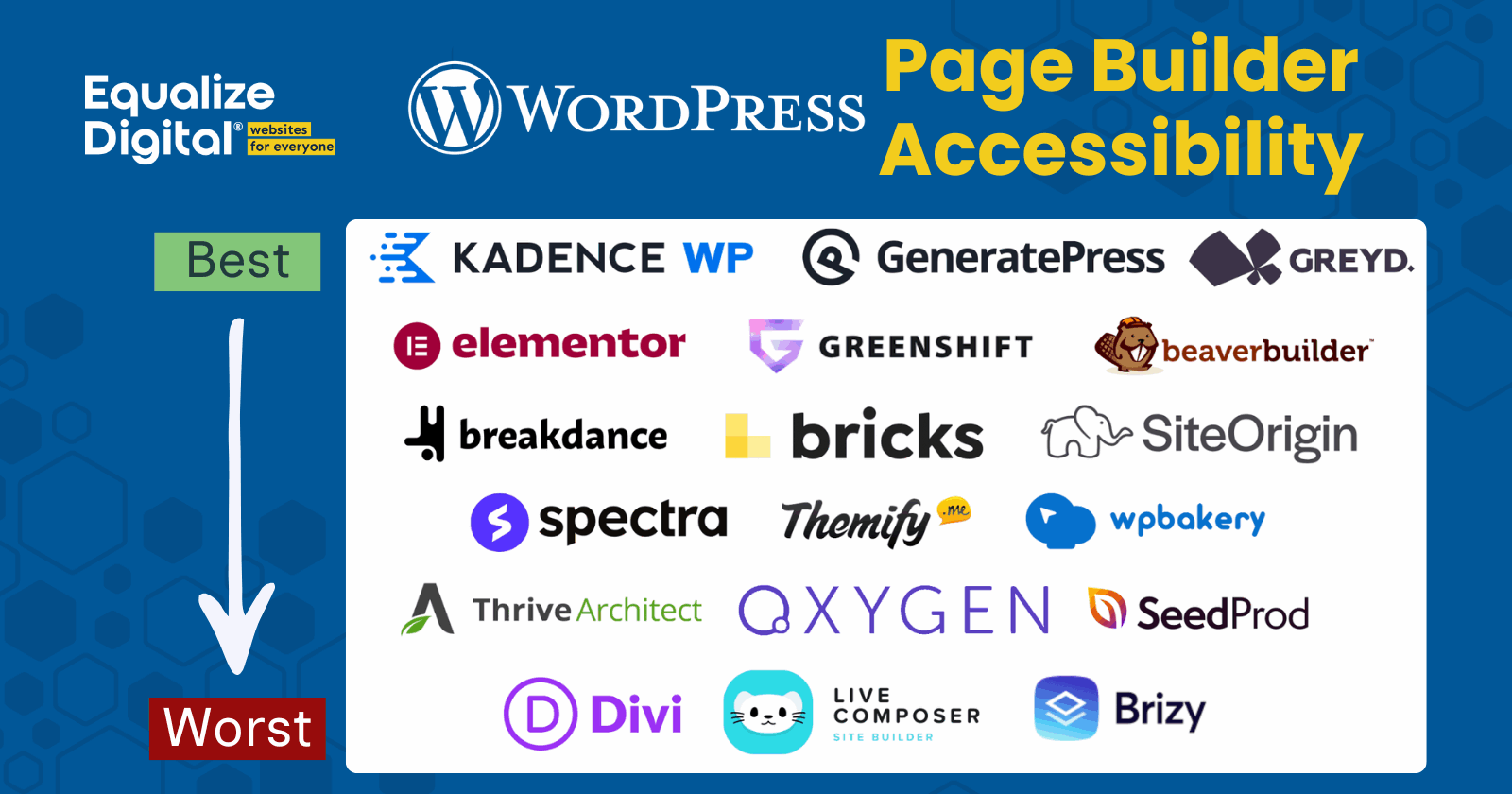
- WordPress Page Builders Ranked from Best to Worst
- Conclusions
- How to Action This Report
- Get the Data
- Disclaimer
- Updates
Watch an Explanation of this Report on Zoom
Testing Methodology
This report covers the accessibility of 19 popular WordPress page builders or block libraries that can be used to build professional WordPress websites for businesses, nonprofits, schools, and government agencies. These builders are compared against WordPress core alone as a baseline.
Note: For purposes of this report, we’re using the term “page builders” to refer to both page builders and themes and block libraries that work in the core WordPress block editor (Gutenberg). For ease of communication, we’re broadly defining “page builders” as any toolset that can be used to create a WordPress webpage.
Below is an explanation of how tests were performed for this study. Jump to the ranking.
Test Dates
Page builder accessibility tests were completed between June and August 2025.
Included Builders
The following page builders are included in this report:
- WordPress core (as a baseline)
- Avada
- Beaver Builder
- Breakdance
- Bricks
- Brizy
- Divi
- Elementor
- GeneratePress / Generate Blocks
- Greenshift
- Greyd
- Kadence
- Live Composer
- Oxygen
- SeedProd
- SiteOrigin Page Builder
- Astra / Spectra
- Themify Builder
- Thrive Architect
- WPBakery
Versions tested
In most cases, the current production (live) version of each builder was used, with a few exceptions. Several of the included companies asked us to test beta versions of their software, which may be more accessible than versions available to the general public at the time of publication.
Specific versions of themes and plugins tested are listed in our full data spreadsheet, available here.
Tests include paid features
If a pro or paid version exists for the page builder, the paid version of the builder was tested. Some features tested may not exist in free versions of the builders.
We accessed the paid versions of these builders in multiple ways:
- We or one of our clients already pays for the builder.
- The company that created the page builder gave us a free license so we could test it.
- A WordPress community member who paid for the builder provided us with files for testing.
- We purchased a license of the builder exclusively for testing.
How we accessed the page builder has no impact on its accessibility score. We do not plan to use the free licenses on any public websites and do not have affiliate agreements with any of these builders.
Testing Site Setup
This year, we approached testing site setup extremely methodically to ensure we were getting the most “apples to apples” comparison.
Baseline content
Testing sites were created on a WordPress multisite network, with each builder on a subsite. Each site has identical post and page content and navigation menus.
All content that was added to these websites for testing purposes (such as blog posts) was added without accessibility errors: following the correct heading structure, adding alt text to images, etc. Every test site had a 100% passing score in Accessibility Checker before installing and activating the builder to ensure that any accessibility issues were caused by the builder and not content entry.
Theme selection
Some page builders are included in themes, but many are plugins.
Each page builder plugin was tested using its companion theme if one was available. For example, Elementor was tested with the Hello Elementor theme, and Kadence Blocks was tested with the Kadence Theme, Spectra with Astra, etc.
Page builder plugins that don’t have a companion theme were tested with Twenty Twenty-Five, the current default theme for WordPress. Twenty Twenty-Five is “accessibility-ready” and was the best starting point for ensuring page builder scores were not negatively impacted by the theme.
Builder Setup
When setting up the builders, if multiple templates or starter patterns were available, we did our best to choose ones that didn’t have obvious color contrast issues (though sometimes we were surprised).
Templates were used for creating headers and footers, though we did modify them to reduce false positives in automated accessibility reports:
- Ensured all images had alt text.
- Added URLs to any filler links set to
<a href="#">by the developer. - Added URLs to social media icons.
- Removed excess or unnecessary footer menus.
Default colors were not changed (even if they obviously fail contrast minimums), as one of the WordPress accessibility-ready requirements is that all default colors must pass WCAG 2.1 Level AA color contrast.
Additionally, we did not change link decoration styles (even if a setting exists to meet guidelines) because we were testing the default styles of all links.
For component-level tests, we added each component to a single “Components” page, preceded by an H2. The components were not styled at all and were only configured to the extent of setting them up as similar to one another as possible. Content entered into components was identical across the page builders, and we followed content accessibility best practices, ensuring no accessibility issues were introduced within the content.
This year, we’ve made these test sites public so you can view them along with the report. Request access to the data and test sites below.
No third-party components
Tests were conducted on elements and components solely controlled by the page builder and did not include any third-party add-ons.
For example, we did not add one of the third-party plugins that fix accessibility in Divi before testing; instead, we tested Divi’s accessibility alone.
We feel strongly that page builders need to make their base components accessible and should not be relying on add-ons to fix poor coding in their products.
Users should not have to purchase additional add-on plugins to fix known accessibility problems in their page builder. All developers should consider accessibility in their core products and provide users with the best possible starting point when creating websites.
Testing Process
Two people on our team tested all builders. Some were also tested by a blind screen reader user.
Builders were tested in the following ways:
- Bulk automated testing using our Accessibility Checker WordPress plugin.
- Reviewing heading structure in the HeadingsMap browser extension.
- Reviewing landmarks in the Landmark Navigation browser extension.
- Manual keyboard testing.
- Screen reader testing with both NVDA on Windows and VoiceOver on Mac.
- Testing reflow with browser Zoom, text resizing/spacing, and screen magnifiers.
- Testing respect for operating system reduced motion settings in both Windows and Mac.
The following pages were manually tested for each builder or theme/builder combination:
- Components Page
- Blog Archive Page
- Single Post
- Search Results
- 404 Page
All other pages on the site were tested via Accessibility Checker scans.
Reporting and Scoring Methodology
Google Sheet for reporting
The results were tracked in a Google spreadsheet as testing was completed. This Google Sheet has multiple tabs. There is a tab each for component scores, accessibility-ready scores, and a summary tab that combines data from the two.
On both the components and accessibility-ready tabs, the first column lists each item checked, grouped by component or category. There is a column for each builder under which you can see their scores. Builders received either a pass, fail, concern, or N/A for each item checked.

You can request access to this spreadsheet with all the data below. This post includes tables with high-level scores only due to space limitations. Comments and additional details are only available on the Google Sheet.
Explanation of scores
The scores for each check were given as follows:
- Pass: The element exactly matched specifications, and the page builder was doing that specific thing right from an accessibility standpoint.
- Fail: The element or attribute was missing or not coded correctly. The page builder is clearly failing to meet the specific accessibility check.
- Concern: The element or check mostly passes, but some small part of the component doesn’t pass, or the builder has options that would lead to a content creator adding accessibility problems. When given a “concern,” there is typically a note in the cell explaining why.
- N/A: This stands for “not applicable” and is given when an element or component does not exist in the builder, and thus, the check cannot be completed.
How page builders were ranked
After testing each component and scoring all relevant checks, the page builders were ranked from best to worst in terms of accessibility.
This is devised by averaging the percentage passing checks for both components and accessibility-ready guidelines, in this way:
- Total all cells that contain “pass” for each page builder.
- Total all cells that contain “fail” for each page builder.
- Total all cells that contain “concern” for each page builder.
- Calculate a percentage passing from all applicable checks.
- Average the percentage from the components and accessibility-ready tabs.
After getting a percentage passing of the applicable checks and averaging the two separate scores, we were able to rank the page builders from best at accessibility (highest percentage passing) to worst at accessibility (lowest percentage passing).
Percentage passing calculation
The percentage passing was calculated in this way:

Here is an example of how this calculation works with sample numbers:
- Total pass: 3
- Total fail: 7
- Total concern: 2
(3/(3+7+2))x100=25%In this example, we first add three, seven, and two together (this gives us 12). Then, we divide three (the total passed) by 12 (the total of pass, fail, and concern). Finally, multiply the result by 100 to get the percentage: in this case, 25%.
Why use percentage of applicable
Why do we not just rank builders by the count of “passes”?
Using a percentage of applicable checks allows us to determine how good any given developer is at creating accessible code when they do code things. It doesn’t penalize builders for having fewer components, as would happen if we ranked the page builders simply by the most passes.
Not a weighted score
Note: This is not a weighted score. For simplicity, all checks were assigned an equal value (1 point), even though the issues vary in severity. For example, failing to label a <nav> element has a more significant impact on accessibility than including redundant wording like “navigation” in an aria-label, yet both are counted equally here.
This approach was chosen to simplify comparison across builders and should not be interpreted as suggesting all issues are of equal importance. In reality, some accessibility issues create significant barriers for users (e.g., missing form labels), while others are minor inconveniences (e.g., missing list semantics in a group of posts).
The scores in this report are best understood as an indicator of the number of potential problems identified, not their relative impact. When making accessibility decisions, it is crucial to consider both the quantity and the severity of issues, as well as how the builder is used in real-world projects. Some issues may be avoidable by implementing best practices, while others are inherent limitations of the tool.
Components Tested
Important note: This was not a complete accessibility audit of each page builder. Instead, it was a thorough audit of some selected components and key theme features.
If you need to ensure your website or page builder is Web Content Accessibility Guideline-compliant and fully accessible, we recommend hiring a professional to conduct a WCAG accessibility audit.
Included builder blocks or widgets
The following builder-specific components were tested:
- Navigation (may come from theme)
- Header search (may come from theme)
- Accordion
- Carousel or slider
- Form
- Icon List
- Loop/Posts block
- Tabs
- Testimonials
How components were selected
We selected components for testing based on their prevalence on business websites and those designed by professional designers and built by WordPress developers. The tested components are not necessarily all components that have to be included in websites, but they are frequently used to make websites appear more polished or interactive.
In 2025, we expanded the study to include forms. In the previous year’s report, forms created with page builders were intentionally excluded because they are typically more limited than dedicated form plugins. However, we decided to add them this year since, in practice, many website owners and developers use the form tools provided within page builders—often included in starter templates. Because forms are a common source of critical accessibility issues and many websites don’t use independent form plugins, we decided it was important to evaluate page builder forms as part of this study (even though we don’t recommend using them).
Accessibility ready requirements
We also tested for the WordPress Accessibility Ready requirements, following the new process soon to be introduced on WordPress.org. This included looking at many parts of the site controlled by the theme and assessing:
- Skip to content links
- Landmark roles and names
- Keyboard navigation support
- Controls with Accessible Names, Roles, and States
- Labelling of comment and search formm field
- Heading structure
- Link underlines
- Link text ambiguity
- Color contrast
- Alternative text on theme/builder controlled graphics
- Animations
- Support for reflow, resize, and text spacing changes
- Unexpected changes of context
- Content on hover or focus
- Screen reader text support
As an accessibility best practice, all themes should aim for a 100% accessibility ready requirements score. Because page builders exert greater control over site output than most traditional themes, it is especially critical that they strive for full conformance with these requirements.
Results
The following is a summary of the results for each page builder. Due to space limitations, not all data and notes can be presented here, and tables require horizontal scrolling.
For full data, request access to the Google Sheet below.
Components Results
Navigation
Accessible navigation is vital to allowing people to move around your website, read your content, and access the pages where sales and conversions happen. Learn about coding accessible WordPress navigation menus.
When accessibility testing navigation, we checked:
- The navigation menu is contained in a
<nav>tag. - The
<nav>tag is labeled. - Users can define the
aria-labelon the<nav>tag — this is important especially for utility, footer, or secondary menus, as the aria-label should describe the links contained in the navigation.. - Dropdown menus are keyboard accessible.
- There are separate buttons for opening and closing dropdowns.
- CTA/button styles can be achieved in the primary navigation without custom CSS — this can be passed by allowing a class to be set or having controls for styling a single menu item. It is important to allow people to set a nav link to look like a link; if that’s not easy to do, people incorrectly add these in separate widget areas outside the
<nav>tag. - All focusable elements have a visible keyboard focus.
- The mobile menu is keyboard accessible.
- The navigation works correctly when zoomed.
Page Builder Navigation Accessibility
| Item Tested | WordPress Core Baseline | Avada | Beaver Builder | Breakdance | Bricks | Brizy | Divi | Elementor | GeneratePress / Generate Blocks | Greenshift | Greyd | Kadence | Live Composer | Oxygen | SeedProd | SiteOrigin Page Builder | Astra / Spectra | Themify Builder | Thrive Architect | WPBakery |
|---|---|---|---|---|---|---|---|---|---|---|---|---|---|---|---|---|---|---|---|---|
| Uses Nav tag | pass | pass | concern | pass | pass | pass | fail | pass | concern | N/A | N/A | pass | fail | pass | pass | pass | pass | fail | fail | N/A |
| Nav tag is labeled | pass | pass | pass | fail | fail | fail | fail | pass | pass | N/A | N/A | pass | fail | fail | fail | pass | pass | fail | fail | N/A |
| Users can define the nav tag aria-label | pass | fail | fail | fail | pass | fail | fail | pass | fail | N/A | N/A | pass | fail | pass | fail | fail | pass | fail | fail | N/A |
| Dropdowns keyboard accessible | pass | pass | fail | pass | concern | fail | fail | pass | concern | N/A | N/A | pass | fail | concern | fail | pass | pass | fail | fail | N/A |
| Separate buttons for opening and closing dropdowns | pass | fail | fail | pass | pass | fail | fail | fail | fail | N/A | N/A | pass | fail | fail | fail | fail | pass | fail | fail | N/A |
| CTA/buttons styles achievable in primary navigation without requiring custom CSS | pass | fail | fail | pass | pass | fail | fail | fail | pass | N/A | N/A | pass | fail | fail | fail | fail | fail | fail | pass | N/A |
| Visible keyboard focus | pass | pass | pass | pass | concern | pass | fail | pass | pass | N/A | N/A | pass | fail | pass | pass | pass | concern | fail | fail | N/A |
| Mobile menu is keyboard accessible | pass | pass | fail | pass | pass | fail | fail | fail | pass | N/A | N/A | pass | concern | fail | fail | concern | concern | fail | fail | N/A |
| Works on zoom | pass | pass | pass | pass | pass | fail | fail | fail | pass | N/A | N/A | pass | concern | fail | fail | fail | pass | concern | pass | N/A |
| Other | fail |
Header Search
Many business websites include a button in their header that allows users to open a search form in a modal or expanded section. These search forms can make websites more user-friendly, but only if they’re coded with accessibility in mind.
When accessibility testing the header search, we checked:
- The button to open the search form is coded as a
<button>. - The search form overlay has a focus lock.
- The search form field is labeled.
- The search form label remains visible when data is typed (a magnifying glass icon may be sufficient if positioned in or immediately after the input).
- There is a
<button>to submit the search. - The button to submit the search is labeled.
- The overlay close button is a
<button>. - The close button is labeled.
- Any search suggestions are keyboard and screen reader accessible.
- The search works correctly when zoomed.
Page Builder Header Search Accessibility
| Item Tested | WordPress Core Baseline | Avada | Beaver Builder | Breakdance | Bricks | Brizy | Divi | Elementor | GeneratePress / Generate Blocks | Greenshift | Greyd | Kadence | Live Composer | Oxygen | SeedProd | SiteOrigin Page Builder | Astra / Spectra | Themify Builder | Thrive Architect | WPBakery |
|---|---|---|---|---|---|---|---|---|---|---|---|---|---|---|---|---|---|---|---|---|
| Button to open search form is a button | pass | pass | fail | pass | pass | fail | fail | N/A | pass | N/A | N/A | pass | N/A | N/A | N/A | pass | pass | fail | pass | N/A |
| Search form overlay has focus lock | N/A | fail | fail | fail | fail | fail | fail | N/A | pass | N/A | N/A | pass | N/A | N/A | N/A | fail | fail | fail | fail | N/A |
| Search form field is labeled | pass | pass | pass | pass | pass | fail | fail | N/A | pass | N/A | N/A | pass | N/A | N/A | N/A | pass | pass | pass | pass | N/A |
| Search form label is visible when field has data typed in it (magnifying glass icon may be sufficient if positioned in or immediately after input) | pass | pass | fail | pass | pass | fail | fail | N/A | pass | N/A | N/A | pass | N/A | N/A | N/A | fail | pass | pass | pass | N/A |
| There is a button to submit search | pass | pass | fail | pass | fail | pass | fail | N/A | pass | N/A | N/A | pass | N/A | N/A | N/A | fail | pass | fail | concern | N/A |
| Button to submit search is labeled | pass | pass | N/A | fail | N/A | pass | fail | N/A | pass | N/A | N/A | pass | N/A | N/A | N/A | pass | N/A | fail | N/A | |
| Overlay close button is a button | N/A | pass | N/A | fail | pass | fail | fail | N/A | fail | N/A | N/A | pass | N/A | N/A | N/A | fail | N/A | fail | N/A | N/A |
| Close button is labelled | N/A | pass | N/A | fail | pass | fail | fail | N/A | N/A | N/A | N/A | pass | N/A | N/A | N/A | fail | N/A | fail | N/A | N/A |
| Any search suggestions are keyboard and screen reader accessible | N/A | N/A | N/A | N/A | N/A | pass | N/A | N/A | N/A | N/A | N/A | N/A | N/A | N/A | N/A | N/A | N/A | fail | N/A | N/A |
| Works on zoom | fail | pass | fail | pass | pass | fail | fail | N/A | pass | N/A | N/A | pass | N/A | N/A | N/A | fail | fail | pass | pass | N/A |
| Other | fail |
Accordion
Accordions are incredibly common on most websites, especially when it comes to displaying frequently asked questions or similar groups of content. If your page builder does not code accordions accessibly, many users will not be able to access the content hidden in them. Learn how to code accessible accordions.
When accessibility testing accordions, we checked:
- Accordion titles are headings with
<button>tags inside them. - Accordion buttons use
aria-expanded. - Accordion buttons use
aria-controlsto reference their content. - Users can choose the heading level.
- Hidden content does not receive focus.
- Hidden content is not read by screen readers.
- Accordion buttons have a visible focus indicator.
- Accordions work correctly when zoomed.
Page Builder Accordion Accessibility
| Item Tested | WordPress Core Baseline | Avada | Beaver Builder | Breakdance | Bricks | Brizy | Divi | Elementor | GeneratePress / Generate Blocks | Greenshift | Greyd | Kadence | Live Composer | Oxygen | SeedProd | SiteOrigin Page Builder | Astra / Spectra | Themify Builder | Thrive Architect | WPBakery |
|---|---|---|---|---|---|---|---|---|---|---|---|---|---|---|---|---|---|---|---|---|
| Titles are headings with button tags in them | N/A | concern | concern | pass | fail | fail | fail | pass | fail | pass | fail | pass | fail | fail | fail | pass | fail | fail | fail | fail |
| Buttons use aria-expanded | N/A | pass | pass | pass | pass | fail | fail | pass | pass | pass | pass | pass | fail | fail | concern | pass | pass | pass | fail | fail |
| Buttons use aria-controls to reference content | N/A | pass | pass | pass | pass | fail | fail | pass | pass | pass | pass | pass | fail | fail | N/A | pass | fail | pass | fail | fail |
| User can choose the heading level | N/A | pass | pass | pass | pass | fail | pass | pass | fail | pass | fail | pass | fail | pass | fail | fail | pass | pass | pass | pass |
| Hidden content does not receive focus | N/A | pass | pass | pass | pass | fail | pass | pass | pass | fail | fail | pass | pass | pass | pass | pass | pass | pass | pass | pass |
| Hidden content not read by screen readers | N/A | pass | pass | pass | pass | fail | pass | pass | pass | fail | fail | pass | pass | pass | pass | pass | pass | pass | pass | pass |
| Has visible focus | N/A | pass | pass | pass | pass | fail | fail | pass | pass | pass | concern | pass | fail | fail | fail | pass | pass | fail | fail | fail |
| Works on zoom | N/A | pass | pass | pass | fail | fail | fail | pass | pass | pass | pass | pass | pass | pass | pass | pass | pass | pass | pass | pass |
| Others | fail | fail | fail | fail |
Carousel/Slider
There are many arguments against using sliders or carousels on websites, and we typically avoid putting them on websites we build. However, sliders remain a favorite component for many website owners, especially in that prime spot at the top of the home page.
Unfortunately, many page builders miss the mark when it comes to carousel accessibility, so if you have a carousel or slider on your website, you should test it to confirm it’s accessible. How to test sliders for accessibility.
When accessibility testing carousels/sliders, we checked:
- The carousel is wrapped in a
<section>tag (orrole="region") with anaria-labeloraria-labelledby. - Slides are coded as a list.
- There is the ability to set a heading level if headings are present.
- Previous/next and dot navigation are coded as
<button>elements. - All buttons have meaningful labels.
- Dot navigation includes
aria-currentfor the current item. - Keyboard focus does not move to hidden items.
- Screen readers do not announce hidden items.
- Focus shifts to the current slide when using navigation buttons.
- Auto-play carousels have a pause button.
- Animations respect
prefers-reduced-motion. - There is a visible focus indicator.
- Carousels work correctly when zoomed.
- The ability exists to set proper contrast.
Page Builder Carousel/Sliders Accessibility
| Item Tested | WordPress Core Baseline | Avada | Beaver Builder | Breakdance | Bricks | Brizy | Divi | Elementor | GeneratePress / Generate Blocks | Greenshift | Greyd | Kadence | Live Composer | Oxygen | SeedProd | SiteOrigin Page Builder | Astra / Spectra | Themify Builder | Thrive Architect | WPBakery |
|---|---|---|---|---|---|---|---|---|---|---|---|---|---|---|---|---|---|---|---|---|
| Carousel is wrapped in a section tag (or role=region) with an aria-label or aria-labelledby attribute | N/A | fail | pass | fail | fail | fail | fail | pass | N/A | fail | fail | pass | N/A | fail | N/A | fail | fail | fail | N/A | fail |
| Slides are a list. | N/A | pass | pass | fail | fail | fail | fail | fail | N/A | fail | fail | pass | N/A | pass | N/A | pass | fail | fail | N/A | pass |
| Ability to set heading level if headings are present | N/A | pass | fail | pass | pass | pass | pass | N/A | pass | pass | pass | N/A | pass | N/A | pass | pass | pass | N/A | fail | |
| Previous/next and dot navigation are buttons | N/A | fail | pass | pass | pass | fail | fail | pass | N/A | pass | pass | pass | N/A | fail | N/A | fail | pass | fail | N/A | fail |
| All buttons have meaningful labels | N/A | fail | pass | pass | fail | fail | fail | pass | N/A | pass | pass | pass | N/A | fail | N/A | pass | pass | fail | N/A | fail |
| Dot navigation includes aria-current for current item | N/A | N/A | pass | pass | pass | fail | fail | pass | N/A | pass | fail | pass | N/A | fail | N/A | fail | pass | fail | N/A | fail |
| Keyboard focus does not go to any hidden items. | N/A | pass | pass | pass | pass | pass | pass | pass | N/A | pass | pass | pass | N/A | pass | N/A | pass | pass | fail | N/A | fail |
| Screen readers don’t read any hidden items. | N/A | pass | pass | pass | pass | pass | pass | pass | N/A | fail | pass | pass | N/A | fail | N/A | pass | fail | fail | N/A | fail |
| Focus shifts to slide when using navigation buttons | N/A | fail | fail | fail | fail | fail | fail | fail | N/A | pass | fail | pass | N/A | fail | N/A | pass | fail | fail | N/A | fail |
| Auto-play carousels have a pause button | N/A | fail | pass | fail | fail | concern | fail | fail | N/A | fail | fail | pass | N/A | fail | N/A | fail | fail | concern | N/A | fail |
| Animations respect prefers reduced motion | N/A | fail | fail | pass | fail | fail | pass | pass | N/A | fail | fail | pass | N/A | N/A | N/A | pass | pass | fail | N/A | N/A |
| Has visible focus | N/A | fail | pass | fail | fail | pass | fail | fail | N/A | pass | concern | pass | N/A | concern | N/A | pass | fail | fail | N/A | fail |
| Works on zoom | N/A | fail | pass | pass | fail | fail | fail | pass | N/A | pass | pass | pass | N/A | pass | N/A | pass | concern | fail | N/A | pass |
| Ability to set proper contrast | N/A | pass | pass | pass | pass | pass | pass | pass | N/A | pass | pass | pass | N/A | pass | N/A | pass | pass | pass | N/A | pass |
| Other | fail | fail |
Form
Forms must be accessible to screen readers and keyboard users to avoid barriers to submission. For the purposes of this study, we created forms in each builder with examples of text, select, radio, checkbox, and date fields (as long as the builder supported those fields). Forms had a combination of required and not required fields, and additional helper text was added where possible.
When accessibility testing forms, we checked:
- All fields are keyboard operable.
- All fields have visible and programmatically associated labels.
- All fields are aligned with their visual labels.
- Visual labels do not rely only on placeholder text.
- Required fields have a visible indicator.
- Required fields are programmatically required.
- The name field has an
autocompleteattribute. - The email field has an
autocompleteattribute. - The phone field has an
autocompleteattribute. - There is the ability to set custom
autocompleteattributes on applicable fields. - Field descriptions are programmatically associated with the fields.
- Checkboxes are grouped in a
<fieldset>. - Checkbox labels are wrapped in a
<legend>. - Radio inputs are grouped in a
<fieldset>. - Radio labels are wrapped in a
<legend>. - Error messages are programmatically associated with fields.
- Errors are announced by screen readers.
- Error states do not rely on color alone.
- Error messages are persistent.
- Success messages are announced by screen readers.
- All form elements have a visible focus indicator.
- Forms work correctly when zoomed.
- Focus management is appropriate for errors and for submission success.
Page Builder Form Accessibility
| Item Tested | WordPress Core Baseline | Avada | Beaver Builder | Breakdance | Bricks | Brizy | Divi | Elementor | GeneratePress / Generate Blocks | Greenshift | Greyd | Kadence | Live Composer | Oxygen | SeedProd | SiteOrigin Page Builder | Astra / Spectra | Themify Builder | Thrive Architect | WPBakery |
|---|---|---|---|---|---|---|---|---|---|---|---|---|---|---|---|---|---|---|---|---|
| All fields are keyboard operable | N/A | concern | pass | pass | pass | fail | pass | pass | N/A | pass | pass | pass | N/A | N/A | N/A | pass | pass | pass | fail | N/A |
| All fields are labeled visually and for screen readers | N/A | pass | pass | pass | pass | concern | fail | pass | N/A | concern | pass | pass | N/A | N/A | N/A | pass | fail | fail | fail | N/A |
| All fields are aligned with the visual label | N/A | pass | pass | pass | pass | pass | fail | pass | N/A | pass | pass | pass | N/A | N/A | N/A | pass | pass | pass | pass | N/A |
| Visual labels don't rely on placeholder text | N/A | pass | pass | pass | pass | pass | fail | pass | N/A | concern | concern | pass | N/A | N/A | N/A | pass | pass | pass | pass | N/A |
| Required fields have visiual indicator | N/A | pass | fail | pass | fail | fail | fail | pass | N/A | fail | pass | pass | N/A | N/A | N/A | fail | pass | pass | fail | N/A |
| Required fields are programatically required | N/A | pass | pass | fail | pass | pass | pass | pass | N/A | pass | pass | pass | N/A | N/A | N/A | fail | pass | pass | fail | N/A |
| Name field has autocomplete attribute | N/A | pass | fail | fail | pass | fail | pass | fail | N/A | pass | pass | pass | N/A | N/A | N/A | pass | concern | fail | fail | N/A |
| Email field has autocomplete attribute | N/A | concern | fail | fail | concern | fail | fail | fail | N/A | pass | pass | pass | N/A | N/A | N/A | fail | concern | fail | fail | N/A |
| Phone field has autocomplete attribute | N/A | concern | fail | fail | concern | fail | fail | fail | N/A | pass | pass | pass | N/A | N/A | N/A | fail | concern | fail | fail | N/A |
| Ability to set custom autocomplete attributes on applicable fields | N/A | pass | fail | fail | pass | fail | fail | fail | N/A | fail | concern | pass | N/A | N/A | N/A | fail | concern | fail | fail | N/A |
| Field descriptions are programatically associated with the fields | N/A | N/A | N/A | N/A | N/A | N/A | pass | N/A | N/A | N/A | pass | pass | N/A | N/A | N/A | pass | N/A | N/A | N/A | N/A |
| Checkboxes grouped in fieldset | N/A | pass | N/A | pass | fail | fail | fail | fail | N/A | fail | pass | pass | N/A | N/A | N/A | fail | fail | fail | fail | N/A |
| Checkboxes label wrapped in a legend tag | N/A | fail | N/A | pass | fail | fail | fail | fail | N/A | fail | pass | pass | N/A | N/A | N/A | fail | fail | fail | fail | N/A |
| Radio input grouped in fieldset | N/A | pass | N/A | pass | fail | fail | fail | fail | N/A | fail | pass | pass | N/A | N/A | N/A | fail | fail | fail | fail | N/A |
| Radio label wrapped in a legend tag | N/A | fail | N/A | pass | fail | fail | fail | fail | N/A | fail | pass | pass | N/A | N/A | N/A | fail | fail | fail | fail | N/A |
| Errors are programatically associated with fields | N/A | pass | pass | pass | fail | fail | fail | fail | N/A | pass | pass | pass | N/A | N/A | N/A | pass | pass | fail | fail | N/A |
| Errors announced by screen reader | N/A | fail | fail | fail | fail | fail | fail | pass | N/A | fail | fail | pass | N/A | N/A | N/A | fail | fail | fail | fail | N/A |
| Error states don't rely on color alone | N/A | fail | pass | pass | pass | fail | fail | pass | N/A | pass | fail | pass | N/A | N/A | N/A | pass | pass | pass | fail | N/A |
| Error messages are persistent | N/A | fail | pass | fail | fail | fail | fail | pass | N/A | fail | fail | pass | N/A | N/A | N/A | fail | fail | fail | pass | N/A |
| Success announced by screen readers | N/A | pass | pass | fail | fail | fail | fail | pass | N/A | N/A | pass | pass | N/A | N/A | N/A | fail | fail | fail | fail | N/A |
| Has visible focus | N/A | fail | fail | concern | pass | pass | fail | concern | N/A | pass | concern | pass | N/A | N/A | N/A | fail | fail | fail | fail | N/A |
| Works on zoom | N/A | pass | pass | pass | fail | pass | pass | pass | N/A | pass | pass | pass | N/A | N/A | N/A | pass | fail | pass | pass | N/A |
| Appropriate focus management for errors and submission success | N/A | pass | fail | pass | pass | fail | fail | fail | N/A | pass | pass | pass | N/A | N/A | N/A | fail | pass | pass | pass | N/A |
| Other | fail | fail |
Icon List
Icon lists are commonly used to group lists of features or benefits with decorative icons to make each item stand out. Businesses and theme designers love to include icon lists everywhere, from home pages to product pages and pricing tables. These are relatively simple components that can add accessibility issues for screen reader users, particularly if they don’t utilize HTML list format to group the items. Learn how lists help accessibility.
When accessibility testing icon lists, we checked:
- Icon list elements are coded as an unordered
<ul>list. - Icons have
aria-hidden="true". - Icon lists work correctly when zoomed.
Page Builder Icon List Accessibility
| Item Tested | WordPress Core Baseline | Avada | Beaver Builder | Breakdance | Bricks | Brizy | Divi | Elementor | GeneratePress / Generate Blocks | Greenshift | Greyd | Kadence | Live Composer | Oxygen | SeedProd | SiteOrigin Page Builder | Astra / Spectra | Themify Builder | Thrive Architect | WPBakery |
|---|---|---|---|---|---|---|---|---|---|---|---|---|---|---|---|---|---|---|---|---|
| Elements coded as unordered list | N/A | pass | pass | pass | pass | fail | N/A | pass | N/A | fail | pass | pass | N/A | N/A | pass | pass | fail | N/A | pass | N/A |
| Icon has aria-hidden=”true” | N/A | pass | pass | pass | pass | fail | N/A | pass | N/A | concern | pass | pass | N/A | N/A | pass | pass | concern | N/A | concern | N/A |
| Works on zoom | N/A | pass | pass | pass | pass | pass | N/A | pass | N/A | pass | pass | pass | N/A | N/A | pass | pass | pass | N/A | pass | N/A |
Loop/Posts Block
Want to display three recent blog posts on your home page? You need a loop, a.k.a. a latest or recent post block. These components are incredibly helpful for drawing extra attention to blog posts and can also display grids of team members, a portfolio, or a list of featured products. This is one of the most common and powerful blocks on a WordPress website.
When accessibility testing loop/post blocks, we checked:
- There is the ability to hide redundant links from screen readers and keyboard users (such as with card-style links).
- Posts are coded in a list.
- Content authors can choose the heading level or <p> tag for post titles, allowing for proper heading structure based on where post groups are inserted.
- “Read more” links are not ambiguous.
- Linked image alt text describes where the link points (not the image itself), or the link has an
aria-labeloverriding the alt. - Loops work correctly when zoomed.
Page Builder Loop/Posts Block Accessibility
| Item Tested | WordPress Core Baseline | Avada | Beaver Builder | Breakdance | Bricks | Brizy | Divi | Elementor | GeneratePress / Generate Blocks | Greenshift | Greyd | Kadence | Live Composer | Oxygen | SeedProd | SiteOrigin Page Builder | Astra / Spectra | Themify Builder | Thrive Architect | WPBakery |
|---|---|---|---|---|---|---|---|---|---|---|---|---|---|---|---|---|---|---|---|---|
| Has the ability to hide redundant links from screen readers and keyboard users such as with a card style linking option | fail | fail | pass | fail | pass | pass | fail | pass | pass | fail | fail | pass | fail | fail | fail | fail | fail | fail | fail | fail |
| Posts in list | pass | pass | pass | fail | pass | fail | fail | fail | fail | pass | pass | pass | fail | fail | fail | fail | fail | fail | fail | fail |
| Ability to choose the heading level or p tag for post titles | fail | pass | pass | pass | pass | fail | pass | pass | pass | pass | pass | pass | fail | fail | pass | pass | pass | pass | pass | fail |
| Read more not ambiguous | pass | N/A | N/A | fail | pass | fail | fail | pass | N/A | fail | fail | pass | fail | fail | fail | fail | fail | N/A | fail | fail |
| Linked image alt describes purpose or aria-label on link overrides alt | pass | fail | N/A | fail | concern | N/A | pass | fail | N/A | fail | pass | pass | fail | fail | fail | fail | fail | fail | fail | fail |
| Works on zoom | pass | pass | pass | pass | fail | pass | pass | pass | pass | pass | pass | pass | pass | pass | pass | pass | pass | pass | pass | pass |
| Other | fail | fail |
Tabs
Tabs, like accordions, allow WordPress designers and content creators to group and collapse content interactively. If not coded correctly, tabs (and all the content in the hidden tab panels) will be completely inaccessible to screen readers and keyboard-only users.
When accessibility testing tabs, we checked:
- The tab controls container has
role="tablist". - Tab controls are
<button>elements or can be triggered with the spacebar if the underlying element is not a button. - Tab controls have
role="tab"andaria-controlsattribute. - The current tab control button has
aria-selected="true". - Tab panels have
role="tabpanel". - Tab panels use
aria-labelledbyto provide an accessible name. - Hidden tab content does not receive focus.
- Hidden tab content is not read by screen readers.
- Tab controls have a visible focus indicator.
- Tabs work correctly when zoomed.
Page Builder Tabs Accessibility
| Item Tested | WordPress Core Baseline | Avada | Beaver Builder | Breakdance | Bricks | Brizy | Divi | Elementor | GeneratePress / Generate Blocks | Greenshift | Greyd | Kadence | Live Composer | Oxygen | SeedProd | SiteOrigin Page Builder | Astra / Spectra | Themify Builder | Thrive Architect | WPBakery |
|---|---|---|---|---|---|---|---|---|---|---|---|---|---|---|---|---|---|---|---|---|
| Tab controls container has role="tablist" | N/A | pass | pass | pass | pass | fail | fail | pass | pass | pass | pass | pass | fail | fail | fail | pass | pass | fail | fail | pass |
| Tab controls are buttons or can be triggered with the spacebar | N/A | fail | pass | N/A | N/A | fail | fail | pass | pass | pass | pass | N/A | fail | fail | fail | fail | N/A | fail | fail | concern |
| Tab controls have role="tab" and aria-controls | N/A | pass | pass | pass | pass | fail | fail | pass | pass | pass | pass | pass | fail | fail | fail | fail | fail | pass | pass | fail |
| Current tab control button has aria-selected=”true” | N/A | fail | pass | pass | pass | fail | fail | pass | pass | pass | pass | pass | fail | fail | fail | pass | pass | fail | fail | pass |
| Tab panels have role=”tabpanel” | N/A | pass | pass | pass | pass | fail | fail | pass | pass | pass | pass | pass | fail | fail | fail | fail | pass | fail | fail | pass |
| Tab panels have aria-labelledby | N/A | pass | pass | pass | pass | fail | fail | pass | pass | pass | pass | pass | fail | fail | fail | fail | pass | fail | fail | pass |
| Hidden content does not receive focus | N/A | pass | pass | pass | pass | pass | pass | pass | pass | pass | pass | pass | pass | pass | pass | pass | pass | fail | fail | pass |
| Hidden content not read by screen readers | N/A | pass | concern | pass | pass | pass | pass | pass | pass | pass | pass | pass | pass | pass | pass | pass | pass | pass | pass | pass |
| Visible focus | N/A | fail | pass | pass | pass | fail | fail | pass | pass | fail | concern | pass | fail | fail | pass | pass | concern | pass | pass | concern |
| Works on zoom | N/A | pass | pass | pass | fail | fail | fail | pass | pass | pass | pass | pass | pass | pass | pass | pass | pass | fail | fail | pass |
| Other | fail | concern | concern | fail | fail | fail | concern | fail |
Testimonials
The last component we tested for accessibility was testimonial blocks, which had the greatest variety. Some were standalone quote blocks, while others were carousels. Social proof is incredibly important, but it won’t do much for your brand if everyone can’t access it. Regardless of whether the testimonials are a standalone quote, a group of quotes, or displayed in a carousel, testimonials must be structured semantically and be accessible to screen readers.
When accessibility testing testimonials, we checked:
- Testimonials use a
<blockquote>tag. - No random headings are inserted.
- Any rating indicators (such as star graphics) are accessible.
- Images use user-defined alt text.
- If a testimonial carousel is used, it is accessible.
- Grouped testimonials are coded in a list.
- Testimonials work correctly when zoomed.
- No other obvious accessibility issues were present.
Page Builder Testimonials Accessibility
| Item Tested | WordPress Core Baseline | Avada | Beaver Builder | Breakdance | Bricks | Brizy | Divi | Elementor | GeneratePress / Generate Blocks | Greenshift | Greyd | Kadence | Live Composer | Oxygen | SeedProd | SiteOrigin Page Builder | Astra / Spectra | Themify Builder | Thrive Architect | WPBakery |
|---|---|---|---|---|---|---|---|---|---|---|---|---|---|---|---|---|---|---|---|---|
| Uses blockquote tag | N/A | pass | concern | concern | pass | N/A | fail | fail | N/A | N/A | N/A | pass | fail | fail | fail | fail | fail | fail | fail | N/A |
| No random headings | N/A | pass | pass | pass | pass | N/A | pass | pass | N/A | N/A | N/A | pass | pass | pass | pass | pass | pass | pass | pass | N/A |
| Rating is accessible | N/A | N/A | N/A | fail | N/A | N/A | N/A | fail | N/A | N/A | N/A | pass | N/A | N/A | N/A | N/A | N/A | fail | fail | N/A |
| Image uses user defined alt | N/A | pass | N/A | pass | fail | N/A | fail | pass | N/A | N/A | N/A | pass | pass | pass | fail | fail | pass | pass | pass | N/A |
| If carousel, is accessible | N/A | fail | fail | N/A | fail | N/A | N/A | fail | N/A | N/A | N/A | N/A | fail | N/A | fail | N/A | fail | fail | N/A | N/A |
| Gouped testimonials in a list | N/A | fail | concern | N/A | fail | N/A | N/A | fail | N/A | N/A | N/A | pass | fail | N/A | fail | fail | fail | fail | fail | N/A |
| Works on zoom | N/A | pass | pass | pass | fail | N/A | pass | pass | N/A | N/A | N/A | pass | pass | N/A | pass | pass | pass | pass | pass | N/A |
| No other obvious issues | N/A | pass | pass | pass | pass | N/A | pass | N/A | N/A | N/A | pass | fail | pass | fail | fail | fail | fail | pass | N/A |
Accessibility Ready Results
These are requirements for themes to have the Accessibility Ready tag in the WordPress.org theme directory. Accessibility Ready requirements are created in accordance with the Web Content Accessibility Guidelines (WCAG). When choosing a WordPress theme or page builder, ensure it meets these requirements to get off to the best start.
Note: Failing some component tests results in an automatic failure for related accessibility ready requirements. E.g., if a builder used a <div> instead of a <button> for their mobile menu trigger, it would also automatically fail the “All controls that function as buttons are coded as buttons or have a button role” accessibility ready check.
Skip to Content Link
Skip links are critical for keyboard and screen reader users because they provide a fast way to bypass repetitive navigation and jump directly to the main content of a page.
When accessibility testing skip links, we checked:
- A skip link is present.
- Skip link text is “Skip to content” or “Skip to main content.”
- The skip link is the first focusable element on the page.
- The skip link is visible when it receives focus.
- The skip link moves focus when triggered.
- The skip link is present and functional on the blog page.
- The skip link is present and functional on post single pages.
- The skip link is present and functional on search results pages.
- The skip link is present and functional on 404 pages.
Page Builder Skip Links Accessibility
| Item Tested | WordPress Core Baseline | Avada | Beaver Builder | Breakdance | Bricks | Brizy | Divi | Elementor | GeneratePress / Generate Blocks | Greenshift | Greyd | Kadence | Live Composer | Oxygen | SeedProd | SiteOrigin Page Builder | Astra / Spectra | Themify Builder | Thrive Architect | WPBakery |
|---|---|---|---|---|---|---|---|---|---|---|---|---|---|---|---|---|---|---|---|---|
| Skip link is present | pass | pass | pass | fail | fail | fail | fail | pass | pass | pass | pass | pass | fail | fail | fail | pass | pass | pass | fail | N/A |
| Skip link text is like "Skip to content” or “Skip to main content” | pass | pass | pass | fail | pass | N/A | N/A | pass | pass | pass | pass | pass | N/A | N/A | N/A | pass | pass | pass | N/A | N/A |
| Skip link is first focusable element on page | pass | pass | pass | fail | pass | fail | fail | pass | pass | pass | pass | pass | N/A | N/A | N/A | pass | pass | pass | N/A | N/A |
| Skip link is visible when receiving focus | pass | pass | pass | fail | fail | N/A | N/A | pass | pass | pass | pass | pass | N/A | N/A | N/A | pass | pass | pass | N/A | N/A |
| Skip link moves focus when triggered | pass | pass | pass | fail | pass | N/A | N/A | concern | pass | pass | pass | pass | N/A | N/A | N/A | concern | pass | pass | N/A | N/A |
| Skip link works on blog | pass | pass | pass | fail | pass | fail | fail | pass | pass | pass | pass | pass | fail | fail | fail | fail | pass | pass | fail | N/A |
| Skip link works on post single | pass | pass | pass | fail | pass | fail | fail | pass | pass | pass | pass | pass | fail | fail | fail | fail | pass | pass | fail | N/A |
| Skip link works on search results | pass | pass | pass | fail | pass | fail | fail | pass | pass | pass | pass | pass | fail | fail | fail | fail | pass | pass | fail | N/A |
| Skip link works on 404 | pass | pass | pass | fail | pass | fail | fail | pass | pass | pass | pass | pass | fail | fail | fail | fail | pass | pass | fail | N/A |
Meaningful Landmark Roles and Names
Landmarks help screen reader users understand and navigate the structure of a page quickly. Ensuring correct and non-duplicated landmarks improves usability and prevents confusion.
When accessibility testing landmarks, we checked the following for the components page, blog archive, post single, search results page, and 404 page:
- All page content is wrapped in a landmark region.
- Header content is wrapped in a
bannerlandmark. - Main/body content is wrapped in a
mainlandmark. - Footer content is wrapped in a
contentinfolandmark. - There is only one
bannerlandmark. - There is only one
mainlandmark. - There is only one
contentinfolandmark. - All duplicated landmark regions have unique accessible names.
- Landmark
aria-labeldoes not include the name of the landmark.
Page Builder Landmark Accessibility
| Item Tested | WordPress Core Baseline | Avada | Beaver Builder | Breakdance | Bricks | Brizy | Divi | Elementor | GeneratePress / Generate Blocks | Greenshift | Greyd | Kadence | Live Composer | Oxygen | SeedProd | SiteOrigin Page Builder | Astra / Spectra | Themify Builder | Thrive Architect | WPBakery |
|---|---|---|---|---|---|---|---|---|---|---|---|---|---|---|---|---|---|---|---|---|
| All page content is wrapped in a landmark region | pass | pass | pass | fail | pass | fail | fail | fail | pass | pass | pass | pass | fail | fail | fail | pass | pass | pass | fail | N/A |
| Header content is wrapped in a banner landmark | pass | pass | pass | pass | pass | fail | pass | pass | pass | pass | pass | pass | fail | pass | fail | pass | pass | pass | pass | N/A |
| Main/body content is wrapped in a main landmark | pass | pass | pass | fail | pass | fail | fail | fail | pass | pass | pass | pass | fail | fail | fail | pass | pass | pass | fail | N/A |
| Footer content is wrapped in a contentinfo landmark | pass | pass | pass | pass | pass | fail | pass | pass | pass | pass | pass | pass | fail | fail | fail | pass | pass | pass | pass | N/A |
| There is only one banner landmark | pass | pass | pass | pass | pass | N/A | pass | pass | pass | pass | pass | pass | N/A | pass | N/A | pass | pass | pass | pass | N/A |
| There is only one main landmark | pass | pass | pass | fail | pass | N/A | fail | pass | pass | pass | pass | pass | N/A | N/A | N/A | pass | pass | pass | N/A | N/A |
| There is only one contentinfo landmark | pass | fail | pass | pass | pass | N/A | pass | pass | pass | pass | pass | pass | N/A | N/A | N/A | pass | pass | pass | pass | N/A |
| All duplicated landmark regions have unique accessible names | pass | fail | fail | fail | fail | fail | pass | concern | fail | pass | pass | pass | N/A | fail | fail | pass | pass | N/A | N/A | N/A |
| Landmark aria-label does not include the name of the landmark | pass | fail | pass | N/A | N/A | N/A | N/A | pass | pass | pass | pass | pass | N/A | N/A | N/A | N/A | fail | N/A | pass | N/A |
Keyboard Navigation Support
Keyboard accessibility ensures that people who cannot use a mouse can still access all interactive elements and navigate the site effectively.
When accessibility testing keyboard navigation, we checked:
- All interactive elements can be reached using the keyboard.
- There are no focus traps.
- All interactive elements have a visible focus outline.
- The visible focus outline is the browser default or a 2px solid outline with 3:1 contrast.
- Tab order matches the visual order of the page.
- All elements can be reached when moving backwards (
Shift + Tab). - Dropdowns, modals, and dialogs receive focus when opened.
- Modals and dialogs can be closed with a close button or the escape key.
- Nothing is fully obscured when it receives focus.
- Hidden content does not receive focus.
- Mobile navigation is functional with the keyboard.
Page Builder Keyboard Navigation Accessibility
| Item Tested | WordPress Core Baseline | Avada | Beaver Builder | Breakdance | Bricks | Brizy | Divi | Elementor | GeneratePress / Generate Blocks | Greenshift | Greyd | Kadence | Live Composer | Oxygen | SeedProd | SiteOrigin Page Builder | Astra / Spectra | Themify Builder | Thrive Architect | WPBakery |
|---|---|---|---|---|---|---|---|---|---|---|---|---|---|---|---|---|---|---|---|---|
| All interactive elements can be reached using the keyboard | pass | pass | pass | pass | pass | fail | fail | concern | pass | pass | pass | pass | fail | fail | fail | pass | pass | pass | fail | pass |
| There are no focus traps | pass | pass | pass | pass | pass | pass | pass | pass | pass | pass | pass | pass | pass | pass | pass | pass | pass | pass | pass | pass |
| All interactive elements have a visible focus outline | pass | fail | fail | fail | fail | fail | fail | fail | pass | fail | concern | pass | fail | fail | fail | fail | fail | fail | fail | fail |
| Visible focus outline is browser default or 2px solid with 3:1 contrast | pass | fail | fail | fail | fail | concern | fail | pass | pass | pass | fail | pass | fail | fail | pass | pass | fail | fail | fail | fail |
| Tab order matches visual order of the page | pass | fail | concern | fail | pass | pass | pass | pass | pass | fail | fail | pass | pass | fail | pass | pass | fail | fail | fail | fail |
| All elements can be reached when moving backwards (shift + tab) | pass | pass | pass | pass | pass | pass | pass | pass | pass | pass | pass | pass | pass | fail | pass | pass | pass | pass | pass | pass |
| Dropdowns, modals, and dialogs receive focus when opened | pass | fail | pass | pass | pass | fail | fail | pass | pass | pass | pass | N/A | pass | pass | N/A | pass | pass | pass | fail | N/A |
| Modals and dialogs can be closed with a close button or escape key | pass | pass | fail | fail | pass | fail | fail | N/A | N/A | N/A | N/A | N/A | pass | fail | N/A | fail | N/A | fail | pass | N/A |
| Nothing is fully obscured when it receives focus | pass | pass | pass | pass | pass | pass | pass | N/A | pass | pass | pass | N/A | pass | pass | pass | pass | pass | pass | pass | fail |
| Hidden content does not receive focus | pass | concern | pass | pass | pass | fail | pass | pass | pass | fail | fail | pass | pass | pass | pass | pass | pass | pass | fail | fail |
| Mobile navigation is keyboard functional | pass | pass | concern | pass | pass | fail | pass | pass | pass | pass | pass | pass | fail | fail | fail | pass | pass | concern | concern | N/A |
Controls with Accessible Names, Roles, and States
Interactive controls must have correct roles, names, and states so screen readers can identify their purpose and current condition.
When accessibility testing controls, we checked:
- All controls that function as links are coded as links or have a
linkrole. - All controls that function as buttons are coded as buttons or have a
buttonrole. - All form fields are correctly coded as inputs.
- All controls have unique accessible names that clearly describe their purpose.
- Accessible names for controls begin with any visible text.
- All elements using
role="button"can be triggered with the spacebar. - All controls communicate their state (expanded, collapsed, selected, etc.).
- Disabled buttons are programmatically disabled using the
disabledattribute. - Tab controls are programmatically defined and associated with tab panels.
Page Builder Accessible Names, Roles, and States
| Item Tested | WordPress Core Baseline | Avada | Beaver Builder | Breakdance | Bricks | Brizy | Divi | Elementor | GeneratePress / Generate Blocks | Greenshift | Greyd | Kadence | Live Composer | Oxygen | SeedProd | SiteOrigin Page Builder | Astra / Spectra | Themify Builder | Thrive Architect | WPBakery |
|---|---|---|---|---|---|---|---|---|---|---|---|---|---|---|---|---|---|---|---|---|
| All controls that function as links are coded as links or have a link role | pass | pass | pass | pass | pass | pass | pass | pass | pass | pass | pass | pass | pass | pass | pass | pass | pass | pass | pass | pass |
| All controls that function as buttons are coded as buttons or have a button role | pass | fail | fail | fail | fail | fail | fail | fail | fail | fail | fail | pass | fail | fail | fail | pass | fail | fail | fail | fail |
| All form fields are correctly coded as inputs | pass | pass | pass | pass | pass | pass | pass | pass | pass | pass | pass | pass | pass | pass | pass | pass | pass | pass | pass | pass |
| All controls have unique accessible names that clearly describe their purpose | pass | fail | fail | fail | fail | fail | pass | fail | fail | fail | fail | pass | fail | fail | fail | fail | fail | fail | fail | fail |
| Accessible names for all controls start with any visible text | pass | fail | pass | pass | fail | pass | pass | pass | pass | fail | pass | pass | pass | pass | pass | pass | fail | pass | pass | pass |
| All elements using role="button" can be triggered with the spacebar | N/A | fail | N/A | pass | fail | N/A | N/A | pass | pass | pass | fail | pass | N/A | N/A | N/A | pass | fail | N/A | N/A | N/A |
| All controls communicate their state (expanded, collapsed, selected, etc.) | pass | fail | fail | pass | pass | fail | fail | pass | fail | pass | pass | pass | fail | fail | fail | pass | pass | fail | fail | fail |
| All disabled buttons are programatically disabled with a `disabled` attribute | N/A | N/A | N/A | pass | N/A | fail | N/A | N/A | N/A | N/A | fail | N/A | fail | N/A | N/A | N/A | N/A | N/A | N/A | N/A |
| Tab controls are programmatically defined and associated with tab panels | N/A | pass | pass | pass | pass | fail | fail | pass | pass | pass | pass | pass | fail | fail | fail | pass | pass | fail | fail | fail |
Labelled Form Fields
Labels are essential for screen reader users and for people with cognitive disabilities who benefit from clear, persistent instructions. Forms in WordPress websites go beyond contact forms — they also include search forms and comment forms, which are present in all builders and themes.
When accessibility testing form fields, we checked:
- Search forms in the header or footer have visible and persistent labels.
- Search form widgets or blocks have visible and persistent labels.
- Search forms on search results pages have visible and persistent labels.
- Search forms on 404 pages have visible and persistent labels.
- Comment form fields have visible labels.
- Comment form labels are persistent.
- Comment form labels are explicitly associated with the related form fields.
- Any other form fields created by the theme have visible, persistent labels associated with the input.
- All required fields have a
requiredattribute on the input. - All required fields are visibly marked as required.
Page Builder Form Field Labels
| Item Tested | WordPress Core Baseline | Avada | Beaver Builder | Breakdance | Bricks | Brizy | Divi | Elementor | GeneratePress / Generate Blocks | Greenshift | Greyd | Kadence | Live Composer | Oxygen | SeedProd | SiteOrigin Page Builder | Astra / Spectra | Themify Builder | Thrive Architect | WPBakery |
|---|---|---|---|---|---|---|---|---|---|---|---|---|---|---|---|---|---|---|---|---|
| Search form in header or footer has visible and persistent label | concern | pass | pass | pass | pass | fail | fail | N/A | pass | pass | pass | pass | N/A | N/A | N/A | fail | pass | pass | pass | N/A |
| Search form widget or block has visible and persistent label | N/A | pass | fail | pass | pass | fail | pass | N/A | pass | pass | pass | pass | N/A | N/A | fail | pass | pass | pass | pass | N/A |
| Search form on search results page has visible and persistent label | pass | pass | pass | pass | pass | fail | pass | N/A | pass | pass | pass | pass | N/A | N/A | fail | pass | pass | pass | pass | N/A |
| Search form on 404 page has visible and persistent label | concern | pass | fail | pass | concern | fail | pass | N/A | pass | pass | N/A | pass | N/A | N/A | N/A | pass | pass | pass | pass | N/A |
| Comment form fields have visible labels | pass | fail | pass | pass | concern | fail | fail | pass | fail | pass | pass | pass | fail | pass | pass | fail | fail | pass | fail | N/A |
| Comment form labels are persistent | pass | fail | pass | pass | pass | fail | fail | pass | fail | pass | pass | pass | fail | pass | pass | fail | fail | pass | pass | N/A |
| Comment form labels are explicitly associated with the related form fields | pass | fail | pass | pass | pass | pass | fail | pass | pass | pass | pass | pass | N/A | pass | pass | pass | fail | pass | pass | N/A |
| Any other form fields created by theme have visible and persistant labels associated with the input | N/A | fail | pass | pass | concern | concern | fail | pass | N/A | pass | pass | pass | fail | pass | N/A | pass | fail | pass | fail | N/A |
| All required fields have a required attribute on the input | pass | pass | fail | pass | pass | pass | fail | pass | pass | pass | pass | pass | pass | pass | pass | fail | pass | pass | fail | N/A |
| All required fields are visibly marked as required | pass | fail | fail | pass | pass | fail | fail | pass | fail | pass | pass | pass | fail | pass | pass | fail | fail | pass | fail | N/A |
Headings with Meaningful Structure
Headings help users understand page hierarchy and navigate efficiently with assistive technology. Proper heading structure avoids confusion and ensures predictable navigation.
When accessibility testing headings, we checked the following across multiple pages or archives:
- An H1 is present.
- There is only one H1.
- The H1 is the page title.
- No empty heading tags are present.
- Headings are in order with no skipped levels.
- Headings are only used for section headers, not styling.
- Content following headings relates to the heading.
- All sub-sections defined by the theme use heading elements or are contained in a landmark region with an accessible name.
Page Builder Heading Structure Accessibility
| Item Tested | WordPress Core Baseline | Avada | Beaver Builder | Breakdance | Bricks | Brizy | Divi | Elementor | GeneratePress / Generate Blocks | Greenshift | Greyd | Kadence | Live Composer | Oxygen | SeedProd | SiteOrigin Page Builder | Astra / Spectra | Themify Builder | Thrive Architect | WPBakery |
|---|---|---|---|---|---|---|---|---|---|---|---|---|---|---|---|---|---|---|---|---|
| H1 is present | pass | fail | fail | concern | fail | fail | fail | concern | fail | concern | fail | pass | pass | fail | concern | pass | fail | concern | fail | N/A |
| There is only one H1 | pass | pass | pass | pass | pass | fail | fail | pass | pass | pass | pass | pass | fail | pass | fail | pass | pass | pass | pass | N/A |
| H1 is the page title | pass | pass | pass | pass | pass | fail | fail | pass | pass | pass | pass | pass | pass | pass | pass | pass | pass | pass | pass | N/A |
| No empty heading tags are present | pass | pass | pass | pass | pass | pass | pass | pass | pass | pass | pass | pass | pass | pass | pass | pass | pass | pass | pass | N/A |
| Headings are in order with no skipped heading levels | concern | fail | fail | fail | fail | fail | fail | fail | fail | fail | fail | pass | pass | fail | fail | pass | fail | fail | fail | fail |
| Headings are only used for section headers and not styling | pass | pass | pass | pass | pass | fail | pass | fail | fail | pass | pass | pass | pass | pass | pass | pass | pass | pass | fail | N/A |
| Content following headings relates to the heading | pass | pass | pass | pass | pass | fail | pass | pass | pass | pass | pass | pass | pass | pass | pass | pass | pass | pass | pass | N/A |
| All sub-sections defined by the theme use heading elements or are contained in a landmark region with an accessible name | pass | pass | pass | pass | pass | fail | pass | pass | pass | pass | pass | pass | pass | pass | pass | pass | pass | pass | pass | N/A |
Underlined Links in Text
Links within body content must be visually distinct from surrounding text. Relying only on color to distinguish links or their hover or focus states can make them inaccessible for people with color vision deficiencies.
When accessibility testing links in text, we checked links in their default state as created by the builder or theme. The following items were tested:
- Links in page/post body content (paragraphs) are underlined.
- Links in page/post body content (paragraphs) do not rely only on color on hover.
- Links in comments are underlined.
- Links in comments do not rely only on color on hover.
- Links in sidebars/widget areas are underlined.
- Links in sidebars/widget areas do not rely only on color on hover.
- Links in footer paragraphs are underlined.
- Links in footer paragraphs do not rely only on color on hover.
Page Builder Link Underlines
| Item Tested | WordPress Core Baseline | Avada | Beaver Builder | Breakdance | Bricks | Brizy | Divi | Elementor | GeneratePress / Generate Blocks | Greenshift | Greyd | Kadence | Live Composer | Oxygen | SeedProd | SiteOrigin Page Builder | Astra / Spectra | Themify Builder | Thrive Architect | WPBakery |
|---|---|---|---|---|---|---|---|---|---|---|---|---|---|---|---|---|---|---|---|---|
| Links in page/post body content (paragraphs) are underlined | pass | fail | fail | fail | fail | fail | fail | fail | pass | pass | pass | pass | fail | fail | fail | fail | fail | fail | concern | N/A |
| Links in page/post body content (paragraphs) are don't rely only on color on hover | pass | fail | fail | pass | fail | fail | fail | fail | concern | pass | pass | pass | fail | fail | pass | pass | fail | fail | concern | N/A |
| Links in comments are underlined | pass | fail | fail | N/A | fail | N/A | fail | pass | pass | pass | pass | pass | fail | fail | fail | pass | fail | fail | concern | N/A |
| Links in comments don't rely only on color on hover | pass | fail | fail | N/A | fail | N/A | fail | fail | concern | pass | pass | pass | fail | fail | pass | pass | fail | fail | concern | N/A |
| Links in sidebars/widget areas are underlined | N/A | fail | pass | N/A | fail | N/A | fail | N/A | pass | N/A | N/A | pass | N/A | N/A | fail | pass | N/A | fail | N/A | N/A |
| Links in sidebars/widget areas don't rely only on color on hover | N/A | fail | pass | N/A | fail | N/A | fail | N/A | concern | N/A | N/A | pass | N/A | N/A | pass | fail | N/A | fail | N/A | N/A |
| Links in footer paragraphs are underlined | pass | fail | pass | pass | fail | fail | fail | fail | pass | pass | pass | pass | fail | fail | fail | pass | fail | fail | pass | N/A |
| Links in footer paragraphs don't rely only on color on hover | pass | fail | pass | pass | fail | concern | fail | fail | concern | pass | pass | pass | fail | fail | pass | fail | fail | fail | pass | N/A |
No Ambiguous Link Text
Ambiguous link text, such as “Read More,” can confuse screen reader users and those navigating quickly. It also makes assistive technology features such as the Rotor in VoiceOver or Elements List in NVDA unusable, as there’s no way to distinguish links and where they go.
When accessibility testing for ambiguous link text, we checked:
- “Read More” links have unique accessible names.
- “Read More” links include the post title.
- “Read More” accessible names begin with the visible link text.
- There are no ambiguous links on the page.
- No links with identical names point to different URLs.
Page Builder Link Text
| Item Tested | WordPress Core Baseline | Avada | Beaver Builder | Breakdance | Bricks | Brizy | Divi | Elementor | GeneratePress / Generate Blocks | Greenshift | Greyd | Kadence | Live Composer | Oxygen | SeedProd | SiteOrigin Page Builder | Astra / Spectra | Themify Builder | Thrive Architect | WPBakery |
|---|---|---|---|---|---|---|---|---|---|---|---|---|---|---|---|---|---|---|---|---|
| Read More links have unique accessible names | pass | fail | fail | fail | N/A | fail | fail | pass | pass | fail | fail | pass | fail | fail | fail | fail | fail | N/A | fail | fail |
| Read More links contain the post title | pass | pass | fail | fail | N/A | fail | fail | pass | pass | fail | fail | pass | fail | fail | fail | fail | fail | N/A | fail | fail |
| Read More links accessible names start with the visible text | pass | fail | pass | pass | N/A | pass | pass | pass | pass | pass | pass | pass | pass | pass | N/A | N/A | pass | N/A | pass | pass |
| There are no ambiguous links on the page | pass | fail | fail | fail | pass | fail | fail | pass | pass | fail | fail | pass | fail | pass | fail | fail | pass | pass | fail | fail |
| No links with identical names point to different URLs | pass | pass | fail | fail | pass | fail | fail | pass | pass | fail | fail | pass | fail | fail | fail | fail | fail | pass | fail | fail |
Sufficient Color Contrast of Text and UI Controls
Adequate contrast ensures that text and interactive elements are readable by people with low vision or color vision deficiencies. When building a website, you’re likely to change the default colors provided by a page builder or theme; however, accessibility-ready guidelines for WordPress themes require that default colors pass contrast minimums. This means that the site owner only has to change colors if they want to, not because they have to.
When accessibility testing contrast, we checked:
- All text has a contrast ratio of at least 4.5:1.
- All interface elements have a contrast ratio of at least 3:1.
- Link hover states have a contrast ratio of at least 4.5:1.
- Link focus states have a contrast ratio of at least 4.5:1.
- Interactive UI component hover states have a contrast ratio of at least 3:1.
- Interactive UI component focus states have a contrast ratio of at least 3:1.
Page Builder Default Color Contrast
| Item Tested | WordPress Core Baseline | Avada | Beaver Builder | Breakdance | Bricks | Brizy | Divi | Elementor | GeneratePress / Generate Blocks | Greenshift | Greyd | Kadence | Live Composer | Oxygen | SeedProd | SiteOrigin Page Builder | Astra / Spectra | Themify Builder | Thrive Architect | WPBakery |
|---|---|---|---|---|---|---|---|---|---|---|---|---|---|---|---|---|---|---|---|---|
| All text has a contrast ratio of at least 4.5:1 | pass | fail | pass | fail | fail | fail | fail | fail | pass | fail | pass | pass | fail | fail | fail | fail | fail | fail | fail | fail |
| All interface elements have a contrast ratio of at least 3:1 | pass | fail | fail | fail | fail | fail | fail | fail | pass | fail | pass | pass | fail | fail | fail | fail | pass | pass | fail | pass |
| Link hover states have a contrast ratio of at least 4.5:1 | pass | fail | pass | pass | concern | pass | fail | fail | pass | concern | pass | pass | fail | fail | pass | pass | concern | fail | fail | N/A |
| Link focus states have a contrast ratio of at least 4.5:1 | pass | pass | pass | pass | concern | pass | fail | fail | pass | concern | pass | pass | concern | concern | pass | pass | concern | concern | concern | N/A |
| Interactive UI components hover states have a contrast ratio of at least 3:1 | pass | fail | pass | fail | pass | concern | fail | pass | pass | concern | pass | pass | fail | fail | pass | pass | fail | fail | fail | pass |
| Interactive UI components focus states have a contrast ratio of at least 3:1 | pass | fail | pass | fail | concern | concern | fail | pass | pass | concern | pass | pass | concern | concern | pass | pass | pass | concern | concern | pass |
Alternative Text on Images and Graphics
Alternative text ensures that meaningful images are conveyed to screen reader users and decorative graphics do not create unnecessary noise.
When accessibility testing images and graphics, we checked the following for images inserted by the builder or theme:
- All meaningful images have appropriate accessible names.
- Images inside buttons or controls are treated as decorative if the button/control already has an accessible name.
- Decorative images are hidden from screen readers using
alt="". - Decorative font icons or extended ASCII characters are hidden from screen readers with
aria-hidden="true"on a wrapper element. - Decorative SVGs are hidden from screen readers with
aria-hidden="true"on the SVG or a wrapper element.
Page Builder Image Accessibility
| Item Tested | WordPress Core Baseline | Avada | Beaver Builder | Breakdance | Bricks | Brizy | Divi | Elementor | GeneratePress / Generate Blocks | Greenshift | Greyd | Kadence | Live Composer | Oxygen | SeedProd | SiteOrigin Page Builder | Astra / Spectra | Themify Builder | Thrive Architect | WPBakery |
|---|---|---|---|---|---|---|---|---|---|---|---|---|---|---|---|---|---|---|---|---|
| All meaningful images have appropriate accessible names | pass | pass | pass | pass | concern | pass | fail | pass | pass | pass | pass | pass | pass | pass | fail | pass | pass | pass | fail | pass |
| Images inside buttons or controls are treated as decorative when the button/control already has an accessible name | pass | pass | pass | pass | pass | fail | pass | pass | pass | pass | pass | pass | pass | pass | N/A | N/A | pass | pass | pass | pass |
| Decorative images are hidden from screen readers using alt="" | N/A | pass | concern | fail | pass | pass | pass | N/A | N/A | pass | pass | N/A | pass | pass | N/A | pass | pass | pass | pass | pass |
| Decorative font icons or extended ASCII are hidden from screen readers with aria-hidden="true" on a wrap element. | N/A | pass | fail | pass | pass | fail | pass | pass | pass | fail | pass | pass | N/A | pass | fail | pass | pass | fail | pass | N/A |
| Decorative SVGs are hidden from screen readers with aria-hidden="true" on the SVG or a wrap element. | N/A | pass | pass | pass | pass | fail | N/A | pass | pass | pass | pass | pass | N/A | pass | fail | pass | concern | pass | pass | N/A |
Accessible Audio, Video, and Animations
Animations and media must not create barriers for people with photosensitivity, motion sensitivity, or cognitive disabilities.
When accessibility testing audio, video, and animations, we checked:
- No animation or video flashes more than three times.
- Hero or background videos in the theme have an accessible pause button.
- Auto-playing carousels or sliders in the theme have an accessible pause button.
- Parallax and other animations on the page can be paused.
- Animations are disabled or significantly reduced when
prefers-reduced-motionis enabled.
Page Builder Animation Accessibility
| Item Tested | WordPress Core Baseline | Avada | Beaver Builder | Breakdance | Bricks | Brizy | Divi | Elementor | GeneratePress / Generate Blocks | Greenshift | Greyd | Kadence | Live Composer | Oxygen | SeedProd | SiteOrigin Page Builder | Astra / Spectra | Themify Builder | Thrive Architect | WPBakery |
|---|---|---|---|---|---|---|---|---|---|---|---|---|---|---|---|---|---|---|---|---|
| No animation or video flashes more than three times | pass | N/A | N/A | N/A | N/A | N/A | N/A | N/A | N/A | N/A | N/A | N/A | N/A | N/A | N/A | N/A | N/A | N/A | N/A | N/A |
| Hero or other background videos in the theme have an accessible pause button | N/A | N/A | N/A | N/A | N/A | N/A | N/A | N/A | N/A | N/A | N/A | N/A | N/A | N/A | N/A | N/A | N/A | N/A | ||
| Auto-playing carousels or sliders in the theme have an accessible pause button. | N/A | fail | pass | fail | fail | concern | fail | fail | N/A | fail | fail | pass | N/A | fail | N/A | fail | fail | concern | N/A | fail |
| Parallax and other animations on the page can be paused | N/A | fail | N/A | N/A | N/A | N/A | N/A | N/A | N/A | N/A | N/A | N/A | N/A | N/A | N/A | N/A | N/A | N/A | N/A | N/A |
| Animations are off or significantly reduced when prefers-reduced-motion is on | N/A | fail | fail | pass | fail | fail | pass | pass | N/A | fail | fail | pass | N/A | N/A | N/A | pass | pass | fail | N/A | N/A |
Support for Reflow, Resize, and Text Spacing Changes
Content must remain usable and legible at different zoom levels and with custom text spacing. This ensures accessibility for people with low vision, dyslexia, or other reading disabilities.
When accessibility testing reflow, resize, and text spacing, we checked:
- Content adapts to 200% zoom, stacking vertically and wrapping appropriately.
- Content (excluding data tables) does not require horizontal scrolling at 200% zoom.
- Text is not overlapping or cut off at 200% zoom.
- Interactive elements (buttons, links, forms) are usable at 200% zoom.
- Content adapts to 400% zoom, stacking vertically and wrapping appropriately.
- Content (excluding data tables) does not require horizontal scrolling at 400% zoom.
- Text is not overlapping or cut off at 400% zoom.
- Interactive elements (buttons, links, forms) are usable at 400% zoom.
- Text is not overlapped or cut off when line height is set to 1.5x font size.
- Text is not overlapped or cut off when letter spacing is set to 0.12x font size.
- Text is not overlapped or cut off when word spacing is set to 0.16x font size.
- Text is not overlapped or cut off when paragraph spacing is set to 2x font size.
- Text is not overlapped or cut off when the “Zoom Text Only” setting is enabled in Firefox.
Page Builder Reflow
| Item Tested | WordPress Core Baseline | Avada | Beaver Builder | Breakdance | Bricks | Brizy | Divi | Elementor | GeneratePress / Generate Blocks | Greenshift | Greyd | Kadence | Live Composer | Oxygen | SeedProd | SiteOrigin Page Builder | Astra / Spectra | Themify Builder | Thrive Architect | WPBakery |
|---|---|---|---|---|---|---|---|---|---|---|---|---|---|---|---|---|---|---|---|---|
| Content adapts to 200% zoom, stacking vertically and wrapping appropriately | pass | pass | pass | pass | fail | fail | pass | pass | pass | pass | pass | pass | pass | fail | fail | pass | pass | pass | pass | pass |
| Content (excluding data tables) does not require horizontal scrolling at 200% zoom | pass | pass | pass | pass | fail | pass | pass | pass | pass | pass | pass | pass | pass | pass | pass | pass | pass | pass | pass | pass |
| Text is not overlapping or cut off at 200% zoom | pass | pass | pass | pass | fail | pass | pass | pass | pass | pass | pass | pass | pass | pass | fail | fail | pass | pass | pass | pass |
| Interactive elements (buttons, links, forms) are usable at 200% zoom | pass | pass | fail | pass | fail | fail | pass | pass | pass | pass | pass | pass | pass | fail | pass | fail | pass | fail | pass | pass |
| Content adapts to 400% zoom, stacking vertically and wrapping appropriately | pass | pass | pass | pass | fail | fail | pass | pass | pass | pass | pass | pass | pass | fail | pass | pass | pass | pass | pass | pass |
| Content (excluding data tables) does not require horizontal scrolling at 400% zoom | pass | pass | pass | pass | fail | pass | pass | pass | pass | pass | pass | pass | pass | pass | pass | pass | pass | pass | pass | pass |
| Text is not overlapping or cut off at 400% zoom | pass | pass | pass | pass | fail | pass | pass | pass | pass | pass | pass | pass | pass | pass | pass | pass | pass | pass | pass | fail |
| Interactive elements (buttons, links, forms) are usable at 400% zoom | fail | fail | fail | pass | fail | fail | pass | pass | pass | pass | pass | pass | pass | fail | fail | pass | pass | fail | pass | pass |
| Text is not overlaped or cut off when line height is set to 1.5x font size | pass | fail | fail | pass | pass | fail | pass | pass | pass | pass | pass | pass | pass | pass | pass | pass | pass | pass | pass | pass |
| Text is not overlaped or cut off when letter spacing is set to 0.12x font size | pass | fail | pass | pass | pass | fail | pass | pass | pass | pass | pass | pass | pass | pass | pass | pass | pass | fail | pass | pass |
| Text is not overlaped or cut off when word spacing is set to 0.16x font size | pass | fail | pass | pass | pass | fail | pass | pass | pass | pass | pass | pass | pass | pass | pass | pass | pass | fail | pass | pass |
| Text is not overlaped or cut off when paragraph spacing is set to 2x font size | pass | fail | pass | pass | pass | fail | pass | pass | pass | pass | pass | pass | pass | pass | pass | pass | pass | fail | pass | pass |
| Text is not overlapped or cut off when the Zoom Text Only setting is enabled in Firefox | pass | pass | pass | pass | pass | pass | pass | pass | pass | pass | pass | pass | pass | pass | pass | pass | pass | pass | pass | pass |
No Unexpected Changes of Context
Unexpected context changes disorient users, particularly screen reader and keyboard users. Focus or input selection should never trigger new pages or major changes without warning.
When accessibility testing context changes, we checked:
- When elements receive tab focus, there are no unexpected page loads, form submissions, or focus shifts.
- When navigating inputs with arrow keys, there are no unexpected page loads, form submissions, or focus shifts.
- When choosing an option in an input or select, there are no unexpected page loads, form submissions, or focus shifts.
Page Builder Context Change Accessibility
| Item Tested | WordPress Core Baseline | Avada | Beaver Builder | Breakdance | Bricks | Brizy | Divi | Elementor | GeneratePress / Generate Blocks | Greenshift | Greyd | Kadence | Live Composer | Oxygen | SeedProd | SiteOrigin Page Builder | Astra / Spectra | Themify Builder | Thrive Architect | WPBakery |
|---|---|---|---|---|---|---|---|---|---|---|---|---|---|---|---|---|---|---|---|---|
| When elements receive tab focus, there are no unexpected page loads, form submissions, or focus shifts | pass | fail | pass | pass | pass | pass | pass | pass | fail | pass | pass | pass | pass | pass | pass | pass | pass | pass | fail | pass |
| When navigating inputs with arrow keys, there are no unexpected page loads, form submissions, or focus shifts | pass | pass | pass | pass | pass | pass | pass | pass | pass | pass | pass | pass | pass | pass | pass | pass | pass | pass | fail | pass |
| When choosing an option in an input or select, there are no unexpected page loads, form submissions, or focus shifts | N/A | pass | pass | pass | pass | pass | pass | pass | pass | pass | pass | pass | pass | pass | N/A | pass | pass | pass | pass | pass |
No Links Opening New Windows or Tabs Without Warning
Links that open in a new window or tab can disorient users if not clearly indicated. It is recommended to avoid opening links in new tabs by default, although it is allowed in WordPress Accessibility Ready themes as long as there is a warning.
When configuring test sites, we did not enable any settings to open links in new windows or tabs. This behavior is most commonly present in social media links or footer credits back to the page builder or theme’s website. If these links were present, we checked:
- Links that open in a new tab have a visual indicator.
- Links that open in a new tab have an auditory announcement.
Page Builder Link New Tab Warnings
| Item Tested | WordPress Core Baseline | Avada | Beaver Builder | Breakdance | Bricks | Brizy | Divi | Elementor | GeneratePress / Generate Blocks | Greenshift | Greyd | Kadence | Live Composer | Oxygen | SeedProd | SiteOrigin Page Builder | Astra / Spectra | Themify Builder | Thrive Architect | WPBakery |
|---|---|---|---|---|---|---|---|---|---|---|---|---|---|---|---|---|---|---|---|---|
| Links that open in a new tab have a visual indicator | N/A | N/A | fail | N/A | N/A | N/A | N/A | N/A | N/A | N/A | N/A | N/A | fail | N/A | fail | fail | N/A | N/A | fail | N/A |
| Links that open in a new tab have an auditory announcement | N/A | N/A | fail | N/A | N/A | N/A | N/A | N/A | N/A | N/A | N/A | N/A | fail | N/A | fail | fail | N/A | N/A | fail | N/A |
Content on Hover or Focus is Accessible
Additional content that appears on hover or focus must be accessible to both mouse and keyboard users and remain usable when zoomed. In most cases, none of the builders had content available on hover or focus, and we did not intentionally add any tooltip widgets or blocks.
In two cases, page builder forms included content on hover or focus to add additional context for fields. When present, we checked:
- Content visible on hover becomes visible when the trigger element is keyboard focused.
- Content visible on hover or focus can be hovered over with the mouse.
- Content visible on hover or focus can be dismissed with the escape key.
- Content visible on hover or focus is announced by screen readers when the trigger element is reached.
- Links and buttons within hover/focus content can be reached and interacted with via the keyboard.
- Content visible on hover or focus is visible and not clipped by the viewport at 200% zoom.
- Content visible on hover or focus is visible and not clipped by the viewport at 400% zoom.
Page Builder Hover/Focus Content Accessibility
| Item Tested | WordPress Core Baseline | Avada | Beaver Builder | Breakdance | Bricks | Brizy | Divi | Elementor | GeneratePress / Generate Blocks | Greenshift | Greyd | Kadence | Live Composer | Oxygen | SeedProd | SiteOrigin Page Builder | Astra / Spectra | Themify Builder | Thrive Architect | WPBakery |
|---|---|---|---|---|---|---|---|---|---|---|---|---|---|---|---|---|---|---|---|---|
| Content visible on hover becomes visible when the trigger element is keyboard focused | N/A | fail | N/A | N/A | N/A | N/A | N/A | N/A | N/A | N/A | pass | N/A | N/A | N/A | N/A | N/A | N/A | N/A | N/A | N/A |
| Content visible on hover or focus can be hovered over with the mouse | N/A | fail | N/A | N/A | N/A | N/A | N/A | N/A | N/A | N/A | pass | N/A | N/A | N/A | N/A | N/A | N/A | N/A | N/A | N/A |
| Content visible on hover or focus can be dismissed with the escape key | N/A | fail | N/A | N/A | N/A | N/A | N/A | N/A | N/A | N/A | pass | N/A | N/A | N/A | N/A | N/A | N/A | N/A | N/A | N/A |
| Content visible on hover or focus is announced by screen readers when the trigger element is reached | N/A | fail | N/A | N/A | N/A | N/A | N/A | N/A | N/A | N/A | pass | N/A | N/A | N/A | N/A | N/A | N/A | N/A | N/A | N/A |
| Links/buttons within content visible on hover or focus can be reached and interacted with via the keyboard | N/A | N/A | N/A | N/A | N/A | N/A | N/A | N/A | N/A | N/A | pass | N/A | N/A | N/A | N/A | N/A | N/A | N/A | N/A | N/A |
| Content visible on hover or focus is visible and not clipped by the viewport when zoomed to 200% | N/A | fail | N/A | N/A | N/A | N/A | N/A | N/A | N/A | N/A | pass | N/A | N/A | N/A | N/A | N/A | N/A | N/A | N/A | N/A |
| Content visible on hover or focus is visible and not clipped by the viewport when zoomed to 400% | N/A | fail | N/A | N/A | N/A | N/A | N/A | N/A | N/A | N/A | pass | N/A | N/A | N/A | N/A | N/A | N/A | N/A | N/A | N/A |
Screen Reader Text Supported
Screen reader text classes allow developers and content creators to add text for assistive technology users that is not visible on the screen. For this check, we tested to see if the builder or theme properly hid content from sighted people (but revealed it to screen readers) when wrapped in one of two classes: .screen-reader-text or .sr-only.
Having a screen reader text class built in makes it easier for non-technical content authors to add screen reader text where needed, without having to define their own custom CSS.
✅ All page builders tested had a defined screen reader text class.
WordPress Page Builders Ranked from Best to Worst
The following table shows the tested WordPress page builders and block libraries ranked from best to worst by percent passing scores.
| Rank | Page Builder / Theme | Percentage |
|---|---|---|
| 1 | Kadence | 100.00% |
| 2 | GeneratePress / GenerateBlocks | 81.66% |
| 3 | Greyd | 77.28% |
| 4 | Elementor | 75.55% |
| 5 | Greenshift | 72.07% |
| 6 | Beaver Builder | 68.47% |
| 7 | Breakdance | 65.84% |
| 8 | Bricks | 63.57% |
| 9 | SiteOrigin Page Builder | 63.55% |
| 10 | Astra / Spectra | 63.01% |
| 11 | Avada | 59.68% |
| 12 | Themify Builder | 52.36% |
| 13 | WPBakery | 51.38% |
| 14 | Thrive Architect | 45.74% |
| 15 | Oxygen | 41.95% |
| 16 | SeedProd | 39.05% |
| 17 | Divi | 36.24% |
| 18 | Live Composer | 32.22% |
| 19 | Brizy | 22.94% |
How they compare to WordPress/Gutenberg
A comparison of these builders to WordPress core or the Gutenberg plugin is extremely difficult because WordPress core has far fewer components than most page builders. The block editor (Gutenberg) and WordPress core themes don’t ship with many of the advanced components that builders are judged on — like sliders, carousels, accordions, tabs, or advanced forms. Core offers a very basic set of blocks (paragraphs, headings, lists, images, Latest Posts, etc.). Page builders, by contrast, add dozens of advanced modules.
In this report, WordPress is used as a baseline rather than a competitor. It shows where all websites begin before adding additional plugins or advanced themes. It may be possible to build a blog or personal website with WordPress core alone, but most real-world sites need more than the basics — forms, marketing components, dynamic layouts — and that’s where builders come in.
The full report includes results for testing WordPress core alone, which scored 91.23%. This should be considered the starting point for all WordPress websites, and it would be ideal if all builders could strive to at least match the baseline score, particularly for theme Accessibility Ready requirements.
Conclusions
After completing a comprehensive accessibility audit with more than 300 checks, using automated testing tools and manual testing techniques, we can confidently say that:
For the second year in a row, Kadence is the best tool for creating accessible WordPress websites.
Kadence leads with a perfect score of 100%, significantly outperforming all other page builders and themes. This is no surprise as the StellarWP team has been prioritizing accessibility in their products, going through the manual audit and remediation process for Kadence and other plugins.
Other strong performers include GeneratePress / GenerateBlocks, Greyd, Elementor, and Greenshift, all of which demonstrate above-average accessibility compliance.
Disclosure: Kadence is developed by StellarWP, a company that has engaged Equalize Digital, Inc. for accessibility auditing services over the past year. Equalize Digital provided testing and recommendations that StellarWP has acted upon to address accessibility issues. While this professional relationship exists, the results presented in this report are based solely on testing conducted between June and August 2025, following the same methodology applied to all page builders reviewed.
Close scores hide variations in issue severity
In the mid-range, builders like Beaver Builder, Breakdance, Bricks, SiteOrigin Page Builder, and Astra / Spectra cluster closely together, showing moderate accessibility readiness. Avada follows just below this group.
The differences in scores in these builders are minute — they may only be off by less than a point or two. However, the raw data shows that the nature of their accessibility problems can differ significantly. For example, Spectra has a critical failure with form labels—any forms built with it are entirely unlabeled, which is a major barrier for screen reader users.
So, although the ranking is useful, it’s key to remember that the actual ranking for these tools could shift significantly if the issues were weighted by severity. Raw scores should not be interpreted in isolation, and examining which features failed is vital.
Newer builders don’t always have the best code
Builders that are newer and designed with accessibility in mind tend to deliver both breadth (high overall percentages) and depth (strong performance on critical features). However, being a newer theme or plugin does not guarantee accessibility, as some more recently launched products also don’t score well.
The beauty of WordPress is that anyone can create and launch a plugin; however, a low barrier to entry is a double-edged sword: there’s little guarantee that the plugin or theme produced will have accessible (and secure) code. When choosing a page builder, newer tools are the best bets, but should still be tested for conformance.
Legacy builders continue to lag behind
Newer builders may not be a guarantee of accessibility, but legacy builders continue to struggle.
Divi was one of the earliest major visual builders. As seen for the second year, it remains one of the worst page builders for accessibility. Avada and Live Composers are other examples of decade-old builders that fail to pass standards, including basics like providing skip links and structuring content landmarks correctly. Component-level tests reveal further problems, such as reliance on outdated markup, missing tags, unlabeled navigation elements, and dropdown menus that are not fully keyboard or screen-reader accessible. These builders may have large amounts of technical debt that make accessibility remediation more difficult.
Despite these shortcomings, legacy builders still hold a significant market share with millions of active websites. That means many WordPress websites in the wild start from a baseline that has significant accessibility gaps. Organizations that rely on legacy solutions must plan for heavy customization or add-on remediation to meet accessibility standards.
Builders can wipe out accessibility gains from themes
Builders like Brizy and SeedProd don’t ship with their own themes. When tested with an accessibility-ready theme (Twenty Twenty-Five), they overrode key elements such as skip links and landmark regions.
This means that even if a developer starts with an accessible theme, an inaccessible builder can completely erase those benefits by taking over the header, footer, or navigation output. Choosing an accessibility-ready theme is not enough—you must ensure that your page builder doesn’t undo the improvements.
Positive signs of improvement over time
Some builders are actively working on accessibility. Beyond Kadence going up to 100%, noteworthy improvements in the last year include:
- Beaver Builder improved from 48% to 68.47%.
- Bricks improved from 50% to 63.57%.
- GeneratePress improved from 67.80% to 81.66%.
This shows that advocacy and feedback are having an impact, and there are WordPress companies that want to make their products more accessible. Several builders reached out to us this year and asked to be included in the report. This is also a great sign of developers who want to do better when it comes to accessibility.
Accessibility is a process, not a one-time achievement. Having a low score is not great, but what matters most is how the builder uses that information. In subsequent years, we expect to see some higher-ranked builders drop in ranking as they don’t release significant improvements, and builders currently ranked below them make meaningful gains.
How to Action This Report
Agencies and Web Developers:
If you run an agency or build WordPress websites for clients, this report may be a call to be more intentional about the tools you standardize on.
Some builders significantly reduce accessibility risks, while others, such as Divi, LiveComposer, and Brizy, introduce major barriers that can put both you and your clients at risk, and add a whole lot of extra work.
Any website can be made accessible — yes, even ones built with the worst builder on the list. (Watch for a talk at WordPress Accessibility Day 2025 on building a website for the blind with Divi, for example). However, choosing accessible tools from the start saves time, reduces liability, and strengthens your value proposition. It’s just easier to build accessible websites with tools that were built with accessibility in mind.
If a client insists on using a builder with known accessibility issues, make sure to budget for remediation work and document the risks. Depending on your coding skills, you may be able to fix the problems yourself, or you may need to bring in a trusted partner to remediate issues. The report can also serve as a client-facing resource to back up your recommendations if needed.
Website Owners:
As a website owner, your choice of builder has a direct impact on your site’s accessibility — and on your compliance obligations. Even if you start with an accessibility-ready theme, the wrong builder can undo that work.
If you’re already using a builder with known issues, use this report to identify where your site is most likely to have problems, and prioritize testing and fixing those areas. If you aren’t sure how to do that, we can help.
One thing worth noting is that, if budget is a concern, one of the easiest ways to improve accessibility on a budget is to simplify your site design by removing complex components that don’t work well. It doesn’t matter if the slider in your builder fails at accessibility if you don’t put a slider on your website. Eliminating problematic components (or pages) can be the fastest and cheapest way to conformance.
Looking ahead, when you redesign or add new functionality, choose a builder that scored highly to minimize long-term risks.
Everyone:
If you pay for one of these builders, please share this report with them! Plugin and theme developers are most likely to fix accessibility issues in their products if their customers tell them it matters.
We need your help sharing the report to raise awareness of the issues and motivate product companies to make the necessary fixes.
Get the Data
To get access to our reporting sheet and testing site, fill out the following form and we’ll email you the access information.
Disclaimer
This report is published by Equalize Digital, Inc. for informational purposes only and does not constitute legal advice. Accessibility laws and enforcement vary by jurisdiction, and while this report references general standards such as the Web Content Accessibility Guidelines (WCAG) and the WordPress Theme Accessibility Ready Requirements, it should not be relied upon to determine legal compliance in any specific region. For advice on accessibility compliance obligations applicable to your organization, please consult a qualified attorney.
Tests were conducted between June and August 2025, and results represent the state of each page builder during that time frame. The specific plugin and theme versions evaluated are documented in this report and the summary tab of the attached spreadsheet. Because page builders and WordPress themes are updated frequently, accessibility status may have changed since the testing period, and this report reflects only a snapshot in time.
The scope of testing included the page builders themselves (plugins and/or themes), measured against WCAG and WordPress Accessibility Ready criteria. It did not include third-party extensions or other integrations, which may independently affect accessibility outcomes. Testing utilized a combination of automated tools and manual audits with keyboard, screen magnifiers, OS settings, and screen readers. Automated testing tools used included Equalize Digital Accessibility Checker and the HeadingsMap and Landmark Navigation browser extensions. Screen reader testing was conducted with both NVDA on Windows and VoiceOver on Mac. Testing was conducted by accessibility professionals, including individuals holding IAAP certifications.
No page builder, theme, or plugin can guarantee full accessibility or legal compliance on its own. Achieving and maintaining accessible websites requires proper content authoring practices, ongoing testing, and remediation. Equalize Digital, Inc. disclaims any warranties, express or implied, regarding the accuracy, completeness, or reliability of the findings in this report, and assumes no liability for actions taken based on this information. For personalized accessibility consulting and expert advice about your specific situation, please contact us.
All product names, logos, and brands referenced in this report and its accompanying materials are trademarks of their respective owners. Use of these names, logos, and brands is for identification purposes only and does not imply endorsement or affiliation between Equalize Digital, Inc. and respective trademark holders.
Disclosure: Kadence is developed by StellarWP, a company that has engaged Equalize Digital, Inc. for accessibility auditing services over the past year. Equalize Digital provided testing and recommendations that StellarWP has acted upon to address accessibility issues. While this professional relationship exists, the results presented in this report are based solely on testing conducted between June and August 2025, following the same methodology applied to all page builders reviewed.
Updates
- August 19, 2025: added a more transparent disclosure about the professional relationship between Equalize Digital and StellarWP in the conclusions section of the report.
- August 20, 2025: Corrected jump link URLs to data request form.