Making a WordPress website accessible doesn’t have to be super expensive or a massive undertaking. Small business owners and bloggers can quickly make their websites accessible without breaking the bank or waiting months for results. And, with careful choices of themes and plugins, it’s possible to make a WordPress website accessible without even touching code.
This post presents a case study on how to achieve low-cost accessibility remediation with immediate, visible results in just two days.
It all begins with me finally deciding to deal with the elephant in the room: my outdated and horribly inaccessible personal website. Over the weekend, I sat down to fix as many accessibility problems as I could on my website. After two days of work, I have a website that is significantly more accessible, better SEO optimized, and has dramatically improved Google Page Speed scores.
Here’s how I did it without spending a ton of extra money, writing a ton of custom code, or getting a developer to help me.
Article continued below.
Stay on top of web accessibility news and best practices.
Join our email list to get notified of changes to website accessibility laws, WordPress accessibility resources, and accessibility webinar invitations in your inbox.
Background
I’ve been blogging on a self-hosted WordPress website since 2010. Many of my blog posts were created long before I had even heard about accessibility, and the site was built using a random WordPress theme I bought off ThemeForest. It relied on Elementor templates created by that random theme developer.
When I bought the theme from ThemeForest several years ago and set it up, I was really proud of the site. Here’s a peek at the top of the home page – you can also see how it looked in the Wayback Machine.

Unfortunately, my website hadn’t aged well. Somewhere along the way, thanks to updates either of the theme or plugins, some of the padding on containers had shrunk, taking text too close to the edge of containers. It also loaded slowly and didn’t have good Google Page Speed scores.
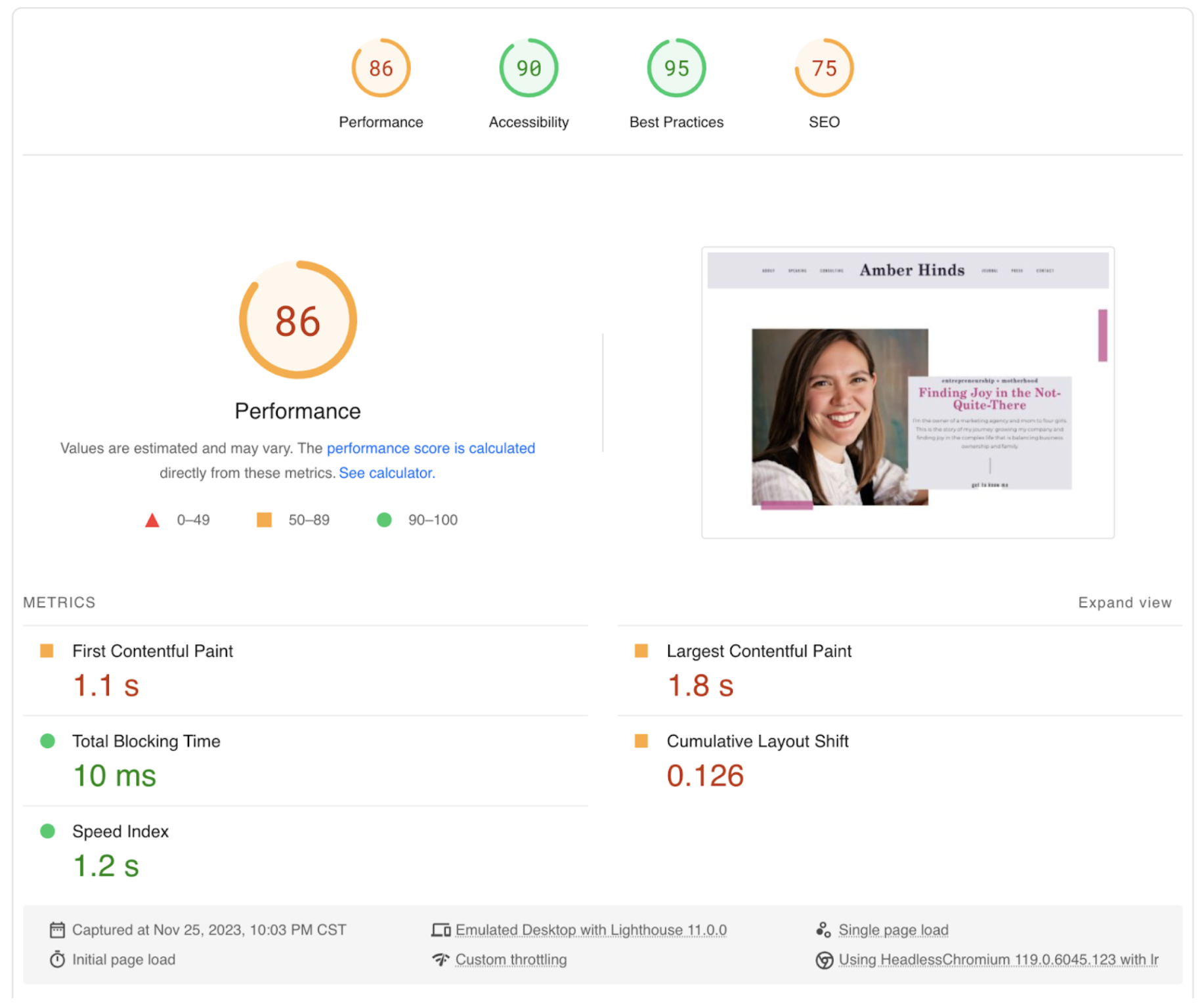
On desktop, the website scored 86 for performance, 90 for accessibility, 95 for best practices, and 75 for SEO. The page speed score on mobile was 28 for performance with first contentful paint, largest contentful paint, total blocking time, and cumulative layout shift in the “red” or worst score range.
I don’t have specific business goals for my website and haven’t posted on it for more than a year, so I’m not especially concerned with the performance or SEO issues. But now that I know more about building accessible websites, I was really concerned with how many accessibility issues were on the site.
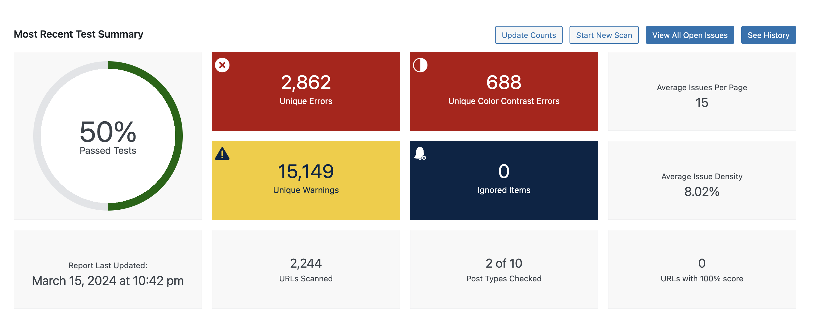
I have had Accessibility Checker Pro on the site for a while, and the scores were pretty bad.
Accessibility Goal
Here was the challenge. I wanted to make my website more accessible but with the following constraints:
- I wanted it to be as low-cost as possible, ideally without adding new subscription fees for plugins, themes, or tools.
- I didn’t want to spend a lot of time fixing the issues. I wanted a fast solution that could make fixes right away, but I know accessibility overlays are not the answer.
- I didn’t want to pay a developer to help me, so I was limited to my own WordPress super-user, CSS and PHP, but very little JavaScript skills.
Accessibility Remediation vs Rebuild
When we do WordPress accessibility audits at Equalize Digital, one of the biggest questions we ask ourselves as we interpret the findings is:
Is it better to remediate this website as-is and fix the broken elements, or is it better to scrap the website completely and start over?
How to Decide: Remediation vs New Website
Here are questions to ask when deciding if it’s better to remediate a site or to rebuild the site:
- What are the types of accessibility problems on the site? Are they in small, easily replaceable, or fixable elements (like social sharing buttons), or are they foundational within major website components?
- How many unique accessibility issues need to be fixed, and how many are there relative to the number of site components?
- How big is the budget and how does that compare to costs to rebuild versus remendation?
- What is the timeline required for fixing the live site? How long would it take to redesign and redevelop a new site, and does that align with the expected timeline for publishing fixes?
- What is the current theme, and what plugins are used on the site? Can they be remediated easily, or would they need to be replaced?
- What skills are available on your team to remediate existing elements versus replacing them?
- How old is the website and how are other parts of it working or not working (branding, design, conversion optimization, performance, SEO, etc.)? Is the website due for a redesign anyway?
Typically, there’s a threshold at which there are so many problems that it would be cheaper to just start over. But in the case of a very large website with many custom post types or complex components, remediating various components over time may be more cost-effective.
If a website seems to be working well in all areas except accessibility, I.e., it’s easy to edit, has a good design, ranks well in search, converts visitors, and otherwise meets company objectives, that is usually a good case for remediation.
If a website isn’t meeting organizational goals, is outdated, has other issues beyond accessibility, or has many accessibility problems, it can be a good case for a redesign and rebuild rather than just an accessibility remediation.
Assessing My Own Site
As I started digging into my own site and doing a manual review of the problems that Accessibility Checker flagged, plus inspecting code and keyboard and screen reader testing on the front end, here are some of the things I saw:
- There were no skip links.
- The theme developer didn’t use semantic HTML. There was a
<header>tag, but no<main>tag. The navigation menus were not in<nav>tags, etc. - The default WordPress comments template had been modified in the theme to remove all the labels from the inputs.
- The social media sharing links on posts were coded into the theme and were all unlabeled.
- Many parts of the theme were not coded to basic WordPress coding standards.
As I reviewed the theme’s issues, it quickly became clear that remediating many of them would require me to add or modify code in a child theme. I’m still proficient at theme development, but I wasn’t sure I wanted to code fixes. I wanted an “easy” fix—things I could do in the editor. Finding and fixing accessibility issues in PHP could have required a bigger time commitment than I wanted.
The performance issues and lack of adherence to WordPress coding standards didn’t give me confidence that the theme provided a solid foundation for continued development.
Given all this and beacuse the website’s content needed to be updated as well, it was clear that rebuilding the site was a better choice than sticking with my existing theme.
Approach to Building Accessibility-First
Once I settled on a complete rebuild as the correct approach to fixing the site’s accessibility problems, I had to decide on a new theme and what plugin changes I wanted to make.
Choosing a Theme
We’re big fans of the block editor at Equalize Digital, and all of our custom WordPress websites are built using it. So I knew I was going to ditch the page builder and build my site in the block editor this time around.
I briefly considered utilizing one of the popular block themes or block libraries only because I thought they might have some templates that would give me a head start on the design. The appeal of these libraries is that they can allow you to move faster as you build pages without having to think as much about the layout.
Ultimately, though, I decided to rebuild my site in the default Twenty Twenty-Four Theme, using Full Site Editing (FSE) and only core blocks. Here’s why:
- They are free and don’t require any upfront or ongoing license costs.
- They are accessibility tested by the WordPress Accessibility Team, which guarantees they provide a minimal accessibility baseline, including skip links, accessible navigation, correctly coded buttons, and more – a guarantee I was less sure of with third-party add-ons.
- This is the lean dev choice; it is least likely to slow down website speed or performance because I wouldn’t be installing anything that added additional CSS or JavaScript files.
- I felt most confident in backward compatibility with core components and that the website would stay the way I created it than if I added additional plugins.
A downside to using Twenty Twenty-Four and only core blocks is that I would be more limited in some of the styling controls available in the block editor, but for my purposes, I decided that didn’t matter. I was willing to write CSS in the customizer if I couldn’t achieve what I wanted with core blocks or FSE controls, and I’m content with a cleaner, more simple design.
Adjusting My Color Palette
The initial Accessibility Checker audit for the website found 688 color contrast issues. I plugged my website colors into the Eight Shapes Contrast Grid and realized that I had a problem with my pink.
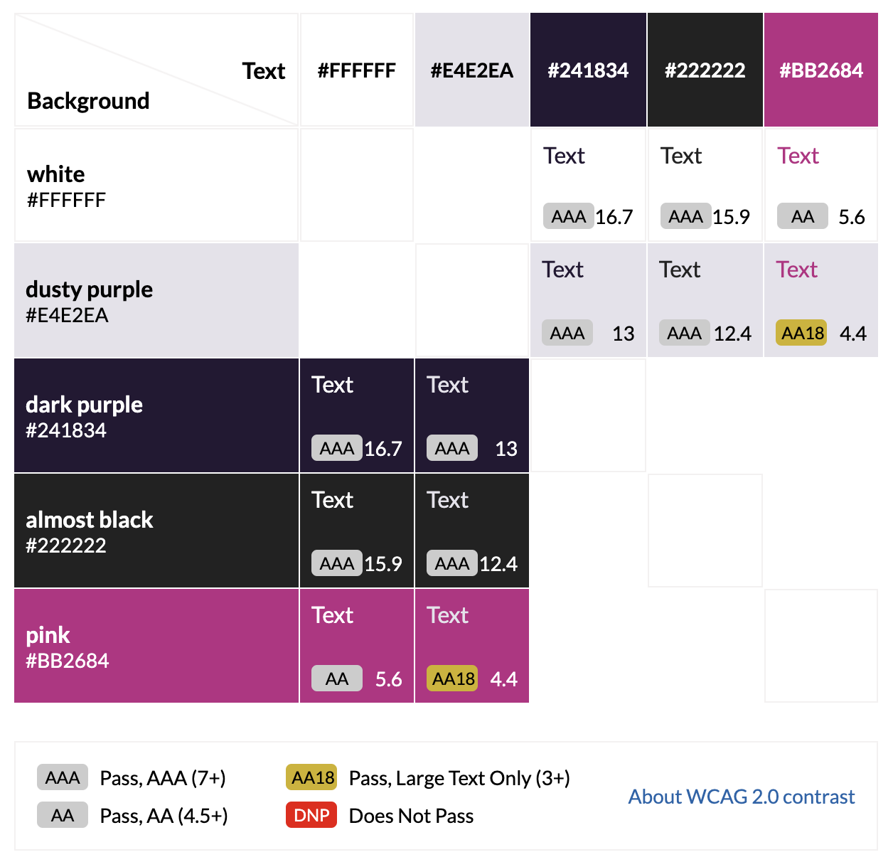
The hot pink I was using as an accent color only passed AA on white, and didn’t pass AA on either of my available dark background colors (dark purple and almost black). It only passed AA on the light (“dusty”) purple background for large text, not normal text.
This color palette didn’t have enough color options to adequately contrast on both light and dark backgrounds. To improve the palette, I did two things.
First, I darkened the pink to a shade that passed AAA on white and AA for normal-sized text on my dusty purple.
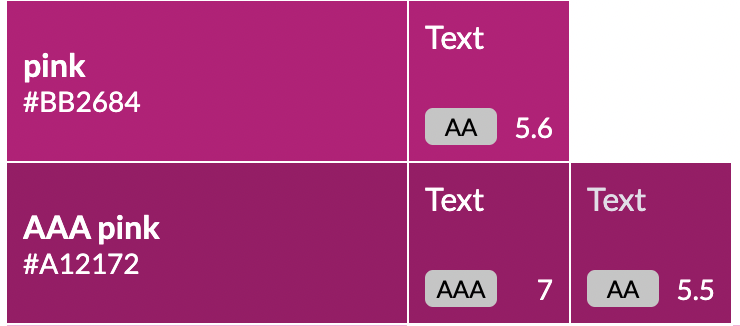
This new pink is not quite as bright, but it provides more opportunities for use throughout the site.
The second improvement to the color palette was adding a lighter pink that could be used for links or other accents on dark backgrounds and had a AAA color contrast ratio with those colors. (Where possible, I like to meet AAA color contrast instead of AA. It provides the most accessible experience and is not as hard as you might think.)
This is the new color palette:
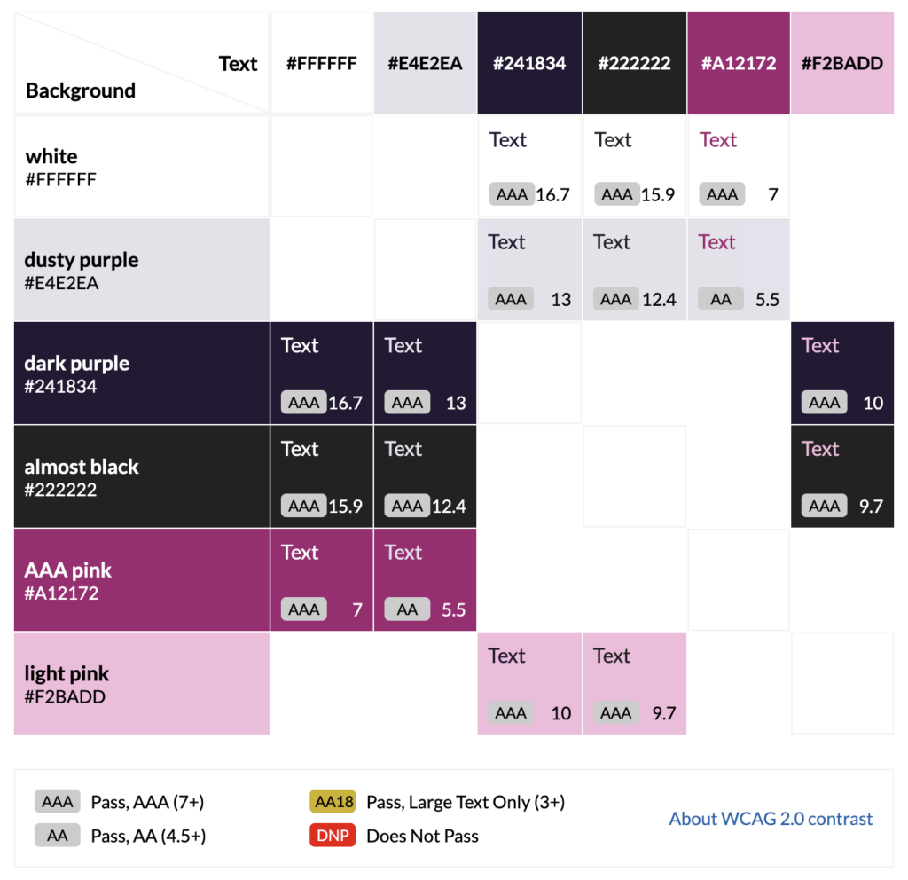
This palette stays true to the spirit of my original color palette while providing more accessible color combinations and allowed me to reach the goal of achieving zero contrast errors.
Rebuild and Remediation Process
Because I was rebuilding in a low-code manner, I just worked on my website on a staging server. No local setup was required.
Here are the basic steps that I followed when rebuilding the site:
- Activate the Twenty Twenty-Four theme and the Create Block Theme plugin (this allows you to remove the fonts in Twenty Twenty-Four, add your own fonts, and save the theme as a custom child theme).
- Delete the old theme and deactivate and delete all the old plugins I didn’t want.
- Select accessible fonts from Google fonts with unique character identifiers and add them to the theme. I chose Inclusive Sans.
- Install new accessibility helper plugins: Accessibility New Window Warnings and Screen Reader Text Format.
- Set up the header and navigation menu in the full-site editor (FSE).
- Edit the footer template in FSE, adding a screen-reader-only H2 “Footer” at the top of the footer and making all the visible headings H3s instead of H2s.
- Opened a blank page and clicked “save draft” to trigger an Accessibility Checker scan of the header and footer to ensure there were no problems I was missing.
- Rebuilt each of my 16 pages in core WordPress blocks, making sure to check for and correct any issues identified in Accessibility Checker as I worked on each page. Paying special attention to heading order, link anchor text, image alternative text, and color contrast.
- Edited the single post template and blog archive in FSE.
- After setting up all of the main template areas, I ran a new full site scan in Accessibility Checker Pro to get the plugin to recheck every blog post and clear out issues that were previously logged but no longer exist.
At that point, I was essentially “done” with the first phase of the rebuild and accessibility remediation and made the website live. I then went on to making some adjustments to plugins and how they were used on the website.
Plugin Changes
While assessing the site, I noticed that some basic changes could be made to the WordPress plugins I was using to improve overall accessibility.
Remove Smash Balloon Instagram Feed Pro
The website originally had the Smash Balloon Instagram Feed Pro plugin set to display images from my Instagram feed in the footer. When clicked, the images opened a lightbox on the page showing the Instagram caption and comments.
Back in January, Accessibility Checker flagged numerous accessibility issues related to buttons in the feed and the lightbox option, so I had changed the plugin’s setting to link directly to Instagram instead of opening a lightbox. This resolved many accessibility problems, but a handful remained.
Because I stopped posting on Instagram over a year ago, I decided to remove this plugin completely—it was easier than trying to patch the plugin with code in my theme. Sometimes the easiest and cheapest fix is removing a component.
Gravity Forms Accessibility Fixes
All the forms on the website were built with Gravity Forms, but they were built a long time ago, so they were all in “legacy styling” mode (which doesn’t have as many accessibility features).
There was also at least one form where I had created a major issue by using placeholder text instead of a visible label. 😳

Because Gravity Forms has put a lot of effort into accessibility, the accessibility fixes here were all straightforward, no-code fixes. For each form, I did the following:
- Turned off legacy styling in form settings.
- Turned on the validation summary in form settings.
- Changed the required indicator in form settings to show “required” instead of an asterisk.
- Made sure all fields had a visible label.
- Edited the color of the submit button to match my new AAA brand colors.
- Enabled the autocomplete attribute in each field that asks for information about the user.
There’s more information about these settings in Gravity Forms’ accessibility documentation.
Other Non-Accessibility Fixes
Beyond plugins for enhanced accessibility, I added a couple to help with performance and SEO. Though improving SEO wasn’t my top goal for the rebuild, it seemed prudent to address this at the same time. The additional plugins that I installed were Yoast SEO, Smush Pro, and Perfmatters.
Results
Time Investment
Rebuilding my website in Twenty Twenty-Four took about 15 hours of work.
This fast turnaround was possible for a few reasons. First, it’s always faster when you’re doing work for yourself, and you can make decisions on the fly without having to wait for feedback from anyone else. Second, I was fine with having a plainer and straightforward design, if only as a “minimum viable product” that allows me to launch a more accessible site faster. (There are already elements that I’m planning to come back and modify later.) And, third, it’s a basic website using only posts and pages – no custom post types or complex functionality to design, develop, or remediate.
Rebuilding a website for an organization rather than a person could take significantly longer, but this lower time investment may be possible for a freelancer working on a small business website with limited scope. If you’re working on your own website and are very familiar with WordPress, you may also be able to make a new website over a weekend.
Low-Cost Accessibility
Technically this remediation cost nothing because I did it for myself and already have developer license keys for all the premium plugins used.
If you were budgeting to hire someone to do accessibility remediation for you, you should account for a higher cost depending on the number of hours it’s expected to take and license keys if you need to purchase licenses for more accessible plugins to replace ones that add problems to the website. You can see our monthly remediation plans as an example of accessibility remediation pricing.
You should also budget to include our Accessibility Checker Pro plugin on your website. It will dramatically reduce testing time and save you money by speeding up remediation.
What Got Fixed
Here’s a screenshot of the top of new home page of my website. You can check it out yourself at amberhinds.com.
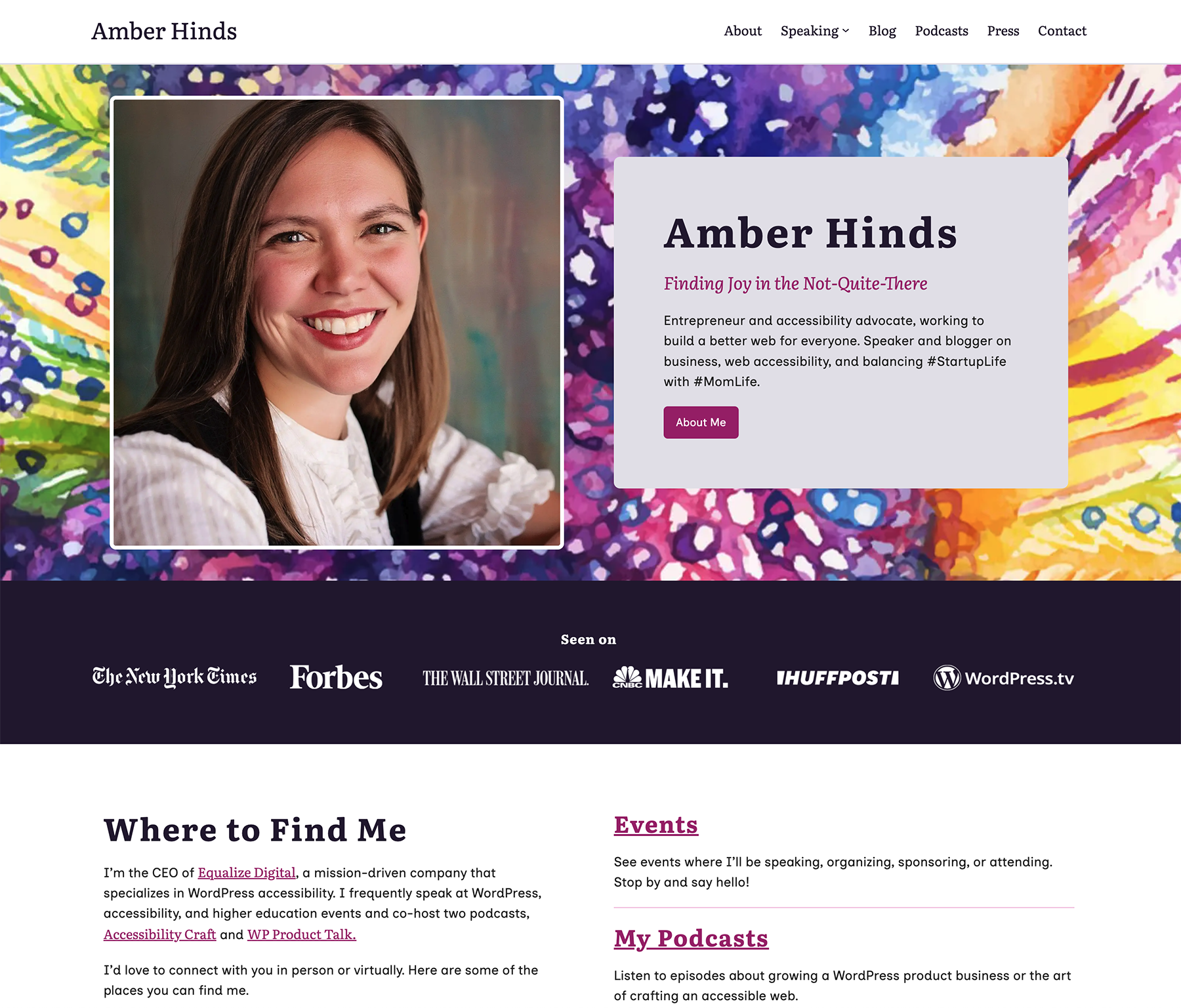
For skeptics, WordPress full site editing has come a long way. I think it looks pretty good for only using core blocks.
Beyond how it looks, spending a few hours replacing the theme with Twenty Twenty-Four and removing the page builder to build the site block editor had a major positive impact on the accessibility of the website.
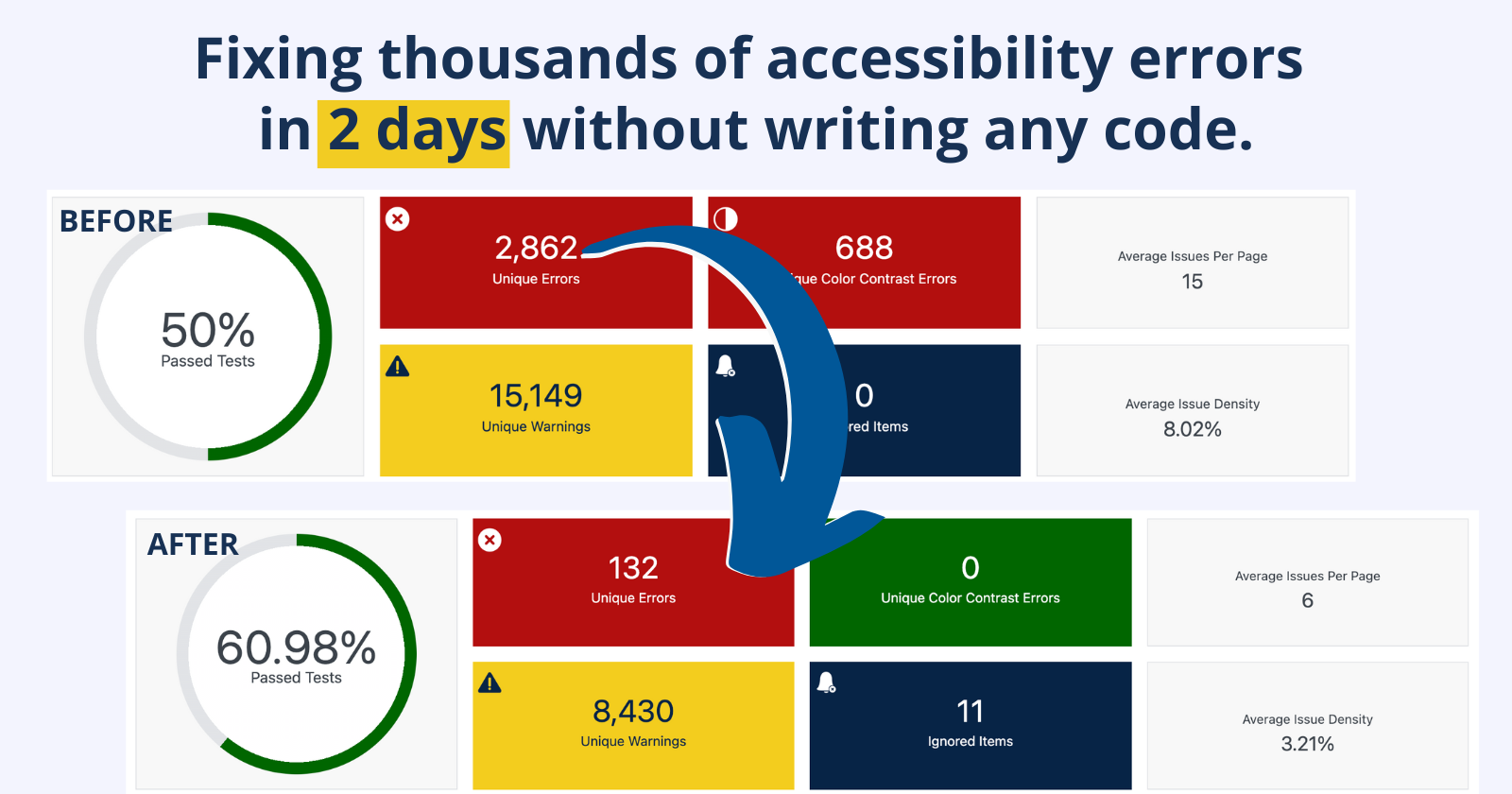
Remember the “before” accessibility score with thousands of issues? Here’s what Accessibility Checker’s most recent test summary looks like now.
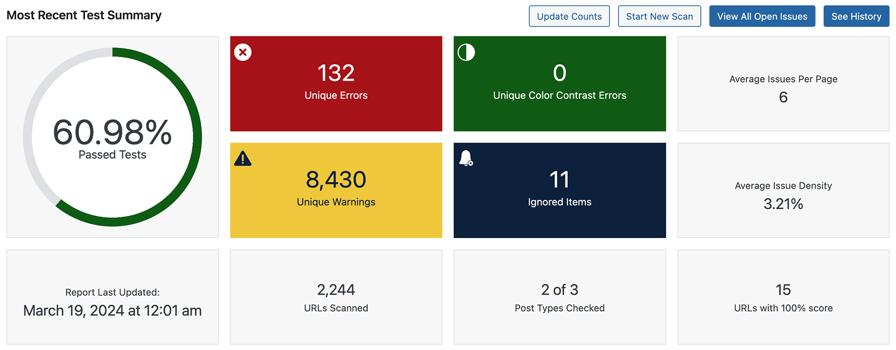
Only changing the theme and adjusting the color palette reduced the website’s number of unique errors from 2,862 to 132. All color contrast problems are gone, skip links and HTML landmarks are now present, the navigation works as it should, and more—without me having to write a single line of code.
Though the website is not yet fully accessible, it is massively improved for almost no cost and with only two days of work by a non-developer. I’m now setup to continue remediation and work towards making the site fully accessible.
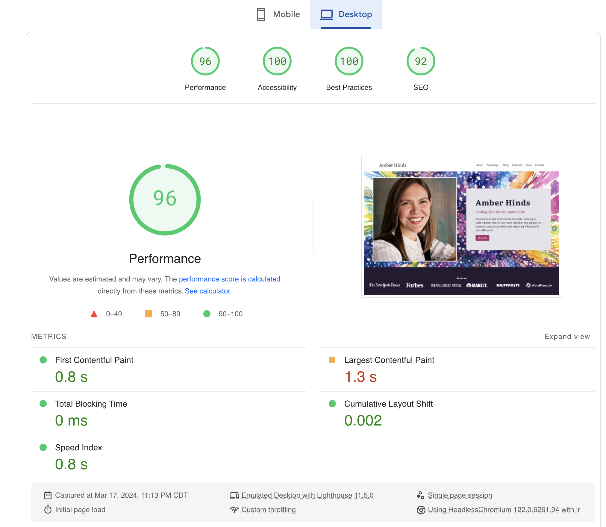
As a bonus, the website now scores 96 for performance in Google Page Speed on desktop (82 on mobile, up from 28).
Next Steps
Accessibility is an Ongoing Process
As you can see from the Accessibility Checker report above, my work is not yet done. I’ve resolved all the sitewide header, footer, and template issues. Now, I need to go through the Open Issues report in Accessibility Checker and fix individual blog posts as I am able.
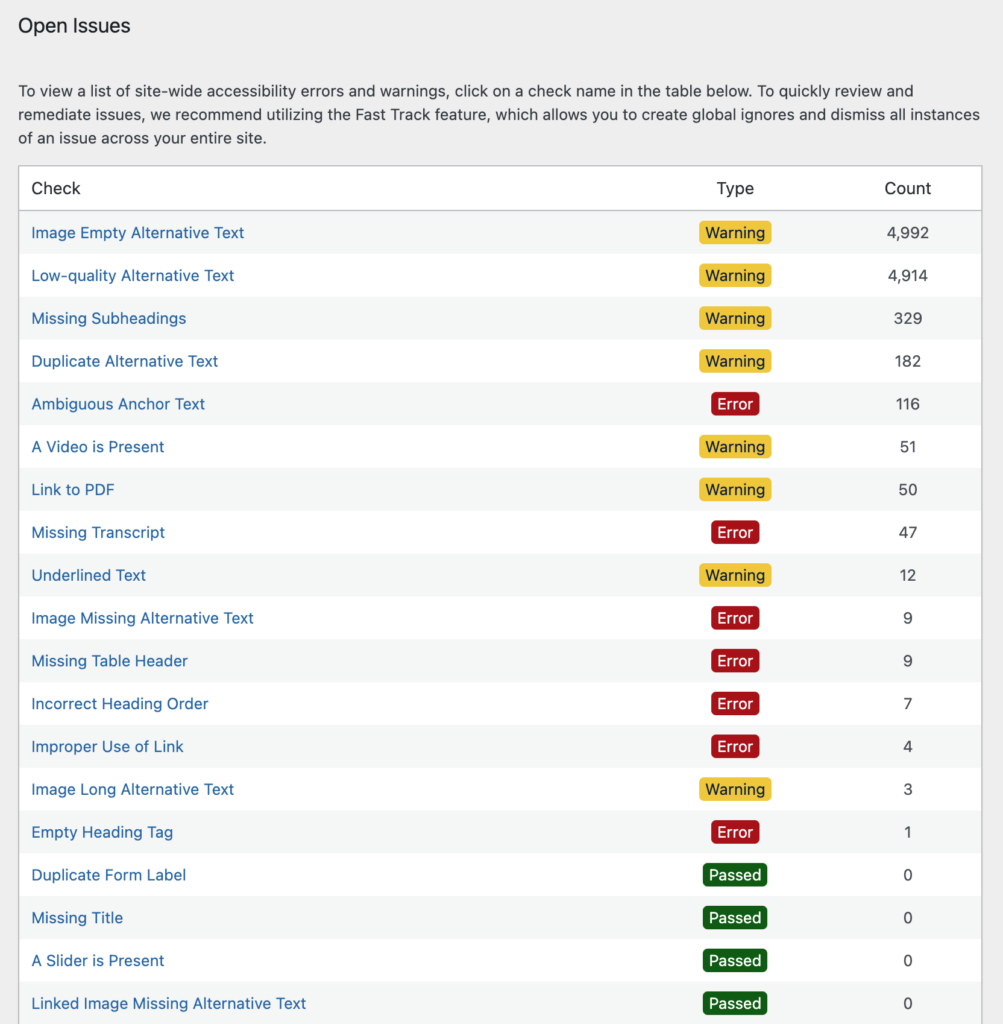
Not surprisingly, the two most common issues on the website are Image Empty Alternative Text and Low-quality Alternative Text, each with nearly 5,000 images flagged. I may want to explore AI-generated alt text to help provide a starting point for these, though I haven’t yet found an alt text generator that I think is worth the time.
If this were a business website, I would assess my budget and determine how quickly I want to resolve problems. Then, I would set aside a specific number of hours each week or month to work my way through this list. I might also prioritize fixing issues on blog posts that get more traffic or that are more central to my customer journey (versus just going in the order of the open issues report or by publish date).
What can you do?
I hope that you found this case study interesting as you’re considering the accessibility issues on your website, and it inspires you to take action – whether that’s remediating accessibility problems on your current site or completely rebuilding it with a new theme.
Accessibility doesn’t have to break the bank. There are ways to spread costs and tasks over time, and it’s okay to start over if that seems easier. As shown above, sometimes lower-effort tasks can have a hugely positive impact on accessibility and there are compelling reasons to switch your WordPress theme rather than trying to fix it.
Ready to get started fixing your website? You can’t fix what you don’t know about! Install Equalize Digital Accessibility Checker and start finding (and fixing!) problems today. If you need help remediating your website, contact us.