In the race to meet digital accessibility standards, the “accessibility toolbar” has become the web’s favorite shortcut. It’s an alluring promise: one line of code, a floating icon, and a suite of toggles that claim to fix your site’s barriers instantly.
But as the web enters a new era of stricter legal scrutiny when it comes to accessibility, the cracks in this approach are becoming impossible to ignore.
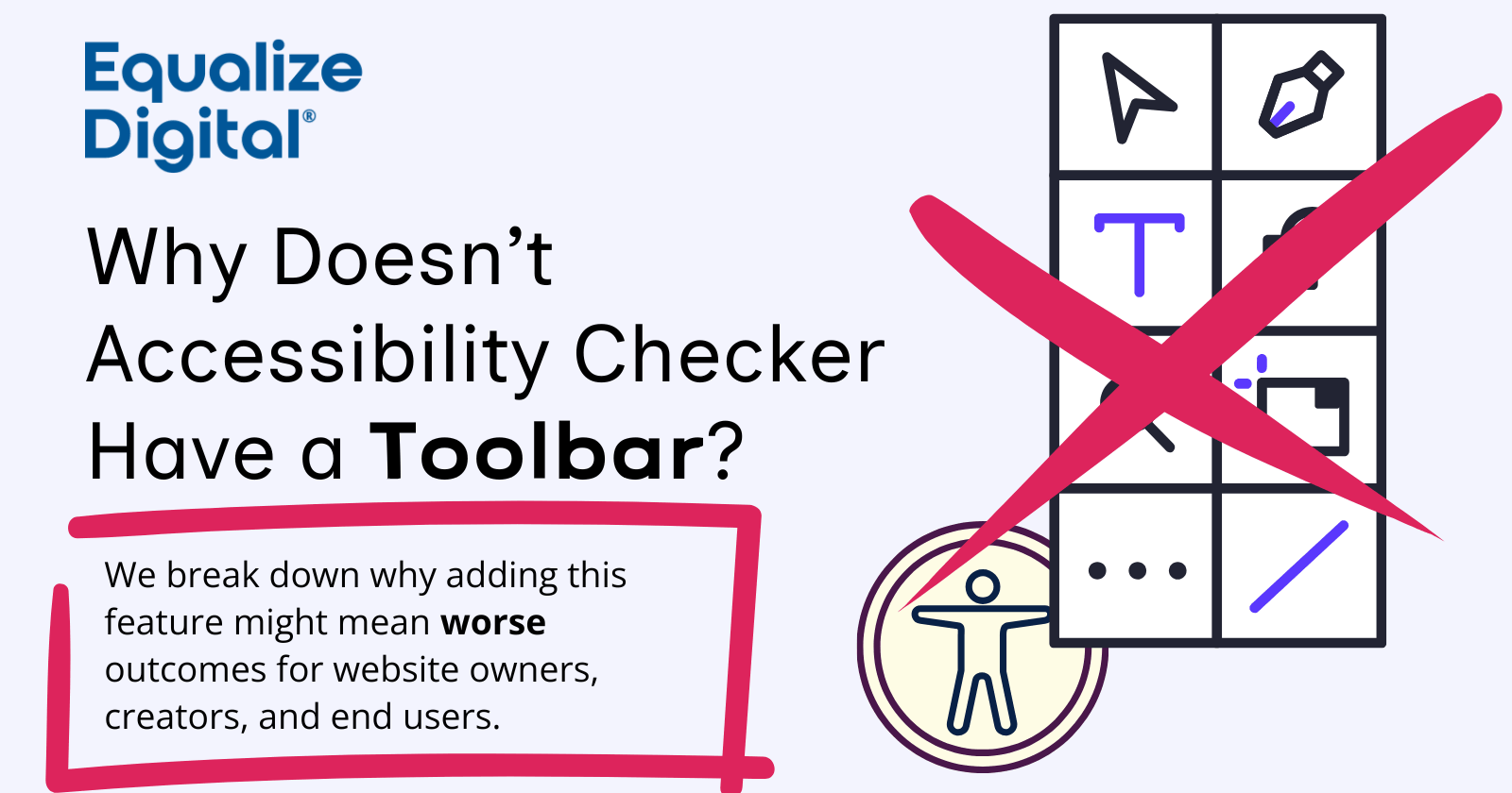
A high quality website shouldn’t require an accessibility widget or toolbar. Accessibility considerations should be baked into the very foundation of the code and content. In this post, we’re pulling back the curtain on why we’ve taken a firm stance against front-end accessibility “helper” toolbars or widgets.
The Timeless Allure of the “Quick Fix” Accessibility Toolbar
If you look at the landscape of web development and publishing today, it’s easy to see why accessibility toolbars and overlays have exploded in popularity. On the surface, many of these tools make a compelling promise: Total accessibility conformance with a single line of code.
But, the reasons for their rise are more about slick marketing and promises of convenience than actually solving accessibility.
They’re Marketed Towards a Non-Technical Audience
For many website owners who aren’t deep in the weeds of WCAG (Web Content Accessibility Guidelines) or assistive technology, these toolbars look like a logical, cost-effective win. If you don’t fully understand how a screen reader interprets a web page or how a keyboard user navigates, a floating widget with a “dyslexia font” button or a “high contrast” toggle looks like accessibility.
The companies selling these tools know about this disconnect. Their marketing is designed to appeal to well-meaning people who want to “solve” accessibility without ever having to learn the complexities of it. They sell the dream of a “hands-off” solution to a problem that actually requires consistent, hands-on attention.
They’re Positioned as a Tool for Work Avoidance
I’m not going to sugar coat anything: Real accessibility is hard.
It requires manually auditing code, rewriting content for clarity, and fixing the deep-seated architectural issues in the systems we use to publish content. And at times, the very software products we rely on in our publishing workflows are what’s creating the barriers in the first place.
You have to put in a good deal of work to resolve your accessibility debt, and then even more effort has to go into re-working procedures and systems to ensure accessibility is maintained over time. This stuff isn’t easy, and it certainly isn’t cheap. But then again, when has quality ever been cheap?
Toolbars present an attractive alternative to this hard work. Why spend weeks refactoring your navigation menu or adding descriptive alt text to a thousand images when a widget claims it can just “handle it” for you?
It’s a classic Band-Aid solution.
Pay Attention to Who the (Actual) Customer Is
The most revealing fact about in inefficacy of accessibility toolbars is who they are marketed to. If you look at the sales pages for these tools, they aren’t talking to people with disabilities. They are talking to website owners.
This means that fundamentally, by extension, these platforms exist to advance and protect the interests of website owners, not individuals with disabilities.
They may offer surface-level features or configurations that attempt to help end users in a misaligned fashion, but we need to ask ourselves this important question:
If these toolbars were truly the revolution in accessibility they claim to be, why aren’t people with disabilities demanding a consumer version for themselves?
The fact is, nobody is demanding a consumer version of these products that can be installed at the browser, or OS level.
Maybe, that’s because these solutions don’t work, or (at best) are totally redundant.
Accessibility Toolbars Just Aren’t Necessary
A very common argument for front-end toolbars is that they give users the power to customize their experience on a website. But, users who need those customizations often already have that power, and the toolbar approach to customization is frequently sub-optimal (or outright broken).
The OS/Browser is the Toolbar
Modern operating systems and browsers (whether it’s Windows, macOS, iOS, or Android) have excellent accessibility features built directly into the foundation. That expensive, specialized toolbar is trying to re-do something that is already being done locally on the user’s machine.
Some examples:
- System-Wide Themes: Windows High Contrast Mode and macOS Color Filters allow users to change the entire OS palette. A well-built site can respect this via a forced colors media query.
- Dark & Light Mode: Users set this once. Websites should automatically adapt using
prefers-color-scheme, rather than forcing the user to toggle a “Dark Mode” button on every site. - Text Scaling & Zoom: Browsers offer Full-Page Zoom (scaling everything) and Text-Only Zoom (which enlarges text without breaking layout). Mobile devices have “Dynamic Type” settings that scale text across all apps and websites simultaneously.
- Reader Views: Safari, Firefox, and Edge have “Reader Modes” that strip away ads and sidebars, allowing the user to choose their own custom font (like OpenDyslexic), line height, and background color.
- Native Screen Readers: Every major operating system has a screen reader that can be installed and configured to the users preferences and used across everything, not on a per-site or per-app basis.
This is just a selection of common assistive technologies available. There are even more that we haven’t mentioned.
Ensuring a Persistent Experience Across Websites
The biggest advantage of native features is persistence. If a user needs 125% text size and a dark background, they set it once in their browser. Every website they visit should respect those settings immediately.
When you add a toolbar, you are asking that user to start over. You are saying:
I know you have your computer set up exactly how you need it, but on my site, I want you to use my specific, limited set of options instead.
Performance, Performance, Performance
From a technical perspective, toolbars create suboptimal performance lags. You are forcing every visitor to download a heavy JavaScript library to perform tasks that their own computer can already do faster, more securely, and with better performance.
These widgets add to page load times and can interfere with other site functions. Adding a redundant layer of code that serves a purpose already handled by the OS isn’t just inefficient, it’s bad engineering.
Take Toolbars to Their Logical Extreme
To understand why the toolbar model fails at scale, you only have to take it to its logical extreme. Imagine a web where every single site you visit has its own unique accessibility toolbar. As a user with low vision, you would have to:
- Navigate to Site A, find its specific “Accessibility” icon, and set your desired font, zoom level, and contrast.
- Navigate to Site B, find their different icon, and re-do those same settings for font, zoom, and contrast because they use a different toolbar vendor.
- Repeat this for every single tab you open throughout the day.
That isn’t accessibility. That’s an unpaid, part-time second job.
The only reason we don’t live in this nightmare is that most users continue to rely on their own tools to provide a consistent experience across the entire internet. Our job as website owners is to make sure the website’s code is ready for those tools, not to add another redundant set of configuration options to the pile.
Website Users Are Already Overwhelmed (and Opting Out)
We have reached a breaking point in web design. Visit many modern sites today and you aren’t greeted with content. Instead, you’re presented with gauntlet of interruptions and hurdles.
First, a cookie consent banner slides up from the bottom, asking you to configure 19 different privacy settings.
Then, a newsletter pop-up dims the screen, demanding you enter your email address before you can read anything.
After that, a bright red chat bubble starts bouncing in the bottom-right corner like a Jack Russell Terrier. Boy, that sure is distracting.
As you try to leave, the dreaded “limited time offer” banner drops down from the top because of an “exit intent” trigger.
And now we’re going to add an accessibility toolbar icon to that pile?
The actual content of the page (i.e. the thing the user actually came for) is buried under a mountain of floating, jumping, and ambush-ready UI elements.
Users are Voting Against These Experiences
We are already seeing the consequences of the continuous erosion of good user experience in the modern internet. Recent data shows a significant shift in how people consume information. With the rise of ChatGPT, Perplexity, and Google’s AI Overviews, users are increasingly getting their answers without ever clicking through to a website.
The numbers are startling:
Search industry analyst projections from 2024 and 2025 data from Seer Interactive shows that when AI summaries are present, organic click-through rates to websites can plumment by 35% to 65%.
Why is this happening? Because users are exhausted.
They are fleeing to the clean, simple, chat-like interfaces of AI because those platforms give them the information they want without the noise. At least, until they start sprinkling pay-to-play noise back in.
Users don’t want to fight through three banners and an accessibility toolbar to find an answer. They just want the answer.
If we want websites to survive in this new era, we have to stop adding interruptions and start making the core content accessible and easy to reach. Many industry experts and commentators are saying that citations in AI summaries are the “new search engine optimization.”
Accessible websites will outperform inaccessible websites in AI summary citations, because AI crawlers function in a similar manner to screen readers. And AI crawlers aren’t going to use a toolbar to try and access your content.
Compliance shield, or target reticle?
Among the most common promises made by accessibility toolbars is that of “instant legal protection.” They market themselves as a one-click insurance policy against Americans with Disabilities Act (ADA) lawsuits or European Accessibility Act (EAA) compliance. But the legal and regulatory landscape has continued to evolve.
It has never been more clear that the shield they promised is actually a target. Using an accessibility widget or toolbar exposes you to more risk.
Law Firms Use Toolbars as an Indicator of Non-Compliance
In the legal world, a toolbar is often seen as a tacit admission. It tells a plaintiff’s attorney: “This organization knows their website has accessibility issues, but they’ve chosen a ‘Band-Aid’ instead of actually fixing the issues.”
The numbers back this up:
According to 2025 Reports from UsableNet, roughly 25% of all digital accessibility lawsuits specifically targeted websites that already had an accessibility widget or overlay installed.
Far from preventing a lawsuit, the presence of that little accessibility icon signals ADA “sue-to-settle” law firms that the site is likely full of unaddressed code-level barriers.
The US FTC and EU Have Weighed In: Toolbars Don’t Work
The “false advertising” of the toolbar industry finally hit a breaking point in early 2025. The Federal Trade Commission (FTC) fined AccessiBe, a leading overlay provider, $1 million for misleading businesses. The FTC found that the company’s claims of “guaranteed compliance” and “instant fixes” were deceptive and failed to protect businesses from the very legal risks they were paying to avoid. They stated that the overlay could not make websites accessible.
In the EU, German auditors have rejected accessibility overlays as a viable path to compliance with EAA regulatory requirements. Specifically, the BIK which tests against a German testing methodology called BITV (based on WCAG) have stated that they can’t assess any website that uses an accessibility overlay or widget for conformance to BITV.
Just Because a Solution Offers a Toolbar, Doesn’t Make it Bad
While we have taken a hard stance against toolbars in our own product for the reasons outlined here, that’s not the same thing as saying “all accessibility solutions with a toolbar are bad.”
Some long-standing solutions have implemented toolbars due to external (or internal) pressure to have the option available, including tools built by widely renowned accessibility experts with long track records of positive contributions to the field.
So, how do you spot whether a solution is genuinely trying to help? Look for these positive indicators that the solution you’re considering is one of the good guys:
- No False Promises: They don’t claim their toolbar or widget makes you “instantly compliant” or “lawsuit-proof.” Making these promises is a huge red flag.
- The Toolbar is Secondary: If they offer a toolbar, it isn’t the main thing they are promoting as the go-to solution. It is there to try and complement other services.
- Focus on Remediation: They prioritize real, manual accessibility testing and remediation as a core approach. The toolbar is treated as a “stop gap” measure.
- Educational Approach: They often include documentation that explicitly states that a site’s underlying theme and content accessibility have to be fixed manually.
True Accessibility is Seamless
The ultimate irony of the accessibility toolbar is that it draws attention to the very thing it’s failing to meaningfully address.
Toolbars are, by definition, surface-level. They exist as an injected layer of JavaScript that can only manipulate what is already there. They cannot reach the heart of the problem. No script, no matter how sophisticated, can “guess” its way into creating a true facade of a high-quality user experience.
It takes a creator who cares enough to fix the source of the issue.
In a perfect world, a user with a disability shouldn’t have to announce their presence to your website by clicking a special icon. They should simply arrive, and the website should already be ready for them.
True accessibility is seamless. It lives in the code and content structure, waiting to respond to the user’s existing preferences. Instead of forcing a visitor to hunt for what they need in a proprietary toolbar, a well-built website will adapt automatically.
When you build this way, the accessibility isn’t a feature or add-on, it’s just how the site works.
Solve Accessibility the Right Way
From day one, Accessibility Checker was designed to be a tool for creators and builders. We built it to help you improve accessibility at the source. We aren’t interested in helping you hide a problem; we’re here to help you solve it efficiently.
We also believe that meaningful adoption of accessibility best practices requires long-term growth in both knowledge and skills. By integrating best practices directly into your workflow, Accessibility Checker helps you and your team grow your expertise over time.
Because of this commitment to real solutions and education, Accessibility Checker does not have a front-end toolbar. We refuse to sell a “quick fix” that undermines the very standards we are helping uphold.
If any of this resonates, consider checking out Accessibility Checker and explore our online learning and different service options.
We believe your users deserve a website that works for them automatically, without needing to click a floating icon to get the experience they’re entitled to.