When learning about accessible web best practices, you may have come across the POUR acronym which comes from four principles that are used to create the W3C’s Web Content Accessibility Guidelines (WCAG).
About WCAG and the Principles of Web Accessibility
Web Content Accessibility Guidelines are internationally agreed-upon standards established to help content authors and developers create accessible web content. WCAG can measure the accessibility of websites, web applications, PDFs, and other digital technology.
WCAG is a list of testable criteria that are grouped under the four principles of website accessibility that make up the POUR acronym. These principles are:
- perceivable,
- operable,
- understandable, and
- robust.
You can learn more about the success criteria that make up WCAG in or WCAG 2 knowledge base. Continue reading for a more in-depth look at the four web accessibility principles.
Article continued below.
Stay on top of web accessibility news and best practices.
Join our email list to get notified of changes to website accessibility laws, WordPress accessibility resources, and accessibility webinar invitations in your inbox.
Principle 1: Perceivable
The first letter in the web accessibility POUR acronym stands for perceivable.
For a website to be accessible, people who access it must be able to perceive the information and interface components on that site. This means website elements need to be presentable to a user in a way that they can discern regardless of which senses they do or do not have use of.
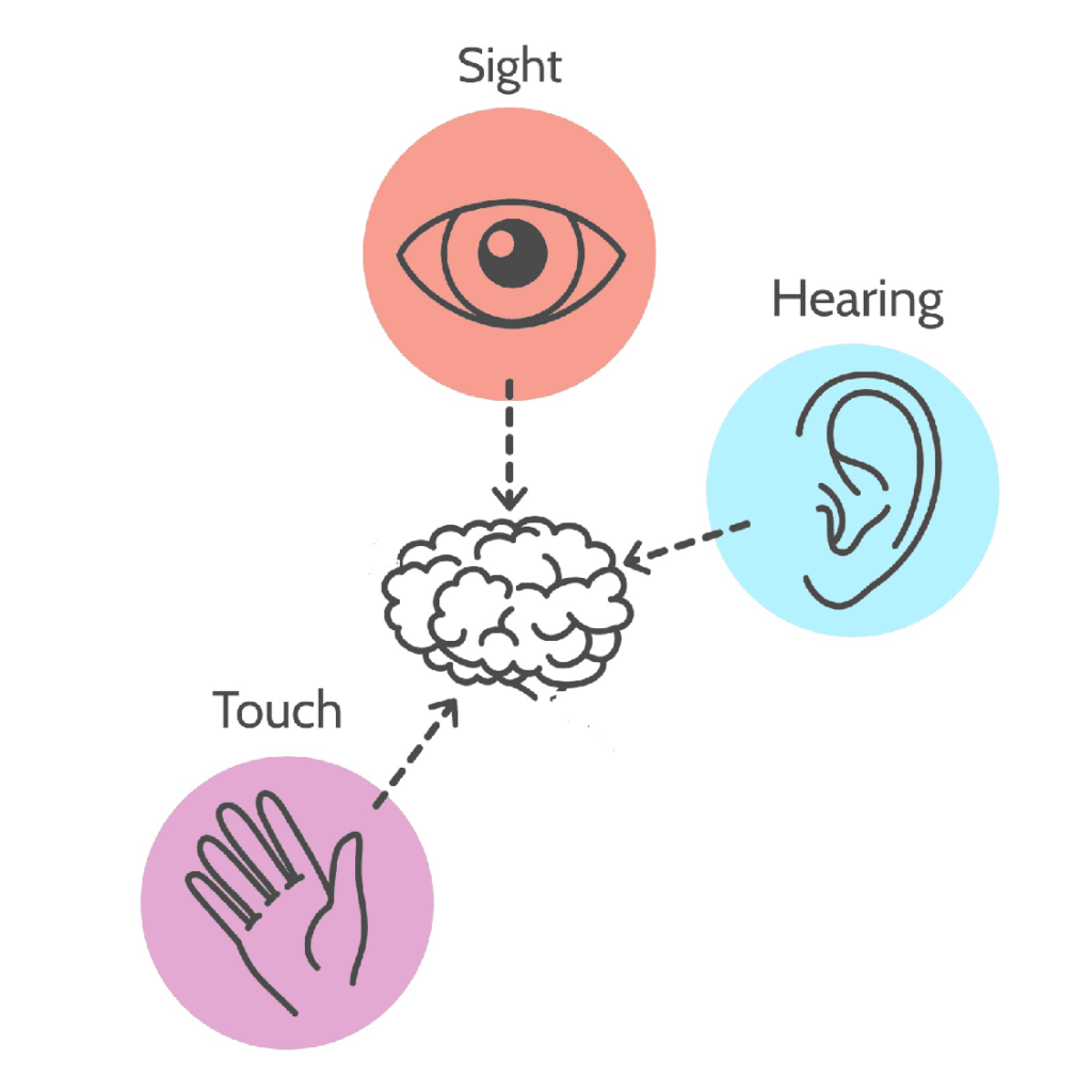
This graphic shows the typical ways that we can perceive and interact with information on a website: via sight, sound, or, in some cases, touch.

For information on a website to be perceivable, it has to be capable of transforming from one form to another. This allows people who cannot use one or more of their senses to experience the website via a different sense.
For a website to be perceivable, the main content of the message has to be separate from how it is styled. This allows users who may have no or limited use of one or more of their senses to access the information however works best for them.
Examples of perceivable web content:
- Videos must have captions for deaf or hard-of-hearing users.
- Audio files must have transcripts for deaf or hard-of-hearing users.
- Images must have alternative text describing the image for visually-impaired users.
- Text must be added to the page via HTML rather than CSS so the text can still be read if styles are turned off completely.
Principle 2: Operable
The next letter in the POUR acronym is O, which stands for operable.
Simply put, a website is operable if the user interface and navigation components can be used by everyone, including people who do not navigate the web using a standard keyboard and mouse.

People with motor disabilities, quadriplegia, blindness, or even extreme cases of arthritis cannot use a mouse to click through websites.
If someone cannot use a mouse or traditional keyboard, they must still be able to fully operate the interface of your website. This means, for example, they should be able to operate the navigation menus, change slides on carousels, open and close accordions, or engage with tabbed content. Your website cannot require interactions that these users would be unable to perform or complete.
Key features of operable websites include:
- Multiple ways to interact with the website.
- User control over time limits/timing.
- Clear instructions and error recovery options that can be controlled regardless of ability.
- Semantic HTML on links and buttons, rather than using
<div>or<span>tags. - No elements that require drag-and-drop interactions unless there is an accessible alternative.
Principle 3: Understandable
The next letter in the POUR acronym, U, stands for the principle understandable.
An understandable website is one in which the content and the way the website functions are clear to all users.
This means that, regardless of ability, people must understand not only the information on your web pages, but also how to navigate the website to find the information they want, and how to use any tools or features built into the website.
Understandable websites have:
- Appropriately targeted language and reading level (typically at 8th- or 9th-grade reading level if writing for the general public).
- Supplemental representation of information, such as:
- Summaries or excerpts before long articles.
- Written descriptions of information contained in charts or graphs.
- Transcripts of audio or video files.
- Audio files that let people listen to pages instead of reading them.
- Understandable functionality, which typically comes from elements like:
- Consistent font styles (family, colors, and sizing) across all pages of the site.
- A well-thought-out and easy-to-use navigation structure.
- Clear instructions for forms and visible form labels.
- Tooltips or “getting started” guides for special features.

Principle 4: Robust
The last letter in the POUR acronym stands for robust.
Your website needs to be robust enough that it supports and can be accessed on a variety of devices, including assistive technologies. This means that as technology and user agents evolve, the content must still remain accessible, and be able to be interpreted.
Ideally, robust websites must:
- Be functional across current and (as much as possible) future devices, operating systems, and browsers.
- Support some outdated operating systems and browser versions, as elderly people and people who use assistive technology are less likely to be running the most up-to-date versions of their browser or operating system.
- Validate against technical standards for any applicable platforms.
Incorporating POUR into Your Website
Each of these principles has a set of guidelines and success criteria for testing if your website is accessible. In order to make sure your website is POUR: perceivable, operable, understandable, and robust, you will need to take each guideline and success criterion into consideration.
Start Testing for POUR Principles on Your WordPress Site
Have a good handle on the four principles of website accessibility or want to dive in on your own? Get started with our WordPress Accessibility Checker plugin and test your website accessibility for free.
Accessibility Checker has more than 40 tests created to measure conformance with WCAG POUR principles. It puts reports right in the WordPress admin where you’re creating content, making it easy to test your website for accessibility as you add or edit pages and posts.
Get Help With Making Your Website Accessible
If you want to make sure your web content follows the four principles of accessibility but you aren’t sure where to start, contact us. Our team of trained accessibility consultants can help you navigate relevant guidelines and create a website that is accessible now and for years to come.
We offer WCAG accessibility audits, user testing, and WordPress accessibility remediation plans that fit any budget, along with building bespoke accessibility-first websites.
To learn more about the principles, guidelines, and success criteria included in WCAG, read “Understanding the Four Principles of Accessibility” on the W3 website or attend an upcoming WordPress Accessibility Meetup.