Web Content Accessibility Guidelines (WCAG) have provided a technical standard for web accessibility since May 1999. WCAG 2.2, published in October 2023, extends previous versions of WCAG to provide additional criteria for testing if a website is accessible.
Many organizations around the world are still measuring accessibility compliance against previous versions of WCAG, such as WCAG 2.0 or 2.1. However, if you want your website to stay ahead of website accessibility laws and best practices, now is the time to familiarize yourself with WCAG 2.2 and start meeting it.
Article continued below.
Stay on top of web accessibility news and best practices.
Join our email list to get notified of changes to website accessibility laws, WordPress accessibility resources, and accessibility webinar invitations in your inbox.
WCAG Background
Web Content Accessibility Guidelines are a set of technical guidelines primarily intended for:
- Web content developers and creators (page authors, site designers, etc.).
- Web authoring tool developers (WordPress core developers or WordPress plugin developers, for example).
- Web accessibility evaluation tool developers (teams like Equalize Digital building tools like our WordPress Accessibility Checker plugin).
- Others who want or need a standard for web or mobile accessibility (website owners, accessibility testers, and other stakeholders).
Defining “success criteria”
WCAG is made up of a list of success criteria that can be used to determine if a website is accessible.
A success criterion is a testable rule that accessibility testers can compare each element of the website against to easily determine if it “passes” or “fails.”
If a website fails a certain criterion, it fails WCAG at the conformance level of that criterion (A, AA, AAA).
Learn more about WCAG
If you’re new to WCAG and are not sure where to get started, we recommend reading these additional resources:
- Web Accessibility: POUR Acronym Explained
- WCAG Conformance Levels Comparison: Which One You Should Follow
- WCAG 2.1 Explained
What’s Changed in WCAG 2.2
WCAG 2.2 added 9 new success criteria and removed one.
When new versions of WCAG are released, they add testing criteria to the existing version of WCAG. This means websites that conform to WCAG 2.2 also conform to WCAG 2.1 and WCAG 2.0. If you want to meet all WCAG versions, you can test your website against WCAG 2.2 and you don’t need reference earlier versions.
4.1.1 Parsing removed in WCAG 2.2
For the first time, a new version of WCAG removed a guideline because it was determined to be obsolete. The WCAG 2.2 FAQ gives this reason for why 4.1.1 Parsing was removed:
Parsing was included in WCAG 2.0 to ensure that browsers and assistive technologies could accurately parse markup and content. Since then, specifications (such as HTML) and browsers have improved how they handle parsing errors. Also, previously assistive technology did their own markup parsing. Now they rely on the browser.
WCAG FAQ, How and why is success criteria 4.1.1 Parsing obsolete?
With today’s technology, anything that failed parsing would also have failed other criteria such as Info and Relationships or Name, Role, Value. In order to simplify WCAG 2.2, this criterion was removed.
New Success Criteria in WCAG 2.2
There are 9 new success criteria in WCAG 2.2, 8 of which are A and AA levels of conformance. Typically, AA is the standard to follow in the U.S., Canada, Europe, and other countries around the world. You’ll want your website to pass the new A and AA criteria to ensure continued WCAG conformance.
2.4.11 Focus Not Obscured (Minimum) (AA)
This success criterion is one that we scratched our heads about because it requires that when an interactive element like a link or button gets keyboard-focused, it is at least partially visible.
Our accessibility specialists were already failing elements under 2.4.7 Focus Visible when performing accessibility audits for WordPress websites if the focus indicator was not at least partially visible. However, not all testers were doing so, so this new criterion was introduced.
The text of the success criterion is:
When a user interface component receives keyboard focus, the component is not entirely hidden due to author-created content.
How to test 2.4.11 Focus Not Obscured (Minimum)
To test your website for 2.4.11 Focus Not Obscured (Minimum), you need to go to the front end of your website and use the Tab key to move through the focusable elements on the page. As you tab through each button, link, and form field, make sure that you can see at least part of the component you have tabbed to on the screen and that no other components are completely blocking it.
Example of 2.4.11 Focus Not Obscured (Minimum) Passes and Failures
Here is a common example where we see elements receiving focus that is obscured and that you might want to check for on your own website.
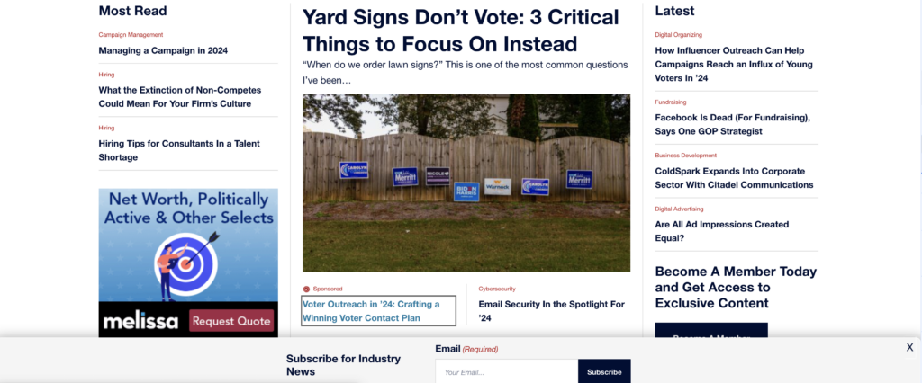
This image of a news website shows a popup (a.k.a. modal) that appears automatically at the bottom of the screen. The modal would count as “author-created content” because it was created by the website owner and triggered automatically (versus a popup or modal triggered by the user clicking a button on the screen to open it).
Above the modal, we can see that a link to an article has received keyboard focus because it has a gray outline around it and a different color from the other links on the page. To test if the website passes 2.4.11 Focus Not Obscured, we would tab to elements lower on the page and make sure that the website scrolled automatically so the popup does not block them.
❌ If the popup ever covers elements as they receive focus, then that would be a failure.
✅ If focusable elements are never fully covered by the popup when they receive focus, then that would mean the website passes 2.4.11 Focus Not Obscured.
For more examples of passes or failures and to learn more about this success criterion, read Understanding SC 2.4.11: Focus Not Obscured (Minimum) (Level AA).
2.4.12 Focus Not Obscured (Enhanced) (AAA)
Success Criterion 2.4.12 Focus Not Obscured (Enhanced) is the AAA version of 2.4.11 Focus Not Obscured. Many success criteria have a AA and a AAA version. These criteria address the same issue, but have different levels assigned as a minimum passing and a best passing alternative. Color contrast is a rule you may be familiar with that does this similarly.
The enhanced version of Focused Not Obscured requires that the focusable element is fully rather than partially visible. This is the exact text of the success criterion:
When a user interface component receives keyboard focus, no part of the component is hidden by author-created content.
How to test 2.4.12 Focus Not Obscured (Enhanced)
To test your website for 2.4.12 Focus Not Obscured (Enhanced), you need to go to the front end of your website and use the Tab key to move through the focusable elements on the page much as you did when testing for Focused Not Obscured (Minimum). This time, as you tab through each button, link, and form field, make sure that you can all of the component you have tabbed to on the screen in full.
Examples of 2.4.11 Focus Not Obscured (Minimum) vs 2.4.12 Focus Not Obscured (Enhanced)
Looking at the same website that we looked at previously, here is the difference between the AA and AAA levels for Focus Not Obscured.
In this screenshot, the focusable element is partially visible above the top of the sticky email subscribe modal. You can see part of the link text and the top and part of the sides of the focus indicator outline.

✅ This element passes 2.4.11 Focus Not Obscured (Minimum) (AA).
❌ This element does not pass 2.4.12 Focus Not Obscured (Enhanced) (AAA).
Here is a screenshot of the same element but it moves above the popup when it receives focus so that both the link text and the focus outline is fully visible with nothing blocking it.

✅ This element passes 2.4.11 Focus Not Obscured (Minimum) (AA).
✅ This element passes 2.4.12 Focus Not Obscured (Enhanced) (AAA).
For more examples of passes or failures and to learn more about this success criterion, read Understanding SC 2.4.12: Focus Not Obscured (Enhanced) (Level AAA).
2.4.13 Focus Appearance (AAA)
This new success criterion requires that focus indicators (typically outlines) have a sufficient size and color to appropriately contrast with the background and to stand out on the website. This is especially important for people with low vision or older people who may have difficulty seeing small visual changes on a web page.
The text of this success criteria reads:
When the keyboard focus indicator is visible, an area of the focus indicator meets all the following:
- is at least as large as the area of a 2 CSS pixel thick perimeter of the unfocused component or sub-component, and
- has a contrast ratio of at least 3:1 between the same pixels in the focused and unfocused states
Exceptions:
- The focus indicator is determined by the user agent and cannot be adjusted by the author, or
- The focus indicator and the indicator’s background color are not modified by the author.
This is a AAA success criteria, however, the team at Equalize Digital feels strongly that in order to be fully accessible, a website needs to have a focus indicator that is visible. When we build custom websites, we always set our focus outline to 2px solid – not 1px and not dotted or dashed.
Don’t discount this success criterion just because it’s AAA – we recommend making your focus indicator as visible as possible and striving to pass this criterion whenever possible.
How to Test 2.4.13 Focus Appearance
To test your website for conformance with 2.4.13 Focus Appearance, use the Tab key to tab through all elements on the page and ensure they have a visible focus outline that is at least 2px thick and that passes color contrast checks with the background.
You can also check your CSS file and look for any styles declared on the :focus selector to ensure that it is set to outline: 2px solid;.
Examples of 2.4.13 Focus Appearance Passes and Failures
Here are some examples of focus indicators and whether they would pass or fail 2.4.13 Focus Appearance.
Failure example 1:
Here’s a focus indicator being shown around the “Get WordPress” button on the WordPress.org home page.
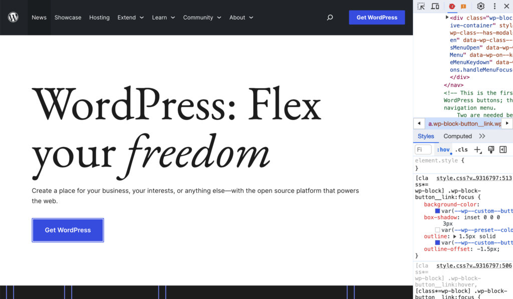
At first glance this focus indicator looks good. It is fully visible and offset from the button. The blue being used (#3858e9) has a 5.61:1 color contrast ratio, so it passes AA color contrast and exceeds the 3:1 color contrast ratio required by 2.4.13 Focus Appearance. However, when we inspect the code, we can see that the outline is only set to 1.5px thick, not the required minimum of 2px.
❌ This element does not pass 2.4.13 Focus Appearance (AAA).
Failure example 2:
Here is another example of a button on the WordPress.org home page with a different focus style. This one is in the header of the website.
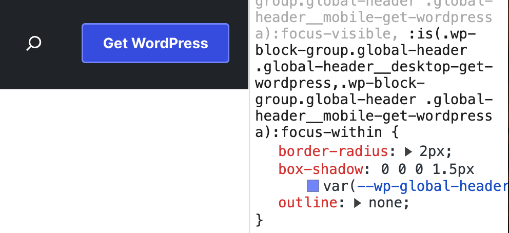
This header “Get WordPress” button has CSS styles on focus with outline:none; and a light blue 1.5px box-shadow around it instead. The light blue (#7b90ff) used for the box shadow has a 5.14:1 color contrast ratio with the black background (good), but only a 1.94:1 color contrast ratio with the blue of the button (bad).
❌ This element does not pass 2.4.13 Focus Appearance (AAA).
Failure example 3:
The demos site for the WordPress Twenty Twenty-Four theme provides another example of a failure.

This theme originally had a focus outline that was set to 1px dotted. (It has since been fixed.) The outline color is black and it has a 2px offset from the button itself, so it passes color contrast with the light gray background. However the 1px thickness and dotted style is not sufficent.
❌ This element does not pass 2.4.13 Focus Appearance (AAA).
Exception example:
Back to the WordPress.org home page, we can find an example of the exceptions to 2.4.13 Focus Appearance.
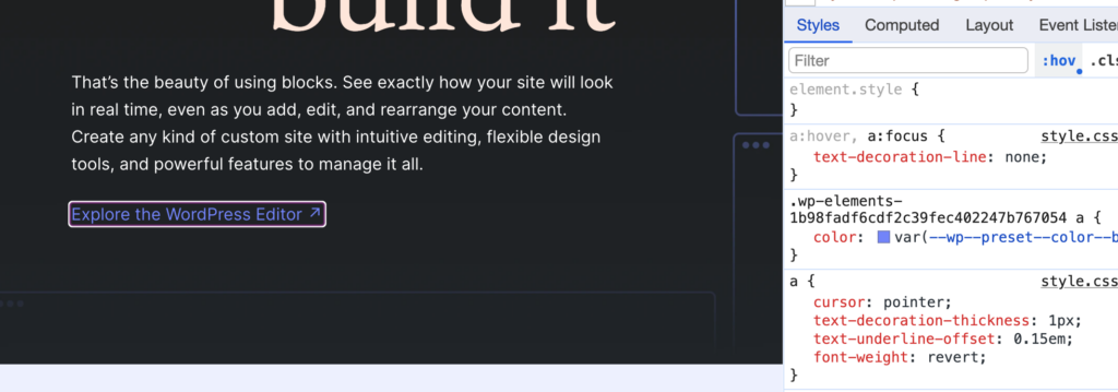
Here the focus indicator is a double white and purple line. This is the focus indicator set by Chromium-based browsers (like Chrome, Edge, and Brave). These browser use a two-color focus indicator to ensure appropriate color contrast on both dark and light backgrounds.
When we inspect the styles of this link, we can see that the developer has not defined an outline at all (only removed the text decoration) on focus. This allows the browser to control the focus indicator and would be a “pass” under the exceptions to the success criteria because the author did not define a focus width or color at all.
✅ This element passes 2.4.13 Focus Appearance (AAA).
Pass Example:
Here’s an example of a focus indicator shown on the breadcrumbs on the Accessibility Checker page on our website.
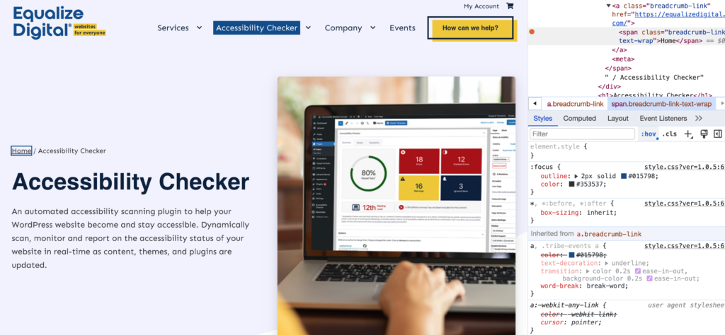
The focus indicator on our website uses a 2px solid outline. We have defined a dark blue color (#015798) for the outline, which has a color contrast ratio of 6.8:1 with the very light blue (#f3f4fe) background this element is on.
✅ This element passes 2.4.13 Focus Appearance (AAA).
For more examples of passes or failures and to learn more about this success criterion, read Understanding SC 2.4.13: Focus Appearance (Level AAA).
2.5.7 Dragging Movements (AA)
The Dragging Movements success criterion is the first of several that were added with the goal of making it easier for users to operate various functionality on websites without a mouse.
2.5.7 Dragging Movements requires that if a website requires a movement that involves dragging, there is an alternative way of achiving the task or submitting information that does not require dragging. This is especially important for people who cannot use a mouse at all, but can also impact mouse users who have dificulty holding down teh mouse button while moving it, such as someone who as hand tremors.
The success criteria says:
All functionality that uses a dragging movement for operation can be achieved by a single pointer without dragging, unless dragging is essential or the functionality is determined by the user agent and not modified by the author.
You may think that WordPress websites don’t have elements that require dragging, and on the front end, that is frequently true, but dragging can be very common in the editor, so if you’re a Gutenberg developer, working on WordPress core, or a WordPress plugin or theme developer, you’ll want to be mindful of this new success criterion.
Dragging movements are also included in some form fields, so if you’re building a survey, for example, and want people to order elements by preference, you may need to re-think that drag-and-drop field and have a different way for them to tell you their first, second, and third choice.
How to Test 2.5.7 Dragging Movements
If you have something on your website that requires a dragging movement, go to that element and ensure that there is an alternative that does not require dragging. For example, clicking on the element will provide visible arrows that can be clicked to move it up or down. The element should also be able to be used without the mouse and with a keyboard only, typically with a combination of the Spacebar, Return/Enter key, and arrow keys.
Examples of 2.5.7 Dragging Movements Passes and Failures
Failure Example:
Gravity Forms is our favorite form plugin, and does a great job with accessibility, however they have not yet tested and remediated all of their add-ons. The Survey add-on for Gravity Forms includes a “rank” field that relies on JavaScript to add sortable functionality.

The HTML behind this question is a simple HTML list, which is not keyboard operable and if you were to click with a mouse, you would see there is no alternative that allows users to reorder just by clicking rather than dragging.
❌ This element does not pass 2.5.7 Dragging Movements (AA).
Pass Example:
In the WordPress admin, we can find an example of alternate method to dragging in the block editor. When you’re editing a post or page in WordPress, you can drag blocks to rearange them. But what if you can’t easily drag blocks?

The block editor provides an alternate way to reorder content is you can’t drag and drop it. There are arrow buttons (labled “move up” and “move down”) that can be clicked with a mouse or with the keyboard to move blocks without dragging them.
✅ This element passes 2.5.7 Dragging Movements (AA).
If you’re looking for additional examples of how drag and drop can be made to work for people of all abilities, Salesforce has great examples of accessible drag and drop patterns on their GitHub.
To learn more about this success criterion, read Understanding SC 2.5.7: Dragging Movements (Level AA).
2.5.8 Target Size (Minimum) (AA)
Success Criterion 2.5.8, Target Size (Minimum) is a new AA rule that has been introduced for something that previously only had a AAA rule. The AAA success criteria, 2.5.5 Target Size (Enhanced) requires that clickable elements have a minimum size of 44 by 44 pixels, unless part of a sentence or block of text.
This new success criteria creates a AA minimum for tap target size. It says:
The size of the target for pointer inputs is at least 24 by 24 CSS pixels, except where:
- Spacing: Undersized targets (those less than 24 by 24 CSS pixels) are positioned so that if a 24 CSS pixel diameter circle is centered on the bounding box of each, the circles do not intersect another target or the circle for another undersized target;
- Equivalent: The function can be achieved through a different control on the same page that meets this criterion;
- Inline: The target is in a sentence or its size is otherwise constrained by the line-height of non-target text;
- User agent control: The size of the target is determined by the user agent and is not modified by the author;
- Essential: A particular presentation of the target is essential or is legally required for the information being conveyed.
Having a minimum target size is helpful for people who have limited mobility or tremors that make it difficult to click very small buttons, whether with a mouse or on a touchscreen device like a mobile phone. It can also be helpful for people who have large fingers or are using an assistive device like a mouth stick or head pointer.
How to Test 2.5.8 Target Size (Minimum)
If you want to test if your website passes 2.5.8 Target Size Minimum, you need to inspect the links and buttons on your website that are not part of a block of text and ensure that they are at least 24px tall and 24px wide. You can do this by right-clicking on the element with your mouse and clicking “inspect” in the options menu, then checking the size in the CSS.
You’ll especially want to look at your navigation menu elements, social media links, and other icons links.
Examples of Test 2.5.8 Target Size (Minimum) Passes and Failures
Failure Example:
The Tonal website, which is featured in the WordPress.org Showcase, provides an example of social media icons that are styled using rems, but result in a small target size.
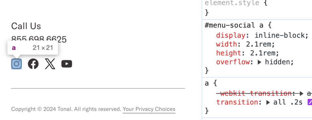
These links are 21 by 21 pixel and are relatively close together, which may make them hard for people to click.
❌ This element does not pass 2.5.8 Target Size (Minimum) (AA).
Pass Example:
The footer of the WordPress.org website includes social media links that only have a visible icon for the platform they are linking to.

These icons are 28 pixels tall and 28 pixels wide. They also have some nice spacing between them which helps to keep people from accidently clicking on a different link than they meant to click on.
✅ This element passes 2.5.8 Target Size (Minimum) (AA).
Exception Example:
Links that are in a sentence or in a block of text are not required to meet the minimum height and width. For example, this paragraph from the WordPress.org home page includes links on the words themes and patterns.
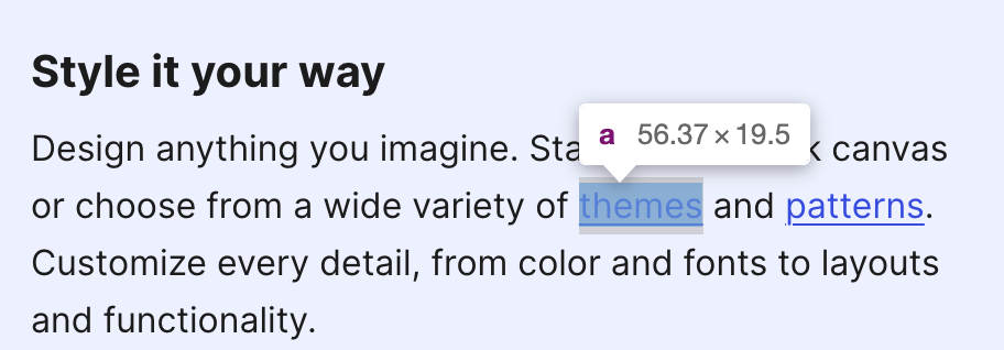
The link on the word “themes” is 56.37px wide, but it is only 19.5 pixels tall. Because it is in the middle of the paragraph and the height of the link target is set by the line height in the paragraph, this link does not have to be 24px tall. It is an exception to the rule.
✅ This element passes 2.5.8 Target Size (Minimum) (AA).
2.5.8 Target Size (Minimum) AA vs. 2.5.5 Target Size (Enhanced) AAA
Anything that passes 2.5.5 Target Size (Enhanced) will automatically pass 2.5.8 Target Size (Minimum). So, if you were already AAA compliant for target size, then you don’t need to worry about this new AA success criteria.
For example, we made the social media links in the footer of our website AAA compliant for tap target size.
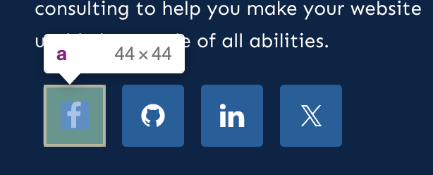
The social media icons in our footer are 44 by 44 pixels. That means we already pass the new AA success criteria without having to make any changes to our website.
✅ This element passes 2.5.8 Target Size (Minimum) (AA).
✅ This element passes 2.5.5 Target Size (Enhanced) (AAA).
For more examples of passes or failures and to learn more about this success criterion, read Understanding SC 2.5.8: Target Size (Minimum) (Level AA).
3.2.6 Consistent Help (A)
The new 3.2.6 Consistent Help success criterion is level A, which means that it’s a bare-minimum expectation and should be relatively easy to achive. This success criteria most applies to websites with chat or self help tools. It essentially says that, if you have help features on multiple pages, they should always be located in the same place on every page.
If a web page contains any of the following help mechanisms, and those mechanisms are repeated on multiple web pages within a set of web pages, they occur in the same relative order to other page content, unless a change is initiated by the user:
- Human contact details;
- Human contact mechanism;
- Self-help option;
- A fully automated contact mechanism.
Having your help features consistently placed is good for all people, but can be sepecially important for people with cognative disabilities. It helps to ensure that they know how to find or get help regardless of where it is on your website.
How to Test 3.2.6 Consistent Help
If you have help features on your website, whether it’s a button to trigger a live chat modal or just your phone number visible in the footer, you want to make sure that it is in the same location on every page. Navigate through your website and ensure that the location of the help feature does not change on a page-by-page basis.
Examples of 3.2.6 Consistent Help Passes and Failures
WCAG defines help mechanisms as:
- Human contact details such as a phone number, email address, hours of operation.
- Human contact mechanism such as a messaging system, chat client, contact form, social media channel.
- Self-help option such as an up-to-date Frequently Asked Questions, How Do I page, Support page.
- A fully automated contact mechanism such as a chatbot.
If you have these items on your website, you need to make sure that they have the same location across web pages. This can be understood to mean your company address and any means of contacting you.
Failure Example:
The AIOSEO website has links to get help both in the header navigation and in the footer. These are visible on most pages on the website.

However, when you click on the pricing page in the navigation, you’re unexpectedly taken to a page designed like a landing page without a full header or footer.

On this page, the navigation completely disappears. The Help Center link and footer support link don’t exist at all, and it’s unclear how to get help if you have questions about the pricing plans or product.
❌ This website does not pass 3.2.6 Consistent Help (A).
Pass Example:
The WP Engine website has live chat widget that can be opened via a button in the bottom right corner of the website.

This live chat is consistently visible in the bottom right corner regardless of which page you go to. It never moves, for example, to the left or top. It is also visible in the same place on mobile devices or if the browser is zoomed. In the HTML DOM, it is always the last focusable element on the page, inserted before the closing body tag.
✅ This website passes 3.2.6 Consistent Help (A).
For more examples of passes or failures and to learn more about this success criterion, read Understanding SC 3.2.6: Consistent Help (Level A).
3.3.7 Redundant Entry (A)
Success Criterion 3.3.7 Redundant Information is aimed at helping people with several types of disabilities. People with cognitive disabilities who have difficulty remembering information that they have entered before and people with mobility challenges who may be using eye-tracking or other alternative devices, for which typing can be much slower than if they were using a keyboard.
If you’re a parent who has ever had to fill in the same form over and over again while registering multiple kids for school, you know how frustrating it can be to have to type the same information repeatedly. Now, imagine that you have to fill in all those forms without using a keyboard.
This success criterion requires that you don’t ask users to provide the same information more than once during the same session to avoid frustration and unnecessary work on the part of the user. It says:
Information previously entered by or provided to the user that is required to be entered again in the same process is either:
- auto-populated, or
- available for the user to select.
Except when:
- re-entering the information is essential,
- the information is required to ensure the security of the content, or
- previously entered information is no longer valid.
How to Test 3.3.7 Redundant Entry
If you’re asking users to fill in forms on your website, you need to be aware of this new success criterion. To see if you’re passing 3.3.7 Redundant Entry, view all of the forms on your website that you have logged in users fill out, and confirm that you’re not asking them to provide information you already have (saved on their user profile for example) or that you’re not asking them to fill out the same question multiple times in the same session or form.
Examples of 3.3.7 Redundant Entry Passes and Failures
Failure Example:
The WordPress core password reset process may be an example of a failure of 3.3.7 Redundant Entry. This is the current process if you are logged out of your WordPress website and need to reset your password, then want to log into your website.
- Go to the login page and click “forgot password.”
- Enter your username or email address into the lost password form to request a reset link.
- Go to your email and click the reset password link.
- This opens a form on your WordPress site where you can type a new password.
- After saving your new password, you can click a link to login.
After following that process, you are redirected to the standard login page without anything filled in.
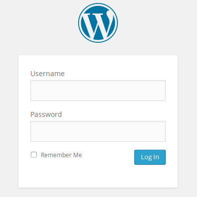
It makes sense that your password is not filled into this form because prefilling it could be a security concern. However, to reduce asking people to fill in redundant information, the username field could be prefilled. As it stands, the user must retype their username or email address again, even though they are in a session where it could easily be auto-filled for them.
❌ This form does not pass 3.3.7 Redundant Entry (A).
Pass Example:
The Equalize Digital team built a complex web application for Workforce Solutions Panhandle, a state organization that works with people who are receiving unemployment, childcare, food, and other assistance. This web application functions as a portal where users can log into their accounts and submit the forms required to receive these benefits from the state and federal government.
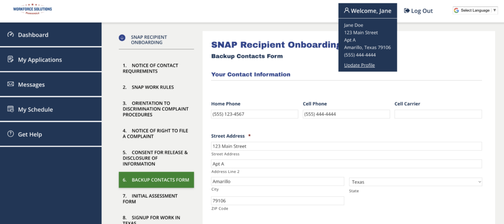
In this portal, users submit information about themselves when they create an account, including their name, address, and phone numbers. This information is saved on their user profile as user meta.
When they go to any form page to submit a form, this is already filled in for them on the form using the Gravity Forms user merge tag. This is shown in the above screenshot of a Backup Contacts Form as part of the SNAP Recipient Onboarding. They have the ability to edit the information if needed but are not required to retype it in because the system has done that work for them.
✅ This form passes 3.3.7 Redundant Entry (A).
For more examples of passes or failures and to learn more about this success criterion, read Understanding SC 3.3.7: Redundant Entry (Level A).
3.3.8 Accessible Authentication (Minimum) (AA)
3.3.8 Accessible Authentication (Minimum) is one of two new success criteria that address captchas on website login forms. This AA version states that your login form should not make people solve, recall, or transcribe something to log in. It is specifically targeted to making logins easier for people with cognitive disabilities including short term memory loss.
A cognitive function test (such as remembering a password or solving a puzzle) is not required for any step in an authentication process unless that step provides at least one of the following:
- Alternative: Another authentication method that does not rely on a cognitive function test.
- Mechanism: A mechanism is available to assist the user in completing the cognitive function test.
- Object Recognition: The cognitive function test is to recognize objects.
- Personal Content: The cognitive function test is to identify non-text content the user provided to the website.
For the purposes of this success criterion, “Object recognition” and “Personal content” may be represented by images, video, or audio. So captchas that ask people to click on all the squares that have traffic lights are OK, as are having a photo that they previously selected on the login page as a way of confirming it is them.
You can get around the cognitive function test that is remembering a password as long as your form allows them to copy and paste in the password or use a password manager such as 1Password to auto-fill it.
How to Test 3.3.8 Accessible Authentication (Minimum)
To test your website for compliance with 3.3.8 Accessible Authentication (Minimum), go to the login form and ensure that the following is true:
- Users can fill the password field by pasting into it.
- Users can fill the password field with a password manager.
- If your website has 2-Factor Authentication, the field in which they type the 2FA code allows pasting data.
- If your website has a captcha, it is an image/object recognition captcha and not a word or combination of letters and numbers captcha.
Examples of 3.3.8 Accessible Authentication (Minimum) Passes and Failures
Failure Example:
A common security feature on WordPress websites is the math captcha included in Jetpack Protect.
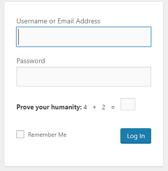
When Jetpack Protect is enabled on a website, it adds an addition math problem to the WordPress login form. In the example shown above, the user has to type their username and password into the form and also add 4 plus 2 to be able to log into the website. This is a cognitive function test that may be difficult for some users to complete.
❌ This form does not pass 3.3.8 Accessible Authentication (Minimum) (AA).
Pass Example 1:
Some plugins like SolidWP and WordFence add 2-Factor Authentication to the login screen. These plugins email the user a verification code after they log into the website to finish the login process.
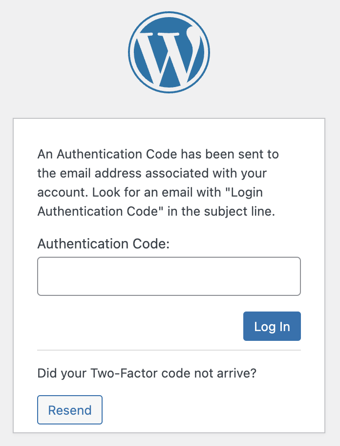
This screenshot shows the Authentication Code field added to the WordPress login screen by SolidWP. This field allows the users to paste the code into it so they don’t have to remember the numbers after checking their email. The email also includes a link so that users can bypass typing the code and log in by clicking the link in their email.
✅ This form passes 3.3.8 Accessible Authentication (Minimum) (AA).
Pass Example 2:
Some WordPress websites integrate with Google reCAPTCHA and include an “I’m not a robot” checkbox.
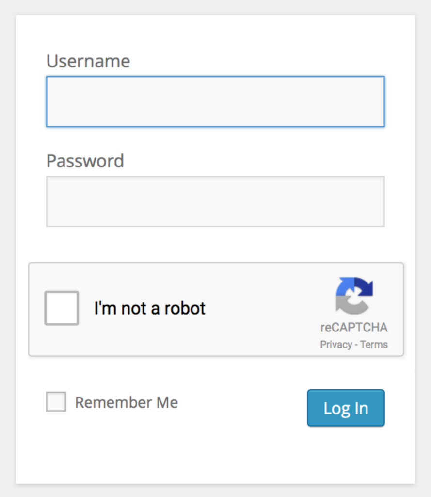
This sort of authentication, with a simple checkbox where the user does not have to type or identify anything, is not considered a cognitive function test.
If the captcha asks the user to select images that contain a certain object, such as the image below, this is an example of allowed object recognition.
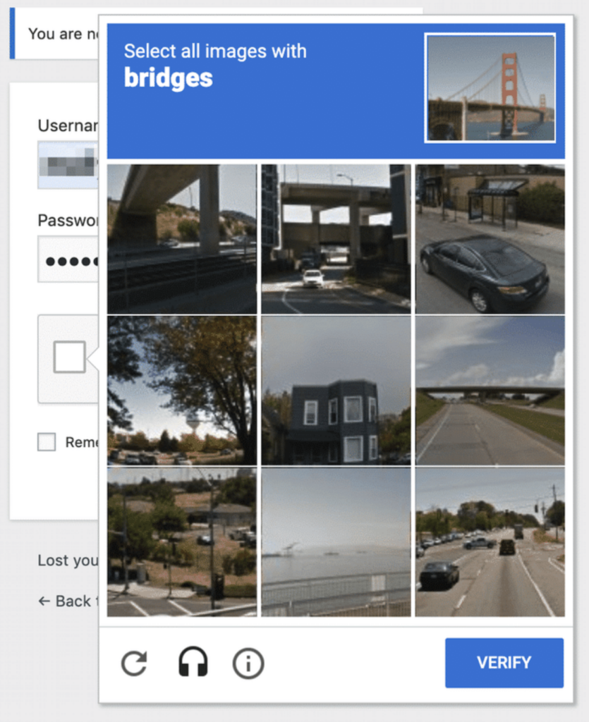
Because this is object recognition, it is not considered a cognitive function test at the AA level.
✅ This form passes 3.3.8 Accessible Authentication (Minimum) (AA).
For more examples of passes or failures and to learn more about this success criterion, read Understanding SC 3.3.8: Accessible Authentication (Minimum) (Level AA).
3.3.9 Accessible Authentication (Enhanced) (AAA)
The last success criterion added in WCAG 2.2 is 3.3.9 Accessible Authentication (Enhanced), the AAA version of 3.3.8 Accessible Authentication (Minimum).
This stricter criterion requires that you don’t make people recognize objects or images in order to log in. The language of 3.3.9 Accessible Authentication (Enhanced) states:
A cognitive function test (such as remembering a password or solving a puzzle) is not required for any step in an authentication process unless that step provides at least one of the following:
- Alternative: Another authentication method that does not rely on a cognitive function test.
- Mechanism: A mechanism is available to assist the user in completing the cognitive function test.
So it is the same as 3.3.8 Accessible Authentication (Minimum), only it has two fewer exceptions.
How to Test 3.3.9 Accessible Authentication (Enhanced)
Testing 3.3.9 Accessible Authentication (Enhanced) is much like testing 3.3.8 Accessible Authentication (Minimum). Look at your WordPress login form and ensure none of the previously mentioned cognitive function tests, including image recognition captchas, are present.
Examples of 3.3.9 Accessible Authentication (Enhanced) Passes and Failures
Failure Example:
To pass this criterion, and have a AAA compliant login form, the previously shared example of Google’s reCAPTCHA asking people to recognize images would not be allowed.
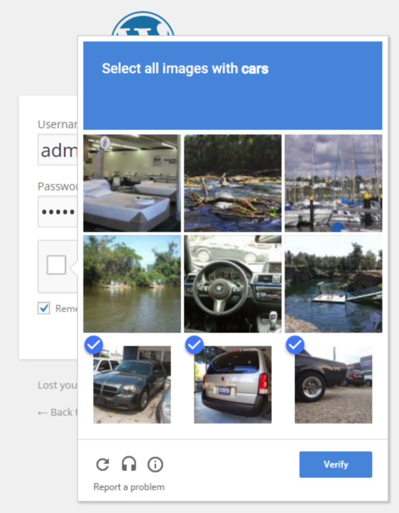
The image above shows Google reCAPTCHA v2 asking people to select all images that contain cars. This could be difficult if an image contains only a small part of a car or, for example, the center image shows the steering wheel and dashboard in a car. Some people will not know if the captcha wants them to select images of both the interior and exterior of cars or if the steering wheel picture is even inside a car versus some other vehicle.
❌ This form does not pass 3.3.9 Accessible Authentication (Minimum) (AAA).
Pass Example:
If you’re using the standard WordPress login form with no modifications, your website is automatically AAA-compliant for accessible authentication. 🎉

✅ This form passes 3.3.9 Accessible Authentication (Minimum) (AAA).
For more examples of passes or failures and to learn more about this success criterion, read Understanding SC 3.3.9: Accessible Authentication (Enhanced) (Level AAA).
WCAG 2.2 Compliance Help
Hopefully, this post helped provide a better understanding of the new rules added in WCAG 2.2 and how you can test for them on your WordPress website. If you aren’t sure where to start with WCAG 2.2 compliance for your website, get in touch with one of our accessibility experts.
Our experienced team can perform accessibility audits and remediate your WordPress site to ensure you’re on the right track to WCAG compliance. We can help you figure out which version of WCAG (2.1 or 2.2) and which level (AA or AAA) to work towards.
Not ready for a custom audit? Start finding accessibility problems on your WordPress website today with the free version of our Accessibility Checker plugin. Sign up free, install, and start testing your website for accessibility problems now.
