The most common question regarding accessibility is, “How bad is a given site, and what’s it going to take to fix it?” Most people would like to get at least a ballpark answer without spending $1,000. This session will cover how we use a quick audit to answer these common questions and move forward on solving accessibility issues.
- How accessible or inaccessible is a given website?
- How do you determine your major pain points?
- How do you identify which parts of your site are causing the most accessibility issues?
- How do you use this information to choose what direction to take in remediating the site?
Thanks to Our Sponsors
IvyCat helps clients and agencies create, market, and maintain high-performing WordPress websites and web apps that are fast, easy to use, accessible, and get results. Their website care plans, search engine optimization, and accessibility services help clients grow and succeed without the stress and headaches of doing it alone.
Watch the Recording
Read the Transcript
>> AMBER HINDS: Welcome to WordPress Accessibility Meetups, Quick Accessibility Audits, with Gen Herres. A few announcements before we get started. If you have not been before, we have a Facebook group where you can connect with other attendees between meetups. You can find it if you search WordPress Accessibility on Facebook or the direct URL is facebook.com/groups/wordpress.accessibility. You can find upcoming events and past recordings all in one place on our website. The short way to get there is to go to equalizedigital.com/meetup. Everyone always asks, is this being recorded? Yes, it is being recorded. It takes us about a week to two weeks, sort of in between there, to get corrected captions and a full transcript, and then we do post the recording up at that URL. Bookmark it, or the other way you can get notified is you can join our email list, and that is equalizedigital.com/focus-state.
If we did things right, you’ll also get prompted to join when you leave the webinar, if Zoom directs you to the right place. We send out news, we send out links when the recordings are available, and other resources related to accessibility, so definitely join that.
If you are someone who prefers audio-only versions, we do release the audio from meetup recordings on our podcast, Accessibility Craft, in between conversation episodes where we talk about craft beverages and general accessibility topics. I think this week, actually, we had a guest, Patrick Rauland, from Xero Shoes, who was talking about doing accessibility on their WooCommerce websites that they have for both. They have three different websites, a US, a UK, and an EU website. If you’re interested, you can find that and the recording from other meetups in audio format on accessibilitycraft.com.
We are seeking additional sponsors for meetup. This meetup is part of the official WordPress Meetups program, but when I contacted them about captioning and transcription and all that, they said that, unfortunately, they don’t have budget, and so they said, go out and find sponsors. If you or your company would be interested in helping to support the meetups and helping us to continue to make them accessible for all attendees, please reach out to us. You can find information on the meetup page on our website, or you can message us. You can email myself and Paola at meetup at equalizeddigital.com. You can also reach us there if you have suggestions for the meetup. If you’re interested in speaking, we’re always looking for speakers.
Right now, we’re kind of far-booked out, which is nice, but we are definitely looking for people for the end of the year. If you would be interested in speaking, we’d love to hear from you. In addition, if you have a topic you want to learn about, but you aren’t the speaker, but you want us to try and find a speaker for that, that’s always helpful for us, because it gives us an idea of things that we should try to find people to cover.
I am Amber Hinds. I am the CEO of a company called Equalize Digital. We’re the organizer of the meetup. We are a mission-driven organization that focuses specifically on WordPress Accessibility. Our plugin, Accessibility Checker, has a free version on WordPress.org, and then also has paid versions, and we do a lot of accessibility services as well. Our website, again if you want to learn more about us, is equalizedigital.com. We’re most active on Twitter @EqualizeDigital, but you can find us on a lot of the different social platforms.
We do have a live captioning sponsor today, who I want to thank, and that is IvyCat. IvyCat helps clients and agencies create, market, and maintain high-performing WordPress websites and web apps that are fast, easy to use, accessible, and get results. Their website care plans, search engine optimization, and accessibility services help clients grow and succeed without the stress and headaches of doing it alone. A huge shout-out to IvyCat, and a big thank you to them, because they have sponsored our live captions for a lot of these daytime meetups, and we couldn’t do it without them. It is very helpful. If you want to learn more about IvyCat, you can go to ivycat.com.
We also like to encourage our attendees to just send them a quick thank you on social, if you’re on LinkedIn or Twitter. On Twitter, they’re @ivycatweb, and just say thank you for sponsoring captions for WordPress Accessibility meetups. It helps our sponsors to know that what they’re doing matters, and that it is helpful. Please thank them if you are willing to do that.
We have three upcoming events that I want to tease. The first one is, we did figure out, I know I had said last month, we’re probably going to do something for Global Accessibility Awareness Day, but I hadn’t had the details worked out. We are teaming up with a few other companies in the WordPress space to talk specifically about WordPress Accessibility in plugins and themes. That will be a special, not during one of our normal meetup times, on Thursday, May 16th, at 10 AM Central. I think Paola can probably toss a link to RSVP for that, or get more information in the chat. If you’re interested, you can also find it on the meetup page as well.
Then on Monday, May 20th, Simon Miner will be talking about Building Empathy with Stakeholders to Drive Accessibility. That is our evening meetup, so it is at 7 PM US Central time. Then this same time slot in June, on Thursday, June 6th, Nick Croft will be talking about Six Levels of A11Y or Accessibility Maturity: Know Where You Are to Know Where You Are Going. They’re all going to be really great topics, so we look forward to seeing you all at those meetups.
Let me, if I can get Gen to turn her camera on, then I’ll be able to spotlight her and pop her up here. I am very excited to introduce Gen Herres back as a speaker at meetups. She’s spoken several times before and has spoken at WordCamp US and a lot of other groups. It turns out that we’re twins today. We are both wearing accidentally our WordPress Accessibility Day t-shirt from last year, where she was also a speaker. It was a phenomenal presentation where she showed an inaccessible theme, maybe, and an accessible theme next to each other and compared. Super great. I always appreciate having Gen because she has a lot of great information to share.
Gen is the owner of Anphira, LLC. She also runs the Baltimore WordPress meetup group, which I think they do a lot on Zoom still.
>> GEN HERRES: Yes, everything is on Zoom still. We have people from all over the US. We have people from South America, Africa. We’ve had Europe, Australia, New Zealand, and I think even a couple out of Asia.
>> AMBER: That’s awesome, yes. She also runs a meetup group that you can attend as well. Thank you, Gen. We’re excited to have you here. I’m going to stop sharing, and I am going to let you take over sharing as soon as I figure out where that silly Zoom toolbar went. There we go. If you have questions during today’s meetup, we do utilize the Q&A feature in Zoom. If you can please add those to Q&A, then at the end of Gen’s presentation, I will come back on, and we’ll make sure to get all of your questions answered. Thanks so much.
>> GEN: Before I start on the presentation, I always like to answer the question, where do I get the extra info? I have a learn section on my website, Easy Ally Guide, and if Paola, you could drop the URL into the chat for them. There’s videos, and there’s actually an entire video series that goes with this quick audit. You guys can check that out. In a side note, I just got my DHS Trusted Tester Certification. That’s very exciting. I survived the test.
All right. Today, we are going to talk about quick audits for accessibility. We’ll talk about the purpose of the quick audits. When is a good time to do them? Who is qualified to do them? We’ll actually do a how to do them, including a demo on the E-ZPass website of New York. We’ll talk about understanding the results, and then where you go from there.
These slides and links for all of my presentations that I’ve done for all different locations are available on my website at easyallyguide.com/learn.
The purpose of a quick audit. There are instant automated audits. You’ve probably done these. There are a number of different tools on the internet which allow you to do them. One of the popular tools is Deque’s axe product, and that has been around for quite a while. It also powers Google Lighthouse. I share some statistics on this page. Those are from published statistics at Deque based on their axe product.
Instant automated is easy, fast, and cheap. It doesn’t require much training, and it is good at some things. It can find out whether the page has actually had a language identified. It can do pretty decently on contrast testing. The axe product has been shown to find about 83% of the errors. It definitely does do a bit of the work, but it doesn’t do it completely. It can find bypass blocks. It can detect if alt text is present, but it can’t determine if that alt text is appropriate. It can find more than half, 54%, of the errors for name, role, value.
The drawbacks of these instant automated is that they have low coverage. They cannot test for 75% of the WCAG 2.2 criteria, which means that they’re only testing for 25%, and of that 25%, they’re only partially testing it. From the studies that Deque has done over thousands and thousands of websites, they cannot completely test any single WCAG criteria. The majority of lawsuits are based on manual user testing, specifically legally blind people using a screen reader. Now, legally blind people, many of them can still see the screen. Some of them can read on the screen. Legally blind means they can’t read an eye chart at 20 feet away, but they may be able to read a computer screen at one foot away, and especially with text size increases and magnification. They know if they are missing content.
Comprehensive manual is the other main topic when it comes to audits. These are slow, expensive, but very good. They require experienced testers and multiple testers to do comprehensive coverage. They can test all of the WCAG 2.2 criteria, and they can completely test all of that criteria. The drawbacks are that these can take weeks to produce, cost thousands of dollars, and they end up writing up a huge number of repeated issues. This isn’t great when you want to just evaluate a website and determine, is it good or a total train wreck?
The middle ground are these quick audits. Typically, they’ll take a couple of hours for people who are newer to the process or trying to cover multiple pages. I can usually run through this in under 20 minutes. Writing it up, of course, frequently takes about twice as long. They require one trained person. They keep the cost pretty reasonable. It puts it at a point that you can do an audit or an intake on a website and bundle this into the cost without your client freaking out, and they identify major pain points for remediation. They are usually enough to get a good scoping of how much needs to be done.
Speaking of scoping, it talks about where are accessibility errors coming from. Specifically related to WordPress, this is theme, plugins or add-ons, and then, of course, content. It talks about whether these issues are small fixes or significant changes, and whether people are really blocked from the website or if they can kind of get through it but it’s an unpleasant experience, because those matter in terms of is this a really critical error or is this more of a major error?
When to do a quick audit? There are a number of good times for doing quick audits. When you take on a brand new client and they have an existing website, you want to know how much of a mess or not a mess, it’s usually a mess, is this existing website. When you’re discussing a redesign. When talking a client out of a website that they think they absolutely love and want to copy. Early in your build process to make sure that you’re on the right track. Of course, if you receive a accessibility inquiry or demand letter. Or if you’ve just recently discovered that your client needs to comply with WCAG 2.1 level AA for ADA Title II. ADA Title II applies to state and local governments in the United States. It also applies to a lot of organizations that receive funding, and that can be both for-profit and not-for-profit organizations that receive funding or other compensation from state or local governments. This adds in a lot of websites that now have a very specific set of criteria they need to meet. Of course, anytime you don’t have an answer for the question of how good or bad is this website’s accessibility. I have a quote here from Benjamin Franklin. You may delay, but time will not.
Taking on a new client with an existing website. This is a great time to talk about web accessibility because you are not currently at fault. You didn’t build it. It’s not your mess. You can point the finger at the people who were previously working on it. This is a great time to do an overall audit of the website. Look at accessibility, security, privacy, copyright, all sorts of these different legal issues that affect websites and go through them all with your client. This really shows your client that you care about them and you care about their website and their business, as lawsuits for these topics can be in the thousands to tens of thousands of dollars. This also gives you a very good evaluation for how much work you need to do to get this site into a good manageable state.
When you’re discussing a redesign, it is a great time to benchmark the current accessibility of the website. Also to possibly benchmark a couple of competitors. You can highlight the importance of accessibility because users can’t convert into buyers unless they can actually use the website. It’s a great time to get a lot of client sign-off. You can talk to clients about topics like, do you want people to be able to use this website on a mobile phone while outside? Most people are going to say, yes, I want people to be able to use my website on a phone while outside. Well, that means bright sunlight, wearing sunglasses. The contrast of the website has gone from all the people okay to totally washed out and then darkened because of sunlight and then sunglasses. If you didn’t have really good contrast to start with, the website has become unreadable, which means if I clicked it in search results, I can’t read it. I just go back to search results. I left. I didn’t even consider your website because I couldn’t read it, even though I have 20/20 vision. I don’t have 20/20 vision outside in bright sunlight with sunglasses.
Talking a client out of this website they love. I have had so many clients come to me and say, oh, this website is so awesome. I want to copy them. Unfortunately, the clients are usually only looking at how aesthetically pretty is it to them on the desktop. They’re not looking at it on their phone. They’re not looking at it on their phone in various different locations. They aren’t looking at ease of use and they aren’t looking at user expectations. For example, one client brought me a website and they said, this thing is awesome. I want to copy them. Every single heading on the website was bright blue. The blue that we all associate with hyperlinks. Some of the headings were links. Some of the headings were not, and I had absolutely no idea which was which unless I tried clicking on it. This this is not a good usable experience. This frustrates people and makes them leave.
Early in your build process. When you’ve just gotten your theme set up, got your settings in, and you’ve only built out one or two pages, this is a great time to do a check-in and make sure that your build is on track and you don’t need to make any modifications to your process. Because it’s much less expensive to modify things early than after you’ve built 100 pages and you have to rework 100 pages. It’s not a pleasant experience.
If you receive an accessibility inquiry letter. Now, when your client receives an accessibility inquiry letter, they are probably going to be very motivated to actually do something. This is a great time to get them educated and on board, and to do a gap assessment on how to get a budget together and get problems rectified. If you receive a website that has ADA Title II or state and local government in the United States, a whole bunch of websites are going to need to be compliant with WCAG 2.1 level AA by April of 2026 or 2027. A lot of those websites will fall under the 2026 rule. This is a great time to talk to your clients and get them started on the process of getting their website accessible, while we have time to plan things out for 2025 and 2026 work.
Who can do a quick audit? You need a certain person or people to do a quick audit. The reason is you need to be able to know if something is broken. Typically, quick audits are done by a single person, but it could be done by multiple people. For example, you may have a virtual assistant who does some of the testing and then you have a more senior person who does the final few tests.
Whoever is doing it needs to have good corrected vision because they need to be able to see the website in its native state, read, and understand it. They need to not have color, sensory, or reading issues. They need to use standard input devices. They need to be a basic screen reader user, fluent in the language of the website, and have knowledge of proper accessible markup and code inspection.
Good vision is important because you need to tell if an image has proper alt text. You need to tell if assistive technology can’t reach something. You need to clearly see keyboard focus, and you need to be able to test issues with zooming and understand whether the headings and page title are appropriate. You need to not have color issues that are significant or sensory issues or reading issues.
Automated contrast checkers can find roughly 83%. That’s for the axe product from Deque. You still need humans to find the other 17%. The pages being tested are unknowns. People who have sensory or vestibular issues could become quite ill trying to interact with these websites, and we don’t want to be making people ill. It’s important that the people not have these sensory issues which could cause them to become ill. That’s not pleasant. Of course, they need to be able to read transcripts and captions and hear videos to make sure that that information is accurate.
Uses standard input devices. The person needs to be able to use a standard mouse or trackpad because they need to check hover and focus states, and they also need to understand the difference between keyboard and mouse navigation, and what can be reached via both of those. They need to be a basic screen reader user. You do not need an advanced screen reader user. Honestly, most people who use screen readers are not advanced. We do see some of the speakers at the WordPress Accessibility meetup who are very advanced screen reader users.
The reality is most of the people who are actually using screen readers out there in the world are not that good. You just need basic skills with a screen reader to be able to get through the testing. Unfortunately, screen readers are not the easiest things to use, so you do need some experience with them. Almost every lawsuit cites a legally blind person using a screen reader, so these screen reader tests are really essential to finding out if this website is in jeopardy for a lawsuit.
Fluent in the language of the website. You need to be able to navigate the site, read the captions and the transcripts, understand that headings are appropriate, and of course, run the screen reader. For all of this, you need to be fluent in the language of the website.
It’s also important to have knowledge of proper accessible markup and be able to do code inspection. When I do these, one of the most valuable things that comes out is that I tell people where the issues are coming from, and I usually specifically highlight “this is the code that’s on your page,” and I’ll usually bold “this is the problem code.” This is what needs to be fixed going forward, and that is so incredibly valuable to developers, and even to people who are just adding content because they can see what the problem is. They can also then start to check some of their own work on remediation going forward.
How to do a quick audit? I have information on video instructions for a number of these modules on my YouTube video series, and I’m also adding more content on YouTube as I go. Please take a look at those as I break some of these steps down into a lot more detail. I use two browsers, sometimes three browsers. Chrome is the most commonly used browser out there. By default, I want to use Chrome. Firefox is a browser that is known to be very challenging with its CSS. I normally use Firefox to use some of the CSS testing, and also to do the text zoom testing.
You’ll need a screen reader. The most common are NVDA on PCs or VoiceOver on Mac. There are other ones available, but those are just the most common. You’ll need to do code inspection, so you do need to be able to read that code, know how to access the code, and of course, you need to have your keyboard and mice available.
The checklist that I will be using is this checklist tool. Then there is a review of the process on this other link, and again, these slides and links are all available on my website. I’m sure that Paola has added the link to the chat. Of course, I also posted the link on the actual meetup.
E-ZPass website of New York is the website that I will be testing. This website is an official website of New York State, part of the New York State government, so it will definitely fall under the new ADA Title II. This website is a bit of a train wreck, so it’s a great thing to do a test on. Here, I have switched tabs over to the E-ZPass New York website. I will do my best to try to describe this as I know it’s going to end up in the podcast as well.
The first thing I’m going to do is hop over to my checklist and create a quick audit or a single page. Here we are. The first item that we’re going to check for is an accessibility statement. To do this, I will go to the website in question. I will do Control F to find, and I will look for the word accessibility, which is not found on the page. I will also just do a quick glance at the footer section, and I do not see any sort of accessibility policy. I will mark the conformance level as it does not support, and the issue source as content, because that is just missing content from the website.
The next item is cookie and privacy policies. Now, I happen to know that this website does not have any sort of cookie banner. It does have a privacy policy. What I’m going to do is just get my cursor marked near the privacy policy, just before it in the DOM. I’m going to tab over and make sure that if I hit the privacy policy, I can actually navigate there via the keyboard.
The privacy policy is actually able to reach the page. I don’t do any sort of extensive privacy policy check, but I do check for an updated date, because that is legally required in quite a few privacy laws. I also do check for contact information. They do have some contact information on here, although I don’t see an email address. I’m doing a find on the @ symbol as those are involved in all email addresses, and they don’t have any sort of email or electronic contact method. That is definitely going to call that partially supports and content.
Proper alt text on images now. On the E-ZPass homepage, what I’m going to do is take a look at the images that are here and their alt text. There’s quite a few ways to do this. I am going to turn on one of my browser extensions. This one haven’t. I’m supposed to wait. All right, this is the WAVE tester, and here it allows me to see the images and what they are marked up as. This image does not look to have any alt text, so this image has a lot of text content in it, and missing alt text is a failure.
These images down here are actually links, and I am not seeing any alt text displayed for them. You can double-check with the inspector, but no, they are not marked up with any sort of alt text. I am going to say partially supports because there was at least one pass and at least one failure. This is going to be content-related.
The next test I’m going to do is proper labels on form inputs. I will turn off the WAVE extension. I am looking to see if they have an input form. Here we are. I just went to a page that has an input form, and so what I’m looking for is to see whether they have appropriate labels and matching inputs.
>> AMBER: Hey, Gen, you might need to dock the inspector because we can’t see the inspector.
>> GEN: Thank you. I forget that sometimes. All right, so here we have a label. This label does not have any programmatic markup, which would be the name, role, value. It should have programmatic markup that identifies it with its matching input, and this input should have an ID value that the label can then reference. I would mark this as a failure because of that. The marker for the required is an image, and this image uses a title, which is a failure, and has no alt text, which is a failure. It’s not able to identify that that is, in fact, a required. I would mark this form as failing. Usually, once it gets into a lot of. Typically, I mark forms as failing as a website add-ons as they are typically for a WordPress website. They are a specific plugin that is used to do it.
Proper links and link states. Go back to the home page. What I’m looking for is when I’m on a link, I can clearly tell that I am hovering. This image here is being used as a link, but it has no hover state. There’s a number of issues where this is a heading and this is a link, but they are visually identical to each other. Same thing over here. This is a heading, but this is a link. I would give it a failure because the links are not consistently marked up, and I can’t clearly visually identify them from other content. The link states look basically all right, except for these images, which have no hover states. I will mark that up as partially supports. Typically, I will mark up link states as a theme issue, although this is probably going to be both content and theme as part of that is the images and part of it’s the theme.
Keyboard focus state. Now we get to go through this website with the keyboard. I will jump ahead one criteria and check for the skip link as the very first thing I check for with the keyboard. I put my cursor into the URL bar, and then I hit tab. The very first link I encounter is the home link, which means that there was no skip link, so I am marking the skip link as a failure, and if this was a WordPress site, that would normally be part of the theme. I will continue to test for focus state. What I’m looking for is a clear visual focus state.
Now, even though these links that I’m looking at in this banner didn’t have a hover state, there is actually a focus state. I would probably sell them on contrast, though, because it’s not super easy to see. A little of a surprise, I have just jumped from the header of the website down to the footer of the website without interacting with any of the center content on the website. I am now looking at the image. The image is outlined in blue. However, the image itself has a ton of blue, so it’s very hard to see the focus.
I tabbed through the lower links on the website. I am now back in the header of the website. I’ve gone from the top of the header to the lower header to the footer, to the top of the footer, to the bottom of the footer, now to the middle of the header. Now I am in the content of the website. This is definitely a focus order failure. The non-image links do actually focus, though, to a pretty decent state, but there were definitely quite a few failures. I will mark this as both content and theme. In a WordPress site, jumping around with focus state from header to footer to content would likely be related to the theme, and the content issues would be with the images.
Navigable menu for keyboard users. This tests whether the keyboard users can actually navigate the menu. We were fine testing this on the desktop, but many people use the keyboard on mobile view because they are zooming on the website on their desktop computer. These are generally low-vision users. As this website is not responsive, the entire website has become huge. We are failing this because the website is just scrolling all over the place. I am able to reach the items, but due to the horizontal scrolling, I’m going to fail them on that. I’ll mark partially supports since the desktop was okay, but the mobile was not. Issues related to responsiveness, I almost always mark up as theme, as your theme should be handling responsiveness.
Text size with zoom. For this, I will go use the Firefox browser. Hopefully, I can switch to my Firefox. I’m now in the Firefox browser, and in Firefox, you can go to the view menu, then zoom, and select something called zoom text only. This allows me to just zoom the text. This is a feature in both Firefox and Safari, and there are a number of Chrome extensions to do it in Chrome, but I like to do this natively in Firefox.
The first thing I’ll notice here in Firefox, since I have absolutely nothing configured in my Firefox browser, I keep my Firefox completely vanilla. This text is tiny. In my Chrome browser, I keep my text as a minimum font size so that I don’t have to deal with super tiny text, but here on Firefox, I can see the actual font on the website is super tiny. Now I will zoom this text to 200%. I will see some issues in the header. Since the header is a fixed height, and the header background is purple with light gray text overlaid on it, I see some areas where text is overlapping with other text. Some of the text has run off the screen and it’s not reachable.
The actual body content I’m looking at does seem to be pretty much okay, as well as the footer content. The issues are in the header. I’m now going to switch my computer back over to my Chromium-based browser. As soon as I find the window. There we go. I am going to mark text sizing with Zoom as partially supports, and I will mark up the header issue as a source of the theme.
Page titles and headings. The title as well as the headings on the page. I’ve gone back to the E-ZPass tab, and the E-ZPass tab says E-ZPass New York. That’s a pretty good page title. Next, I will hop over and activate WAVE. In WAVE, I can pull up the structure, and WAVE tells me that this page has absolutely no headings at all, so I will mark this as a failure. I will mark that as a content-based failure.
Next thing I’m going to look at is color contrast for text. For this, I will turn on the WAVE extension again. It shows me that it has found two contrast errors. This red text on a yellow background does not meet contrast, and this date of May 2nd, 2024 is overlaid on a not quite determined what color background that is with the WAVE tool, but programmatically, it is thinking that it does not pass. I will turn off WAVE and take a look at it. It’s actually on a dark gray background, but that dark gray background is an image, so WAVE can’t detect images and image backgrounds so it can’t tell if the contrast is sufficient or not. Here, it’s a dark gray with a light gray. That definitely does pass. The red text on a yellow background fails. It doesn’t fail by a ton. I will mark partially support and mark that as a content issue.
The next one is no autoplay, continuous animations, or visually disorienting content. When I look at the website, this is a very quick test. I don’t see anything that autoplays, moves on its own, or disrupts anyone with vestibular issues. I will mark that as supports, and not applicable.
The last one is closed captions and transcripts. When I look at the page, I do not see any media content at all, so I am going to mark that one as not applicable. The reason why I mark the no autoplay or continuous animations as supports versus closed captions and transcripts as not applicable is because I can positively verify that nothing autoplayed. There were no animations. There wasn’t any disruptive content, so I mark that as supports. Whereas there’s a precondition for closed captions and transcripts. There has to be media on the page or I cannot test this criteria at all. Since there’s no media on the page, I mark this as not applicable.
I will finally do a quick screen reader test. Zoom and my computer and screen readers just do not get along. As I’m sure you can imagine, this website does have some issues with the screen reader. I will mark that as partially supports, and I mark that as both content and theme.
Then finally, I click Generate Report, and so this will now give me my report. I get a little summary that tells me one criteria passed, eight partially, four flat-out failed, and one was not applicable. Then it goes into the details. I can copy this testing summary to my preferred editor of choice.
I will now head back to the slides and talk about understanding the results. What does one page of viewing a website tell us about the website? It allows us to take a look at the website header, the website footer, the stylesheet, and the overall theme issues, the content issues, and how people are adding content correctly or incorrectly, and the website add-on issues.
We take a look at the conformance level of each of the issues. We specifically take a lot of look at items that were ranked as partially supports or does not support. Typically, we shouldn’t have anything by the end of the test that says not tested, but if we do, we really need to go back and fill it out again because we should be testing everything. Anything that mark as supports, yay, we’re happy about. We don’t need to do anything. Anything that was found to be not applicable, then we also don’t need to worry about.
Look for your common issue sources. Once your quick audit is done, you’ll have a source attributed to each issue. What you want to look at is whether multiple sources or multiple issues are caused by the same source. For example, if five items were all tagged as a theme issue, then you want to take a really good look at your theme and decide if that should be the one that you want to get rid of. If your sources are tracing back to content, then you want to take a look at your process for adding content, and it probably needs revision so that you start adding content in an accessible way.
The best approach is always to start doing it better, and then you can come back and remediate some of the previous work, but don’t try and remediate everything at once. Try to really get your process dialed in before you try to remediate previous items. Of course, website add-ons. If you are having issues with all of your forms, then either your form tool is misconfigured or you need to replace your form tool.
What to do next. Based on the results, what should you do next? Some components, such as a form, you can just replace them in place. You can replace each form one by one through your website, and do that pretty easily without disrupting your process too much or having to do a lot of work in staging and then merge that into live. Some items may just need setting adjustments. If the issue is the default color for your links, that could just be a theme setting, and you just have to make an adjustment to that theme setting. We love those issues. Those are nice and quick and easy to fix.
Content training is almost always one of the outcomes from doing a quick audit is that we need to look at the people and break down what process they are using so that we can get that fixed and get that fixed for them perhaps with your page builder. If you’re using the block editor, you can disable and turn off a number of different elements, so that may be a good option. I know several other page builders allow you to disable options on the site, and that’s a great approach to prevent people from using inaccessible options. Of course, consult with a developer for wider issues that happen, especially from customizations that have been made.
Here is an example of the changes for a contact form. It could be the form itself, or it could be the configuration. You will change out your form, probably, and do user training. I always personally prefer forms that are built in an actual dedicated form tool. I know that some people have a habit of just putting a form on an individual page with the page builder, but the problem is if you put essentially the same form on 15 different pages using your page builder, you then have to go in and edit every one of those 15 pages to make an update. Whereas if you use a dedicated form tool, you have normally dropped it in via a module or short code, and you only have to change the source form. You don’t have to change every individual form. Always user training. Teach people that placeholders are not your friends, and that it’s important to have the required or not required information on each form field.
This also allows us to get straight to work fixing things. For example, color contrast issues. We can get right into fixing those on the website. We don’t have to wait a long period of time to get the audit back before we can start implementing these things. Once you have gotten the website to a point that you no longer are having issues on quick audits, then you can start moving into a broader scope of audit, but this shorter audit really allows you to find and start addressing things quickly, because it doesn’t make a lot of sense to spend a lot of time and resources writing up repeated issues.
You can use a quick audit on multiple pages to build out a gap assessment. What you would do is take a sampling of different pages on your website. For example, if it was an e-commerce website, you would probably grab the home page, one of your standard sales or landing pages, take a look at your product layout. If you have multiple different product types and they use different looks, different templates, you would want to look at each of those templates.
You would take a look at your category template, possibly a couple of those, your cart, and of course, your checkout and confirmation pages. You’re able to look at a few pages and get a very broad assessment of the whole website, because especially with WordPress, pages are built based on templates normally, and so we can look at what’s going on with each of the templates and fix those without having to dig down into every single page and all of those details.
You can make a plan of whether you want to take this to a staging site and do a full remodel, or whether you’re going to do a mediate in place, or if you’re going to do a hybrid option. If you have built out most of your pages, just using, for example, the Elementor page builder, that allows you to use any theme you want, so you could change out your theme, leaving the pages built with the page builder, and you could get some quick accessibility wins just by doing that without it being a monumental endeavor over in staging. Then you can go through and remediate the individual pages or templates as you go.
Once you get the bulk or the high-level theme and website add-ons, plugins fixed, most of the rest of the work is correcting content, and much of that can be done in place, going through individual pages and updating them.
Of course, be noisy. If you are going to stop using a specific plugin or theme because it’s not working for you, be noisy about it. Tell the plugin and theme developers why you are no longer using their products. If you are comparing two or three different options, whoever you didn’t pick, send them a quick email. Tell them, I didn’t pick your product because it was not accessible. Here’s a couple examples. Tell them because they care about lost sales. Sales are very important to them, especially for premium plugins. Things that impact their wallet matter. Be noisy, fire off quick emails. The squeaky wheel gets the grease. The more noise and emails that they get like this, the more likely they are to start fixing things.
All right, time for questions.
>> AMBER: We did get a few questions, so I’m going to work through them. If anyone has questions for Gen, please do post them in the Q&A module, and I will pass them along. Brenda had asked, how long does a quick audit take? Is what you just showed what you normally do for a quick audit?
>> GEN: Yes.
>> AMBER: So about 20 minutes– [crosstalk]
>> GEN: Typically, what I do is it will take 15 to 20 minutes to run down the checklist, but then writing it up takes twice as long as that. I have some clients who will book time instead of booking a– I have a quick audit product which people can purchase, and that includes the write-up, and I highlight code, and I tell you this is exactly what’s wrong with it, and this is what you need to fix. Then I have times that people can book, and that’s just like a live Zoom call like this, where I click and go through the website, and go through things, and I talk through it, so they’ll normally record that, and you have that as the write-up that goes to their developers.
>> AMBER: Yes, and that way it maybe can be less expensive for them because they don’t have to pay for you to do all the [crosstalk]–
>> GEN: I mean, you don’t know how it is. You spend most of your time writing everything up.
>> AMBER: Yes. I mean, we actually had this similar conversation about contributing to WordPress, and we were like opening the TrackIt or the GitHub issue, and actually writing out a detailed explanation takes more time than the fix takes half the time, right? Yes, I think it’s great that you figured out a way to offer a less expensive that still gets the same information out for people who are willing to just have the video.
There was a question about the DHS Trusted Tester Certification. Do you think that that is enough, or do you still need the CPACC? Do you want to talk about your thoughts on certifications a little bit?
>> GEN: Yes, I can talk about those, too. The DHS Trusted Tester is a specific certification for Section 508. This means that you actually have a Trusted Tester ID number, and if you were working on a Section 508 applicable website, such as I was talking with someone recently, and they had a website, and it was receiving funding for the organization from CMS, which is the Center for Medicaid and Medicare, and they wanted to have a Trusted Tester ID number on the person who’d be writing up the report. They wanted to see that you had a certification or something behind you doing it.
I also was talking with a couple organizations up in Canada, because I do some work for Canadian companies, and Section 508 covers WCAG 2.0 with a couple little variations, and AODA, which is the Accessibility for Ontarians with Disabilities Act, is also WCAG 2.0 with a couple little modifications. It was very applicable for them. They’re like, oh, good, you have the certification, which is for WCAG 2.0, so that’s very applicable to our Accessibility for Ontarians. This is great for us trying to get the contract. CPACC?
>> AMBER: Yes, go ahead.
>> GEN: The DHS Trusted Tester is specifically about how to test websites using the Trusted Tester process. It is a lot of actual hands-on testing. They have a ton of examples. This is what passes. This is what fails. Here’s why. This is when it does apply. This is when it does not apply. The CPACC is very, very different. I have actually been studying for the CPACC. It’s driving me nuts a bit, which is why I switched over to Trusted Tester. The CPACC is not on WCAG’s criteria. [crosstalk]
>> AMBER: It’s more on general accessibility and disability information versus understanding WCAG.
>> GEN: The CPACC is very much more high-level, but it’s high-level also in details, which is really annoying because, for example, there’s the process for creating more accessible experiences. I can’t remember the name of it off the top of my head, but that has like seven parts of it, and each part has four specific items. Some of what they’re asking about is, can you match each of those 28 specific items to the appropriate parent item and know which one isn’t one of those parent items? I’m like, it doesn’t matter in the real world.
>> AMBER: The other certification that the International Association of Accessibility Professionals offers is the Web Accessibility Specialist, which I almost think is closer from like a testing or a technical standpoint to Trusted Tester.
>> GEN: I haven’t actually looked into that one yet.
>> AMBER: Yes. I think the way I would advise people on certifications is, like you said, there are certain situations where, especially federal government, where they might require it in order to get the business.
I think if you want to learn how to test, then Trusted Tester might be useful, but it also has some idiosyncrasies which I know you posted more about on Facebook that we probably don’t want to go into.
>> GEN: There are definitely some idiosyncrasies, and that could be an entire meet-up on its own.
>> AMBER: Yes. Someone had asked if we could follow up with a meet-up just on certifications. Maybe we could put together a panel discussion and have them come back.
>> GEN: That would probably be a great idea.
>> AMBER: Yes. I think what I would say broadly is these are really good for learning but I don’t you have to have a certification to be a really good accessibility. There are even some people, like-
>> GEN: No, you don’t.
>> AMBER: -Adrian Roselli is a really recognized person who’s been very anti-certification, so–
>> GEN: Again, some certain projects to win them, or especially if someone is comparing between a couple of different agencies and they’re like, “I don’t know what to do. I don’t know who to hire,” and someone has a cert, that person is definitely going to get much higher in the rankings.
>> AMBER: For sure, yes. Going back to that E-ZPass website, I want to add, there was a comment that I thought was really good from Peter who says the E-ZPass New York website, which he has to use occasionally, hasn’t changed since 2009.
>> GEN: No, it hasn’t.
>> AMBER: He says that’s the earlier version he’s found on the way back machine so he literally looked at exactly the same website. He says, “As it’s not even responsive for mobile devices, I imagine it’s frustrating for most of its visitors.”
>> GEN: Yes, so I thought it was a great candidate.
>> AMBER: I know. As I watched this, I was like, “I feel like we should send them this recording,” and be like, “Here’s your free accessibility audit; you need to build your website.” It seems like they should know that it needs– Maybe, I don’t know. Maybe they’ve been thinking they’ll make an app instead or–
>> GEN: Do you know how many bureaucrats they have?
>> AMBER: Yes. Gene had asked on that review, “Do you review the readability of the text, such as the leading between lines?” in your [inaudible] [crosstalk].
>> GEN: The specific WCAG criteria is that the space between lines has to be adjustable to 1.5 so I don’t normally review the actual spacing between lines. Frequently, if it is really squished, I’m going to put a comment in there saying, “This is really hard to read.” I would flag this one on the font size because their font is tiny. This font is not readable to people. Especially, not on a mobile phone [inaudible] [crosstalk].
>> AMBER: As we thought, it doesn’t really do anything on Zoom to help.
>> GEN: No.
>> AMBER: It doesn’t wrap appropriately and all that. Someone had asked, the checklist that you were using, “Is that part of your tools-only membership on your site?”
>> GEN: Yes, it is.
>> AMBER: Can you share about that?
>> GEN: Yes. I have a tools-only membership on the Easy A11y Guide. That gets you access for one year to the audit checklist builder, which will build checklists for the quick audit. It will build for development, which is full webpage testing, which is everything. You can choose WCAG 2, 2.1, or 2.2 level AA. You can include best practices or not. It will also allow you to do something for, if you want to select a design. Let’s say you have a static mock-up from a designer and you want to go through that static mock-up and determine if there are probably issues that are going to then get passed forward into development because obviously, you want to fix things earlier if possible, shift left, don’t make the mistake in the first place, and then it doesn’t get built into development.
Then there’s also one for people who are adding content to the website so that they can go through and check to see how they’ve done that.
>> AMBER: Awesome.
>> GEN: They can build each of those checklists out.
>> AMBER: Let’s see. The next question was, “When evaluating heading structures if a site is utilizing an above-the-fold design with rotating slides, would you pass or fail them for having multiple H1s?”
>> GEN: I would fail them for multiple H1s.
>> AMBER: They should have a screen reader only H1, maybe, and the slide should use H2s.
>> GEN: Yes, or you could possibly put the first slide as having an H1 and the subsequent slides as H2s.
>> AMBER: If that makes sense, semantically, yes.
>> GEN: If that’s logical.
>> AMBER: I think that would be a good solution, yes. David had asked, “Some people recommend switching the order of the text and image in a post-query loop using CSS. Is that acceptable given if it doesn’t affect the tab focus order?” I think you’re saying if in the DOM, the image is before, like, let’s say it’s at H3 for the post title, but then you could use CSS, like, row reverse or something to make it [inaudible] [crosstalk] or vice versa.
>> GEN: Yes, your flex box will do.
>> AMBER: Yes. Do you have any opinions on that?
>> GEN: I wouldn’t flat-out fail it, but I would probably gripe about it. Because in terms of the focus order, I wouldn’t have the image as a focusable element. If the image is focusable as a link and the heading is focusable as a link, then you’ve got repeated link and I’d fail you on that. The other option is, of course, just put a link around the whole thing. Basically, use the link as a div and put the link around the entire thing, put a nice pretty focus box around the whole thing, then there’s one single link and I’m not going to then fault you on a double link. I probably wouldn’t fault you on the focus order, I would probably fault you on the double link because it’s the exact same link right after each other. Screen reader– keyboard users hate that.
>> AMBER: Yes, that’s kind of how we’ve been trying to do it when we do custom design, we do the card style, is what we call it, where the whole thing is linked. Then we’ll just have an aria-label with the important stuff.
>> GEN: Yes.
>> AMBER: Simon said, “The 2024 WebAIM Million report listed the following six most common accessibility issues on the web; low contrast text, missing alternative text for images, missing form input labels, empty links, empty buttons, missing document language. Your quick audit process includes several of these, can or should it be expected to check for empty buttons or links or missing document language? I guess you didn’t have that in your quick audit.” Can you maybe talk about deciding what to put in a quick audit versus a full audit and some thoughts on that?
>> GEN: Yes. Honestly, when I have been testing pages in the last year, I don’t think I’ve seen a single page that didn’t have language listed. The themes list your language now pretty reliably in WordPress.
>> AMBER: Maybe it’s more likely to be found outside of the WordPress environment?
>> GEN: Yes. And then as far as the button’s links,–
>> AMBER: I feel like we ought to build a website–
>> GEN: -I get those in the keyboard focus state because as I’m tabbing through the website, if you have a visual button there and I don’t hit it when I’m tabbing through the keyboard focus state, then I’ll fail you because I couldn’t access the item. That is normally what I–
>> AMBER: Well, that wouldn’t be an empty button though, right?
>> GEN: Well, that’s a div as a button usually.
>> AMBER: You’d more test the empty buttons on your screen reader.
>> GEN: That’s usually a div as a button.
>> AMBER: Or sometimes it’s coded correctly as a button, but it has an icon only.
>> GEN: Yes. Honestly, it usually will fail the keyboard focus. I don’t normally have- It already fails something in the testing.
>> AMBER: Yes. I know for us, and that’s why you were talking about you need to use a screen reader too, like you can’t not use a screen reader. That’s a lot of times where I encounter, unless I was going to right-click and inspect every icon button is like doing the screen reader because you’ll hear it because it’ll just say “Button.”
>> GEN: [inaudible] [crosstalk].
>> AMBER: It won’t say like button, what it is, or it’ll say link.
>> GEN: If something is having an issue with an empty button link, it almost always is failing either the keyboard focus or the screen reader test. Almost every time it will fail one of those so I don’t need to have a separate test for it.
>> AMBER: Yes, because you would fail it on the screen reader or say it doesn’t fully support. I think on that, your goal with these, it’s not necessarily to give them a comprehensive audit, it’s to give them an initial picture of–
>> GEN: It’s not to be comprehensive. I’m not aiming for a comprehensive audit. I’m not aiming to catch every little thing. I’m aiming to catch big blocking things because that’s what actually affects people and whether a person can actually use this website. I don’t want to get too far into the details, too far into the weeds. I want to make sure that your header and your footer and your basic formatting of content is working because if that’s not working, fix these, worry about details later. I always prefer kind of that remediate and then testing.
>> AMBER: Step by step.
>> GEN: Yes. Rather than trying to write up a huge report. Plus a huge report just isn’t digestible to people. Like, this is an abbreviated list and it’s long enough to be useful, but still short enough to actually be digestible.
>> AMBER: Then if they do that, and then they could come back to get more testing or something like that.
>> GEN: Exactly.
>> AMBER: It’s not the be-all and end-all, it’s like step one in the process of becoming accessible.
>> GEN: Exactly.
>> AMBER: I think these are also really useful for someone that’s not sure, because we get these questions a lot, right? “Do we fix what we have or do we just start over?”
>> GEN: That’s exactly what this is for.
>> AMBER: Yes, it can help you make that decision of, I mean, obviously, I think we all agree, E-ZPass website should just start over.
>> GEN: Start from scratch, okay?
>> AMBER: Yes, yes, yes. There’s nothing salvageable here.
>> GEN: No. No. We can keep [inaudible] [crosstalk].
>> AMBER: I think that’s why the click audit can be helpful, I think, because it can help you make those initial assessments and decisions about how to move forward. Heather had asked, “Is there an easy way to check color contrast of text over an image?”
>> GEN: Not really. You have to basically grab your cursor. I have a Mac, so I use an application called Digital Color Meter, it is built-in on a Mac. It is in Applications and then go to Utilities. In there, is this cute little app called Digital Color Meter. If you use it, you want to configure it to display in sRGB, that’s the setting. I have found it is the best thing ever for giving me color codes on text that is in images, or if there’s an image background, getting a good text code to put into a checker.
>> AMBER: Yes, I frequently will inspect the site in DevTools. I’ll go to like anything, just like the body text color, and you can click on the square and then get an eyedropper. Then I’ll go over and I’ll put it on the lightest color that is near the text and eyedrop that to get that hex code, and then whatever the text color is, and then I go to like WebAim’s contrast checker, and I check it there. That’s kind of how I’ve been handling it. It’s a multi-step process, I think.
>> GEN: I like the Mac tool, Digital Color Meter, because I can have the website open on one side of my screen and I can have my color checker open on the other side, and I can just tap and put in the values and just move my mouse over it because I don’t have to click with Digital Color Meter. I don’t have to click anything so I can just hover, put the hex code in, hover, put the hex code in, hit Go, hover on the next thing, put the hex code and the hex code without having to actually do all those clicks.
>> AMBER: That’s handy. I have a Mac too, so I’m going to have to go and find that tool and try it out. That’s cool.
>> GEN: You need to put Digital Color Meter into your bar at the bottom of the page because– I use that thing almost daily.
>> AMBER: That’s cool, yes. All right, someone had asked, “Is it true that continuous animations or autoplay are permissible if there is an obvious way to pause or stop it?”
>> GEN: Yes, they are permitted as long as there is a clear and obvious way to stop them.
>> AMBER: Easy questions are fun. All right, let’s see. David said, “You mentioned that testers should not have color or sensitivity issues. As someone with mild motion sensitivity and visual red-green deficiency, does that mean I’ll be unable to properly test the site?”
>> GEN: It’s an, “It depends.” For example, I was on Target’s website. I have a Target card. On their payment screen, they had displayed the due date in red and the payment date in orange so I thought that was an error because that was red, and red is an error state. We all have used websites and red is almost always an error state. It’s a warning, it’s a caution. I had a whole bunch of anxiety thinking I wasn’t going to pay it by the due date. If someone’s red-green colorblind, they won’t see red, they will see green. Whether it’s red or green, they won’t know the difference so they won’t know if this is going to trigger people to suddenly get a whole bunch of anxiety because red is an error state and green is a success state.
I would say they can still do it because you can use an inspector and you can check the color code. Basically, every time you see something that is that red-green-orange kind of stuff, you would need to actually look at the hex color code and see if you’re seeing it in the reds or in the greens. It is possible, but not easy.
>> AMBER: Yes, I think that if you are a person with disabilities, you can definitely be an accessibility tester, but you need to be aware of how your disabilities might impact your ability to test in whatever aspects are specific to you. In that case, you might want to bring in a partner.
>> GEN: Yes.
>> AMBER: Like Raghavendra Satish Peri who does a fair bit of testing for us, he does testing for his own clients, is blind, but he has a sighted assistant that double checks him on things. Like she can test the color contrast, he can’t test color contrast because he can’t see it, right? He doesn’t want to go and read hex codes for all the things.
>> GEN: For example, you could have an assistant. As I mentioned at the beginning of the presentation for who can do this you could have a virtual assistant who quickly went through some of the easy ones. They tested the accessibility statement, the cookie and privacy. If you as a more advanced tester can’t see red-green, you could just assign that kind of stuff to them because that’s something that a virtual assistant can be trained to do.
>> AMBER: Yes. I think like with motion sensitivity, on many websites that might not matter and you might never encounter it. I think if you are someone that has that, I mean, I’ve talked to someone who said their wife threw up, literally threw up when visiting the website, right?
>> GEN: Yes.
>> AMBER: I think you probably are aware and maybe if that’s your thing, you might always have prefers-reduced-motion turned on. You would know right away if the website is not respecting that. Then you would probably leave and be like, “Okay, this is one I can’t test on this particular page,” maybe, not just on other pages. I’ll have my assistant or helper or someone test. I don’t want to give the impression that people with disabilities cannot accessibility test because I think they definitely can.
>> GEN: No, they definitely can, they just can’t see the [inaudible] [crosstalk].
>> AMBER: In many cases, they can be a great person to do it. It’s just they might need to have other assistants to be totally thorough. Denim said, “How do we get access–” Oh, we already answered that, that that’s part of your membership, that tool, and it’s $99 a year?
>> GEN: Yes.
>> AMBER: Okay. Let’s see, Joel said, “What is your response when a website owner is asking for an accessibility plugin or widget to pivot to a quick audit? Do you suggest that the clients have an audit and a plugin that provides things like font size increase, contrast changes?” What thoughts would you like to give about those?
>> GEN: All right. There are two categories of tool or widget-type things. One is those tools that maybe swap contrast on a website, increase or decrease font size, some of those things. The others are, of course, the things that we won’t name because we don’t want to be sued by these companies, but these overlay companies that try to provide this one-click instant fix. For those, I have a video on my video library, which specifically is, “Should I use an overlay on my website?” I have in the transcript, important things like the European Disability Forum joint statement on accessibility overlays that very, very clearly says in very plain language, “Overlays do not meet legal requirements.” I usually start with that because that is very clear to people. That’s not a fact sheet, that’s not this or that, it’s an extremely clear statement by a powerful authority. People tend to respond better when you give them a clear statement from a powerful authority, it’s just what I found, so I go with that.
>> AMBER: Yes, so I think Paula did link your, “Should you use an accessibility overlay,” in the chat for people. Peter also shared the overlayfactsheet.com, which is a great reference. We’ve sent that to clients as well.
>> GEN: Honestly, the clients that I work with, I have not found the overlay fact sheet to get through to them.
>> AMBER: Motivate them? [chuckles]
>> GEN: Yes, I haven’t found it, but when I sent them the EU statement from this big authority, they were like, “Oh, okay, nevermind. Nevermind.” That was the big kicker that made the difference, or citing one of the lawsuits, what was it? Eyebobs in Pennsylvania, where the issue was caused by the overlay.
>> AMBER: Yes, they were using accessiBe and they’re not anymore. Sometimes we’ve referenced or sent people UsableNet does a report every six months. Typically one of the things they always included is [inaudible] [crosstalk]
>> GEN: Well, they do a monthly report and then they do a-
>> AMBER: Yes, like an annual summary.
>> GEN: -semi-annual and then they do an annual. They do a whole bunch.
>> AMBER: Yes.
>> GEN: Thank you. Thank you [inaudible] [crosstalk].
>> AMBER: They will talk about the percentage of websites that already had an overlay when they got sued, which I think was 30% last year. That can sometimes be helpful if you have a legally-minded client.
>> GEN: Yes.
>> AMBER: Let’s see. I’m going to circle back to some of these that I’m skipping, but I’m trying to kind of go in an order to make sense. Lucy said that she has a client who’s not ready to make any changes. “Can I appropriately word an accessibility statement to say something to the effect that this is on our radar and we are working on making changes?” My initial gut is that seems kind of dishonest.
>> GEN: I wouldn’t probably say that. I’d probably make it really, really short. I’d probably omit the part where, “We’re committed to digital accessibility,” because you’re not, so I wouldn’t say that. I would probably just say that hopefully, you’ve implemented at least a couple of accessible features within the website so hopefully at least it’s a responsive design. Hopefully, at least there’s a skip link. Hopefully, at least some of it has been done. I would outline that maybe you care about digital accessibility instead of you’re committed to it. Then possibly outline a couple of the things that have been done or do exist on the website. Then, of course, include an accessibility support contact, contact information, tell people, “If you have a problem, please contact us,” because it gives them an outlet rather than just suing you.
>> AMBER: Yes. Yes, that kind of was my gut. I wouldn’t say that you’re committed to something-
>> GEN: No.
>> AMBER: -if you’re not. At the least, have the client provide some way that people can get request support or alternate versions. Let’s see, someone asked, “When you find a code that needs fixing in-browser tools, how do you go into WordPress and fix it? I’m a designer, not a developer.” What are your thoughts on that?
>> GEN: It depends on the issue.
>> AMBER: How the website is built?
>> GEN: I mean, I am a developer. I have been a developer for many years and I can fix all sorts of things with code. It depends on what the issue is. If it’s an inaccessible accordion, for example, then you probably need to switch out to a different accordion tool. Depending on what builder you’re using and such, hopefully, you can find an accessible alternative, or you’ll need to find an alternative way to display that content. For the most part, if you’re not a developer, then you’ll need to look for, “Can I substitute something else?” Of course, as someone just added in the chat, “Hire a developer.” Yes.
>> AMBER: Yes.
>> GEN: We developers like to be hired.
>> AMBER: [chuckles] Yes, it really depends on how it’s built. Sometimes it’s just a setting change in a plugin. Sometimes it’s changing a plugin, like you mentioned. I would also shout out to what you said, which is contacting. You said it’s important to contact plugin and theme developers. Also, we’ve had good luck with some of them, especially some of the smaller individuals, they just didn’t know. If you flag for them, they will release an update or a fix to make something work better. I think sometimes if you’re not a developer, maybe go first and ask for support.
>> GEN: I’ve had good and bad experience with that, so give it a go, give it a go. I found sometimes with some of them, I just wrote it up. Sometimes I recorded a video, like I had an issue with a screen reader. I obviously needed to record a video for them so that they could see the screen reader failure. Also recording a video shows them how to test. I did some work with the FluentBooking plugin and I had recorded a summary video after the testing where I went through and I actually showed them what I was testing and how I was testing. Then they said that was just absolutely fabulous because their developers understood not just what they were supposed to fix, but how they could check their work.
>> AMBER: We are at a little bit after 11:30, which is when we normally end. We have a little buffer with our captioner. If you want, I could do a lightning round for you.
>> GEN: Go ahead, lightning round.
>> AMBER: All right. I’m going to preface one of these and not actually ask you a question, but just go fast, which is Karen had asked about showing a good site and a bad site, which obviously we don’t have time for today, but I am going to put in the chat, a link to Gen’s talk from WordPress Accessibility Day 2023. Because even though the title is Building a Theme, it literally shows a good and a bad right next to each other. I highly recommend going into that.
Fiirst lightning question that Joel said is, “Do you have a recommendation for accessible privacy policies and cookie banners?”
>> GEN: Permageddon.
>> AMBER: Okay. Mike asked, “Does your write-up include highlighting each instance of an infraction or error or just one example?”
>> GEN: It depends. It is a quick audit. I’m not going to sit there for an hour and write out every single image that failed alt text. I will take a sample of a few different ones and if I see a failure, I will write off one failure, and then say, “There are several others.”
>> AMBER: Awesome. Giovanni asked, “Do you think it’s a good idea to run a quick audit before asking for a professional audit? Does it save money on your professional audit if you’ve had a quick audit first?”
>> GEN: Yes, it definitely does. Professional audits are typically based on how bad it is. Because the vast majority of time is writing up errors, so if there are a lot less errors and the website has a lot fewer issues, it’s going to take them a lot less time to write it up.
>> AMBER: It’s not just get the quick audit, it’s get the quick audit-
>> GEN: And fix it.
>> AMBER: -and fix everything with the quick audit, then have a full audit, right?
>> GEN: Yes.
>> AMBER: Well, we’ve even told people too, they could get even just the free version of our accessibility checker and fix everything on their homepage, right? Because that gets the header and the footer before having a full audit.
>> GEN: Yes.
>> AMBER: I’m like, “That will save you so much money and time.”
>> GEN: It will save them so much money. Do a quick audit or get a quick audit and then fix that stuff. I know that Equalize Digital has a plan where people can sign up and they can get a little bit of testing and then a bit of remediation each month going forward. I also have one of those plans where you get a little bit of testing and a bit of remediation to kind of work your website to become more accessible.
>> AMBER: Gerson had asked, “After the client has fixed the issues from your audit, do you include a retest in your offer or do you sell that separately?”
>> GEN: That’s a separate.
>> AMBER: Okay. Amy Jo was wondering if you could talk a little bit about background video. She had a client recently who wanted a video in the hero section. It does autoplay and there is no option to turn it off.
>> GEN: Then it fails because there’s no option to turn it off. Shopify’s current website, if I remember correctly, has a giant autoplaying video and it’s right behind their links. I’m like, “This is so incredibly distracting.” I’ve literally put my hand on the screen to cover up the video so I can try and read the links.
>> AMBER: I just try and talk everyone out of background videos. I’m like, “That’s probably really cool five years ago, let’s not do them now.”
>> GEN: You can’t read anything on them. You really can’t.
>> AMBER: Then put a pause button. I know a lot of the WordPress plugins don’t support that, but we’ve had some where we just cut some code ones and we just put a pause button in the lower right corner of the video or the container where the video is, I guess. Denim said, “Do you have a link to the statement about accessibility overlays from the EU?”
>> GEN: Yes, it is in the link. I think Paola posted it.
>> AMBER: Okay, awesome. Looks like Jessica Chambers also posted one as well. Okay. I think we’ve gotten through all of the Q&A. Thank you so much for staying extra time and for all of the fabulous information that you have shared, as we expected. How can people get in touch with you if they want to follow up?
>> GEN: I have this website called Easy A11y Guide, and there are at least 15 links that we probably dropped into the chat for it. The link is also on the Meetup post.
>> AMBER: Great, thanks so much. Hope everyone has a wonderful day.
>> GEN: Bye.
>> AMBER: Bye.
[] [END OF AUDIO]
Links Mentioned
- Webinar Chat
- The Baltimore WordPress Group
- Screen Reader Ropes Course
- Should you use an accessibility overlay?
- Overlay Fact Sheet
- European Disability Forum
- UsableNet Reports
- Building an Accessible Theme for Accessible First Sites
About the Meetup
Article continued below.
Stay on top of web accessibility news and best practices.
Join our email list to get notified of changes to website accessibility laws, WordPress accessibility resources, and accessibility webinar invitations in your inbox.
Summarized Session Information
In this session, Gen Herres covers the essentials of quick accessibility audits, providing a detailed framework for identifying and addressing accessibility issues on websites. The session explores various facets of accessibility auditing, including the purpose, timing, execution, and interpretation of results, leading to effective remediation strategies.
Purpose of quick audits: quick audits are essential preliminary steps for identifying accessibility issues. They range from automated tools like Deque’s axe product, which quickly highlights basic accessibility faults, to comprehensive manual audits that delve deeply into website compliance with WCAG 2.2 criteria.
When to do them: the session outlines optimal moments for conducting quick audits, such as when taking on new clients, during redesigns, or in response to accessibility inquiries. These audits provide crucial insights that help maintain compliance and enhance user experience without extensive time investment.
Who can do them: effective quick audits require individuals equipped with specific skills, including proficiency in using screen readers, understanding of accessible markup, and the ability to navigate and inspect websites thoroughly.
How to do them: the audit process involves using various tools and techniques, including multiple browsers and accessibility testing tools like WAVE, to ensure comprehensive coverage of potential accessibility issues.
Quick audit practical example: a live demonstration of a quick audit on the E-ZPass New York website illustrates the step-by-step process of checking for accessibility statements, alt text on images, keyboard navigability, and other key accessibility features.
Understanding results: the session discusses how to analyze the results from a quick audit, emphasizing the importance of identifying common issues and determining their sources, which could range from content errors to theme-related problems.
What to do next: based on the audit findings, immediate actions might include simple fixes like adjusting theme settings or more complex changes such as overhauling content management processes. The session also encourages ongoing advocacy for accessibility, urging participants to communicate with plugin and theme developers about accessibility shortcomings.
Gen Herres provided valuable insights and practical steps for anyone looking to enhance the accessibility of their websites, ensuring they are inclusive and compliant with current standards.
Session Outline
- Purpose of quick audits
- When to do them
- Who can do them
- How to do them
- Quick audit practical example
- Understanding results
- What to do next
Purpose of quick audits
Quick audits, particularly those that are automated, serve as an essential preliminary step in identifying accessibility issues on websites. Many tools available online facilitate these audits, with Deque’s axe product being one of the most prominent examples. This tool, renowned for its robustness and widespread use, also underpins Google Lighthouse, highlighting its reliability and industry acceptance.
Instant automated: easy, fast, cheap, low coverage
Instant automated audits are lauded for their ease of use, speed, and cost-effectiveness. These audits require minimal training and are particularly adept at performing specific checks. For instance, they can efficiently verify if a web page has specified a language and conduct contrast testing to assess visual accessibility.
The axe product, a popular tool in this category, is notably proficient, identifying approximately 83% of detectable accessibility errors. It is effective in detecting the presence of bypass blocks and whether alt text is present for images, though it cannot assess the appropriateness of the alt text provided. Additionally, it successfully identifies over half, specifically 54%, of the errors related to name, role, and value attributes.
However, instant automated audits have significant limitations. They cover only about 25% of the WCAG 2.2 criteria, and even within this subset, their testing is partial and incomplete.
According to studies conducted by Deque across thousands of websites, no single WCAG criterion can be fully tested by these automated tools alone. Moreover, most accessibility-related lawsuits stem from issues identified through manual user testing, often involving legally blind individuals using screen readers. It’s crucial to note that legal blindness varies significantly in its impact; many legally blind individuals can still see the screen well enough to notice when content is missing, thanks to adaptations such as increased text size and screen magnification. This highlights a critical gap in automated testing, which fails to capture the nuanced user experience of individuals with visual impairments.
Comprehensive manual: slow, expensive, good
In contrast to instant automated audits, comprehensive manual audits represent a more in-depth approach to assessing website accessibility. These audits are characteristically slow and expensive but are highly effective in their coverage and accuracy. Conducted by experienced testers, often requiring the collaboration of multiple individuals, manual audits can test against all WCAG 2.2 criteria comprehensively. This thoroughness ensures that every aspect of the criteria is examined, providing a complete assessment of a website’s accessibility.
However, the drawbacks of comprehensive manual audits are notable. These audits can take weeks to complete and may cost thousands of dollars. Additionally, they often result in extensive reports that may include a large number of repeated issues. This can be cumbersome for organizations that need a quick assessment to determine the general accessibility level of their website—whether it meets basic standards or is significantly lacking.
The time and financial investment required for comprehensive manual audits makes them less feasible for routine or preliminary evaluations, though their depth and precision are unmatched.
The middle ground: quick accessibility audits
Quick accessibility audits serve as a practical middle ground between instant automated audits and comprehensive manual audits. These audits typically take a few hours for those new to the process or when covering multiple pages, although experienced auditors can complete them in under 20 minutes. However, documenting the findings generally takes twice as long as the audit itself. Quick audits require only one trained individual, keeping costs manageable and making it feasible to include audit expenses in client proposals without causing undue concern.
Quick audits effectively identify major accessibility issues that need remediation and provide a good estimate of the overall scope of work required. This type of audit is particularly useful for gauging the extent of necessary changes to enhance a website’s accessibility.
In terms of scoping, quick audits help pinpoint the origin of accessibility errors, particularly in WordPress environments, identifying whether they stem from themes, plugins, add-ons, or content. They assess whether issues are minor fixes or require significant changes and whether these issues completely block access to the website or merely make navigation unpleasant. This distinction is crucial for prioritizing fixes, determining whether an error is critical or a major concern, and understanding the impact on user experience.
When to do quick accessibility audits
Quick accessibility audits are pivotal for numerous situations in web development and accessibility compliance. These audits allow you to assess the accessibility status of a website rapidly and are particularly beneficial in several scenarios:
- Taking on a new client with an existing website: this is an optimal time for a quick audit. Not only does this help identify existing issues for which you are not responsible, but it also enables you to comprehensively assess various aspects such as accessibility, security, and privacy. This thorough evaluation demonstrates your commitment to the client’s interests and lays the groundwork for necessary improvements.
- During discussions of a redesign: a quick audit can benchmark the current accessibility status of a website and even compare it against competitors. This process underscores the importance of accessibility for user interaction and conversion, and it provides a solid foundation for client discussions about enhancements, such as ensuring readability under different conditions like bright sunlight and sunglasses.
- Taking a client out of “this website they love”: clients often fall in love with aesthetically pleasing websites without considering usability on different devices or in various environments. Quick audits can reveal overlooked issues, such as misleading designs where headings look like hyperlinks but aren’t, which can frustrate users and lead to a poor experience.
- Early in the build process: conducting a quick audit after the initial setup and a few pages have been designed helps ensure the build is on the right track. Making adjustments early on rather than after extensive development is more cost-effective and less labor-intensive.
- Responding to accessibility inquiries or demand letters: if a client receives an accessibility inquiry or demand letter, particularly related to ADA Title II compliance, it motivates immediate action. Quick audits at this stage can identify major compliance gaps and help plan for necessary adjustments to meet legal standards by set deadlines.
These scenarios illustrate the strategic importance of quick audits in managing web accessibility effectively. By conducting these audits, you can proactively address potential issues, guide clients towards more accessible designs, and ensure compliance with accessibility standards, ultimately protecting your clients from potential legal repercussions.
Who can do quick accessibility audits?
Quick accessibility audits are essential for assessing web accessibility, but they require specific skills and attributes in the individuals performing them. Here’s an outline of the key qualifications and traits needed for effective quick auditing:
- Visual acuity: auditors must have good corrected vision to assess the visual aspects of a website accurately. This includes verifying the presence and appropriateness of alt text for images, detecting issues with keyboard focus, and evaluating the effectiveness of zoom functions. Good vision is also necessary to ensure that headings, page titles, and other visual elements are appropriately configured.
- Absence of color, sensory, or reading impairments: since quick audits often involve evaluating color contrast and navigating sites that could potentially trigger sensory responses, it is crucial that auditors do not have color vision deficiencies or sensory issues that could affect their performance or well-being.
- Proficiency with standard input devices: auditors should be capable of using standard input devices like a mouse or trackpad. This skill is necessary to test hover and focus states and to differentiate between keyboard and mouse navigation, ensuring that all interactive elements are accessible through both methods.
- Basic screen reader skills: while not requiring advanced skills, auditors must be competent in using screen readers. This ability is vital because screen reader compatibility is a common issue cited in accessibility lawsuits. Basic proficiency ensures that auditors can effectively evaluate how accessible a website is for users who rely on these tools. Not sure how to use a screen reader? Check out our online courses on screen reader testing or read on below.
- Language fluency: being fluent in the language of the website is essential. This proficiency allows auditors to navigate the site effectively, understand multimedia transcripts and captions, and ensure that textual content is accessible and appropriate.
- Knowledge of accessible markup and code inspection: auditors need to be familiar with accessible web design practices and how to inspect code for accessibility issues. This knowledge enables them to identify problematic elements within the website’s codebase and provide actionable insights for developers and content creators.
These qualifications ensure that the auditor can conduct a thorough and effective quick audit, addressing all potential accessibility issues and ensuring that the website meets the required standards to avoid compliance risks and enhance user experience.
How to do a quick accessibility audit?
To begin conducting a quick audit, you should seek educational resources offering detailed guidance. Gen has developed a series of instructional videos available on YouTube, which breaks down the steps in a quick audit into detailed segments. These videos are an excellent starting point for anyone new to accessibility audits, providing foundational knowledge and updates on new auditing techniques as they develop.
Tools used
An effective quick audit requires using multiple browsers to identify varying issues that may not be apparent across all platforms. Chrome is recommended as the primary browser due to its widespread use and general reliability. However, Firefox is also crucial for its stringent handling of CSS and its capabilities in text zoom testing, which can reveal accessibility issues that Chrome might not. Testing across different browsers ensures a comprehensive review of a website’s accessibility features.
Screen readers are indispensable tools in accessibility testing. Commonly used screen readers include NVDA for PCs and VoiceOver for Macs. These tools simulate the user experience of visually impaired users, allowing auditors to identify navigational and informational barriers that are not perceivable without such technology. Proficiency in using these screen readers is essential for conducting thorough accessibility evaluations.
Code inspection is a critical component of the quick audit process. Auditors must be proficient in reading and understanding HTML and CSS to identify semantic inaccuracies, improper use of ARIA roles, and other technical issues. This step involves delving into the website’s underlying code to diagnose problems that affect its accessibility to users with disabilities.
Take an online course to learn screen reader testing
If you want to learn more about how to use a screen reader for accessibility testing, check out our online courses. These courses include detailed instructions on how to use a screen reader, what keyboard shortcuts to know, recommended settings for testing, and good and bad examples of multiple different components, so you know what to listen for.
Checklist
To ensure all aspects of accessibility are covered during an audit, you should use a structured checklist. Gen recommends using a specific checklist tool that helps streamline the auditing process by providing a clear framework for review. This tool assists in maintaining a systematic approach, ensuring no critical elements are overlooked.
Quick accessibility audit practical example
In this live demonstration of a quick audit, Gen audits the E-ZPass New York website, an official site for the New York State government, which must comply with ADA Title II. The site is notably problematic, making it an ideal candidate for this exercise. Gen’s goal is to navigate and evaluate the site against a checklist that includes key accessibility features.
Accessibility statement
The first checkpoint in the audit is the presence of an accessibility statement. This statement is crucial as it outlines the website’s commitment to making its digital content accessible to all users, including those with disabilities.
Gen begins by searching for the word “accessibility” using the browser’s search function but finds no results on the page.
Gen also checks the website’s footer, which is a common location for these statements, but finds nothing there either. Due to the absence of an accessibility statement, she marks this item as “does not support” with the issue source noted as content—specifically, the missing content on the website.
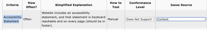
Cookie and privacy policies
Next, Gen examines the site for cookie and privacy policies. Gen notes the absence of a cookie banner, which could be a compliance issue in jurisdictions that require websites to inform users about cookie usage. However, the site does have a privacy policy, which she accesses using keyboard navigation to ensure it is accessible via keyboard alone—a crucial check for users who rely on keyboards rather than a mouse.
Gen does not conduct a thorough legal analysis in reviewing the privacy policy but checks for an updated date and contact information, both common requirements under various privacy laws. She finds some contact information but notes the lack of an email address or any electronic contact method, which she marks as “partially supports.” The absence of an email address in the contact information could limit the ways in which users can reach out for assistance or inquiries, especially for those who prefer or require digital communication methods.
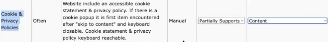
Proper alt text on images
Gen begins by assessing the alt text for images on the homepage. Using the WAVE browser extension, she inspects the images to ensure they are properly described for users relying on screen readers.
She finds that several images, including one containing significant text content, lack any alt text—a clear accessibility failure. Some images that serve as links also lack alt text, making navigation and understanding content difficult for visually impaired users. She marks this test as “partially supports” due to mixed results, noting that the issues are related to content.
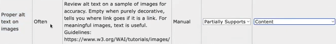
Proper labels on form inputs
Next, Gen evaluates the website’s forms to check if input fields are properly labeled, which is crucial for users to understand what information is required. Upon inspection, she discovers that a label for an input field lacks the programmatic markup needed to link it explicitly to its corresponding input, a setup that should typically include ‘for’ and ‘id’ attributes linking labels and inputs.
Additionally, she notices an image used to denote required fields that fails to provide alternative text or an appropriate title attribute, further hindering accessibility. This form is marked as “failing” due to these significant accessibility barriers.

Proper links and link states
Gen checks the visual clarity and functionality of links, particularly whether links can be distinguished from non-link text and if they display a hover state. She notes that some images used as links lack a hover state, and in several cases, headings and links are visually indistinguishable. This lack of differentiation can confuse users about which elements are interactive.
Although the link states are generally acceptable, the hover states and visual differentiation issues lead her to mark this aspect as “partially supports.” She attributes the problems to content and theme, indicating that the website’s design and content management need improvement.

Clear keyboard focus state
Gen notes that while some links in the banner lack a hover state, they do exhibit a focus state when selected. However, the contrast of this focus state is low, making it difficult to discern, which could hinder the navigation experience for users with visual impairments.
As she navigates, the focus jumps unpredictably from the header to the footer and back, sometimes bypassing the main content. This erratic focus order indicates a failure to ensure a logical and sequential navigation path, significantly affecting the site’s usability for keyboard-dependent users.

Skip link for keyboard users
Next, Gen checks for a skip link—an essential feature that allows users to bypass repetitive navigation links and directly access the main content. Unfortunately, the first element she encounters via the keyboard is the home link, indicating the absence of a skip link. This oversight is marked as a failure, as it forces keyboard users to tab through every navigation link before reaching the main content, which can be tedious and inefficient.

Navigable menu and website for keyword users
Gen assesses the site’s menu’s navigability for keyboard users. While the menu is navigable on a desktop setting, the website’s lack of responsiveness on mobile devices presents significant challenges.
The site does not adjust well to different screen sizes, leading to excessive horizontal scrolling that complicates navigation for users, particularly those with low vision who may rely on zoom functions.
Although desktop navigation is adequate, the poor mobile experience leads Gen to rate this aspect as only partially supportive, attributing the issue largely to the website’s theme, which should ideally handle responsiveness more effectively.
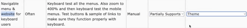
Text sizing with zoom
Gen uses Firefox to test the website’s text sizing when zoomed, a feature crucial for users who need larger text to read comfortably. In Firefox, she enables “zoom text only” to focus solely on text scalability. Immediately, she noticed that the default text size on the website was very small. After zooming the text to 200%, issues become apparent in the header where the fixed height does not accommodate the enlarged text, causing overlap and some text to run off the screen. However, the body and footer content scale appropriately without issues.
Gen concludes that the website partially supports text resizing, with the main problems localized to the header attributable to the site’s theme.
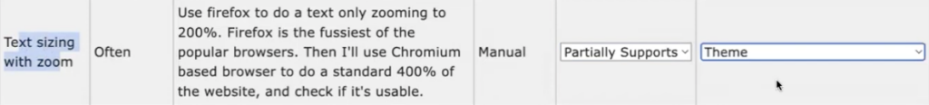
Page titles and headings
Next, Gen assesses the website’s page titles and headings, which are fundamental for navigation and understanding the structure of the content. The page title “E-ZPass New York” is deemed appropriate. However, using the WAVE tool, Gen discovers that the website lacks any headings, a significant oversight that impacts the semantic structure and navigability of the site.
This absence is marked as a content-based failure, highlighting a critical area for improvement to meet accessibility standards.

Color contrast for text
Gen examines the color contrast of the text using the WAVE tool, which is essential for readability, especially for users with visual impairments. The tool identifies two contrast errors: red text on a yellow background and a date displayed on a dark gray background. While the latter initially appears to fail, a closer inspection reveals that the dark gray and light gray combination actually passes contrast standards. However, the red text on a yellow background, though not failing by a large margin, does not meet the required contrast ratio.
Gen marks this test as partially supportive, noting these issues as content-related.

No autoplay, continuous animations, or visually disorienting content
Gen begins by checking for any autoplay features, continuous animations, or content that could be visually disorienting or disruptive, especially to users with vestibular disorders.
She confirms that the website does not contain any elements that autoplay or move independently, which could potentially cause discomfort or disorientation.
Given this, she marks this criterion as “supports,” indicating that the website adheres to best practices for motion and animation from an accessibility perspective.
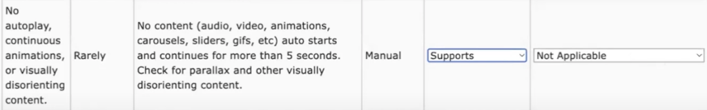
Closed captions and transcripts
Next, Gen examines the website for the presence of media that would require closed captions or transcripts to make audio and video content accessible. She finds no media content on the page, which renders this criterion non-applicable.
Gen explains her rationale for marking the absence of autoplay and animations as “supports” versus closed captions and transcripts as “not applicable.” The distinction lies in being able to positively confirm the absence of auto-playing or animated content, whereas the need for captions and transcripts does not arise without media content.

Quick screen reader test
Finally, Gen notes some issues that affect the screen reader’s effectiveness, which suggests that both the content and the underlying theme of the website contribute to these challenges.
She marks this test as “partially supports,” indicating that while the website may be navigable with a screen reader to some extent, there are significant areas for improvement to ensure full accessibility.

Quick accessibility audit report
After exhausting all the quick audit accessibility criteria, this tool offers the option to generate the report. You get a little summary that tells you one criterion passed, eight partially failed, four flat-out failed, and one was not applicable. Then, it goes into the details.
Understanding the results
What does one page tell us?
Analyzing just one page of a website can provide significant insights into the broader issues that may exist across the entire site. It allows auditors to examine various components such as the website header, footer, stylesheet, and overall theme. Additionally, it sheds light on content issues—how content is being added, whether it’s done correctly or not, and any problems related to website add-ons. This holistic view helps identify consistent problems and areas requiring focused attention.
Look at conformance level of issue
In assessing the conformance level of each issue identified during the audit, special attention is given to items ranked as “partially supports” or “does not support.” These categories highlight areas where the website fails to meet accessibility standards and thus requires immediate action.
Ideally, by the end of an audit, no items should be left untested; if any are found, it indicates a need to revisit those areas. Items marked as “supports” signify compliance with accessibility standards and do not require further action, similar to items deemed “not applicable.”
Look for common issue sources
Once the audit is complete, it’s important to analyze the sources of the issues. Identifying whether multiple problems stem from a single source can be particularly revealing. For example, if several issues are attributed to the website’s theme, it might be necessary to reconsider whether to continue using that theme or replace it. If content is frequently identified as a source of issues, it suggests that the process for adding content needs to be revised to ensure it is done accessibly.
Instead of attempting to remediate all issues at once, the best approach is to refine the content creation and management processes first. This proactive strategy helps prevent future issues while planning the remediation of existing ones. Moreover, issues with website add-ons, like forms, might indicate that the tool is misconfigured or needs replacement, pointing to a need for technical adjustments or new solutions.
What to do next
Based on results decide what to do
Based on the audit results, certain components might need immediate action. For instance, problematic forms can be replaced individually without major disruption, often directly on the live site. Similarly, simple adjustments in theme settings, such as altering the default color for links, can resolve certain issues quickly and easily. These types of changes are preferable as they are straightforward and do not require extensive effort or staging.
What change needs to be made?
Identifying the necessary changes involves a thorough review of the audit findings. This may include modifying the way content is added to the site, which often necessitates training for the team responsible for content management.
For more complex issues, such as customizations that have introduced accessibility barriers, consultation with a developer may be required. An example can be adjusting the configuration of contact forms and educating users about accessibility best practices, such as the proper use of form fields and the avoidance of placeholders.
Get straight to work fixing things
Once the required changes are identified, starting remediation immediately is beneficial. Addressing straightforward issues like color contrast can be done quickly without waiting for a comprehensive audit report.
This proactive approach allows for rapid improvements and reduces the time spent on revising repeated issues.
Multiple pages for Gap Assessment
Conducting quick audits on multiple pages helps in creating a comprehensive gap assessment. This involves sampling various pages, such as the homepage, product pages, and checkout processes, especially in e-commerce settings.
This strategy ensures a broad evaluation of the site, leveraging the templated nature of content management systems like WordPress to make widespread improvements efficiently.
Remodel vs. remediate in place
Deciding between a full site remodel and remediating in place depends on the extent of the issues and the website’s structure.
For sites heavily reliant on page builders, switching themes might provide quick accessibility improvements without the need for extensive redevelopment. This can often be done with minimal disruption and without moving to a staging environment.
Be noisy and speak up about accessibility
Finally, it’s important to advocate for accessibility by providing feedback to plugin and theme developers, especially when their products fail to meet accessibility standards. Being vocal about the reasons for not choosing a particular product can influence developers to prioritize accessibility improvements. This advocacy benefits the individual website and contributes to broader advancements in web accessibility standards.