Modals are one of the most common components that cause accessibility problems on websites and software. WordPress plugins, cookie banners, and other third-party components, often include modals or popups that open automatically or with the click of a button. If modals are not made with accessibility in mind, they can be incredibly difficult or impossible to use for blind and visually impaired or keyboard-only users.
In this tutorial, I’m going to show you just how easy it is to code an accessible modal that is Web Content Accessibility Guidelines (WCAG) 2.2 AA conformant.
Common Accessibility Problems with Modals
Before we dive into how to code an accessible modal, it’s useful to know what problems our accessibility auditing team frequently sees when testing modals. Here are the most common accessibility issues we identify in modals:
- Lack of Focus Management: Focus doesn’t move to the modal when it opens or doesn’t return to the trigger element when it closes.
- Missing Keyboard Navigation: Users can’t navigate the modal with the keyboard (e.g., no support for Tab/Shift+Tab or Esc to close).
- No ARIA Roles or Labels: Modal lacks appropriate roles (e.g.,
role="dialog") and accessible names (aria-labelledby,aria-describedby). - Inadequate Color Contrast: Text and interactive elements don’t meet contrast requirements.
- No Close Button or Poorly Labeled Close Button: Close button is missing, not keyboard accessible, or unlabeled.
- Dynamic Content Not Announced: Updates within the modal aren’t announced to screen readers.
- Improper Scroll Management: Users can scroll background content when the modal is open.
- Small Touch Targets: Buttons and interactive elements are too small for touch users.
- No Trap for Focus: Users can tab out of the modal or leave the modal when using a screen reader and navigating with arrow keys, with closing the modal.
Not sure how to use a screen reader? Check out our online courses on screen reader testing.
If modals on your website or in your software have these issues, they need to be re-coded or remediated for accessibility.
Features of Accessible Modals
Code Explainer Video
Watch this video for a walk-through of the HTML, CSS, and JavaScript required to create an accessible modal. All code can be found in a CodePen embed below.
[00:00:00] Steve Jones: Hi, I’m Steve Jones. I’m here today to walk through how to create an accessible modal. The reason why accessible modals matter is to give equal access to all users to modals. And a lot of times important information and important actions are achieved through modal. So it is paramount that we make sure that everybody can access those.
This modal follows the WCAG 2. 2 guidelines and ensures that the modal is keyboard accessible and screen reader compatible. In this video, I’m going to walk through the HTML structure, including the ARIA attributes that are used to achieve this the CSS styling we’ll touch on for a second JavaScript, and finally, we will run through a demonstration.
Let’s start with the HTML structure that we use to achieve the accessible modal. You’ll see I just have a basic HTML document here. And at the top of the body here, you’ll see that I have a a button. And I have a couple classes that I’ve added to this that I can later on control this with JavaScript and do some styling.
So this is the button, and we want to ensure that our modals are triggered by a button because it’s an action. It’s not a link or a div, unless the div has a role of button. But even in that case, you have to if you set role equal to button, there’s certain considerations that you might have to make in JavaScript to make it function a hundred percent like a button.
So in most cases, you want to ensure that this is an actual button element. So for the down, you’ll see where we have our modal, we got like a modal overlay, and then we have the actual modal. And I want to touch on some of the the aria attribute considerations that you want to use when creating an accessible modal.
Of course, I’ve got a class and I’ve got an ID on this. This just helps me control this. And the first attribute here is a role. And I have it set to dialogue, and this defines this as a modal dialogue. And next I have an aria modal equals true, which tells the screen reader that this is a modal.
Then I have an aria-labeledby. And I’ve set that equal to modal title, and finally I have an aria-describedby, and I’ve have that set to modal description, and those last two those are IDs that they’re pointing to, so an aria-labeledby will point to the modal title, which is here and it’ll allow the screen reader to know that this modal is called accessible modal Title and then an aria-describedby points to the description here, so it matches this id and exposes that description to the screen reader. Further down,
you can see that I just have some kind of example content in this and I’ve chosen to use just a simple form. So I have some form mock up here with the with a couple inputs with Properly labeled labels and a button to submit and cancel. And that is the markup. So next let’s walk through the CSS used in this accessible modal.
What you’ll notice first here, the top most div in our modal is the modal overlay. And we’ve got it set to display none. And this basically just hides all the modal elements on the page. And then below that, we have we have, Modal overlay is active, and this is, if these two classes exist together, then we actually set the display on the modal so it is shown.
And we will do this in JavaScript in the next couple steps, but the modal overlay also has a little bit of a tinted background to give it a little bit of contrast when it opens. This is typically done with most modals, but that’s up to your own preference. And then further down, I just have some standard styling for the modal header and content and the example content, the form groups that I’m using in here, and then some simple button styles.
So we give it a little bit of a a nice look other than, just default HTML button styles. So next what we’ll do is we’ll jump over into the JavaScript so we can see how to actually impend that class. But before I do that I can actually spoof it in the browser just to test that this is working.
If I add the class is active to the modal, you can see that it pops up. So stick with me and we’ll go through the JavaScript and see how we do that. So now let’s walk through the JavaScript it takes to achieve an accessible modal. In our JavaScript file you’ll see that we set up our constants.
We actually initiate the the modal. And what this does is it triggers our binding event, so that we can set up all of our listeners for our buttons and focus dates and things like that. So let’s go down first to the open modal. So this is you click the button to initiate the modal, and this is the function that runs and basically it sets that is active class.
And then it hides the overflow on the body so that the page doesn’t scroll behind the modal. And then we set the initial focus, which is a, which is another function further down here. So when we click on the button, I just don’t want to keep the focus state on the initial button. I want to move it over into the modal to, to help
the user, the keyboard user along, so they don’t click the button and they don’t really know they got to hit tab again to get into the modal. I prefer to just shift that focus state to get that keyboard user into the modal right away. And that’s what this function does here. So we also have a function here called close modal.
When, of course, when the close buttons clicked, or in our case, we also have a cancel button, which is not necessary, but it’s nice to give, especially if there’s a form in there. So it gives the user or the keyboard user or even the mouse user, the ability to click that cancel button.
And then we have our method for checking if the modal was currently open. Then we can get the focusable elements. So why do we need to get the focusable elements inside of a modal? Because in a modal, a keyboard, user’s just going to tab through the elements, the focusable elements in that modal, and without getting those focusable elements, and then setting what we call a focus trap on those elements the keyboard user will hit tab through those elements and then
will just continue down the DOM of the page. And if we’ve already opened up a modal and we’ve already frozen the scrolling of the body they’re tabbing through and they can’t really see where they’re tabbing through and they can lose context to where they were. What we want to do is we want to grab the focusable elements and then we want to set a focus trap.
So if I hit tab. Tab, multiple times. If there’s three focusable elements in there, it’ll go through those, and then just start back over again inside of the modal. And just, it’ll just loop within the modal itself until it’s closed. So I will demonstrate that here in a minute, but I just wanted to explain that a little bit.
So you can see our trap focus function here. This was our initial focus that I spoke about At the beginning of this file, but yeah, so you can see our function for trapping focus is here We basically are just looping through we’re getting the length of the focusable elements and we’re looping through When we get to the end, we just shoot back to the first focusable element So we also want to ensure that when the modal is closed That we return focus back to the button that they use to initiate the modal and we do that with here within the close method. That’s a brief walkthrough of the JavaScript that it takes to achieve this.
And next let’s jump into a live demo. Alright, here we are. We have our accessible modal up live on a webpage so that we can go through and test it. And what I’m going to do is I’m going to turn on my VoiceOver. I use a Mac, so I typically use VoiceOver. So you can listen along.
[00:08:42] VoiceOver: VoiceOver on Brave.
Accessible modal. Brave. Window. Accessible modal web content has keyboard focus. You are currently on a web content inside of a group. To enter the web, open accessible modal button. You are currently on a button inside of web content. To click this button, press control, option, space. To exit this web area, press control, option, shift, up arrow.
[00:09:03] Steve Jones: All right, so we got notified that we are on a button that is a modal and we can go ahead and click that. And I will note before I click that, that from a CSS standpoint too, that I do have focus outlines on all these elements as well. So it’s important to make sure that we have visual focuses as well.
So I’m going to go ahead and click this.
[00:09:26] VoiceOver: Dialogue with four items. Heading level two. Accessible modal title. You are currently on a heading level two inside of a dialogue to exit this group press ctrl option shift up arrow
[00:09:37] Steve Jones: So the screen reader tells us that we’re in a modal. It tells us how many items are in there It read out our title.
You saw that our focus actually shifted into the modal. So we have contacts to where we are on the keyboard, I’m gonna Keep hitting the tab key so we can tab through.
[00:09:54] VoiceOver: Close modal button. You are currently on a button inside of a dialog. To click this button, press control, option, space. To exit this group, press control, option, shift, up arrow.
[00:10:05] Steve Jones: Alright, so we got the readout that we have a close button here. I’m going to continue on.
[00:10:11] VoiceOver: Your name, edit text. You are currently on a text field inside of a dialogue to enter text in this field type to exit this group press ctrl Option shift up arrow.
[00:10:21] Steve Jones: So Since we labeled this is just an example.
This is not necessarily part of the modal has to be part of the modal but I’m using a form here and I’ve properly labeled this input. So the screen reader actually Has context to what that input field is. So we can go on
[00:10:41] VoiceOver: your submit button. You are currently cancel button. You are currently on a button.
Close modal button. You are currently on a button. Inside your name. Edit your email. Submit but cancel button. Close modal button. Your name. Edit text. Cancel. Back your email. Submit. Cancel.
[00:10:58] Steve Jones: So what I wanted to do was click through and see that we are trapping focus and it’s hard with the screen reader, but so let me
[00:11:04] VoiceOver: VoiceOver off.
[00:11:05] Steve Jones: Let me turn that off and we’re do it a little quicker here. So you see I’m focused on the button and now I’m tabbing through. I’m going through all the focusable elements in the modal, and it just returns back to the first one, over and over again. That way we stay within the context of the modal. So what happens when we close the modal?
So let me turn my screen reader back on.
[00:11:30] VoiceOver: VoiceOver on brave accessible dialogue with four items close modal open accessible modal button. You are currently on a accessible VoiceOver off.
[00:11:39] Steve Jones: So you’ll notice that when I closed it. The focus got returned back to the original button that we used to initiate the modal.
I’ll do that without the screen reader just so you can see the flow. So I’m on the button, open the modal, I lock focus, I can hit the cancel button, which is tied to the same JavaScript function as the close, and I return back. It’s read out to the screen reader with the context of everything is, and this is our accessible modal.
So just to recap with a little bit of HTML markup, the proper ARIA attributes some CSS styling, and a little bit of JavaScript, we can create a fully accessible modal that is accessible to all users.
How To Make Modals Accessible
As explained in the video, if you’re coding a modal and want to make it accessible to everyone and WCAG 2.2 compliant, your modal must include the following:
- Proper Trigger Element: Use a native
<button>element to open the modal. - ARIA Attributes:
role="dialog"to define the element as a modal dialog.aria-modal="true"to inform screen readers that the modal is active.aria-labelledbyandaria-describedbyto associate the modal with its title and description.
- Keyboard Accessibility:
- Focus moves into the modal when it opens and returns to the trigger button when closed.
- Users can close the modal with the Escape key or designated close buttons.
- All interactive elements within the modal are focusable and operable via the keyboard.
- Focus Trap: Tabbing cycles through focusable elements inside the modal, preventing focus from moving outside.
- Visual Focus Indicators: Focus outlines are visible for all interactive elements to assist keyboard users.
- Scroll Management: Page scrolling is disabled when the modal is open to prevent background interaction.
When creating accessible modals, the initial structure will be created with HTML and CSS. JavaScript is also needed to manage the modal state, class toggling, and focus behaviors.
Try out the modal from my example video and get the code lower down on the page.
Article continued below.
Stay on top of web accessibility news and best practices.
Join our email list to get notified of changes to website accessibility laws, WordPress accessibility resources, and accessibility webinar invitations in your inbox.
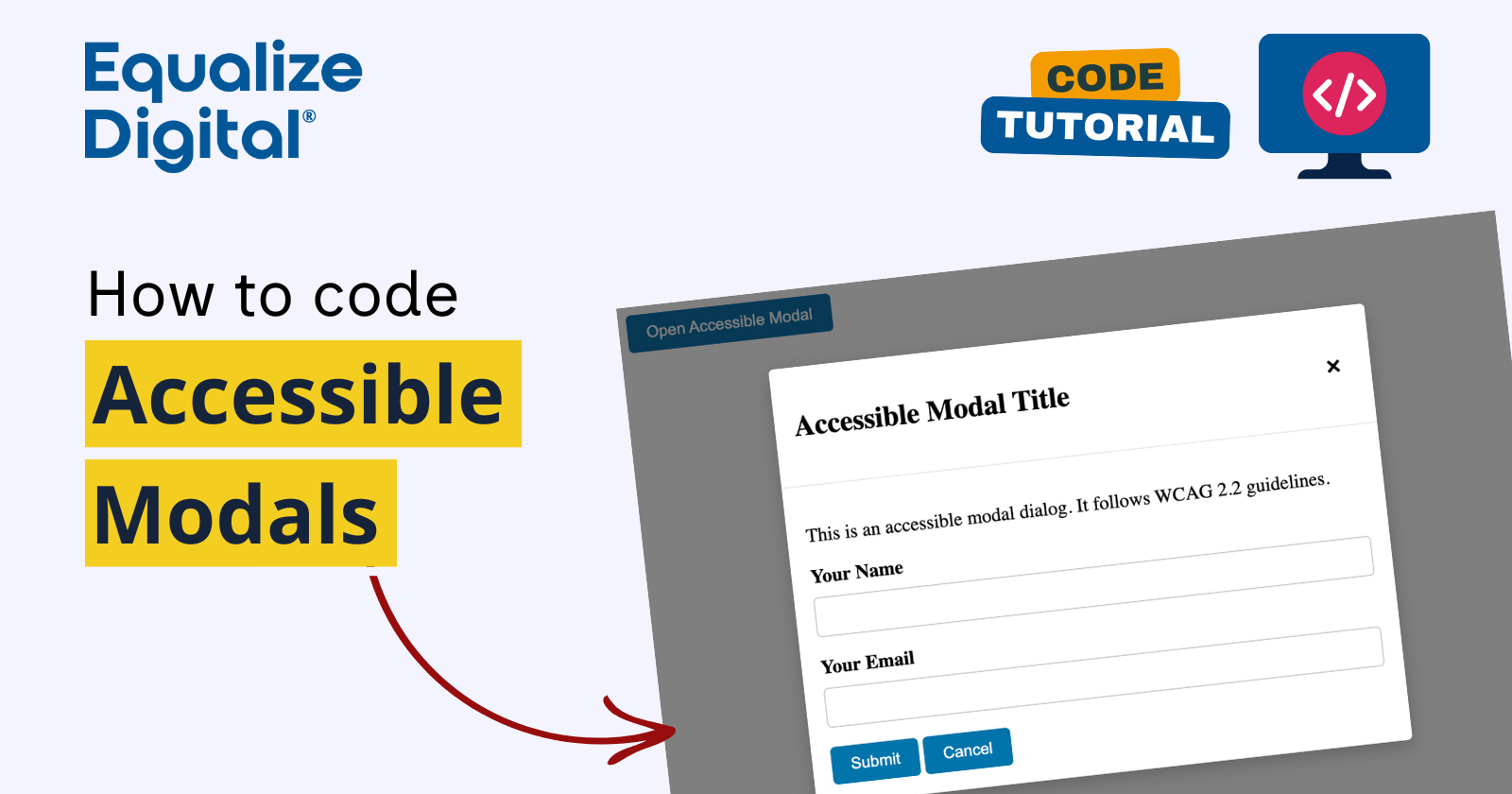
Example of an Accessible Modal
Want to see the example from the video for yourself? Click the “Open Accessible Modal” button to see it in action.
Code for an Accessible Modal
Here is an example of HTML, CSS, and JavaScript for coding the accessible modal shown above, which opens at the click of a button.
See the Pen Accessible Modal Example by Equalize Digital (@equalizedigital) on CodePen.
This example is conformant with WCAG 2.2 AA, as required by many accessibility laws around the world. It also conforms to U.S. Web Design Standards and how modals are expected to be coded on government websites in the United States.
See and edit this Accessible Modal Example on CodePen.
Need help?
Have questions about making your accordions accessible? We offer accessibility audits and remediation plans that help you make your website or WordPress plugin more accessible, as well as one-off consulting engagements. Our Accessibility Checker plugin can help you find and fix many common accessibility problems. Contact us to get started today.