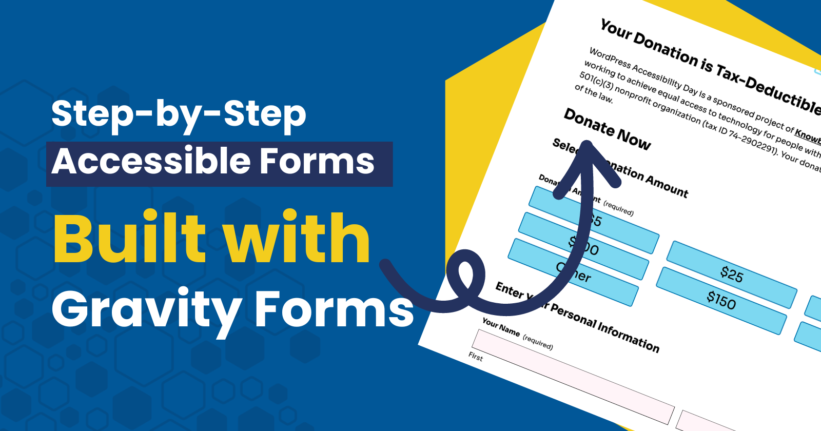
Forms are among the most critical components of any website. They serve as the primary means for users to contact you, request services, make donations, and perform a myriad of other functions. Therefore, it is essential that website owners and managers learn how to build accessible forms, particularly by focusing on Gravity Forms accessibility so that all users (including users with disabilities) can have equal access to this critical functionality.
Learning how to build accessible forms is not just a best practice—it’s a legal requirement. Around the world, various laws in the United States, Canada, the European Union, the United Kingdom, and others mandate that websites be accessible to individuals with disabilities.
This article will explore the importance of building accessible forms and provide practical tips on using Gravity Forms accessibility features to achieve this goal. By implementing some key best practices, virtually anyone can learn how to create forms that meet accessibility requirements and are usable by everyone.
Gravity Forms is a powerful WordPress form builder plugin that allows website owners and managers to build accessible forms without knowing code. Gravity Forms has a longstanding reputation as a leader in implementing accessibility standards in its own products.
Using the Right Tools the Right Way
Using the right tools is crucial when implementing accessibility best practices, but it’s only part of the equation. Simply choosing an accessible form, theme, or page builder isn’t sufficient on its own.
How a website owner or manager configures and utilizes these tools is equally important. An accessible tool can still produce inaccessible content if not used correctly. Therefore, understanding and applying accessibility principles throughout the setup process is essential to ensure that all users can fully engage with your website, regardless of their abilities.
Article continued below.
Stay on top of web accessibility news and best practices.
Join our email list to get notified of changes to website accessibility laws, WordPress accessibility resources, and accessibility webinar invitations in your inbox.
How to Build Accessible Forms, Step by Step
Equalize Digital’s team frequently uses Gravity Forms to build web forms both in-house and for its accessibility remediation customers. We use these exact processes to ensure that any form we build meets common accessibility best practices.
Step 1: Set Up Layout Options
Create a new web form and navigate to the settings area for that form. Ensure that the layout settings for your accessible Gravity Form are configured as follows:
- Description Placement = Above Inputs.
- Toggle On “Validation Summary.”
- Required Field Indicator = “Text: (Required)”
- No conditional logic on Submit Button.

Step 2: Set Up General Form Options
Ensure that the additional form options are configured as follows:
- Toggle On “Anti-spam honeypot.”
- Toggle Off “Animated transitions.”
- Toggle Off “Legacy markup.”

Step 3: Build the Form (Accessibility Tips)
What follows is an exhaustive set of tips and recommendations for how to build accessible forms inside of the Gravity Forms form-building tool.
Prioritize using Advanced Fields (e.g., Name, Time, or Address) where applicable. These advanced fields contain special settings and logic designed to help users complete them in the appropriate manner. Using the wrong field for the job (e.g., multiple short text fields in place of an advanced address field) increases the likelihood that users will get confused, encounter a barrier, or submit information incorrectly.

Paginate long forms. Paginating long forms reduces cognitive load, making it easier for users to process and complete the form. It also helps users who rely on screen readers or other assistive technologies by providing a clearer structure and reducing the amount of information they need to navigate all at once.
Use conditional logic to hide unnecessary fields. Only displaying relevant fields based on user input reduces clutter, making the form easier to navigate and understand. This approach is especially helpful for users with cognitive disabilities or those relying on screen readers, as it minimizes the information they need to process at any given time.

Any required field should be marked as “required” in the individual field settings. This avoids unnecessary confusion and back-and-forth, as users cannot submit forms without the required fields being filled in. If users forget or place incorrect information into a required field, Gravity Forms will output an error message to help them complete the form correctly.

Visible field labels are required for accessibility. Never leave field labels blank, and never hide field labels visually on the front end. Floating labels are OK but less ideal for accessibility overall. Field labels are critical for all users because they help them understand what information they are expected to provide in each form field.

Remember to set auto-complete attributes on relevant fields. This improves the user’s experience by requiring less information to be typed in manually. A robust implementation of auto-complete attributes has been shown to increase conversions. This is particularly helpful for individuals who (for any number of reasons) type very slowly.

For dropdowns, make sure the first choice is always (Select). Leave the value of the default (Select) option as blank/null. This ensures end users can not mistakenly submit the form without making a selection from the dropdown.

Make opt-ins easier for all users. Do not use the Consent field with very long text (i.e., a large contract or privacy policy). Instead, set up the opt-in as a checkbox that includes a link to a dedicated page that houses the opt-in information. Ensure that these links open in a new tab and that the link includes a new window warning.

Step 4: Embed Your Form with the Correct Settings
Always enable AJAX when adding a form to a page. This ensures that error and confirmation messages will load without a page reload and will be announced to screen reader users. Without AJAX, the page reloads, and the user is brought back to the top of the page. This is much less ideal because depending on the location of the form, the user may either have to search for the error messages or mistakenly assume the form was submitted correctly and move on.
Stay mindful of the heading structure on the page you’re adding the form to. Gravity Forms outputs Form Titles as an H2 (heading level 2) and Section Titles within the form as an H3 (heading level 3). Depending on where you place the form on the page, this could create an issue with out-of-order heading levels.

Next Steps for Developers: Enhancing Gravity Forms Accessibility
Now that you have a solid understanding of Gravity Forms accessibility and how to build accessible forms, it’s time to take your skills to the next level. As a developer, there are always additional steps you can take to ensure that the forms you create are not only compliant but also provide a seamless experience for all users, including those with disabilities.
To further enhance your knowledge and implementation of Gravity Forms accessibility, we recommend exploring advanced techniques and best practices specifically tailored for developers. By deepening your understanding and applying these strategies, you can ensure that your forms are fully optimized for accessibility.
For a more in-depth guide on developing with accessibility in mind using Gravity Forms, visit the Gravity Forms Developer Accessibility Guide. This resource will provide you with the tools and insights needed to make your forms more accessible, helping you to better serve all users.
Accessibility Checker Can Help
Equalize Digital Accessibility Checker was specifically designed to help website owners, managers, content creators, and developers find, fix, and prevent accessibility problems on their WordPress websites before they hit publish. Several of the issues we pointed out in this article would be detected by an Accessibility Checker scan.
Remember, if you aren’t measuring accessibility, you aren’t managing it!
