A well-executed designer-to-developer handoff is key to ensuring a website is not only accessible but also stays true to the design that has been carefully and thoughtfully crafted. So, how can a designer make sure the finished website is accessible and aligns with their design? How can designers help developers make the right accessibility choices?
In this session, Danielle explored crucial details that designers should provide to guide the effective implementation of their designs.
Items covered include:
- Communicating sizing and spacing preferences using minimums, maximums, and flexible units beyond fixed widths and percentages where appropriate.
- Defining focal points, overlays, and gradient placement for background images.
- Providing clear instructions for interactive elements, hover states, and keyboard navigation expectations.
- Identifying potential problem areas and suggesting fallback options in case designs shift between breakpoints.
By improving the design handoff process and increasing transparency around key decisions, designers can empower developers to create accessible, functional, and visually consistent experiences.
Thanks to Our Sponsors
Watch the Recording
Read the Transcript
>> AMBER HINDS: Welcome to WordPress Accessibility Meetup, From Concept to Code: Communicating Accessibility in the Design Handoff, with Danielle Zarcaro. A few announcements. If you have not been before, we have a Facebook group that you can use to connect between meetups. You can find that if you go to facebook.com/groups/wordpress.accessibility. You can also just find it if you search WordPress Accessibility. It’s a great place to share things you’re working on, get feedback, help other people, and just help connect with the community in between meetups.
Everyone always asks, is this being recorded? Yes, it is being recorded. It takes us about two weeks to edit the video and get corrected captions and a full transcript, and that will be published along with all of our upcoming events if you go to equalizedigital.com/meetup. The other way to get notified when the recording is available is if you join our email list. You will get event reminders, and also we send out a weekly newsletter that includes news and events from around the web, not just ours. You can sign up for that if you go to equalizedigital.com/focus-state. We also release the audio for these on our podcast and you can find it at accessibilitycraft.com.
I do have a bullet point on here that we’re seeking additional sponsors for the meetup. This is part of the official WordPress meetup program, but the community foundation has told us that they do not have the budget for any live captions or transcripts or any other accessibility features, and they said, “Go out and find sponsors.” If you or your company would be interested in helping to support the meetup and make it accessible for all of our attendees, we would very much appreciate it.
You can reach out to us if you have any suggestions, if you want to learn more about sponsorship, or if you need any accommodations to make the meetup work for you, if you email meetup@equalizedigital.com.
I’ve been talking, but I haven’t introduced myself yet. I am Amber Hinds. I’m the CEO of Equalize Digital and the lead organizer for the meetup. Equalize Digital is a mission-driven organization focused on WordPress Accessibility. We have a WordPress plugin called Accessibility Checker that scans for accessibility problems and provides reports on the post-edit screen to make building accessible websites easier. You can learn more about us at equalizedigital.com. We are at Equalize Digital on many of the social medias, not all of them, but many of them. That’s where you can go if you want to learn more about us and what we’re doing. Our plugin does have a free version and we always love feedback on it if anyone gives it a try.
We do have a sponsor today for our live captions, and that is GoDaddy. GoDaddy’s mission is to empower a worldwide community of entrepreneurs by giving them all the help and tools they need to grow online, including a simpler, safer WordPress experience. GoDaddy provides a managed WordPress experience that is as easy as it is effective. The latest version of WordPress comes pre-installed with exclusive themes, plugins, and tools to get you up and running quickly with automated backups, updates, and malware removal so that all their pros can spend less time on monotonous maintenance and more time building their businesses. You can learn more about GoDaddy if you go to godaddy.com.
I also always like to encourage people, if you are on socials and you are willing to tag a thank you to GoDaddy for sponsoring captions, that is very helpful. It encourages them to want to continue sponsoring our captions, so we would appreciate it if you would be willing to do that wherever you are most active on social.
I want to tell you about a couple of upcoming events. Our next meetup will be on Thursday, April 3rd at 10:00 AM Central Time, and that meetup will be called Accessible Firebrand: Why Can’t I Use My Brand Color There? If Not There, Then Where? That will be presented by Mark Alvis and Deneb Pulshiper. Then on Monday, April 21st at 7:00 PM Central Time, so the same time slot next month, Shannon Towell will be presenting on UX, UI, and Accessibility: The Perfect Trio.
I also want to call out that I am doing Accessibility Remediation YouTube Livestreams, which you can find if you go to the Equalize Digital YouTube channel. These are Thursdays at 11:00 AM Central Time. If you’ve ever wondered what it looks like to take a website that has accessibility problems and fix those in a– I’m going to call it a semi-code kind of way, because it’s all in the editor using maybe code snippets or settings, rather than doing a lot of really complex coding in a local install and GitHub versioning and all that kind of stuff.
It is my attempt at trying to show you how approachable accessibility remediation can be. You can tune in for those live or you can find the replays on our YouTube channel.
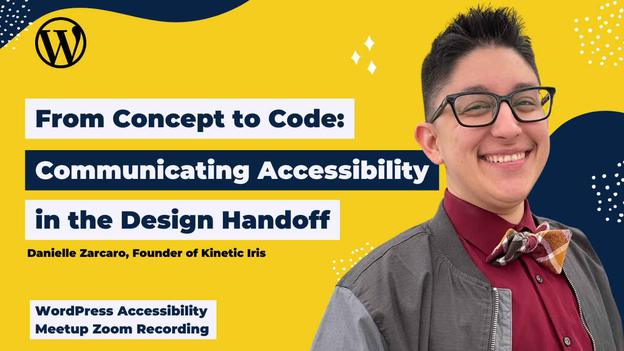
I’m going to add a spotlight and introduce our speaker, Danielle. Danielle is the founder of Kinetic Iris, a web development studio that partners with digital agencies to deliver expert website accessibility and development services for both new and existing websites. A lifelong night owl, they have recently taken up crochet, which has proven to be an excellent way to unwind and disconnect from so much screen time. Welcome, Danielle.
>> DANIELLE ZARCARO: Thank you. Thanks for having me.
>> AMBER: I’m going to stop sharing. I’m going to let you take over. While we are doing that, I will give just a quick announcement that we are going to be using the Q&A feature in Zoom. If you have any questions during the meetup, please do post those there instead of the chat. It’s a little bit easier for us to keep track of. Then I’ll be back at the end to pass those along to Danielle. Thanks, Danielle. Take it away.
>> DANIELLE: Cool. This is From Concept to Code. It’s mostly going to address the ability to communicate different efforts to make accessible websites at the end. I noticed that there is a question already about making that handoff itself accessible. I don’t have anything specific in here about that, but I would love to try to address that at the end and see what we can come up with together.
When you’re creating a design independently from the development of the site, there’s some steps that you can take to make sure that your design gets built in a way that’s not only staying true to that design that you worked so hard on, but that it’s also done accessibly. It’s also going to come in handy if you’re the one doing the design and development in the browser. I know that happens a lot. These are all things that you’re going to be able to keep in mind as you’re going through that process.
Some of these things might seem like overkill or common sense. If you always include this information in every build, shouldn’t everyone know this by now? Why do we have to keep doing this? It’s going to be helpful to include these things either as a reminder or for reference or in case someone on the team is new and might not know, it’s just going to make things easier.
If you’re a developer, these are things that you can ask your designers to give you, either starting small by asking for one or two things, and then going from there, or just outlining everything that you’re going to want from them, and if they’re willing to work with you, and work together to be able to have all the information that you need in order to build an accessible site, rather than trying to fill in holes off the top of your head.
I’m a developer, and so I know that if I’m given a design, I somehow never get it quite right, especially when it’s like a hover color or some kind of icon change on hover. If it’s not given to me exactly as it should be, it’s just my brain isn’t quite wired to fill in those holes that are in the design. All of this is going to make the process easier for everybody involved, and hopefully limit the revisions at the end, which is my least favorite part of any project.
Whatever your situation, developers can use the information that designers give to make those informed decisions, and hopefully, like I said, reduce the need for revisions, and the accessibility remediation at the end of a project. Again, we’re trying to just infuse accessibility into every part of the process. We’re building the components to your components. It’s like a pre-components situation. We’re going to be building systems for color, typography, spacing, adding additional context, all of those things, and so let’s just dive right in.
First up is the color combinations. We want to make sure that we’re providing what you can and can’t use together. This is probably the most common thing. I like Figma. It’s pretty easy for me as a developer to take a look at and use, and so that’s what I based my research on for this. It’s one of the most common things that I saw. I saw four right off the bat that provided this type of color matrix. This is typically what I’ll get. I’ve gone into my Chrome and we’re in that Figma community things, resources that Figma makes available to you that you can then just open right up in Figma.
Now, we’re on one that’s called Free Accessible Design System, but they don’t actually have what can go on what color, foreground, background, any of that. This is typically what I’ll get as a developer, a list of all the colors, some swatches, and the hex codes, and all of that. That’s fine, but what’s even better is having, for example, this Untitled UI one. That’s actually its title, it’s Untitled UI. One of the things that they give is a starting point for creating the color combinations and then also putting in the contrast number and whether that passes AA or AAA.
You can see certain ones in the middle, they don’t have any because they don’t pass color contrast. I think an improvement to this would be not to include those at all, but in case somebody wants all the information possible, you have that available to you. This way, if somebody does need to pull from, “Oh, we need this component and I happen to need some other color,” or whatever it is, now you have all the color options available to you rather than having to then go generate– The developer has to go and generate their own color matrix and then everybody is doing the same thing multiple times. This just puts it all in one place.
Another one that I noticed was Wedges. It took me three times to try to download this. I think there’s a problem with the link that they give you, but I did manage to download it. They have one available as well. They have one actually on light mode and dark mode. You can get a good feel for the colors. If you Google like color matrix, there’s tools out there where you can input your color palette and it spits out all this information. This one doesn’t have any that don’t pass contrast and they give you light and dark mode. Then it gives you the amounts that maybe we want to stay away from this one because it’s too close or something like that.
Anyway, this is, I think, a really great way to take it a step further when you’re doing a handoff to just account for any possible scenario where somebody might need a color combo. Then there’s two other ones that are just contrast grids. There’s one that’s color contrast grid for Figma variables and then Harmony accessible UI color palette. That one uses the, I forget what it’s called, OKLCH or something like that.
I’m not a designer. I don’t know what all of these things necessarily mean and if they’re better or worse or whatever. I don’t know what these numbers mean, but it was a color matrix that I found. We could always go into more detail about these. I don’t think this is a version that is the same as hex. It’s based on brightness, colors. This is just another option if that’s the way that you design things.
One thing I do want to mention is on my slides here, you’ll have my info @queerdevperson. That’s on each slide up in the left. That’s where my social handle for as many social networks that I could get. Then on the right-hand side at the top is the link to the slides. That’s going to be kineticiris.com/wpa11ymeetup. That’s going to give you all of these links. You can just take a screenshot of that, go to it, and bookmark it. This way, you don’t have to worry about missing any of these things.
That is my recommendation for colors. You’re usually already putting together some kind of palette and then so just take a step further for your own benefit and for anyone you’re handing this off to, they get the colors that work with the brand. Then this way, that also gives you the opportunity to come up with alternative accessible colors if that’s necessary, because a lot of times, the color combos don’t work.
For sizing and spacing, I find that Figma allows you to pretty much use whatever unit that you want. Some things to make it easier to fit within the standards of not only minimum and maximum font sizes but also scaling, when would a font size be too small or too big for any given heading or paragraph or anything like that. Two of the ones that I– I called it United, but it’s actually, I noticed, what was it called? Untitled. That’s actually Untitled UI. I’ll have to edit that. On this slide, it says United UI, that’s the Untitled UI from before. I guess my brain didn’t like that it was Untitled, so I gave it a title.
That one and Wedges both had typography options. I think at least Wedges did it in REMS, which is good. There’s a lot of info out there about making your font sizes scale, but there’s also caveats to a lot of things, especially when you’re using Clamp and making sure that font sizes don’t get too big or small or overlap. A person that I use a lot for dev-related things is Josh W. Comeau, I think is how you say his last name. Again, this link is going to be at the URL, kineticiris.com/wpa11ymeetup.
He has a link that, I think, does a really good job of giving you enough technical information if you want it, but not too much that you’re overwhelmed. He’s going to go into some details about why you might not want to use REMS for padding and how to go about using Max and Clamp in a way that’s accessible. Designing in values rather than fixed pixels and using line heights that get as close to that 1.5 line height that we’re striving towards, but just not setting it in fixed pixels because if you’re giving me a font size of 18 and then a line height of 18 pixels and then a line height of 28 pixels, well, in order for me to be able to develop that in a way that is most accessible, I now have to either go to a line-height generator or do the math in my head.
That’s just so much room for error when, in Figma, you can just hit that setting and just do that either on– It’s the REMS, but you don’t have to include REMS. If it’s just 1.5, that’s just going to make life easier for everybody. Then just make sure that we have the right ratio. Avoid going to that pixel default.
Another thing that I see is you have this list of all your headings and your font sizes and the font families and the line heights. Well, just another thing to include in there is an ideal minimum or maximum for that. We’re scaling this and we want to make sure that it goes to at least 200%. We have that minimum and that maximum, but I can’t make a decision for how small a font can get as long. As it fits within readability standards, I don’t really know if your H3 is too small compared to the paragraph text. Giving me that ideal ratio of all of these fonts is really going to be helpful when I’m going in and coding them.
Next up, we have some images. It’s interesting because images I find overlap the most between developer, designer, content, strategy, all of those things. It’s hard sometimes to decide who the responsibility falls on for a lot of image accessibility. Aside from the traditional making sure that there’s enough opacity behind the text for that image, what else can a designer do when it comes to these images to help their developers make informed choices?
First, if we’re talking about background images, and I just wrote a blog post on internationalization. This was something that I realized I hadn’t considered enough. I have two screenshots here. One is a left-to-right version where English, different languages that you read left to right. You have your white gradient over the image into the transparent so that you can see this person reaching for some stars. Then you have a heading and some subtext.
Then next to that one, I have it where I tested in my– I have a browser extension that mimics right to left languages. The only thing that changed direction was the text. You have the heading in the text over on the right side, but the gradient didn’t follow that. Now, there’s some color contrast issues because the text is on top of this blue color. Now I have to worry about if it passes color contrast and all of that stuff because that gradient didn’t flip with it.
This isn’t something that you can always necessarily anticipate or that you need to spend time doing. If you’re not targeting a language that’s right to left, it can be hard to advocate for putting hours into making sure that this works, but it could be something that maybe together over time you start to implement where you’re detecting whether these languages exist and what you as a designer want to happen.
If I take this gradient and I flip it with that text, well then you’re still going to have that other side of the image be visible instead of this person reaching for the stars. The other side of this image is just a blue background with the rest of the stars. Is that an ideal experience or do we need to somehow figure out a way to flip this image or do something else in order to make this the ideal experience that you’re expecting as a designer? It’s just something that I came across that I don’t know that I necessarily have a full use case for in terms of a project, but you never know what somebody’s first language is.
If somebody wants to read this in a right-to-left language and that’s their browser default, you just don’t know. It’s something to at least consider going forward as something to maybe think about. This is also relevant to responsiveness. A lot of times, the height of a div is fixed, but the background needs to fill the whole space. What part of that image do you want to see in the center of that? What part am I focusing on? This is something that I have to guess as a developer. Am I fixing the top of the image or the bottom of the image? Am I trying to make it fill it or am I scaling it? What’s happening to this image if the height or the width of that box changes?
That’s something that could really benefit someone like me, someone who’s a developer. If it’s an image like this, it doesn’t have to happen for every image. If you have an image where it’s a person’s face, that’s pretty obvious, but is it? Maybe it’s an image with a person’s face, but also a desk and then things behind them. Do we know what part of this image you want visible all the time?
If it’s something that maybe you’re seeing miscommunications or it’s something that you’re constantly having to adjust, it’s just super easy to add a little comment and figment and be like, “Keep this visible as often as possible.” That’s just something that I don’t think I’ve seen very much in the handoff that I personally would love to see more of. That’s just some background image information.
Also, along the lines of images is icons. You might not as a designer know this, and that’s okay, but a lot of times, you’re getting information from some kind of content or strategy. It might be easier for you to discern whether an icon is decorative or not. As a developer, I’m really having to guess a lot of times if this is relevant to the content in some way. It’s not always as straightforward as an image would be where it’s either repeating content so we can hide it or it’s like a circle, and so we know that it’s decorative.
If you happen to know on some level that this should have an empty alt or especially if it’s an SVG and should have ARIA hidden on it, that’s a really helpful way to call out that behavior. The earlier that you can build this into the process, the better. I find that a lot of times with SVGs, if they’re not being included as in an image tag, they get forgotten. They get read out in a weird way in the screen reader, but it should actually be hidden or have some kind of alternative text explicitly added. Whereas for an image, it’s a little easier with platforms because they have the alt text box right there.
That’s just something I wanted to call out. A lot of times when I’m getting designs, they’re just templates. It’s like a blog post template or a homepage. It’s not quite the final content. We don’t really care about alt text yet, but there are a lot of times where it’s like, here’s the page and build it. It’s all the final content images and things like that. Again, you’re getting that handed off from you from content. Maybe you can have a discussion with content like, “Hey, can you guys write the alt text for this as well? Then I’ll pass that on to the developer.” Because it’s a skill in itself, writing alt text. I can describe the image, but I’d also have to read the content and understand what the purpose of the image is.
It’s just easier if the person writing the content can also tell me what the purpose of the image is, even if it’s not the final text, it’s just less likely to get forgotten if you can include that info in the handoff. Whether that’s in Figma or in some kind of additional document, whatever it is, this is really helpful to have because there’ve been times where I know that I’m adding images to this page and I’m like, “Somebody’s not going to remember to put alt text in this and I’m going to have to remember to go back to this.” If there’s not a checklist at the end of somebody’s process, where it’s ready to get launched and we’re making sure images have alt text, it’s going to get missed.
Those are the image call-outs that I wanted to make about the design handoff. It’s hard to know whose job it is, but the more you can do, the better. It could be a situation where everybody on the team sits down and talks about what this means and when are icons important? When is it by itself? When does it have text associated with it? Is it a cart icon? All those things, all those scenarios, that could be something that you all get together and discuss as a team.
Next, we have links and buttons. I would say this is also a pretty popular one in Figma. I do have a lot of questions on here on the slide. I’m not going to read them all word for word, but we are going to touch on each of these. Again, there’s a PDF version on kineticiris.com/wpa11ymeetup that could give you these questions word for word, but I am going to hit all of these things. I just know that sometimes it’s easier for people to follow along if they are given the things that I’m going to hit.
This is a pretty popular thing with Figma frameworks and things. The ones that I showed you do have buttons and links as a starting point for you to use and just input your colors and it’ll update it. One thing I did notice was that a lot of the disabled states that they give you don’t pass color contrast. Just make sure that all of the things that you’re doing don’t include a disabled state if you don’t need one. I find it almost never is needed. That’s a situation where don’t give too much information if you don’t need it. That’s something I wanted to call out about, these Figma frameworks where sometimes they’re giving you too much. Just get rid of it if you don’t need it.
Things like hover and focus, what should a button or link do on hover and on focus? Are we going with the outline? Are we going with a different background? Are we going with something happening on hover? Are we underlining our links and then removing the underline on hover? I strongly dislike having to guess what somebody wants to happen on hover because there are so many options. I’ve done it so many different ways and I never know which one somebody wants. It’s just so much easier if you just tell me.
This also applies to things that change state, so a play or pause button. If you’re including a video in a design, background video, whatever the video is, it should include that play pause button. A lot of times, I’ll get the video with a play button. I’m assuming that if it needs to pause, then that’s going to switch and give me a pause icon. If you can just give me that. In Figma, there’s that dropdown that gives you the different states where you can choose from default and hover, choose from play and pause, choose from open and closed, default selected for fancy dropdowns and things.
If you’re including something that does something, what happens after you’ve done that thing? Thinking through all of those things is going to help make it align closer to that design rather than having me try to figure it out. I do my best. We all always do our best, but it’s just going to be better. It’s going to come out better if you tell me what you want it to look like.
Another really complex-ish element in these designs is cards. You wouldn’t think it’s complicated. You have all of the info inside of a box that has an outline on it. What items are linked? Is it the title? Then you have some categories in there that needs to be linked with a heart for favoriting features. Are we having to link one thing inside of there? Then when you hover over the whole card, you’re going to be able to click. Is it going to have a title and a button linked, which means that I have to then hide the button to screen readers so that they don’t get two links that are the same thing?
There’s all these scenarios for this one little component that’s just going to make it easier if you let me know what item is linked and what’s happening in here. Have the whole thing linked? What’s happening on hover? What’s happening on focus? Because I need to make sure that if there’s an outline, does it overlap with the item next to it, or does it go in the right way? All of these scenarios that are just with this one tiny card thing. Again, that’s where that focus element comes into play. If you have images associated with this card and does the layout change on mobile, and then we have to have a different aspect ratio for that image and all of that stuff.
As much info as you can give about these interactive elements, that causes the most, not stress, but the most unknowns in these things because I can make a decision and maybe you don’t care. If you don’t care about something, honestly, with a component like a card, just say, “Do what you think.” Put a little note like, “However you implement this is fine.” Sometimes ask your developer that you’re going to hand it off to, “Do you care if I don’t care?” Then sometimes they’ll be like, “Whatever. I’ll just do whatever.” If you know what you want, then tell me.
I think honestly that if you’re going to create a page with some dummy or demo content on there, I would still stay away from using click here or this is read more. We’re trying to mimic a real scenario. Include a sentence that says, this is a link or something that mimics the real thing just to get out of the habit of– By doing that, it almost makes it more likely that someone might follow that and then use the words click here or something like that. I would just make sure that any demo content you have in there still follows best practices.
Then again, with buttons, aside from hover and focus, give an example of a minimum button size and a really long button text. This is another one that I came across in my internationalization blog post where some languages have a single symbol for something that we might have three words for. Being able to know what the minimum button size is, is going to be really helpful when I’m going in and coding it because the requirements are, what, like 24 pixels? The button’s not going to look right if it’s just a square. It’s not going to give that same signal of button. What’s that minimum button size that you want? Then what does the button do if the text is too long? Because you can’t account for every scenario.
A lot of times, I’ve seen developers put in no wrap on white space. That’s just going to make all the text bump out the side because you’re trying to get the design right on the hover that shows an icon and does all this stuff. The way to implement that is to make sure that it stays this height specifically. If you start to design in a way that is a little bit more flexible, then I can implement the button in a way that is flexible as well.
Then along those same lines, making sure that if you don’t have a specific hero design or page design that has two buttons or interactive elements next to each other, make sure that you’re giving an example elsewhere, maybe in the intro docs where you’re putting your color palettes and your font sizes. Also, give an example of buttons where I have this much space between two buttons that are next to each other or on top of each other. I have a minimum height of this for my accordion item. Just having these parameters around things is really going to make things a lot easier to future-proof the site and make sure that if somebody adds something to the site that you’re not expecting, that it still is going to account for those scenarios.
Let’s see what’s next. We have forms next. Again, another Figma thing that I’ve seen is they do a good job of giving you different states. You have the regular form field and then they give you an error state. I need to know what color red do you want as the border. Am I putting the default regular red? Is there a brand red? All of these decisions to a designer might seem obvious. To a developer, it takes that extra second. Then now I have to think in a different gear in my brain and it messes up a bit of a flow.
What are we doing for required? Are we using the nice and simple required text, or are we using the asterisk that needs a little bit of more consideration when I’m developing the form? Are we using any special, which I don’t enjoy, special kind of checkboxes or radio buttons or things like that? What in this form do I need to fix or style or anything like that? If at all possible, if you have any kind of interest in making sure that the form is going to follow the expected user behavior. If you’re more of a user experience expert or you have some of that knowledge, it could even be helpful to include the type of field. Some are obvious like text and email and things.
There’s a finite list of autocomplete values that help. It’s like autofill values that help a user fill out a form. If you’re asking for a company name or organization or job title or something like that, it could be helpful to make sure that that gets implemented to put that in with the form that you’re filling out. That’s a little bit more of a techie thing. I wouldn’t necessarily fault you for not including that, but it helps it not get missed.
Even if you’re just adding a note that says, make sure to look for autofill values where appropriate. Just a little something to signify that this is a thing that we have to do. Just like you add in a checklist, your launch checklist, you know how to do all these things, but you got to check it off to make sure you do it. Adding a little message there, make sure to include autofill values, that could be something that’s really helpful to signal to the developer to go into that extra setting and implement that.
That’s kind of it with forms. The other thing is I like giving users the summary at the top of a form if there’s errors after they’ve submitted it. Is that something that we’re including? If so, make sure you include that at the top of the form. Are we giving them that sort of message at the top? All of these scenarios that you have options for in these forms, it’s like you’re just helping narrow down all of these possibilities that I can choose from as the developer and giving you what you want out of it.
Some anticipated features. If it’s a company or an organization that might put out a blog post with a complicated table or a graph or some kind of chart or something that’s complicated, is there going to need to be some kind of table description or image description on these things that I need to make sure that I create a style for and make sure that it works appropriately? We try with base styles to account for all of these scenarios, but sometimes it could be a paragraph tag that is inheriting a font size that isn’t right. It’s just a thing that not all sites are going to need something like that necessarily, but maybe a user has an image and then happens to add a caption for any kind of reason.
There’s a number of reasons why you’d add a caption. It’s just to make sure that you’re accounting for all of these different scenarios that could happen given the client, the business, all of the possibilities that might happen. It takes literally maybe 15 seconds for me to add it, check it, and fix it if it’s not, but it’s not something that I might think about if it’s not there for me to see in the design or it’s something that I might not know if it needs to change. Maybe it’s totally fine as just a regular paragraph. How much space should be underneath it? I don’t know all of these things off the top of my head. It might be helpful to give a developer a little bit of extra info on some of that stuff.
It’s also worth learning, in relation to forms, what form fields are accessible and which ones aren’t. If you’re showing a client, maybe they have this form that they need people to fill out and it’s a big part of the redesign, and so you’re suggesting a date picker. Is that necessary, or can we just include a field where they enter a date? There are so many things that can happen with date pickers and date formats and the accessibility of a given calendar pop-out and all of these things. If you’re giving the client that option without them asking for it, it complicates the development side when it probably would have been just as easy to just add a text field and everybody would have been happy with that.
Don’t overcomplicate things if they don’t need to be. Learning a little bit about forms, form fields, different accessible statuses of what takes an extra JavaScript library to implement versus what’s built into the browser, and things like that. If you’re not sure, always reach out to the developer and be like, “Hey, I was thinking of suggesting this. Is this a good idea?” Then I can be like, “Here’s some other ways that maybe we can implement that instead.”
Some additional context is really helpful as a developer if we’re doing anything beyond the basics. There are some things as a designer if you have some base-level accessibility knowledge about heading levels, for instance. I think the next slide, I actually do have an example of what I’m talking about. Yes. Something like this eyebrow pattern that people seem to like to use. When should we use certain tags? A lot of times, it’s going to be totally obvious. I don’t need to know what every heading tag should be, especially because, in Figma, you can name your different font styles. If you’re using the H2 style and it looks like it should be an H2 on the page, I don’t need you to point out every little thing.
Sometimes adding too much can be annoying and distracting and just in the way. With stuff like this where maybe it’s not so obvious, what are we doing here? There’s a lot of ways that this can go in terms of coding. You have small text on top of big text. Are we taking that eyebrow and making that the H1 on the page? Because this is a hero area, so is that the H1, and then underneath that is just a paragraph that looks big? Are we sacrificing that visual order for a more explanatory DOM order, or are we sacrificing DOM order for visual order, where maybe in the code, the bigger text is actually the H1 or H2 so that the code is on top and the eyebrow text is on the bottom, and then we’re switching the order, which I don’t always love?
This is a less-than-ideal situation in terms of having to mess with the expected experience, but it’s not the end of the world. I just need to know which is which. What do you want in this? What’s the expected thing? There’s always the chance that it could change based on any given page. If you’re designing page by page, maybe you do know that on this page, it’s going to be this. Try to stay as consistent as possible and just give me the information that you know. Again, this is a content thing that I might not feel comfortable making the call for, and I might not know what the better option is.
Then something else would be helpful to know is if something should be a list. Sometimes there’s three boxes that are call-outs on a page. It’s like features that this business does or services they offer. That probably doesn’t need to be a list. Maybe it could, I don’t know. Like an archive page that has all of the blog posts, maybe it should probably be a list. If that is something that you feel comfortable making the call on, that’s going to get rid of any ambiguity and make sure that you’re providing the developer with the expected experience. Again, that’s a little bit more technical. You do have to be somewhat comfortable with deciding what should be a list and what shouldn’t.
If you know what, or you think you know, or you have a suggestion for what element something should be, then definitely let us know as a developer. Then if we’re confused, or it doesn’t make sense, or it doesn’t seem right, then we can always reach out. If you want to eliminate ambiguity and just make sure that things are done right, if you know something should be in a list, make it a list. If it’s something that is call-outs that are horizontal and it’s a list that just doesn’t have bullets, it has an icon, make sure that you’re telling us that we should be hiding this icon and make it a list and that should be done in the CSS or whatever it is.
If there’s these patterns that you’re seeing or that you’re hearing that could be done in a more accessible way, make sure that you’re letting us know that. A developer might know these things. I think ideally, as a developer gets exposed to these accessibility patterns and things that tend to happen each time, like hiding an icon when it’s used as a list kind of thing, they should know that. Maybe they don’t. Maybe this is the first time they’re hearing about it. This way, it ensures that consistent output.
Also, what I’m talking about here doesn’t cover complex things. If you have an e-commerce site, the most important part about that site is making sure somebody can check out. This heading order and all of these things are going to be super important and all of this matters, but that’s going to be most important, making sure that somebody can check out. Those are things that if you’re designing a checkout experience, a lot of times that’s going to be defined by the platform.
As a designer, maybe you’re looking at what is the most visually appealing checkout experience. It’s just making sure that that lines up with an accessible experience for somebody. That’s when you get into these buttons and being able to tab over to things and all of these things. I just wanted to throw that in here that I’m not accounting for every scenario. These are just things that if you’re creating as a designer or you’re a developer requesting these things, these are going to make everyone’s lives easier so that you can then focus on the more advanced features of a site.
Include some inspiration. We’re trying to provide, basically, transparency by giving information behind some decisions. Why is this eyebrow up here? I don’t know that I care as long as you give me the info, but if you’re not sure about a thing, one thing I did want to call out. For instance, this is a good thing about transparency and making sure that I have as much information as I possibly need. I went to the previous slide. We have this image here that’s giving an example of that hero pattern with the eyebrow text and then the text that looks like a heading and then some paragraph text.
There’s a background image, and then there’s some lines under it. This person is telling me those lines that are at the bottom should be separate from the background because maybe they want to be able to update one and not the other or whatever the reason is, that’s what they want. You’re giving the information that I need in order to give you what you’re expecting. Rather than assume that I know because they’re two separate assets that they need to be coded in there so that you can upload them separately, I might just assume that you had two separate assets and that you designed it in Figma that way and then now I need to export the whole thing.
Another thing is if, for instance, this background image did need to be exported as one image, do you want me to attach the bottom of the image? Is that important that you see those lines or is it important that the image is centered? That’s another example of what I was talking about before about background images. There’s all of these scenarios that I’m just guessing at as a developer.
If you’re giving me, this text might become kind of long and so we want to make sure that the bluish color that’s here in this background image is behind this text rather than the lines. You telling me what is important out of this image is going to tell me how much padding I need to add on the bottom of this section. All of those things, the more information, the more transparent you can get about some of these things, the better.
Providing some inspiration. If you happen to find something on the internet that you’re using as your basis for some kind of component or something, just let me know. Here’s an image example of somebody giving me focus states and they’re showing me a button on a light background and a dark background. They’ve given me not only that there’s four pixels between the element and its border and the color that it should be on light and dark backgrounds, but they’re giving me the example that they used as this.
Maybe if I’m somebody who hasn’t done a dotted outline before or if it’s supposed to be this very specific dotted outline, because sometimes browsers, if I’m using the built-in CSS like dotted border, it might not render exactly the same. If you’re very particular because this is a brand element, well, then you can give me that test example and I can take a look at what you’re talking about. I can then see what is most important to you in this element. If you ever have any kind of inspiration, especially for interactive elements, interactive elements are a big one. Figma makes it really easy to make things fancy and animate, but it’s not always the easiest to then recreate and make functional. If you have any kind of actual inspiration, always include that kind of thing.
Our intention is obviously to empower everybody in this process to feel confident in the site at the end of this process. Designers want to make sure that their design is being created in the way that they intended. Developers are trying to make it functional and everybody wants to make sure that everybody can access it. Providing as much information as possible, making sure that you’re covering as many bases as possible. That’s going to make everybody, I think, the happiest in this process.
This last resource that I have, I actually came across this as I was doing research. I found it interesting that her stuff overlapped with my stuff a lot. Some things might be overkill, like she mentioned, including a focus, like a tab order and everything. Unless that is really important for some reason, I would leave that up to the developer. I think if you had a preference in a two-column layout where you have a sidebar and a main area and you want the focus should go to the main area first and then the sidebar second, that’s totally fine, but I wouldn’t get granular unless there was a real big reason for it.
This is an amazing guide. She has presented this a couple of times. I would definitely check that out if you find this stuff helpful and you want to learn more. It’s stephaniewalter.design/blog/a-designers-guide-to-documenting-accessibility-user-interactions. It’s a long URL. Again, just go to the slides. I have this link there listed. That’s going to be it for this. Hopefully, I didn’t go on too long, and that we still have some time in case somebody has questions. Let me know.
>> AMBER: Thank you. Let me see if I can find myself again. There we go. Thank you so much, Danielle. That was great. We do have time for questions. If anyone wants to put them in the Q&A panel, I’d be happy to pass them along. I thought it might be interesting as you were talking about notes and stuff. If you don’t mind stopping sharing, I pulled up two things because I always think it’s interesting to hear how different people do it. I have two Figma files that show maybe some evolution and some different ways we’ve handled dev notes. I’d be curious to get your honest reactions to them. I can share my screen.
>> DANIELLE: I love that.
>> AMBER: All right. Let me think. I think one of the things that is really hard is trying to figure out where to get notes. For a while, we used to have a lot of them on our tasks. In a Basecamp project, we’d have a big thing with dev notes for each page. They would have huge sections. Maybe in a minute, I can go try and dig one of those up. Then I was like, “No, there’s some stuff that is just so much easier to say on a file.” What I’m showing right now is the NursePro Plus, like a homepage for their knowledge base. In this one, we’ve literally gone through– This is the thing I’ve learned. Sometimes I have to tell developers what heading level to make in.
>> DANIELLE: Yes, that’s what I was saying. It’s like, if you want to be sure that it’s going to be done right, then throw it in there.
>> AMBER: Yes. There’s comments on each one. That’s an H1. This is an H2. These just say, “This should be an unordered list,” because it doesn’t have bullet points. We’re like, “Let’s not assume that a developer will know that this should be a list.”
>> DANIELLE: It’s not even that a developer should know. It’s just there’s this millisecond of stress about, should I assume that it needs to be a list, or do I now have to contact them and tell them that it’s going to have to be a list or that it should be a list and they didn’t know that, now they don’t want it to be a list. It’s just, just throw it in there. Throw it in there. [laughs]
>> AMBER: Yes. Then like this one down here is an H2, but you notice it’s bigger than those ones. Structurally, it should be an H2. They’re just smaller, so they fit better in the design. I don’t know, right?
>> DANIELLE: Yes, and all that stuff helps me to be able to decide what should be the bit. If you don’t have like a page that tells me what the main H2 size is, then this way I can be like, “Okay, cool. That’s going to be the main H2 size, and then I’ll have a class for that other one.” It helps me start to strategize on how I’m going to develop it.
>> AMBER: We usually have one of these. Although this is not a good example, this is what you’re saying. You get these things that say, here’s all the colors, but it doesn’t actually say how they can be used together, so it’s not as useful as one of those hex things.
>> DANIELLE: Yes, and it’s an enhancement. It’s not that that’s bad in any way. Most of the time, what you’re going to give me is going to tell me whether I need a background or foreground color. I think that just helps give some clarity for everybody.
>> AMBER: I think something that we’ve figured out too. Our designer would make this, and I’m trying to see if– Yes. Occasionally, he puts notes out to the side, but then structurally, it’ll happen in a design. We can see in the knowledge base, the H2 is 35 point, which I’m always like, “That’s definitely a designer thinking, not thinking for them.”
>> DANIELLE: Don’t give me points because then sometimes it’s a one-to-one translation into pixels, and sometimes it’s not. I don’t enjoy that.
>> AMBER: Then I go through and I’m like, “In his head, he might have used whatever he thought the H3 or the H4 styles were for this,” but I’m like, “No, it’s got to be an H2,” so I just label it as an H2. We were doing a lot of comments.
>> DANIELLE: That’s okay, because when you click on one of those, sometimes you can see that they’re using H3 styles, which is good because then I can just use an H3 class, and then still keep an H2.
>> AMBER: Yes, by looking at whatever the size is.
>> DANIELLE: Yes.
>> AMBER: Then I noticed sometimes that some of our devs were missing stuff when it was just in comments, so I started going through things where I’m like actually pulling out and putting those to the side more in addition to the comments. For example, on this student loan planner site, it has this block with tabs. I’m literally like, “Accessible tabs with manual activation. Here’s the ARIA authoring practice example,” because I want it to match that. I found that that’s helpful. I don’t know how you feel about that when you get handed, here’s a code example. Do you like that?
>> DANIELLE: No, I think it’s perfect. I think if I had any concern about it, then that makes it clear that it’s open to like– I don’t know, the fact that you’ve thought about it then means that if I had a question about it, or if I’m like, “Oh, hey, I actually found this one. Were you tied to that one? This one’s closer to the style.” It just opens up that communication line for me that I think is helpful.
I think the only thing that I would say is sometimes I know it’s you have to pay for a different plan in Figma to have dev mode. They took it out of beta. Now they’re charging for it. It’s helpful if I can dismiss out those comments and then just see the design because sometimes they get in the way of me clicking on things, and so that can be frustrating. If there’s some kind of Figma thing where I can hide a layer or just do something where I can get rid of them so that I can look at stuff, that’s an ideal scenario as well.
Keeping it on design mode and then hiding it on dev mode, that would actually be better because I had somebody do it in dev mode and then there’s like all these comments. I’m like, “I need to click on these things to see the info,” and I can’t because that’s in the way. I don’t know where the best place is to put it, maybe next to the text instead of directly on it. I don’t know. This is basically what I’m talking about.
>> AMBER: That’s why I started pulling more of them out. Then also, I couldn’t have any of my devs be like, “Oh, I must have missed that comment.” I’m like, “Well, it’s not collapsed.” I guess you could have missed it if your browser was more narrow, maybe. We started to do that, like putting some of the comments. Some of them are kind of long. I’m trying to find one. Here’s one, because this is just a weird complex section where you’re like, how does this even function? What does it do? I had to write a really specific thing about what the client wants here and what is intended and all.
>> DANIELLE: No, I think all of that is great because especially with this, where it’s an interactive thing and is it changing something underneath and what’s happening, I want to assume as little as possible. The more you can give me, the more parameters that I have, the better I know how to implement it for sure.
>> AMBER: Well, I thought it would be fun to share that. Let’s go back real quick to the question that we had from the very beginning about handing off a website. This is a little bit, I think, beyond design handing to a developer, but handing off to a client and potentially handing that website off to a client or an individual who is deafblind. Do you have any thoughts on that?
>> DANIELLE: It’s going to be really important to ask them what they want. I think they’re going to have either some kind of program that they favor that works well with the tools that they use or something like that, right off the bat, rather than starting and then being like, “Oh, you use this. Well, I started it in this.” Asking right off the bat, what are the platforms or programs? Do you use Figma? What’s accessible to you? Just finding out from them directly what tools they use because they might be like, “Oh, yes, this–“
My dog wants to go. I don’t know if you heard her. Asking them what you use is going to get you half the way there because if the developer is the one who needs some kind of accessibility support in the handoff itself or that maybe they’re deafblind or something like that, Figma sounds like it would be a nightmare to me trying to figure out all of that crap weighed through all of those menus. Maybe they want something more straightforward. Maybe they’ll take all your sticky notes and use that as their stuff.
I would just ask them how they prefer their information. It’s a very personal thing. I don’t have any personal experience because I’m not deaf or blind, so I don’t have the answer. It’s probably its own presentation, like here’s an example of what a handoff to a blind developer or a deafblind developer or somebody who is reviewing your site or something like that. I think it’s always going to be more beneficial to hear from them than me.
>> AMBER: I think, and I’m not 100% certain about the intent of the question if it was asking about the design handoff to a deafblind developer or a website handoff to a deafblind person. My initial thought on if you are building a website for a content team that has someone who is blind or deafblind is you probably want to have that conversation pretty early to figure out what the right platform is. This person is saying website handoff non-developer. My initial gut reaction is if I were going to build a website for a non-developer who is deafblind, I would not use a block editor and I would not use a page builder.
>> DANIELLE: I would get rid of everything, give them ACF fields, and just–
>> AMBER: That’s exactly what I was thinking. I think I would build a lot of it with ACF fields, maybe ACF flexible content areas, although I’m not 100% sure on the accessibility of being able to rearrange those in the editor because I’ve never tested that. I think I’d build more in the old-school way that we used to build websites before the block editor existed.
>> DANIELLE: I think that’s a conversation you have with them in a discovery session, like what are the concerns that you have? I think it’s obviously a concern period that you never know if somebody who is deafblind is going to need to go onto a site and edit it. If it’s an immediate concern, that’s definitely a conversation to have with them, for sure. I think, ultimately, I can’t give a satisfactory enough answer for my liking because I don’t know, but I’d love to know. I’d love to find out.
>> AMBER: I think I would definitely talk to them and find out what they’re used to. I have seen a few people who– I think actually there was someone who presented at WordPress Accessibility Day last year who was blind and said that she liked the block editor better.t I’ve also heard from users that they find it very difficult. I think that’s really what you need to explore then.
>> DANIELLE: I wonder if it’s different for the content blog side of things versus the site-building side of things. It could be two different scenarios.
>> AMBER: One thing that I love about just writing in the block editor is that it supports markdown. You can type headings really easily and links and adding images even and a lot of stuff you can do just with a keyboard without having to use your mouse, but building more complex layouts is definitely more challenging.
I would think you’d want to make sure that you have really solid documentation, but that’s something that I think all of us as web developers can get better about for any of our customers, because many of our customers, whether they have disabilities or not, I think we over-assume their level of comfort with WordPress a lot of times, and we’re like, “Oh, this will be easy for them to edit,” but they’re not going to intuitively know, unless you have a very savvy, experienced WordPress user.
I would always recommend including in your scope, time to write documentation on here’s how you edit this, here’s how you change things, here’s what you should do moving forward.
>> DANIELLE: I think, especially if you’re using the block editor, just showing them the personalization, like customization that you can do to your own environment, turning on and off, no distraction mode, or getting rid of certain blocks that you never use, and just streamlining whatever those options are could go a long way as well. I don’t think a lot of people know that exists, to be honest.
>> AMBER: Yes. That was the last question that we have. I don’t know if anyone else has anything, but otherwise, this has been a phenomenal conversation and I appreciate all the links that you shared in your slides. Do you want to give everyone a quick reminder of where they can reach you if they want to follow up?
>> DANIELLE: Sure. @queerdevperson is going to be pretty reliable on socials. Kineticiris.com and overnightwebsite.com are both going to be other ways where you can find social links or contact forms or anything like that. I’m always open for questions or opinions. I will definitely let you know if I have no idea and we’ll need to ask somebody else. I’m not afraid of not having the answer, because I think that’s a lot of this field is being like, “I’ve never heard of that. Let’s go find out.” That’s where you find me.
>> AMBER: That’s great. Well, thank you so much, Danielle.
>> DANIELLE: Thanks for having me. Hopefully, everyone got some good info. If you have any assets or Figma examples or something that you think I would want to maybe include on that kineticiris/wpa11ymeetup, I can always add in a revision to it and include some additional links if I think it would be helpful too. Feel free to share any resources you have.
>> AMBER: All right. Thank you. Bye, everybody. comments on each one. That’s an H1. This is an H2. These just say, “This should be an unordered list,” because it doesn’t have bullet points. We’re like, “Let’s not assume that a developer will know that this should be a list.”
>> DANIELLE: It’s not even that a developer should know. It’s just there’s this millisecond of stress about, should I assume that it needs to be a list, or do I now have to contact them and tell them that it’s going to have to be a list or that it should be a list and they didn’t know that, now they don’t want it to be a list. It’s just, just throw it in there. Throw it in there. [laughs]
>> AMBER: Yes. Then like this one down here is an H2, but you notice it’s bigger than those ones. Structurally, it should be an H2. They’re just smaller, so they fit better in the design. I don’t know, right?
>> DANIELLE: Yes, and all that stuff helps me to be able to decide what should be the bit. If you don’t have like a page that tells me what the main H2 size is, then this way I can be like, “Okay, cool. That’s going to be the main H2 size, and then I’ll have a class for that other one.” It helps me start to strategize on how I’m going to develop it.
>> AMBER: We usually have one of these. Although this is not a good example, this is what you’re saying. You get these things that say, here’s all the colors, but it doesn’t actually say how they can be used together, so it’s not as useful as one of those hex things.
>> DANIELLE: Yes, and it’s an enhancement. It’s not that that’s bad in any way. Most of the time, what you’re going to give me is going to tell me whether I need a background or foreground color. I think that just helps give some clarity for everybody.
>> AMBER: I think something that we’ve figured out too. Our designer would make this, and I’m trying to see if– Yes. Occasionally, he puts notes out to the side, but then structurally, it’ll happen in a design. We can see in the knowledge base, the H2 is 35 point, which I’m always like, “That’s definitely a designer thinking, not thinking for them.”
>> DANIELLE: Don’t give me points because then sometimes it’s a one-to-one translation into pixels, and sometimes it’s not. I don’t enjoy that.
>> AMBER: Then I go through and I’m like, “In his head, he might have used whatever he thought the H3 or the H4 styles were for this,” but I’m like, “No, it’s got to be an H2,” so I just label it as an H2. We were doing a lot of comments.
>> DANIELLE: That’s okay, because when you click on one of those, sometimes you can see that they’re using H3 styles, which is good because then I can just use an H3 class, and then still keep an H2.
>> AMBER: Yes, by looking at whatever the size is.
>> DANIELLE: Yes.
>> AMBER: Then I noticed sometimes that some of our devs were missing stuff when it was just in comments, so I started going through things where I’m like actually pulling out and putting those to the side more in addition to the comments. For example, on this student loan planner site, it has this block with tabs. I’m literally like, “Accessible tabs with manual activation. Here’s the ARIA authoring practice example,” because I want it to match that. I found that that’s helpful. I don’t know how you feel about that when you get handed, here’s a code example. Do you like that?
>> DANIELLE: No, I think it’s perfect. I think if I had any concern about it, then that makes it clear that it’s open to like– I don’t know, the fact that you’ve thought about it then means that if I had a question about it, or if I’m like, “Oh, hey, I actually found this one. Were you tied to that one? This one’s closer to the style.” It just opens up that communication line for me that I think is helpful.
I think the only thing that I would say is sometimes I know it’s you have to pay for a different plan in Figma to have dev mode. They took it out of beta. Now they’re charging for it. It’s helpful if I can dismiss out those comments and then just see the design because sometimes they get in the way of me clicking on things, and so that can be frustrating. If there’s some kind of Figma thing where I can hide a layer or just do something where I can get rid of them so that I can look at stuff, that’s an ideal scenario as well.
Keeping it on design mode and then hiding it on dev mode, that would actually be better because I had somebody do it in dev mode and then there’s like all these comments. I’m like, “I need to click on these things to see the info,” and I can’t because that’s in the way. I don’t know where the best place is to put it, maybe next to the text instead of directly on it. I don’t know. This is basically what I’m talking about.
>> AMBER: That’s why I started pulling more of them out. Then also, I couldn’t have any of my devs be like, “Oh, I must have missed that comment.” I’m like, “Well, it’s not collapsed.” I guess you could have missed it if your browser was more narrow, maybe. We started to do that, like putting some of the comments. Some of them are kind of long. I’m trying to find one. Here’s one, because this is just a weird complex section where you’re like, how does this even function? What does it do? I had to write a really specific thing about what the client wants here and what is intended and all.
>> DANIELLE: No, I think all of that is great because especially with this, where it’s an interactive thing and is it changing something underneath and what’s happening, I want to assume as little as possible. The more you can give me, the more parameters that I have, the better I know how to implement it for sure.
>> AMBER: Well, I thought it would be fun to share that. Let’s go back real quick to the question that we had from the very beginning about handing off a website. This is a little bit, I think, beyond design handing to a developer, but handing off to a client and potentially handing that website off to a client or an individual who is deafblind. Do you have any thoughts on that?
>> DANIELLE: It’s going to be really important to ask them what they want. I think they’re going to have either some kind of program that they favor that works well with the tools that they use or something like that, right off the bat, rather than starting and then being like, “Oh, you use this. Well, I started it in this.” Asking right off the bat, what are the platforms or programs? Do you use Figma? What’s accessible to you? Just finding out from them directly what tools they use because they might be like, “Oh, yes, this–“
My dog wants to go. I don’t know if you heard her. Asking them what you use is going to get you half the way there because if the developer is the one who needs some kind of accessibility support in the handoff itself or that maybe they’re deafblind or something like that, Figma sounds like it would be a nightmare to me trying to figure out all of that crap weighed through all of those menus. Maybe they want something more straightforward. Maybe they’ll take all your sticky notes and use that as their stuff.
I would just ask them how they prefer their information. It’s a very personal thing. I don’t have any personal experience because I’m not deaf or blind, so I don’t have the answer. It’s probably its own presentation, like here’s an example of what a handoff to a blind developer or a deafblind developer or somebody who is reviewing your site or something like that. I think it’s always going to be more beneficial to hear from them than me.
>> AMBER: I think, and I’m not 100% certain about the intent of the question if it was asking about the design handoff to a deafblind developer or a website handoff to a deafblind person. My initial thought on if you are building a website for a content team that has someone who is blind or deafblind is you probably want to have that conversation pretty early to figure out what the right platform is. This person is saying website handoff non-developer. My initial gut reaction is if I were going to build a website for a non-developer who is deafblind, I would not use a block editor and I would not use a page builder.
>> DANIELLE: I would get rid of everything, give them ACF fields, and just–
>> AMBER: That’s exactly what I was thinking. I think I would build a lot of it with ACF fields, maybe ACF flexible content areas, although I’m not 100% sure on the accessibility of being able to rearrange those in the editor because I’ve never tested that. I think I’d build more in the old-school way that we used to build websites before the block editor existed.
>> DANIELLE: I think that’s a conversation you have with them in a discovery session, like what are the concerns that you have? I think it’s obviously a concern period that you never know if somebody who is deafblind is going to need to go onto a site and edit it. If it’s an immediate concern, that’s definitely a conversation to have with them, for sure. I think, ultimately, I can’t give a satisfactory enough answer for my liking because I don’t know, but I’d love to know. I’d love to find out.
>> AMBER: I think I would definitely talk to them and find out what they’re used to. I have seen a few people who– I think actually there was someone who presented at WordPress Accessibility Day last year who was blind and said that she liked the block editor better.t I’ve also heard from users that they find it very difficult. I think that’s really what you need to explore then.
>> DANIELLE: I wonder if it’s different for the content blog side of things versus the site-building side of things. It could be two different scenarios.
>> AMBER: One thing that I love about just writing in the block editor is that it supports markdown. You can type headings really easily and links and adding images even and a lot of stuff you can do just with a keyboard without having to use your mouse, but building more complex layouts is definitely more challenging.
I would think you’d want to make sure that you have really solid documentation, but that’s something that I think all of us as web developers can get better about for any of our customers, because many of our customers, whether they have disabilities or not, I think we over-assume their level of comfort with WordPress a lot of times, and we’re like, “Oh, this will be easy for them to edit,” but they’re not going to intuitively know, unless you have a very savvy, experienced WordPress user.
I would always recommend including in your scope, time to write documentation on here’s how you edit this, here’s how you change things, here’s what you should do moving forward.
>> DANIELLE: I think, especially if you’re using the block editor, just showing them the personalization, like customization that you can do to your own environment, turning on and off, no distraction mode, or getting rid of certain blocks that you never use, and just streamlining whatever those options are could go a long way as well. I don’t think a lot of people know that exists, to be honest.
>> AMBER: Yes. That was the last question that we have. I don’t know if anyone else has anything, but otherwise, this has been a phenomenal conversation and I appreciate all the links that you shared in your slides. Do you want to give everyone a quick reminder of where they can reach you if they want to follow up?
>> DANIELLE: Sure. @queerdevperson is going to be pretty reliable on socials. Kineticiris.com and overnightwebsite.com are both going to be other ways where you can find social links or contact forms or anything like that. I’m always open for questions or opinions. I will definitely let you know if I have no idea and we’ll need to ask somebody else. I’m not afraid of not having the answer, because I think that’s a lot of this field is being like, “I’ve never heard of that. Let’s go find out.” That’s where you find me.
>> AMBER: That’s great. Well, thank you so much, Danielle.
>> DANIELLE: Thanks for having me. Hopefully, everyone got some good info. If you have any assets or Figma examples or something that you think I would want to maybe include on that kineticiris/wpa11ymeetup, I can always add in a revision to it and include some additional links if I think it would be helpful too. Feel free to share any resources you have.
>> AMBER: All right. Thank you. Bye, everybody.
>> [01:12:02] [END OF AUDIO]
About the Meetup
The WordPress Accessibility Meetup is a global group of WordPress developers, designers, and users interested in building more accessible websites. The meetup meets twice per month for presentations on a variety of topics related to making WordPress websites accessible to people of all abilities. Meetups are held on the 1st Thursday of the month at 10 AM Central/8 AM Pacific and on the 3rd Monday of the month at 7 PM Central/5 PM Pacific.
Learn more about WordPress Accessibility Meetup.
Summarized Session Information
This session, presented by Danielle Zarcaro, explores how designers can effectively communicate accessibility requirements to developers during the design handoff process. The presentation covers essential considerations such as color contrast, sizing and spacing, images, links and buttons, forms, and anticipated features, ensuring accessibility is maintained throughout development.
Danielle shares practical strategies for documenting accessibility details in design files, using tools like Figma plugins and accessibility checkers to validate color contrast, typography, and interactive elements. The session also highlights the importance of anticipating future content needs, providing additional design context, and including references to accessibility best practices.
Session Outline
- Introduction
- Color combination
- Sizing and spacing
- Images
- Links and buttons
- Forms
- Anticipated features
- Additional context
- Include inspiration
- Resources for designers
Introduction
Communicating accessibility effectively during the design handoff is crucial to ensuring that the final website or application remains true to the original design while also being accessible. Whether you are a designer handing off your work to a developer or someone who handles both design and development, taking steps to provide accessibility details will help ensure a smoother process. Including this information from the start can also reduce revisions and last-minute accessibility remediation.
This guide covers key aspects of accessibility to include in the design handoff, including color combinations, sizing and spacing, images, links and buttons, forms, anticipated features, additional context, inspiration, and resources for designers.
Color combination
The importance of color contrast
One of the most fundamental aspects of accessibility is ensuring proper color contrast. A design handoff should include not only a list of colors and hex codes but also a matrix showing which foreground and background color combinations are accessible. This is one of the most common accessibility issues, and many design tools provide ways to facilitate this process.
Tools for color contrast validation
Figma offers accessible design resources that designers can use to communicate color accessibility to developers. However, the level of detail in these resources varies. Some Figma community files provide a list of colors and hex codes but do not specify which colors can be used together or their contrast ratios. While this is a good starting point, a better approach is found in tools like Untitled UI, which not only lists color combinations but also provides their contrast ratios and whether they pass AA or AAA standards.
For example, some colors in these matrices are marked as failing to meet contrast requirements. An improved approach would be to exclude colors that fail the contrast test altogether so that developers don’t accidentally select inaccessible options. This prevents unnecessary guesswork and multiple people generating their own color matrices independently, which leads to inefficiencies.
Wedges is a tool that provides a contrast matrix that accounts for both light and dark mode, ensuring that accessibility is maintained across different themes. One notable feature of Wedges is that it does not display any color combinations that fail contrast requirements, making it easier for developers to choose accessible options without sifting through unusable colors.
Other tools, such as Color Contrast Grid for Figma Variables and Harmony Accessible UI Color Palette, offer additional approaches, with some using alternative color models like OKLCH, which is based on brightness and color perception rather than standard hex values.
Documenting color contrast information
Designers do not need to be experts in color contrast calculations to improve accessibility. Simply including a detailed color matrix in the design handoff, specifying which combinations work and which do not, significantly reduces the chances of accessibility issues slipping through.
By including a color contrast matrix in the design handoff, designers help developers maintain brand colors while also ensuring accessibility. Additionally, this process provides an opportunity to define alternative accessible color options where necessary. Since many brand color combinations fail contrast requirements, having accessible alternatives ensures that the design remains visually appealing and functional for all users.
Sizing and spacing
Choosing scalable units over fixed values
Sizing and spacing are crucial considerations for accessibility, and it’s important to use scalable units rather than fixed values. Figma allows designers to use different units for text sizing, including pixels and REMs, but REMs are often preferred because they scale better with user preferences and browser settings.
Ensuring typography scalability
One challenge in typography is ensuring that fonts scale appropriately while maintaining hierarchy. Design systems like Untitled UI and Wedges include typography scales that provide consistency. At least one of these systems used REMs, which is beneficial for accessibility. However, scaling must also be balanced to prevent excessive size increases that disrupt layout consistency. You can use CSS properties like clamp() to set reasonable minimum and maximum values to keep text both readable and visually cohesive.
Maintaining readability with proper line heights
Line height is another key factor in readability. Figma allows designers to specify line heights as fixed pixel values or relative units. You should avoid fixed pixel line heights because they do not scale well when users increase their text size. Instead, you can define line height using multipliers, such as 1.5, which allows better adaptability across different text sizes and screen widths.
Consistency in spacing and layout
Spacing between elements is equally important. You should set consistent spacing values for buttons, form elements, and interactive components to ensure sufficient separation between touch targets. Minimum and maximum spacing should be defined in design files so that developers do not have to make arbitrary decisions.
Another consideration is ensuring that components such as headings and body text maintain a clear relationship in terms of size. It is helpful to specify ideal minimum and maximum font sizes for different elements in the design handoff. For example, an H3 should not be too similar in size to paragraph text, as this could create confusion in the hierarchy. Providing clear ratio guidelines for heading levels ensures that developers can implement them accurately without needing to make assumptions.
The impact of scalable design choices
By defining typography, spacing, and sizing guidelines in detail, designers can ensure their work translates into a functional, accessible experience that adapts well to different user needs. Avoiding rigid pixel-based definitions and instead focusing on scalable, adaptable values leads to a better, more inclusive end product.
Images
Background images and text contrast
Background images impact accessibility, especially when text is placed over them. A common issue arises when background images include a gradient that ensures text contrast. However, this can cause problems when switching between left-to-right and right-to-left languages. If the text alignment changes, but the gradient does not adjust accordingly, it can result in insufficient contrast, making the text difficult to read. Designers should consider how gradients behave across different layouts and explicitly document whether they should flip for right-to-left languages.
Responsive behavior and image cropping
When background images are used, designers should specify which portion of the image should remain visible when screen sizes change. Developers often have to guess whether an image should scale, crop, or reposition. A simple note in the design file indicating “keep this area visible” can prevent misalignment in different screen sizes and ensure that the most important parts of an image are always shown.
Icons: decorative vs. meaningful
Icons can be purely decorative or provide meaningful information. Designers should specify whether an icon is decorative and should have an empty alt attribute (aria-hidden="true"), or whether it conveys information and requires descriptive alternative text. Since developers may not always understand the context of an icon’s use, including this information in the handoff ensures proper implementation.
Alt text and content collaboration
Alt text is often forgotten in the design handoff process. If content creators are responsible for writing alt text, there should be a clear workflow to ensure it is provided before development. Since writing meaningful alt text requires understanding both the image and the surrounding content, it is beneficial for designers and content teams to collaborate on this early in the process.
By documenting these image considerations in the design handoff, designers help developers make informed decisions, reducing the likelihood of accessibility issues slipping through and ensuring a more inclusive final product.
Links and buttons
Defining button and link states
Designers should clearly define how buttons and links behave in different states, such as default, hover, focus, and disabled states. Often, developers have to guess what should happen, which can lead to inconsistencies. If designers provide clear documentation of expected interactions, developers can implement them correctly the first time.
Interactive elements and focus behavior
For interactive elements, such as buttons and links, it is important to specify what changes should occur when a user hovers over or focuses on an element. Some Figma templates provide these options, but they often include disabled states that do not meet contrast requirements. You can remove unnecessary states if they are not needed in the project.
Handling button sizes and text variations
Another key consideration is button size. Designers should specify both minimum and maximum button sizes, ensuring they remain large enough for easy interaction without excessive scaling.
Some languages require longer text than others, which can cause buttons to expand beyond their intended space. By defining how text should behave in buttons—whether it should wrap or truncate—designers help prevent layout issues when the site is translated into different languages.
Card components and nested links
A common issue with card-based designs: should the entire card be clickable, or just certain elements within it? If the card contains multiple links, developers need to know whether each element should be separately focusable or if the entire card should act as a single link. Clarifying these behaviors in the design phase reduces confusion during development.
Best practices for accessibility
Designers shouldn’t use ambiguous link text, such as “click here” or “read more,” in mockups. Instead, provide meaningful link text that describes the destination or action, ensuring accessibility for screen reader users. Additionally, outlining expected padding and spacing between buttons helps maintain consistency across different layouts.
By addressing these factors in the design handoff, designers ensure that buttons and links function predictably and meet accessibility standards without requiring multiple rounds of revision.
Forms
Error states and required fields
Forms should include clear definitions for error states and required fields. This means specifying what color should be used for error borders, whether error messages should appear inline or at the top of the form, and whether an asterisk or text should indicate required fields.
Input field behavior and validation
Form fields should specify their expected input types, such as email, phone number, or date picker. While some designers leave these decisions up to developers, explicitly stating them in the design handoff reduces confusion and ensures a better user experience. Additionally, including guidelines for autocomplete attributes can help users fill out forms faster and more accurately.
Accessibility considerations for form components
Radio buttons, checkboxes, and dropdowns should be designed with clear focus indicators. Additionally, designers should provide an example of how form labels should be associated with input fields to avoid accessibility pitfalls. Designers should also consider how forms behave on mobile devices, ensuring that elements have enough space for touch interactions.
Error summaries and user guidance
Another important aspect of form design is error handling. Designers should specify whether error messages should be displayed next to individual fields or as a summary at the top of the form. Including both approaches can improve accessibility for users who rely on screen readers.
By addressing these aspects in the design handoff, designers ensure that forms are accessible, easy to use, and aligned with best practices for usability.
Anticipated features
Planning for future content needs
It is important to think beyond the current state of the website and anticipate the types of content that may be added in the future. If an organization plans to publish blog posts with complex tables, graphs, or interactive elements, designers should ensure that the design system includes styles and accessibility considerations for these features.
Handling complex data presentations
For organizations dealing with data-heavy content, tables and visualizations must be designed with accessibility in mind. Designers should consider elements such as caption placement and alternative text for data visualizations, as well as ensuring that interactive elements are keyboard accessible.
Responsive design for future content changes
Another factor to anticipate is how content changes might affect responsive layouts. If a site is expected to support long-form content, it is helpful to define flexible spacing and font size guidelines so that text-heavy pages remain readable across different screen sizes.
Accessibility in evolving site components
If new features such as embedded videos, accordions, or dynamically generated content are introduced, designers should document best practices for ensuring these elements remain accessible. Providing guidance on autoplay behavior, focus management, and keyboard navigation can prevent accessibility barriers from emerging as the site evolves.
By proactively addressing anticipated features, designers can create a foundation that supports accessible content and functionality as the website grows and adapts over time.
Include inspiration
Leveraging existing accessible design patterns
It’s valuable to look at accessibility-friendly design patterns as inspiration. Rather than starting from scratch, designers can reference well-established best practices that have already been tested for accessibility. By identifying good examples of focus states, hover interactions, animations, and typography, designers can create more inclusive designs that are both visually appealing and functionally effective.
Providing reference examples for developers
If a design is inspired by a specific website or component library known for accessibility, it can be helpful to include links or screenshots in the design handoff. Providing examples of expected interactive behavior helps developers understand the intent behind design choices and ensures proper implementation. For example, including references for accessible modal dialogs, keyboard-friendly dropdown menus, and readable text contrasts can serve as useful guides.
Balancing aesthetics and usability
One of the challenges in accessible design is ensuring that aesthetic choices do not interfere with usability. Designers should be mindful of prioritizing clarity and readability over purely decorative elements. If a particular visual style is chosen for branding purposes, it is essential to verify that it does not negatively impact accessibility.
Resources for designers
Essential tools and guidelines
Designers do not need to memorize every accessibility rule but should instead rely on trusted resources. Designers can familiarize themselves with the Web Content Accessibility Guidelines (WCAG), which serve as the standard for digital accessibility. Using these guidelines as a reference helps designers ensure their work aligns with best practices.
Accessibility plugins and testing tools
Several Figma plugins can assist in integrating accessibility into the design process. Tools like Figma’s contrast checker, Able Accessibility Plugin, and Stark provide real-time feedback on contrast issues and ensure color combinations are WCAG-compliant. These tools make it easier for designers to catch and correct accessibility issues early in the design phase.
Learning from accessibility communities
Designers should also engage with accessibility-focused communities and resources. They can do so by following organizations like A11y Project, Deque Systems, and WebAIM, which regularly publish articles, tools, and case studies on accessibility. Additionally, participating in accessibility meetups or online forums can help designers stay updated on best practices and real-world challenges.
Documenting accessibility in design handoff
To ensure a seamless transition from design to development, Danielle advised designers to document accessibility decisions clearly in their design files. Using structured annotations, style guides, and example implementations helps developers understand and implement accessibility considerations correctly.
By leveraging these resources, designers can build accessibility knowledge, stay informed about evolving standards, and integrate best practices into their workflows from the start.