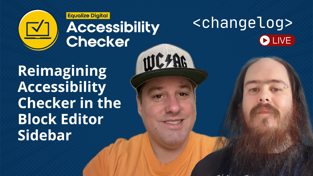
In a recent changelog livestream, we walked through one of the biggest UI and workflow updates we’ve made to Accessibility Checker in years: Block Editor sidebar that reimagines how accessibility issues are surfaced while editing content in WordPress.
Accessibility Checker has been around for over five years. When it was first built, the Block Editor was still evolving, so the plugin relied primarily on a classic meta box. As WordPress matured, it became clear that Accessibility Checker needed to evolve alongside it.
In this livestream, we demoed the new sidebar interface, explained the design and technical decisions behind it, and showed how it improves the workflow for identifying and remediating accessibility issues in WordPress. These changes are included in Accessibility Checker version 1.38.0, which is now available.
Here’s a complete recap of what we covered.
Watch the Video
Video Transcript
Steve: All right. I think we are live.
William: Yeah. Looks like it.
Steve: We checking the stream.
William: Yep. Checking on YouTube. It is going. I’m presuming everything else is fine.
Steve: Yep. Probably is. Cool.
So how’s it going, William? Doing good.
William: Yeah. Doing all right. Can’t complain.
Steve: It’s been a little bit.
William: It has.
Steve: We missed the the last one.
The one that we normally have at the beginning of the month. But, that’s for good reason, right?
William: Yeah. It’s because we didn’t do any work that month.
Steve: That’s right. No work at all. Just,
William: Yep.
Steve: Just a bunch of slackers, not coding. No.
William: Signed in. Chat a bit.
Steve: That’s right.
William: Left.
Steve: No, we’re being facetious. We’ve [00:01:00] actually been working very hard on some new stuff and some stuff that just needed that extra couple weeks of work.
So we’ll give it a little bit of time, see if anybody joins us. If not, we’re just push forward and talk about new stuff.
What Accessibility Checker Is
Steve: This is the Accessibility Checker Changelog Livestream where we talk about the WordPress plugin, the Accessibility Checker, which is an automated accessibility scanning plugin to help your WordPress website become and stay accessible.
We have a free full featured plugin called Accessibility Checker. We have a Pro Version that you can get to that extends upon that and adds lots of pro level premium features.
And we also have three add-ons to our pro plugin that you can get at different subscription levels.
We have an Audit History Plugin to track [00:02:00] your accessibility compliance over time.
We have a Multi-site Add-on that allows you to manage your license and stats and activations across a multi-site network.
And we have an Export Add-on that allows you to export your accessibility scan data to a CSV file so you could import that into your system of choice.
Why a Block Editor Sidebar
Steve: Today’s theme, William, is reimagining Accessibility Checker in the Block Editor Sidebar.
William: Yeah. So, we did not have any Sidebar Integration. We effectively didn’t really have any Block Editor Integration. Any deep integration for a long time. So, now that changes. And we went all in.
Steve: Yeah, we went all in.
So, for those that don’t know, Accessibility Checker is quite old, or as my teenage children would say, “unc.”[00:03:00]
And yeah, William is shaking his head at me, can’t believe he said that.
William: I don’t know what that means.
Steve: It just means old. Accessibility Checker has just had its fifth birthday. It’s five years old and five years ago the Block Editor was not quite where it is today. And we used a Classic Meta Box. If you’re a current user of the plugin, you are very familiar with our meta box that you use to check your status and see how many issues you have and to manage your readability.
What our goal here, for the new year is to go through the plugin and do some UI and UX overhaul. Since it’s been five years, it’s time to give the plugin a little bit of a refresh, a little bit more of a visual modern visual look and to help integrate it more deeply into the WordPress Admin to make it feel like it works more seamlessly with the Block [00:04:00] Editor. And at the same time maintaining backward support for post types or websites that don’t support the Block Editor.
So, what we’ve done is we took the current Classic Meta Box and just rethought it. How? If we’re rebuilding this in the Sidebar of the Block Editor, how can we rethink this? And if you’ve used the Block Editor and the Sidebar is a very…. it’s a not a very wide space.
So we’re going from having a very wide space for the meta box to having a very narrow space for the sidebar. And when that happens, you have to make a lot of UI and UX considerations and you have to really think deeply about the information you’re trying to service and very deeply about what all you put in there because like it can, you can’t put big blocks of text ’cause they wrap and it look, it looks bad.
William: Effectively you have 265 pixels, [00:05:00] which doesn’t account for padding.
Steve: Yeah.
William: So you got pad out a little bit as well. You may get 240 pixels worth of usable space. It’s nothing.
Steve: Yeah.
William: You can fit a button side by side, and that’s about it.
Steve: That’s right. Even your text labels have to have some consideration, right?
Yep. But, the big benefit of the Block Editor Sidebar is it surfaces the Accessibility Checker one at the top of the page inside of the toolbar alongside the other sidebars that other plugins may add or the default sidebars that are there and it services it beside your content. So, no longer are you looking at your content, scrolling down to the meta box, “Okay, what is this?” Trying to find that issue in your editor, and this just back and forth. Now, you push it to the side. Your contents on the left, your sidebars on the right. I think you can move these sidebars, can’t you? To the right and left.
William: I think you can swap them to the other side. [00:06:00] I have never had any reason to move it to the other side. I believe you can.
Steve: But it puts it in one pane in two columns. You now have a visual of your content and Accessibility Checker at the same time.
There’s a lot to talk about in regards to what we did, but I think we should pull it up and we should start going through it and just start talking about some of the changes that we made.
‘Cause there are a lot of terminology changes. We had a lot of internal discussion if we should build a glossary since terminology is being reconsidered so much and trying to unify terminology throughout all of our products.
But let me pull it up and we’re, we’ll just walk through it piece by piece.
Cool.
First Look at the New Sidebar
Steve: So, this is just a normal post in the WordPress Admin and you now say, you can now see that we have a little icon up here in the top toolbar in the right. And if you use like the Yoast [00:07:00] plugin, you can, you have, Yoast has their sidebar here. So now we have ours.
But, we wanted to make sure that, since we’re moving this and creating new functionality to the that you didn’t overlook it. So, we’ve added a meta box down below in the post sidebar for Accessibility Checker says you have 12 problems to address and 16 issues that need to be reviewed with a button that will initiate that sidebar. So that’s just us helping you if you’re in this default view that hey, Accessibility Checker is running it, there are issues. And this kind of just helps bridge the gap between the old meta box and the new sidebar.
So I’ll go ahead and click on the sidebar icon to pull it up. So we are presented with the Default View here. Is this large enough, William? Should I try to
William: if you could zoom in, I think that may be quite good.
Yeah, that, that looks better. It is. [00:08:00] You don’t realize how small it is until you have to start sharing.
Steve: Yeah. Yeah. So since the sidebar’s quite small, I will show it at a zoomed in view here so we can look at it in the screen share together easily.
Building with Gutenberg Components
Steve: So William, before I talk through some of this stuff were there huge technical challenges in getting here?
William: So, surprisingly, the components that already exist that are used to build gutenberg itself, or the Block Editor, are all available to reuse and they are quite reusable. A lot of this is core UI components. It will look very familiar to people. You will recognize the panels. These are the same panels that exist in style edits. For example, if you have a block open to edit, these are the same panels.
So, as far as technical hurdles go, easier than expected. Not simple, but not complicated either.
Steve: [00:09:00] Yeah. So we’re able to like take Accessibility Checker data and kind of take WordPress Core Block Editor components, and utilize those and build out this sidebar.
Though, sure, there’s a custom, there’s a few custom element components that we’ve added here, but it’s just a much more mature application way of building it. And we were pleased to find that in using those components that we did have what are called properties, props inside these components that actually do allow us to achieve the level of accessibility that we’re trying to achieve here. It can be discussed a little bit in the Gutenberg Block Editor, that it’s completely inaccessible or it’s not usable. But, we’ve seen a lot of maturity in regards to accessibility inside the Block Editor, and we were actually pleased to find ourselves that these components maybe [00:10:00] not out of the box we’re set exactly the way we wanted them set for accessibility. But, the props were there for us to achieve the level of accessibility with our own plugin that we’re trying to achieve.
William: Yeah, I actually think I’ve changed my generalized opinion on whether the Block Editor is accessible or not. I think they’ve made an awful lot of progress since the last time that I had evaluated this. Like a huge amount of progress.
Steve: Yeah, I would agree. And I think that may be a little bit of our delay to move Accessibility Checker into the Block Editor for those reasons and maybe some of our own misconceptions as well, why we delayed on that. Because what we try to do with Accessibility Checker is it’s a plugin that is used to scan your website for accessibility problems. But, we also try to practice what we preach and we try to make our plugin accessible [00:11:00] itself because we want, if, regardless of somebody’s ability, if they want to make their website accessible, we want our tool to be accessible to check the accessibility of their website. So, we were pleased to find that we were able to achieve a good level of accessibility while moving into the Block Editor.
William: Yeah, labels were readily available to you. To add keyboard navigation was surprisingly high level on the majority of the components we needed them to be on. Tabs, for example, which we will see shortly, I was incredibly surprised had full keyboard support and implemented properly.
Steve: Yeah. With arrow keys. Yes. Yes.
William: Yep.
Steve: Yeah. Cool.
Panels and New Terminology
Steve: So, let’s take a look. We have… I’m gonna close this one. We have four panels in the sidebar, and these correlate to our old meta box. But, you’ll notice that the terminology’s changed a little bit. So, we [00:12:00] used to have the Summary Tab in the meta box, which is now the Accessibility Status accordion here.
And we used to have the Details Panel, which is now the Accessibility Analysis Panel.
And, in the meta box in, we’re gonna talk about the meta box here in a little bit too, because it has been brought up to date and we’re trying to keep things in parity with the sidebar as much as we can.
We actually in the previous Details Panel we used to call Ignored Items. They’re filtered in with the other issues. So, what we’ve done is we’ve actually separated them out now in the sidebar. So, we now have a panel called Dismissed Issues. And the reasoning for moving those out and surfacing them into their own panel is we’re trying to create separation between what needs to be actioned on and what are artifacts of remediation.
[00:13:00] Before we were collating those things and now we want to separate those out to create greater separation on what you’ve done and what you need to do.
And then finally, we have a fourth panel called the Readability Analysis, which was called Readability before
William: It was just called Readability. Correct.
Steve: Yes. So let’s dive into each panel individually.
Status Panel Metrics Explained
Steve: So William, you want to talk about the Accessibility Status Panel? Sure.
William: So the Accessibility Status panel is very much the same as what you would see in the existing or the previous Meta Box. It has all the surface level information that you might need to make a decision about what you’re going to focus on laid in this page.
So, in this example here we have 12 problems and 16 items that needs review. [00:14:00] Immediately, arguably problems are bad, but things that you need to review might actually be worse ’cause we don’t know if they’re problems.
But, one major difference here is we no longer break out Contrast Errors. Previously, we would break contrast Errors out and have Errors as two separate groups. Contrast Errors are Errors and all Errors are Problems, and Contrast Errors now are included in the Problems Count. They are the same. They need to be dealt with. So they’re a single group.
The other big change here is that the number past checks used to be named Past Tests, and it used to be the largest object in the Meta Box. After some consideration, we decided maybe it isn’t the most important aspect of the data here, and as such, it has a similar weight as all of the other items.
Steve: Yep. Yeah. So to tag on that a little bit, the ordering has been moved around too.
So William said that [00:15:00] we had problems and then we had contrast issues. And I think our original thought around separating those out as two individual issues is because Color Contrast can be a lot of times with themes and WordPress themes one of the biggest things to focus on. But, as far as giving weight to things, they really have the same weight. So we’ve just decided to collect those into one data point. So those are now called Problems. So we’re no longer calling them Errors because what we’ve introduced is, we’re talking about here in a little bit is severity. So if we’re calling things Errors and Warnings, and then we have a Severity, like if a Warning has a Critical Severity and an Error has a Low Severity, like which one takes priority?
So, what we’ve done is we’ve removed that Terminology of Errors and Warnings, and we’ve replaced it with Problems and Needs Review because that really is the distinction. Previously an error before was something that we could programmatically with very good [00:16:00] accuracy tell that this is an issue. And needs review is something that programmatically we couldn’t with 100% or 99.9% accuracy tell you that this is an issue. It actually required a little bit of human review. And, alt text is a perfect example of something that gets flagged as Needs Review. Because there could be a very valid case for not adding alt text to a decorative image.
Builder Support and Future Frontend Plans
Steve: We have a question here. Let me pull this up. From Daniel, is there any chance for this to eventually roll out to other editors, ie. Bricks Builder?
So like I stated earlier we’re looking down the road to major UI and UX overhaul of the Accessibility Checker this year. This is the first step.
There is a step coming up. I don’t know if it’s next or if it’s the one after the [00:17:00] next one to make new considerations for how Accessibility Checker shown on the front. We currently have our Front-end Highlighter that was made several years ago, and we are looking at a future new tool to expose and manage accessibility issues on the front end in a much better way.
I have not used Bricks Builder, but I would imagine that does, I’m not sure if it’s a back end or a front end builder.
William: Okay, so Bricks is a front end ish type of builder, so we will not be able to deploy this exact permutation of this sidebar on Bricks. If you want to use this sidebar, you will need to use the Classic Editor or the Block Editor. However, as Steve was saying, we have future plans to bring all of these new features, which, we maybe haven’t yet spoke about, but we will be bringing all those features to a new Front-end [00:18:00] Highlighter moderator scanner system. So it’s a bit hybrid.
Steve: Yeah. So does, do you know William, if the Front-end Highlighter works with Bricks?
Alex: So when I looked at this with Daniel previously, so Hi Daniel. It works okay for highlighting issues, but the re-scan doesn’t work so well with Bricks because of its overly esque system. So it would be able to detect issues, but it also detects Bricks overly as well.
Steve: Yeah.
William: So it doesn’t work with as well as it does on just a markup base page.
Steve: Right. Yeah, totally.
There are challenges with Page Builders and we know that like our Front-end Highlighter works quite well with Elementor. Doesn’t seem to conflict with Elementor panels a whole bunch. And we’re working with Kevin over at Edge to make sure that our Front-end [00:19:00] Highlighter is working with Edge and we’ve got some updates coming in regards to that.
So yeah, so we’re looking what this future thing that we haven’t really scoped out a whole bunch and we haven’t really talked about a lot publicly. We are looking for a solution that solves the front end exposure of issues for anything regardless of what Page Builder or what platform it’s running in. Maybe even if it’s not running WordPress.
So thanks for your question. Daniel’s got a follow up. Yeah. This is a great point. I’m gonna pull this up. So Daniel said, I asked about Bricks not only because I use it because it’s user base tends to care about accessibility more than the users of some other builders. That’s a great [00:20:00] point, daniel, and we should definitely pull up Bricks, William. We should put that on our list to do some testing on to make sure that our Front-end Highlighter is compatible and that we can help that community and support that community in making their websites accessible.
William: Yeah, for sure. I actually, as I said, I have spoken with Daniel before. Maybe we could actually sync up again and find out more from an actual user what the needs are. So I might email you back on that thread, Daniel, and we can connect and figure out the best way to make sure Bricks is supported fully.
Steve: Yeah. Awesome. Cool. Sounds great. Cool.
So back to the the Status here.
I was explaining like the difference between Errors and Warnings. They’re now Problems and Needs Review. And we’re gonna talk a little bit more about Severity and a little bit. If you use our Pro Plugin, you know about our Severity Flags that we added a few versions back. But, we’ll talk about that here in a minute.
And then, yeah, [00:21:00] so Reading Level, not much has changed in regards to Reading Level here, the way we display it. I’m gonna talk about the icons here in a minute, William, ’cause that’s really important.
William: Yep.
Steve: And then William said, Passed Checks has been brought down in priority. It doesn’t have a big circle. Now, we have maintained this in the Meta Box, and we’re talking about that when we get to the Meta Box, and I’ll tell you why we’re maintaining the previous kind of layout for that. But, Passed Checks has been brought down in priority and we had a lot of internal discussion about this because Passed Checks just it just runs a calculation on how many of our rules is this post passing and then it gives you a percentage of pass. And previously it used color to indicate good when there could be a whole lot of reasons not to necessarily convey good. Because there’s issues when you’re scanning a page to where if a rule doesn’t apply to that page you’re [00:22:00] still getting credit for that rule passing.
William: I don’t wanna call that out actually, specifically. We did change this, it used to be called Passed Tests, and we have changed it to Passed Checks, but we had a lot of back and forth about even the term on this.
Because this 81% are not applicable to this content. It doesn’t mean they’re passed, really. It means that they have not failed. And there is a big difference there. I think arguably a more important metric is 19% of the checks did not pass here. And maybe in the future we’ll offer a toggle to flip this number around for, like for personal, whichever one someone might want. I actually would prefer this to be inverted.
Steve: Yeah. Totally. I do too. And what that does is it obscures away whether or not the rule passed because an Issue existed on the page and it was accessible, it was done right, or it didn’t [00:23:00] exist on the page and the rule didn’t apply. So if you inverse it and you focus on only what failed, you’re only looking at, where you need to improve.
And yeah, we really went back and forth about this. Like I was calling it Coverage in an early iteration of this. And I will tag on here. We did go through a full design phase on this, which we don’t do a lot and we haven’t done a lot in a while. And a lot of people may not know this. I’m not just the CTO of Equalize Digital. I’m not just a developer, but I actually went to college to be a designer. So I have these, all these weird skill sets that work together and really, I don’t really flex the design stuff much anymore. But as of building this, I did and really brought in it in that convergence between the design and the development into how we can present a much better visual UI and a much better user experience.
Because what we’re trying to do in Accessibility [00:24:00] Checker, we’re not just trying to make something pretty and something eye-catching. We’re trying to surface data and expose it to you to get you to take action and to not give confusion to you or cognitive overload as well ’cause like accessibility at first can be like, oh, I got 12 problems, or I got 16 needs review. I don’t know what to do. So we’re trying to surface this stuff. Say, “Hey, you need to take action, but here’s the most important thing to take action on.” And not overloads.
Icons, Color, and Cognitive Load
Steve: I wanna talk about the icons a little bit. So before we were using these big washes of blocks of color to convey whether or not something was good or bad, right? Green or red.
We’ve taken a step back and we’ve changed how we’re using color, how we’re using shape and how we’re using icons to convey meaning. So we’ve removed those big, deep colors and we’ve opted for [00:25:00] icons to handle that.
Before…. so like Accessibility Status, so right now you can see I have 12 problems. If you look at the top accordion here. So at the top level, we’re surfacing whether or not you need to open this accordion. If everything was passed, this would be a green box with a check in it. So we have, for something that needs attention, we have a circle. Is that information icon, is that what this or alert icon?
William: It’s exclamation mark.
Steve: Exclamation. Thanks, William. So we have a red circle with an exclamation. And then if it’s something that is a little less critical than that we have a triangle with the exclamation in it. So the exclamation on both of those signifies that at some level they’re the same. But the triangle and it being orange signifies that it’s a little less, it’s slightly less [00:26:00] of a huge concern. And then we have a square check box that’s green if something’s good.
So we’re conveying meaning with color, icon, and shape. Not just colors.
William: Yeah. The shape indicator here made an awful lot of difference for me.
Actually, I didn’t realize previously how if everything was a circle then nothing was a notice bubble.
Steve: Yeah.
William: As such, now we do have the shapes and it, so everything is signified by color and shape. And in some cases also the icon that’s inside of the shape. But we are no longer just using color or just using an icon.
It’s always both.
Steve: Yeah. Yeah. Yeah. We have Troy joining us.
William: Hey, Troy.
Steve: Hey, Troy. How’s it going? Troy said “You guys did one heck of a great job fitting a lot of important data [00:27:00] into a small space. Very clean fits into the overall look of core as well.” Yeah. Thanks, Troy. And I do wanna…
William: It was not easy.
Steve: It was not easy. And, we went through many rounds of reduction and even from design, what we ended up with in design over to code we still have pulled things out, and we have to keep asking ourselves, does removing this actually convey the less meaning or does this, it actually cause the user to have a worse experience by removing it? And if not, we should just remove it. Move on. We can explain these things in documentation, in other places. And it’s hard.
It’s hard too for a mature plugin that’s been around for five years for somebody, and we use our plugin in our own remediations. And when you’re used to where things are, what things are called and when you start pulling things out, people on the team can start to be like, oh where’d this go? Why isn’t this here?
William: We are about to come up to something that I was very much against removing [00:28:00] until I realized I didn’t actually use it. I just liked it to be there.
Steve: Yeah. I don’t know what that is, but
William: I’ll point it out when we get there.
Steve: Okay.
To finish up on the Status Panel. I want to talk about the Passed Check icon a little bit. So the Passed Check icon, you’ll notice before in the meta box, the Passed Check would be green. And it was almost always if it was 81%, it was green. If it was 10%, it was green. Almost always saying, good job, good job. Especially if those checks didn’t apply, then you’re getting green and a thumb, like a good job well done, a pat on the back for something you didn’t do.
And so with some of the ambiguity around what Passed Checks is trying to convey, we’ve changed the icon to an informational icon and that is to say, “Hey, this is informational. You should look at this and pay attention to it.” But we’re not going to make any kind of [00:29:00] assumption on whether or not this is green good or red bad.
It looks like our fearless CEO has joined the party. Welcome to the party, Amber. Glad to have you.
William: Yeah. I think the information icon is just also a significant of, this is supplementary. This does not really impact your decision.
Steve: Yeah.
William: But this is here when you need it. So you’ll see that it is on the Passed Checks, but you’ll also notice that it is on Dismissed Issues as well.
We will explain when we get to Dismissed Issues why we think they’re only informational.
Steve: Cool.
Click Through to Analysis Panel
Steve: A feature added to the Accessibility Status, previously the Summary, and oddly enough, this is something that’s been requested from many people that have used the plugin is in the Summary, the old Summary tab, they wanna be able to click on it and get to the stuff. So we’ve added that functionality. Something that seems very simple, but so what I’ll do is I’ll show you if you’re looking at Problems and you click on a Problem, it automatically opens the Accessibility [00:30:00] Analysis and goes to the Problems Tab and opens it up. So that brings us to the next tab, the Accessibility Analysis. In the Meta Box this was called the Details Panel. And we’re calling it Analysis ’cause we want to convey that, “Hey these are the things that we’ve scanned that you need to take action on.” And that’s all that’s in here, right? We’re not mixing in remediation artifacts and things like that.
So when looking at this Panel, like at the top level, you can see that we have the exclamation icon that’s red, showing that there are Issues in here that are Problems. If there were no Problems in the Accessibility Analysis and only Needs Review, that icon would be the exclamation triangle that is orange.
And we are now at the top level, we are surfacing the number of Total Issues. So before you open a panel, you can see, I can see, “Hey, there’s some Problems in here I need to review, [00:31:00] and there’s 28 Total Issues in here.”
Problems vs Needs Review Workflow
Steve: So in Problems, we now have these Tabs, which William talked about a little bit. These are core components that we found to be fairly accessible and we were very appreciative of that. You can see I have 12 Problems and I have 16 Needs Reviews. So we’ve separated these out. Why do we separate ’em out, William?
William: Problems are something that you need to do something about. But Needs Review are things you need to review them. We are uncertain and we will need a human eye to take a look.
They’re two quite different workflows. Anything that is in Problem needs a remediation effort, but anything in Needs Review needs to be looked at and it might not have a remediation effort required. It might actually just be able to be dismissed. It needs a human to look at it. But these are two separate workflows and you don’t really need the same information at the same time when you’re [00:32:00] tackling either.
Steve: Yeah. So this goes back to the cognitive load, right? We’re making two folders here. We’re saying, “Hey, look at these first.” But know that they’re equal, they live on the same plane here. So we do have exclamation icons for both Problems and Needs Review that are slightly different, but at the same time, we’re surfacing them the same ’cause we don’t really know. ’cause the Needs Review requires a human audit.
William: And some of the Issues in Needs Review may actually be more problematic than Problems.
Steve: Yeah. Yeah. Or more critical. Yeah, totally.
So now, if we go down a level, we look at the rule, the individual rules.
So we’re still grouping Issues into rules like we did in the old meta box. And we can see that I have Ambiguous Anchor Text. I have three of those and that it’s Critical. And we are now ordering these in criticality. So the most critical will be at the top and the least at the bottom. [00:33:00] So again, putting these in the separate folders and then collating these folders to surface the items that need the greatest attention.
And so I will go into the Ambiguous Anchor Text accordion, so you’ll see the Issues now.
So this was the next really difficult UI/UX change that we made and we evaluated a lot of other accessibility tools to see how they handle this. And a lot of them handle it in the same fashion.
But previously in the old meta box, when you would open this up, you would actually see the code snippet, right? You’d open it up, you’d see the affected code, and then you’d see a couple other action items to the right. And so we’re in a sidebar that’s, whatever, 245 pixels at most, and we have to show a huge code snippet?
William: The code snippet is the thing I was talking about earlier that I thought I was [00:34:00] going to miss a lot.
Steve: Yeah.
William: And it turns out not so much. I only ever looked at it on the front end where I could find that markup snippet.
Steve: Yeah.
William: Can’t find it here.
Steve: And this is where like you UI and UX get real complicated because William’s experience on how he interacts with the plugin is different than Amber’s experience with the plugin and how she interacts with it. And it’s different than the way I interact with it. And it may be different for if I looked in the old meta box and I pulled it open and I see this affected code and it’s a big, huge block of code. I’m a developer, Amber’s a power user slash developer and she can look at that code and I can look at that code and William can look at that code and we can… It’s like the matrix. When you see the letters going down the screen, you can see pictures. We can tell what that is and where it is on the page and…
Yeah, so Amber says, “Yeah, I want the code snippet ASAP.” [00:35:00]
William: I thought I wanted the code snippet as well.
Steve: Yeah.
William: I didn’t but Amber made…
Steve: This was hard for me. I think I fell in the middle of where you and Amber are I fell into, I want it in the sidebar, but I know that from a UI perspective, it just can’t happen.
William: And I think we reached a fairly good compromise on where it could live.
Steve: Yep. So when we go to these Issues. So you’ll see we have an Issue Number. So this is basically a Database ID. Every issue gets a unique number. And then we do have…
William: Hopefully most users have less numbers than this one, which is…
Steve: Yeah.
William: What, 300,000?
Steve: This is my local site copy, and I will say that this has probably been around for numerous years and testing the Accessibility Checker here. So most people don’t have 300,000 plus Issues.
Issue Actions and New Modal
Steve: So we have [00:36:00] that and it links and we’re show you that in a minute, but then we have this ellipses menu to the right, which is our Issue Actions. If I click on that, this is where the Actions live. I can view this on page, I can show the code, or I can dismiss the issue. So if I click view on page, and now I’m super zoomed in, so this may look a little funny, but actually it doesn’t look that bad. So it does our normal, it highlights it on the front end, and you can get all the information on the front end you want, like William said, he looks at this code box here on the front end to show the code.
And we’re trying to like make the plugin more non-developer friendly so that this code snippets here for power users, ones that really want to get into it and maybe for future use being able to modify this. But we’re trying to make this a little more user-friendly for non-technical people.
So those are some of the actions you can take and let’s go ahead and open [00:37:00] up the modal.
William: I do wanna call it, there’s one additional Action which you do not see because we don’t have anything for Ambiguous Anchor Text, but there is also a Fix Action that can appear on some of the issues if we have an Automated Fix for it. You’re not gonna see one here.
Steve: Yeah.
William: Link Open New Window.
Steve: Yeah.
William: There is a fix for this.
Steve: Yeah. So there is an Apply Fix and these are the same actions that you would get in the meta box.
William: Correct.
Steve: So lemme jump back over to Problem, to that problem. I’m gonna click on the Issue and now we’re presented with this new modal. And so in an effort to try to make the sidebar live on the side and your content side by side, but we still want to be able to expose a lot of data to you about that issue and we can’t fit it all in the sidebar there. So we needed a place to put it. So we’ve introduced this new Single Issue Modal which is a modal that shows the Issue ID at the top. [00:38:00] We have a future plan to maybe allow this Issue titled to be edited.
WCAG Details and Syntax Highlighting
Steve: And then below we have our WCAG information that we introduced in the pro plugin, several, a few versions back. Amber went through and did a amazing amount of work on surfacing WCAG Criterion inside the plugin, and we show that on our Open Issues Page. But that has not been available for free users until now. So we’re now surfacing that here.
I do have the pro plugin installed and activated. So if the pro plugin is installed and activated, you do get this toggle to show exclamation. When you open that up, it tells you why this issue matters, how to fix it, and then a link over to our documentation for much more detailed instructions on how to fix these issues.
William: Yeah. And if you’re a free user, you have that link that takes you to the detailed documentation. You [00:39:00] don’t miss out on being able to access that information. For pro users, it’s just readily available. And as such, we can show it here in this box for them. Yep. But that all that information is available to everyone.
You just have to visit the website to get the quick how to fix.
Steve: Yeah, so what we’ve done is we’ve surfaced this information that’s already in the Open Issues to pro users right here in the same panel. And William said, if you’re a free user, this link actually just shows right here so you have access to the same information.
Before I keep going down the content here, I wanna look at the sidebar here. So we have a sidebar where we show the Type, which we know is a Problem because we were just in the Problems Tab and we showed the Severity, which is Critical, and the Landmark, which is Main, and this is a Link. So if I click Main, this jumps over and highlights the Landmark. This was added a few [00:40:00] versions back in the plugin as well. And then we have our View on Page link that was in that Action Menu as well. So we can view this on the front end if we would like.
So back to the main content, William you wanna talk about?
William: Yeah, so here we have the effective code, which is what I really thought I would miss in the sidebar. It turns out I don’t miss it as much. However, we also have code matter available from WordPress, which allows us to do syntax highlighting.
So in the previous old meta box, this would just be a code box and or inside the code tag or pret tag, and it would just be a grey background, black text. Now, we have full syntax highlighted. So regardless of what type of markup this is, it should actually be easier to identify the important aspects of this for a developer. The syntax highlighting might not be very useful [00:41:00] for a lot of our users, but for me it’s very nice.
Steve: Yeah, it’s pretty. We got a question, Troy asked, you wanna read this one?
William: Yes. ” Love the references to WCAG docs. Are you guys maintaining anything that helps generate the data in the popover or is that all being pulled from an official endpoint somewhere?” So it turns out there is not an official endpoint from WCAG, and this is self maintained information. Some of it is mostly readily available from WCAG, but a few of the aspects of it, like how to fix and some of the references that are available for pro users are maintained by us and mostly maintained by Amber. Thanks. Not by me.
Steve: Yeah. Yeah.
And that’s interesting you bring this up, Troy, that this was actually something that William and I were just talking about earlier today [00:42:00] because like I said, we are working on expanding Accessibility Checker into different applications and services and that information is actually not available in a public API and we actually we’re discussing about building our own API to handle that. Great question.
So cool. So that’s something in the works.
And the next one here, William. Yeah.
Dismiss Reasons and Comments
William: So, this message here. Previously, you could Ignore an Issue. We no longer use the term Ignore because we actually are not ignoring it’s an Issue. We are Dismissing it after careful consideration, we hope. And previously you could only comment and that was it. Now, there is also some options here that you can Flag your Issue as the reason you’ve dismissed it.
Needs Review vs False Positives
William: You might think it’s a false positive, which could [00:43:00] happen, especially in Needs Review type Issues. You’ve maybe remediated it and it’ll go away next time you scan or you’ve confirmed it’s accessible because some Needs Review Items, we just don’t know whether they’re problematic. For example, if we detect a Slider is present, we’ll flag that as a Needs Review Item. But you may actually have a fully accessible slider, which is quite uncommon. So definitely check, but you may have confirmed it’s accessible, in which case you can flag it as such when you Dismiss this Issue.
Steve: Yeah.
Why Ignore Became Dismiss
Steve: A little bit to why we don’t say Ignore Items anymore. Because one, it was always a little awkward to say. Ignored Items or is it Ignore Items? Like it was always a kind of a weird thing to say. And we’re trying to think a little bit about the meaning of the terminology that we’re using. What does ignore mean? If it’s an Accessibility Issue and it’s been surfaced, why would we ignore it? Are we [00:44:00] ignoring it for a period of time? Are we ignoring it forever? Are we ignoring it because we want our score to go up? Are we gaming the system by using the Ignore system? And what we wanted to do was bring a little bit more of clarity to why things are being quote unquote Ignored.
So we, we did land on the word Dismiss. So you can dismiss it for many reasons. But it’s more actionable. It’s, I took this action to dismiss it. I’m not just ignoring, I’m ignoring it, not my problem.
William: And yeah, the term Ignored, this is almost always used in a negative way. We didn’t necessarily want that. I will point out some of these reasons here. So this might be news to Steve because I haven’t mentioned this yet, but I do think there will be a filter introduced over these reasons. So if users have very specific workflow in their local sites, they will be able to use a filter to potentially add additional reasons here.
Steve: Yeah.
Dismiss Reasons and Comments
William: So these are the three [00:45:00] that we surface. For you now, like with a filter, you can probably add more of those in the not too distant future.
Steve: Yeah, I’ll read those out too just so anybody listening or that can’t see this can have… so we have Dismiss Issue As, and we have radios for False Positive, Remediated and Confirmed Accessible. And that is a brand new feature added in to help with remediation. So we have our comment box. This wasn’t called comment before, was it called something else?
William: I have it up, so let me take a look. It was just called comment, but it didn’t say it was optional.
Steve: Oh, okay. Yeah. So we have the comment box. You can go in here and type your comment and it’s cool ’cause it’s a component and it expands as you type right, like it so it’s a lot more modern feeling. And we did add in the ability to do a little bit of code formatting. So with bold, italics, and then [00:46:00] links, you can link texts now.
William: Yeah, so personally, I don’t see that I would ever have a use for this, but there was a case made that maybe instructions may be left here. So someone might be coming in and doing remediation work and dictating what might need to be done to tackle this issue. So instructions can be left here, for example, by someone and, some basic format might be nice from that. And potentially a developer can come back later on and fix the problem. Or maybe even the content author can cycle back and read that comment.
Steve: Yep. Cool. So then below that you can see that we have a button called Dismiss Issue. And that will dismiss this. I’ll just so everybody on the call can see, I’ll go ahead and dismiss an issue. We get a notification that Issue Dismissed Successfully. And then you can see the Comment and I must have a space in there. And then the reason why and who it was [00:47:00] dismissed by and the date. And these are things that we had before. And I will say that we are running Accessibility Checker version 1.38.0 Beta One.
William: Yes.
Steve: Okay. So this is a Beta Version of the plugin. These features have not released yet. They will come out shortly. The plugin is currently in user testing right now. But this is a piece that is still being worked on and some design and CSS stuff is still being worked on this.
So I can reopen the Issue now that I’ve maybe I accidentally hit the button. I could reopen it here. But when I go to close the modal, that the Issue Has Been Dismissed and it is now, and now lives down in Dismissed Issues. You can see there’s four now instead of three. And we returned focus back to the current rule because that item actually removed and we didn’t think that would make sense to actually move focus back to the Dismissed Item because we want to keep [00:48:00] you in your remediation. And so ideally your next thing would be to go back through that listing and keep remediating.
Dismiss Options and Global Dismiss
Steve: But that’s not all. There’s more to the Dismiss Issues. William, you wanna talk about that?
William: Yes. So there’s two additional options here in the instructive. The first one is just a nice user friendly feature Dismiss and Close Modal, right? It saves you having to make one click. It’ll Dismiss as soon as it gets a successful result back from the API where the Dismiss happens from the multiple close. And that’s just a nice UI, ease of use type of thing, like quality of life.
The other one is Dismiss Globally. So previously, you would not be able to do a Global Dismiss from this page, and this is a pro feature because Global Ignores our a pro feature or Global Dismiss as they will be in future. So if you’re using the Pro Plugin, you can Globally Dismiss this right [00:49:00] from the individual page and that saves you having to go find this Issue in the Open Issues Tab or the Fast Track Tab. You can just Globally Dismiss it right from here. And it has all the same things. Globals Dismisses don’t necessarily have Comments assigned, however, now you can add an Individual Comment here to the Issue you’re dismissing. It won’t propagate to all the Dismissed Items Globally, but it will on this Local Issue.
Steve: Yeah. Yep. So that’s a new feature that we’ve brought you can Globally Dismiss from the Single Issues Page. Looks like,
Live Counts and Manual Scans
Steve: We got another question from Daniel here.
Sorry if I missed this earlier. “Does the sidebar update errors and count live as the user edits or only upon savings?” It’s a great question. It does it live. So if I go here and I Dismiss this Dismiss and Close, it’s gonna [00:50:00] close the modal and you can see it just updated.
William: I do wanna make sure that Daniel isn’t asking if it updates as you are editing content here, because it currently does not add update as you edit the content yet. It has to scan a rendered page. So Save does have to occur. But if you modify an Issue by a dismiss. The numbers reflect immediately in the sidebar or nearly immediately.
Steve: Yeah.
William: But we did skip a feature, so maybe we can cycle back to that. So if in the Title Bar here, beside Accessibility Checker, there is actually now a Menu that you can click to Scan the Page from.
Steve: So that just did a scan, right?
William: It did. And obviously none of the content has changed, so nothing has been reflected as updated. But if you’re editing content, you can actually come up here and click that Scan Button and it will scan preview of the content prior to needing to save.
Steve: Oh, yeah. [00:51:00] Yeah. So Daniel did confirm that you were right, William.
So this is a thing that we can do this. But part of the problem in doing that is that we don’t know what your final save state is going to be. So the way Accessibility Checker works is if you’re, if it’s pulling and there, there’s a code term pulling, if it’s like checking every five seconds to see if there’s any content updated or I think that the Block Editor even dispatches an edit
William: And then the event that is…
Steve: Yeah.
William: It has a d bounce attached and it is every five seconds, I believe.
Steve: Yeah. And we could do that. And you could be making changes. And this stuff is actually being written to a database. We’re not just scanning like a snapshot and storing it locally. This is all your Issues get saved to a database because they could be managed at a Global level. And so if we were doing that, you’d be writing to the database and [00:52:00] then what if you just closed off that page and didn’t save it. You didn’t do a final save. You just closed out and you get that little notice that says, are you sure you want to there’s unsaved changes. Are you sure? And you hit fine and you go off. We’ve actually written stuff to the database that’s not source the source of truth.
We can do that, but it’s a little risky. But like William said, we do have what we call Sidebar Actions at the top where you can re-scan the page in real time and you can actually Refresh the content.
Refresh and Clear Issues Tools
Steve: Do you wanna explain the Refresh?
William: Yeah. So the Refresh Action it probably is a little bit of a niche use case.
However, if for example, if someone is a pro user, they might be Ignoring Issues from the Fast Track Page, which won’t immediately be reflected in the sidebar. So you might wanna Refresh the sidebar without resaving your content. Or also you could have maybe change the theme of a website, in which case you can Refresh to make sure the data gets [00:53:00] re-repoed if things have, if things outside of the editor have changed, you might wanna Refresh the data that is in the sidebar just to make sure that it is always up to date.
Steve: And this final….
William: Yeah. So this is, does almost exactly the same as the Cleared Issues Button in the old Meta Box does. It just deletes all the data for the Issues on this post and lets it either be rescanned if needed, or I think there’s limit, just again for this Cleared Issues button, we added this to solve a problem that no longer exists. It’s a nice to have, I think.
Steve: Yeah. And we found that internally our own auditors like to use this tool from time to time. I can hit Clear Issues just to show you I hit Clear. It says this will Clear all Issues for this post is save will be required to trigger a fresh scan of the post. Do you want to continue? Yes, I do. So it’s gonna go through and it cleared [00:54:00] out all of, so that’s interesting.
William: So I need to update that message. Because you don’t actually need to save anymore.
Steve: Because we have the re-scan.
William: Re-scan.
Steve: So without saving the post, I can now initiate a re-scan and now I have all my data back.
William: Correct. And you will notice that your numbers have changed because you had Dismissed Issues that are no longer Dismissed. However, if you scroll down, if you had any Globally Dismissed Issues, they would show you didn’t, but they would still be Dismissed if they were Globally Dismissed.
Steve: Cool.
So that is the Sidebar Actions. And these are helpful to help manage your scan overall. Sometimes you don’t wanna I know if I’m on a client’s website and I go into their post and I know it needs a re-scan, sometimes I’m nervous to hit the re-scan ’cause I don’t know what services or plugins they have attached to a post that trigger when a post
William: People don’t wanna re-save their
Steve: [00:55:00] Yeah. Is it gonna send an email if I re-save to all their users? So it is nice having something exclusive to the Accessibility Checker to manage that scan and re-scan.
So Cool. So that’s Sidebar Actions.
Needs Review Images Preview
Steve: We were down in the Accessibility Analysis Panel going through some issues.
I think in the Modal we need to show something with an image and possibly a fix, William.
William: Yes. So for the fix we can show this.
Steve: Yeah. So I’ve gone to the next tab. Like I said, we’ve collated Problems and Needs Review out. And if I click on Needs Review, you can see I have items that need to be manually reviewed by a human auditor to confirm that they are accessible or not accessible.
And we have the Severity Flags here, you can see, and we’ve ordered the Most Severe at the top. So if I click on Possible Heading, oh, that’s not what I wanted. I [00:56:00] wanted something with an image. Let’s see. Okay, so just like before, we would try to pull an image out of the code snippet to give you more of an indicator of where this is or what image it is. And so we’re doing not the same here. You can see this is the image, and of course, if this doesn’t need alt text, you can go ahead and Dismiss it.
William: I do wanna point out here, so while this is, feature. Perry, it’s the same, almost. You can see the image. There has been a slight enhancement here, so if you have an issue that might have multiple images in it. For example, again, the slider is present, might have six or seven images, one for each slide. All of those images will actually be available to see in this panel here, as opposed to just the first image, which is what the old meta box would use.
Steve: So I’ll just dismiss that because I’m saying it’s decorative. It’s not, but I just said it was for demonstration [00:57:00] purposes only. So that’s the Accessibility Panel. So you can go through and you can see all of your rules and all the issues and go in and remediate them and get those all accessible. And your Need to Review Items follows the same pattern.
Reopen Dismissed Issues Accessibly
Steve: So we’ve talked about Dismissed Issues. So like I said we’re uncoating Dismissed Issues from the Analysis because this is something that you’ve, that an auditor or a user has taken action on, and we want to filter that away. But at the same time, we want them to still be able to come in and see what has Dismissed and maybe review why it was Dismissed.
And for that, so since we have the dismissed as reason now when you pull up the same pattern, UI pattern for Dismissed Issues as the Accessibility [00:58:00] Analysis.
William: It’s the very same component.
Steve: But the Dismissed as Reason is actually flagged on the Issue here. So you can come here and you can see why it was dismissed at just a glance without having to open the modal and go down here and read why.
But I will show you don’t have to take all those clicks. You can use the Action Item to Reopen the Issue and brings your focus down to the current place and reopens it. And then you can actually review what’s here and dismiss it again if you like.
William: Yeah. And as far as Screen Readers go, these notices that are appeared when you Dismiss or Reopening Issue, they get announced the Screen Readers as soon as they appear. So Issue Reopened Successfully will be announced to the Screen Reader user if they use that action and end up on this page so they don’t lose context. Even though we are moving them around, they still get told what just has occurred.
Steve: Yep. [00:59:00] So that will go away.
One Click Fixes Workflow
Steve: Did we look at fixes? Let’s see.
William: We did not look at fixes.
Steve: Sorry for the, we’re jumping around a little bit, but let me find one that has a fix. It’s probably Link Opens in a New Window.
William: That’s the easiest one to showcase.
Steve: So I could either just open the modal and go to it or I can actually hit the Action, the Issue Action Items and hit Apply Fix. And that I’ll open the modal and we’ll focus on the Fix Issue. I’m zoomed in quite a bit, so let me zoom out a little bit.
William: Yeah, so this is an interesting issue to showcase fixes because this has two potential fixes in our plugin.
We can either prevent it from opening a new window by removing the target=blank, or we can add a warning the same as what our new window warning plugin does. Able add an icon and a label that says first screen reader users source that it opens in a new window. So there’s two options here. Most [01:00:00] issues with effects have only one option, but this one has two.
Steve: Yeah. So if I choose Prevent Links from Opening in a New Window, so I have five of these should all go away, right?
William: Fingers crossed. You save this.
Steve: So I save this, I get a Saved Notification. Once I close the modal, it’s gonna re-scan and they’re all gone.
William: Correct.
Steve: Beautiful.
William: Instantly fixed and checked. Verified.
Steve: Instantly.
The way accessibility works is you apply the fix, it rescans the page, and all your issues go away. So we’re not just applying a fix and hoping for the best ’cause. What if our fix actually doesn’t work in some circumstances, we’re fixing it, re-scanning it, and if it still is an issue, it will resurface back in.
William: Yeah. Actually, if someone does encounter an issue where they Apply a Fix and the Issue doesn’t go away, I would love to hear about it so that I could make sure that that exact markup in that case is editor on a test [01:01:00] suite, which will make sure we actually fix it and keep it fixed with our Automated Fixes.
That was a lot of times to say Fix.
Steve: Yep. So that’s how the Fixes work. They worked that way before, but I think it you can see it in action a little bit. Here real quick. We fixed and remediated five issues just with a click of a button. So if you’re not using the fixes and the plugin take a look at ’em.
You, there’s a lot you can do.
Global Fixes and Pro Features
Steve: I’ll pull ’em up here since we’re talking about it. I I’m zoomed in a lot.
So you can see we got a lot of Fixes in here for fixing things like, Removing Tab Index and Title Attributes, Forcing Link Underlines, the Viewport Changes like we just went through.
So you can see that we toggled block links from Opening in a New Window and you can see that’s toggled here because this is what we just did on that single post. Now, those are at a Global Level. It does fix it for the whole website. So if you are running pro, [01:02:00] you might want to run a full site scan after enabling these.
Block PDF Uploads. So we have some of these are pro fixes that are available only in our pro plugin. I’d have to disable Pro to tell you which ones. Let’s see. Deactivate Accessibility Checker Pro. So you can see in the free plugin which ones are pro only. So Block PDF Uploads, Add File Size and Type to Links, Add Missing Page Titles. And we did have a previous changelog all about our Fixes. So you can go back to the episode, which I’m not sure or have that linked in the show notes in the post that goes out about this changelog.
So let me jump back over to my post again.
Back to my sidebar. So I think that’s everything.
Readability Icons and Summary
Steve: So let’s go to the final tab here and take a look at [01:03:00] Readability Analysis.
William: I actually do wanna point out that now you have a different icon here.
Steve: In readability analysis. So this was part of it.
William: It previously was green.
Steve: Yeah. Explain why we changed this.
William: Yeah. So well, first off, I’m gonna comment on the fact that this was green earlier and it’s now the triangular warning Issue rather than the green square. Because when you delete all the data about the post, the summary also was removed. So now this, it’s a 12th grade reading level, so it’s got the warning sign because this needs a summary and there is no summary.
If you add a summary here that is under a ninth grade reading level, the icon will change. Yeah.
Steve: I was more specifically talking about why we’re using the orange triangle, which was warning before rather than the Error, the red circle. I’ll answer my own question, but the [01:04:00] Readability, the Reading Level is not necessarily a WCAG requirement. I think it is at AAA Level, but we don’t currently have a way in the plugin to to define the WCAG level that you want to comply with. If you did have a AAA requirement defined in the plugin or the ability to do that, we would make this red to show that it is something of attention. But we changed it to the orange triangle exclamation to say, “Hey, this is something you need to take notice of. It’s not necessarily it’s a violation, but you need to be aware of it and you should pay some attention to this.” And we’ve just done this in an effort to try to convey meaning a lot better with our icons, in our text.
We can demo this. This is how the plugin has worked for a long time. I thought I had some text somewhere.
William: You can probably just grab the first sentence or the first two sentences here to indicate it. It doesn’t look [01:05:00] like it’s a lot of long, those are a couple of long words, but…
Steve: Yeah, it’s still 12th grade.
William: If you just delete some of the longer words, the sentences will no longer make sense, but you’ll get different.
Steve: I’m asking AI for some text below a certain grade level. Okay.
William: Yeah. You’re pulling that up. This is a AAA level Success Criteria. 3.1.5.
Yeah. Comprehension.
Steve: Yeah. Cool. So I added in text that was below a Ninth Grade Reading Level as a simplified Summary. You can see I have this 12th grade reading level text here, which is actually Alice in Wonderland.
Now you can see that we’ve evaluated your simplified summary and it’s below the ninth grade reading level, and you get the green checkbox. And the 12th Grade Reading Level of the post now [01:06:00] uses the gray or black Information Icon. We don’t turn this to a check, a green check because your initial post is still above the recommended reading level.
But the simplified summary actually does bring it into compliance with the AAA Requirement. And if you pull open the Accessibility Status Panel, you can see under that Reading Level stat that you now have the green checkbox and that it says Summary Provided. So if I remove that Summary and re-scan, and you don’t have to save the post for this to scan, you can see in the Accessibility Status that the Reading Level has the orange triangle exclamation icon and it says Summary Required.
Just doing what we can to surface where the Reading [01:07:00] Level is in the stats and give you all the tools you need to add a Simplified Summary to supplement your post that has a higher Reading Grade Level. And that works pretty much like the old meta box.
Meta Box UI Parity Update
Steve: And speaking of the old meta box, I know we’re running long here, but
William: Yeah, so if you wanna swap to my screen, actually I have both the old one and the new one up with the same data in it and two different windows so we can do a comparison if you wanna go out quick. Oh, actually maybe I shared only a window and I don’t have both up.
Steve: You can show yours here.
William: So just I go back.
Steve: And I have the other one open. So this was the old meta box that everybody’s very familiar with using.
And so in changing the sidebar, it brought up the conversation. We’ve made a lot of terminology changes, a lot of layout [01:08:00] changes, a lot of the way things are displayed changes. How do we have to keep parity between the two? Is the Meta Box legacy at this point? And it really isn’t legacy because the sidebar’s only gonna work on a Gutenberg Block Editor compatible website. If they’re running Classic Editor or even if your custom post type is only a classic editor, you still need a way to manage the Accessibility Checker.
Let’s take a look at…
William: So for me, one of the big differences here is, first off, you know these giant blocks of color they’re, this is color for information without any other real nullifier. So red is bad, green is good. Yellow or orange is in the middle. But yeah, so the, these are huge blocks of color with very little data attached. They’re just numbers. [01:09:00] And we have a lot of space here in comparison to the amount of space that’s in the sidebar. But, these look different and they also use different terms as you’ll see in a second. But this is the classic Meta Box that everyone is used to seeing. And this blue icon and all the other ones being white annoys me. The blue icon on the warnings panel.
Steve: Yeah.
William: Yeah. White icon doesn’t pass Color Contrast.
Steve: Yeah.
Templates and FSE Scanning
Steve: So Troy has another question here. He says that “Has there been any consideration given to adding any of this to templates? Say if I were to show templates while editing content, but my template had an error.”
I’m gonna make an assumption that you’re talking about full site editing templates. Is that correct, Troy? There has been some consideration given to the full site editing and how we can implement the Accessibility Checker [01:10:00] on like template parts.
Yes, that’s exactly, yeah. Yeah.
So we have internally talked about this. I think there actually is an issue open in our GitHub in regard to this on how in the full site editor when you’re modifying a template part or like a header, a footer, how we can run Accessibility Checker just on that template part.
And last year we introduced Scanning of Custom Post Types and Taxonomies so we now have a mechanism to store data in what we call a Virtual Custom Post Type. And we have Virtual Custom Post Type there’s like a Taxonomy that goes along with, this is a virtual custom post type taxonomy. These are Taxonomies and Custom Post Types used inside of Accessibility Checker to give the same feel to things that aren’t actual post. And I think we can extend that to full site editing parts, right William?
William: Yes. So it’s not trivial, but it is absolutely feasible [01:11:00] that we will be able to use the features we introduced for Archive Scans and Taxonomy Scans to be able to be applied to template parts as well.
I did initially do some pres scoping of that, but it wasn’t feasible for initial release. But it absolutely is possible to scan template parts individually and potentially propagate those exact results from the template parts through to pages which contain those templates.
Steve: Yep. It’s a great, it’s a great question, Troy.
Thanks.
Migrating Old Ignored Items
Steve: we have another one from, Daniel, you wanna read this one, William?
William: Yeah. So Daniel asked, “What will this update do to previously Ignore Items? Will there be a way for us to go through and mark them as one of the three?” So the only way you can do that is to un-dismiss the item and then re-dismiss it with an item on it. There is no backporting of the labels currently. I’m gonna take note of that because maybe we do wanna add the [01:12:00] migration that allows people to customize that if they can write a filter. But yeah, currently you would have to un-ignore and then re-dismiss the issue to get one of the reasons applied.
Steve: Yeah. So since you brought it up, Troy, I think we can, or sorry, Daniel, I think we can show that. So you do have a mechanism, so if I have a Dismissed Issue here and we’re jumping into the new modified meta box here a little bit, but some things are the same, but you can see here that Dismissed Issue had has a false positive. You can reopen it like your issue will show it. Just these won’t be selected William?
William: Correct. These will be empty by default and it will be disabled while it is dismissed. But as soon as you reopen it, you’ll be able to edit.
Steve: You can choose it, but you do [01:13:00] have to do it at, on a per basis ’cause this is a new feature. So it’s like a moving forward feature. There’s not,
William: Yeah. I actually do think I will provide a WP-CLI command for backporting these. I’m going to probably build that today.
Steve: Cool. That’d be awesome. We’ll make a card in linear for you, in our GitHub for you, and you can track the progress of that.
So cool.
AI and Accessibility Tradeoffs
Steve: So that jumps us into and Troy does have an AI question here and William and I are big AI geeks, but we’re a little bit we’re big, we’re a little bit realistic about AI too. We use it a lot and we’re actually trying to lean on it as much as we can to make our small team operate as quickly and bigger than the size we actually are.
But we can talk about this, we can sidebar on this and jump into the meta box. But Troy said “Nice. I was curious as I expected with [01:14:00] AI building more themes, we will see more a11y issues and templates.” So this is a really interesting question because you could go both ways with it. Like you could say, arguably the accessibility might be better.
William: In some cases, I have found actually that, especially when we were transitioning our PHP rules to JavaScript rules, so we could scan everything on the front end. We have some AI code review tools, CodeRabbit specifically that was incredibly insightful about missteps with accessibility messes that the old PHP rules might have not accounted for all edge cases. And if your code base or the prompts ask for accessible content. I actually think the AI is better than average at producing accessible output. It is yeah, [01:15:00] surprisingly good. Sometimes it recognizing labels or missing labels and also keyboard handlers, if you add a link that’s not a button. CodeRabbit did show at me one time that I didn’t add the space bar handler. It was correct. I missed it. Yeah, and I actually think the AI can sometimes do good reviews of code that has, I don’t wanna say bad code, but code that people forgot a thing. Yeah. I often forget the AI can sometimes catch you, but it can go the opposite way. If you’re moving incredibly quickly, you just want it finished, the AI might just drop you a chunk of markup and it could be horribly inaccessible.
Steve: Yeah. I think that’s a whole, the whole breakdown on the methodology around the application of AI and what we do, right? Sure. There’s the crowd that’s gonna try to capitalize off of it just because it can do stuff fast and they don’t even have to think about it or review it. [01:16:00] And I think the way that like we use it is we’re trying to use it to make the software better. There is a lot of conversation internally in our company whether or not the AI is making us faster. But we can say that it is making us better. It is making the software better. It is catching bugs, it is catching accessibility issues before it goes out. So it’s just better tooling to help us make better software. We’re not necessarily trying to just turn out slop so we can release something which that may be the crowd that gets in a little bit of trouble with the accessibility there.
But I will say if those template parts that are being made in the full site editor if those template parts are used on the front end of the website they’re gonna be scanned by Accessibility Checker and they’re gonna be exposed on the page in which they live. If your homepage gets scanned, it’s going to surface as a Global Issue. And so we’re still catching those, but it will, it would be a [01:17:00] great enhancement for the Accessibility Checker to actually expose those issues in the backend while you’re editing those template parts. Because those template parts, you can be adding links and you can be adding images. And if you’re not adding alt text or you’re making ambiguous texts inside your links, we could expose it there. So I think that’s a great idea.
Wrap Up and Release Timeline
William: We do have one more question. I guess we’re very much past time, so we need to wrap up soon. But we do have another question from Daniel. He asked “For pages not in the block editor. Will the old Meta Boxes remain available as is for now?” And the answer to that loosely is yes. However, they also have had almost all of the enhancements we created for the sidebar back ported, and they’ve had the visual refresh as well. But the Classic Meta Box is not going away probably ever.
People who use classic editor or any non block based editor will always need that classic Meta Box. So yeah, so it’ll be there.
Steve: Since [01:18:00] we’re running short on time, let’s do a lightning round on the meta box and what we’ve done to bring it in parity with the sidebar. So the meta box, we’ve tried to keep it familiar but update the UI and the design to match the sidebar. So there are some things that we kinda left that we removed in the sidebar as far as like contrast problems. And these are things that we may modify in future releases to make these even more in parity with each other. But we didn’t wanna make the meta box such a huge change that it was alarming.
Now, not having the colors in here the way they were is alarming. This is a much more simplified blank, white clean look. But we wanted to bring in the same iconography that we used in the sidebar to convey the same meaning here.
So this is the, what was previously the Summary Panel, which is now the Accessibility Status Panel.
Like we said, we talked a lot about the Passed Checks, which used to be called Passed Tests. [01:19:00] And this Progress Bar, we have left the Progress Bar for now to keep that familiarity, but we’ve changed the color to more of a neutral blue, so we’re not making a big assumption on green good, red bad.
I don’t know if there’s anything else on here that major that we’ve changed. Anything you wanna comment on, William?
William: Just the terminology changes in the right hand side. There is Problems and Needs Review and Dismissed. Now they’re not Issues, Warnings, Ignored.
Steve: Yeah.
William: So we did update that and as you said, the iconography.
Steve: Yeah.
William: Circles with exclamation marks, squares with x triangles.
Steve: Yep.
William: It’s in sync.
Steve: Cool. So on the Accessibility Analysis Panel, which was previously the Details Panel the updates that have been made here, oh, let me collapse this down. So the updates that have been made here again, is pulling in the iconography. We used to have the count in a little bubble that was a color over here. So we’ve brought in the iconography with the same coloring, and we’ve moved the [01:20:00] count to the back of the rule to bring it exactly in line with the way that the sidebar displays the count of Issues. We’ve added in the Severity and we’ve updated the ordering to order by Severity in this panel. So we have a new flag here. This was, like I said, something that was introduced into pro plugin last year and we are now surfacing Severity throughout the plugin. And I think that’s all the updates there.
If I open up an Issue when we just talked about this. You wanna just summarize this?
William: Yeah. So we brought the Dismiss Reason over to this the Individual Dismisses and the a single Issue for each of the Meta Boxes. You can now use the Dismiss Reasons. This was a new feature specifically for the sidebar, but we back ported it here. So you don’t lose this feature if you do not use the new sidebar, you still have access to this.
Steve: Yep. Cool. [01:21:00] So that is some of the changes to the Accessibility Analysis Panel.
And then finally the Readability Analysis Panel, which was previously just Readability. We’ve updated this with the same iconography from the sidebar, just so again, these match up and there’s no confusion going back and forth. We’ve removed colors. The grade level used to switch between red and green based on if it’s passing or not. And we have removed that and we’re allowing the iconography to drive the urgency of that.
But other than that, I think just some terminology updates and some button up label updates is about all we’ve changed there.
So that is a quick overview of the new Accessibility Checker sidebar, [01:22:00] and our first iteration on new UI enhancements. Do we have any other questions before we go, William?
William: Let’s see. I don’t see any new questions come in. Although I appreciate everyone asking questions and being around today.
Steve: Yeah. It makes it more conversational. See, Troy said, “I’ve had some success in guiding AI design to fix, but there’s part of me that knows that some folks won’t think to do that.” Yes, AI is a great tool and if you have the knowledge already, like of accessibility or software engineering, the AI becomes a superpower. But again in the wrong hand it can create what we call slop. So that’s a great observation. You got anything to add to that, William?
William: No, I think that is absolutely on the head. If you don’t know what to ask the AI then you are not going to know what to value when it gives you a back. So that’s the [01:23:00] same. I guess we are somewhat biased in that sense, that we ask things differently than what an average person might.
Steve: Yeah.
William: And that could be the reason why we get all key results for accessibility from the AI.
Steve: Yeah. Amber says “I agree. You get better output if you know how to prompt it.”
It’s totally true. And like even in the discussion that William and I were having a couple weeks ago or whatever I was making some quick comment about AI, why can’t you get it to do this? And it does it great for me, right? Or not him, but just an observation on people’s using AI and then Williams I don’t think you know this, but you prompt a lot different than probably a lot of other people.
William: Yes.
Steve: So there’s probably a little bit of, I’m gonna coin a term, William, I’m gonna copyright it after this, but I’m gonna copyright it after this. I gotta make an X post about this ’cause I’ll get all kinds of, but ” prompt bias,” right?
William: I think that’s very much real. [01:24:00] I write prompts in a very specific way that encourages it to be quite verbose sometimes with comments. And I’ve seen people write, produce a lot of AI code that contains zero comments at all. And I think everyone does have a bit of a bias towards what they like to write their code like and that extends into how they ask the AI to produce the code as well.
Steve: And you ask questions like you ask questions to answers that you already know because you want to see what it does.
William: Yeah. But it’s always good to get alternative perspectives. That’s sometimes the AI can be the other pair of eyes.
Steve: So cool. One of these days we’ll have to do just a big WordPress AI Accessibility live stream and go real deep on this AI stuff and how we’re using it and how it can help with accessibility and, just development in general and remediating your [01:25:00] website.
We do a lot of remediations at Equalize Digital and our remediations are definitely going a lot quicker with the use of AI. And when we’re fixing things in, like page builders and stuff like that, the AI can really assist us in that.
We don’t necessarily get a boost or a huge win internally for us. But the client does. We can go further on the website with the clients allotted budget.
William: Yeah, there is quite a lot of we talked earlier on about tabs and how tabs need to be arrow key usable and that’s actually a misstep that most people who build tabs forget.
You should use arrows to navigate through a set of tabs and the amount of code that’s required to do that is actually quite a lot. And there’s no out of the box package to do that. But you can quite easily ask the AI and explain the requirements and the AI can look at the code on the page and work out the exact [01:26:00] selectors that need to be applied to the right items. And you’re still telling it what needs done, but it can type faster than you can. And that’s where the speed acceleration comes from.
Steve: Yeah. Cool. I think that wraps this episode. This one was a long one. But I’m so appreciative of you all joining us and listening in and adding conversation and questions and look for these new features to come out in the next release of Accessibility Checker that will hopefully be out in the next week or so.
And we look forward to seeing you on the next live stream.
William: Thanks everyone, see you later.
Steve: See you.
Why We Built a Block Editor Sidebar
For years, Accessibility Checker lived primarily in a classic meta box below the editor. That meant users had to scroll back and forth between their content and the accessibility scan results.
The new sidebar changes that workflow.
Instead of jumping between areas of the screen, the plugin now appears directly alongside your content in the Block Editor, allowing you to view accessibility results and edit your content at the same time.
This required a full rethink of the interface.
The classic meta box had a wide layout, while the sidebar only offers about 240 pixels of usable space. That constraint forced us to carefully consider:
- Which information is essential
- How to reduce cognitive load
- How to display meaningful data in a very small space
The result is a cleaner, more focused interface that surfaces the most important accessibility information without overwhelming the user.
Building the Sidebar with Gutenberg Components
Technically, the new sidebar is built using native Gutenberg UI components.
Many of the panels, tabs, and interface patterns used in the sidebar are the same components used by the Block Editor itself. This helped ensure the plugin feels like a natural part of WordPress.
During development, we were also encouraged by the improvements in accessibility within Gutenberg itself. Many components already support keyboard navigation and accessible labeling, allowing us to build a plugin that aligns with our own goal: making sure the tool used to test accessibility is itself accessible.
The New Sidebar Structure
The sidebar is organized into four panels:
- Accessibility Status
- Accessibility Analysis
- Dismissed Issues
- Readability Analysis
These panels mirror the structure of the old meta box, but with updated terminology and clearer workflows.
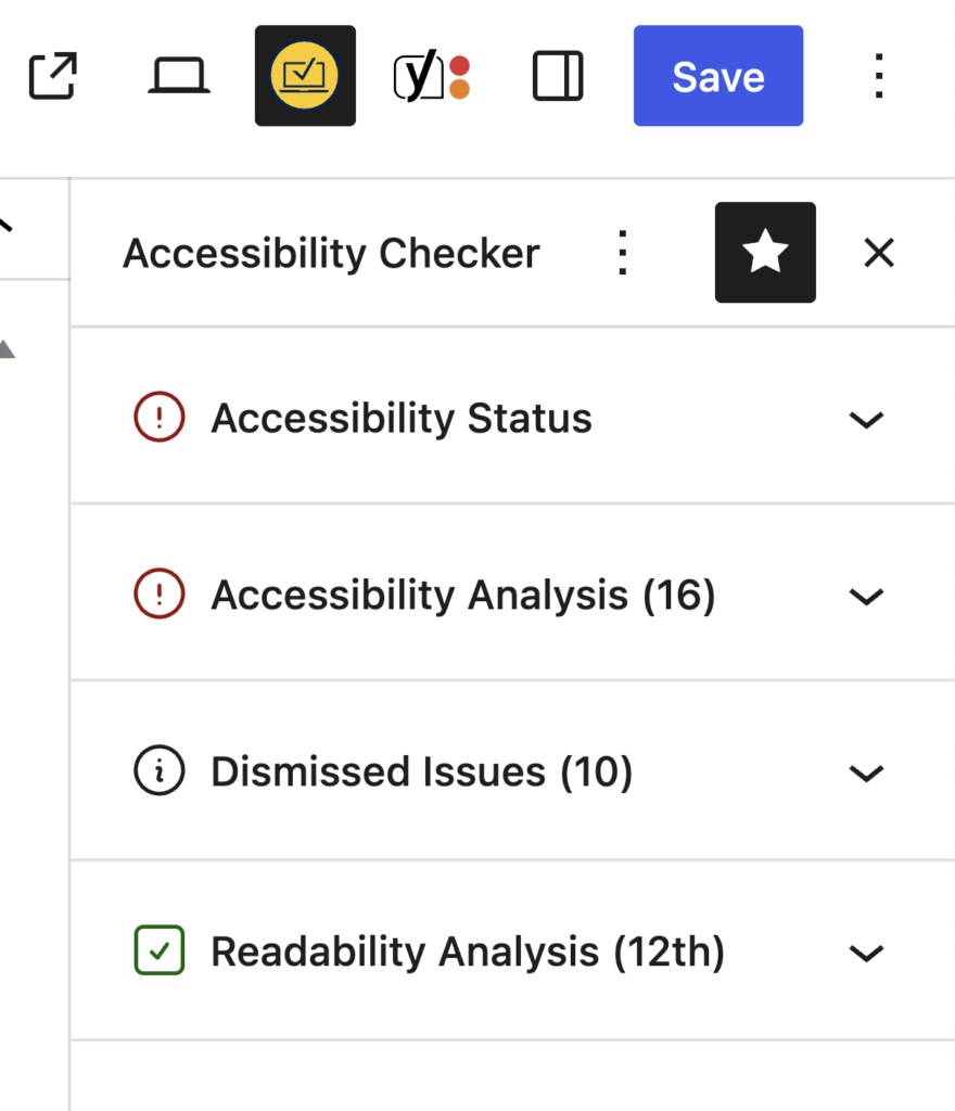
One of the biggest changes is separating issues that still require action from those that have already been addressed or dismissed.
Accessibility Status Panel
The Accessibility Status panel provides a high-level overview of the current page.
It includes these four metrics:
- Number of Problems
- Number of Needs Review items
- Reading Level
- Number of Passed Checks
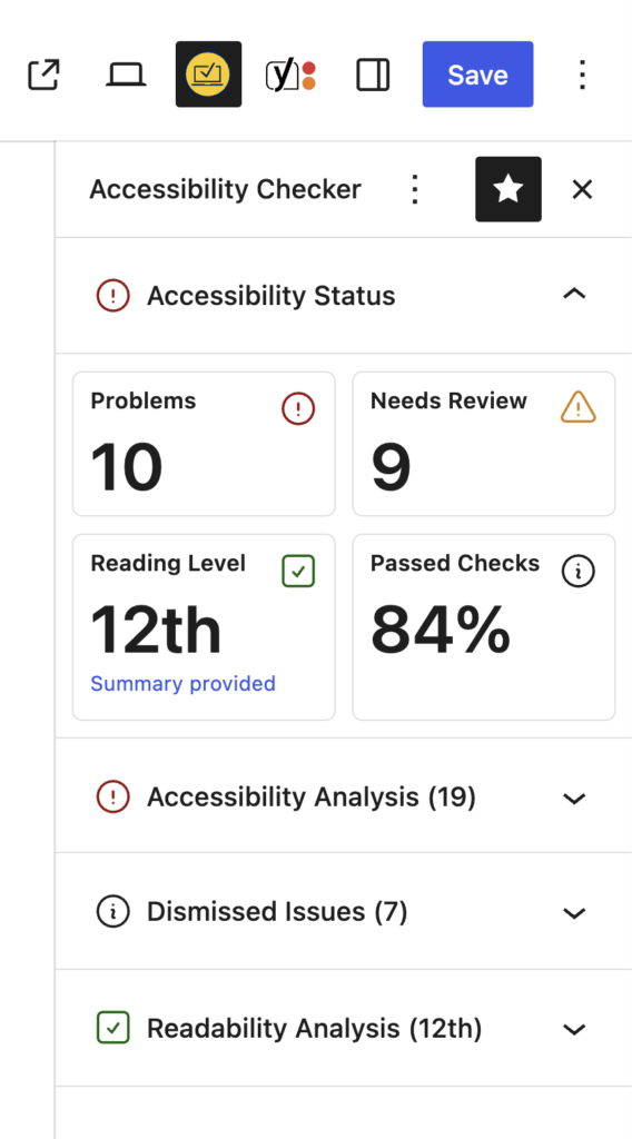
The terminology here has changed from earlier versions of the plugin. Previously, issues were labeled as Errors or Warnings. We replaced those terms with:
- Problems: issues that require remediation
- Needs Review: items that require human evaluation
This change better reflects how the plugin actually works. Some issues can be identified programmatically with high confidence, while others require a human decision.
For example, an image without alt text may be acceptable if the image is purely decorative. That type of issue is flagged as Needs Review.
Accessibility Analysis Panel
The Accessibility Analysis panel is where remediation work happens.
Issues are separated into two tabs:
- Problems
- Needs Review
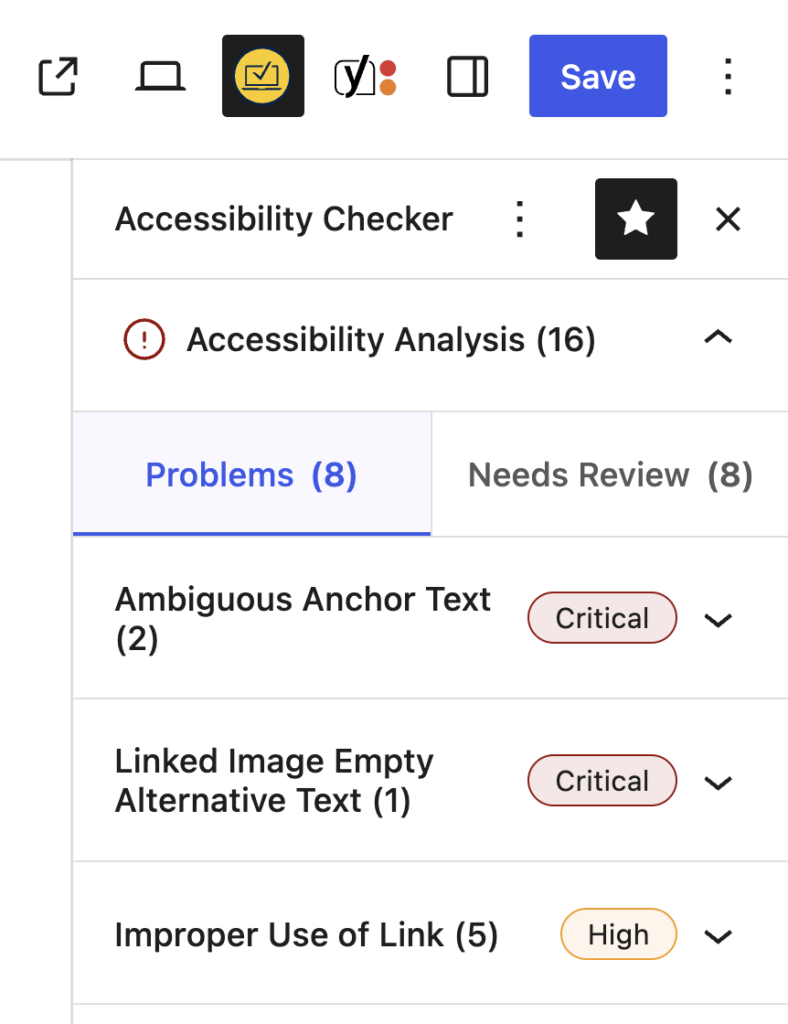
This separation reflects two different workflows:
- Problems require remediation
- Needs Review items require investigation
Each issue is grouped by rule and sorted by severity so the most critical issues appear first.
Selecting an issue opens a detailed modal containing:
- Issue ID
- WCAG success criteria
- Severity level
- Affected HTML code
- Documentation on how to fix the issue
The modal allows us to provide detailed information without overcrowding the sidebar itself.
Viewing Issues on the Page
Each issue includes actions such as:
- View on page
- Show affected code
- Dismiss the issue
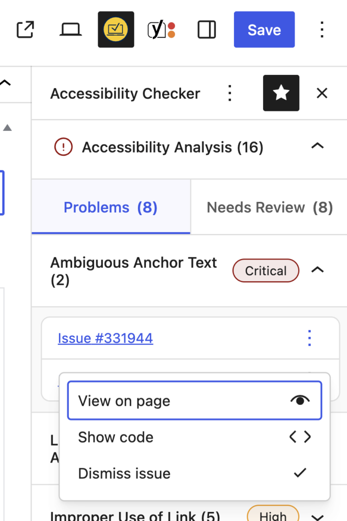
The View on page option highlights the element directly on the website’s front end, so users can quickly locate the issue in context.
One-Click Accessibility Fixes
Some issues can be resolved with automated fixes.
For example, if links open in a new window without a warning, the plugin can either:
- Remove the
target="_blank"attribute - Add a screen-reader warning indicating the link opens in a new window
When a fix is applied, Accessibility Checker immediately rescans the page to confirm the issue has been resolved.
From “Ignore” to “Dismiss”
Previously, users could ignore issues.
We replaced that terminology with Dismissed issues to better reflect what’s actually happening.
When dismissing an issue, users can now choose a reason:
- False positive
- Remediated
- Confirmed accessible
Optional comments can also be added to document why the issue was dismissed.
This makes remediation workflows clearer for teams and auditors reviewing accessibility work.
Dismissed Issues Panel
Dismissed issues are now displayed in their own panel.
Separating them from active issues reduces clutter and ensures users focus on the items that still require action.
At the same time, dismissed issues remain accessible for review or reopening if needed.
Readability Analysis
The sidebar also includes a Readability Analysis panel.
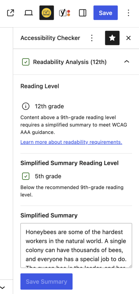
This measures the content’s reading level and allows authors to provide a simplified summary.
If the content’s reading level is high, adding a summary written below a ninth-grade reading level can help meet accessibility recommendations for comprehension.
Providing a summary can update the status indicator and help bring content closer to WCAG AAA guidelines.
Sidebar Actions and Scanning Tools
At the top of the sidebar, we added quick actions that allow users to manage scans directly from the editor.
These include:
- Scan page: rescans the current content.
- Refresh results: updates the sidebar without saving.
- Clear issues: removes stored issue data so a fresh scan can run.
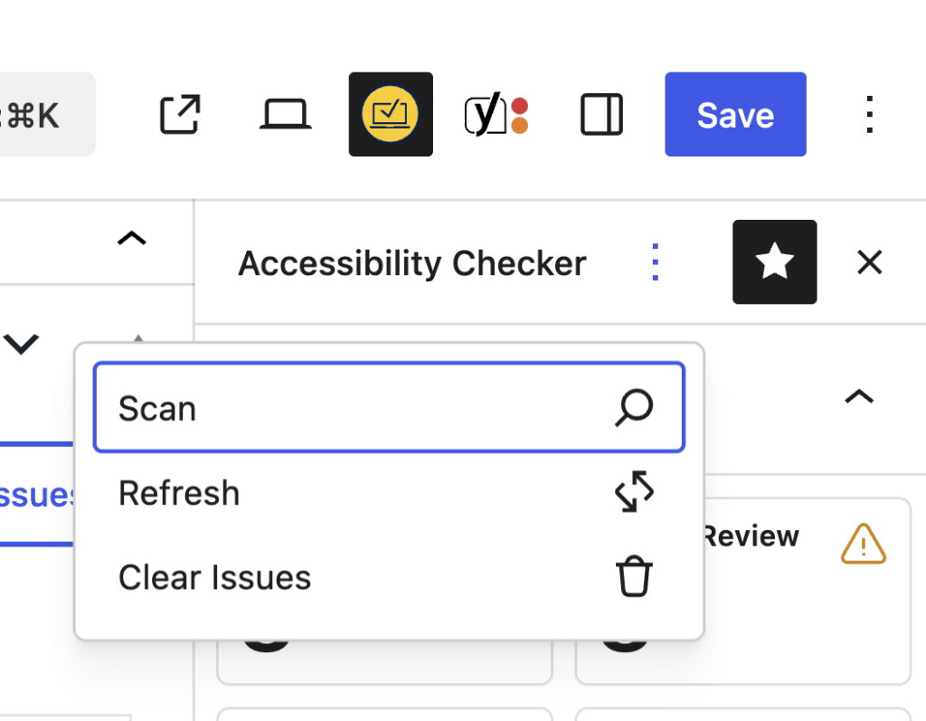
These tools allow users to run scans without triggering a full post save, which can be helpful on sites where saving content triggers additional workflows, such as notifications.
A New Approach to Icons and Color
Another major change is how the interface communicates meaning.
Older versions relied heavily on large blocks of color. The redesign instead uses color, shape, and icons together to convey information.
For example:
- A red circle with an exclamation mark indicates a problem that needs attention
- An orange triangle indicates a warning or an item that needs review
- A green square with a checkmark indicates a successful check
This approach improves accessibility and makes the interface easier to understand at a glance.
Updating the Classic Meta Box
While the new sidebar is the future, the classic meta box is not going away.
Many sites still use the Classic Editor or non-block editing environments, so the meta box remains necessary.
However, it has also been refreshed to align with the new sidebar design:
- Updated terminology
- New icon system
- Cleaner layout
- More consistent metrics
This ensures users receive the same data regardless of which editor they use.
What’s Next
The Block Editor sidebar is just the first step in a broader UI and UX overhaul for Accessibility Checker.
Future work includes improvements to the front-end highlighter and scanning tools, as well as exploring ways to expose accessibility issues in other editing environments and workflows.
Our goal remains the same: to make it easier for anyone using WordPress to find, understand, and fix accessibility issues.
Join Us for the Next Livestream
The Accessibility Checker Changelog livestream airs on the second and fourth Thursdays of the month, alternating with our plugin release schedule. Each episode will feature demos, technical deep dives, and previews of new features. Follow us on YouTube to get notified when we go live.
To learn more, download Accessibility Checker or upgrade to Pro.
If you have feedback or questions, you can connect with Steve Jones on X or join our Facebook group.
We look forward to sharing more soon in the next changelog.