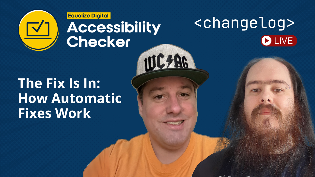
The latest episode of the Accessibility Checker Changelog livestream was hosted by CTO Steve Jones and lead developer William Patton. This biweekly series offers a behind-the-scenes look at the newest Accessibility Checker WordPress plugin update, including recent features, development decisions, and insights into the broader WordPress accessibility landscape.
This episode focuses on the new Accessibility Checker automatic fixes (Free and Pro), demonstrating how they simplify remediation, improve accessibility, and enhance website usability.
Watch the Video
Video Transcript
Show/Hide Transcript
Steve: [00:00:00] All right. We should be live.
William: Yes.
Steve: Alright. Let me check the channels and see if everything’s working. Looks like it’s working.
William: That was easier than last time.
Steve: Yeah. So how’s it going, William?
William: Yeah, it’s going pretty good.
Steve: Good.
William: It’s a week.
Steve: Sure is almost like Equalize Digital is cooking something new, right?
William: Yeah.
Steve: We might be. No spoiler alerts here, but we are
William: Don’t be looking at my side bar.
Steve: That’s right. We are cooking something new and hopefully we will be launching that before too long.
Give it a few minutes, make sure everything’s working. Let me check X, make sure that we’re [00:01:00] going out live on X.
I don’t know. I don’t know if we’re live on X. Did we not have X? No, I’ve got X set up. Yes, there it is. We are live. Nice on X. We could check LinkedIn.
William: Can we check LinkedIn?
Steve: I don’t know. It’s LinkedIn.
William: I can, but no, I can’t check LinkedIn. I can open another tab and fill.
Steve: Yep. We are live on LinkedIn. Awesome. So we got everybody. Oh, look at that. We got a, looks like we got some confirmation that it’s working. Awesome.
Welcome to the Accessibility Checker Changelog livestream. We try to have these every couple weeks where we go through and talk about some of the latest features in the plugin.
This episode’s a little unique that we are actually going [00:02:00] backwards to a feature that we have previously released, but something that we think is good to share and good to walk through and would be good to have a kind of a walkthrough of how to one, break a website so that you can then fix it.
So, today we’re gonna be talking about the fixes inside of the Accessibility Checker. So not only is the Accessibility Checker a scanner, it also is a fixer. If you don’t know, the Accessibility Checker is an automated accessibility scanning tool and fixing tool that can help you make your WordPress website accessible and stay accessible.
We have a full featured free Accessibility Checker plugin. Our full rule set is available in the free plugin and you can scan on a per post or per page basis. We do have a premium version of Accessibility Checker Pro, which allows you to have global [00:03:00] full site, auditing tools and some additional fixes are in pro, some more advanced fixes, which we will go over here shortly.
And then we have add-ons at certain price tiers.
We have an audit History Add-on that’ll let you track your accessibility compliance over time.
We have a Multi-site Add-on that allows you to manage your Accessibility Checker plugins at the network level.
And we have an Exporter Add-on that allows you to export your accessibility issues to CSV files.
Like I said, this one is called the fixes in how automatic fixes work.
You ready, William?
William: Yep.
Steve: Alright, so what we’ll do is we’re just, we’re try to run through these one by one, and we’re trying to get William to break a website so we could then fix a website or find a theme that is broken. So, it’s gonna be a little bit of an interesting practice here.
[00:04:00] In Accessibility Checker free, the way you get to fixes is you go to the WordPress Admin Dashboard and you go to Accessibility Settings, and then there is a tab called Fixes. You’ll see what a fixes are available for Free and which fixes are available for Pro, and as you can see, the Free fixes far outweigh the Pro fixes at this point. We’re trying to give a lot of these fixes away in the Free Plugin so that there is no cost barrier to be being able to make your website more accessible with just a couple clicks.
Let’s start with the first one, add language and direction attributes.
William: Yeah, so all websites should have at least a language attribute.
Some of them may want a direction attribute, some of them might not want a direction attribute. I only speak English and I only read websites in English, and it’s always [00:05:00] the same direction for me, but that isn’t the same case for all languages. Some languages are from right to left and it is good to tell browsers that may assume the default that you can do that. It’s also good to say what your language is as well.
Steve: Yeah.
Each fix comes with detailed documentation. As you saw, I clicked on the information icon, which pops open the documentation for that specific fix.
The fixes generally show you how to, or sorry, the documentation for the fix shows how to take the steps to apply it. And then it tells you what the fix actually does, and it tells you the impact on accessibility.
We try to provide you with a lot of documentation and a lot of information on why you should do this and how this actually impacts users with certain disabilities or just how it impacts accessibility as a whole.
Do you want to give this one a [00:06:00] try, William?
William: Yep. So I have that you…
Steve: Let me pull up your broken theme.
Yeah, I’m gonna switch to William’s screen here. There you go.
William: Yeah. I have this theme here, this is Twenty-twenty four, I believe, and by default outputs a language, but it does not output a direction. Let’s see if I can zoom that.
Yeah, on this HTML tag here, you see there’s a line tag with the current language of this site in my browser and there’s no direction. So, if I were to visit this tab here and enable this fix. Save. I can reload this page and we now see that there’s a direction tag of left to right which matches the content on this website.
Steve: William has the inspector open and he is viewing the elements of the [00:07:00] page. This is on the HTML tag. It now says lang=”en-US” and dir=LTR, left to right.
William: Yes, and that could be right to left depending on the content itself. The language isn’t always a dictator of what the direction is, so, these do need to be separate. As I said, this is the Twenty-twenty four Theme, and by default it puts a language tag but does not have direction. That is pretty normal for the majority of themes that I have tested. They have language but no direction.
Steve: Yeah, that’s an interesting, putting left to right, we just assume, right? We assume that everybody’s left to right, and that’s not always a fair assumption, such as like languages like Arabic and Hebrew, right? Which are right to left.
William: Correct.[00:08:00]
Steve: Yeah. Very cool.
The screen readers actually, will read that and respect that and announce that out correctly.
William: They will. In addition to this fix being here, we don’t have a fix for this, but I do wanna call out that you can apply direction and line tags to any other element.
If you have a part on your page that differs to what the browser default is or what your webpage is, you can specify that. That is not part of our fix, but I did wanna call it that it doesn’t exclusively have to be on the HTML tag.
Steve: Right? There can be a switch. And that’s typical, right?
William: Yes.
Steve: If sometimes, you provide both English and say Spanish or something and looking at our documentation, it says that the screen readers, for instance, rely on this information to correctly pronounce words and phrases, thus improving the experience for users with visual impairments.
So, without the language attribute, assistive tools may misinterpret the [00:09:00] text leading to frustrated user experience.
William: Yeah. But, I would be frustrated if it write the words backwards.
Steve: Yeah. ’cause that’s essentially what it’s doing.
William: Yeah.
Steve: Cool. So, that one’s pretty easy. Do we want to go into how you determine, what left to right or right to left to put on there, William? Like from a programmatic standpoint?
William: I would need to refresh my memory of how I decided, that’s all. Maybe we rely on the documentation that we wrote at the time.
Steve: An overarching thing is we’re not just, we’re not just defaulting to left to right. We’re actually making a decision a programmatic well thought out decision.
William: Yeah. WordPress does actually include this from get_bloginfo() and they have an is_rtl() function, which can return data. Which both of these functions are being used to do the initial determination. However, if neither of these provide the direction, then it will [00:10:00] use JavaScript on the browser when the page loads to do a final determination based on what language the user wants. Which the JavaScript fallback isn’t the best. So, ideally the website dictates, so the website should really say what it is.
Steve: And then we just try to…
William: But in cases where they don’t, we do at least have that fallback that checks from the browser.
Steve: Yep. Very cool. Alright, so let’s see what’s next.
Remove tab index.
William: Yeah.
I can actually showcase that here. I do have a fix for, or some content for this. So, if you see a start Focus Indicators up here in the Navigation Menu, tab through the navigation aims and it starts to reach the content. And as soon as I press Tab again, it has bypassed most of the content on the page because the Tab Indexes are set incorrectly.
I have skipped [00:11:00] past probably six or seven whole sections of this website to reach this link down here that says Home on it. And if I reverse Tab back up, it goes back to the metadata of the Page. A whole bunch of this content is not accessible in the correct Tab order. If I continue to press Tab, eventually I will reach the content that was skipped.
Steve: You’re…
William: A long way to go to get to it.
Steve: Yeah.
William: This is the problem with changing the Tab Index on Elements is that people have to pass through a lot of very irrelevant content to get to this. In the case of me with the dev tools inspector open, I actually had to go through all of my browser Tabs, all of the browser Buttons, all of dev tools to reach what was actually Page content, because the Tab Index has been modified.
And I have a collection of different Tab Indexes, like this button has a Tab Index of [00:12:00] three. This link beside it has a Tab Index of five. Some things have duplicate Tab Indexes of four. So various things here have tab indexes that break the flow of the Page for a keyboard user.
Steve: Alright, let’s fix it.
He’s enabling the fix in the Settings.
William: Yep.
That’s the second fix in the list. Remove Tab Index. Hit Save. I will reload the content Page.
Then if I tap through the Page of content starting all the way from the header to the Nav Menu. The post metadata that is above the content and never have reached the content and it is Tab into any of the interactive elements in the [00:13:00] order that they would be expected to be reached in.
Steve: Cool.
Very cool. As a company that does a lot of accessibility remediation, the Tab Index can actually be a useful tool in some instances.
William: Correct.
Actually, here I have this Button and this Button has a Tab Index of negative one, and this Button is removed from the tab order, potentially, in our case on purpose.
If I press Tab, it skips it to the input that’s beside it, and if a reverse Tab, it goes back to the header with the Tab Index of one above it. It is entirely skipped in the Tab order with a Tab Index of negative one, and that is removed from any accessible that is entirely inaccessible for someone who’s using a keyboard only.
Steve: The Accessibility Checker will actually only modify Tab positive…
William: Correct.
Steve: Positive Tab [00:14:00] Indexes in an effort not to break an intentional negative one Tab Index. ’cause a negative one Tab Index actually will remove something from the tab and due to
William: Often one, that in the case of my example content here where the Tab Index is a Button. You almost never would want a Button not to be accessible.
However, you might have other types of content. The negative one is a legitimate item to be applied and, we need to keep that. So, we do only modify positive Tab Indexes.
Steve: And correct me if I’m wrong, but we actually only apply this to actual tabable elements as well, right?
William: Correct. There is a list of elements that are technically interactive, capable of being Tabbed to by default.
For example, this heading here that I can Tab to is not generally an item that should be Tabbed [00:15:00] to.
I do have this in bracket here, right? Bad. I’ve made this heading tab tabable when it shouldn’t be tabable. That should be read out as part of a different tree that screen readers would have access to. But this should not be accessible.
However, in the case of my bad test content it is. I’ve not touched that as part of this fix because it isn’t actually a natively interactable element, bands links, various other elements might be interactive, but the Heading should not be.
Steve: Yep. Cool. The fix is Smart.
I don’t know if we touched on this yet, but I think this is a good place to talk about this a little bit too, is like when we, we don’t just wholesale apply fixes to the website and hope for the best, right?
We have an accessibility scanner built into our plugin and it will scan your page and it’ll find issues and then it’ll say, “Hey, you can actually apply a fix to fix this, or you can apply the [00:16:00] fixes at the global level.”
William: Correct.
This is the error I’ve pulled up for the Post that we were just looking at, and we can see there is seven items flagged in that content for Tab Order Modified.
I do have the fix enabled, but if the fix was not yet enabled, there is actually an action in the right hand side column for each item that’s discovered where you can click the fix and a modal will appear where the fix, the same content that appears in the same Page would appear here.
You get the information bubble where you can click to open the link to get to the documentation from it, or you can just enable it on the checkbox. Click Save. Now that has been saved.
If I were to reload this Tab, the seven Tab Order Modify item should go down whenever it rescans.
Steve: Yeah, so we scan to identify issues. [00:17:00] We apply a fix to an issue or a set of issues, and then it rescans again to ensure that the fix that we applied actually worked.
William: Yeah. You can see now there is no Tab Order Modified items listed here because none of the natively focusable elements have been detected as changed.
Steve: It’s Accessibility Checker/Fixer/Checker.
We always want to check that our fix actually worked because there could be scenarios where, you know William said with old language where we’ve actually, we’re not getting the language direction from the website and we’re falling back to some JavaScript fix that we have for that. What if that’s wrong and it doesn’t apply the fix, right? The scanner will catch it and still say, “Hey, even though we applied this fix. It’s still not working and it’s something you need to look into.”
William: Correct.
All of the fixes we have become [00:18:00] validated whenever we apply the fix. In fact, you can validate them directly on the front-end by running the re-scan.
Yep. That is that fix. Remove tab index title attributes.
Before I save. Modify that one. Let me just find the element on this Page.
Steve: This is Removing Tab Attribute or Removing Title Attributes.
William: Correct. I’m inspecting this image. It is a broken image right now. It doesn’t exist on this website, but it markups still exist and it has a title.
Screen readers will read this out. They will read this title.
Steve: And in a lot of instances, give a preference, right?
William: Yes. They will prefer the title over the alt tag when in the situation of images. This is an image that has no alt text and has a title of decorative flourish, which arguably [00:19:00] based on the name of the file, could be an accurate description, but it also might not.
Steve: Yeah.
William: However, as far as accessibility goes, title is a fallback and is never really preferred, accessible name to use for elements.
When it comes to an image, the preferred accessible name is alt text and if I open up Accessibility Checker issues and tap through them till I find the image that I was just looking at, which is here. This image is missing al text. That’s actually what our fix or our checker has detected. This image is missing al text. However, it does have a title attribute attached to it. So, if I revisit the fix page, enable that fix and save this [00:20:00] and then reload the content of this page, and I will inspect this element again, that now no longer has a title of decorative flourish, but has an alt text of decorative flourish.
So, while the fix says “remove title attributes,” it actually doesn’t always just remove them. If there is no other preferred accessible name, the title will be moved to that preferred accessible place.
It indicates the image, that’s always the alt text and never the Title Tag.
Steve: We could just remove it, but that actually doesn’t improve the accessibility because we’re actually
William: It actually makes it worse.
Steve: We’re taking something away that, like the Title Attribute actually does get read out by the screen reader and the screen reader does give it a little bit of preference, but if we were to just remove it now has nothing.
William: Yeah. If an image has an alt text and a Title [00:21:00] Tag, the Title Tag will be read out by most screen readers, which is usually not what you want. You normally want the alternative text to be read out. So, if this image did contain alt text by default and the title would just be removed because the alt text would be favored.
Steve: Yeah. This is outlined in our documentation, and I think it’s pretty clear in the documentation. For images, if an alt attribute is present, the title attribute is removed. If an alt exists, the content from the title attribute is moved to the alt attribute.
William: Yes. And in the case of links, I forgot to talk about links, but this link did have a title of home previously, and now the fix is enabled.
It actually has been moved to a label aria-label, which is the preferred,
Steve: Right.
William: Accessible name for a link.
Steve: Yeah. Yeah.
For links and buttons, the fixed checks for an aria-label or an aria-labelledby. If either it’s present, the [00:22:00] title attribute is removed. If neither is found, the title content is transferred to an aria-label.
William: Yes. While I have this up, actually, I do see that I do have an example this image here did have an alt text of “red ceramic mug” by default and the title has just been removed. And we can tell that because we had some helper classes to various elements that have changed. There’s edac-removed-title class indicates that this has been operated on by our fix.
Steve: Yeah. This also supports form elements as well. It will do the same thing as, it does for link buttons, but instead of moving it to an aria-label, it’ll move it to a “for attribute” .
William: It will. It is not so easy when it comes to input elements because some of those input elements don’t necessarily have good data to take to “for type”. But [00:23:00] yes, if there was an input here that was appropriate to have it moved, it would’ve been moved.
Steve: Cool. Alright, let’s move on to the next one, which is Force Link Underline.
William: Yes.
This actually took me a while to find a theme that I could break this on. The older themes that I was looking at, the pre block themes make it harder to break this.
However, I have this link on my page. This link is just called “No Underline”, and I have used inline styles of text-decoration: none to remove this underline.
If I were to come to the fixes signs and enable that fix, and save the changes. Then revisit the page content. Reload the page. This link now has an underline under it.
The link is called “No Underline”. It used to have inline [00:24:00] styles that remove the underline. However, now we have inline styles that force an underline on this link. This only operates on links that are inside the content.
If I scroll back up to the top of the page, I also have links inside the navigation, and they have not had underline supplied by default because these are nav items. We only apply this to non navigation links.
Steve: Yeah. That would be anything inside of a nav landmark or
William: Correct.
Steve: Anything with a labeled
William: Navigation.
Steve: A role=navigation. Yep. Yep.
This actually when you apply this fixes the focus state as well, right?
It adds an outline.
William: No, we have a fix for that. This theme actually has a focus outline
Steve: Oh, okay.
William: So wait. Yeah, it’s fine. But we have a separate fix…
Steve: For that. Okay.
William: For introduction of,
Steve: This is probably a really simple fix, but and a lot of like accessibility auditing [00:25:00] and remediation that we do.
This is something that is problematic and an issue most of the time.
You can get a lot of mileage out of a fix like this.
You can see like, sometimes designers don’t want that text decoration underline on their elements to try to make ’em look a little more fancy.
There’s ways to achieve accessible links and that differentiate themselves from the rest of the content. But the easiest way to do it is with a text declaration, and that’s pretty standard and pretty universal.
William: It’s the default and has always been the default in all browsers as far as I can remember, and I’m pretty old. It’s been that way for a long time.
Steve: Yeah.
William: And I do think an unspoken rule in accessibility sometimes is just meet expectations. I expect links to have underlines in most situations. It’s easiest to just pervade that underlying.
Steve: [00:26:00] Yeah. While you may be able to achieve it with like bolded text that is a different color than the body text. And if it still has the correct focus outlines and things like that you could achieve it. But you really get in the territory of confusing people on whether or not that’s a link or not. This is not just people with disabilities or people using assistive technologies. This is everybody.
William: This is just me.
I expect that links to have underlines. That’s my expectation. Sometimes they don’t, and it sometimes confuses me.
Steve: Yeah.
If you want clicks on those links, I would suggest having a text declaration.
William: Yeah. And actually on this website, as someone who, can perceive most colors, I do have some issues with reds. But, actually on this theme, I see that the links are the same color as the body text.
Without the underlying, how would you know? That’s one of the reasons why a visual indicator [00:27:00] supersedes a color.
Steve: Yeah. We could do a whole episode just on that alone. But, let’s move on. ’cause we’ve got a lot of fixes to get through.
William: Yes.
You wanna explain what the Viewport Tag is for?
I’m gonna need to Google how to break this on this thing.
Steve: We don’t have to go through all of them, but we could skip through over some if you think that we need to for time, but the next…
William: Let’s come back to that one then. Okay. We can just talk through and we can demo, if I can figure out.
Steve: Yeah, let’s talk about it though. The Make Viewport Scalable. Ensure that the Viewport Tag allows for scaling and enhancing accessibility on mobile devices. We actually internally through a remediation, have gone through a lot of testing of this feature recently William?
William: Yes, we have.
In my inspector, I’m expecting what the Viewport Tag on this particular website is. It is the initial content, the width is based on the device width and the initial scale is one, [00:28:00] and there is nothing else in this thing in the content of this Viewport Tag.
However, there are other options that could appear here. Width as it is right now, if I come to this Tab and I zoom this page, zooms just fine. I can increase the scale, no issue. However, if this meta tag has, I think it’s scalable=no.
Steve: On a mobile device.
William: Oh, thankfully the browser is overriding this negative choice of Macs.
However, on a mobile device, I probably will not be able to zoom.
Steve: Right.
William: I’m zooming to 500% right now and it is not changing.
Steve: It’s user-scalable=no. But I think it’ll still work on a desktop browser.
William: Oh yeah. user-scalable. That is correct. It is been so long since I’ve tried to prevent [00:29:00] people from scaling websites that I forgot what it was called.
Steve: Does it do it on desktop? Oh, you’ve got your mobile. Yeah. Desktop’s not a problem.
It’s gonna be a problem on mobile devices.
William: Yes, or depending on what browser you’re using. If you’re using an auto browser. Yeah. It may not just overwrite this. ’cause what’s happening here is my browser is deciding that’s incorrect.
Steve: Why would a web developer not want the page to be scalable?
William: In the olden days, maybe that was fine. I can’t think of very many legitimate reasons why you would want that right now.
Steve: Yeah.
William: However, the inability to increase the text size is a problem for someone who is hard of seeing.
Steve: Yeah.
William: Or someone who’s had a few too many beers.
Steve: Yeah. Or somebody that’s just trying to like, zoom into a phone number and copy and paste it on a phone,
William: Yeah.
Steve: Things like that. So you don’t wanna… I know back in the like early days of [00:30:00] responsive web design and web development, that it was common, to set that viewport not to scale for your responsive layouts so it was easier to code.
But, nowadays you wanna make sure that you’re not making that decision for that user. That website can be zoomed out and zoomed in, and that all the elements on the page naturally scaled to fit their their page. I think that people would do it too.
If you’ve prevent it from being scalable then like a sticky nav, is not gonna be a problem. But if they scale in with a sticky nav, the navigation can just get bigger and bigger and it can start overlapping elements and stuff.
William: Yeah, I think that is true. Although the WordPress Admin I have right now has it zoomed in, I guess it does at a certain point, decides not to scroll.
Probably for that reason.
Steve: Yeah, totally.
Cool. I think that covers that one.
What do we got next? We got all kinds of good fixes for you guys.
Go [00:31:00] to EqualizeDigital.com/AccessibilityChecker and download our free plugin and start fixing these things today right away. That’s my sales pitch for the day. That was our commercial.
Back to the regularly scheduled livestream.
The next one is Block Links Opening New Windows. This is a very controversial fix, William.
William: That’s sometimes. Not for me. I have no issue with opening new tabs when I choose to. But, it’s nice to know when it is going to happen.
For example, if I could not see the list of tabs I have at the top of my browser and I just click on this link right here, I wouldn’t know that I’ve been taken away. It’s not gonna work because it’s a broken link. I wouldn’t have known I was going somewhere else if I clicked on that link, because I might not be able to see the list of tabs.
Steve: [00:32:00] Let’s show ’em how we can actually inform the user. This is a visual user and a screen reader user that link opens in a new window.
William: As a visual user, or in fact as any user for me to know, this link would open a new window. Of course, my link text is “New Window Open”, but not all of them are.
The only way for me to know would be to inspect the code and to see this target=”_blank” on the anchor tag. That is the only way I would know this link is gonna open a new window.
If I come back to the fixes and I enable to fix the block links, opening new windows and save that fix. Reload this page. If I scroll back to that new window open link, inspect it, we can see that the target=”_blank” is no longer present there.
If I were to click this link, it would open in the current tab, which in most situations is the expected [00:33:00] behavior.
There is a companion to this New Window Open fix, which is to Add a Label to Links to Open in a New Tab. If I click thisand save it. These links are actually mutually exclusive. You can really have both of these. In fact, there is a note here that’s says “This setting will have no effect if the “Block Links Opening New Windows” fix is enabled.”. I’m gonna disable that same fix that I just had on. Hit save. I will come back to the content and we will look at the New Window Open Link again.
Once the page reloads, we can see that there is now an icon beside it. There is a visual indicator that link will open a new tab. It also has a tool tip for when it is hovered over with a mouse that says [00:34:00] it opens a new tab. If I were to inspect it, we can also see that there is a label, an aria-label that says “New Window Open”, which is the text, the link text, and then “opens in a new window.”
It wouldn’t be redundant if this link was not named something that tells me what it is.
Steve: Right.
The tool tip is actually accessible too. If you hit the Escape Key, it’ll close. If you were in the, focused on it, you were in the inspector, but yeah.
Yeah. It’s an accessible tool tip that we’ve added. This fix was actually derived from a plugin that we actually have. This is the only fix that we have that has its own plugin that you can install this fix just in and of itself. This is the same functionality that you find in Accessibility Checker now, but this plugin is called New Window Warnings. You can find it at [00:35:00] WordPress.org/plugins/accessibility-new-window-warnings. You can install this functionality, this fix just itself.
This one definitely is controversial. I know the documentation for this on our website is a very high trafficked piece of documentation, just because I think a lot of people are seeking whether or not they should open a link in a new window or not because it seems like, a lot of people are thinking, “If you’re on my website, I want the links to open in a new window so that you don’t leave my website.”
But really is a break in context for a user that wasn’t expecting that to open. ’cause then they have to, if you’re using a screen reader, you gotta get back that tab. You gotta get back to the place on the page you were, and it’s really time consuming.
But, if you tell ’em, “Hey, this is gonna open a new window, are you sure you really wanna do it?” It’s just much more accessible.
William: Yeah.
Most people who are browsing the web now understand how the Back Button works. It has been a standard feature forever, and in fact, an awful lot of mouses that people use these [00:36:00] days include back and forward buttons right on the mouse. It is a very native and well understood feature.
There is no real reason.
Steve: Yeah.
William: You would wanna open all external links by default in your tabs that there might be some legitimate reasons, but by default, it shouldn’t be the case.
Steve: Cool. I wanna skip around a little bit. Does that mess you up?
William: Nope. I’ve literally just had to skip to because these links aren’t the two similar ones or
Steve: Yeah.
William: Yeah. They should be side by side. I might do that without asking permission.
Steve: Yep. I do wanna get to the really good ones that are in the Pro Plugin, but, I want to look at the Focus Outline fix first.
William: Yes.
I’m gonna enable this. It might be quite difficult to properly showcase on this website because it already has ’em. The theme already has.
Steve: There’s the customizer.
What if you…?
William: That’s what I’m thinking. Can I break it?
Steve: [00:37:00] Yeah.
William: I might be able to break it. Yeah. But let me see if I can break it.
You can explain why these are useful and I will break it.
Steve: Sure.
When a keyboard user is tabbing through tapable elements on the page, we want to provide a visual outline to the element once it’s focused.
Typically we do this with, a two pixel outline that’s got a two pixel offset that is a good contrasting color.
Where that gets really difficult sometimes from a development standpoint, especially if you’re using a theme that you downloaded is if outlines are set in CSS, right? If you set the outline color to blue or green or whatever or white, you have to define the outline color per the background that it’s on. So, if the main content area is white your focus outline probably should be a very [00:38:00] contrasty blue or whatever very contrasting color. That would be set in the css. But, if you’re on a, say you get to the footer and it’s black if you have that outline set globally the contrasting blue is not going to look good on a black and it’s not gonna meet accessibility, color contrast requirements. So, you would have to write custom CSS to make it say a white outline in the footer area.
What we did with this fix was we decided, “Hey, the browser actually gets this right out of the box. It’s us web developers that kind of mess this up as we create our themes and we create our websites.”
Sometimes I’ve seen focus outlines removed just for pure aesthetics because, the developer doesn’t like the way it looks when you click on the link and just for a second you see the outline.
Now, we could get into like Focus Within and Focus Visible and things like that. There’s ways to get around seeing that outline just [00:39:00] on an Active State. But, what our approach here was to not be opinionated about the outline, but to restore the default browser outline, which comes with the beauty of having that browser blue and white. You have two outlines, so regardless of the background you’re on, it’s going to meet color contrast.
Were you able to break it?
William: Maybe.
I’ve literally just added the sale that completely onsets the outline.
Steve: Cool.
Hopefully.
William: Yeah, outline onset and I have disabled our fix and I will disable the focus that comes from the theme.
So, now if I’m in a webpage of content and I’m pressing Tab, my focus is being moved, but I can’t see where it is.
Steve: For a visual user using a keyboard, [00:40:00] this can be very problematic ’cause William has no idea where he’s at.
William: Nope.
I can see in my inspector at the side, some various styles are being changed, which has given me an indicator of where I’m, is the only reason, but I have no visual indicator on the page. They showcasing anything about where I’m at. The only way I will know when I get to a certain point is yeah, so the page has scrolled because I’ve got more than halfway and I’m scrolling back up or Shift Tab and the page has moved again. I know that I’m at least halfway down or up the page, but no idea where.
And we did just… the browser does this. I’ve disabled it by explicitly unsaying the focus on every single element on the page. However, we have some styles here that include the important tag that will override this unset.
So, I’ve enabled the [00:41:00] fix styles. If I come back to the webpage and I press tab. Now, all of the links or all of the focusable elements now have a focus ring. I can see where they are.
Steve did mention that there would be a blue and white outline for me on my browser, Chrome, the outline is black regardless. But in Safari, Steve will see a blue white outline.
Steve: Yeah. Steve’s not, definitely not using Safari. Hold on.
William: I think that may be a Mac default.
Steve: Oh, is that what it is? Okay.
William: Yeah. So for me, I always get black and a white ring or black ring. You can see ,unless I can’t see blue anymore, in which case this looks like black to me.
Steve: Yeah. Let me show what it looks like on a Mac.
William: Yeah.
Steve: I’ve pulled up in my screen. I have this website running, what is this? Twenty-twenty green. What year is this? Twenty-twenty something. When it was
William: I think it’s three. [00:42:00]
Steve: Three. Okay. Twenty-twenty three.
I have the fix enabled in the, in this settings right here, Add Focus Outline. If I Tab through, you can see that I do have a blue and white outline.
Now, this theme does for some reason, on focus, add a white back.
William: That’s a background.
Steve: That’s a background. Let me switch this.
William: But, that is actually quite a good thing to force. The color. But, hopefully, it has a filter that makes sure the text inside.
Steve: Yeah.
William: If the text was white.
Steve: Let me switch to…
William: That actually is the exact reason why browser defaults have two tone.
They have a blue and a white is because what if you’re on a white background, you can see the blue.
But, if you’re on a very dark background, you need the white. You won’t see the blue.
Steve: Yeah. You could actually see this better in the other theme, I think I’m on Twenty-twenty now, but…
William: Twenty-twenty two.
Steve: All right.
William: The pink one.[00:43:00]
Steve: Yeah, let me jump back to this green one because they actually did show it better.
You can see that I do have a white and a blue outline, this double outline, and actually achieving that with CSS is extremely difficult. You have to do a lot of trickery, so we thought that our fix year was a little elegant, was basically just setting this style sheet back to the Browser Default.
William: Yes.
Steve: Do I have a…
William: Almost all browsers handle this way better than we could.
Steve: Yeah.
William: Comfortably handle it in CSS.
Steve: I’m in the footer now and I’ve focused on the search form, search button, and you can see I still have good contrast because I have that blue outline and I have a white outline.
That is the Focus Outline fix.
Cool. So let’s. Let’s jump around a little bit. That’s almost all of the free fixes.
I think we skipped Over Skip Links. We have a fix that [00:44:00] allows you to enable skip links if your theme is missing skip links.
William: You wanna just check that? ’cause this is the only fix currently that has a two step process.
If you enable that, actually two additional fields open up where you can input the IDs that you need to skip links to target.
Steve: Right. This may be for me, it may be…
William: For a lot of people it’s main content area.
Steve: Or something like that, or main…
Do you have to put the pound sign?
William: It’s optional.
Steve: It’ll actually strip it out or not strip it out.
William: Yes. I would prefer people put it in ’cause that makes sense to me ’cause it’s an ID.
Steve: Yeah.
William: However, if people forget it, it’s fine. I will also call it, this field is a little bit different. It isn’t a single input requirement. So you might have different target IDs on different pages across your site. You actually can input several target IDs in [00:45:00] there, just comma separated them.
Steve: So like the…
William: Say most of your blog pages have main content, but you have landing pages that just have content. You could do this and the fix will cascade through. It’ll look for each one until it finds the one that is correct for the page and that will become the target.
Steve: If I just put #main-content, # content.
William: Correct.
Steve: It’ll actually try the first one. If it doesn’t work, it’ll check the second one.
William: Yes, and this was done because Elementor builder outputs their on the set of markup. They have a full page, like takeover. It is not a template that comes from your theme. Thus the IDs will almost always differ and without the option to specify multiple there.
Steve: Yeah. Yeah. That’s pretty cool.
William: It just isn’t gonna work.
Steve: Yeah. Yeah.
William: Is the only fix that has a two-pronged input requirement. [00:46:00]
Steve: Cool. That’s most of the free fixes, but I wanna jump in while we still have time and talk about some of the pro fixes because these are some of my favorite fixes and they’re some of the more advanced ones. That’s why we’ve we include those in our Premium Accessibility Checker Pro Plugin. These come available with all levels of our Premium plugin.
I don’t have Pro active right now, but if I go to plugins, and I activate the Pro Plugin, and then I go to our little toolbar here at the top and I go to Fixes. You can now see that I have the Pro Fixes enabled.
Which one do you wanna go through first, William?
William: I think the easiest one to showcase is the Block PDF Uploads, which is absolutely not an accessibility fix in on and of itself. However, PDFs are an accessibility nightmare [00:47:00] for most people, which is why this was added. It is also why this is in the Pro plugin and not in the Free plugin because this is not an accessibility enhancement in and of itself. We very much included all of the accessibility enhancement fixes in Free.
Steve: This is a control level. You as a site owner, if you’re running a large site that has lots of content creators, this is a Control Feature where you can control the type of content that gets linked into articles. And, as William says, PDFs really can be problematic for accessibility if they’re not generated and audited and remediated appropriately with the right accessible PDF Tags. This is a good way to control content that your content creators are adding to the website.
Do you want to demo that so you have it enabled?
William: I do not, and I [00:48:00] actually, do you have a user that is not an Admin User on that test site of yours? Because I realize I do not.
Steve: I think so. Let me..
William: Because admins by default will always be able to upload PDFs and I only have an Admin User on this test site.
Steve: I have an Editor. Would that work?
William: That would work fine. Yeah. If you enable that fix and just have a PDF to test.
Steve: Alright, so let me show my screen here. Let me go to Fixes, Accessibility Checker Fixes and I want to enable Block PDF Uploads. Hit Save Changes. Then we wanna switch to this Editor User.
Let’s see if I can remember the password for that, which is probably 123456.
William: That’s the least secure password. But, if you read the backwards, it might be the most…
Steve: [00:49:00] Yeah. This is a local site and it can be deleted and destroyed and rebuilt.
If I go to media…
William: Yep. If you go to the library and test something random.
Steve: Let me…
Hold on, let me find a PDF real quick without showing the whole world my file system here.
I’m gonna bring my screen back up so you can see all my weird GIFs that I use to test.
William: It’s almost Thanksgiving.
Steve: Oh, it’s almost Thanksgiving.
William: That GIF that I absolutely hate is gonna come out again.
Steve: I’m gonna drag over a PDF and it uploaded. Is it supposed to do that?
William: You may have the permission.
Maybe we didn’t set it for them on this. That it should not have uploaded if the fix is properly enabled.
Can you try again here one time? Maybe you’ve just found a [00:50:00] bug.
Steve: Let me…
William: Can you click the Select Fail? Maybe.
Steve: Hold on. I’m gonna try this right here.
Maybe Editors still have the “Add Media.”
So you’re saying try to select it?
William: Yeah. If you click the Select Fails Button.
Steve: Yeah, that’s what I’m doing that, but I’m doing it off screen.
William: Oh, I can’t see it. Yeah.
Steve: No, it’s still uploaded. What are we doing wrong, William?
William: Oh, that may be broken. That may be a broken fix. Let me, I will take a note of that right now.
Steve: Are we sure it’s broken? Are we sure we’re not doing that?
William: I am not sure it’s broken. So I am going to take a note.
Steve: Now, it’s very possible that this Editor I have has
William: Permission.
Steve: Modified permissions because…
William: Yes… that’s what I hope is the case.
Steve: We do a lot of plugin dev here and we modify stuff.
Let me ensure that, let me log out here. I’m gonna log in as…[00:51:00]
I’m gonna go back to Fixes.
Block PDF uploads, restrict PDF uploads for users, without the edac upload PDF capability. So, we have a custom capability allowed for
William: If your data has manage options as well. It could also bypass by considering them as an Admin.
Steve: I bet. I bet you I have given this user that capability.
William: Probably.
Steve: In my testing.
William: We can cycle back to that. But, I will check this after this call.
Maybe we can show off the, my least favorite to build, but most favorite now that it exists fix, which is the Add File Size & Type To Links.
Steve: Yeah, let’s do that and let me just test another User before we do [00:52:00] this. Then, if not William will be releasing a hot fix real quick.
William: A new Pro needs to get released out this week, so that’s a good one to do.
Steve: This is a, okay, so something’s up here. This is a subscriber, but, oh they have Admin User Roles.
William: The Editor does not know.
Steve: But I’ve been,
William: You’ve been messing around with this. Do you not have a plugin that handles Yeah. You’ve got User Role Editor.
Steve: Oh, I do. I’ve been messing with these.
William: Since this subscriber is an Administrator. Let’s check what the Editor can do with the User Role Editor.
Steve: Right there. That’s exactly it. All right, let me log out of this to User. I’m gonna go back to our Editor User. Here you are.
William: You need to change [00:53:00] that before you sign out.
Steve: Wait, I wanna jump back a little bit before. I wanna show this chat message from Amber Hinds, our fearless CEO.
This is, this must have been when we were talking about the the highlight.
William: Yes, it probably is.
Steve: She said…
William: Actually maybe it’s an option and that’s why Mac is black.
Steve: Maybe.
Amber said ” I always get pink because I set that as my preferred color.” In your browser settings for your outline, for your Focus Outline, I guess you could set it.
I’ve never modified this, Amber.
William: I may have now that she said you can do that
Steve: Amber for first pink which is very girly and William prefers black, which is very….
William: I’m gonna change mines to pink right now.
Steve: Okay.
Yeah. That’s funny.
Jumping back to this. What we’ve done is we…
William: Oh, it’s a Mac.
Steve: Oh, it’s a Mac setting. Okay.
William: You gonna have to send me a Mac just so I can get a pink [00:54:00] outline.
Steve: Yeah. Amber says “In your Mac you can set the focus outline color.” That’s a nice little perk of Mac users.
It’s pretty cool. I didn’t know that. I’m gonna set mine to pink too so the next time I do this, I get a little laugh.
Cool. Let’s recap what happened here, William. We’re trying to block PDFs from uploading and I
William: Yes and we have provided the option for a custom capability so that a Site Manager can pick and choose Individual Users that can upload the PDFs.
Steve has decided to give his Editor Role, which wouldn’t by default have this permission. The permission, and as such, did not get blocked when he tried to test.
Steve: You will see on my screen that I have two options here: one edac_upload_pdf and edacp_upload_pdf.
This is likely only a ME thing.
William: You’ve had this test site since [00:55:00] we first started working on this fix.
Steve: Yeah, so we’ve gone through some normalization of our prefixes. This is probably just a me thing. If you’re using the plugin and you’re using the User Role Editor, you’re only gonna see one of these user capabilities.
I switched to the Editor User. I tried to upload a PDF and to William, and my surprise, it uploaded when it shouldn’t because we had the fix set to block it. So, we circle back and we have a capability. I’ve applied the custom capability to the Editor User Role, so I’m going to remove that. Now, let me zoom out.
William: Do you have to zoom out to save this? That’s annoying.
Steve: Probably no.
William: You may also want to check the actual user as well, not just the role.
Steve: Oh, to see what they’re…
William: Just to make sure that it hasn’t been applied in two places
Steve: At the user level.
William: Yeah.
Steve: I don’t think you can modify capabilities at the user level.
Not with [00:56:00] this.
William: Yeah, you can. It’s at the end.
Steve: Oh. You can add additional ones.
William: You can edit the capabilities.
Steve: We wanna look for “edac” and it’s disabled.
William: Okay.
Steve: Cool.
Now, if I go back to that user and I log in. I’m in incognito window.
Now I’m logged in and now it’s time for the moment of truth. If I go to media, and I go to drag and drop in a PDF, oh, look at that.
William: You have not got your
Steve: Oh, I’m in a different window.
William: Yeah, you got a different window that didn’t show.
Steve: Have I not been showing this the whole time?
William: You showed all the changes.
You did not show the upload or the incognito window.
Steve: Oh, okay. Let’s go back. I was just enjoying that myself, all by myself, help a brother out, William, [00:57:00]
William: You described it well enough. I also can’t see the screen.
Steve: He’s just leaving me out the dry here or hanging me out the dry.
Editor. Now, let’s log in with the editor so that everybody in the world can see. Let me use my super secret password. Now, let’s go to media and the big dramatic build drum roll there.
There you go. We drag and drop that in. Now look, I’ve been blocked. I can’t upload PDFs. I’m presented with a admin error that says, gives the name of the file I tried to upload and it says, “Sorry, the website administrator has blocked PDF uploads from your user role. Please contact an administrator for support to have them upload the file.” Then you, there’s a button there, you can dismiss the error. Now the fix is working.
It works as intended. William doesn’t have to bat out a hot fix, but this did allow [00:58:00] us to explain how our custom capability works.
Yeah, cool. Next premium fix, William.
William: This one was my least favorite to build, but it is my most favorite to use now that it works. This is the Add File Size and Type to Links.
I have this enabled on this. I’m enabling it right now. I’m gonna click Save Changes and then I’m gonna visit this content, which you can now see this PDF link, which is “Accessibility Checker hot Fix general steps outline”. I can’t remember uploading that, but I did and is a PDF of 34.35 kilobytes. It has now appended that to the link. You can also see there is a button beside this link, which is very genetically labeled “Download,” but it is also a link to a file, a PDF file that is [00:59:00] 34.35 kilobytes in size. So, it’s this two links to the same file and they’re both added.
If I come back to the fixes page and I uncheck and save that fix and reload the page. We will see that those Items that were appended to the end of the links will no longer be present. So, this link just says, “Accessibility Checker hot fix general steps outline”. There is no indicator of the file type or the size of the file.
That is the fix, but to make that work was a lot more effort than it seems like it should be.
Steve: Yeah. So why is this is a USWDS guideline, is that correct?
William: I think so. I couldn’t remember who it was from, but that’s correct.
Steve: Yeah. This is part of the USWDS [01:00:00] Design System guidelines to add this context to download links. This just helps the user have more context because of what they’re downloading and how much bandwidth it’s actually going to take to download it.
And
William: Yes, and this is a perfect case in point. This button here just says “Download,” but it really doesn’t give context about what you will download.
But now you can, you don’t know what you’re getting, but you do know that it is a PDF and its size and 34.35 kilobytes it’s probably fine to download on most mobile browsers, but we have all came across those PDF files that might be 50 or 60 megabytes, and you do not want to be trying to open them on a train with a 4G connection going through tunnels. That isn’t gonna work.
Steve: Right. It’s parallel to the Opening a New Window Warning, right? Like when a link opens in a new window a lot of times screen reader users don’t [01:01:00] know that it’s going to do that, and I think a lot of times with the accessibility and, we talk about compliance, right? But, we’re stepping, taking a step further from compliance. The compliance line is not always where we’re trying to get to. We’re actually trying to get to full accessibility, which is well beyond the compliance, the legal compliance line. A lot of these scenarios like this, just with the link Open in the New Window, you really wanna just set clear expectations about what’s going to happen when you click this link ’cause it could be like a .EXE file, right? And I can’t even run that. I’m on a Mac. I’ve accidentally clicked on some link to download and downloads an executable file for a Windows machine. I’m on a Mac, so I just wasted my time clicking on that.
William: Yeah, sometimes this can also be, so when I click this button, a PDF in my browser, this PDF will open directly in this browser. And that’s true of other file types as well. This could be a [01:02:00] .MP4 file, this could be a video, and when I click on this, it could open another tab, so then it says “Download.” But what would actually happen is another tab would open and that video might start playing, and you might be in a library where it would be inappropriate to have your speakers at full volume playing a random video, which in my case is probably gonna be a heavy metal music video, which not many people want to hear.
Steve: Yeah.
Something I don’t think we really talk a whole lot about when it comes to accessibility is bandwidth and not everybody has the same resources to be able to buy the fiber optic two gigabit up, two gigabit down, right? There are people that live in rural areas and there are people…
William: Not everyone is lucky as Steve to get that gigabit connection. I actually am very lucky that I have a 100 megabit connection. Prior to that, I had 20 and just six years ago I had a two megabit connection. I do live in rural Scotland, so you know,
Steve: Yeah.
William: There is [01:03:00] the case in point, but I got upgrades. Not everyone has received those upgrades yet, and I still can’t get full fiber.
Steve: In William’s case, it’s a regional restriction, so a hundred megabits is doable.
William: It’s not fine when my wife is watching 4K videos and my kids are wanting to play their games.
Steve: Yeah.
William: It isn’t quite enough.
Steve: Here in the States, I’ve got access to gigabit, but actually they have two gigabit up and down now that I could get if I wanted to.
But, but there are people that live in rural areas that may be using a Starlink that doesn’t have great reception or they may still be using a dial up connection or they’re using a library computer that just has a slow connection and they don’t want to be downloading executable files at the library.
You want to try to be accessible not just to people of differing abilities, you wanna be accessible to people of different income levels and different regional restrictions on their internet [01:04:00] bandwidth.
Some people like actually will use like, we have T-Mobile three four 5G. It’s 5G now. I’m old, I’m dating myself. 5G modems or even a 4G modem in their house that they run their whole house off of. Or you could be in Texas like Amber and be struggling with Internet speed. Amber wrote, “Are you talking about my crappy internet now?”
William: Someone who does have Starlink and the 4G dongle.
Steve: Right?
Being mindful about access to internet bandwidth is a good addition to do this. It just makes your website, I think adding this to especially pages that… We’ve remediated a website that had just a ton of downloads, like meeting minutes and things like that and adding that just gives it a little bit more of a professional touch in my opinion. It just seems like the website’s a little more intelligent. Anything else to add to that? [01:05:00]
William: No, I just, I mean I do have one thing to add to that. Let me see if I can find the code. I do wanna highlight, so this came up in the support ticket recently and I would like to highlight some of the code if I can find it real quick.
Oh, that’s the wrong plugin.
While this fix actually just looks at the content it does also target ACF Fields. However, you might have other fields on your site that this does not apply to, that you want it to, there is actually this. [01:06:00] edac_file_size_and_type_additional_filters There, that filter, you can add other fields that might exist on your website or other content areas to make sure that the fix is applied. That shows the file size and file types to that content.
Even if it isn’t inside their content of the page.
Steve: We’ve gone ahead and filtered in all ACF fields, correct?
William: Yes.
Steve: And we’ve provided a filter where if you have some custom meta that you’ve created, either it comes from a plugin or something, you can grab that filter and write your, and hook your stuff into that so that it’ll work as well.
Yep.
William: Oh no, nevermind. The AI did not get it right to showcase it. Pretend I didn’t write that code.
Steve: You didn’t. The AI did.
William: If you as outlined in the fix how you can apply that [01:07:00] in the fixed documentation.
Steve: And I think before we move on to the next one here, I think the last thing to mention too is this works for files hosted on your server.
What if a file is hosted somewhere else? Are you still able to pull this information?
William: Unfortunately, it proved problematic to determine the size of the file type. Without making a request for the file, you can’t know that in advance. However, we can determine what the type is from the extension in a lot of cases. So if this was an external file, it would just say PDF, it wouldn’t be able to tell you the exact size, unfortunately.
However, that is a possible enhancement in the future if it proves to be a valuable add, but it is complicated to see what the size of a file is before you’re requested.
This file is locally hosted, we can read it and we know it size, but for other, [01:08:00] and this is the same with visiting any random URL on the website until you visit it, you don’t know what is on that URL.
Steve: Right. Yeah.
William: If it contains like .PDF the end, .MP4, .PNG, you can infer what the type is. Isn’t a guarantee. But it, it is better than not knowing. So that’s right. We can take for offsite files, we will say the type for on site files, we will say both the type and the size and the sizes it’s not always gonna be dictated in kilobytes. If this was a very large thing, it would say megabytes. If it was small, it would say bytes. It varies depending on the context of the size of the file.
Steve: Cool.
Let’s move on to Add Missing Page Title. This is another Premium fix.
William: It is.
Again, unfortunately I couldn’t easily break this theme. Block themes, [01:09:00] output title quite readily. There is, or just actually most modern themes now, always output title. But, you might have a broken theme or there might be something on your website that breaks this title.
We do have a fix that will attempt to generate the title. I will need to pull up the documentation so that I’m totally certain about the process that it uses.
For the homepage, it will be your website’s name. But, for other pages it will be the Post or Page title. If that cannot be found on the page, the first heading an H1 or H2, and if none, no headings are found, it will fall back to the site title again. Yeah, this is the hierarchy of how it decides what the appropriate page title might be.
This one here will always be the most preferable, followed by this, and [01:10:00] ideally, we never fall back to this one. It depends on how broken the website is or how broken the page is, but in general, there is usually gonna be at least a tile or ideally WordPress will have a Post or Page tile to give us.
Steve: The reason why you want a Page Title is because it literally sets the whole tone for the Page and tells the screener like where they are. If there’s no page title it’s just confusion, right?
William: Yes, and as we can see the title on this Page here, the Page is called “Fix Content.”
The title of this page is Fix Content – Accessibility Checker Rule Validation, and that is the name of this website. If we look back at the documentation, the site title and the separator will be appended if available. So, whenever we generate a title from one of these three options, or I guess not the third one, the third option is literally the addition of the site title and [01:11:00] separator. That actually is the pattern that this page has when the title works correctly. If this title were to be broken by other code on this website, this same title would be output when our admins and page title fix is able.
Steve: This is not just an accessibility feature, this is also an SEO feature.
William: Correct. And again, the fact that this is not purely an accessibility fix is the reason why this lives in Pro and does not live in Free. The value of this, given how frequently I see broken titles these days is quite low. Most titles work fine ’cause most people have themes that have been tested. That wasn’t always the case. Quite a lot of themes had broken Title Tags ’cause they didn’t include it in their header. Many years ago, WordPress swapped to the ability to automatically generate it with a function call. [01:12:00] Very various themes might still not have implemented that.
Steve: Yeah.
William: Those themes that I most often see a broken Title Tag on. And while I’m saying they’re very old, there is a lot of very old websites.
Steve: Yeah. I remember building that, that title back in the day before Yoast SEO, and before all in one SEO. Actually just doing it yourself. But yeah, so that’s that fix.
We got one more Premium one, right?
William: Is that the Labeling of Form Fields?
Steve: Yep. Labeling of Form Fields.
William: Yes. This one I may have some content here that I can showcase it with. Let me just reload this page.
I do have this input here is input with a broken Tab Index. However, I can probably enable the label form fields fix, see if that will does content, [01:13:00] and we might be able to get a label for this. Let’s see.
Oh, yep. Visually, we have a label now above the form input, there is a label an actual label tag when inspected and it wraps the input and the generated label has came from the placeholder text.
Steve: A placeholder is not enough? Like why isn’t a placeholder enough?
William: A placeholder is not enough for a few reasons, but first off, I can show, we can see the placeholder now that my focus is in that field.
But, as soon as I start to type, the placeholder goes away. A lot of people might have memory issues. I know that when I’m filling out forms, so in the case of a single form or a single field, that’s not such an issue. But, for a set of very long form fields, you might not know. This also could be a phone number field, and it [01:14:00] might want a very specific format, so random numbers and letters might not be fine, or just random numbers. It might literally want a format that has dashes in it. Yeah, it looks like that. And if you don’t see the placeholder. You have no idea.
Steve: For me, where I’ve been really annoyed where these websites that only have placeholders, and this kind of came about of it was a design thing, right?
Like you can make this slick form, it doesn’t take up a lot of room.
William: Yeah. But, we can see why the design or matrix choose that based on what has changed in this form. We can see that now the vertical space differs because this has a label above it and the button beside it doesn’t. Maybe you might not visually want that. However, someone filling in that field almost always would want a label to be visible.
Steve: Me, as somebody that’s probably just considered typical would when I fill like, especially an important government [01:15:00] form, right? You fill it out and then like my OCD makes me go back through and check it like 10 times before I hit Submit.
And like I could have something tied in that field. Like even if it’s a phone number in my head, I’d be like. Okay. It’s a phone. That’s the phone number field. But really, I don’t even know if there’s no label there.
William: Sometimes you might accidentally do that as well. You might type a strong password.
Steve: Yeah.
William: You might type your password into the wrong place.
Steve: Yeah.
William: You don’t know ’cause if the only place that says it’s the password field is the placeholder, it relies on you paying attention. And I will be honest, when I’m filling out very long form, by the time I get to the end where it asks for my password or my other details, I’m checked out.
Steve: Yeah.
William: I’m not really paying attention. I could quite readily type my password into a field that…
Steve: Well, and sometimes the autofill actually doesn’t fill in the right field.
William: Yeah. So this could be a name, this could [01:16:00] be a phone number once you have started inputting into it.
Steve: Yeah.
William: You don’t know unless there is a visible label. If this label was gone, I wouldn’t have any idea.
Steve: We say all that to say that a visible label is absolutely necessary. Stop removing them. Learn,
William: Yes.
Steve: Learn to design around them.
William: Also, a call out that while a visual label or a wrapped label is preferable, that is visual. If someone as a designer so chooses to change how that styles, we do output a class on here, which someone could target and re-fill this so that it was maybe left aligned, left label, right form field. It doesn’t have to be top down. It can be re-styled however you want and we do provide that class name that would let that happen.
Steve: Cool.
Let’s talk a little bit about how it decides what that label should be called.
I have the [01:17:00] documentation of, and I’m not,
William: You will need to read the…
Steve: I’m not quizzing
William: Order or preference. But, placeholder will be first, or label will be first.
Steve: Nope. Wrong. Incorrect. You failed.
William: As an input labeled by.
Steve: Nope.
Hold on.
William: So I have no idea what supposed to be, and then all I know is the things that I made it look at.
Steve: These features we did create a year ago, over a year ago. We are testing ourselves here a little bit.
It’s gonna start with the aria-label.
William: That makes sense.
Steve: That makes,
William: That’s all was first. I should have said that.
Steve: William’s like that. Yep. That’s how I coded it. That makes sense. Yeah.
William: Yeah.
Steve: First it’s gonna check for an aria-label. If there is no aria-label, it will check for placeholder text, which I think in this case it’s pulling the placeholder text.
William: Correct, and it does say where it is being generated from in the…
Steve: Oh, very cool. I didn’t know it did that.
William: I can’t remember what order things go that I, [01:18:00] for me, I mean it not is for anyone who needs it.
Steve: Yeah. That’s pretty cool.
What William’s talking about is he’s looking in the inspector
William: I get it, so I’ll explain it. In my inspector, I have a data attribute on the label that has been generated and its value states where it has been produced from. So, if this was from a label, it would say label, but currently this is from the placeholder and it says placeholder. And that data attribute is data-edac-generated-label-from.
Steve: And it’s equal to placeholder in this case.
Then, if there is no placeholder, it goes onto the title attribute. And if there is no title attribute, it goes onto the name attribute. Which in that order, aria-label, placeholder, text title, attribute, name attribute. The most preferable is definitely at the top and it gets least preferable as you go down the list.
What we’re [01:19:00] doing is we’re doing everything we can to interpret what that label should be because it’s so important to have it there.
It doesn’t just pull over those labels and just stick them in there as they are. It will do some string replacement to replace underscores with spaces to split camel case words with spaces and capitalize the first letter of words.
William: Yes. That is only in an effort to make sure that it is gonna be readable.
Quite often if you have a placeholder or a name field is the one actually that almost always, like a name can’t have spaces in it, a name has to be one configured string, so it would either have underscores or dashes if it had separations or it would be camel case. That’s just some basic text processing or person to make sure that this comes out as a readable [01:20:00] string. There’s no guarantee that formula will, but we’re trying to make it readable, human readable.
Steve: Right. So, if you have a form on your website that doesn’t have labels and you know you’re not a developer and you have the Accessibility Checker Pro, you can enable this and all your form fields will have labels, and the plugin will actually, like I said before, will scan the page again to ensure that those labels were applied correctly.
Cool.
I think that brings us to the end. What we can do is we can we normally at this part we tease, we’re running well over time here, but we do tease like upcoming features and I think we can tease a little bit of a feature that is in line with our fixes and a fix that we talked about implementing in the Pro plugin. This would be a premium fix is our Pause Animated GIFs Feature.
[01:21:00] Do you have that ready to demo? Or I can demo it. Lemme see.
William: Yeah, I think you have to demo that. I built that and we, and then I throw it away and I never wanna look at animated GIFs ever again.
Steve: Yeah. Let me…
William: Please, just for anyone listening, please don’t use animated GIFs. They’re painful.
Steve: While I’m pulling this up, can you explain what this fix does?
William: Yeah.
Whenever you have a GIF on a webpage, almost all animated GIFs will just all play on a loop forever. They’re sometimes quite flashy in terms of how they look in their colors. They might be distracting for a lot of users. Case in point, these are quite flashy GIFs that Steve has built up on the page. And, the fact that they’re moving and they can’t be stopped is a distraction, and it also might be, someone who has some cognitive issue concentration issues [01:22:00] like me, that I’m distractable, I get distracted by flashy colors. We might just wanna turn these off, and natively GIFs cannot do that. Not just GIFs, there are other web formats that support animation as well. webp, for example,
Steve: webp. Yeah.
William: Yeah, we built this thing, this system.
Steve: This is, like I said, we’re teasing a upcoming fix that we plan to implement in the future.
This is all up for changing and being modified.
What I’m looking at is, I’m looking at this, so we actually have a plugin for this, and you can did you pull that up in…?
William: I can frame it in.
Steve: What we’re doing the show notes on this too, is we’re provide a link to the GitHub repository for this, where you can download this plugin and install it on your website.
We have a lot of settings for this, which likely will be paired down a little bit if this gets moved into the Accessibility Checker Pro plugin, where you can choose [01:23:00] a whole set of settings such as, the container that it targets and the classes that it inherits. Whether there’s a shared pause button so you can create a pause button and you can actually give it a target, like an ID and that one button can pause all the GIFs on the page.
You can here, you can show or hide the pause button ’cause say you just want ’em all paused by default, and then we have some button styles here.
Didn’t we have initial paused? So, if I click on initially paused right, and I refresh the page, so you’ll see that the GIFs all start paused. This is probably,
William: Actually just to call it. So they actually all start with the default of whatever they’re going to do, which is animated. As soon as possible, as soon as it’s feasible, we run the pause on it. It actually isn’t instant because there’s limitation there of how quick we [01:24:00] can do this. But, we do it as soon as possible, and you have Steve reloads his page again. You might see a slight flicker at the beginning, but that, 300 milliseconds into the page load is as soon as we can pause.
Steve: Let me do it from a non page or not open page.
Yeah so there is, and like I said, this is not a production ready feature right now. There could be more done, but that may require us to do some preloading on our end.
William: Yes.
It is a solvable problem. We did not solve it at the time, but I did wanna call that out, is that isn’t actually in instant because of the limitation of how quick we can do our operations. Yeah.
Steve: Yeah. This was during the Global Accessibility Day, this year this was a project that William, I took on and tried to create this plugin and all in one day.
[01:25:00] These are paused and then I can hit the play button to play them or hit it again to pause them again.
This helps meet accessibility compliance for GIFs ’cause any type of animation on the page should provide a feature, a pause feature. This goes a long way to help with that compliance.
Is there anything else worth showing on here?
William: I don’t really think so. I think a lot of these are developer-esque type features.
They might not be directly exposed when this is converted to effects.
Steve: Yeah. Yeah.
William: A lot of these, yeah, lot of,
Steve: You can have ’em play, playing by default, and then, of course the user can pause it and these are keyboard accessible pause buttons.
See this beautiful animated outline I have that’s a little over the top, but, and the buttons, [01:26:00] the outline of the button and the focus area help give context ’cause it creates that double contrast.
William: Yeah. Because actually in the case of this specific GIF, the button is blue by default and the background in the GIF is blue. So they can get lost feasibly.
Steve: Having, yeah, the white and the black is very helpful.
And we’ve done a lot to make sure that these buttons are accessible. You can see that the correct attributes are being toggled back and forth, and that it reads out the correct text, even though we’re not showing visible text for visual users.
This is an upcoming fix that we’re hoping to roll in at some point, and that is our tease of an upcoming future.
I think with that, this has been a very long episode. We’ve gone through most of our fixes. I would implore you to visit our website or visit WordPress.org and download the free plugin or [01:27:00] upgrade to the premium plugin to give it a try.
If you’re a current user of Accessibility Checker, please give us a a glowing five star review on WordPress.com and until the next live stream we will be working on new features and possibly some secret new products that we won’t talk about here.
Do you have any closing statements, William?
William: No, but I, if you wanna pull up my browser so they may see in the side bar where that secret feature we won’t talk about maybe.
Steve: No, don’t look at that. I’m not gonna pull it up. Oh, I pulled it up. Don’t click on it. Yeah, don’t click on it.
Don’t even circle it with your cursor. It’s a secret. No, those that watch may I can’t keep them. Yeah, they may catch on, but, we are gonna get back to work on features for you guys and we will see you in a couple weeks on the next Accessibility Checker Changelog.
Take care. Thanks.
William: See you all [01:28:00] there.
What are Automatic Accessibility Fixes and Why They Matter
Automatic fixes are designed to handle straightforward accessibility issues that can be corrected safely and predictably through code. Instead of simply flagging an issue, these fixes modify your website’s output in real-time to resolve the problem.
Automatic fixes make accessibility more approachable, especially for users who are just getting started or managing sites without a developer on hand. They don’t replace manual remediation, but they do create a stronger baseline for compliance and usability.
Free Accessibility Checker Fixes
Add “lang” and “dir” Attributes
Every website should include at least a language attribute (lang) and, in many cases, a direction attribute (dir). While English sites are almost always left-to-right, not all languages follow this convention. Some languages are from right to left, and it’s good to tell browsers that may assume the default that you can do that. It’s also good to say what your language is as well. This fix helps browsers and assistive technologies interpret the page content correctly, ensuring users experience the text as intended.
When demonstrating the fix, William used the Twenty Twenty-Four theme, which outputs a language attribute by default but omits the direction attribute. After enabling the fix, he reloaded the page and showed that the plugin had added both attributes automatically — lang="en-US" and dir="LTR" — confirming that Accessibility Checker dynamically applies them to the <html> tag. Most themes I’ve tested have language but no direction.
To determine how the fix sets the correct direction automatically, it uses a programmatically informed process with WordPress functions like get_bloginfo() and is_rtl() to check whether a site should display left-to-right or right-to-left. If neither provides the necessary information, a JavaScript fallback runs in the browser at page load to determine direction based on the user’s language settings. The JavaScript fallback isn’t the best, so ideally, the website dictates it.
Remove Positive Tab Index
The Remove Positive Tab Index fix restores logical keyboard navigation by removing custom tab indexes that disrupt the natural flow of focus. Positive tab indexes change the order in which elements receive focus, often causing users to skip over key sections or become disoriented when navigating with a keyboard. By removing these unnecessary values, the fix ensures that focus moves through a page in a consistent and predictable way.
During the demo, William showed how a page with several positive tab indexes caused the focus to jump unpredictably across elements. After applying the fix, the tab order returned to a natural sequence — moving from the header through the navigation and into the content as expected. This improvement helps maintain proper accessibility for users who rely on keyboard navigation, screen readers, or other assistive technologies.
Accessibility Checker specifically targets positive tab indexes while preserving negative ones, since negative values are sometimes used intentionally to remove elements from the tab order. The fix also applies only to interactive elements such as buttons, links, and form fields, ensuring non-interactive content remains unaffected. By addressing these specific cases, the feature prevents navigation issues without interfering with deliberate accessibility settings.
Remove Title Attributes from Elements with Preferred Accessible Names
This fix helps clean up redundant or outdated title attributes on elements that already have accessible names, such as visible text or aria-label attributes. Removing unnecessary titles prevents confusion for assistive technology users, as screen readers may read both the title and label, resulting in duplicated or conflicting information.
During the demonstration, William showed how the plugin automatically identifies elements where the title attribute is unnecessary and removes it while preserving meaningful labeling. This cleanup improves the clarity and accuracy of accessible names, ensuring users receive consistent information regardless of how they access the page.
The fix is especially useful for legacy websites or themes that rely heavily on title attributes for accessibility. Automating the cleanup saves developers time and helps maintain compliance with modern accessibility standards.
Force Link Underline
The Force Link Underline fix ensures that all links, outside of <nav> tags, have a visible underline, improving link visibility and usability for all users. Many modern designs rely on color alone to distinguish links from text, which can make them difficult to identify for users with color vision deficiencies.
During the livestream, William demonstrated how enabling the fix adds underlines to all links, other than navigation links, ensuring they remain visually distinct even in minimal designs. This small visual change has a significant impact on accessibility, helping users identify interactive elements quickly.
The fix can be toggled on or off depending on the website’s design preferences. It reinforces the principle that accessible design and good design are not mutually exclusive — clear, visible links benefit everyone.
Make Viewport Scalable
This fix ensures users can zoom and resize text on mobile devices by removing restrictions that prevent scaling. Many developers set viewports that disable zooming, making it difficult for users with low vision to enlarge text or interact comfortably with page content.
After applying this fix, the plugin automatically adjusts the viewport settings to allow pinch-and-zoom functionality. This provides a more flexible user experience, especially for mobile users who depend on magnification to read or interact with websites.
Allowing users to control their zoom levels aligns with WCAG guidelines for reflow and readability. It supports independence and usability for a broad range of visitors, particularly those using small screens or adaptive technologies.
Block Links Opening New Windows
Links that open in new windows or tabs without user awareness can cause confusion for keyboard and screen reader users. The Block Links Opening New Windows fix prevents links from opening in new windows unless explicitly defined, maintaining consistent and predictable navigation.
This fix helps users maintain control over their browsing experience. When a new window or tab is necessary, developers can still specify that behavior intentionally, ensuring that it’s never unexpected.
By default, this fix improves usability for all visitors — not just those using assistive technologies. It keeps navigation straightforward and avoids disrupting the browsing flow.
Focus Outline
The Focus Outline fix ensures all interactive elements have a clear and visible focus indicator. This feature supports users who navigate via keyboard, showing exactly where their focus is on the page at any given time.
William demonstrated how missing or invisible focus styles can make it impossible for users to know what element is active. Once the fix was enabled, clear outlines appeared around all focusable elements, improving visibility and usability. The fix attempts to restore the focus styles that the browser would output if there were no overrides in a sites style rules.
By making focus indicators consistent across a site, this fix enhances accessibility and aligns with WCAG requirements for focus visibility. It also improves testing and QA workflows by highlighting focusable elements during development.
Enable Skip Links
Skip links allow users to bypass repetitive navigation and jump directly to the main content. The Enable Skip Links fix automatically adds a functional skip link, if one doesn’t exist, ensuring every site has this essential accessibility feature.
During the livestream, we showed how enabling the fix inserts a skip link that appears when users begin navigating via keyboard. This addition makes it easier for users to move efficiently through content, particularly on pages with long navigation menus.
The skip link is styled for visibility but can be customized to match the website’s design. This fix helps ensure that every site provides equal access to its main content for all visitors.
Pro Accessibility Checker Fixes
Block PDF Uploads
The Block PDF Uploads fix prevents users from uploading inaccessible PDFs. This proactive measure helps teams maintain accessibility compliance by addressing issues before they appear on the site.
When enabled, the plugin blocks uploads of PDFs that lack accessibility features, prompting users to review or replace the files before publishing. This is particularly valuable for large teams where multiple contributors handle content updates.
By intercepting inaccessible files early, this fix helps maintain a more consistent and accessible user experience across the site.
Add File Size & Type to Links
This fix enhances transparency by automatically appending file type and size to downloadable document links. Users know exactly what they’re downloading and how large the file is before clicking.
During the demo, William showed how the fix transforms links such as “Download Report” into “Download Report (PDF, 2 MB).” This simple addition provides clarity and helps users make informed decisions before opening files.
This feature supports usability and accessibility best practices by reducing confusion, especially for users with limited bandwidth or specific file-type restrictions.
Add Missing Page Title
The Add Missing Page Title fix automatically adds a title when one is missing, improving navigation for assistive technologies. Page titles are among the first elements announced by screen readers and are crucial for context and orientation.
When the fix is applied, Accessibility Checker detects missing titles and inserts a default based on site and page data. This ensures that all pages communicate their purpose clearly to users and search engines alike.
Consistent and descriptive titles improve both accessibility and SEO, making this fix a practical addition for developers and content managers.
Label Form Fields
This fix automatically labels form fields that are missing labels, improving usability and accessibility for screen reader users. Unlabeled fields can cause confusion by leaving users uncertain about what information to enter.
When enabled, Accessibility Checker identifies inputs without associated labels and creates proper associations to ensure they are correctly announced by assistive technology. This helps users navigate forms confidently and complete tasks independently.
By automating form labeling, this fix saves developers time and ensures compliance with accessibility standards. It also improves overall form usability for all visitors.
What’s Next for Accessibility Checker Fixes
Pause Animated GIFs Feature
The team shared a preview of an upcoming feature that will allow users to pause animated GIFs. This functionality detects looping animations and adds user controls to stop motion when needed.
The new feature will improve accessibility for people with motion sensitivities and align with WCAG requirements for giving users control over moving content. It will also enhance usability by allowing visitors to focus on the information that matters most.
With this addition, Accessibility Checker continues evolving beyond detection and fixes—empowering users to build inclusive, user-friendly experiences for everyone.
Get Started with Accessibility Checker Fixes
Accessibility Checker Fixes are available in both the Free and Pro versions, giving users the ability to automatically resolve common accessibility issues directly from the plugin interface. To try them out, update to the latest version of Accessibility Checker and explore the new Fixes tab in your scan results. From there, you can review identified issues, apply automated fixes, and instantly rescan your content to confirm that the problem has been resolved. To learn more about our fixes, read our documentation.
Each fix includes detailed descriptions and intelligent safeguards to ensure your site remains stable and accessible. The plugin handles updates dynamically—whether it’s adjusting code in the page output, modifying theme attributes, or enforcing accessibility best practices behind the scenes.
If you’re managing multiple WordPress sites or working to maintain ongoing accessibility compliance, these new automatic fixes simplify your workflow and save valuable time. Update to the latest version of Accessibility Checker today to start using automatic fixes and make accessibility improvements easier than ever.
Join Us for the Next Livestream
The Accessibility Checker Changelog livestream airs biweekly, alternating with our plugin release schedule. Each episode will feature demos, technical deep dives, and previews of new features. Follow us on YouTube to get notified when we go live.
To learn more, download the plugin, or upgrade to Pro, visit our Accessibility Checker page.
If you have feedback or questions, connect with us on X:
- Steve Jones: @SteveJonesDev
- Equalize Digital: @EqualizeDigital
We look forward to sharing more soon. See you at the next changelog update.