Every company is strongly invested in their brand colors, even when these don’t meet contrast ratio requirements against their site’s background color. From an accessibility specialist’s perspective, it’s essential to know where these colors cannot be used, but from a designer’s practical and aesthetic perspective, it’s important to know where and how they can safely be used to build brand identity.
In this session, Mark and Deneb explored how and why companies often use their brand colors in inaccessible ways. They discussed ways to demonstrate the problem to the company decision-makers, including tools to help illustrate it.
Thanks to Our Sponsor
Kinsta provides managed hosting services for WordPress. It is powering 120,000 businesses worldwide and based on the user reviews it is the highest-rated managed WordPress host on G2. It has everything you need, including an unbeatable combination of speed, security, and expert support.
Powered by Google Cloud and the fastest C3D and C2 servers combined with CDN and Edge Caching. Your sites are secured with Cloudflare Enterprise, protecting you from DDoS attacks. All plans include free migrations, and the first month of the starter plans is completely free, so you can try the service risk-free.
Watch the Recording
Read the Transcript
>> AMBER HINES: Welcome to WordPress Accessibility Meetup, Accessible Firebrand: Why Can’t I Use My Brand Colors There, and If Not There, Then Where? with Mark Alvis and Deneb Pulsipher. A few announcements. If you have not been before, we have a Facebook group that you can use to connect with other attendees in between meetups. If you go to facebook.com/groups/wordpress.accessibility, or you just search for WordPress Accessibility, you can find the Facebook group. It’s a great place to share what you’re working on, get feedback, get plugin ideas, or help with testing something. Also a great place to help other people. It’s a nice little community, so please join. Everyone always asks, is this meetup being recorded? Yes, it is being recorded. It takes us about two weeks to get corrected captions and a transcript and the edited video, and then we post it up on our website. You can find upcoming events and past recordings in one place if you go to equalizedigital.com/meetup. You will also get notified when the recording is available.
You can do that by going to equalizedigital.com/focus-state, or you can hear the audio from these meetups if you tune into our podcast, which you can find at accessibilitycraft.com. We alternate audio from the meetups, which a few folks had requested because they wanted to be able to listen to them instead of having to go to YouTube to watch. We alternate that with combinations with myself and my partners trying out craft beverages and talking about accessibility. It’s a super fun podcast. Please go give it a listen.
We are seeking additional sponsors for the meetup. This is part of the official WordPress meetups program, but the WordPress Community Foundation told us that they did not have any budget to help us cover the cost of making this meetup accessible. We rely on sponsors to help cover the cost of our live captioning, our post-event transcription, if we are able to offer sign language interpretation, any of those things. If you or your company would be interested in helping to support accessibility for the meetup, please contact us. We would be happy to share information with you about what that entails.
If you have any suggestion for the meetup or you need any additional accommodations to make the meetup work better for you, if you are interested in speaking, particularly if you’d be interested in speaking at an evening meetup, we have a few of those coming up that we don’t have speakers lined up for yet, you can contact us at meetupatequalizeddigital.com.
I have not introduced myself. I’ve been chattering away at you all, but for everyone, I am Amber Hines. I’m the CEO of a company called Equalize Digital. We are the lead organizers of this WordPress Accessibility Meetup. Equalize Digital is a mission-driven organization, a corporate member of the International Association of Accessibility Professionals, abbreviated IAAP. We are focused on WordPress accessibility. We offer a WordPress plugin called Accessibility Checker that scans for accessibility problems and provides reports on the post-edit screen to make building accessible websites easier. You can learn more about us at equalizedigital.com, and we are on many social media platforms as @EqualizeDigital.
We do have a sponsor for our live captioning today who I’d like to thank, and that is Kinsta. If you’re not familiar with Kinsta, Kinsta provides managed hosting services for WordPress. It is powering 120,000 business websites worldwide. Based on user reviews, it is in the highest-rated managed WordPress hosts on the G2 review platform. It has everything you need, including an unbeatable combination of speed, security, and expert support.
Powered by Google Cloud and the fastest C3D and C2 servers, combined with CDN and edge caching, your sites are secured with Cloudflare Enterprise, protecting you from DDoS attacks. All plans include free migrations, and the first month of the starter plans is completely free, so you can try out Kinsta risk-free. You can learn more about Kinsta if you go to Kinsta, which is spelled K-I-N-S-T-A, .com.
I always like to encourage our attendees, if you are so willing, on whatever social media platform you are on, to send them a tweet or a message or something where you tag them and just say, “Hey, thank you for sponsoring captions for WordPress Accessibility Meetup.” That helps to encourage them to want to continue to sponsor the captions for the meetup. Please, if you are willing, give them a quick tag and say thank you for supporting our meetup.
There are a couple of upcoming events that you should be aware of. On Monday, April 21st at 7:00 PM Central Time, Shannon Towell will be presenting UX, UI, and Accessibility: The Perfect Trio. On Thursday, May 1st at 10:00 AM Central Time, so the same time slot next month, myself and my partner, Steve Jones, will be giving a presentation called Remediation or Rebuild? where we’re going to talk about if you have an existing website, how you can decide if it’s right to remediate accessibility problems, or if you should just throw it away and start over.
Another fun thing that I have been doing on Thursdays at 11:00 AM Central Time, excluding Thursdays when there’s a meetup, I do Accessibility Remediation livestreams on YouTube. Next week, Ben, the lead developer for Kadence WP, will be joining me because I have a few things I can’t figure out. [chuckles] What better than having someone who knows the software or the plugin and theme, because he built it, come and show me how to fix some of the problems? That will be super fun if you want to tune in for that.
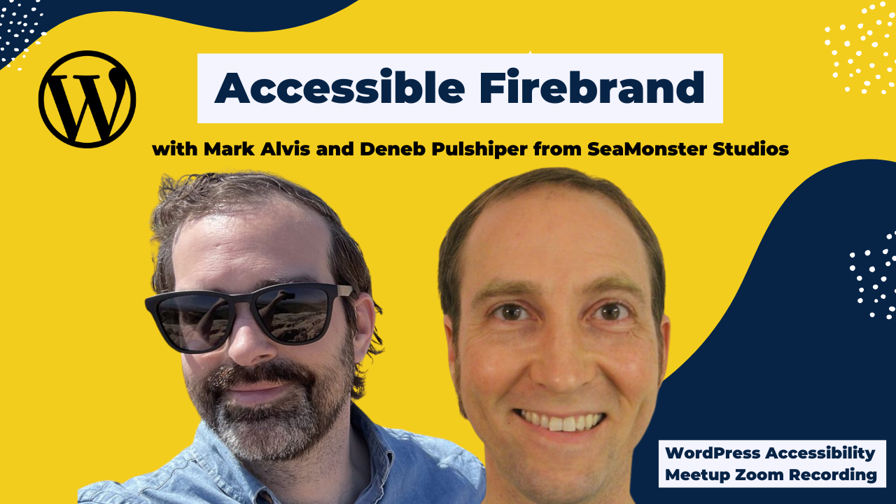
I’m going to pin our speakers up here that you need to have their videos on, and then I can add them. I am very excited to introduce today’s speakers, Mark and Deneb. Mark is a brand and UA designer, and Deneb goes by the title of Captain Accessible at SeaMonster Studios. They are a pair that I have had the pleasure of hearing speak at other events like WordPress Accessibility Day. I think Deneb has also spoken for us at Meetup previously here. We are so excited to have them back and very much welcome you to the stage.
>> MARK ALVIS: You should be seeing our screen image now. Working?
>> DENEB PULSIPHER: Yes, I can see thumbs up.
>> MARK: Very cool.
>> DENEB: We got a thumbs up, at least one.
>> MARK: Nice. As you can see, there’s a QR code in the bottom left. If you guys want to take a picture of that, it will give you access to our PowerPoint and you can follow along as you go, or feel free to just watch the screen. Awesome. We’re going to get started here and move to the next slide. Hello. Again, as you said, this is Mark Alvis and Deneb. We’re from SeaMonster Studios. Deneb, why don’t you take it from here and I’ll jump in.
>> DENEB: Sure. At SeaMonster Studios, when I started getting involved in accessibility, I spoke to my boss, and I said, “Hey, what should my title be?” because it’s a new role that I was getting into. He took a poll of the whole team and they decided that I should be Captain Accessible. That’s what I am, just the accessibility guy.
>> MARK: Awesome. I am the brand and UI guy. That’s basically it.
>> DENEB: Let’s see. I started in web development– I actually took a bootcamp because I used to be an English teacher, so coming to it from a different role. I learned the essentials of web development in my bootcamp. I think we had one discussion about accessibility. It lasted about 30 minutes. That was it. I’m guessing that’s probably what most bootcamps and many professionals, that’s all they get as well.
One of my first days on the job, Wes, our boss, asked me, “Hey, could you review this site for accessibility?” I said, “How do I do that?” He said, “I don’t know. Figure it out,” and so I did and I just fell in love with doing that, making sure that the websites work for everybody. Really became, as it says, an accessibility advocate, but really that third bullet point, a philoaccessibilist, a lover of accessibility, really. I got my WAS, CPACC, CPWA. I got the whole thing. Even trusted tester. I’ve never used that, of course, but just because I wanted to fully embrace this role, and I do. I really love it. That’s me.
>> MARK: Awesome. As we talked about earlier, my name is Mark. I’ve got about 15 years of brand identity and brand system management under the belt. Mostly brand systems, color palette design, UI, everything visual when it comes to that. SeaMonster Studios, we offer development, accessibility, optimization, and visual branding. I will do a lot of this stuff on the visual branding side. In previous life, I’ve worked with Starbucks, Microsoft, Russell Investments, Bing, other companies similar to that.
Today what we want to do here, just give you a quick overview, we’re going to talk about the unfortunate tug-of-war that can happen sometimes between the accessibility world and the design world. We’re going to talk about the pain points that we experience on both sides. Also, some common pitfalls that we might fall into. We want to give you guys some strategies on how to persuade your boss, or maybe it’s not your boss, maybe it’s your brand manager. Then we got three takeaways basically to help you present your case with that. Basically, that’s what to expect today. Now let’s jump into it here.
Branding accessibility, match made in heaven, right? [chuckles] Ah, sometimes it actually ends up being a little different. Deneb, what do we see here?
>> DENEB: [chuckles] This is a picture. I don’t know if you guys remember those, “I’m a PC, I’m a Mac,” ads from– was it the ’90s? Early 2000s maybe?
>> MARK: Yes.
>> DENEB: A man in a very nice suit and a white shirt and a tie is on one side of the screen. On the other side, he’s slouching, he’s wearing a long-sleeved shirt, just casual attire. Just two very, very different types of people.
>> MARK: Right. Two different types of people in two unique perspectives, right? Mac PC, tech-driven versus art-driven, you could say. I think just putting it in a different form here, you’ve got cat people, you’ve got dog people, cats versus dogs. Let’s get political here. We’ve got Democrats, we’ve got Republicans. Honestly, the list goes on and on and on. We see this in human nature. We tend to have two different silos that we put ourselves into. In this, sometimes it can be branding and accessibility in the two different silos.
>> DENEB: I like this slide because it shows a red circle with the word branding in it and a white circle with the word accessibility in it. They’re two separate circles. In between those two is now a word versus, or initials anyhow.
>> MARK: Yes. Unfortunately, it’s not always as peaceful as we might want it to be. Sometimes we’ll get a little bit of fighting going on here or some type of adversarial relationship. I think what it comes down to is it ends up being a tug-of-war of priorities. On one side, you’ve got branding, we’re concerned with things that have to do with aesthetics, the priorities that have to do with color, hierarchy, all that type of stuff, and on the other side, accessibility, which is absolutely just as important. I’ll let you speak more to that in a bit here, Deneb.
I think moving on, it’s beauty versus usability. Both are very highly important priorities. I think what it can turn into is a war of personalities. “I’m right.” “No, I’m right.” I think at the end of the day, that ends up just being a lose-lose scenario for both sides. That’s what we want to talk about today. Maybe just dive into that, the goods and the bads. Let’s take a breath here and let’s think about that. Who remembers this guy?
>> DENEB: On this slide, Mark has inserted an image of he’s a man, looks very angry, his fingers in the air, ready to shout at somebody.
>> MARK: [chuckles]
>> DENEB: Tell us who this is, Mark.
>> MARK: In the chat, I’m assuming you guys are saying something about Seinfeld, Soup Nazi. Hey, let me actually tell you, this is not the Soup Nazi. This is the Brand Nazi. This is your brand manager. This is the guy who’s trying to tell you, “No, you cannot change these colors. It is in our brand guide. No, you may not, okay?” Who has actually run up against this type of person?
>> DENEB: Oh, man, we all have.
>> MARK: I would like to say that I’m not guilty of this, but I probably-
>> DENEB: [laughs]
>> MARK: -am guilty of this. Why is this? Why do we get so huffy about the colors? Why does it matter so much? From the branding side, the priority really comes down to, we want to deliver a unique, memorable, and consistent brand experience. We do that in various ways, but mainly through color. Color is a huge, huge part of that. Let me give you just a couple of examples.
On your screen, I’ve got four sets of boxes. On the left is brown and yellow. Middle left is purple, orange. Middle right, blue and red. All the way to the right is yellow and red. This is a category of service. If I were to ask you, “What kind of companies are represented here?” would you be able to guess? There’s going to be four logos underneath this. Pretending that you guys are all blowing up the chat guessing these companies.
>> DENEB: Our chat is oddly quiet. Come on, guys.
>> MARK: I don’t know where you guys– It’s 8:15 where I’m at, or 8:23 in the morning, so might have something to do with it. Who guessed the shipping industry? Now, check this out. These are black and white logos of UPS, FedEx, Postal Service, and DHL. You put all four of these up next to each other, and you can see there’s shape, there are letters, and then there’s pictograms. Now, watch what happens when I switch to the next slide and add color. Boom. Immediately, the logos distinguish themselves from each other.
Color plays a huge, huge factor in differentiation between different companies.
When you’re talking to branding, there’s so many companies out there, you need to be able to set yourself apart using color. Another reason why color is important to us, it’s used for scannability and visual hierarchy. On this screen, you can see a whole bunch of big read me, read me, read me, read me. Then in the bottom right, there’s a small red “made you look”. Now, when we actually break this down, the gray letters are 45 point, and the red letters are only 16 point, but naturally, your eye goes to the red. Red is used as a sense of danger or awareness in terms of your scannability. That’s a physiological response that we have.
The next example is color is used to establish aesthetics, vibe, personality, harmony, balance, all that stuff. There’s tonal nuance here. In this image, you have some new old style Art Nouveau typography and graphics that look like it could have been made in Paris. It’s just beautifully done. I believe this is Louise Fili or someone along those lines. You can see that a lot of care has been done in choosing the right colors and the right tones.
Now, if we flatten out the colors, what happens is we’ve got just black and white image on the left, and we’ve got color image on the right. This is Windows icons that I did a couple of years ago. You can see the one on the right, it’s a lot more beautiful. There is a purpose for color. Then, of course, there’s purpose for black and white. All of that is determined by color and the tone and the detail.
Lastly, color is used for psychology and brand perception. Up to 90% of an initial impression comes from the color. You can see on this slide, there’s three logos on the left and three logos on the right. On the left, they’re vibrant. You’ve got the green Starbucks, you’ve got the red and the yellow, the McDonald’s and Burger King, which are just enticing. You’ve got the vibrant colors. On the right, I don’t know if I want to say boring, serve a purpose.
>> DENEB: They’re boring. [chuckles]
>> MARK: There we go. You’ve got the corporate blue, you’ve got the IRS, you’ve got United States Postal Service and IBM. There’s a difference between the color choices here. It has a big, big impact on the immediate perception that you have.
>> DENEB: Mark, just to jump in really quick, Laura said that those boring ones on the right were safe and Paula said they were trustworthy. It’s not about good and bad, it’s about what’s the meaning.
>> MARK: What’s the purpose? What is the target, the art direction? Absolutely. Let’s just talk through some of the pain points from the perspective of the designer. Why do I get all huffy when Deneb comes to me and, “Hey, Mark, you got some issues with these colors here.”? As a designer, I am trained for years and years and years, and I would even say maybe even born with special acuities around color that I would say, “Hey, this is my job. I know what I’m doing. Don’t tell me what to do.” Of course, we’re talking about when ego gets in the way. We should always be open, we should always be teachable, there should always be opportunity for growth.
Sometimes it’s not us. It might be the CEO or the company owner or the brand manager or something like that. Sometimes the color decisions can be a personal affinity to bright yellow or bright green or something, and it doesn’t work when you’re creating an accessible color system, but the owner or the CEO is just so stuck on it. Sometimes also there are system limitations when it comes to technology. All the products, WordPress, Shopify, any of those, sometimes they need development help, and as a designer, I may not be trained in that. I’ve got my what I can do and what I can’t do.
Lastly, I want to create beautiful products. Branding is a beautiful process to me. If I am forced to flatten out all of these beautiful nuances into black and white or something, to me, we run the risk of flattening the hierarchy and reducing the personality and the charm of the brand itself. Really, brand is about differentiation, and so there’s some high-risk things there. The pain is real.
From the design perspective, it’s legitimate. I know it’s absolutely legitimate from accessibility as well, and I know you’re going to get into that next here. I guess when you’re going to ask this question, if brands are spending so much time and effort on creating a color scheme, why can’t we just use the brand color anywhere we want? Deneb, why don’t you take it from here and give us some of that insight there?
>> DENEB: Yes, for sure. It is important to understand where the branding people are coming from because those are legitimate concerns, and a lot of thought has gone into that. The priority for accessibility professionals, however, is slightly different. We want to make sure that the content is fully accessible for all users equally, and so making sure that everybody can receive what it is that you’ve put together. I guess considering how to make it so that everybody can receive that.
If you’ll go to the next slide, I want to run through just really quickly the history of the color accessibility standards. In the very beginning of the internet, 1991, the very first websites just looked like pages of text because that’s all they were. There was no styling. The next bullet point says that styling came out in 1996. Five years later, CSS1 was introduced. Then for a few years, it was the Wild West until ’99 when WCAG 1.0 came out, where the Web Content Accessibility Guidelines were put together saying, “We got to make sure that this content, everything that all you web developers are putting out there, that it can actually be consumed by all of the intended audience.”
WCAG 1.0 had a requirement for color. The requirement for the color was fairly vague, really. That requirement said that you needed to ensure that foreground and background color combinations provide sufficient contrast when viewed by someone having color deficits or when viewed on a black-and-white screen. This is very vague. This standard is super vague. Back in the day, they had a quick test, so a way that you could check this. It made me laugh even more because the quick test for this standard was that what you should do is you should print out your website on a black-and-white printer. Then you should take it to a photocopier and photocopy it a couple of times and see if you can still read it. That was the test.
[chuckling]
>> DENEB: This standard, at least it was starting to move in the right direction of figuring out how to determine what’s dark enough, or I guess the first standard just identified that it needed to be dark enough. If you’ll go to the next slide. That standard actually lasted basically until 2008 when WCAG 2.0 came out. That requirement there was that the visual presentation of text and images of text has a contrast ratio of at least 4.5:1. That’s the standard that most of us know. 4.5:1 contrast ratio was the initial standard there in 2008. That’s lasted. It’s still that today.
Now, when WCAG 3.0 comes out, whenever it comes out, who knows when, it’s rumored that they’re going to use the APCA value. It’s more nuanced. I don’t understand it all, unfortunately, not yet. I will when it finally comes out. There was a pretty good session on this, not this past Axe-Con, but I think the one before that, if you want to find out about APCA a little bit more.
Ultimately, right now, the standard is 4.5:1 for regular-sized text. You can go to the next slide, which declares that the issue is that it’s problematic to use some brand colors in situation for accessible content. Then we have some examples to show the colors that are used in brand may not be able to be used in the content of the site. This first slide shows us a very big, beautiful Coca-Cola image in the logo in red. Mark, would you tell me what you as a brand guy see in this logo?
>> MARK: I see a masterpiece. This has been around since basically 1887 or something like that. It’s beautiful, right? It’s got personality, it’s got charm, it’s got a bright, vibrant red color. Surely, it’s accessible, right, Deneb?
>> DENEB: Let’s check it out. On this next slide, we have what the actual Coca-Cola red hex value is, which is F40000. Now, this against white has a contrast ratio of 4.33:1. Most texts, normal size needs to be 4.5:1. We see that the Coca-Cola red on a white background doesn’t meet that contrast ratio, and neither does a white on that color of red background for normal size text.
>> MARK: It’s beautiful, but not accessible in this scenario. Next example, we got Baskin-Robbins, some of my favorite ice cream back in the day. What do you think about this one, Deneb?
>> DENEB: This Baskin-Robbins, the indigo and the pink, if you’ll go to the next slide, I’ve analyzed with this. The white text on a pink box, so using the middle 31 in the Baskin-Robbins 31 logo, white text against that pink background would not work. It’s 3.19:1. The pink text on an indigo background wouldn’t work either. That’s 2.14:1. However, there is an accessible option that you could use with your text, which would be just to use the indigo, so either white on indigo for their buttons if they wanted to do that, or indigo text for something like links. They do have an accessible option.
>> MARK: Got you. Next, we got FedEx, another classic. Let’s break this one down.
>> DENEB: Sure. This FedEx, so the left, the Fed of the FedEx is a dark blue color and the X is an orange color. Looking at the contrast ratios, that orange on white only has a contrast of 3.39:1. Orange on purple is slightly better, but not much, 3.69:1. The purple on white would work. It’s 12.5:1. Once again, they could use that dark brand color in their content, just not the orange.
>> MARK: Right on. Let’s move on. Burger King, I’m hungry. How about this one?
>> DENEB: [chuckles] Burger King, this is their old logo from several years ago where it’s very vibrant colors. It’s this vibrant yellow, and the Burger King itself, the words are this pink color. Then it has this blue swoosh around it. The red against white has 4.34:1. Once again, wouldn’t work for text, almost would though. Yellow on white is going to be 1.87:1, so that can’t really stand on its own anywhere, not even with large text. Blue on white, however, that blue color, containing swoosh, I guess, has 7.67:1. If they wanted to use a brand color in their content, that would be the one that they could opt for.
>> MARK: I think what’s crazy, as a designer, this logo pops. It looks amazing. I know we’ll get more into this later, but they did a new logo which has that vintage vibe. I love this logo, but it doesn’t quite pop as much. Let’s break this one down.
>> DENEB: True. It’s an interesting choice because they went from this very vibrant pink and yellow and blue colors to their new logo has a darker orange and a darker red, but it’s all on this tan. The result is that the red on tan has a contrast ratio of 4.32:1, which is super close to meeting contrast ratios.
The orange on tan is just 2.39, and so both of those are problematic, but what moving to this logo did do is that it made possible an addition of a new color to this brand, which is brown, that now on their website, they use everywhere. They use a lot of this brown. The brown has a fine contrast ratio. I can’t remember what– Oh, it’s like 11:1. That’s the contrast with that tan color. They like that tan color. The new brown has a fine contrast with it.
>> MARK: There we go. We talked about the logos popping. What does the rules actually say about the colors or the brand name when pertaining to logos?
>> DENEB: I’m glad you asked it. WCAG 2.2 success criterion 1.4.2 says, “Text that is part of a logo or brand name has no contrast requirement.”
>> MARK: Aha, say that again. What was that, Deneb?
>> DENEB: As part of a logo or brand name, it has no contrast requirement. You might say then brand colors don’t need to be accessible, but if you’ll go to the next slide– Oh, we’re missing a slide there. True, the brand colors themselves don’t need to be accessible. However, the content color does need. If they’re using that brand color in the content, it does need to be accessible. What’s the difference? We’ve got two different, I guess, dichotomies, the brand versus content. Noticing the difference here, on this slide, we have an image of two different parts of the Coca-Cola website. One is a part that uses a lot of the branding.
>> MARK: I’m going to bring this to this next slide here. It really brings it in. On the left side, you’ve got the copywriting, you’ve got the call to action, and we want to say the container box or whatever. Then on the right, you’ve got the beautiful imagery, you’ve got the product packaging, and a color. It really brings it all together, but like you said, they are in two different categories. We’re making the distinction between the two.
One thing to think about is Art & Copy. I don’t know if any of you guys have seen this amazing documentary. It’s one of my favorites. They really just bring the point home. We’re either going to be dealing with brand, accessibility, artwork, copywriting, legibility versus expression. That type of thing. Back to you, let’s get some more info here.
>> DENEB: Yes. [clears throat] I think it’s interesting as well to mention that when Mark and I started talking this over, just talking about brand colors and stuff, he said, “No, Deneb, I don’t think you’re right. I think all the big companies, they use their brand color wherever they want.” I said, “Why don’t we do some research?” We both went and we looked at a bunch of websites, and he came back to me, and he said, “No, Deneb, you’re right. The big companies, they don’t use their brand color.” He didn’t use these terms.
>> MARK: You’re putting words in my mouth, but I will give you this one for the sake of the presentation. You’ll see later on. We’ve actually collected four or five examples that show how they’ve made migrations towards basically just separating all of the artwork with all of the content and text. Absolutely right.
>> DENEB: Sure. While brand colors don’t need to be accessible necessarily, they don’t need to meet any contrast ratio standard, the content does because it is the Web Content Accessibility Guidelines. What is content? Let’s talk about that for just a minute. I’d say content is any information that is communicated through the text of the site. I’ve got some examples. For example, paragraphs, headings, links, buttons, anything that is communicating its content through words, through the text. We’ve got some examples here of just those things.
Headings. On the right side of this slide, I’ve got a screenshot of one of the websites that we work with where their headings are their brand orange color. Unfortunately, this brand color has only 2.06:1 contrast ratio, which for people who have no contrast sensitivity problems, it’s still legible. It’s okay. They could probably read it. If you go to the next slide, I’ve decreased the overall contrast of the site by about 67%. Now it’s very difficult to read those headings because they’re just so dim. Anyhow.
Looking at links and text on this next slide, we’ve got another screenshot of a site that used a pinkish text that only had a contrast of 2.66:1 with the background. That’s not going to meet that ratio, and they had some other text there that was even worse. If you go to the next slide, buttons can also be problematic because you don’t know what the button says if you can’t read the content, or the words of the button. In this case, this company, there’s an image of their button, which has a yellow background and white text. I’m sure they used it, they designed it that way because they thought it popped. Everybody’s looking for what pops. Unfortunately, this only has a contrast ratio of 1.64:1, which does not pop.
If you’ll go to the next slide, I’ve decreased the contrast of this image, and you can see that the book now text inside of that button is very, very difficult to read. We’ve got some problems. I know and we all know that we’re preaching to the choir here. You guys are all accessibility savvy and interested, and so you all get this. The question is, how do I persuade my boss?
>> MARK: Or my brand genius designer, ego-driven colleague. [laughs]
>> DENEB: You said it, not me.
[laughter]
>> MARK: We got three strategies for you guys here. We’re going to break these down each for you. The first one, present the data. There’s lots of data out there. Number one, we’re going to start with the color blindness. Deneb, let’s talk about color blindness here. What do you see first of all? Then we’ll get into the actual breakdown.
>> DENEB: As far as the stats of color blindness are, it’s a big thing. 4.25% of all people are colorblind. That’s a lot. Now, that breaks down to 1 in 12 men, and about 1 in 200 women. That’s almost approaching 5% of all people are colorblind. On the right side of this slide, we have an image. It’s an image of apples. The top of it is full color. The bottom of it has been decreased to simulate red-green color blindness.
For those who can see the color in the top, and we can all not see the color in the bottom, but it’s a pretty distinctive difference. If you can bring something like this to your boss, to your brand guy, whoever’s pushing back against this, and say, “Hey, 4.25% of all people are colorblind. They’re seeing this bottom image. You may be seeing this top image, but we need to take into account those people too.”
>> MARK: Yes. Next one, we’ve got myopia. Basically, nearsightedness. The colors blur, blend together. You can see on the top picture, the top right, it’s a normal image. On the bottom right, it’s got the simulated image where it’s blurry, there’s nearsightedness. To be honest with you, I am getting to the age now where I am naturally starting to see this normally. I don’t know if that is a one-up as a designer, or it’s a bummer because I need a new set of glasses every year. What’s the stats on these?
>> DENEB: Myopia affects about 30% of all Americans, but myopia has an inverse relationship with contrast sensitivity in young adults, at least in this study. Meaning that the greater the myopia, the lesser the contrast sensitivity, so the harder it is to distinguish between colors. You need the contrast to be higher in order to distinguish.
>> MARK: Right, especially small text and objects.
>> DENEB: Yes.
>> MARK: Our last example here, aging retina. You can see, on the right side, we’ve got a picture of an old Honda Odyssey, which is one of my old vans here. The headlight has this yellowed, oxidized lens over it that just tends to happen with all of these old cars. It’s the exact same thing with our eye. It’s like you’re driving with headlights through the dark, and you’ve got these oxidized headlamps, and it’s just harder to perceive everything. What’s the stat on this one, Deneb?
>> DENEB: It’s the same way. Between the ages of 20 and 60 in humans, the amount of light reaching the retina declines about 67% because of the yellowing of the lens. Greater than 16% of the population is older than 60. They have decreased contrast sensitivity just by dint of their having older eyes, I suppose.
>> MARK: All three of these things, adding them up here.
>> DENEB: Yes. All of that comes to more than half the population. 16%, aging retina, 30%, myopia, 4.25%, colorblindness. That adds up to 50.25%. That’s over half of the population has some challenges in this area, and the other slightly less than half don’t. The question we got to ask is, do you want to serve the 4.25%? Do you want to serve the 33%? Do you want to serve the 16% as well? Do you want the business and goodwill of this half of your visitors? If we can drive that point home, I think the business owners and the brand specialists will be more open to considering another possibility.
>> MARK: Yes, just present the data. There’s a lot of it to present here. Number two, peer pressure. Everyone is doing it. You know you want to, right? We had mentioned before we’ve seen over the past four or five years this big migration of the content going from just more accessibility. Here’s a couple of examples. Screenshots taken, about a year old now. You can see Apple. Almost every creative uses Apple. However, you can see that they got black text and it’s on a stark background. The artwork is above it, it’s not underneath it. That is a great example. Again, back to our Coke example, the brand is on the right and they’ve separated out the content on the left side here.
Microsoft. What they have, they’ve got a full spread image, except for they use a content box over the photo that is solid white, gives the headline in black, gives the copy, and then the call to action in dark blue. Then moving on to the redesigned Baskin-Robbins. You can see it’s got a ton of color. There’s a ton of personality, which is awesome. It’s got white over the dark brown for the content box. It’s not just on white, you can flip it around. Then the new pink, it’s got a contest ratio of 4.7:1. What makes this work is that they use humongous text. Again, back to that note about small text versus large text.
Then, again, the lovely rebrand. I love this. I’m totally into this. It reminds me of my childhood. They’re using that new brown as the headline. It’s big, it’s bold. What’s really interesting is, remember we talked about the red button, if it’s just cream on red, it doesn’t really fully meet that criteria. If you look closely, the order pickup is actually white. They have little pops of white here and there, that it doesn’t overpower the brand as a whole. You still get that aged vintage vibey thing, but they are using white strategically here. It’s all good. This is great stuff. The brands are still great and intact.
The third takeaway, I’d like to present to you guys, it’s the magic of using tints in shades. This is called a color step ramp. in the brand world, this is standard. This may not be standard in the accessibility world or the content world, so we just want to bring this to light here. If we take a step back here, we go 30,000 feet in the air from where we are right now, digital color and the computers we’re looking at is just simply our best try at recreating the world around us.
If you take a look around the room, take a look around outside, there’s millions and millions of colors. There’s nuances just within your one glance, and there are certain variables at play that basically determine whether something is beautiful, determine if something has contrast or pop or whatever. The difference between digital and analog color is an interesting one. I think it really comes down to light versus shade.
We’ll get into that a little bit more later, but how about this? Who remembers about four or five years ago this image that went viral while we were all wearing masks and in the pandemic? On the screen, if you can’t see the screen, it’s got someone in a dress, and it’s striped. It either looks like it is white and gold, or there was this whole big debate going of people saying that, actually, it’s blue and black. How come people can debate about it? How can we see it differently? Why is this? There’s a bunch of scientific stuff, and they’re having to do with your eyes and cones and all that stuff, but it really comes down to different perception.
What’s interesting is when you look at it through different lenses or in different lighting conditions, the exact same color will appear differently. You can see that in this illustration where, on the top, it’s got the color matching but the different parts– It’s so interesting. I don’t fully understand it, but I know it is a real thing. Here’s the deal. The colors were each perceived differently based on the lighting conditions around it. Lighting on the spectrum, the accuracy that you’re going to perceive something depends on the lighting and contrast conditions around it.
Also, you think about it from, like we talked about, it comes down to light and dark. Here’s another example. We’ve got basically a single sheet of paper sitting on a desk. It’s not a trick question or anything like that. It really is just a single piece of paper. You see there is light and there is shadow. It’s the exact same color piece of paper, but the perception of the color that you see digitally is through the lens of either highlight or shadow.
Again, another example. We’ve got green leaves here. The color’s leaf in the sunlight is a brighter green and the color’s leaf in the shadows is a darker green. It’s the exact same green. There’s nuance here. There’s different shadings of the pattern or whatever, but same leaf, different shades. Let’s apply that principle to our digital brand colors online. We’re getting into a little bit of gray area here.
>> DENEB: Can I jump in just real quick, Mark?
>> MARK: Oh, please, yes.
>> DENEB: We’re doing all of this, we’re introducing all of this as ways to talk to your bosses who are a little hesitant to change anything. If you can show them, “This accessible blue or whatever, it’s still your shade of blue. It’s just as if you were looking at it on a piece of paper in a shadow.” Right?
>> MARK: Right. No, that’s great. The technical name is bringing in a tint ramp. The practical theory on this, the goal basically is we want to build a versatile tonal system of tints and shades, but based on the approved brand color. It’s a workaround. Like you had said, there’s ways to work around this so we can keep our brand consistency. It gives us a way to have that conversation. Again, think about your brand color, and then if it’s in sunlight, you add 20% white to it. If it’s in shade, you’re going to add 20% black to it, or something like that.
Here’s a visual example. The brand color on the left, and you’re going to do a quick step of every 20%. This is what it looks like all the way up to 100% of white. Conversely, the brand color adding 20% of black, or K in the old CMYK color model, you step it down 20% all the way down to the black. Theoretically, these should all be safe according to this theory.
Here’s an example of a tint ramp that I’ve put together for one of our SeaMonster clients. Starts with the brand colors up top and it tints it up. It gives us this whole palette to work from. This can be applied in a lot of different ways. This is just a big theory for us to think about here. Now we’re at this place where maybe we’ve talked you into it. What about just using the original brand colors? What can we use? What can’t we use? Where can we use just the original brand color? As you said, Deneb, anywhere that’s not content-bearing, feel free to use whatever colors are in your brand, but when it comes to content, keeping it accessible by using tints and shades, right?
>> DENEB: Yes.
>> MARK: The more complicated answer is that it’s definitely up to you and your brand team, but we’ve created a list of examples of treatments and things that show you different ways that you can do that. This will be fairly quick. We’ll just give you guys this. Basically, it’s a whole list here. I’ll run through some visual examples as well here. In terms of photography and illustration and art, think about using color pops, think about using photography on top of your brand colors. Think about how Burger King used it in this illustration behind the photos. Then Apple had this wonderful illustration here. You can bring color into it, just separate it from the content.
Number two, the section dividers, or the color bars. Gusto, I love the branding of Gusto. I use Gusto. You can see on this right-hand side, there’s this just big, nice teal blue color bar. Got the illustration up top. Got the white on top of the blue color bar, bringing in some more of those brand colors. In this example, it is using patterns in the background as different elements. SeaMonster redesigned the Popchips website. You can see the little triangle illustrations on the right side we incorporated around the bags. Then on the left side is the landing page where we use it as a pattern element in the back just to give more personality and vibe, and yet the white still has that high contrast on top of it.
Yes, I would say, as a designer, I might have tried something a little less stark, but you know what? I live and learn and this is a few years ago, so here you go. Lastly, consider using bitmap or duotone images. Again, the caveat is this stuff is all subject to your brand treatments and your brand guidelines. Again, these are conversations that maybe you can bring up to them, and say, “Hey, could we consider using imagery that has our brand colors in it rather than putting inaccessible color schemes on top of the color boxes or whatever.” Some other examples.
Here’s some more esoteric examples. Text color or text decorations, this little squiggly underneath it here, or this yellow box underneath the headline, that type of stuff. Just to quickly go through some more, Deneb, you’ve done a lot of work with focus indicators, and bringing your brand color into that if it works or not.
>> DENEB: Yes.
>> MARK: Text color boxes.
>> DENEB: Any place that’s not content, so it’s not the text of it, if you can add text decorations that include some of those colors, that’s totally fine. I say in the previous slide unsubstantial text decorations like overlines or squiggles, shadows, text boxing around the text but not as the text. Then, the focus indicator. I have a caveat there saying it should be coupled with a dark and light inner border or outline so that it does have that contrast. That’s another way to get your brand color there. Then the next page. We talked about, or you showed us some examples of Text Color Box under titles on images.
Typically, when you have a title as the text, it’s going to be very large, so it should be able to meet a lower standard. It has to be three to one. I did a blog post illustrating some of these text decorations that you could use. There’s a bit.ly link. If you have the slides, you can follow the link or look it up on SeaMonster Studio’s blog. It’s called Accessible Firebrand, also like this. It’s the impetus for this.
>> MARK: In review, putting that all together. Number one, present the data. It doesn’t have to be a hard conversation. We can work together. There’s lots of data out there. Half of the population has visibility issues, and remind them of that. Number two, as a designer, accessibility doesn’t have to suck. We can do this where it looks great, it’s legible, and it’s beautiful. It doesn’t have to be so stark and uninspiring. Let’s keep that realization. Number three, keep the content color fully accessible and separate the content from the art. There we go. Deneb, let’s take us home here.
>> DENEB: Finally, at this end, so in the beginning, we had branding in one sphere, a white one, and accessibility in another sphere. Well, now we are bringing those two spheres together, making a Venn diagram that says branding and accessibility. Let’s get these together, and let’s set the world on fire.
>> MARK: Let’s do it together.
>> DENEB: It’s a win-win for everybody.
>> MARK: Everyone’s happy. We’re good. Let’s be friends. We don’t have to be in this silos. We can work together. It takes- Let’s work together.
>> DENEB: It takes openness, open-minded, it’s better for everyone, blended priorities. That is it. Thank you, guys. If you want to email me, Captain Deneb, Deneb@cmonsterstudios.com. Mark is mark@cmonsterstudios.com. You can do that. Also, I’m Deneb Pulsifer. I’m the only Deneb Pulsifer on LinkedIn.
>> MARK: In the world, probably.
>> DENEB: Not the only Deneb in the world, but Deneb Pulsifer, probably.
>> MARK: Amazing. Wonderful.
>> AMBER: Why don’t you guys stop sharing? I’m going to let Paula take over. For everyone, please, if you have any questions for Deneb and Mark, post those in the Q&A. I might put Paula on the spot. You think you can invent a question while people put them in, or should I try and do that?
>> PAULA: You’re going to have to try and do that.
>> AMBER: All right. I will be here too. I will say I’m curious on your thoughts on how you approach that large text color contrast ratio can be lower. I’ve tried hard to, with our clients, not have them pick anything that. I call it AA18. It has to be larger than 18 pixels. I get nervous about what we do on mobile. There are scenarios where things get lower, and then I feel like you have to pay a lot more attention. It can never be smaller than this. How have you approached that?
>> DENEB: Well, it’s a good question. Like you, I prefer the 4 1⁄2 to 1 standard, but I found myself not wanting to get into it with some clients. I do make sure that any place we use, their brand color is larger. It’s 19 and bold. I guess that’s capitulating a little bit. I think what Mark showed us in terms of what color really is in the real world and being able to see that colors, even a darker version of your color, is still your brand color. It’s like looking at your color and shade. I think that’s a great way to show– Let’s add this to your– Maybe this is where Mark’s going to have to come in. Is there an elegant way to encourage someone to add an accessible color to their brand palette?
>> MARK: Yes, that’s what we’re all talking about. I’ve seen a whole bunch of companies lately. Let’s see here. I’m a musician, designer. One of my favorite places to buy used instruments is this website called Reverb.com. They changed their main color, which is an orange. They went from this lighter orange. It’s funny. We were talking about this before the presentation started, and I noticed they shifted their entire brand color a little darker, and I’m assuming it has to do with accessibility. That’s a bigger conversation that they probably had between designers, owners, CEOs, or whoever needs to have that conversation. If you need to do that, we need to do that.
It’s a matter of accepting the fact that accessibility is a priority. It might look beautiful to half of the population, but if it’s not accessible, you’re shooting yourself in the foot. Yes, I’ve definitely seen that. It comes down to having that conversation. Again, doing it in a way that we’re humans, we’re people. Let’s get along, and let’s have great conversations and work this out. We’re not that much different from each other, honestly.
>> PAULA: Yes, that’s a great answer. I did see that Caitlin popped in a question. “I see greater knowledge of accessibility in the brand guidelines, but it’s often not used across assets and particularly creative campaigns. Larger brands often bring in outside agencies, and accessibility isn’t taken into account. I’m wanting to better integrate accessibility into campaign briefs. How would you approach this?”
>> MARK: That is a great question. Let’s see. I do know that, like you said, a lot of times, there are outside agencies that come in. I’ve been on both sides of it, to be honest with you. What is interesting is that sometimes people are given leniency within the brand, and they don’t have to go so cut and dry and follow the guidelines. I would say it’s going to be a conversation upfront because, at the end of the day, you are hiring this agency to produce a product or a campaign that will increase your numbers. It’s all about awareness or profitability, or if it’s a nonprofit, it’s not about profit, but it’s about the awareness. You’ve got to build that into your goals.
When you are talking to different agencies, that’s one of the goalposts. That’s one of the milestones of saying we want to increase our profitability by this much. We want to– It needs to be accessible. What that means is that we need to hit these contrast ratios. I would say put that in upfront before you’re even hiring them, and then maybe the agencies that care about accessibility, they’re going to jump up to the top of the list. The people who don’t really care about it, they’re like, “Maybe these aren’t our guys for this campaign.” Yes, priorities. I think it’s about priorities. Deneb, do you have any thoughts on that?
>> DENEB: It was mentioned in– Caitlin mentioned that the accessibility, the accessible colors, are in the brand guidelines. It might be a matter of calling the agency on it. Say, “No, look, our brand guidelines say this, and we hired you, and we expect you to know that.” That’s confrontational, but–
>> MARK: Maybe there’s not a chapter in the brand guidelines around accessibility, and that would be the first thing that you could do is create a standalone chapter for accessibility. Maybe that requires the tints and shades ramps or examples of how to use it. Getting the tools ready to set everyone up for success.
>> PAULA: Yes, great answer. We do have another question. “Have you ever tried to add the contrast on a color by making it a little bit different without telling the client? If so, how did that go? Did they actually notice?”
>> MARK: I’m going to plead the fifth on this one.
>> DENEB: Yes. I try not to do that, but I try– What I do when I find a color that needs to be tweaked a tiny bit is I’ll send the message, the email or whatever, and in that message, I’ll say, “Here’s what your old color looks like,” and I’ll have the text in that color. If it needs to be tweaked a tiny bit, the next line will be, “Here’s what the new color would look like. It’s not much different. You probably wouldn’t even notice it. Is it okay if I make this change to site wide?” Most people are open to that.
>> MARK: Even thinking through some of the treatments. Maybe it’s a green background that doesn’t quite hit the contrast ratio. Maybe the background, you guys start using a subtle gradient. Maybe it goes from the lighter green down to a darker green, a beautiful gradient behind it. Therefore, the darkness is higher up and comes through, and it’s got more contrast to it. It gets it over that contrast ratio. Maybe you want to put in the graphic image, the duotone or whatever that sits behind there. It’s using some of these tools rather than the stark color that doesn’t work.
To answer your question, yes, it’s a conversation. It’s about A and B’ing. Showing them the one that is accessible and saying this one is slightly different. It’s got a higher ratio. It falls within your tint ramp. “Are you guys okay with us using this?” That type of thing.
>> DENEB: That increases awareness too, which is part of what we’re hoping for here. We call the presentation Accessible Firebrand. We want everybody to be firebrands and spread the religion. Spread the gospel of accessible colors. I think conversations should be had. I don’t think we should be trying to find ways to avoid them and do the right thing despite our people. Let’s persuade them that the right thing is the right thing. It’s such a minor change in many cases that they should do it and feel good about it.
>> PAULA: Yes, and that makes total sense. We do have another question coming in. Brett asks, “How do you approach balancing brand identity with accessibility standards, especially when a brand’s colors don’t initially meet contrast or visibility guidelines?”
>> MARK: Deneb, you got this? I’ve got something.
>> DENEB: I’ll let you go first. Okay. I think it’s more you.
>> MARK: Yes, this is the name of the game. This is where we’re at in terms of awareness within our design culture. 5 years ago, its accessibility is a 5, I would say. It’s more of a “nice to have.” It’s not a high priority. Now, it’s becoming a high priority, and people are building it from the ground up to meet accessibility standards. How do you balance that? It’s for sure case by case, but it’s going to be a matter of how can you separate the content from the artwork. Can you have the artwork, the imagery, the illustrations, the patterns? Can you separate those out so that the content itself has those darker, higher contrast against a lighter background or vice versa? I think it’s a matter of accepting user interface for what it is, rather than trying to think about it from a printer or whatever perspective.
>> DENEB: Yes, Mark gave us this amazing way to view colors in a new way. To inject the tint ramps and the shade ramps and stuff, so that maybe including some accessible colors by into the brand by doing that. If you run into somebody, the company owner or the brand guy, who is inflexible, intractable, will not add an accessible color, then you have to say, “Here’s the principle. We’ve got to keep the brand colors separate from the content.” We can put that color in different places. That’s why we gave that whole list of images with lots of that color.
Think of the Coca-Cola website. It had so much of that red color, but none of it was in the content, none of it. All of it was part of that image, part of the cans. Their color came through. It was not in the content. That’s why I gave the list of the other things that you could add that are decorative, flourishes, and keep it out of the text itself so when they’re intractable, you say that. If they’re open to considering adding a new color, then you do what Mark showed you how to do. Explain about seeing colors in shadow and all of that. Otherwise, say, “We’ve got to keep brand colors out of the content if it’s that way.”
>> PAULA: That’s a great answer, and that goes into– You answered what I was going to ask next. What happens when the client is very pushy and they don’t want to go astray from their actual colors and they are not accessible? Given that you separate the branding from the content, that would be a great answer for that. Yes, I appreciate that answer, and I do not see any other questions coming in. I want to thank you guys for this amazing presentation on Firebrand. If you want to remind everyone where they can find you and any final thoughts that you may have, you have the floor right now.
>> DENEB: Okay, well, we’re excited to be here. You do have our– You can always email us, find us on LinkedIn, or come to cmonsterstudios.com and find us there.
>> MARK: Yes, thank you guys so much. Again, let’s work together. Deneb, you’re my friend.
>> DENEB: That’s right.
>> MARK: Thank you for teaching me all this stuff. This goes to show that we can work this out. We can have conversations. We can have hard conversations. We can do it kindly. We can say our perspective. Again, we’ve got to realize this about human nature. We tend to live in silos and we tend to do this thing. That’s not the answer, okay? The answer is to sit down and to have conversations and realize that the other person across the table is a human being like you. They’ve got feelings. They’ve probably got a cat. Maybe you’ve got a dog or whatever. Let’s be genuine. Let’s be awesome. Let’s work this out so that everyone can have access to our brand and our product.
>> DENEB: Yes, it’s worth it. It’s important enough that we need to overcome some of our tendency to be tribal or to stick with what we know. This is something that is worth it to come out of our comfort zones a little bit. Both ways. I’m talking to all of you accessibility lovers, fellow accessibilists like me. It’s a hard conversation to initiate in some ways because the emotions run so high. We are going to have to come out of our comfort zones a little bit to initiate the conversation and hopefully do it in such a way that we can come together.
>> PAULA: Again, thank you so much, Deneb. Thank you so much, Mark. This was an amazing presentation full of valuable knowledge. Thank you, everyone, for attending. We’ll see you again in our next meet up on the third Monday of the month at 7:00 PM Central. Thank you, everyone. Bye.
>> DENEB: Thank you.
>> MARK: Bye. Bye.
>> [01:18:43] [END OF AUDIO]
About the Meetup
The WordPress Accessibility Meetup is a global group of WordPress developers, designers, and users interested in building more accessible websites. The meetup meets twice per month for presentations on a variety of topics related to making WordPress websites accessible to people of all abilities. Meetups are held on the 1st Thursday of the month at 10 AM Central/8 AM Pacific and on the 3rd Monday of the month at 7 PM Central/5 PM Pacific.
Learn more about WordPress Accessibility Meetup.
Summarized Session Information
In this session, Mark Alvis and Deneb Pulsipher of SeaMonster Studios explore the often-contentious relationship between branding and accessibility. Drawing from their professional experiences—Mark as a brand identity and UI expert, and Deneb as an accessibility specialist—they break down why brand colors frequently fail accessibility standards and offer practical strategies for resolving this conflict.
Through real-world examples, historical context, and persuasive techniques, they illustrate how design and accessibility teams can collaborate to create visually striking and fully accessible digital experiences.
The session is packed with data, humor, and actionable advice for anyone facing resistance to accessible design within their organization.
Session Outline
- Branding and accessibility: friends or foes?
- The brand nazi and the problem with changing colors
- The accessibility perspective on color
- Famous brands failing contrast tests
- Logos vs. content: what does the law say?
- Common content problem areas
- Persuading stakeholders: three strategies
- Where can you still use brand colors?
- Final thoughts: let’s set the world on fire (together)
Branding and accessibility: friends or foes?
We all see cultural divides everywhere. For example, “I’m a Mac, I’m a PC” ads highlight how branding and accessibility can feel like two opposing camps—cat people versus dog people, tech-driven versus art-driven. This duality often plays out in web design, where brand aesthetics can clash with accessibility requirements.
Unfortunately, these priorities can pull in opposite directions, turning the creative process into a tug-of-war between beauty and usability. Without collaboration, both sides lose.
The brand nazi and the problem with changing colors
Introducing the stereotypical “brand nazi”—the inflexible brand manager who refuses any deviation from the brand guidelines— illustrates the frustrations both designers and accessibility professionals feel when trying to make compromises.
From the brand perspective, color consistency is vital. Colors help establish identity, support scannability, define visual hierarchy, express personality, and create psychological impact. Simple color combinations like brown and yellow, or red and blue, can instantly recall UPS, FedEx, the Postal Service, or DHL.
When stripped to black and white, logos lose clarity.
But when color is restored, they immediately pop.
Color is also crucial for attracting attention (e.g., red implying urgency), expressing mood, and achieving aesthetic harmony. For example, Art Nouveau typography and Windows icons show how flattening color removes nuance and charm. Visual differentiation is everything in branding, and flattening it risks losing that unique flair.
The accessibility perspective on color
The priority for accessibility professionals is ensuring content is perceivable and usable by all users—including those with visual impairments or contrast sensitivity issues. This is why brand colors can’t always be used in digital content.
The evolution of accessibility standards:
- 1991: The earliest websites were plain text with no styles
- 1996: CSS1 introduced styling.
- 1999: WCAG 1.0 included a vague requirement for sufficient contrast, with a laughable test: print the site in black and white, photocopy it a few times, and see if it’s readable.
- 2008: WCAG 2.0 brought clarity, requiring a 4.5:1 contrast ratio for regular-sized text.
- Upcoming: WCAG 3.0 will likely use APCA for more nuanced contrast evaluation.
Despite the clear standard, brand colors often fail to meet contrast guidelines when used in content.
Famous brands failing contrast tests
Real-world examples of beloved brand colors falling short.
- Coca-Cola: Its iconic red on a white background only has a 4.33:1 contrast ratio—below the 4.5:1 requirement.
- Baskin-Robbins: Their pink and indigo fail contrast checks for both white-on-pink and pink-on-indigo text. However, their indigo can be used accessibly on a white background.
- FedEx: Orange on white (3.39:1) and orange on purple (3.69:1) fail. Their dark purple is accessible on a white background (12:53:1).
- Old Burger King logo: The yellow and red don’t pass for text. Only the blue outline color has sufficient contrast on a white background.
- New Burger King logo: The orange and red against tan are slightly better, but still problematic. However, they introduced a new brown color (11:1 contrast) that works well and is used frequently on their website.
These logos look visually compelling, even though they don’t meet accessibility standards for content. That contrast between appearance and usability is where the tension lies.
Logos vs. content: what does the law say?
Logos and brand names are exempt from contrast requirements (WCAG 2.2, SC 1.4.2). This means Coca-Cola’s red logo is fine, but using that red in paragraph text or buttons must meet contrast standards.
For example, the Coca-Cola site differentiates between visual branding and accessible text content. This distinction is critical: brand imagery is free to use any color, but textual content must be accessible.
Common content problem areas
Using brand colors in content can create issues:
- Headings: Orange text with a 2.06:1 contrast ratio might be readable to many, but becomes illegible when contrast is reduced.
- Links and text: Pink text with a 2.66:1 ratio fails standards and strains users’ eyes.
- Buttons: A yellow button with white text had a contrast ratio of 1.64:1, making it unreadable when viewed by users with reduced contrast sensitivity.
Decreasing contrast mimics how users with vision challenges perceive these elements—and it’s not pretty.
Persuading stakeholders: three strategies
Three tactics for persuading resistant designers or brand managers.
1. Present the data
- Color blindness: 4.25% of people (1 in 12 men and 1 in 200 women).
- Myopia (nearsightedness): Affects 30% of Americans and reduces contrast sensitivity.
- Aging retina: By age 60, light reaching the retina drops 67%. Over 16% of the population is older than 60.
Combined, these issues affect over 50% of the population. If you’re ignoring accessibility, you’re potentially excluding half your audience.
2. Peer pressure: everyone is doing it
We also have some top companies that are already adapting.
- Apple: Clean white background with black text and colorful artwork above—not underneath—text.
- Microsoft: Dark text over a solid white content box, layered atop imagery.
- Baskin-Robbins: Redesigned to use large white text over dark brown backgrounds. Even their new pink meets standards due to its large size.
- Burger King: Their rebrand uses brown for high-contrast headings and adds small white elements for legibility.
These companies prove accessibility and brand integrity can coexist beautifully.
3. The magic of tints and shades
Mark introduced the concept of a tint ramp, which builds accessible variants of a brand color by adding white (for tints) or black (for shades). This system retains brand identity while ensuring sufficient contrast.
Using examples from SeaMonster client work, he showed how a palette can be expanded by creating lighter or darker versions of a brand color. It’s like seeing your brand color in sunlight or shadow—it’s still your color, just adapted for usability.
Where can you still use brand colors?
Brand colors can still shine—just not in content text. Examples of acceptable uses include:
- Photography and illustrations: Art elements can showcase brand colors freely.
- Section dividers and color bars: Adding personality without interfering with content.
- Background patterns: Like the triangles on Popchips packaging.
- Text decorations: Underlines, boxes, or squiggles that don’t interfere with legibility.
- Focus indicators: Enhanced with contrast borders.
- Large text headlines: If the contrast meets the lower standard of 3:1.
Final thoughts: let’s set the world on fire (together)
By embracing openness, mutual understanding, and blended priorities, teams can create digital experiences that are both beautiful and accessible.
Designers and accessibility professionals can—and must—work together. When they do, it’s a win-win for everyone.