From the initial website design phase, accessibility must be prioritized to ensure everyone can navigate, understand, and interact with your website. When accessibility is considered early in the design process, it reduces costly fixes later and improves usability for all visitors.
Article continued below.
Stay on top of web accessibility news and best practices.
Join our email list to get notified of changes to website accessibility laws, WordPress accessibility resources, and accessibility webinar invitations in your inbox.
Key Principles of Accessibility in Website Design
1. Typography Matters: Choose Readable Fonts
Text readability is a fundamental aspect of accessibility in website design. Choosing the right fonts and spacing ensures that users with visual impairments, dyslexia, and cognitive disabilities can easily read and understand content.
Legible fonts with clear spacing improve readability and prevent misinterpretation of text. Poor typography choices can lead to confusion, increased cognitive load, and difficulty processing information.
If a website uses fonts with poor readability, users may struggle to distinguish letters and words, leading to frustration, misinterpretation of content, and increased cognitive effort. Poor typography can also exclude users with visual impairments and dyslexia from effectively engaging with content.
Best practices for typography:
- Use sans-serif fonts with clear distinctions between similar characters (e.g., “rn” vs. “m,” “Il1” vs. “O0o”). Fonts with unique letter characteristics reduce ambiguity and improve readability.
- Ensure sufficient letter-spacing and line height to prevent letters and words from blending together. WCAG recommends at least 1.5x spacing for lines and 0.12x spacing for letters.
- Avoid decorative, script, or specialty fonts that are difficult to read, especially for users with dyslexia. Studies suggest that common fonts like Arial, Verdana, and Open Sans improve readability across user groups.
- Consider kerning and character differentiation to prevent confusion between letters like “b” and “d” or “p” and “q.” Proper spacing reduces the likelihood of misreading text.
- Avoid justified text, which can create uneven word spacing (also known as “rivers of space”), making text more challenging to read for individuals with dyslexia or low vision.
For a deeper dive into best practices for accessible typography, check out this meetup recording on accessible typography by Carie Fisher.
2. Ensure Sufficient Color Contrast
Color contrast is crucial for readability, especially for users with low vision or color blindness.

Low-contrast text, such as light gray on a white background, can be difficult for users with vision impairments to read. This can cause eye strain, make information inaccessible, and lead to higher bounce rates as users abandon the site.
Best practices for contrast:
- Follow WCAG guidelines by maintaining a contrast ratio of at least 4.5:1 for standard text and 3:1 for large text.
- Ensure that interactive elements like buttons and links have enough contrast against their background to remain easily visible.
- Test your color combinations using tools like Stark for Figma.
3. Design for Interactivity
Design interactive elements to ensure they are intuitive for all users and accessible for keyboard users. It’s essential to make interactive components like buttons or links evident through design queues (like common design patterns, underlines, or icons) that they are interactive.
Designers should not leave items like focus or hover states up to developers – include them in your design to ensure they are not overlooked. Also, pay attention to tap-target sizing and spacing to ensure the website is usable on touch devices like mobile phones or for users with motor disabilities who may have difficulty using a mouse due to conditions like Parkinson’s disease, cerebral palsy, or arthritis.
Best practices for interactive components:
- Ensure a clear focus indicator is part of the design (e.g., a visible outline or background change).
- Design a logical tab order that follows the natural reading flow.
- Interactive elements should be at least 44x44px to accommodate touch users.
- Include adequate spacing between elements to prevent accidental taps.
- Ensure different states (hover, focus, active, disabled) are visually distinct using more than just color (e.g., underline links, adjust opacity, or add icons).
- Include text alongside icons where possible to improve clarity.
4. Proper Labeling and Form Design
Forms play a critical role in web accessibility, yet they are often designed in ways that make them difficult to use.
Users may struggle to complete forms that have missing or unclear labels, leading to high abandonment rates and lost conversions. Screen reader users may not receive critical instructions, preventing them from submitting necessary information.
Well-structured forms allow users of all abilities to input information correctly and efficiently.
Best practices for form design:
- Provide visible labels for all form fields instead of relying on placeholder text, which disappears when users start typing and is not read aloud by screen readers.
- Indicate required fields using the word “required” instead of an asterisk, which may not be universally understood.
- Maintain close proximity between labels and their corresponding fields to avoid confusion.
- Ensure that error messages are descriptive and not solely dependent on color (e.g., red text). Use text and icons to indicate errors.
5. Maintain a Consistent and Intuitive Navigation Structure
An accessible navigation menu is essential as it defines the structure of a website, giving users a clear understanding of how the content is organized visually and mentally.
Disorganized or inconsistent navigation can confuse users, making locating content or completing actions difficult. This can result in higher bounce rates, reduced engagement, and a frustrating user experience.
In contrast, a well-structured navigation system helps users efficiently find content and prevents frustration.
Best practices for designing navigation menus:
- Keep menus consistent across all pages.
- Provide multiple ways to navigate content, such as a search feature, breadcrumb navigation, and a well-organized site menu.
- Ensure that navigation elements are predictable and do not change unexpectedly.
- Avoid complex dropdown menus that require precise mouse movements, as they can be difficult for users with motor impairments.
For a deeper dive into navigation best practices, check out this meetup recording and summary on accessible navigation.
Make Accessibility a Priority from the Start
Accessibility is not just a developer’s responsibility—it starts with design. By incorporating these best practices into the design phase, you can create a website that is inclusive, user-friendly, and legally compliant.
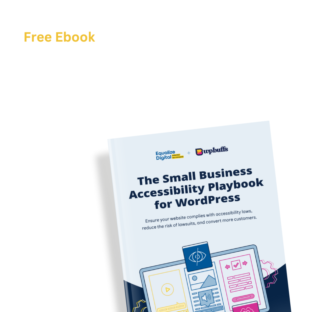
Take the Next Step Toward Accessible Design
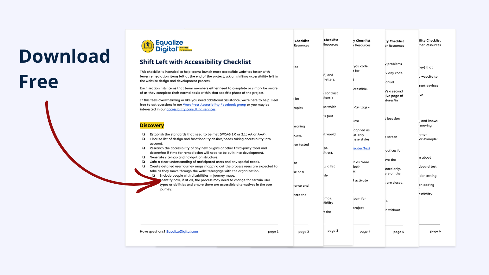
Want to ensure that accessibility is integrated from the beginning? Download our Shift Left Checklist to guide your design process.