Check your dashboard – updates are available for both the paid and free versions of Accessibility Checker. We’ve been teasing this release for a while and are excited to announce that it’s finally ready to roll out on your sites! 🥳
Accessibility Checker Pro 1.2
As more websites have started using Accessibility Checker, we’ve seen it put through its paces on many fronts, from the size of the sites being scanned to the themes and plugins being used alongside it to the hosting environment where it’s being run.
One of the biggest challenges we’ve been working on is improving how scans are run and reports are generated so that site-wide reports on the Open Issues, Fast Track, and Ignore Log pages function performantly even on low-cost hosting and/or on sites with very large issue counts.
We’ve seen Accessibility Checker installed on government websites with hundreds of thousands of pages across 15 custom post types and e-commerce websites with 100,000 products. It doesn’t take long in those scenarios to generate massive numbers of errors and warnings when you run a full site scan. And for some users, especially those on less optimized hosting plans, this made the Open Issues and Fast Track pages unusable.
Performance and usability go hand-in-hand.
We knew one way to improve the performance issues was to provide more bite-sized reports. As we discussed possible solutions to the performance challenges, we realized that reimagining the Open Issues page would allow us to reduce the number of queries being run and also provide more meaningful information to site managers and developers at the same time.
Improved Site-Wide Open Issues Report
Previously, the Open Issues page consisted of a table of all the errors and warnings found site-wide.
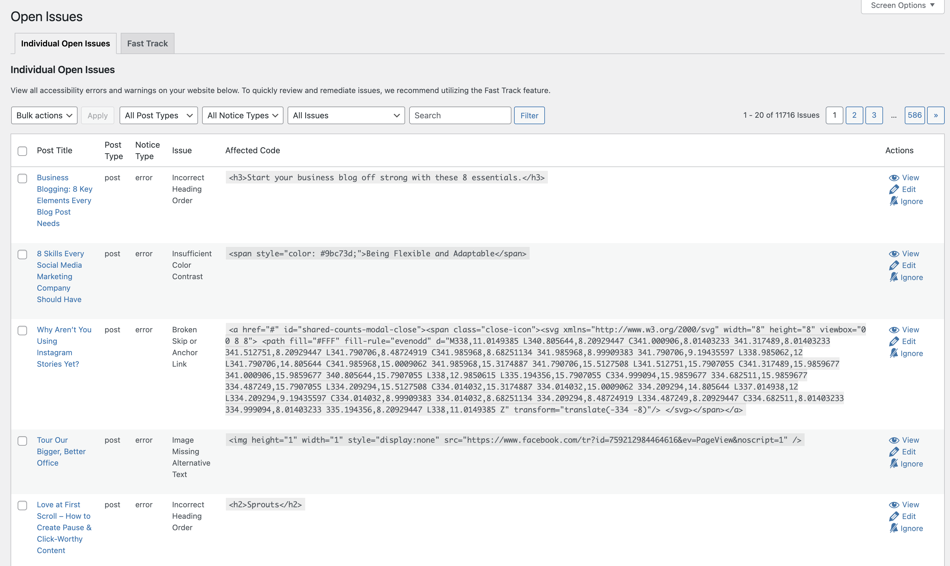
While it can be handy to see all the issues on your site in a single place, coming to a table like this with 11,716 issues all mixed together is overwhelming and not especially helpful. It also doesn’t give site managers a high-level view of the issues that must be addressed. And, of course, when you have hundreds of thousands of issues in this table, it can be pretty slow to load.
In Accessibility Checker 2.0, the Open Issues page has been redeveloped to first show a table of all the checks we perform on the site and how many issues were found for each one.
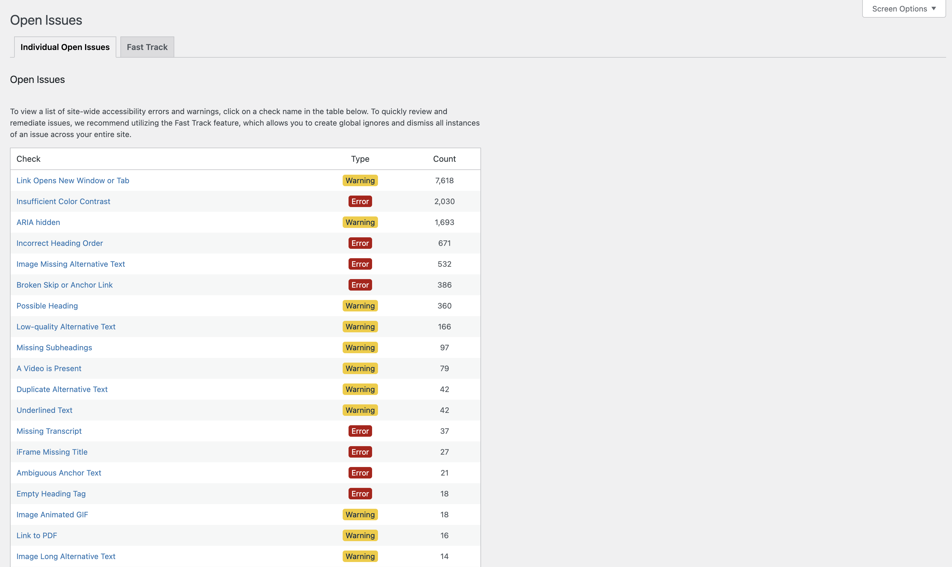
Each of our more than 40 accessibility tests is included, and they’re ordered by the number of issues found from most to fewest. You can also see whether the problem is categorized as an error or warning.
This allows you to quickly see that there are 7,618 links that open in a new window or tab, 671 cases of headings out of order, or 532 images missing alternative text, for example.
If nothing was found that flagged an issue for a particular check, you’ll see it at the bottom of the table with a type of “passed” and 0 in the count column.

Over time, as you resolve accessibility issues on your (or your client’s) site, you will see all of these checks change to “passed” with a green background.
If a problem is added somewhere on your site either by a content creator or a plugin update, that issue will float to the top the next time a new scan is run. This will make it easier to track the accessibility of your entire site over time.
New Open Issues Subpages
As of version 1.2, each individual check now has its own page that shows the code snippets that flagged issues.
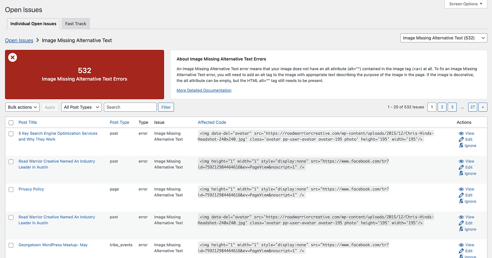
These open issues subpages each have a box at the top left showing the number of issues found. Next to that is an explainer box with a short paragraph that explains what the error or warning is and provides a brief overview of how to fix it. There is a link to read more detailed documentation on our site if you want more information.
Below these header sections is the table that used to be on the Open Issues page, with columns for the post title, post type, type (error or warning), issue, affected code, and actions (view, edit, ignore). You can sort by post title, post type, or affected code and can filter by post type or do a keyword search.
At the top right of the page is a dropdown that allows you to quickly jump between the different subpages.
Improvements Extend to Ignores Log
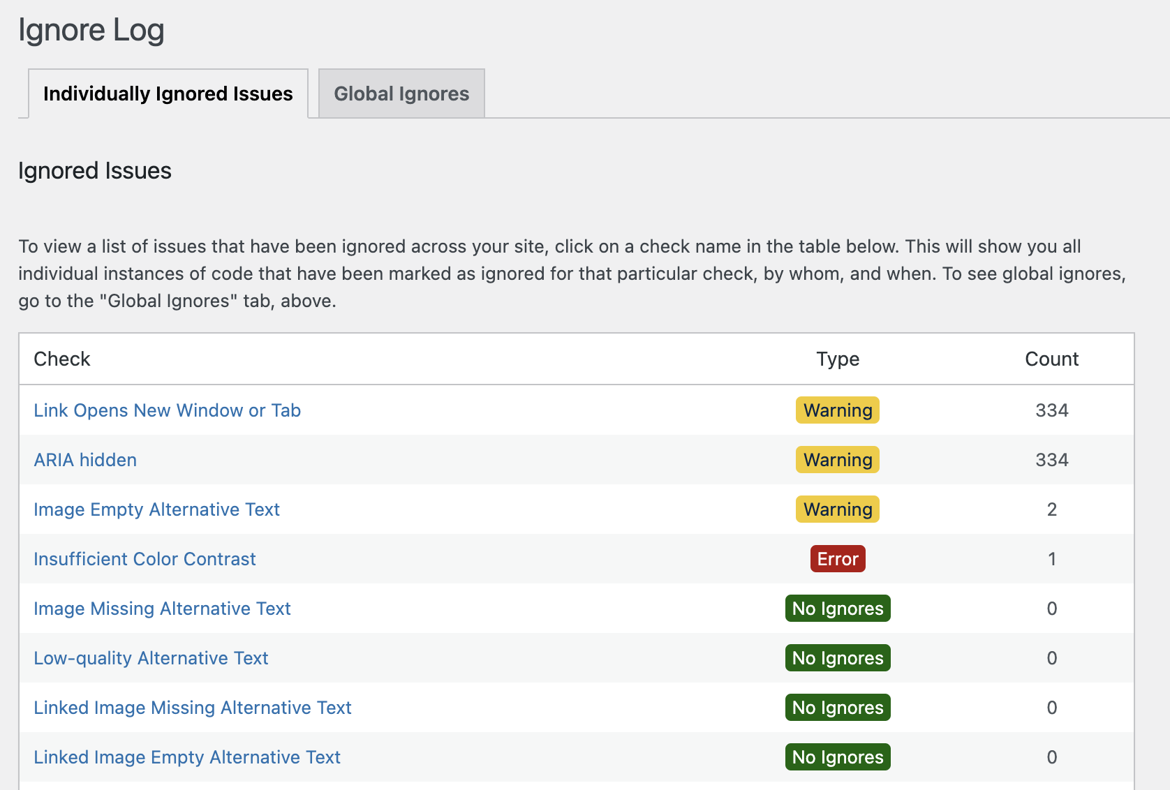
Beyond the changes to the open issues page, you’ll see similar improvements on the Ignores Log. This means site admins can quickly see, at a glance, what accessibility issues are most commonly being ignored by developers or content creators.
Faster Loading on Fast Track
To help with performance on the Fast Track page, we added a post type select so you can view grouped issues by post type. This reduces query load, so Fast Track will load more quickly on sites with tens or hundreds of thousands of accessibility issues identified by the plugin.
By default, Fast Track will load the “Pages” view. If you want to switch to another post type to see the code snippets with the most issues, you’ll need to switch to that post type in the dropdown menu that has been added to the page.
Heading Accessibility Improvements
We’re constantly working to improve our own accessibility as well. The Accessibility Checker Pro 1.2 release included changes to the heading order on Open Issues, Fast Track, Ignore Log, and Global Ignores pages. We changed which heading was labeled as the H1 so that screen reader users can more clearly distinguish which page they’re on.
(Free) Accessibility Checker 1.3
Updates were also released today to the free version of Accessibility Checker.
Attention to Detail
Some of these were small fixes or clean up, including:
- Removing admin notices from other plugins on Accessibility Checker settings pages – ensures you can check the accessibility of your site distraction-free.
- Fixing the wrapping of very long code snippets on post edit screen Accessibility Checker details tab.
- Updating our database check to ensure Accessibility Checker tables exist and create them if, for some reason, they were not created on the first plugin activation.
Added: Rule summary text to rules array
To support adding information about each check (which we internally call rules) to their Open Issues subpage, this summary information was added.
Currently, the summary information is only available in paid versions of Accessibility Checker, but in a future release, you’ll see this information become available on the details tab on the post edit screen for all users, including free users.
This is part of our broader goal of adding more helpful information into the plugin to better help people who are new to accessibility understand the issues they see.
Label Accessibility Fixes
In previous versions of Accessibility Checker, ignored issues were shown on the details tab as a number on a navy blue circle between the count of open issues (on a red, yellow, or green circle) and the name of the check.

During one of our accessibility audits of the plugin, we realized that this placement of the ignore count was bad for accessibility in a few ways:
First, it relied on color alone to distinguish between the issue count and ignore count, which is a Web Content Accessibility Guidelines failure.
Second, it really had no apparent meaning to anyone and would require all users to intuit that “four one insufficient color contrast” meant there were four color contrast issues and one that had been ignored.
Accessibility Checker 1.3 fixes this by relocating the ignore count and adding a clear label to it so that it now reads as “Four insufficient color contrast. One ignored item.”

This is an excellent example of how a small change in the way you’re labeling things can make a big difference in your website or application’s accessibility and useability for everyone.
What’s Next
We have lots of exciting things planned for future Accessibility Checker releases, including ways to make it easier to find the issue on the front and back end of the website and improvements to checks that cause lots of confusion.
Thank you for continuing to support our efforts to make finding accessibility problems easier in WordPress.
