If you’ve ever hesitated over what to write in the alt text field, or wondered whether an image even needs it, you’re not alone. Alt text is one of the simplest tools for improving web accessibility, but it’s also one of the most misunderstood. Yet getting it right makes a meaningful difference for people who rely on screen readers, browse with images turned off, or simply need clearer context. It even helps your SEO and supports a smoother, more user-friendly experience for everyone who visits your site.
No matter if you’re new to accessibility or improving an existing workflow, learning to write effective alt text in WordPress can make your website far more inclusive.
This guide walks through what alt text is, when you should—or shouldn’t—use it, how to write meaningful descriptions, and how to handle decorative images, icons, media thumbnails, interactive elements, and accessibility checks so your entire WordPress site delivers a more accessible experience.
What Is Alt Text?
Alternative text (commonly called alt text or an “alt attribute”) is a short, written description added to an image’s HTML. Its purpose is to convey the essential information a sighted user would get from the image.
Screen readers announce alt text aloud, enabling blind and low-vision users to understand key visuals. If an image fails to load, browsers also display the alt text in its place.
In WordPress, alt text can be added through the Media Library or directly in the Image block settings. It does not appear visually on your site; its value lies in the experience it creates for assistive technology users.
Why Alt Text Matters
Accessibility
Accurate alt text ensures images are accessible to people who rely on screen readers. Without it, visitors may miss vital context, instructions, or content meaning.
Search Engine Optimization
While accessibility is the priority, alt text can also support search engine visibility. By describing content clearly, search engines better understand your page’s topic.
Legal Compliance
Alt text is a requirement of WCAG success criterion 1.1.1 (Non-text Content) and is part of many accessibility laws, including the ADA, Section 508, and the Accessibility for Manitobans Act. Providing high-quality alt text helps reduce risk and demonstrates a commitment to digital inclusion.
When to Use Alt Text—and When Not To
Not every image should have alt text. The key is determining the image’s function.
✔️ Images That Need Alt Text
Provide alt text when an image conveys meaning that isn’t already communicated in the surrounding text.
Examples:
- Informational images (charts, diagrams, icons with meaning)
- Images that support or illustrate content
- Product photos
- Images with text (such as screenshots or signs)
- Buttons or linked images (these should describe the purpose of the link)
✖️ Images That Should Have Empty Alt Text
Decorative images—such as background shapes or stylistic icons—should be skipped by screen readers.
In WordPress:
- Leave the alt field empty
- This produces
alt="", instructing assistive tech to ignore it
If you also want accessibility auditing tools (such as Accessibility Checker) to ignore the image, add role="presentation" to reinforce its decorative nature.
For developers: Never omit the alt attribute entirely. Missing alt text causes screen readers to read the file name or announce the image as unlabelled, which is an accessibility failure.
How to Write Effective Alt Text
Writing great alt text may feel overwhelming at first, but a simple rule applies: Describe the image with the essential information a user needs to understand it, no more, no less.
Here are some guidelines:
1. Be concise but descriptive
Aim for one short sentence that clearly conveys meaning.

Instead of:
“A photo that shows a large white fluffy dog sitting on the green grass on a sunny day with its tongue sticking out as if smiling.”
Try:
“White fluffy dog sitting on grass.”
2. Avoid phrases like “image of” or “picture of”
Screen readers already announce that the element is an image.

Bad:
“Image of a person using a laptop.”
Better:
“Person using a laptop.”
3. Include relevant context
If the image supports a concept or tells part of a story, include the information users need to understand that context.
Example:
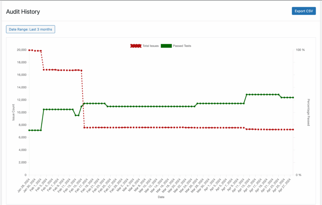
“Line graph above a table showing passed tests and total errors improving over time.”
4. Convey text that appears in the image
If an image contains meaningful text, for example, a screenshot, chart, infographic, or diagram, your alt text should reflect that content. For complex visuals like these, that may mean providing a two-part text alternative: a short description in the alt attribute, and a more extended, accessible text version elsewhere on the page (for example, directly below the image).
Example:
In the article Who Accessibility Helps (Infographic), the infographic visually lists six groups of people who benefit from accessible websites. Because the image contains significant written content, the page includes a complete “Text Alternative” section immediately following the graphic.
For this type of complex infographic, the alt text should inform users what the image is and where they can find the full content.
Alt text:
“Who accessibility helps infographic, content follows image.”
This approach avoids overwhelming users with long alt text while still ensuring all information is accessible.
5. Consider the image’s purpose
Ask yourself: Why is this image here?
Write alt text that fulfills that purpose.
For linked images, describe the action:
“Download the accessibility guide.”
6. Keep SEO secondary
Alt text should primarily serve accessibility. If keywords fit naturally, great, but avoid keyword stuffing.
How to Add Alt Text in WordPress
WordPress makes it simple to add alt text through its native tools:
From the Media Library
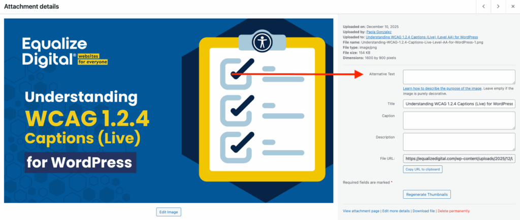
- Go to Media → Library.
- Select an image.
- Enter your description in the Alternative Text field.
- Save.
Important note: when you edit alternative text in the WordPress media library, it updates the alternative text for featured images and for any image newly added to a post or page. It does not, however, fix any photos that have already been inserted in a post or page. If you need to update alternative text on images already in use, edit them directly on the post or page where they are used.
Using the Image Block
Alt text saved in the Media Library becomes the default for future uses of that image, but you can override it per block if needed, based on context, as shown below.
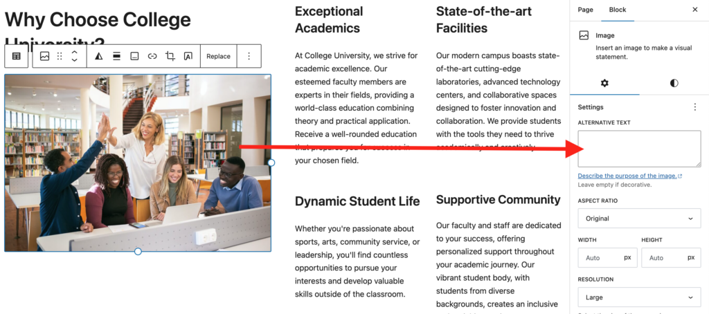
- Add or select an Image block in the Block Editor.
- In the right-hand sidebar, locate the Alternative Text field.
- Enter your description.
Making Icons and SVGs Accessible
Icons often communicate actions (edit, download) or statuses (success, warning). When an icon conveys meaning, it must have an accessible label.
Provide a label using:
aria-labelaria-labelledby- A
<title>element inside the SVG - The Image block’s Alt Text field (if added as an image)
If the icon is decorative only, hide it using aria-hidden="true" so screen readers skip it.
Providing Text Alternatives for Media Thumbnails
Users should know what a video or audio file contains before interacting with it. In WordPress, you can:
- Add captions beneath media blocks
- Include a transcript link
- Add brief alt text to the thumbnail image
Example alt text for a video preview:
“Load video: Accessibility in WordPress.”
Ensuring Image and Icon Buttons Have Accessible Labels
Icon-only buttons (search icons, hamburger menus, arrows) must have accessible names describing their function.
Labels can be added via:
- Visually hidden text (e.g.,
.screen-reader-text) aria-labelaria-labelledby
Page builders may require entering these labels manually. The Screen Reader Text Format plugin is helpful when working in the Block Editor.
Choosing Accessible CAPTCHA or Alternatives
Traditional CAPTCHA can block users with disabilities. More accessible options include:
- Invisible reCAPTCHA, which verifies behavior automatically
- Honeypot fields, which trap bots without user interaction
These alternatives reduce barriers while protecting your forms.
Common Mistakes to Avoid
- Adding alt text to purely decorative images
- Stuffing keywords into alt attributes
- Using the same alt text for every instance of an image, regardless of context
- Writing overly long descriptions
- Leaving important images without alt text altogether
Verifying Alt Text Using Accessibility Checker
The Accessibility Checker WordPress plugin helps you identify missing, empty, or duplicated alt text directly inside the WordPress admin.
The plugin scans your content and flags:
- Images missing alt attributes
- Images that may need meaningful descriptions
- Decorative images incorrectly marked with text
- Repetitive alt text that may cause confusion
By reviewing these items in your Accessibility Checker report, you can improve the quality and accuracy of your site’s image descriptions and ensure ongoing compliance as new content is added.
Making Your WordPress Images Truly Accessible
Thoughtful alt text is one of the simplest yet most impactful ways to improve accessibility on your WordPress site. By describing images concisely, choosing when to include or skip alt text, and using tools like Accessibility Checker to validate your work, you create a more equitable and user-friendly experience for all visitors.
Accessible images lead to better communication, stronger engagement, and a website that aligns with both compliance requirements and inclusive design best practices.
If you’d like help auditing the accessibility of your WordPress website or improving your editorial workflow, the Equalize Digital team is here to assist.