Don’t you love all the great AI tools available at the moment? Specifically, aren’t all the captions design tools fantastic? All those options! Animations, flashing effects, typography, graphic treatments… Aren’t they so creative and great?
Nope. No, they are not. Your fancy open captions are literally making billions of people sick. In this session, you can find out how and what to do instead.
Thanks to Our Sponsor
Kinsta provides managed hosting services for WordPress. It is powering 120,000 businesses worldwide and based on the user reviews it is the highest-rated managed WordPress host on G2. It has everything you need, including an unbeatable combination of speed, security, and expert support.
Powered by Google Cloud and the fastest C3D and C2 servers combined with CDN and Edge Caching. Your sites are secured with Cloudflare Enterprise, protecting you from DDoS attacks. All plans include free migrations, and the first month of the starter plans is completely free, so you can try the service risk-free.
Watch the Recording
Read the Transcript
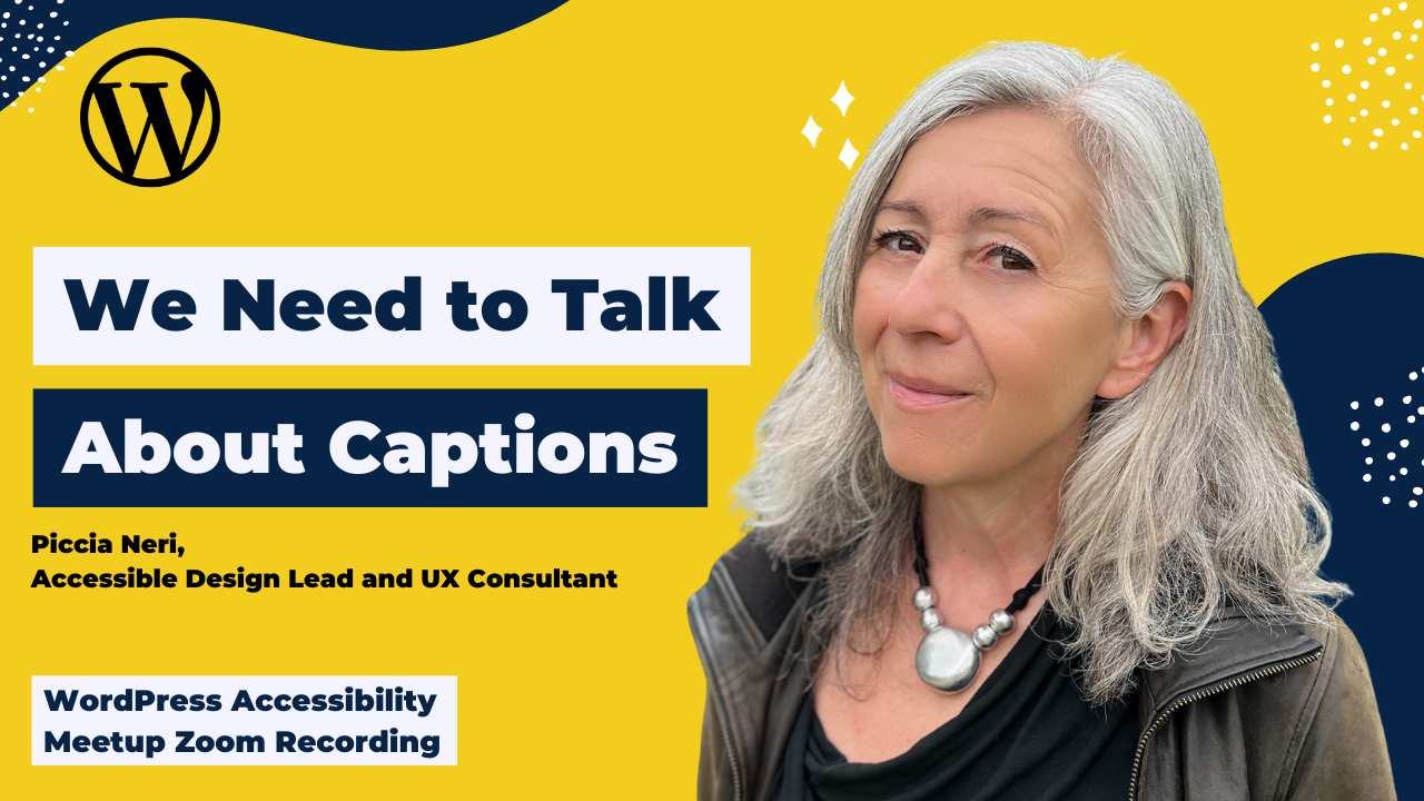
>> AMBER HINDS: Welcome, everyone, to WordPress Accessibility Meetup: We Need to Talk About Captions with Piccia Neri. A few announcements if you haven’t been before, we have a Facebook Group that you can use to connect between meetups. You can find that if you go to facebook.com/groups/wordpress.accessibility. It’s a great place to share what you’re working on, get feedback, help other people, get plug-in recommendations or theme recommendations, all sorts of things. Please go join. There’s a great community in there.
Everyone always asks, “Is this being recorded?” Yes, this is being recorded. You can find upcoming events and all past recordings in one place if you go to equalizedigital.com/meetup. The recording takes us about two weeks to edit and get corrected captions and a transcript, and then we will post it up there. You will also get notified when the recording is available if you join our e-mail list, and you can get that if you go to equalizedigital.com/focus-state.
We send out a weekly e-mail newsletter and also event announcements, so it’s a great way to get notified of any upcoming events or additional meetups like this that you might want to tune in for. The other place that we release the recording is in audio format. You can find that on our podcast, which you can find at accessibilitycraft.com, or in any of your favorite podcast apps, hopefully, if we did things right.
We are seeking additional sponsors for the meetup. This meetup is part of the official WordPress community meetups program. Unfortunately, they have told us that they don’t have the funds to cover the cost of captioning or transcription or sign language interpretation. They said, “If you want to do that, you have to go out and find sponsors.” If you or your company would be interested in helping to make this meetup accessible, then we would kindly request that you contact us. We’d be happy to share with you information about sponsoring what that entails.
The way to contact us, whether you are interested in sponsoring or if you have suggestions for the meetup, if you need any additional accommodations to make the meetup work for you, or if you’re interested in speaking, you can e-mail us at meetup@equalizedigital.com. That goes to myself and Paula, my co-organizer, who you’ll be seeing in the chat. That is the best way to get a hold of us if there’s anything you need, or if you want to help out with meetup.
Who are we? I am Amber Hinds. I’m the CEO of Equalize Digital. Equalize Digital is the lead organizer for the meetup. We are a mission-driven organization and a corporate member of the International Association of Accessibility Professionals focused on WordPress accessibility. We have a WordPress plug-in, Accessibility Checker, that helps you find and fix problems on your site. We also offer online courses for NVDA and VoiceOver screen reader testing. We do accessibility audits, remediation, and consulting work as well. Our website is equalizedigital.com.
We do have a sponsor that I would like to thank today. Kinsta is sponsoring the live captions that you can see. We do have a human typing these captions today to ensure that they are as accurate as possible. Kinsta provides managed hosting services for WordPress. It is powering 120,000 businesses worldwide. Based on the user reviews that it has, it is the highest-rated managed WordPress host on G2.
It has everything you need, including an unbeatable combination of speed, security, and expert support. Powered by Google Cloud and the fastest C3D and C2 servers combined with CDN and edge caching, your sites are secured with Cloudflare Enterprise, protecting you from DDoS attacks. All plans include free migrations, and the first month of the starter plans is completely free, so you can try their service risk-free. If you want to learn more about Kinsta, you can find them at kinsta.com.
The other thing we always ask everyone is if you are willing on whatever social media platform you go on, because there’s lots of them and we all have our favorites, if you’re willing to find Kinsta on there, and just send them a quick DM or a tag that says something like, “Thank you for sponsoring captions for WordPress Accessibility Meetup. That is much appreciated,” it helps them to know that we’re delivering on what we want, and also tells them that this is important, and that the sponsorship matters, and that they are making a difference for people when they sponsor captions. If anyone is willing to thank Kinsta for sponsoring captions, we very much appreciate it. It helps encourage them to want to continue doing so in the future.
Two upcoming events for everyone. If you were at our last meetup in August on Monday evening, Paula announced that that was going to be, through the end of the year, our last evening meetup. We are taking a pause on evening meetups, just so everyone is aware. That means that we’re only going to be doing this daytime slot through the end of the year. This is based on a combination of some difficulty finding speakers who wanted to speak outside of US business hours, and also just some feedback from our attendees in the survey that we did over the summer about what dates and times work for them.
At the beginning of next year, we will be reassessing and what might make sense for a second meetup of the month. Up until then, there will be one meetup a month. However, in October, there are going to be two opportunities to learn. The first one is, of course, this same time slot on Thursday, October 2nd, at 10:00 AM Central Time in the US. We are going to have a talk about convincing your clients of accessibility arguments and business cases.
Then on October 15th through 16th will be WordPress Accessibility Day. If you’re not familiar with WordPress Accessibility Day, it is a free 24-hour conference that takes place via Zoom events, so you can live stream it in your pajamas, or at the office, or wherever you want. You could listen to it while you’re driving maybe. Registration is open now. The schedule is open. It doesn’t cost anything to attend.
Because it is a 24-hour live stream, that means that no matter where you are in the world, there are going to be talks during your business hours. We really hope that you will go and join us for that. You can find information about WordPress Accessibility Day, see the schedule, register, all of those good things if you go to 2025.wpaccessibility.day. I apologize. I didn’t think to put that on this slide, probably ought to have. It looks like Paula amazingly has already shared that in the chat, so you can grab that link out of the chat as well.
I am very excited to pull up our speaker, Piccia Neri, and introduce her today. Piccia empowers agencies, businesses, designers, and developers to thrive and win on the web by putting their users at the center. She does this as an accessible design and UX consultant, and she’s been a leader on global projects. She’s a course provider, trainer, coach, and she is a wonderful accessibility advocate. I highly recommend following her on social media. That’s how I first got to know Piccia. She speaks at conferences globally on UX and accessible design, and her current main focus is on balancing creativity and accessibility without sacrificing either.
Welcome, Piccia, we are so excited to have you here today. I am going to stop sharing and let you take over. Just a quick note for everyone before I hide myself that there is a Q&A module in Zoom, and we will be coming back at the end. Piccia did let us know that if you have any thoughts you want to put in the chat, she’s going to try and watch it while she’s talking. If you have questions you want me to ask her at the end, put those in the Q&A module, and we will definitely make sure we have good, solid Q&A at the end of the presentation. Welcome, Piccia, and I’ll let you take over.
>> PICCIA NERI: Amber, thank you so much for such a wonderful presentation. I am really honored to be here because, to be honest, the amount of content that you output at Equalize Digital is incredible, what you do for the community, how much I learn from your blog posts. I have a permanently open tab on Equalize Digital. It’s just amazing what you do. I am incredibly thankful, and I really, really mean it.
>> AMBER: Oh, thank you.
>> PICCIA: Well, we’re all learning, aren’t we? It’s not like it’s ever finished when you learn about accessibility. I also want to say that I always call myself maybe a specialist. Even when I say that, I’m like, “Well, I hope,” because I am constantly learning. There’s a really interesting comment from Ahmed from Edinburgh, who says that he’s biased because he’s deaf, hard of hearing, so he needs captions.
That’s where we all start, isn’t it? We start with accessibility often because something alerts us to it. Either it’s an issue we have, or someone close to us has that issue. I don’t think you’re biased, Ahmed. Also, you help everyone when you make sure that people know about captions, which is– I’m here. I’m definitely biased, and I’ll explain why captions are so important to me.
Anyway, first of all, once again, thank you to Equalize Digital for all that you do, and please do what Amber asked, to go and make sure that Kinsta know that their help is appreciated and their sponsorship makes sense and really does resonate and have a good effect on people. Thank you also. It’s so nice to see so many friendly, not faces, but you know what I mean, in the chat.
Those of you who I don’t know, I hope that after this, we will know each other. Look me up on social media. I’m mainly active on LinkedIn. Because I’m such a brilliant marketer, I don’t think I’ve put my link anywhere. Once you spell my name right, then you can find me anywhere. Without further ado, let’s get started. I’m going to share my screen. Please confirm. You should be seeing my first slide, We Need to Talk About Captions.
We do. We need to talk about captions because we’re living in a day and age where captions are everywhere. You would think, “Oh, that’s great because now, finally, we have captions.” Well, it hasn’t quite happened that way. What we’re going to talk about today, a little bit of an agenda, is we’re going to talk about what captions are and why they were created, who they help, and the path from access to aesthetics, which is what has happened recently, why today’s trends are harmful, and how to do it right from shoot to screen.
I’m going to start from something that may surprise you, but it’s a very strong connection. It’s something that I have in common with Generation Z, so the people born from ’95 to 2010, if I’m not wrong. Gen Z. I’m 50-plus, so I’m Generation X. What I have in common with them is that we always have closed captions on. The prior screen agenda on for a bit longer. I’m going to put it up again, what captions are and why they were created, who they help, the path from access to aesthetics, why today’s trends are harmful, and how to do it right from shoot to screen. I think that you should be able to take a screenshot.
I was saying that it’s really interesting that I find that I have this thing in common with young people, that we tend to always have closed captions on. Hearing has apparently nothing to do with it or very little. We get to talk about this earlier, but I’ve noticed that I have a lot of Generation Z people in my life. There’s a big gap time-wise between me and them, but we have quite a few habits that are very similar, and closed captions is one.
Personally, I cannot live without them anymore. It’s my go-to, but it doesn’t always have to do with hearing. Having said this, it’s a bit of a premise. Let’s go with a brief history of captions. Why? Because captions were a real innovation. One of the greatest arguments, if you can say so, towards accessibility, us champions of accessibility often point out that accessibility drives innovation. They are one accessibility inventions, things that we take for granted today, really started a lot of– Sorry, I was looking at too many things at the same time. Sorry. I’m going to start again.
I just was saying that opposite to what people often say that accessibility restricts creativity. My counter-argument to that always is that a lot of incredibly creative innovation started as accessibility innovations, and captions is one of them. The pioneers of accessibility were in the US. Dr. Gregory Frazier, he was a deaf engineer. He was also an author, he was a professor, and he was an Emmy Award winner who began developing a closed captioning system in the late ’60s.
He used a combination of magnetic tapes and decoders to create captions on TV broadcasts. He was still in the experimental stages, but it paved the way for later developments in this field. Then, later on, Dr. Norwood was a deaf physicist who also did a lot. Again, back to Ahmed, they were deaf, so they needed to help themselves, and they worked at it. It’s completely normal. That’s what we all do. Norwood is the one who started developing a system for closed captioning on television. That’s what he did.
Then in the UK, there was Professor Alan Newell, who, if I’m not wrong, had to do with teletext, which was a way of captioning. There were early demos of closed captions in the early ’70s in the US. In 1973, there were closed captions on ABC’s World News Tonight. I believe that it required a decoder, but still, it was already possible then. Then in 1979, the National Captioning Institute, NCI, was founded in the US. They drove a lot of innovation.
The first common story in captioning history is that the BBC captioned The French Chef program with Julia Child. This was a US program that was then aired in the UK years later, in 1972, with open captions. I will get into what that is now. It was a groundbreaking decision that the BBC made to add open captions for deaf and hard-of-hearing audience. It showed what was possible, even before the closed captioning system that we know today was developed.
Up to now, I believe that mainstream captioning was only, well, for silent films, which is a different story. That’s something else entirely, or for translation. This was pure accessibility. It was a novel idea. It seems more obvious now, but it really wasn’t at the time. It was the first show with open captions. Then, in a few more pioneering innovation, it was in 1979 in the UK, the BBC had teletext captions. There was a specific channel where you could have captions.
In 1982, there was already real-time captioning for live broadcasts in the US. In 1990, the Television Decoder Circuitry Act happened in the US. Probably you, Amber, know more about, or other people in the audience may know better than me about this. I don’t know if this was part of the ADA, the Americans with Disabilities Act, because the ADA is also from 1990, if I am not wrong. This 1990 Decoder Act was a real monumental piece of accessibility legislation, according to my research, because this was a fight for access on television first, because the digital world in 1990 didn’t quite exist on a mainstream level yet.
What is important about this is that captions were born from a need for access, not aesthetics, which is really important in this day and age to make this difference. Now, fast forward to the 2000s, there’s a proliferation online because now, we have videos online all the time. People can record their own videos and upload them. Slowly, there’s lots of different technology that gets developed to put captions.
In 2009, YouTube started enabling auto-closed captions. This means that any video that got uploaded to YouTube, if you enable the option, it gets automatic closed captions, which are still not perfect, but way better than they used to be. Then in 2012, there was an agreement between the National Association of the Deaf, NAD, again, it’s a US organization, and Netflix. They teamed up to guarantee closed captions in 100% of Netflix streaming content by 2014.
I don’t think that Netflix are a particularly– besides any judgment, this is amazing. This was an absolute game-changer for so many people. I believe that it changed the culture for all the people that have said in the chat, a couple of people. Regan Kelly said that her young daughters use closed captions all the time because it helps them focus. We’ll get to that. That’s really something that’s been a major, major change, this agreement with the NAD. I’m sure that there was legal pressure as well, but it doesn’t matter. What matters is the result is really good.
Then in 2017, there were various apps started appearing clips by Apple that I think had live caption stickers for iOS video. Then Kapwing is another online editor, which had auto caption and burning caption. We’ll talk about that in a bit. VEED is a really good app that also allows you to edit video, and it has captions. Then rev.com has both human-made and auto captions. They’re exportable, and you can do whatever you want with them.
Descript is another video editing platform that also captions and does transcripts. Then TurboScribe is a brilliant one. It’s very, very accurate. There’s also Otter.ai that I forgot to put in this list. Really, there are so many. InShot, Canva, CapCut, so, so many. I can’t help seeing, there’s a– we will talk about that. Ahmed is saying in the comments that Amber said that if you have children or are looking after them, put captions on, as there is strong evidence that it can help to improve literacy rate.
I’m slightly anticipating it myself, but dyslexic people actually find that captions help them a lot. It feels counterintuitive, but yes, there is evidence. I don’t personally have that. Ahmed, if you have it and if you want to share it, that would be great. Et cetera, there are so many apps these days that help with caption. In short, speech-to-text, at this moment in time, in 2025, is easy, cheap, and also relatively accurate. This is very, very good AI. It’s a case of AI doing very good work for humanity.
One thing that I always get confused by, because it’s one of the differences between UK English, British English, which is what I speak, and US English, is the terminology. The difference between a caption and a subtitle. When I have to upload on Vimeo or YouTube, they ask me, “Is it captions or is it a subtitle?” I always have to remind myself because there is a difference. What captions are?
Captions are primarily designed for people who are deaf or hard of hearing, so they need to be accurate. They need to be representative of what is being said. They also include irrelevant non-speech audio like door creaks or laughter, all in square brackets, music playing, applause, this kind of thing. When they’re super well done, they include speaker identifiers one way or another. Sometimes it’s color. Sometimes it’s at the beginning of the sentence in square brackets. They usually, or they should, match the timing of the audio. They can be open, which means burnt in, so you can’t turn them on and off, or closed. They can be turned on and off.
This is an example from Netflix. It’s actually a dark screen because I believe that Netflix doesn’t let you take screenshots. Nevermind. It’s a caption saying, it starts with, in square brackets, woman 1, and then the caption says, “Our latest cold case is from the evening of May 11th, 1973,” and it’s from The Thursday Murder Club film that I highly recommend. The novels are very much fun to watch. Then the following screen says, has in square brackets, “mysterious music playing.”
These are what captions are. Subtitles, on the other hand, are primarily for people that can hear but that need language help. Usually, it’s only the spoken words, translated or transcribed, so with no sound effects or speaker identifiers, because the assumption is that subtitles are for people who can hear. They can also be either open, which means burnt in, or closed, that means that they can be turned on and off.
In short, captions are for accessibility and subtitles are for translation. You can tell the difference also because when you can hear and when you understand the language, subtitles often use different words, which I’m not sure helps. It’s a bit strange. Yes, maybe they make the language easier. It could be for that reason. I also found out that there are two types of subtitles. Standard subtitles that show only the spoken dialogue, and they’re meant for people who can hear but don’t know the language. For instance, when I watch a Korean drama on Netflix, I will turn the English subtitles on because I don’t know the language. These subtitles don’t describe the sounds, the music, the speaker tone.
Sometimes even the tone or voice of the speaker is described, but not with standard subtitles. Then there are SDH, which are subtitles for the deaf and hard of hearing. They’re a hybrid of captions and subtitles serving both audiences, and they’re styled more like captions, often with white text on a black background and so on. In short, captions are in the same language, plus sound effects. Therefore, accessibility and subtitles are spoken words only, and that’s translation. SDH subtitles, which we said are subtitles for the deaf and hard of hearing, also act like captions.
Now, who benefits from captions? Here’s where we could have a conversation that could go on for hours. I’m going to try and not go too off-track with this. First of all, people who are deaf and hard of hearing, those are the first people to benefit from captions because without captions, they simply don’t know what’s going on. They can’t hear it. Then also, neurodivergent individuals, and that’s linked to what Ahmed was saying earlier. Also, it goes a little bit beyond. Actually, I have it as an item later.
People with ADHD. I have an informal diagnosis. It’s not a formal official diagnosis, but I definitely have it. It aids me to focus and process. It’s nothing to do with language for me. I put subtitles on in any language. I am also wondering, our mutual friend, Bet Hannon. I mean mutual with Amber. She’s someone else who’s very active in the accessibility ecosystem in WordPress and outside of it.
Bet wrote to me because I sent an email to my list, talking about the fact that I always have captions on, and that’s something that I have in common with Gen Z. Bet suggested that I do get my hearing tested anyway because I think I hear, but I have a lifetime of headphones and listening to loud music and going to lots of concerts in my youth and now also. It might be that maybe I do have a hearing issue. There’s lots that you can do about it, and it’s a good thing to get it diagnosed early. I am going to do that. Bet, thank you for that suggestion.
It’s very interesting that captions are proven to help people with dyslexia as well. It’s a very interesting side effect. Then people with vestibular disorders, and that is me as well. Why? Because I’m sensitive to sound, and I need visual reinforcement. It’s a strange thing because also things that move on screen really make me sick. Vestibular disorders. When you have a vestibular disorder, it means that your inner ear system is affected. It can affect balance.
Luckily, I don’t have a balance problem normally, but it’s very easy to tip me off that balance, and things that move very fast without me being able to stop them do that. For some reason, captions help me. I just said it. That’s another category that very interestingly gets a lot of help from captions. Then, of course, there’s also the situational disability, the temporary disability that happens when you are on a train. Like the person in this photo is on a train looking at a phone.
If you’ve forgotten your headphones, you won’t be able to watch a video, or maybe it could be an important message that’s been sent to you via video. If you can’t turn your captions on, then you won’t know what the message is about, or you won’t be able to watch a video, and so on. That’s someone else that benefits from captions. Situational disabilities happen to us every day because we’re only ever temporarily abled anyway.
Then someone else who has huge benefit from captions is non-native language speakers. I was mentioning Gen Z earlier. My niece and nephew, they’re Italian. They’ve been encouraged from a very early age to watch videos in the original language, turning subtitles on. Now, they watch in English with English subtitles, and their English is excellent. It’s incredibly useful for learners of any type. You can now learn another language simply by watching Netflix almost. It depends on the language, obviously, but it’s a great, great help and a tool that is a fantastic innovation for everyone.
Then in sound-sensitive environments, like we said earlier, libraries, public transport in a quiet office when you can’t turn the sound on. Now that a lot of people work from co‑working spaces, it’s essential to have closed captions if you’ve forgotten your headphones, or maybe if the battery runs out and you don’t have the cable. Then anyone learning to read, and that’s back to what Ahmed was saying. I can’t wait. I know that Ahmed shared a link with evidence of what he said. I can’t wait to check it out because anyone learning to read, children connecting text to speech, apparently, find it really advantageous.
Actually, something that I just remembered the other day. I grew up in Italy. My mother was a teacher of English as a foreign language, and she was a pioneer of the new teaching techniques. That meant that you went from studying grammar to actually being encouraged to speak and learning with images and sounds and so on. She was teaching us children when we were very young, and I absolutely hated it.
I hated it because she was showing me pictures and saying things without showing– it was forbidden, like she would completely refuse to show me how it was written. I was like, “I need to connect this to something written,” and it just irritated me in the end. I learned, but I learned in a different way. There are lots of learning styles. I’m not saying that that method wasn’t right because it was pioneering, and it’s much easier to learn, and there’s lots of research behind that as well.
I’m not dissing it, I’m just saying that being able to connect text to speech is also very, very helpful for cognition. Now, like I said, to me, having captions on is completely essential. Another way in which captions and transcribing meetings, for instance, is incredibly helpful is when you work online. I’ve led teams globally distributed. It’s not even a meeting. It’s a working session. You work together online for maybe two, three hours.
If you don’t transcribe your video, someone who couldn’t come to the meeting or who needs to go over what was said again will have a really hard time if they have to trace through three hours of video. If you have a transcript, they can just go to the transcript and maybe do a search or skim through it and find what they are looking for. If you don’t transcribe your work meetings, I’m sure that most people do these days, but when I started, I actually had people writing to me and saying, “I am so thankful. I had never seen this done before, and this has saved me hours of pain.”
This is so, so useful as well. It’s another situation where captions are incredibly useful. This is what people call the “curb-cut effect.” It’s an accessibility innovation that is essential for some, but it’s actually great for all. What is the curb-cut effect? It’s the small ramps that are built into pavements or sidewalks in the US as street crossings. Suddenly, there isn’t a step anymore. The step is flattened. This was originally done to make cities accessible for wheelchair users. Once it became common, then so many other people found it useful.
Parents pushing prams, if you have wheeled luggage, if you have a delivery with a heavy trolley, if you’re a cyclist or you’re a runner. I was going to say if you’re a skater, but that’s not the case because I love steps. Anyway, it depends. Sometimes you don’t feel like it. The curb-cut effect is when an accessibility-driven innovation improves usability, convenience, and inclusion for everyone, not just the group that they were initially designed to help. There are so many accessibility innovation that fall under this category, if not every single one. I’d like to put this out here for you that, actually, it’s every single one.
Back to what we were saying earlier about speech-to-text. When speech-to-text to design becomes too easy, that’s where good AI runs the risk of becoming bad AI. There can be such a thing as too easy because this brings us to the core of the problem. Your creative captions are making people sick. I’m not saying as you because if there’s people in the audience that do this, I don’t think you will after this presentation.
Sorry, my eye just fell on a comment by Danib, who is saying, “Did Piccia just reveal that she’s a skater?” Yes, I am, but an inline skater, though. People think that skater means skateboarder, but I skate with inline skates, so the skates that are on a line rather than in a block, yes. The core of the problem is that the– no, I don’t see– Amber has commented, “Rollerblader.” I’m not a Rollerblader because Rollerblade is a brand. It used to be like the only brand.
People called skaters “Rollerbladers,” but I don’t use Rollerblades. [laughs] Sorry, this is getting way too skate-nerdy. Anyway, the core of the problem is that the current trend of treating captions as a pure design element ignores the fundamental purpose of captions, which is access. For many of us, this bad design isn’t just annoying. It is actually physically harmful. I’m showing the Instagram page of a huge influencer called Steven Bartlett.
He’s a very young man who became huge, made a lot of money, I think, just in marketing. He’s even in the British equivalent of Shark Tank, which is called Dragons’ Den. He has a huge Instagram account. He’s a podcaster and so on. His captions are the epitome of everything that’s bad with it. I’m going to show them because I think that we must see some of them, but they come with a trigger alert because they are truly– If you suffer from vestibular disorder, let alone epilepsy or even just anxiety, they come with a big trigger alert. You’re alerted, but I won’t keep them on the screen for too long anyway because I can’t send them.
Here we are. I’m going to change the share. Has the share changed? I think it has. It’s muted because I’m not putting the sound as well. Basically, if I go to his reels, I can choose any of them, and it’s going to be a crazy caption. I can show anyone. Look at this. What we’re seeing now on screen, and I am just going to stop it because I can’t stand it, it’s someone speaking. The captions are actually reproducing her words, I think, verbatim. We don’t have the sound on. I don’t have the sound on. Yes, thanks for making it stop. I’ve made it stop. [chuckles]
Yes, they drive everyone crazy. Above all, they do not help the people that are mostly meant to help, which is the deaf and hard-of-hearing people. I saw that someone made a point about the different terminology for deaf and hard-of-hearing people. I apologize if I am not getting it completely right. I will go through the comments later and make sure that I correct anything that I may have said incorrectly.
However, back to describing these captions, they completely make me dizzy. It’s totally impossible for me to watch this. They help no one at all. They’re not done for accessibility, but for entertainment, as Paul Rea is saying. Yes, okay, but why are you making me sick? These are so fast that I believe they could be probably really harmful to someone who has epilepsy and, just by mistake, lands on that page.
He’s a very particularly strong example, but there are so many others. I know that I and lots of other people have written, left comments so many times because Steven Bartlett, this influencer that I’m talking about, has a podcast that talks about health. He also promotes dubious health advice. Apart from that, he says that he’s in favor of good health. This is definitely not promoting good health.
Alicia is saying that it’s a fad that will probably die out. Let’s hope so. I don’t know whether that’s the case. It’s okay to say that this is art. Actually, I have a whole talk where I talk about this, the difference between entertainment and something that is there for a purpose, but the lines are really blurred online on social media these days because a lot of this content is actually very, very useful content, and that people may actually need. Maybe not this, but some other people that use this kind of caption.
There are so many different examples. The ones that show one word at a time, so I mentioned that there are many, and I’ve got them here in my other examples. How can anything that is physically harmful to a vast category of people be considered entertaining? I am not sure. Actually, it’s many more people than you think. I’m going to go back to my presentation now, if it lets me. I don’t know if it’s seeing it. Yes, here it is. No, I’m not sure you’re seeing the right one. No, stop share. Sorry, I’m just trying to find the right screen. That’s the one.
It’s not just me. It’s probably many more people than you think because 35% of US adults aged 40-plus, and that’s around 69 million, present evidence of vestibular dysfunction. That is, as many people, the equivalent of the whole population of Thailand. That is a lot of people. I’m only mentioning the US because that’s where I found the data. I don’t have data for other places, but we can use it as an example.
4%, which is eight million of US adults, report chronic balance problems. 1.1% report chronic dizziness, and 80% aged 65-plus have experienced dizziness. The source of this data is from the National Institute on Deafness and Other Communication Disorders from the US. This is where I got all of this from. It’s not old people either, because there’s 2.2 billion people with a vision disability, 75 million on the autistic spectrum, 50 million people with epilepsy, 78 million people with dyslexia. The source for all these data is from the World Health Organization, WHO.
In short, your creative captions are making billions of people sick. I could give you loads more examples. This is someone else. He’s called Tom Crosshill. There’s an image on the screen now of one of his Facebook reels, but he also has Instagram and YouTube, where he doesn’t show one word at a time, but what he does is almost worse. There’s a sentence that is cut in the wrong place, and a word at a time. The word that he is saying gets highlighted in green. The text is in white with a black outline and a bit of a drop shadow as well, which is complete cognitive and sensory overload.
Here’s another trigger alert. If everyone agrees, I will not show it because I still feel a bit dizzy from what I showed previously. I’d rather not because I’m sure that you’ve all come across all of these. That’s what this does. Someone mentioned earlier, the ones that show one word at a time. Oh, my God, they are really bad because what I find myself doing, apart from the fact that they make me dizzy. Also, I find it impossible to look at anything else. I get really dizzy because I’m focusing on that one image, and I have no idea what they’re talking about. It completely defeats the purpose.
This is another one that has a huge– Yes, I think we got the idea. No need to show it. These are a few other people that do creative stuff. Danib is saying, “I kind of like the shadow. That helps make the text legible, no matter the background.” No, I really disagree with this. I am a designer, first and foremost. I have a similar example of that later on, Danib. Basically, it doesn’t. It doesn’t help make the text legible, no matter the background.
If you have a busy background, you need to put a solid block of good contrast color behind your text because, otherwise, it will not be legible. This is something that is really, really basic. It’s a contrast error that 99% of websites make. It drives me a bit bonkers as a designer. This is a longer conversation that I’m not going to have now, but giving text a shadow or an outline does not make it any more legible. It could actually make it illegible for certain people.
The example that I have on the screen now, we’re not going to play it, but it’s using all-caps with different background colors and different sizes. It’s all over the place. All-caps are really not recommended. You can use them very, very sparingly. They’re very difficult to use to see for people with dyslexia. They’re not recommended at all. Then there’s also the positioning. In this slide, I’m showing someone who has very thin, all-caps script on top of the image in the middle. Don’t do that.
Now, I have another example of someone that uses that. Not only do they use all-caps, they also use the outline. They use one word at a time highlighting. It’s completely mad-inducing. Let me say this. People need to find another outlet for their visual creativity because bad captions are worse than no captions. I wrote “almost,” and then I crossed it out because I think that bad captions are worse than no captions.
This type of caption is so bad for so many people. For those who argue, “Oh, bad creativity,” which I hear all the time, it’s not your creativity you’re using. It’s the AI of your captions tool that’s making you believe that you’re being creative. Use your creativity to make your content engaging and unforgettable, as well as easy for everyone to understand and possibly buy from you, which is what ultimately everyone wants. Even the people that are not directly selling, they’re selling themselves.
Accessibility improves conversions always. These fancy captions hurt these people, the deaf and hard of hearing, people with low vision. Really bad for them. Neurodivergent people, dyslexic people, which is a form of neurodivergence, people with vestibular disorders. Hello, here I am. People with epilepsy and people with anxiety, they are terribly anxiety-inducing and, therefore, trauma survivors.
Then open captions can’t be turned off. All of the captions that we’ve seen, those examples, you can’t turn them off. That’s really bad. One of the tenets of UX is that you need to give people options and agency, even the agency of turning the captions off if it doesn’t work for them. Because, especially on social media, those tiny screens are so chock-a-block full of information that you need to be able to turn some of it off. Otherwise, literally, you go blind. There is so much to see.
That’s why, by the way, there is an argument that says that children these days are maybe more prone to ADHD because it’s caused by all these devices, but I don’t have any evidence for this. Don’t quote me on this one because I like to always back up my arguments with hard facts. I can’t do that right now, but I know that people say that. Captions with one word at a time are completely wrong, all in caps, as we were saying, because all-caps is wrong on so many levels, or with alternating cases, incredibly confusing as well.
Someone with dyslexia already sees letters dancing all over the place. If you alternate cases, you’re going to make it even harder for them. Same goes for unpredictable layouts, which a lot of these creative captioning does, creative really in inverted commas. Not to mention flashing effects and whirlwind animations. Like I said, younger people may say that they like these, but are they shortening their attention span? I don’t know. Let’s see if we can find evidence on that.
Then fancy typefaces are very often not legible, not understandable. Even when they are, they cause cognitive overload anyway, because you need to decipher them. Fancy color and treatments are also wrong. Against a busy and colorful background, don’t do that. Just don’t do it. When we are used to design for print, that’s when I started designing, you didn’t design websites yet. I wouldn’t print any text on top of an image because it’s either about the image or it’s about the text. Make your mind up.
What we did use to do was brief the photographer to go and take photos with a lot of negative space, two-thirds and a third of negative space. That’s what our direction also does. Then also, never put captions in the middle or some other awkward placement. That’s also very wrong because it’s unexpected. Why are you putting captions on someone’s face? I don’t understand. Why would you do that? Sometimes on your own face.
Then something else that’s very, very important, unedited captions, aka “craptions,” because even though AI is really good these days, it still doesn’t get it wrong. This is a case where I would argue that it is better to put craptions than no captions. If you really care about your audience, do take the time of editing them. That’s why Equalize Digital webinars are so great because they take time to edit them, and it takes time. I edit my own captions, and it is tedious. Even now, with tools that do an excellent job of it, I use TurboScribe, and it now knows what I’m saying. It gets even names right. It’s amazing. It’s really, really good, but it is never perfect. I always have to go through it again. You need to do that if you really care.
Now, I’m going to give you three, not three, 13 basic guidelines for accessible captions. Of course, there is so much more that we could say. We’re skimming the surface. I always believe that by following basic guidelines for accessible captions, in this case, but in general, basic guidelines get you a lot of the way there, even if we haven’t said everything that could be said about captions. Surely, if we all do this, the captions that come out will be so much better for everyone.
My eyes fell on Christina Babcock, saying that one key to accessibility is user choice. That’s where I often say that I’m a UX designer, UI as well, but I’m a UX designer. One of the tenets of UX design is, like I said earlier, option and agency. That’s a big overlap with accessibility. It’s user choice. Open captions, Christina says, do not provide a user with a choice, whereas closed captions provide a choice. That’s so essential because there are other things that you can do with closed captions that you can’t do with open captions.
In fact, the first guideline is use closed captions. Make sure that the caption can be turned off. You do not remove user’s choice to toggle captions on or off. Sometimes open captions are needed because some social networks do not offer any captioning at all. I believe that Instagram is like this, but I am not sure because I’ve not posted a video on Instagram for a long time, if ever, so I don’t know. Wherever you are able to use closed captions, please do so if you want your captions to be truly accessible.
We said how some people with ADHD find captions extremely useful, but some others don’t. To me, I said that I have them on all the time, but sometimes I can’t use them. Sometimes I feel like they overwhelm me, and I have to turn them off. It’s never the same all the time, is it? That’s one of the things that we know about accessibility. Then keep them short and legible. A short sentence at a time, roughly speaking, circa 40 characters on maximum two lines.
Here, I have another Netflix example. The caption on this black screen, because they don’t let me take a screenshot, says, “Are you really from the gas board?” in the first line, and then, “‘or are you a burglar?’ You know,” on the second line. I think this is reported dialogue because the first part is between inverted commas, but don’t make them too short, because as we’ve said various times during this presentation, there should never be one word at a time. Never. Something else, with no highlights. There’s a screenshot on the screen now of a caption that says, commits a number of visual design sins. Felt like learning with a word felt highlighted. Please do not do that. Never highlight one word at a time. It’s completely maddening. Also, make them readable. The screenshot here shows the sentence, and when I, which is also in all caps, also in an illegible colour, also on top of an image, and also is slanted, which really makes it illegible. The thing that I wanted to point out is that if you say and when I, that’s not a meaningful line break. Use meaningful line breaks. A good example is, he went to the store to get milk, first line. Second line, but it was already closed. Bad example is, he went to the store to get milk, but it, second line, was already closed. It would seem obvious, but it just really isn’t. Again, legible because legibility there would be a lot to say about it. Sorry, my earphones are slipping out of my ears. One fell to the floor, but I’m all right for now. I’ll pick it up later. Here is an example that I showed earlier as well, that’s using all caps in these heavily styled captions in all caps. In sentence case, always no all caps. One thing that is done a lot in the US is using a title case, which is every word is capitalised. Please don’t do that. That’s also really hard to read. Sentence case is the case.
If it’s a sentence and not a title, use predictable, familiar layout with no surprises. This is another design principle that should be followed. There’s a real misunderstanding thing about the need for creativity. There are certain things, familiarity is another UX tenet that is also an accessibility principle. Just be predictable, put things where people will find them. Don’t make things jump all over the place. I can’t believe, it’s at number eight, but please promise never, ever, no flashing effects or whirlwind animations ever. I mean, the numbers here it’s just to say how many there are. It’s not an order of importance by any stretch of the imagination.
Once again, no fancy fonts, never. Just don’t use fancy fonts. Use a simple sans-serif font and no drop shadows or outlines. Now, I have on the screen an example of a caption. There’s an image in the background. It’s a woman with a checkered scarf. There’s like, I’m thinking of the word in Spanish or in Italian for this, but it’s like kind of mosaic-tiled pavement behind her. She’s holding a book and the text on top of the image in the middle, centered text, which is also really bad for legibility. It’s changed my perspective, which is misspelt, but never mind, on so many things.
I just manifested a client as a result. I find it so hard to read. This is a real good example of how using drop shadow and using an outline on text on top of a busy image does not help making it more visible or more legible. You have to make your mind up. It’s either about the image or it’s about the text. If you want to put text on an image, do it in a way that doesn’t deface the image and that makes the text legible. There are so many ways of doing this. No drop shadows, no outlines or no other fancy treatments, especially on top of an image.
Make sure wherever you can, I mean, contrast, you always can, almost white against 80% opacity, almost black or darker, but personalization is super important. Again, it goes down to giving users choices. Allow for adjustable size if possible. I know that, for instance, most of the tools that we little people use don’t allow for that. I use Vimeo or YouTube. They don’t allow for adjustable size, but for instance, the BBC iPlayer that you can use, I use it with a VPN because I lived in London for like 20 years, and I love to watch UK series. It has a great caption tool that allows for adjustable size.
I believe that Amazon Prime has that as well. I don’t think that Netflix allows for that, which can be annoying, but I hope we will get there. Then another really important thing is to use what is called in cinematography is called the lower third. The lower third part of any image, you don’t put anything important in it because it’s what is used for a lot of reasons, but mainly for what used to be subtitles in silent cinema and now captions. This is another image of another great influencer whom I love. He’s called Owen Jones, but he uses absolutely unbearable captions with crazy placements and all the style mistakes that we just pointed out, and I’ve tried to get him to listen, but no, he hasn’t yet. Never mind.
Put your captions at the bottom of the frame. Shoot video with access in mind. Even if you’re not a videographer or a filmmaker, this is easy. Just don’t put anything that visually matters at the bottom of the frame because you’re going to have to put your captions in there. Last, but by no means least, edit your captions. That means that also audio quality is of key importance. Invest in a microphone. I bought my mic, which is, I hope, decent. I hope you’re hearing well. I bought it maybe 10 years ago, and it cost me around $99. It doesn’t cost very much. It’s a long-term investment, and audio quality is so important because even people that use hearing aids that can hear, it’s different.
If you sound like you’re coming from the bottom of the ocean because your microphone is not of great quality, that matters. Also, for AI transcription, audio quality is really important. I want to say also something that matters a lot. Do not censor your captions. Don’t leave things out. If someone swears, you need to put it there because otherwise you’re violating another fundamental principle of accessibility, which is that everyone should have the same experience. If a swear word or anything else is audible in your video, you need to transcribe it properly because otherwise you’re patronizing your deaf and hard-of-hearing viewers, because they deserve the same content as everyone else.
This is something that actually an accessibility person, called Natalie McLeese, who’s wonderful, she wrote a post on this recently on LinkedIn. I was like, yes, absolutely. I’m going to say once again that you need to avoid craptions wherever possible. AI is a first draft, and human review is non-negotiable. I understand that sometimes– What I do sometimes, if, for instance, a client needs to see what I’ve done, they need to review it, I will put it up with craptions because they’re not so bad, they’re kind of all right, but I will always revise.
I will advise and I will say, please note that I am in the process of editing captions and the transcript, and you will get them in a few days or whenever they will get them, but I do always review them. It’s non-negotiable. The word error rate, they used to say there was 15 to 50%. It’s not the case now, it’s much lower, but really, it’s very important that you review the caption. What’s the path forward? We’re here for advocacy and implementation. What can we all do? Keep talking about it. Keep complaining.
Whenever we see terrible captions that make us sick, tell them, don’t stop, keep writing. I will keep writing to these people and saying, “Please, often people don’t know. It’s amazing how many times you find out that people actually do change once you tell them. They had no idea they were making you sick. It happens a lot.” We need to tell people. As designers, we can advocate for user-controlled closed captions over designed open captions because I will say it again, designed open captions, you’re not designing them, the AI is. It’s not your creativity, it’s the AI lack of creativity because everybody in the end gets the same captions, really.
Use something else for your branding as well. I don’t care. Do something else. Brand is way more than just aesthetics. Developers advocate for the implementation of native video players that support CC styling and toggles. I understand, again, there are sometimes budget constraints, but let’s do our best for it. Content creators, edit captions, full stop, just do it. Resist temptation, please. I know it’s very tempting. I know it might make you feel like you’re being left behind if you don’t follow this overly designed fad, but you know you will resist the temptation.
Everyone, ask the question, do these captions prioritise access or aesthetics? It’s a very simple question. That brings us to my thank you to all of you for being here. I’m just going to say this now, but I won’t– I’m doing the pre-sale for an accessible design and content course that will be really big, and I’ve got a discount for you. This is the URL, which is https://piccianeri.com/adc/. Piccianeri is spelt P-I-C-C-I-A-N-E-R-I.com, forward slash, A-D-C. The discount code is 15% discount code and it’s ED15 until the 11th of September.
It’s going to be a really big course. I’m not going to– Let’s stop talking about it, but it will be so much. It’s the course that I wish had existed, and it will piece together, with a lot of additions to all the materials that I’ve been putting out online, all the workshops that I’ve given so far, which is loads. The price is unbelievable right now, but I understand. Anyway, that’s it. Let’s leave this. I’m going to stop the share because I get embarrassed when I talk about this stuff too much. There you go.
>> AMBER: Thank you so much for your presentation, Piccia. We do have a couple of minutes for questions, so please, if you have those, if you can put them in the Q&A module, that is helpful. I wanted to start out with a question that I have as you’re talking about all of the different designed captions. Let’s assume that the fancy captions that come on as words are spoken or whatever are not failing rapid flashing requirements, and they pass color contrast, so they are otherwise accessible. If you also have closed captions, is there any problem with having those stylized open captions that are more like design on a video than like the one you showed, where sometimes it showed a person talking, but sometimes it was almost like an infographic type of design with animated words?
Is that okay if you also have traditional closed captions?
>> PICCIA: I don’t see how it can be. By the way, sorry, I disappeared for a second under my desk because another side effect of my vestibular disorder is that if I have only one earbud in, I faint. I get so dizzy.
>> AMBER: It makes you dizzy?
>> PICCIA: Oh, my God, it makes me incredibly dizzy. Anyway, that is such a good point, Amber, and no, it’s actually worse because then I’m seeing it twice, and I go in complete sensory overload. I understand what you’re saying because it’s almost like a graphic device, but I can’t stop it. I can’t decide whether I can stop it or not, and so I don’t see how there’s a way that those open captions can be in any way acceptable. Even when you have the closed captions, it’s actually worse because it’s too much going on.
I think that perhaps if you keep it not moving, if you have like a graphic on the video that doesn’t move and that follows a certain style because that’s your brand, you could have even just text. As what we do in a presentation, we have just text on the slide and then we talk over it, and that will be in the closed captions. That would work, but if it keeps moving, how can I deal with that? It’s impossible, and I’m talking from my personal experience, that there is no way that that’s ever going to work for me.
>> AMBER: Maybe if it’s only like a word or two that animates in with some other graphics versus the full sentence. Because I feel like there is a place for animated videos that include text on the video, as long as they meet contrast, they don’t have rapid flashing, they’re not moving so quick that it’s making people feel nauseous.
>> PICCIA: I’m sure there is.
>> AMBER: It’s an interesting line, I think.
>> PICCIA: Very much, because let’s not forget, I would say I’m a recovering creative designer, but that’s where I come from. I worked for cinema a lot. I was at the British Film Institute for years. I’m very familiar with all of this, and I did motion graphics and all that kind of thing. There is definitely a place for that, but you need to be very mindful of how that works. I can’t not mention Alicia’s comment, the best creative solutions are born from restraint, because I’m actually giving a workshop next week at a conference in Berlin that is less accessibility, let creativity work with, I don’t know what title they gave them.
Basically, it’s exactly about how to get creative solutions from restraints. Restraints, constraints actually foster creativity rather than the other way around. What you are saying, Amber, is such a great creative challenge, and maybe I will actually give it in my workshop. Maybe I will insert that in my workshop. Yes, thank you for the idea.
>> AMBER: Yes, that would be really interesting.
>> PICCIA: Very interesting point.
>> AMBER: Tom had asked, if there is a transcript below the video, are captions required?
>> PICCIA: I think there still are, aren’t they? I think it’s both–
>> AMBER: I think so, yes.
>> PICCIA: It’s definitely a WCAG requirement that you need to make both available. Usually–
>> AMBER: You need to have synchronized– It gets interesting, because I think you could have transcript-like placement, where it’s like right below or to the right, maybe, let’s say, of the video versus overlaid on it, that synchronizes with the video so that it’s timed and it matches timing. Then that might be sufficient to not use the video closed caption, but I don’t know. I’d err on the side of, if you have the transcript, [chuckles] just use it to generate a SRT or VTT file and upload that as well.
>> PICCIA: Also, why not have it for SEO purposes as well, as text? Be crazy not to use it. On YouTube or Vimeo, usually what happens there is that when you activate the synchronized transcript, it doesn’t show the captions anymore, if I’m not wrong, both on YouTube and on Vimeo. What I usually do is I–
>> AMBER: You can have either one, I think. It’s just a setting. You have to enable them separately on Vimeo, I know.
>> PICCIA: Right, okay. What I usually do is I put, and I know that you do that as well, if I’m not wrong, Amber, you also have the transcript as text below, don’t you, in an accessible accordion? Because that’s really useful, and some people prefer to read. That’s what I don’t like when people don’t include the text and just send you to their YouTube video, because I don’t have the– I don’t think it’s possible to look at the transcript there. I don’t know, I may be wrong. Anyway.
>> AMBER: In YouTube, you can look at transcripts. It’s hard to find. You have to expand the description of the video, and then there’ll be like a show transcript, and then it opens it in this little window over to the right of the video, above where it suggests other content. The placement is a little bit odd.
>> PICCIA: It’s odd, and then it forces me to look at the video where I didn’t want to look at the video. I wanted to just look at the text. That’s what I do because I copied you. When I post videos in my article section on my website, I looked at– When I did the first one, I looked at how you do it for the meetups, and I did the same, so thanks. I also have the accessible accordion and the text in there and everything else.
>> AMBER: I would say probably an even better example than our blog because I know this is something when we redo our website that I want to do, but if people are looking for a good example of a player, you can look at the WordPress Accessibility Day conference website. I just pasted a link in here, I think, if it went. There we go. For the keynote from last year, this uses the free AblePlayer plugin that Joe Dolson maintains, and it includes closed captions and transcripts, and the videos pull off of YouTube. The transcript here can be synced or cannot. You can turn it off either way.
I’ll say when we redo our website, I want to better integrate AblePlayer because this is a really nice plugin that he supports and works on. It’s an open-source project, totally free, doesn’t even have a pro version. Definitely worth–
>> PICCIA: That’s amazing. [crosstalk]
>> AMBER: Yes, there was one other question before we go. Someone had said, what about audio recordings, not video? Are there AI programs that can be used to add captions? YouTube, for example, only works with video. How do you generate your transcripts for audio only?
>> PICCIA: Turboscribe does it. Turboscribe is– I’m going to put it in, and I think that there’s lots that you can do for free with Turboscribe. I believe that Otter AI also does that. Maybe–
>> AMBER: We use Descript.
>> PICCIA: Descript. I find, I don’t know if it’s the way I speak, but Alicia is saying Fusebox as well. Sorry, I don’t know if you can hear my cat. He’s meowing very loudly. I find that Descript is terrible. It takes me 10 times as long as with Turboscribe to edit the video. Maybe it’s the way I speak, I don’t know. Anyway, there’s lots of– Stephan Anders is saying Sonix.ai has a good SRT editor. There’s lots of tools these days. That’s what I tell people. Even just, if you really can’t be bothered, at least turn your closed captions on YouTube, and that will do it. A lot of people don’t think they need to edit, and I really hope that this thing is communicated, that editing makes a huge difference.
>> AMBER: I’ll say, before we sign off, it’s also worth saying Meryl Evans. I don’t know, are you familiar with Meryl, Peacha?
>> PICCIA: Yes, we’re friends.
>> AMBER: Maybe Paula can find her website real quick and throw it in, but she’s a really great reference. She is deaf, and she is an accessibility specialist, and she shares a lot about captions and good and bad, and she has videos that, like, side-by-side. Here’s a good example and a bad example for the same video. If you’re trying to figure out what style to use and how to do it, I definitely recommend her as a resource.
>> PICCIA: The term craptions, I should have put a C, copyright sign next to it, because I believe it’s Meryl’s.
>> AMBER: Oh, I don’t know, did she invent that term?
>> PICCIA: She definitely is the one that I heard it from, craptions. I don’t know if she invented it, but she definitely uses it. That’s who I heard it from. Yes, and she’s great. You can follow her on LinkedIn as well. I learn so much from her.
>> AMBER: Narada said, as a deaf person, I use more than one transcribing tool for one project to double-check, unless I was given a script. That is probably a really great tip if you’re using AI, and you need to verify, you could have multiple tools verify for you. I like that.
>> PICCIA: Yes. Absolutely.
>> AMBER: Well, thank you so much for coming and presenting. I know it’s getting a little bit late in the evening there for you over in Europe, so we appreciate it. Just one more time, where can people follow up with you if they have additional questions?
>> PICCIA: Please do connect with me on LinkedIn. Thank you, Paula, for putting the link back up. There’s only one Piccianeri, I believe, so once you get the spelling right, you will find me. I’m very difficult to not find, which is a blessing and a curse. Yes, LinkedIn, Piccianeri on LinkedIn.
>> AMBER: All right. Thank you, and thanks, everyone, for coming. We’ll see you back here next month.
>> PICCIA: Thank you so much. Thank you for having me.
About the Meetup
The WordPress Accessibility Meetup is a global group of WordPress developers, designers, and users interested in building more accessible websites. The meetup meets twice per month for presentations on a variety of topics related to making WordPress websites accessible to people of all abilities. Meetups are held on the 1st Thursday of the month at 10 AM Central/8 AM Pacific and on the 3rd Monday of the month at 7 PM Central/5 PM Pacific.
Learn more about WordPress Accessibility Meetup.
Article continued below.
Stay on top of web accessibility news and best practices.
Join our email list to get notified of changes to website accessibility laws, WordPress accessibility resources, and accessibility webinar invitations in your inbox.
Summarized Session Information
In this session, Piccia Neri explored the true purpose of captions and why they must remain centered on accessibility rather than aesthetics. The history of captioning, from early innovations in the 1960s to their widespread adoption on television and streaming platforms. At every stage, captions were designed to provide equal access for deaf and hard-of-hearing audiences, not as a design flourish.
Captions benefit far more than the community they were originally created for. They support neurodivergent individuals, language learners, children developing literacy, and anyone in sound-sensitive or situationally inaccessible environments. This “curb-cut effect” demonstrates how accessibility innovations improve usability for everyone.
As captions became mainstream and easier to produce through AI-powered tools, a shift occurred. Many creators and influencers have begun using captions as branding elements, incorporating stylized effects, flashy animations, and unusual placements. While visually striking, these practices distort the original purpose of captions and often make content less, not more, accessible.
We also have the harms of these modern trends. Flashing or jittery captions can overwhelm neurodivergent audiences, trigger nausea or dizziness in people with vestibular disorders, and even provoke seizures in individuals with epilepsy. For many, poorly designed captions are worse than no captions at all, causing anxiety, confusion, and exclusion.
To counter these harmful practices, we have practical guidance on how to caption responsibly. From planning during filming to editing captions for clarity, we have outlined 13 golden rules to ensure accessibility. Key recommendations included using closed captions, maintaining consistent placement, avoiding decorative fonts and effects, and always editing AI-generated captions by hand.
Above all, captions are a civil rights issue. They are not optional embellishments but essential tools for equal access. The question every creator should ask is simple yet powerful: Do these captions prioritize access, or do they prioritize aesthetics?
You should resist the lure of flashy presets and instead create captions that prioritize people’s needs, ensuring inclusivity in every piece of content shared online.
Session Outline
- What captions are and why they were created
- Who they help
- The path from access to aesthetics
- Why today’s trends are harmful
- How to do it right (from shoot to screen)
What captions are and why they were created
Accessibility as a driver of innovation
Accessibility often sparks creativity rather than stifling it. There’s a common misconception that accessibility limits design; however, captions are a prime example of an accessibility-driven innovation that became widely adopted. Captions were not created for decoration or style, they emerged from a fight for equal access to information.
Early pioneers in the U.S. and U.K.
The first real work on closed captioning began in the United States during the late 1960s. Dr. Gregory Frazier, a deaf engineer, author, professor, and Emmy Award winner, experimented with combining magnetic tapes and decoders to display captions on TV broadcasts. Although still experimental at that stage, his system paved the way for future development. Around the same time, Dr. Norwood, a deaf physicist, worked on systems for television captioning, motivated by the same personal need for access.
In the U.K., Professor Alan Newell advanced the field through his work with teletext, a broadcast technology that allowed captions to be transmitted over a special channel. These innovators, many of whom were deaf themselves, laid the groundwork by creating solutions to meet their own needs—solutions that later became essential for millions.
From experiments to mainstream adoption
The early 1970s marked the first public demonstrations of closed captions. In 1973, ABC’s World News Tonight aired with captions, although a decoder was required to view them. Around the same time, the BBC made a groundbreaking decision to air The French Chef program with open captions for deaf and hard-of-hearing audiences. This choice showed that captioning could be done on a mainstream scale, even before closed captioning technology was widely available.
By 1979, the National Captioning Institute (NCI) was founded in the U.S., driving further innovation and advocating for widespread caption adoption. In the U.K., the BBC introduced teletext captions in the same year, giving audiences more accessible options.
Legislative milestones
The 1980s brought even more progress. By 1982, real-time captioning made live broadcasts accessible, breaking new ground for deaf and hard-of-hearing viewers. Then, in 1990, the United States passed the Television Decoder Circuitry Act, which required TVs to include caption-decoding technology. This legislation was monumental, arriving the same year as the Americans with Disabilities Act (ADA), and established captioning as a matter of civil rights.
Moving into the digital age
As the internet grew in the 2000s, captioning expanded into online spaces. YouTube introduced auto-generated captions in 2009, making it possible for any uploaded video to display speech-to-text output. While imperfect, this represented a major step toward making online content more inclusive. In 2012, the National Association of the Deaf reached an agreement with Netflix, requiring closed captions across all streaming content by 2014, a shift described as a “game-changer” for millions of people and a cultural turning point.
The rise of captioning tools and apps
From 2017 onward, the field exploded with captioning apps and AI-driven platforms. Tools like Apple’s Clips, Kapwing, VEED, Rev, Descript, TurboScribe, Otter.ai, InShot, Canva, and CapCut began offering automatic captions, transcription, and editing. By 2025, speech-to-text technology had become cheap, accessible, and impressively accurate, an example of AI “doing good work for humanity.”
Defining captions vs. subtitles
Captions are designed primarily for people who are deaf or hard of hearing. They go beyond spoken words to include non-speech sounds such as music, laughter, or doors creaking, often with speaker identifiers. Captions can be open (burned into the video and always visible) or closed (toggleable by the viewer). Subtitles, on the other hand, are for people who can hear but may not understand the spoken language. They typically only transcribe or translate speech without including sound effects.
SDH (subtitles for the deaf and hard of hearing) is a hybrid style that incorporates features of captions, such as sound descriptions, into subtitles.
In summary, captions are about accessibility, while subtitles are about translation.
Who they help
The deaf and hard of hearing
For whom were captions created initially? People who are deaf or hard of hearing. For them, captions are not a convenience but a lifeline. Without captions, they miss out on spoken content entirely. Captions provide equal access to information, entertainment, and education by bridging the gap that sound alone cannot cover.
Neurodivergent individuals
Captions also help neurodivergent people, including those with ADHD and dyslexia. Piccia shared her own experience with ADHD, while not formally diagnosed, she finds captions invaluable for focus and processing, even when the captions are in the same language she is listening to.
For individuals with dyslexia, captions can initially feel counterintuitive, but research indicates that they support comprehension and literacy. By reinforcing auditory and visual input, captions provide structure and context that aid processing.
Vestibular disorders and sensory sensitivity
There’s also a less obvious group: people with vestibular disorders. Vestibular conditions affect the inner ear system, balance, and perception of motion. Fast-moving visuals or unpredictable sounds can cause dizziness or nausea, but captions provide grounding through visual reinforcement. This makes video content easier to tolerate and less overwhelming.
Situational and temporary disabilities
Captions are also crucial in everyday, situational contexts. Watching a video on a train without headphones, sitting in a library, or working in a quiet office all create temporary barriers to sound. With captions, people can still access content without disturbing others. Everyone experiences situational disability at some point, since “we’re only ever temporarily abled anyway.”
Language learners and multicultural audiences
For non-native speakers, captions are an invaluable learning tool. Over time, this exposure significantly improved their language skills. Captions help learners connect spoken words with their written form, offering an immersive and practical path to fluency.
Children and literacy development
Children learning to read also benefit from captions. By connecting spoken words to text, they strengthen literacy and comprehension skills. Piccia recalled her own frustration as a child in Italy, when her mother, a pioneer in teaching English as a foreign language, refused to show her written words while teaching with sounds and images. For Piccia, captions would have provided the written reinforcement she craved, highlighting how different learning styles call for different supports.
Remote workers and collaboration
Beyond education and entertainment, captions and transcripts are also powerful tools in the workplace. For globally distributed teams, they make meetings more accessible and efficient. Transcribing long working sessions allows participants to search, skim, and review key points later, saving hours of frustration.
The curb-cut effect: benefits for all
This is an excellent example of the curb-cut effect: when accessibility features designed for a specific group ultimately improve usability for everyone. Just as curb cuts on sidewalks help parents with strollers, travelers with luggage, and cyclists, captions help people far beyond the deaf and hard-of-hearing community. They support literacy, focus, comprehension, learning, convenience, and inclusion in countless ways, proving that accessibility-driven innovation almost always benefits society as a whole.
The path from access to aesthetics
From necessity to normalization
Captions began as an accessibility tool, created to meet a critical need for equal access. Over the decades, they became mainstream, first through television, then through online platforms like YouTube and Netflix. By the time streaming and social media took over, captions were no longer unusual. They had become a normal part of media consumption, with many viewers leaving captions on by default, regardless of hearing ability.
The influence of technology and AI
The widespread availability of captioning tools and AI speech-to-text platforms changed the landscape. Apps like Kapwing, VEED, Rev, Descript, Otter.ai, and TurboScribe made it fast, easy, and cheap to generate captions for any video. On one hand, this democratization represented progress; captioning became accessible to independent creators and not just big broadcasters. On the other hand, the ease of production opened the door for captions to be repurposed as a stylistic element rather than an accessibility feature.
When captions become design elements
With social media pushing short-form, eye-catching content, captions began to shift from access to aesthetics. Many influencers now treat captions as part of their brand identity, decorating them with flashy animations, unusual placements, or stylized fonts. These “designed captions” often emphasize entertainment value over usability, prioritizing audience attention rather than accessibility.
The unintended consequences
This shift has serious consequences. When captions are treated as visual effects, their original purpose—ensuring equal access—gets lost. Worse, these stylized captions can actively harm the very people they were meant to help. Instead of providing clarity and inclusion, they introduce visual clutter, cognitive overload, and, in some cases, even physical harm.
Creativity vs. accessibility
At the heart of this evolution is a misunderstanding of creativity. There is nothing wrong with creativity, but captions are not the place for it. Overdesigned captions, often generated by AI presets, don’t represent genuine human creativity; they’re simply a misuse of tools. True creativity, she argued, lies in making content engaging and unforgettable while keeping it accessible to everyone.
Why today’s trends are harmful
From helpful to harmful
Captions that are poorly designed can be worse than no captions at all. While they were invented to increase access, today’s flashy, stylized trends are creating new barriers. She pointed to reels and short-form content, where captions often jitter, flash, or appear one word at a time. These “fancy captions” may look trendy but are disorienting, anxiety-inducing, and inaccessible to many viewers.
Cognitive overload and distraction
One of the biggest issues is how stylized captions disrupt reading flow. Flashing colors, bouncing text, and jittery animations overwhelm the brain. Instead of aiding comprehension, these captions split attention, forcing viewers to chase after the meaning word by word. For neurodivergent people, including those with ADHD, autism, or dyslexia, this creates cognitive overload. Instead of helping them focus, captions become an obstacle.
Physical risks for vulnerable groups
Beyond distraction, the real physical harm is caused by these trends. Fast-moving or flashing captions can trigger dizziness and nausea in people with vestibular disorders, a condition she personally experiences. For people with epilepsy, flashing or strobing text can even provoke seizures. She underscored the scale of the problem with statistics:
- 35% of U.S. adults over 40 experience vestibular dysfunction.
- Millions live with epilepsy, dyslexia, low vision, or are on the autism spectrum.
- Globally, billions of people are negatively impacted when captions are distorted into visual effects.
Loss of choice with open captions
There’s also the rise of open (burned-in) captions in social media reels. While closed captions allow users to toggle them on or off, open captions remove that choice. If they are stylized or harmful, viewers cannot disable them. For people who are sensitive to flashing text or who rely on screen readers, this lack of choice excludes them completely.
Accessibility vs. aesthetics
The underlying issue, she argued, is that aesthetics are being placed above accessibility. Influencers and creators often believe they are adding creativity or personality by stylizing captions, but in reality, they are prioritizing branding over inclusion. These captions are not truly creative; they are often the default presets provided by AI tools. This makes them not only harmful but also unoriginal.
Anxiety and exclusion
Finally, there’s the emotional toll of bad captions. Instead of creating access, they cause frustration, anxiety, and even shame for viewers who cannot follow along. When accessibility features are distorted into trendy visuals, the very people who need them most are once again excluded.
How to do it right (from shoot to screen)
Accessibility must come first
Captions must always be designed for accessibility, not aesthetics. The measure of good captions is simple: do they make content more accessible, or do they serve as a distraction? If captions prioritize style over clarity, they fail in their fundamental purpose.
Closed vs. open captions
It’s important to give users choice. Closed captions, which can be turned on or off, are always preferable because they respect different user needs. By contrast, open captions (burned into the video) lock everyone into a single experience. If those captions are poorly styled, viewers sensitive to flashing or animated text have no way to opt out. Whenever possible, creators should ensure captions are closed and user-controlled.
Clarity and brevity
Good captions are short and to the point. It’s recommended to limit captions to about 40 characters per line, never more than two lines. Each line should be a full, meaningful phrase, not chopped into single words or random breaks. Showing one word at a time is one of the worst practices, as it destroys the natural rhythm of reading and comprehension.
Readability standards
Captions should use sentence case (not ALL CAPS and not alternating case), as this is the easiest to read. Fonts must be sans serif, clean, and free from outlines or drop shadows, which add clutter and reduce legibility. Placement should always be predictable and consistent, usually at the bottom of the screen. Flashing colors, moving animations, and jitter effects should never be used, as they create both cognitive and physical barriers.
Contrast and background
Creators should check contrast carefully. Captions should never blend into the background or sit on top of busy visuals. When necessary, use a solid background block behind the text to make it stand out clearly. High contrast between text and background ensures that captions remain readable in all lighting conditions and on all screens.
Planning at the shoot stage
Good captions begin before editing, even during filming. Creators should keep the lower third of the screen clear, so captions don’t overlap with crucial visual information. Making captions an intentional part of the production process ensures they enhance, rather than compete with, the visual story.
Audio quality matters
Another overlooked step is recording clean audio. High-quality microphones and careful sound design improve AI-generated captions by reducing errors. While AI can provide a starting point, captions should never be published “as is.” Clear audio enables faster and more reliable human editing.
Human editing is non-negotiable
All captions must be edited by humans. AI is a tool for efficiency, but it cannot be trusted with accuracy, nuance, or cultural context. Auto-captions regularly make mistakes, sometimes humorous, sometimes offensive. Creators have a responsibility to review and correct captions before publishing.
No censorship in captions
Captions must include everything in the audio, even swear words or sensitive terms. Editing out words or softening them for “politeness” creates unequal access. If a hearing audience hears the word, a deaf or hard-of-hearing audience has the same right to read it. Captions should be complete, honest, and unfiltered.
13 golden rules
This is a set of 13 basic guidelines for accessible captions:
- Use closed captions to give users choice.
- Keep captions short (max. 40 characters, two lines).
- Never display one word at a time.
- Avoid highlighting words.
- Use sentence case (no all caps or alternating case).
- Keep placement consistent at the bottom.
- Avoid flashing or animated effects.
- Use simple sans-serif fonts without outlines/shadows.
- Ensure high contrast with background blocks if needed.
- Allow customization (text size, background).
- Plan for captions during filming.
- Record high-quality audio for accuracy.
- Always edit captions manually.
A call to creators and designers
True accessibility requires rejecting flashy presets and instead crafting captions that serve people. The guiding question she left the audience with was:
“Do these captions prioritize access, or do they prioritize aesthetics?”
If the answer is aesthetics, the work must be redone.