Good design isn’t just about making things look nice. It’s about making your products easy to use and accessible for everyone.
In this presentation, Shannon Towell, a seasoned Experience Designer, broke down the key elements to watch for when building a website to ensure it is user-friendly and inclusive. Shannon took a website, audited it, and improved it step by step, updating its branding and layout to make it clearer and easier to use. Then, she explored how data can guide better design decisions and how UX applies beyond websites—helping museums and cultural institutions create more accessible, engaging experiences.
Thanks to Our Sponsors
Watch the Recording
Read the Transcript
>> AMBER HINDS: Welcome to WordPress Accessibility Meetup, UX, UI, and Accessibility, The Perfect Trio with Shannon Towell, an experienced designer at Shannon Towell Design. Before we get started, I have a few announcements. If you haven’t been before, it’s good to note that we have a Facebook group you can use to connect with other attendees in between meetups. If you go to facebook.com/groups/wordpress.accessibility, or just search WordPress Accessibility on Facebook, you can typically find the group. It’s a good place to share what you’re working on, get feedback, get plugin recommendations, help other people.
There’s a lot of folks who are very helpful in there. You don’t just have to go there if you need help, you can also go and join if you want to help others. We very much appreciate it. Everyone always asks, is this being recorded? The answer is yes, it is being recorded. It takes us about two weeks to get corrected captions, a full transcript, the video edited, and all of that, and then we post it up. You can find upcoming events and past recordings on our website if you go to equalizedigital.com/meetup.
You can also get notified when the recording is available if you join our e-mail list. We send out news once a week with a newsletter that has a roundup about web accessibility news from around the web. It’s not just content that we create, things that we think are helpful or interesting or important changes to laws or other information like that. Of course, we will also send out event reminders. You can join our e-mail list if you go to equalizedigital.com/focus-state.
Then the other place where we release this is in audio format. We release them on our podcast, which you can find if you go to accessibilitycraft.com. We are seeking additional sponsors for the meetup. This is part of the official WordPress Meetup program, but the Community Foundation told us that unfortunately, they are not able to help cover the cost of captions, or transcription, or other accessibility features. They said, “Go out and find sponsors.” If you or your company would be interested in helping to support the meetup, you can find more information about that on the Meetup page on our website that I shared previously, or you can reach out to us at meetup@equalizedigital.com.
That same e-mail address is the e-mail address to use if you have any suggestions for the meetup, if you need any additional accommodations to make the meetup work for you, or if you would be interested in speaking. I will flag that we are looking for speakers for this time slot. I got to think. In July and August, or it might be August and September, Paula can correct me in the chat, but we’re definitely looking for especially speakers for this time slot. If anyone is interested in sharing information with the group, we can do a lot of different topics. Reach out to us, e-mail us, and we’d be happy to hear what you’d be interested in presenting on, helping you brainstorm ideas.
I have not officially introduced myself yet, but if you have not been before, my name is Amber Hinds. I’m the CEO of a company called Equalize Digital. We are a mission-driven organization focused on WordPress accessibility. We have a WordPress plugin called Accessibility Checker, which has a free version on WordPress.org and Pro versions as well. That is an auditing tool. It scans for accessibility problems and puts reports on the post-edit screen to help make building accessible websites easier. You can learn more about us at equalizedigital.com.
We do have one sponsor for this evening’s meetup. GoDaddy is our live captioning sponsor. GoDaddy’s mission is to empower a worldwide community of entrepreneurs by giving them all the help and tools they need to grow online, including a simpler, safer WordPress experience. GoDaddy provides a managed WordPress experience that is as easy as it is effective. The latest version of WordPress comes pre-installed with exclusive themes, plugins, and tools to get you up and running quickly with automated backups, updates, and malware removal so that their pros can spend less time on monotonous maintenance and more time building their businesses.
You can learn more about GoDaddy if you go to godaddy.com. I know a lot of you are probably familiar with GoDaddy. A big thing that I always– this is my one ask for our attendees, is on whatever social media platform you are on, if you are willing to send them a short thank you for sponsoring captions for WordPress Accessibility Meetup, that is helpful. It tells them that we delivered on our telling you about them like we said we would, and it encourages them to want to continue sponsoring because it tells them that it matters. If you’re willing to go give GoDaddy a shout-out for sponsoring captions, we would very much appreciate it.
The next two events that are coming up that you want to mark your calendars for, on Thursday, May 1st, which is going to happen next week because April is somehow the shortest month ever, I don’t know why, my partner Steve and I will be talking about when do you remediate a website or rebuild a website when it has accessibility problems. Basically, should you fix it or should you scrap it and start over?
Then in this same time slot on May 19th or May 20th, if you are in Australia, New Zealand area, we will be having a panel discussion with a couple of different freelancers and agency owners on selling accessibility to clients, how you can build it into projects or sell accessibility as part of recurring revenue, a lot of that kind of stuff. I’m very excited about it, and it should be a great panel discussion. I’m going to bring up our speaker. I’m very excited to introduce Shannon to you. Shannon is based in Melbourne, Australia, and has worked with an array of Australia’s top companies to create websites, apps, and research projects over the last nine years.
For the last two years, her sole focus has been to make the internet a better place through accessible and user-friendly brands and websites through her self-named design business. We are so excited to have you here today, Shannon. Welcome.
>> SHANNON TOWELL: Hi, everyone. As Amber mentioned, I’m here to talk about how UX, UI, and accessibility are the perfect trio. What we’ll be covering today is going through how I would– When a client comes to me and is having some issues with their website and what we can do to fix it. This includes how to implement UX practices in your own business and projects, the importance of asking questions, what data is useful, the relationship between UX, UI, and accessibility, how to be a better advocate, and how UX can be applied to projects that aren’t just web-based.
Amber gave a very lovely introduction before, but yes, I’m Shannon Towell, like the beach towell, and I’m the experienced designer of your dreams. I’m the founder of my self-named design business and also a new business called Accessibility Clinic, which helps museums and cultural institutions become more accessible online and in person. Let’s get stuck in. What you will see on screen is– Yes, it is Buzz, Woody, and Jessie from Toy Story. Here’s how we represent UX, UI, and accessibility.
To me, Woody, perfect example of a UX designer. He loves to take charge, is consistent to a fault, loyal to all the other toys, in this case, users, and just perfect, asks great questions. Whereas Buzz Lightyear, of course, is the UI guru with all of those flashing buttons, the fancy uniform, looks fancy, is willing to adapt, him readjusting to finding out if he’s a toy and not a real astronaut. Loves to pivot, interactive, and always optimistic. That leaves us Jessie, who’s the perfect embodiment of accessibility. The movies actually got better once she joined in, and she’s great at problem solving, is a fierce friend, and an invaluable part of the team. All three of them together, perfect combination, and I’m going to show you exactly how that’s the case.
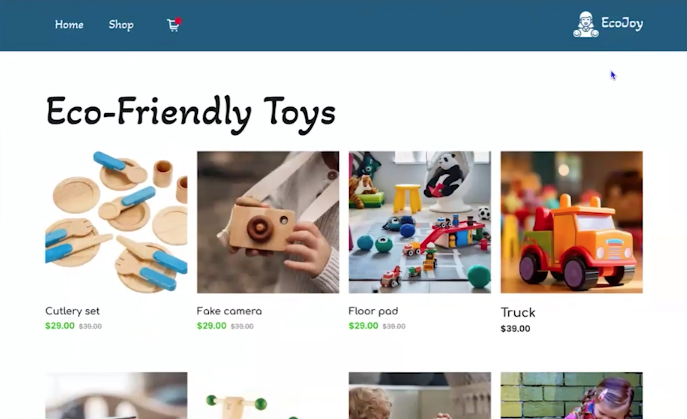
We’re looking at a sustainable toy company today called EcoJoy. Now, they did have a brick-and-mortar store, but due to various circumstances, they’ve decided to pivot, let go of their in-person store, and go purely online. Now they’ve come to us because they’re not getting the sales that they hoped for with their website. They don’t really know what’s wrong, and so they’ve come to us just for some advice. How do UXs create a good experience? On screen, there’s a toolbox with a bunch of tools, and UXs have a lot of tools in our toolkit. The number one in this particular client is a website audit. That’s exactly what we’re going to do.
On screen, you can see their website. We can scroll through, and at the top, it has the menu with home, shop, card icon, the logo, and then just eco-friendly toys with a bunch of different products and a contact form. Pretty average to bad website for a lot of reasons. We’re going to point out exactly what we should be fixing. Whilst I have created this horrible website, this is based on all the clients and past experience that I’ve gone through.
Number one is– On the side, there’s a note with things to fix/note, and we’re going to go through each one. The first one, from bottom to top, is the menu order breaks convention. People love patterns, and particularly in Western culture, we read left to right. Having the menu out of order with the logo on the right-hand side is not the best convention and can cause people to pause and not know where to click. Doing it the more traditional way will be helpful in this instance.
The second point is the color palette. We are talking about a sustainable toy company here. The blue, particularly this shade of blue, doesn’t really scream sustainable toy brand or really the logo. It is a darker blue. Not really one that you would see in nature at all, even the ocean. Maybe a stormy ocean. The bright green is okay, but none of these really have the natural element. Would probably ask if there was any way that they would consider a rebrand.
The brand, in general, it looks cheap and doesn’t necessarily target what their demographic would be. Sustainable toy company, they’re aimed at moms who are willing to pay a premium for well-made toys. Whereas this logo doesn’t really represent that. That is because it was generated through one of those websites and took a second. Something more polished would help resonate with their target audience.
The next point is inconsistent photography. There are eight products on the page, and each one of them is different. This is something that I see a lot, mainly with service-based businesses, about an over-reliance on stock photography. It can shake people’s trust. Particularly with e-commerce, they want to feel confident purchasing because it’s not like they can go to a store anymore and see it in person. Inconsistent photography gives a bit of an Amazon feel, and with all these different styles, can they really trust that they will receive the product if they purchased it? It could give off a mid-drop shipper.
An example here, and not just for this website, is if you are going to use stock photography, I personally advise people to keep it to a minimum. If you can get your own photography, I would say it’s essential for an e-commerce business, but if you are using stock photography, keep it minimal, and if you can, try and use it from the same collection so it looks in sync. Photography is one of those things where if you can invest in it, you do use it continually. My own photos that I took 18 months ago have gotten a lot of use. That’s something to keep in mind.
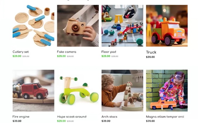
Now, the next one is nondescript product names. We are in a world where SEO names, they do do a lot of heavy lifting, but you want people to– yet again, building that trust that they know what they will receive. Some of the examples here we have are cutlery set, fake camera, floor pad, truck, fire engine, Hape scoot-around, arch stacs, and then what looks like lorem ipsum, which is placeholder text. If you were using a screen reader or even just looking, you can’t really tell what they would be. Cutlery set, is it a play cutlery set? What’s it made out of? Is it steel? Doesn’t really make sense for a toy business, but using something that’s a bit more intuitive can be really good and really help out in this case.
The next point is the text size is too small. Now we can’t go into inspect in this presentation, but when it comes to the products, there are some that are discounted and they have the retail price as a strikethrough next to it. These are very small. I would say it’s probably 10 pixels. The web content accessibility guidelines, while there’s no specific guide around text size, for my clients, I tend to not do anything below 18 pixels just to keep it really safe, clear, and legible.
I have in the why on the side, said, “Not to have text smaller than 16 pixels,” but ideally don’t use anything under 18. Only time where I’d really go below that is if it was an app design and the menu navigation, but avoiding that at all costs. Here, we can also see the heading structure is incorrect. Headings are really important for websites, and if you don’t know the purpose of them, there’s H1 to H6 headings, normally based off of H4, but these are important not only for screen readers, but also SEO purposes.
Just as we would scroll down a page and skim through, people using screen readers also do the same, but they instead use these headings to jump around and find what is relevant to them. Here we’ve got eco-friendly toys as a H1, because they are in order of importance. There’s only ever one H1 per page. That is best practice, and then it goes into H2. An example here would be, if H1 is universe, then H2 would be Earth, and then H3 would be all the continents, for example, North America. Then H4 could be going into Texas, and H5 would be a suburb of Texas. All of them correlate into each other, and that’s really important for SEO purposes and also screen readers.
I have got an example on the right-hand side of where they’ve gone wrong here, and that is H2 has been missed. They’ve skipped from H1 to H3. The next one is color contrast issues. This impacts UI, UX, and accessibility. As you can see here, at the bottom of those eight products, there is pagination to go on to additional pages, but the contrast is really bad. The black text against a dark gray background means it is very difficult to read even with someone that doesn’t have vision problems. That impacts the user experience because if they can’t read it, that’s bad for them. Accessibility for the same reasons, and UI, you want effective UI choices.
If people aren’t able to read it, then that’s not good. For the Contact Us form, the placeholder text is also very difficult to read against the white as it’s a light gray. In this case, when it comes to people designing, there are numerous color contrast tools that you can use. I personally use Contrast Checker quite often, but I also have my own prototype tool on my website, and I can put it in the chat at the end of this presentation, where you can check up to eight colors at a time. It does still need some work on it, but I will put that in for your own use as well.
Next thing is inconsistent letter case use. By this, a mix of sentence case, capital letters, and camel case. When it comes to reading, having everything uppercase can be quite difficult for people to understand because it’s all at the same level. If you are going to use capital letters, keeping them to a minimum, but the best way that people can read content tends to be in sentence case. It has the capital at the start, or if you are using– For a business card, for example, having your website or Facebook group, having camel case. That means every word having a capitalized first letter.
The next one for this website is inconsistent font usage. Some of them are not just inconsistent, they’re really bad. If we look through here, we’ve got one, two, three, four, five, six, seven. We’ve got seven different fonts. One of them is a script font, which is very difficult to read. If you’re having a lot of different fonts, that can also scream that not to trust the website, and UI wise, it can be difficult to yet again, get people to build patterns. You want them to be able to see your logo or a font, and being like, “Yes, they are very on brand.” There’s a few different ways that you can make sure that you’re using accessible fonts as well.
A good thing to check is called the mirror test. A lot of fonts, just they tend to reflect the B and the D. It’s the same letter, just reversed. That goes for P and Q. Another good one to look at is the number one, and uppercase I and a lowercase l. If they all look the same, then that can really impact people who have dyslexia or other neurodiverse tendencies. Keeping an eye out for font usage, keeping them to a minimum. I personally don’t tend to use more than three per site, and a lot more of the time, two.
The next one. You will notice here a theme, inconsistent buttons. This is another thing that can impact UX and also accessibility in some instances. We have here that people can click the products to go to assumedly another page, which has all the details, the pagination, which is another type of button, and then we’ve got a send button for the Contact Us form, and then a Join button for a newsletter subscription. There is a lot going on here. Both of them are round, but one is blue with a script font, and the other one is bright orange with capitalization saying, “JOIN”.
When it comes to buttons, there are– A good use case for UX is each page having one primary action and then one secondary, and at most, one tertiary. How we talked about the H1 to H6 headings, these also have importance, and they don’t necessarily correspond with SEO, but they help direct people’s behavior on the site. On this page, for example, it’s a very poor homepage, but the number one thing that we’d want them to do outside of clicking on a product is probably contacting them. For a contact, you’d want this to be the primary. That could be the one that has color, and then a secondary one could be a secondary color.
You’d tend to keep the same font for both and just use typically background color or even stroke to distinguish them. One other thing to note about buttons is, it’s really important to adhere to the minimum touch size through WCAG. That is 44 by 44 pixels. That ensures if you’re on mobile, that if you have clumsy thumbs, that you can click it with no problem. When I do design websites, the text inputs and buttons, I tend to have a minimum height of 44 pixels. I do tend to do larger, actually normally between 48 and 52. That skinnier button does not meet in this instance, having the 44 pixels high.
The next one. Not an issue for most of the people on this meetup, but Americanized Language. This website is a company that’s based in Melbourne, Victoria, here in Australia. It doesn’t have very much Americanized Language, but it does have cell phone. When it comes to particularly service-based businesses, if it is Americanized language, from an Australian point of view, it can be an indicator that ChatGPT has been used and not edited, and having things that are more localized, because I’m sure it’s the same in the US if you see color with a U, which you would have seen on my presentation. It’s just something that attracts your eye and gives you pause.
Ensuring that all your content is localized to your area is important. We’re getting towards the end of the website audit, but the next thing is it has incorrect and out-of-date information on this page. If we scroll down to the footer, as you will notice when we talked before jumping into the audit, they did have a bricks-and-mortar store that, for various reasons, they’ve decided to pivot to online only. They still have their address listed on their website. The incorrect and out-of-date information is yet again one of those things that can erode customer trust.
There’s nothing else, but if you do have a website and you are doing offers that you no longer support, selling products that you no longer stock, just making sure that it keeps up to date because people are on your website for the most up-to-date information. The next point is very specific to e-commerce, but on this homepage, there is no clear information about postage. Now this can be a particularly big issue in Australia because if you try and purchase anything in America to send to Australia, so expensive, but it appears to be the same in the US as well. People want to know how much postage is going to cost, if anything, and standard delivery times.
When you’re selling products online, sharing accurate information around that is a must. That doesn’t necessarily have to be on the homepage, but it has to be somewhere ideally easily accessible. The next one, and I see there’s a lot of comments in the chat, which is great. I’m looking forward to seeing them all at the end of the presentation. The next thing is, there is so little information on this website in general. As I discussed, it has product listings for eight on the homepage, a contact form, and a newsletter signup form, and that’s it.
It has some contact information in the photo, around 10:00 AM to 6:00 PM, with a phone number and an email, but nothing about the history of the business, about their mission for sustainable toys. This, yet again, makes it a riskier choice for customers. There’s also no testimonials. You’d come onto this website and be like, “Has anyone actually bought stuff off here before?” You don’t want to hit people over the head with information, but you need to give them something, even if they don’t look at it, just peace of mind.
The next one is, they are unable to tab through the website. I know that this is a presentation and not a physical website. You’ll have to take my word for it, this is not keyboard accessible. If you do use the tab key, it doesn’t go, and that is also a good indicator that it is not screen reader-friendly. The why on the right-hand side, using the keyboard to tab through a website, can tell us a lot. It can indicate whether they are focused states, whether those focus states are accessible because given that it has a blue color palette here, and a lot of default focus states are blue, it probably won’t stand out as much as it should.
It can be a quick indicator on how a screen reader interprets the site. It doesn’t make up for testing it with a screen reader itself. Then a good thing is, you would be able to– I assume in this instance, if it was accessible, can you access all the navigation through the keyboard? Because a lot of the time with menus, if they have secondary menus that are in a dropdown, tabbing through doesn’t necessarily mean you can reach those lower levels of navigation. That’s something to keep in mind.
Gotten to the end of our audit. What have we learned? We’ve learned it is a terrible website, and there’s numerous things that are preventing them from making the sales that they need. What do we do next?
>> MILES: Where do you live?
>> BUCK: In the city.
>> MILES: Do you have a house?
>> BUCK: Apartment.
>> SHANNON TOWELL: Hopefully, you can all hear this.
>> MILES: Own or rent.
>> BUCK: Rent.
>> MILES: What do you do for a living?
>> BUCK: Lots of things.
>> MILES: Where’s your office?
>> BUCK: I don’t have one.
>> MILES: How come?
>> BUCK: I don’t need one.
>> MILES: Where’s your wife?
>> BUCK: Don’t have one.
>> MILES: How come?
>> BUCK: It’s a long story.
>> MILES: Do you have kids?
>> BUCK: No, I don’t.
>> MILES: How come?
>> BUCK: It’s an even longer story.
>> MILES: Are you my dad’s brother?
>> BUCK: What’s your record for consecutive questions asked?
>> MILES: 38.
>> BUCK: I’m your dad’s brother, all right.
>> MILES: You have much more hair on your nose than my dad.
>> BUCK: How nice of you to notice.
>> MILES: I’m a kid, that’s my job.
>> SHANNON TOWELL: I just played a clip from Uncle Buck, and now is the time that the UX designer hat to come out and we’re asking so many questions to the owner first. What should we be asking? There’s a list of questions on this that I’ll read out a few of them. What are the goals of this website? There are some assumptions that we can make here, like making sales, who is the target audience, what sets you apart from your competitors, asking about specific business goals, if there’s things they like about their website, if there’s things that they don’t, if they have a plan for updating the website and just seeing where it went wrong and keeping that address. Are there any integrations that they need?
Since they’re e-commerce, there’s probably inventory management systems. They do have a newsletter, by the looks of it. Then talking a bit more about what their overarching systems are. How do they fulfill orders? What’s the process in that? If there are returns and refunds, how are they handled? Then of course, as we mentioned earlier, are they open to a rebrand? Because we tactfully mentioned that it may not be doing exactly what they need it to be doing.
What do we do next? Hopefully, we do have some answers for these, but there’s also something else. If we can get it, it will make our jobs that much easier. Here, there’s a screenshot of Friends with Phoebe and Ross. She’s grabbing him by the ear and saying, “Give me your money, punk!” but money is not what we need here. It could be, but what we’re after is data. Data is a UX designer’s absolute best friend. I have a great quote, and I tell all my clients this, “Bury me in data, I will crawl out with what I need.”
On the right-hand side, you can see a woman at a desk, and she is literally buried in paperwork. There’s a whole mountain behind her. What sort of data are we looking for, and where can we get it? There’s a few good places to start. The first one, seeing as this is a website, is Google Analytics. Google Analytics is great if it is set up properly. What information can we find here? We can find out what pages people are viewing and for how long. We can view any customer demographic data. It can be limited at times. We can see how people are coming to your website, either through social media, email marketing, et cetera.
Some of this is dependent on how Google Analytics is set up, but one of the key things you can see are bounce rates. If people are leaving the site quickly, that can be a great indicator that there are issues with the page loading or they’re not finding the information that they need. It is a blaring symbol, usually that something is wrong, and site speeds in general. That can feed into bounce rates. The next one we can look at is specific website builder data, and because this is an e-commerce platform, we have WooCommerce, but others that you can look at are anything that has an e-commerce builder. Whether that’s Shopify, you’re selling through Squarespace.
Here, we can see some more specific data around purchases. Card abandonment, what people are searching for, if that is available, sales data, what people are ordering, their average spend, and customer retention. If you’re making the sale, are they coming back? If they’re not, is there stuff that we can do to improve that? The good thing about UX is, while we’re looking at their website, UX isn’t just a website problem. It can have far-reaching into other things. Not that we want people, in this case, to make returns or get refunds, but how you manage that with your customers can turn that from an annoying experience into one where they come back or recommend you just for the way you handled it.
The next thing that we can look at, and this can be different for every business, is the business-specific data. This can be one of the most helpful types of data. What we get here can depend on the business itself. In this case, what we’re looking for is, have they received any customer feedback? Ideally, they would have some of their customers from the brick-and-mortar days that are ordering online. They may be able to reach out to past customers and be like, “Hey, how are things going?” or they may have just received it and they got an email being like, “Hey, I can’t order off your website because this is broken or I don’t know what I’m doing on there.”
Another one that’s quite common, and this can be for service-based businesses as well, are common email or chatbot inquiries. If you’re getting the same question again and again, that’s a really good indicator that you should be looking at your content on your website and seeing where you can place that because they’re obviously looking for answers around that particular topic and it will save you the headache of answering those questions, but also it saves the headache of your clients and customers because they can just find that themselves.
Any information about refunds and returns. If they are getting those requests, then what do we involve? Are they specific products? Is it around size, quality, that sort of thing? Another thing which can be really helpful is employee thoughts. Are the employees or even the founder noticing something that they’re not? That can be on the website in this instance, and the processes around it. When it comes to packing the orders, are they arriving undamaged? Is leaving it all to a Thursday afternoon to pack up and send for the week, is that the most optimal way for the employee? Just asking those questions.
This is just a small amount of data that we can get. This can go into quite heavy detail, but in this case, this is what we’re looking for. What are some other ways to get more data? Here, I’ve got six different ways that you can look into getting that. This can change depending on the business, but this is a good place to start. Workshops, and you can have workshops with clients or customers. You can also have internal workshops with the businesses. Really asking those difficult questions and getting some information.
Whilst the website data was more quantitative, and so meaning the number of results, the things here can be more qualitative, meaning quality, that they are a bit harder to track, that they can be so much more valuable. We can do questionnaires. That can be through the website, by email, or in person, for example. If people have ordered something like, “Oh, can you rate your experience one to 10,” for example. That’s a very common one. As a designer, we can do immersion exercises. This can be where you embed yourself in the business for a certain amount of time.
Other projects that I’ve worked on– spoiler alert, and it’ll be later on in the presentation, I did some work with a zoo here based in Melbourne. I spent a number of days on site talking to both visitors and also the staff. They can be really valuable because you’re immersing yourself in the business, and you can see things a bit more clearly. You can also do customer and employee interviews. These would tend to be one-on-one and just having a conversation, and give them the opportunity to air their grievances and feedback with no judgment.
What we can also do are a few advanced analytics on the website. These can include heat maps and click tracking. This can show you how people are interacting with the website. A heat map, as it suggests, it follows the user’s cursor on the website and being like, “All right, well, when they first get on, they’re wanting to click this.” It can tell you what they’re looking for in particular. That can give some really good data, and it’s particularly useful when paired with some of the other information.
For e-commerce, this is one that’s great for them, that can be used for service-based industries as well, is card sorting and tree testing. If you have a long list of think Walmart, they sell hundreds, thousands of products. Their navigation needs to find a way of filtering those through. Card sorting and tree testing would be a great indicator of that. They could be like, “All right, we’ve got a scrunchie,” and I’m literally holding up a scrunchie. “How would you find that through navigation?” You could talk with people, and it’d be like, “All right, I would expect to go to hair accessories, and then it would be under that or beauty, hair products, hair accessories,” because navigating with those big websites can be quite an issue. Getting input on that can be really beneficial.
We’re going back to EcoJoy. What data have we found? From Google Analytics, we’ve seen that 62% of their traffic comes from Instagram. This means that they’re doing something good on Instagram because they’re building enough interest for people to come into the website. We can see the majority of site visitors are women who are aged 25 to 45, which makes sense considering the products that they sell. We can see from their WooCommerce data that 86 of customers abandoned their carts. Gift Guide and Wooden Toys were the most searched terms. This was (if there was a search bar). There wasn’t.
Most sales occurred in November and December, which also makes sense given the Christmas rush. The least amount of sales happened in February. Here in Australia, school starts around February. Probably parents are not wanting to buy toys at that time because they’re busy buying school supplies. That’s something to keep in mind. We can also see through their business data. They don’t have many returns, but that doesn’t necessarily mean they’re doing everything right. It could mean they’re just not making those sales to begin with. If they’re not making sales, they don’t have return requests.
They have a virtual assistant who is in charge of website updates, but she’s not confident at making website changes. EcoJoy also receives at least one message a month asking about their physical store because they still have that information on their website. What do we do next? On screen, what now? We’ve got here a– I think it’s from Hot Wings, but he’s from Community. I cannot remember his name, but it’s a person being like, “Are we done?” The answer is no.
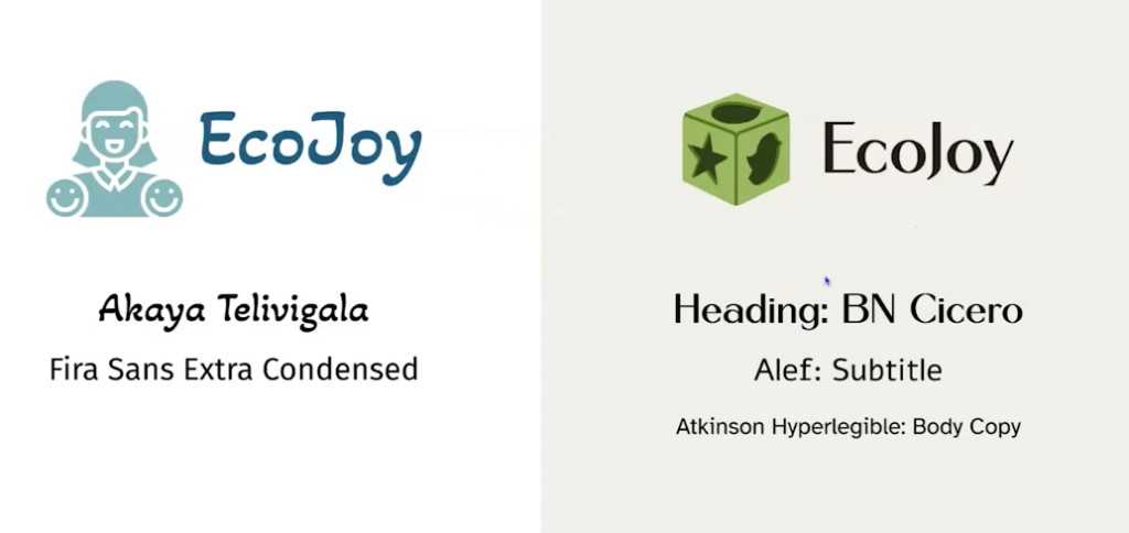
Here’s time for UX and UI to come together. We’ve got two people high-fiving, acting as UX and UI, and then we’ve got accessibility coming up from the bottom left corner, and just acting as a supervisor. Here on screen, we’ve got the existing EcoJoy brand. I haven’t gone into that much detail about it before, but I will do it now. It has a woman with two smiley faces near her shoulder blades. They look like they could be joints, but they are meant to be her children, I assume. That is in a light teal color. EcoJoy is in a semi-script font called Akaya Telivigala. It is camel case, so it has the capital E, C-O, capital J, O-Y, but it is not great.
At the bottom, we can see what colors are used, and it’s pretty much a medium mid-blue, white, and a light teal. Teal, notorious for being horrible at color contrast. On the right-hand side, I’ve got a proposed what we’re changing to. We’ve still got EcoJoy, but it’s changed into a different font. For the logo mark, we’ve got a wooden toy that has holes in it. Imagine those toys where you’re like, “Fit the cube through the square hole,” that type of thing. It has a lot of greens and browns to more mimic the nature element.
If we go onto the next slide, there’s an expansion of what it is. There’s a photo in the top right corner of kids playing with a wooden toy. It is Jenga in this instance, but they all look like they’re having fun because toy store, you want people to look like they’re having fun. We’ve got some more leaf illustrations just to show that it– lean into that natural element and what people would like to see. We’ve changed all the fonts. All of them are– We’ve got a serif for the heading. No, they’re all sans serifs. Sorry.
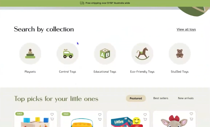
Let’s move on to the next one. Here is their new site, and in my opinion, miles better. I will go through and say how we’ve changed it. At the very top, we’ve got a banner saying free shipping over $150 Australia-wide, because this is an Australian business. In the navigation, we’ve got the shop, blog, contact page, cart, and then a search bar. As we go down, we’ve got a header saying, “Play today, protect tomorrow, crafting smiles of every toy made for learning, fun, and growth.” Really again, highlighting that natural, sustainable element of their products. We’ve got a smiling kid.
We scroll down, we’ve got some filtering available. Search by collection. Now there is the opportunity to view all toys, but they can search by play sets, control toys, educational toys, eco-friendly toys, and stuffed toys. There’s matching iconography for each. This is the homepage. You can already see that this would be really expanded if they go onto it. We’ve got another section, “Top picks for your little ones,” with a Featured Bestsellers and New Arrivals filtering option. All of the images are on a white background. I would still say they’re a little bit basic because a site like this would be quite curated, but a vast improvement on the last one.
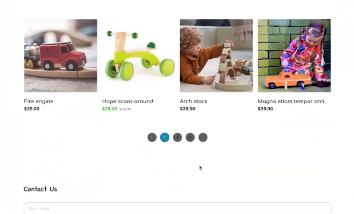
From here, we have a very clear indicator of what’s on sale. We’ve also got ratings. We can see which is the most traded. The first one is five stars. I’ve also noticed that it still has got some placeholder text, but that’s my bad, not on the website. From this homepage, you can quick-add to cart or add it as a favorites to a watch list or something. Wishlist, sorry. If we scroll down again, we’ve got two sections. Back to school. We got that data saying that with the back to– In February, that sales were low, and so this was an encouragement to get those sales up and running. 30% off until, it says the 12th of November, but this should be 12th of March. That is on me.
“Use code BTS30 at checkout,” and then you can shop now. Then, because Gift Guide was heavily searched, we’ve got, “Let us help you find the perfect gift. Check out our gift guide.” Then we also have the ability to search by age because if people don’t have kids, they may not know what is appropriate for each one. You can search from zero to one, one to three, three to five, five to eight years old, and then eight years plus. We’ve got testimonials, which also builds that trust, and “Other people have bought from here, really enjoy it, so I feel confident that I can also purchase from here.”
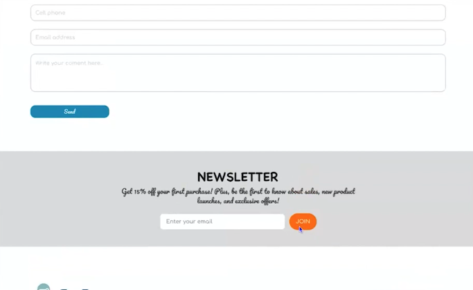
Then some other images which have– These can either be user-generated, and so people that have taken photos of their kids and sent them through, I would say unlikely in this case, or just other product photography showing how it’s being interacted with. Then we’ve got a highlighted section, like customer care. You do have a 24-hour follow-up. Free shipping for orders $150 and up, and return within seven days. Yet again, not hiding that information, showing it.
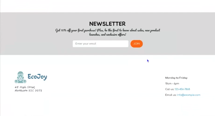
Then more of an incentive to join the mailing list. “Get 15% off your first purchase. Be the first to know about sales, new product launches, and exclusive offers.” Yet again, building that mailing list, which they can use for other marketing opportunities. Then a footer. It doesn’t have the address on it. It has My Account with Track my Order, Terms of Use, Wishlist, Submit your Feedback, and then some customer service information. “Monday to Friday, 10:00 to 6:00, call us, email us,” with some social media tiles.
As you can see, a lot better and the questions that we asked, the data that we received, all of that fed into what is a lot more effective website. Is UX just for websites? No. I’ve worked previously in the museum space, and I think anything fun and interactive that you did in the museum, I hope to develop those experiences, both how they looked and how they felt. I have a few on-screen animated examples.
The mathematic on the left, which you could choose two objects from a collection, press a button, and it would do a six degrees of separation map between them. Hello Zoo in the middle, which you could ask the speaker box any question about a corroboree frog, which is a native Australian frog, and you would get an answer. It acted as a digital zookeeper. Then on the right-hand side, Dinos at the Zoo. This was a booth, and you had a NFC-enabled lanyard that you could tap, and then it would give you a dinosaur fact, as these were right next to real-scaled animatronic dinosaurs. You can see on screen is the in-person example of those dinosaur with the booth. This was an iguanodon.
This is the Holocaust Museum here in Melbourne. You can look into these little windows and see a family going about their– How they dealt with World War II and how they had to leave their homes and go into hiding. This is the thing that I wanted to say a bit more example, because all of these projects have a lot of UX embedded in them. This is just an example of how you could use it for any of your projects. As I mentioned, Ecojoy, we were looking at stuff far past the website.
Looking at their returns process, how they pack orders, how they deal with customers. On screen, this was a– I will go back and replay it. This is an experience called A Day at the Races. This is an interactive experience about horse racing here in Melbourne. Visitors could color in a horse template. They would put it into a booth. They could name it, and then that horse would go onto the big screen and could race against other visitors’ horses. This had a lot of UX in it. This just goes to show how far-reaching some of the UX elements can be.
Here, we’ve got the template on the left-hand side. It has a date to races, quit stalling, and color in, harness your creativity. Then on the bottom left, we have a horseshoe in a square. Now this looks like it could just be a fun little thing. This served a very important point. When you put it into the booth, which scanned it and you could name it, it could be slightly off. The square with the horseshoe was a way to just ensure the computer could programmatically align it each time, and so the design would actually go onto the horse.
On the right-hand side, we have a few different test examples of how to color it in. We tried a few different materials. We’ve got marker, pencil, two pencil and a crayon, because we needed to test both the speed of coloring in, because there was a lot of school groups that went through here. Speed was imperative, but also how easily this stuff could be cleaned off furniture. We went for crayon for that reason. Speed was also one of the reasons why instead of having an A4 sheet of paper, we went for A5. This meant it was easier to color in. It meant that they could print them on site, less paper waste. It was just all good all around.
For asking those questions and really looking at how people would be using it, our needs from a technology point of view, it made it a lot easier. We wanted them to keep the template ideally. That’s why a lot of effort went into the design. We did a lot of testing for this project, and so there’s a few things happening on the screen.
On the left-hand side, there is a timing test. This goes on to how long we needed to scan it, how long we were going to give them to name it, all of that, because once we had that data, then we could work out, okay, how often are we having a race? You don’t want people to be standing around for too long, and you also want to make it worth it. We were able to determine that having a race occur every three minutes was a good sweet spot. It meant that we could have six horses in that time, because there was two booths that people could use to scan and get them in.
We also had a test at the end winning screen. The horse bucking up in the air in celebration. Yes, showing just some of the tech testing, and so how the horses would race around the track. Some of the more standard accessibility testing, and also non-standard. On the right, you can see how I went in and looked at all the color contrast against everything, because we needed to make some adjustments earlier on, because it did pass WCAG AA for large text, but there was a bit of adjusting to do for that with Illustrator.
On the right-hand side, this is the winning screen, but the horse design has kind of a radial gradient. This is what happens if you put a set of keys into the booth, because you’re always wanting to kind of troubleshoot and be like, “All right, if I was a kid who was eight, what would I find funny?” Working out, okay, well, what does happen if we do the wrong thing? There was also some issues around moderating. We had really large moderating on this project. If people were to draw a swear word or a penis, how would we deal with that?
Now, all of these horses would only be on screen for a maximum of three minutes, which was a blessing, but it also meant that, okay, well, what happens? We don’t want to reward people for doing the wrong thing. We also don’t want them to think that the experience is broken. If they did do something like draw a penis, it would just come in as white. It would strip all of the color away, but even through testing, there was some things that slipped through the cracks.
We did testing with a school group, and one of them wrote the N word, and that filtered through, and a swastika. All of that was added to the moderation, but yes, that shows the importance of testing as well. We’re getting towards the end of our presentation here, but in summary, so what have we learned?
When you’re doing a project, a good thing is to ask a bunch of questions. Even if you don’t think it’s relevant, just it can sometimes be a really good– it can help you get close to the information that you need and just get them to open up. Use data where possible to find insights, validate decisions, and eradicate assumptions. You talk to the people who use the product, and this doesn’t just include your clients or customers, talk to the employees and business owners, and keep an eye out for other opportunities, even if they’re not their original priority.
I’ve said this before, and I’ll say it again, this is the beauty of UX and accessibility. It doesn’t just stop at websites. There’s so much you can do above and beyond that, and so as a designer, I’m always looking out for ways I can go above and beyond for my client and just be like, “Hey, have you considered doing it this way?” A lot of the time, they haven’t, and that’s what makes you so much more valuable.
Iteration is a natural part of design. It’s okay to change things, try to make sure you have all of the information needed to do so, but at the end of the day, it doesn’t tend to be life and death, but if there’s anything that you can do that benefits accessibility or UX, it’s pretty good reason for me. We’re getting towards the end.
Here, I’ve got a copy of Make It Stick. Now, it doesn’t really go to UX and UI, but it is about branding. You can grab your copy of Make It Stick: The Memorable Brand Toolkit. There is a QR code in the bottom left corner, and I will put the URL in as well. I will give you a few moments to do that, but yes, about ready to take any questions, and I see that there’s a lot.
>> AMBER HINDS: Thank you so much. Let me see if I can find myself again here. Real quick, before you stop sharing, do you want to flip to your last slide and just share your contact information as well?
>> SHANNON TOWELL: Sure. You can find me, there is a QR code in the bottom-right corner to go to my website. You can find me at shannontowell.design, S-H-A-N-N-O-N-T-O-W-E-L-L.design.I will put all of this information in the chat as well unless Paula’s already done that.
>> AMBER HINDS: Yes, she is amazing like that.
>> SHANNON TOWELL: Thank you.
>> AMBER HINDS: Great. I am going to work through the questions in the Q&A. You do have the ability to upvote them. If you see one that you like, I will kind of go in that order. Otherwise, I’m just going to go top to bottom. For everyone, please put any questions in the Q&A, and if you want to upvote, you’d feel free to do that.
The first question that we got kind of early on, I think when you were talking about the different button styles and things like that was, someone was wondering if you could speak about potential accessibility considerations when choosing to use buttons versus hyperlinks, so links that are styled as buttons. They said, “I see a lot of websites and digital marketing agencies push for lots of button usage to grab attention.” Do you have any thoughts on that?
>> SHANNON TOWELL: Yes. Ideally, from my point of view, you don’t really want to overwhelm people with a lot of buttons or links in general. You want to make sure they’re purposeful. I find with my clients that using buttons is a good way to get them to understand that because if you just see– well, it goes with hyperlinks as well. If you see 20 buttons on a page or 20 hyperlinks is way too much, and so reducing it. I try and keep– unless on that, in this case, it’s an e-commerce site. There’s a lot of buttons to more product information but keeping it to, I would say, two to three actions per page.
There’s sometimes where you can have a repeated button. On some of my package pages, I have information about it and be like, “Yes, I want to buy it,” for example, and then have that a few other times during the page, but it really just depends. Buttons can give a lot more of a visual impact and just using that where it makes sense. Whereas hyperlinks, it might make more sense within a paragraph and you’re referring to another organization, for example. They both have a place that just really depends on the content.
>> AMBER HINDS: I mean, I think in your good example for Ecojoy, one of the things is there, I’m thinking about the different ways of searching, and those were all styled like links, which I think makes sense because that’s what they were, but they also had an icon or a small photograph or something with them to make them stand out. I feel like from a design standpoint, it’s helpful to balance that, because if you just style everything like a button, then it becomes overwhelming and maybe people also get desensitized to the buttons.
>> SHANNON TOWELL: Yes, and that’s another thing that’s really important, styling them slightly different and one for primary, one for secondary. Being really strategic with what you want them to do on the page, because if you just have eight buttons or even three buttons that all look the same, you’re not really giving any of them focus. If they all look the same people, I don’t really know what to pick, and yet again, giving them pause for a lot of UX is just directing them to kind of what will help them, but also what you want them to do.
>> AMBER HINDS: There was a question, how receptive are your clients to UX, UI, and accessibility upfront, or does it take a lot of convincing to bring them on board to certain things?
>> SHANNON TOWELL: It kind of depends. I am fortunate that I’ve been marketing myself in this space for quite a while. I’m starting to get more clients that come to me specifically for this stuff, but I do joke around that UX and accessibility are kind of Trojan horse offerings of mine, even if they– I’m quite clear on all of my collateral, but they come to me because they like what I design. It’s like, well, if you’re working with me, I have a lot higher standard of accessibility and UX and we’re going to do it right. I make sure my price point reflects that. They’re getting that even if they don’t necessarily think they need it. It’s by default with me.
>> AMBER HINDS: I love that description that it’s like a Trojan horse service. It makes me think about– we have a few of our legacy marketing customers that I do accessibility work on their really old websites for SEO reasons. We’ll go through and we’ll be like, “We’re going to go through and fix all of the headings that are out of order,” because guess what? Google page speed flags is now, or Google page speed flags if you have ambiguous links. You can be like, “This is an SEO fix.” It’s an accessibility fix. I mean, it’s both, right?
>> SHANNON TOWELL: Yes, and that is an argument that I use sometimes as well, because I don’t think it’s usually malicious. Just a lot of people don’t know what they don’t know. For some clients, it can be an easier sell of just being like, “Hey, this will help you get more eyeballs on your site.”
>> AMBER HINDS: I would say, for anyone who wants to know more about this, definitely come to the panel discussion next month, because we’re going to be talking a lot about that. Let’s see. There was a question that says, “I’ve always seen a connection between user experience, UX, UI and accessibility practices. In your circles or communities, are there a lot of others doing what you do, or are you alone in talking about these three areas together?”
>> SHANNON TOWELL: I will say that it’s starting to become more popular that I’ve been doing this in Australia. I’ve been freelancing, working for myself the past two years, but even in full-time positions, I was always trying to enhance the accessibility for stuff. I have been doing it a while, but it’s still so new. Ever since like learning a bit more about accessibility, four or five years ago, it just seemed like a natural extension of UX, and I really love UX. It just made more sense to like focus on that, but yes, I would love to see more people in this space because there’s not enough.
>> AMBER HINDS: Do you have a tool that you recommend for tracking clicks and heat mapping?
>> SHANNON TOWELL: No, I haven’t used it too much myself just because a lot of my clients honestly don’t have the budget for it, but yes, I have used one previously in other roles, but that’s quite a few years ago now. I’m sure that there are better ones available. I’m sorry, I don’t have any recommendations off the top of my head.
>> AMBER HINDS: I can answer what we do. We use Hotjar. It is more expensive, but I have found there’s– Microsoft Clarity also is a free option, but what I don’t like as much about Clarity is their screen recording. When it actually records, it doesn’t always start at the beginning, and so you don’t get a full user journey all the time. Usually, we’ll end up using Hotjar, but we’ll just do a month because you can pay for a month. We’ll do a month on a really big plan. Then usually, you get enough data unless the website’s really low traffic. That’s what we do, but let me see.
On the note of data, do your clients want to see the data pre and post-launch, or do you use it more to stress the importance of accessibility, your ideas or other? How much do you share with them or go over with them?
>> SHANNON TOWELL: Kind of both because, a lot of the time, you’re relying on them to actually get you some of the data, particularly if you’re using that to craft an argument before you’re designing a new approach to them or suggesting moving in a different direction. I usually start up Google Analytics for them if they don’t have it beforehand. Websites just because– so they can keep track of it. If they never look at it, then that’s fine, but it’s there if they need it.
I think data can be so powerful, and I don’t really see the need in gatekeeping it. If it’s not working as we’d intended, then it’s just like, “Hey, I’m noticing people aren’t really going on this page, and so let’s figure out what’s stopping them,” and so it can lead to more work. I share it with them where possible.
>> AMBER HINDS: I don’t know if you’ve had this experience, but an experience we’ve had is if it’s a really big company or universities, people who work at universities, they really like the data and you can send them a spreadsheet or a PDF report or something and they will go through it on their own and analyze it and all that stuff.
Then what I found with like small businesses or even medium-sized organizations, a lot of times, you have to get on a call with them and like walk them through the data. You can’t just be like, “Here’s what I found, here’s a summary, and here’s the thing you can go read.” They really need you to walk them through it and talk about implications. Then even if you set up some sort of regular automated report, they’ll never open it. I don’t know if you’ve had that experience.
>> SHANNON TOWELL: A little bit, but I kind of use that as a UX exercise as well. With my website audits, I tend to go page by page, and one of the first ones I did there was over 300 notes, because I go on to each page and call out specific things, whether it’s a UX issue, a content issue, a developer issue, but that’s really overwhelming for pretty much every company.
I have that, and that is available to them, but I also do a consolidated presentation being like, “Hey, there’s a lot of stuff we found, but these are the things that need immediate attention, high attention, medium, or low attention,” and just kind of give them a summary in that way.
>> AMBER HINDS: Frank had asked, Frank said he doesn’t really like WooCommerce. Is there an accessible shopping cart that can work with WordPress? He says, “Years ago, I used Ecwid, but I’m not happy with their performance,” and I have no idea what Ecwid is. I don’t know if you do.
>> SHANNON TOWELL: No, arguably, I don’t do that much e-commerce. It was a very easy example to talk through some of this stuff in this presentation. I do tend to use Shopify more often than WooCommerce. Well, some of that accessibility there. I try and do my best. If you do find one that’s a little more accessible on any platform, let me know.
>> AMBER HINDS: I will say that we’ve actually been auditing WooCommerce and they have fixed all of the issues that we found, and we’re in the process of doing retest. There’s a few, I think, that are going to come out in a release in May, but their goal is to be WCAG AA conformant by the European Accessibility Act deadline in June.
From an accessibility standpoint, WooCommerce, I know, is putting a lot of effort in. That would be where I have most of my experience. I have only barely looked at Shopify or other things like that, so I can’t speak much to it. Nicholas said, “For accessibility, what kind of elements would you use for users that cannot read or have mental disabilities on an app or a website?”
>> SHANNON TOWELL: Yes, that’s an interesting one. I haven’t really experienced having ones that can’t read in general, but I do try and keep things to quite simplified language. I have seen other websites that use a talk aloud function, mainly universities. I’m not sure if it’s a good answer, but I’m not really too sure on that specific one. Sorry.
>> AMBER HINDS: I think you’re touching on what I would touch on, which is you definitely want to make sure your reading level is not too high. If you’re targeting people that have lower reading levels or lower cognitive abilities, maybe even relying a lot more on headings to separate things or bulleted lists instead of long paragraphs might be helpful too. Anything that makes it easier to skim probably would make it easier to read.
Then, I don’t know, it’s hard with other differences. What might be useful, Nicholas, is there was a talk at WordPress Accessibility Day Conference, and Paula is a wizard at finding links, but last year, on the 2024 site, if you go to 2024.wpaccessibility.day, I think you can find a recording and I think there was a talk about neurological differences and accessibility for them, and that might be a good resource. I can’t remember if we’ve had anyone at Meetup speak about it, but yes.
>> SHANNON TOWELL: That’d be a good addition.
>> AMBER HINDS: It would be. I’ll have to go back and look and see. I know we had a talk once about epilepsy, which was kind of interesting, but definitely check out the WordPress Accessibility. Oh, look, and she found it. I would definitely recommend that. Those were the last of our questions. Someone did ask if this was being recorded and if it will be put up, and yes, it will. It’ll take us about two weeks to do, but thank you so much for coming, Shannon, and speaking.
I will say, I don’t know if you were able to see all of the conversation in the chat, but lots of people really appreciated your presentation style. Someone thanked you for all the great image descriptions that you gave of all the slides. Let’s see, I’m trying to see what else. Kira said, “I love the pace of your speaking, how descriptive you were.” Thank you so much.
>> SHANNON TOWELL: Okay, great. I am going to save the chat and read it all later.
>> AMBER HINDS: Awesome. Well, I hope you have a wonderful day, and for all of our folks here in the US, have a wonderful evening. We’ll see you guys back here next week for our main Meetup.
>> [01:25:18] [END OF AUDIO]
Summarized Session Information
In this session, Shannon Towell explores the interconnected roles of UX, UI, and accessibility in building effective digital experiences. Through a detailed audit and redesign of a fictional sustainable toy company website, she demonstrates how to identify usability issues, ask the right questions, gather meaningful data, and implement design improvements that align with user needs and business goals. Shannon also shares examples of how UX extends beyond websites into museums, exhibits, and interactive installations, illustrating the far-reaching impact of accessible and thoughtful design.
Session Outline
- UX, UI, and accessibility: the perfect trio
- A playful introduction to UX, UI, and accessibility
- Website audit: assessing EcoJoy’s current site
- Asking the right questions
- Data is a UX designer’s best friend
- Using the data: EcoJoy’s redesign
- UX is not just for websites
- What we’ve learned
Introduction to UX, UI, and accessibility
The Toy Story characters can help us illustrate how UX, UI, and accessibility function together.
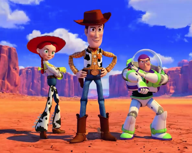
Woody represents UX—loyal, thoughtful, and consistent, always asking the right questions. Buzz Lightyear is UI—fancy buttons, willing to adapt, interactive, and optimistic. Jessie embodies accessibility—problem-solving, essential, and a fierce team member. Just like the characters, these disciplines work best when united.
Website audit: assessing EcoJoy’s current site
EcoJoy is a sustainable toy company that recently closed its brick-and-mortar store to go fully online. Despite the change, sales were not meeting expectations. Shannon conducted a detailed website audit, presenting a fictional version of the site based on her real-life experiences with clients. The audit revealed multiple issues across UX, UI, and accessibility.
Menu order breaks convention
EcoJoy’s menu had its logo placed on the right side, disrupting left-to-right reading patterns common in Western cultures. This unconventional layout created confusion and hesitation for users.
Poor color palette and cheap branding
The site’s blue and green color palette lacked natural, sustainable tones. The dark blue wasn’t evocative of nature, and the bright green didn’t harmonize. The logo, generated from an online tool, looked cheap and failed to reflect the premium, eco-conscious values of the brand aimed at mothers seeking quality toys.
Inconsistent and unreliable photography
All eight product photos on the homepage featured inconsistent photography, which eroded user trust and gave the site a low-effort, drop-shipping appearance. It’s important to have consistent photography, preferably original rather than stock images. It is also recommended to use photos from the same stock collection, if needed, to maintain a unified look.
Vague product names
Products were labeled with names like “cutlery set,” “fake camera,” and “floor pad,” which lacked context and clarity. These names raised questions like: Is the cutlery for play? What material is it made from? It’s important to have intuitive and SEO-friendly names.
Small text and incorrect heading structure
Product pricing used extremely small text, possibly 10 pixels, far below the recommended minimum of 18 pixels. The heading structure also skipped levels, jumping from H1 to H3 and omitting H2s. This affects both SEO and screen reader navigation, which rely on semantic heading structures to provide context and hierarchy.
Poor color contrast
UI elements like pagination used black text on dark gray backgrounds, making them hard to read even for users without vision impairments. Placeholder text in the contact form used light gray on white, which lacked contrast.

Tools like Contrast Checker and prototype tools can help evaluate color accessibility.
Inconsistent letter casing and fonts
The website featured a mishmash of sentence case, uppercase, and camel case. For accessibility and readability, sentence case is generally best. Additionally, the site used seven different fonts—including a script font—creating a disjointed and untrustworthy aesthetic.
You can use the mirror test for fonts to evaluate accessibility for dyslexic users. In many inaccessible fonts, letters such as b and d, or p and q, are simply mirror images of each other. This visual similarity can be especially confusing for users with dyslexia or other reading-related neurodivergences. Similarly, you should check how clearly a font distinguishes between the number 1, a capital I, and a lowercase l. If all three characters look the same, the font is likely to be a poor choice for accessibility. Selecting fonts with distinct, easily distinguishable characters supports better readability for all users.
Inconsistent buttons
Button styles varied in shape, color, font, and labeling (“JOIN” vs. “Send”). You should have one primary and one secondary button style per page to guide user actions effectively. Buttons must also meet minimum touch targets—44×44 pixels—to ensure mobile accessibility.
Localization and incorrect information

Despite being an Australian business, the site used Americanized terms like “cell phone.” It also listed a physical address for a store that no longer existed, which misled users and hurt trust.
Unclear postage information and minimal content
The site lacked information about shipping costs and delivery times. There was also no “About” section, company mission, or testimonials—leaving users uncertain about the business’s credibility. The limited content made it harder for customers to feel confident purchasing.
Lack of keyboard accessibility
The site was not keyboard-accessible, preventing tabbing through elements and indicating poor screen reader support. Shannon emphasized that testing with a keyboard can reveal whether navigation and focus states are properly implemented.
Asking the right questions
Key questions to ask the client to help uncover pain points and build a foundation for improvements.
- What are the goals of this website?
- Who is the target audience?
- What sets you apart from competitors?
- What do you like/dislike about your website?
- What integrations do you need?
- How do you fulfill orders and manage returns?
- Are you open to a rebrand?
Data is a UX designer’s best friend
“Bury me in data, I will crawl out with what I need.” Several key sources of data:
Website analytics
Google Analytics can show visitor demographics, bounce rates, site speed, and traffic sources. High bounce rates might signal poor design or missing content.
E-commerce platform data
Platforms like WooCommerce can provide insights into cart abandonment, sales trends, average spend, and popular search terms.
Business-specific insights
Customer feedback, emails, chatbot inquiries, return data, and staff observations can all reveal hidden issues and improvement opportunities.
Qualitative data sources
- Workshops with customers or internal staff
- Questionnaires
- Immersion exercises
- One-on-one interviews
- Heatmaps and click tracking
- Card sorting and tree testing for navigation
Using the data: EcoJoy’s redesign
Armed with data from analytics, customer behavior, and a detailed site audit, we can showcase a comprehensive redesign of EcoJoy’s brand and website. The redesign was not just cosmetic—it addressed functional, structural, and content-related issues identified earlier, with deliberate decisions grounded in the target audience and EcoJoy’s business goals.
Branding
The original branding featured a cartoonish image of a woman with two smiley faces near her shoulders—presumably children—and used a light teal color. The brand name “EcoJoy” was styled in a semi-script font called Akaya Telivigala and written in camel case (EcoJoy). However, the visual elements failed to reflect the sophistication, sustainability, and trustworthiness the brand needed to convey. The use of teal—known for poor contrast—and the generic, cheaply generated logo made it look unpolished and disconnected from the eco-conscious, premium image the company needed to project.
New logo and color palette
In the redesign, the brand’s look shifted toward a more mature and trustworthy visual identity. The new logo features a wooden toy—similar to shape-sorting toys with holes for geometric blocks—positioned to highlight the tactile, educational nature of EcoJoy’s products. The color palette was reworked to emphasize earthy greens and browns, replacing the inaccessible and unnatural blue and teal. These new colors better reflect nature and sustainability while improving color contrast and overall accessibility.
All fonts were updated to sans-serif options, which are more readable and accessible, especially for digital content. No more script fonts or mismatched typefaces—the new font system is consistent across headings, body text, and buttons.
Homepage layout and structure
The new homepage follows a clear and accessible layout, beginning with a top banner announcing: “Free shipping over $150 Australia-wide.” This addresses one of the key problems in the original site—lack of shipping information—and is prominently placed so users can see it immediately.

The navigation bar is now simple and familiar, with links to:
- Shop
- Blog
- Contact
- Cart
- Search bar
Below the navigation is a welcoming headline: “Play today, protect tomorrow. Crafting smiles with every toy made for learning, fun, and growth.”
This tagline reinforces EcoJoy’s values and connects emotionally with the target audience—parents seeking meaningful, sustainable products for their children.
A large hero image of a smiling child plays a central role in the design, immediately signaling joy, playfulness, and trust.
Product filtering and featured items
Improved product filtering on the homepage:
- View all toys
- Playsets
- Control toys
- Educational toys
- Eco-friendly toys
- Stuffed toys
Each category has matching iconography to support recognition and usability. This organization makes it easy for users to find what they’re looking for, even without knowing the exact product name.
Featured sections include:
- Top picks for your little ones
- Tabs to toggle between Bestsellers and New arrivals
- Clear visual indicators for sale items
- Star ratings below product listings to build trust
All product images now have a consistent white background, giving a cleaner, more professional look. Shannon noted that while the product photography could be more curated, the improvement over the original was significant.
Users can quick-add items to their cart or favorite them for later via a wishlist. These micro-interactions help streamline the shopping process and cater to diverse user preferences.
Incorporating data-driven elements
From the analytics, EcoJoy’s weakest sales month was February, likely due to parents spending on school supplies instead of toys. To counteract this, the redesigned homepage includes a Back to School promotion with 30% off select items. A callout section reads: “30% off until 12th of March. Use code BTS30 at checkout.”
Another heavily searched term was “Gift Guide,” so a prominent section was added inviting users to explore curated gift options: “Let us help you find the perfect gift. Check out our gift guide.”
To assist customers unfamiliar with age-appropriate toys, another new feature is the “Shop by Age” section, with filters for:
- 0–1 years
- 1–3 years
- 3–5 years
- 5–8 years
- 8+ years
This makes browsing easier for gift buyers who may not be parents themselves.
Building trust and encouraging conversions
The redesigned site features a testimonial section, which was previously absent. This helps reassure new customers that others have had positive experiences with EcoJoy.
Next, a series of lifestyle photos follows, showcasing toys in use. These images can be either professional or user-generated, but either way, they help visitors envision their own children playing with the toys, thereby adding emotional value to the products.
A Customer Care section highlights:
- 24-hour response time
- Free shipping on orders over $150
- 7-day return policy
This information was hidden or missing on the original site. Bringing it forward demonstrates transparency and commitment to service.
For list-building and retention, a clear email opt-in offer is now included: “Get 15% off your first purchase. Be the first to know about sales, new product launches, and exclusive offers.” This incentive helps grow the mailing list while rewarding new customers.
Updated footer
The redesigned footer removes the outdated physical store address and replaces it with meaningful links:
- My Account
- Track my Order
- Terms of Use
- Wishlist
- Submit your Feedback
It also includes business hours, phone number, email, and social media icons, rounding out a footer that now meets expectations for a modern e-commerce site.
UX is not just for websites
Some sample projects that applied UX beyond websites, including museums and zoos:
- Mathematics display: An interactive six-degrees-of-separation game using real objects.
- Hello Zoo: A digital speaker box to ask questions about the corroboree frog.
- Dinos at the Zoo: A booth where kids used an NFC lanyard to trigger facts about animatronic dinosaurs.
- Holocaust Museum exhibit: Interactive storytelling windows illustrating personal histories.
An especially detailed project: A Day at the Races, a horse-racing booth for kids. Visitors colored in a paper horse, scanned it, named it, and watched it race against others on a screen. UX played a critical role in every step:
- The horseshoe and square on the template helped the scanner align the drawing.
- Materials like crayon were tested for speed and cleanability.
- Testing determined race timing (every 3 minutes) and naming screen duration.
- Accessibility checks ensured adequate color contrast.
- The team built moderation systems to prevent inappropriate drawings (e.g., offensive words or images).
- The system rejected problematic content by stripping the color and showing a blank horse.
What we’ve learned
In closing, the key lessons from the presentation:
- Ask lots of questions—even the unexpected ones.
- Use data to uncover problems and validate solutions.
- Talk to users, customers, employees, and stakeholders.
- Look beyond websites for UX opportunities.
- Iteration is normal—change is part of the process.
- Accessibility and UX improvements are always worthwhile.