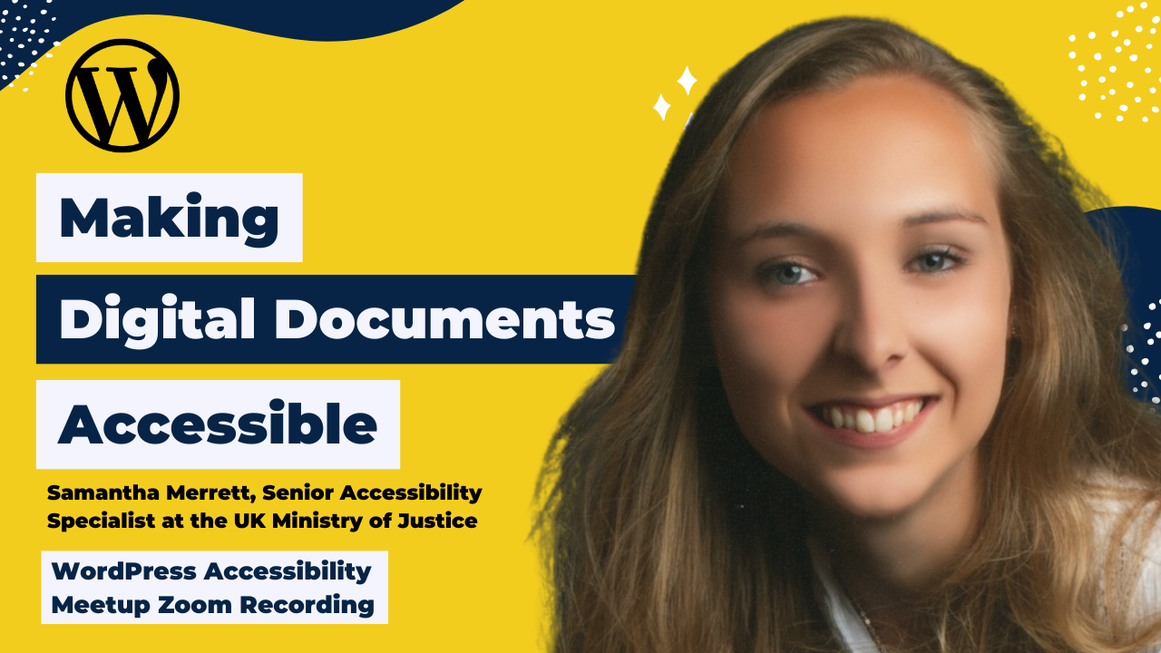
Samantha Merrett walked everyone through what it really takes to create digital documents that are accessible in the real world, not just in theory. Instead of focusing only on rules or checklists, she shared practical tips that participants could start using right away, helping them better understand why document accessibility matters for both compliance and inclusion. The session focused on how thoughtful structure and design choices can make documents easier for everyone to read, navigate, and use.
Thanks to Our Sponsor
GoDaddy provides a Managed WordPress experience that is as easy as it is effective. The latest version of WordPress comes pre-installed with exclusive themes, plugins, and tools to get you up and running quickly, with automated backups, updates, and malware removal so our Pros can spend less time on monotonous maintenance and more time building their businesses.
Watch the Recording
If you missed the meetup or would like a recap, watch the video below or read the transcript. If you have questions about what was covered in this meetup please tweet us @EqualizeDigital on Twitter or join our Facebook group for WordPress Accessibility.
Read the Transcript
>> AMBER HINDS: Welcome to WordPress Accessibility Meetup, Making Digital Documents Accessible: Practical Steps for Inclusive Design with Samantha Merrett, who is a Senior Accessibility Specialist at the Ministry of Justice in the UK. A few announcements if you’ve not joined before. We do have a Facebook group, which is a great place that you can connect between meetups. If you need assistance or you want to share what you’re working on and get feedback. If you have plugin questions or if you want to help others. You can find this Facebook group if you go to facebook.com/groups/wordpress.accessibility. Everyone always asks, is this being recorded? The answer is yes, it is being recorded. It takes us about two weeks to get the edited video, corrected captions, a transcript, and a summary written, and then we post those on our website. You can find upcoming events and past recordings in one place if you go to equalizedigital.com/meetup. I also encourage you to join our email list to get news and event announcements. You can sign up if you go to equalizedigital.com/focus-state.
We send a weekly email newsletter on Thursdays that includes a roundup of articles related to web accessibility. Then we also send out reminders as new events get scheduled, but this is the great way to get notified when this recording is available because it will be included in our weekly newsletter. You can also find our meetups in audio format if you tune into our podcast, which you can learn more about if you go to accessibilitycraft.com.
We are seeking additional sponsors for the meetup. This is part of the official WordPress meetups program, but they told us that there were not funds to cover the cost of captioning and transcription and other things that make the meetup as accessible as possible for attendees. They said, “Go out and find sponsors.” If you or your company would be interested in sponsoring the meetup, you can contact us at meetup@equalizedigital.com. This is the same email address to use if you have any other suggestions for the meetup, if you need any additional accommodations to make the meetup work for you. Please feel free to reach out if needed.
My name is Amber Hinds, and I’m the CEO of a company called Equalize Digital. We are the lead organizer for this meetup. We are a mission-driven organization and a corporate member of the IAAP, the International Association of Accessibility Professionals, focused on WordPress accessibility. We have a WordPress plugin, Accessibility Checker, that helps you find and fix problems on your websites.
We also have online courses for NVDA and VoiceOver screen reader testing, as well as a course on selling accessibility. We do accessibility audits, remediation, and consulting, and you can learn more about us if you go to equalizedigital.com.
We do have a sponsor that I want to thank today, and that is GoDaddy. They are covering the cost of our live captioning, and actually, it doesn’t say this on the slide, but they are also going to be covering the cost of transcription, which we very much appreciate after the fact to make sure we have corrected captions on our videos.
GoDaddy’s mission is to empower a worldwide community of entrepreneurs by giving them all the help and tools they need to grow online, including a simpler, safer WordPress experience. GoDaddy provides a managed WordPress experience that is as easy as it is effective. The latest version of WordPress comes pre-installed with exclusive themes, plugins, and tools to get you up and running quickly with automated backups, updates, and malware removal, so that their pros can spend less time on monotonous maintenance and more time building their businesses. You can learn more about GoDaddy if you go to godaddy.com.
We always encourage folks, no matter where you are on social media, if you are willing to go on whatever that platform is and tweet or post or comment, however it works on that platform, and just give them a quick shout out and say, “Thank you for covering the cost of captioning for WordPress Accessibility Meetup.” That helps to tell them that this is an important sponsorship and that attendees value the accessibility support, and makes them want to continue to sponsor us. If you are willing to do that and give them a short shout-out, we would very much appreciate that.
Two events that you should be aware of. Our next meetup will be on Thursday, March 5th, at 10:00 AM Central Time in the US, so the same time slot, but on Thursday, March 5th. It will be How to Audit a Webpage: Behind the Scenes on Equalize Digital’s Process. I’m going to be walking folks through how I audit a full webpage, top to bottom, and then also how we as a team report on issues. I’m going to show you all the audit library website that we built for managing our library of issues, so that we can report faster. I built it with a very no-code process using Gravity Forms and ACF in 2025. It’s something that easily could be copied if it’s something that you want to do.
That will be our next meetup. Then the following meetup in the same time slot on Tuesday, March 17th will be Scaling Accessibility: Treating Accessibility as a Frontend Architecture and a Leadership Responsibility. We’ll have more information about that coming and registration for that in coming days.
Let me pull up our speaker here. I am very excited to introduce Samantha Merrett. Samantha is a Senior Accessibility Specialist at the Ministry of Justice, where she leads strategic initiatives to embed accessibility across digital services. She has over seven years of experience championing accessible documents and inclusive design. Samantha has developed cross-government training programs, creating hands-on learning spaces like the MoJ Accessibility Bar, and co-organizes the Document Accessibility Community of Practice, a network spanning 65-plus public sector organizations.
Samantha is CPACC certified and passionate about moving accessibility beyond compliance by fostering empathy-driven experiences. Samantha has presented at major conferences, including WordPress Accessibility Day and the MoJ Digital Accessibility Conference, and regularly collaborates with government teams to improve accessibility standards and capabilities. Welcome, Samantha. We are so happy to have you here.
>> SAMANTHA MERRETT: Thank you very much. I’m just going to share my screen before I get going.
>> AMBER HINDS: Well, while you’re doing that, I’ll just give a quick note to everyone that there is a Q&A module available in Zoom. If you want to put any questions that you have in the Q&A, then at the end of the presentation, I’ll come back on and ask those to Samantha.
>> SAMANTHA MERRETT: Lovely. Thank you very much. Hopefully, that is sharing for everybody. Welcome. It is four o’clock in the afternoon for me, but I appreciate it’s probably all different times for people across the world. Hello, everybody, and thank you for joining this session. I was very excited to be part of one of Equalize Digital’s meetups. Hopefully, you will get something out of today because it’s all about creating accessible documents.
Just an agenda for the session, and I’ll do a little bit of housekeeping. Then we will dive straight in because we want to utilize every minute that we have together today. The agenda for the session is, I’m going to start off by talking about why accessible documents matter. I think web is very much well understood, and we often talk a lot about remediation of web pages and auditing, all really important and should definitely be considered. Sometimes documents get slightly sidelined, so that’s why we’re going to talk about why that shouldn’t be the case before we dive into how to choose the right document format, which is really, really important and really helpful when you’re trying to create an accessible document.
Then I will give you some practical tips about creating accessible documents and all sorts of software. Hopefully, you can go away and maybe use some of them today, or you’re just going to be reminded that they exist. Then we’ll end on talk about building that into maybe a workflow or how, in your role, whatever that might be in your workspace, how you can build some of these tips into your everyday work, which might be helpful. I hope something I provide today will be something you can take away and embed in your role later today or even tomorrow.
I won’t bother talking about who I am today because Amber did an amazing job of doing that for me, but just as a visual description for anyone who might benefit from that. I’m a woman in her 20s. I’ve got blonde hair, which is in a ponytail today, and I’m wearing a pair of glasses. As Amber said, I’m a senior accessibility specialist, and I work at the Ministry of Justice in the UK. I am going to visually describe everything on my slides today so there’s nothing on the slide that you won’t get via my voice, but you can also have copies of this if you need to after the session, which I can send out with any top tips as well. You’re always more than welcome to get in touch with me after the session.
Let’s dive straight in and let’s start with the important topic, really, which is why am I here today talking to you about this topic in general? Why do accessible documents matter? To start off, we’re going to have a quick look at what that means when we’re talking about choosing accessible documents and making sure we’re building them correctly.
What is an accessible document if I was going to define it? On the slide, I’ve included, I should have said at the start of my presentation, a few pictures of dogs all the way through. I own a lovely dog myself who’s currently snoring away on the chair next to me, and so I couldn’t put a presentation together without putting a little bit of doggy love in there, too. I will visually describe all of the pictures in my presentation so we can all enjoy them together.
On this first slide is my first dog picture, and it’s a pug sitting down with its head tilted to one side. It’s sitting in front of a blackboard, and it’s got lots of question marks all over it because it’s asking for an answer to this question. For me, defining an accessible document is a document that allows as many people as possible to access and use that information. If you’ve ever tried to make a document accessible, it may feel somewhat tedious. It might feel like there’s a huge checklist of items, and you’re not sure where to start or what tool might be best to help you.
It’s important to keep in mind that the effort that you’re putting in is really, really worth it, and it will produce a really accessible outcome for your users. At the end of the day, why are we creating something or writing something if we don’t want it to be read by the users that we’re creating it for? It’d be pointless and waste of our time.
I’ve got a couple of questions for you when it comes to thinking about why does document accessibility matter? I’m not going to ask the group or put things in the chat; we’re just going to think about this in our own minds. True or false, quite simply, do you think that one inaccessible PDF can break an entire user journey? It’s true or false? Give everyone a couple of seconds to have a think about that, and I’m hoping the first answer that popped into your head was true because that was what I was looking for.
From my own experience of working with colleagues across government and in justice, we sometimes think, “It’s only one PDF. No one really is going to use it. It’s just our terms and conditions, or it’s just the rules and guidance on how to use our system.” I think, actually, someone is probably going to use that, and that’s probably quite a critical document for them to be able to understand your service. That one inaccessible PDF could actually be quite difficult for a user to understand and interpret if they really need to. It’s really important that we make that accessible. It’s great that your service is fully accessible, but actually, that PDF might be equally as needed.
Then I get asked the question, so what is actually required by law? Is it just the website needs to be accessible, the service, right? I don’t need to worry about the documents, or is it really both of them? My answer is always, of course, both need to be accessible. You need an accessible service or product or website, and you also need accessible documents on that product or embedded in that website. It’s really important that you think about that as well. They are often an afterthought. They’re often something we pull together, maybe at the end, once we’ve created something, but actually, they are just as important as the service itself.
We like to bust some myths when we’re working with colleagues here at Ministry of Justice and just in general when I’m talking to people about document accessibility and why it’s really important. Essentially, as we’ve said, having an accessible document helps everybody have access to the same information, hopefully at the same time, which builds that kind of inclusive society.
There’s a projection for the number of adults to outweigh children for the first time in history by 2034, so inclusion and accessibility is going to become really, really important in our everyday lives. It’s also expected that future iterations of the Web Content Accessibility Guidelines, the WCAG, 3.0, will very much include document accessibility, so it’s really important that we’re getting ready for that change and understanding what that will mean.
For me, working in the UK in a public sector organisation, it’s very much the law for us as well, and we can’t forget that. Making sure document accessibility is front and centre, it’s really, really important for us, and I’m sure many of us on the call today as well.
I got a quote when I was building some training materials. I was speaking to colleagues and users who have to grapple with inaccessible documents every day in their everyday role. I asked them, just tell me what do you think of that? How does it make you feel? One of my colleagues said, document accessibility is essential for me to be able to do my job. Constantly having to deal with inaccessible documents has a negative impact on my mental health. Think of the countless days wasted trying to grapple with poorly designed documents or the talent and skills we lose because people just can’t do their jobs properly. I love that quote, and I always use it because I think it’s really powerful for people to understand the impact that inaccessible documents and content in general can have on not only external users or customers that we’re providing for, but also the people that we work with on an everyday basis.
We produced a survey inside our organisation, and we asked colleagues, how does it make you feel when you come across inaccessible documents at work? People were really forthcoming with their thoughts and their feelings, which I was really grateful for because it helped us understand some common themes and what impact this can have on people. There was things like health conditions. Inaccessible documents can cause people to feel really quite fatigued, and they can get headaches and eye strain. Emotionally, they felt frustrated, like really angry and sad and overwhelmed because they just couldn’t understand the information or get into it with their assistive technology.
Then, professionally, they would have to delay tasks. They might lose focus or just abandon tasks altogether because it was just never going to be possible. If they can’t understand that document, they just can’t do their job properly. That has a real big impact on people. Actually, it’s a relatively simple thing to solve if we just start creating accessible documents.
You’ve all joined this course today because I assume you all care a little bit about accessibility, and you’re hungry to learn a little bit more. Enough about why you should care about it, because I think you’re probably all on my page when we’re talking about why. Let’s think about how. We’re going to start off by thinking about the right format choice. You might think that’s obvious, but it’s not always that obvious. Format has a really big impact on the final accessible output because you could create a fully accessible document, and then you convert it to something that’s inaccessible, or you publish it in a way that is inaccessible.
For example, in our organisation, we create a lot of presentations, very similar to the one I’m sharing with you today. What somebody could do with this presentation is then export it to a PDF format, not do any of the accessibility work, and publish it. The PowerPoint itself might be quite accessible. They might have built in all the kinds of things we’re going to talk about today, but by converting it to PDF and just clicking Save As in PDF, or even worse, printing to PDF, they’re actually undoing a lot of the good work they’ve done. It will make that final document format very inaccessible. It’s important to think about that when we’re choosing the right format choice. It’s very important.
As the meme on this slide suggests, which is Woody and Buzz from Toy Story, and the words read, “Bad choices. Bad choices everywhere.” There are bad choices everywhere, but there are also good choices. When you’re making that choice, I tend to tell people, ask yourself the following questions. Who’s going to use it? How are they going to use your document? How are you going to share it? Now that answer might always be the same, if you’re always producing content in a similar way for a similar user group, or it might be very different every single time you’re creating something. It’s important to always ask yourself that question, so you can just double-check that you are using the right document format.
In today’s presentation, I’m going to talk about spreadsheets. I’m going to talk about Word documents or process documents in general, PowerPoint presentations or presentations you might create in any kind of presenting software, PDFs, and web pages. Of course, there are a lot of other document format choices, but for me, with the work that I do and the work I’ve seen others are doing, these are the most common document format types that we use.
I’ll also put a slight disclaimer out that a lot of the tips and some of the screenshots and things I’m going to explain are done on Microsoft products, because that is what we use internally here within the UK Ministry of Justice. Actually, a lot of the advice applies to all software types. Hopefully, you can take what I’m using today and apply that to things like Google Docs or LibreOffice. The tips should be software agnostic, no matter what you’re using. Just bear that in mind when I’m showing screenshots and things, if that’s what you’re going to base some of your guidance off of.
Presentations then. PowerPoint presentations, whatever presentation you’re using. PowerPoint presentations and presentations in general should be used to convey a story or a message. I’ve got a dog meme on this slide. The dog looks quite intense. Its eyes really, really close to the camera, and the words say, “I have my eye on you.” The reason the dog looks so intense is because, I would say for me and my experience working with colleagues, PowerPoint and presentations are one of the most misused format types.
It should primarily be used for presentations that tell a story. They’re quite a visual tool most of the time, but the presenter should be the main focus of any kind of presentation. The slides are there as a resource and/or a backup. What they shouldn’t be used for are projects or reports. We always say to people, please do not make a presentation and export it to PDF. It is very difficult to make it accessible, and you’re making it very hard work for yourself when there’s a lot other format choices you could use for that kind of content.
Moving on to Excel or a data sheet in general, any kind of spreadsheet software. Again, this one’s more self-explanatory, and people tend to use this one right. It’s for storing and analysing data and reporting a large amounts of data. You might use it for budget sheets, attendance reports, balance sheets, any kind of thing like that. What we shouldn’t use spreadsheets for is writing lots of text, and it’s not ideal for any kind of project management, forms, or anything like that. Again, there are better format types for that kind of thing.
What format type, you might ask? Well, most of the time, Word or any kind of word processing software is going to be your best option. We have a little bit of a saying that we tend to inform colleagues of within justice, and that is, “If it’s made in Word, it can stay in Word.” If you’re in doubt about what format you should choose or you’re not quite sure where best it sits, stick it in some Word document, and then afterward, you can convert it out to something else if you decide it’s better suited to a different format.
Any kind of word processing is great because it’s easy to make the information more accessible. If you are ever going to move to the dreaded PDF option, it is the best for converting to PDF. It tends to be the most compatible for a wide range of assistive technology. It can be quite personalised by users, so they can change colours, size, text, which they can in all the others as well, but Word tends to be the easiest one to do that in. Again, that’s why we tend to default to Word if we’re in doubt of what format we should be using, depending on the scenario.
Understood that’s not the end of your options. There are various other options. Think web page first, if you can. If you’re publishing information online, do you need to add an attachment, or could you just put the information directly onto a web page? Really, you’re asking yourself the question, do I really need this document? The same applies if you’re sending emails. Do you always have to attach a file, or could you just copy that information into the email instead? Admittedly, that’s not always going to work. A lot of the time, that makes emails quite long and lengthy, and it’s just not going to work. That’s fine, but as long as you’ve considered whether attachment is needed or not, you’re making the right step, and then you can make the right choice afterwards.
You might have noticed, I purposefully didn’t talk about PDFs because they’re a little bit of a bugbear of mine, I must admit. Should we create a PDF? is the question. The simple answer would be no. Another dog meme, I’ve got a mastiff puppy with its paw held up to the camera, and the words read, “How about no,” written across the top. Little bit sassy, maybe, but we tend to advise teams to publish in HTML wherever possible. Users can use their own custom browse settings and make adaptions to that content where they need to.
It also means that as content owners, we can easily update that information because all we’ve got to do is find that web page or that HTML page, rather than having to go, “Who owns that PDF? Who saw that last? Who’s got that saved?” “Oh, they’ve left now, so we’ll have to start all over again.” That can sometimes be quite frustrating.
Also, from an assistive technology point of view, we’ve had user testimonies that say things similar to the following. I always open a PDF with trepidation because more than half the time, trying to read one with my assistive technology is a frustrating experience. Users already have that feeling before they’ve even opened up the document or even attempted to. I tend to try and avoid them where I can to stop other users having that feeling when they receive content from me. It’s not always possible, but wherever I can, I avoid a PDF.
People come back to me all the time and say, “Why?” I like a PDF. We’ve always done it in PDF format, so why do we have to stop now? The problem with a PDF is they’re not designed to be flexible in their layout, and they can cause problems for assistive tech users as a result.
As the dog meme on this slide, which features a bulldog-type looking dog with its chin on the floor, looking quite unhappy, saying, “Oh look, another PDF file.” Some of the myths I hear about PDFs is they can’t be accessible, they can’t be edited, they should never be used, and they never work with screen readers. They’re all myths. They can be made accessible. They can be edited if you’ve got the right software. We can use them if we need to in the right circumstance, and they can work with screen readers if we make sure that we’ve done the accessibility work on them.
That’s a lot of cans and ifs. That’s if the knowledge is there, if we have the right software. We tend just to avoid all of those myths and all of those ifs, and just act on what we know, and we can teach people how to make accessible Word documents, publish accessible HTML content, a lot easier than we can teach someone about a PDF tagging tree. I’m going to talk a little bit about that at the end of the presentation because I can’t not talk about PDFs, but we don’t dwell on it, and we tend to try and avoid them where we can. Again, we do our best, but it’s not perfect.
That is formats. That is different types of document formats, and they’re the main ones I’m going to cover today. My next part of the presentation is split into four parts. I’m going to take you through some top tips for Word documents or any kind of word processing doc, any kind of presentation that you might be creating, any kind of spreadsheet you’re pulling together, and then we’re going to end on a few tips on PDFs. I’m keeping it brief on purpose, but if anybody wants to know more, you can always reach out to me. I am happy to talk about PDFs, even if I don’t like them very much.
We’re going to start by talking about wonderful Word documents. Again, some of the things I’m going to talk about are about the Microsoft suite here, but again, I’m sure these are applied across the software suite, no matter what you’re using. If you’re going to talk about any kind of document accessibility, regardless of what you’re creating, headings are so, so important. Headings are the backbone of any document or any kind of content that you might create. A user should be able to scan your content or your document using just your headings and get a really comprehensive overview of that page content.
Headings structure the information by splitting it into different sections. They can help people find information quickly, regardless of how they’re accessing that information, so via a screen reader with voice recognition or reading the information on the screen. Make sure your headings are descriptive and make sure they’re understandable on their own. Let your heading text tell the story about the contents of that page. All readers will benefit from a well-structured document, and headings are a massive, massive part of that. Make sure you’re using them when you’re creating any kind of content.
Again, if you are working in any kind of word processing document and you’re using the styled headings that are provided for you, so your heading ones, your heading twos, normally in a styles pane somewhere that you can format. The first heading in your document should always be your Heading 1. That’s your main heading. It’s sometimes referred to as Title, but in Word, don’t get those two confused. Your first heading in your document should always be your Heading 1. Subsections, subheadings will be Heading 2 and so on. There’s Heading 3 and 4. You’re looking to create a nice, solid hierarchy.
When I talk about this, I often talk about it in terms of like Russian dolls. I always think about the first one is your Heading 1. Inside that, you have your Heading 2. Then you get your Heading 3. You can go all the way down to 5 and 6 if you really want to. I wouldn’t necessarily advise it. It makes structure quite complex, but if you need to, they’re there to use. If you think about them as Russian dolls, and every time you start a new section, you go back to that big one at the start, and you start going down again.
It’s helpful to think of them like that because you can’t stop and skip a heading level. You have to open up each doll to get to the one inside, and heading levels are very similar. You can’t skip one and get the little one inside it unless you open them all up. It’s helpful to think about them in that way. Just be careful of using preset styles. Just make sure they are accessible. Some of the preset styles we see are using light fonts with awful contrast. Just make your own styles if you need to. Make sure they’ve got the appropriate contrast and maybe bold styling if that’s appropriate.
The other thing to say about structure is tables. Headings are really, really important, and tables are pretty high up that list as well. Tables are a really useful tool for organising any type of data. They can make it nice and easy to read, and they can make comparisons between datasets. However, to make a table accessible, you have to ensure that you’ve considered the four bullet points that I have on this slide.
I’ve got the first one says, “Identify the header row.” Make sure somewhere in your table, it doesn’t have to necessarily be a header row; it could be a header column. I think most commonly in table structure, you will have a header row. It’s just natural, but you might not, and maybe a header column is more applicable. As long as you’ve identified a row or column as your header, you’ve helped to make that table more accessible.
Also, if you have a table that’s going to span across maybe two pages or maybe even more than that, don’t let your rows break across pages. For example, if you’ve got one row of a table, don’t let some of the information sit on one page and the rest of it sit on the other. Make sure that row travels as a group, and it comes together. That’s a really important point to make as well.
Don’t split or merge cells, just don’t do it. It makes the content quite difficult to navigate sometimes. Just make sure you’ve got a really nice regular table with equal numbers of rows to columns, et cetera. Give your table a title. Make sure you’ve made it descriptive. Tell people what that table is about and what it’s showing. Even if that title just says, “Table of contents,” that’s all you need to write if that’s what it is. Just make sure you’re making it really clear.
Also, you can add alternative text to a table. Just a short sentence of text to say, “This table shows X,” or you can pull out some of the most important information. Whatever you think would be most useful context for a user to have about that table, that’s what should go into your text. Finally, I always say to people, check you can tab through in a logical order. Check that you can go from top to bottom in your table, and you’re tabbing in a way, and you’re reading that information in a way that makes sense. Then you can guarantee you’ve structured a table in an accessible way.
What’s my biggest no when it comes to tables? Trust me, I’ve seen it. Do not add tables as images. I’ve seen people screenshot a table and paste it into a document. I’m sure everybody on this call already can see the issue with that; it’s not very accessible at all. I challenge someone to write me a sentence of alt text, or alternative text, that describes a picture of a table. It’s going to be quite tricky. Tables have got a lot of data in them. It’s pretty much impossible to make a picture of a table fully accessible. Just make sure you’re adding them as raw tables that you can navigate through.
Where can you build all that in? How can you add all of that? Well, regardless of what software program you’re using, there should be a table’s property dialogue box of some kind. If you write, select your table, in there, you’ll be able to select to make sure your row doesn’t break across pages. Select your header row, add your title, add your alternative text. That way, you can make sure you’re adding all your elements in really quite a simple way, just using your table’s properties box. It takes a little bit of time to add all that information in, but once you’ve added it in, you set your table up quite nicely to be accessible.
On the theme of shapes and tables, we’re going to talk a little bit about text boxes and shapes. Shapes are often used as quite a visual tool to enhance the layout of appearance of text on a page, maybe. You’ve got something that says like, “Important notice,” and you put it in a red box because you think that makes it stand out.
Content in shapes is not often read aloud by screen reader users. Screen readers can’t always navigate into those shapes and make that content visible or understood. We tend to tell our users and our colleagues that we work with to avoid using text boxes and shapes. It adds extra load because then you have to add alternative text, and it defeats the object of using that shape in the first place. Instead, we tend to encourage colleagues to add borders around text because that means the text is accessible to all users. It’s just text on a page with a nice border around it, but it also makes sure that that text will stand out if you want it to, also visually appear enhanced on the page for whatever reason.
We also tell people it’s all well and good to make sure it’s visually enhanced on the page, but also you make sure the text tells that same story. Make sure your text says, “Important note,” or “Please note,” or something along those lines to make it really, really clear that that text is also really important for anybody who might be listening to it.
On a similar note, we’re going to talk about images and alt text. It’s really important. I think whatever you’re talking about in accessibility, alternative text will always come up because it’s really, really important when it comes to making sure that your images are described in a way that can be understood by everybody. I’ve got a couple of examples in the next slide of good, bad, and maybe okay alternative text, and how we tend to use it with our colleagues at the MoJ.
When it comes to adding alt text, just make sure you’re making it short and concise, but meaningful. The text should describe the meaning of any non-text content so that people might not perceive it or understand it otherwise. Only tell the user what they need to know. Don’t overload them with other stuff that isn’t really that important. Make sure it’s relevant for the context that you’re using it in.
Sometimes I’ll have colleagues write great alternative text, really detailed, really lovely, but really not that relevant to what they’re talking about, so really, as a user, I’m getting more information than I really need. Actually, that’s a bit of cognitive overload then. Just making sure that what we’re writing is really relevant and concise to what we’re talking about and the context in which we’re talking about it in.
Good, bad, and ugly alt text. Images can make you feel a particular way and that’s a lot of the time probably why we use them. That’s something that should be made available to a screen reader user or any user who might not be viewing the images on the webpage or in a document as normal.
On the picture on the slide is a Great Dane with a wild look, catching a treat mid-air with his mouth wide open. An example of bad alternative text would be something along the lines of image 342.jpg. That often happens when we don’t add alternative text, and the automated software just picks up the file name, for example, and sticks that in that field. That doesn’t give the user any information. It’s completely useless, and we might’ve just left it blank because it gives me no information.
An example of like maybe, okay, alternative text would be like dog with its mouth wide open. It describes the basics, but it doesn’t really give any much more detail than that. I might be able to work out why the image has been used based on the context, but I could do better. Good alternative text would be something like I started this section off with. A Great Dane with his mouth wide open, lips flopping open, catching a treat mid-air.
For me, this image is more than just about a dog catching a treat. The dog looks a little bit wild. The picture is supposed to be slightly comical, I think. Well, that’s the emotion I get from the picture, and that’s why I wanted to communicate that in my alt text. The image expresses a particular tone, and that really matters. It should really go in the alt text, which is why I put the word wild in there in my original example as well, because I think that adds to that comical effect.
Then finishing off with formatting link text. I have a grumpy-looking dog on this slide with very, very wild hair. This is how I often feel when I review documents that have inaccessible link text. Many a time do I read content when all the links say, “Read more information, click here, select here for more information.” They’re useless. In the same way, given the full URL is rarely helpful, you need to make sure that your links are meaningful in what they say and that they’re descriptive. Users can bring up a list of links as a really good navigational tool, but it’s only a good navigational tool if we’re actually making sure the text is descriptive and helpful. Just making sure that when you’re using links in your documents, that they are descriptive.
Don’t forget, I’ve got a dog image, a black Lab with big brown eyes looking at the camera with the words, “Don’t forget me.” What shouldn’t we forget? We shouldn’t forget about designing a document for neurodiversity; it’s often overlooked. Spoken a lot about screen readers, and that’s really important, it really is, but it’s important to design in other ways as well, so plain English. Make sure we’re thinking about that. We’re using clear language, accessible fonts. We’re not using italics and underline all of the time or at all, really, in most of our content. We’re checking our colours. We’re checking that they’ve got good contrast. We’re consistent in the way that we’re formatting things. These all matter.
Just because I haven’t pulled them out today as top tips doesn’t mean they matter any less. It’s just I’ve got a finite time to give you some information today, so I’ve chosen to put them on one slide. Just keep those things in mind as well. Don’t forget about those when you’re putting your content together and finishing off your documents.
Moving into polished presentations, what should you think about when you’re putting together a presentation? Again, most presentation software has some master slide or slide master. Slide masters are so important. They create an accessible layout for your slides, and they really help to ensure consistency. When you create a slide deck using the slide master, and then you decide, do you know what? Don’t like that blue background. I want to put a purple background on, which I’m not sure about your colour contrast, but we’ll put that one aside for a moment. If you do that in the master layout, every slide in your presentation will change with you. Rather than you having to click on every slide or do it in a more manual way, slide master helps to create that consistency.
It also helps with adding slide headings and things like that, and making sure things are scaled in the right way. Using your master slide or slide master is really, really important. Try and use that if you’re creating a slide deck. If you have a presentation with lots of slides, sections are a really nice way to structure it. If you’re including several different topics. My presentation today, I had an intro, I’ve got Word, presentation, I’m talking about spreadsheets next. It’s got sections in there to help provide structure to my presentation.
It’s nice when people are reading the presentation outside of maybe the main meeting, they’ve got that structure there to help them understand what’s included in that presentation. They’re not a necessity, but they’re definitely nice to have for longer presentations.
These are a necessity. These are unique slide titles. You must have, unique is the key word here, descriptive titles on each slide. Even if they aren’t visible, although that’s not really that advisable, it’s always good to have visible slide titles, but do you want to hide them off the slide? You can do that. Just make sure they’re unique. We never repeat a slide title, even if we have multiple slides with the same information or continued information. I don’t know, you’ve got two slides about resources, each slide needs to be numbered so that you’re making them unique, even if they’re just another slide about more resources. Make sure that’s written in the slide title; don’t repeat your title.
Again, this helps when you’re trying to skim through or using a screen reader, and you want to get an idea of the content, making sure that you’ve got nice list of slide titles is really, really helpful. People can choose the content they want to listen to. Again, the format and tips are no different to the ones we’ve just been through for Word documents; they’re very, very similar.
Another dog for you, a dog looking quite grumpy at the camera, because when we start creating presentations, we often get a little bit caught up in, they must look pretty and I want to make them this colour and I want it to look like this, which don’t get me wrong, it’s good to do and it’s good to design these things. Also, just use a readable font, be generous with the spacing. Don’t use transitions that whirl me around and spin me around until I’m a bit dizzy. Keep it nice and simple. Keep the links short and descriptive. Make sure you’re not using acronyms and jargon all of the time, and explain what you’re saying. As we’ve said, make sure your slide titles are unique. Think I might keep saying that one until everybody around me knows what I mean.
Finally, on presentations, don’t use colour on its own to specify things. If you’re giving a presentation, just be really mindful that people are going to experience in those slides in different ways. On the slide, I have two circles. One is red, and one is red with the letter A in the middle. I want to avoid indicating with colour alone. If you say something like, “Highlighted in red is,” not everyone will know what you’re pointing to. Instead, say, “Labelled with letter A and coloured in red.” There may be some in the audience who are not viewing the screen at all. Send the slides in advance and give those short descriptions of that visual content, and that will help people navigate through that content in their own way.
Finally, in our last five minutes of this presentation, we’re going to talk about spreadsheets, PDFs, and then we are finished. Spreadsheets, there isn’t loads to say on spreadsheets in terms of giving you some top tips, because there are just some simple things you can do to help make your spreadsheets as accessible as they can be. The first thing is index sheets and file names. If you’ve got several sheets in your workbook, and provide an index sheet at the start, so it’s basically like a table of contents or a chapter list, and create links to those other worksheets. Tell the user what the workbook is about and provide that list of worksheets or contents which are inside that workbook. It’s a really nice way just to give a bit of an overview about what your spreadsheet covers and the different data or sheets that you’ve got included in there.
Use cell A1. I’ve got a dog on this side with a hat on and a magnifying glass, looking a bit like Sherlock Holmes, I suppose, like a private investigator. That’s because I always look for cell A1 whenever I open up a spreadsheet. Cell A1 is an important cell, and it should never be left blank. Cell A1 can give you a summary of your workbook. It should be used for the title of the table, maybe, and then the table will follow that. Just make sure you always put something in cell A1 so that it makes it really clear what that worksheet is going to be about.
Name your sheets and name your tables. The default most of the time for spreadsheets is going to be sheet 1, sheet 2. That’s not really that helpful, is it? It doesn’t tell me what that worksheet’s about. Give the meaningful names. Make sure that you’re making sure your worksheet, whatever that worksheet is about, you’ve given it a title that reflects that.
It’s also important, as we’ve spoken about in any application, if you’re going to use a table, make sure it’s actually a table. I think, especially in any spreadsheet software, it’s really easy just to put stuff in columns and rows and not actually make it a fully structured table that’s properly formatted. Just make sure you are actually using a proper table format if you are going to use a table in a spreadsheet.
Finally, no blanking, no merging. Do not merge or split cells into an irregular pattern. I think we’ve heard that elsewhere, maybe when we talked about Word docs and tables. Very similar in spreadsheets. Don’t leave cells blank. Always put something in that cell. It might be a zero, could be a not applicable, or empty. Whatever it is, is appropriate. Just don’t leave any cells blank in the middle of a table.
Delete any empty rows or columns. You don’t want any space in there that’s just sitting empty. It doesn’t work well. You’re trying to navigate through with any kind of assistive tech, it makes life a little bit more difficult. Just make sure it’s nice and neat, and you’ve got rid of any of those empty rows or columns in your table.
Finally, and to end, perfect PDFs. Is that possible in the next two minutes? Probably not, but here’s an introduction to a perfect PDF. If you’re going to talk PDF language, you’ve got to use the word tags. Tags are labels that describe the structure and meaning of content. On this slide, I have a picture of a dog tag with the name Bella on it. That’s the name of my dog. I couldn’t resist talking about tags and not put a dog tag with her name on it in there.
Tags in a PDF work slightly differently. They tell assistive technology what each part of that PDF is. It could be a heading, a paragraph, a list, a table, and so on. Think of them as the kind of behind-the-scenes code that makes a PDF readable and navigable for everybody. It’s really important that we’re using tags and we understand them. If you are using any kind of PDF software and you want to have a look at the tags, there’s a screenshot on the slide to show how to get there.
If I was going to explain it, you go to the View menu. You say Show/Hide, Navigation Pane, and then Accessibility Tags. They’re often turned on by default, but if you don’t do a lot of PDF work, there might be a chance that they’re not turned on, so that’s how you find them if you haven’t already used them before or know where they live.
As I said before, there are various different types of tag. You will choose your type of tag depending on what kind of content it is. If it’s just paragraph text on the page, it gets a <p> tag for paragraph. If it’s a heading, it will get an <H1, H2, H3> depending on the level of heading. If it’s a list, lists get a little bit more complicated because there are various different items within a list. You have the main list <L>, the list item <LI>, and you might have a label <Lbl>, which could be your bullet point, your hyphen, or your dash. Then you have your list body <LBody>, which is then the little bit that follows that bullet point, which could be your text. Each part of that list gets given a tag. That’s where it gets a little bit more complex because they have to be nested within each other, et cetera, et cetera, but gives you an idea about how tags work.
Images, of course, get a figure tag <Figure>. Tables, again, work similar to lists in that you get a <Table> tag and then each row <TR>, header <TH>, table data cell <TD> get individual tags as well. Don’t worry too much about this. If PDF tagging and accessibility is new to you, this is very much an introduction to some of these things, but it gives you an idea into what goes into potentially creating an accessible PDF document.
I think creating accessible PDFs would be at least one other session, if not a few more, to really get your head around tagging and how that works in the tag tree, as we call it, which is just your list of tags in your PDF document.
If you are going to change your tags around in a PDF, you can change the order of them. You can drag and move them. You just need to check that they’re in the right order when you’re going through your PDF. Deleting empty tags is always a good top tip. You don’t need empty tags; just get rid of them. It’s very, very important that you still check for alternative text in a PDF document. Checking that content has got the right tag assigned to it, of course. Checking headings, lists, tables, links, form fields, whatever you’ve got in there.
Just double-checking the tags are correct because it doesn’t always work when it’s converted across, and not everything is going to potentially align nicely. Just walk through your tag tree, as we call it. Go down from top to bottom and double-check that they’re all assigned correctly.
You’ll be glad to know that my presentation is nearly over, so just some final thoughts for you. I’m sorry to throw that PDF stuff in at the end. I don’t mean to throw that in and leave everybody a bit mystified by it. There’s a lot to dig into, and I wanted to cover the full spectrum of accessible documents today, which is why I’ve very gone top-level with it. As I say, if anybody wants to know any more, I’m always happy to have a conversation.
I’m going to leave you with some thoughts and a nice white dog winking at me on the camera, giving me some top tips to remember. I’d leave you with the following. If you’re creating any kind of document that is not for personal use, please test it and check it for accessibility. I don’t care if three people are going to read that document; that’s more than just you, so it needs to be accessible.
Producing two versions of things is not ideal. One accessible version only if possible, but that’s not always possible, and we acknowledge that. Where that’s not going to be possible for whatever reason, of course, producing two versions is the best next step. As you would do, maybe if you were creating a product or service, test at every stage of development, making sure that from the moment you’ve started to write something in a document to the moment you press publish, you’ve tested it and check that it’s accessible.
Of course, with any kind of– I’m sure you’ve had this many a time in webinars before, build in accessibility from the start. Get a template, make sure everybody in your organisation is working from an accessible template, because if they are, it’s going to save everybody a lot of time further down the road, because you’re building it in from the beginning. That’s what we try and do here. We try and get people working from templates, and that helps to build that consistency across the piece.
That is enough from me. I’m just going to thank you and hand over for any questions or comments people might have. Thank you very much.
>> AMBER HINDS: Thank you, Samantha. That was great. We do have quite a few questions, so I’m going to try and get through them quickly.
>> SAMANTHA MERRETT: Go for it.
>> AMBER HINDS: There’s a few that were short, so I’ll probably do those first. For everyone, I am also going to look at upvotes. If there’s a specific question you want to make sure we ask, if you want to give that the thumbs up or the upvote in the Q&A panel, that will help. Someone had asked, what program are you using to view tags on the PDF in that screen share that you showed?
>> SAMANTHA MERRETT: Adobe Acrobat Pro.
>> AMBER HINDS: Is that typically what you would recommend for looking at the tags?
>> SAMANTHA MERRETT: Yes. Well, it’s the one I’ve used most of the time. I don’t have any experience using any of the tools, so I guess I’m slightly biased, but it’s the one that works for me, and it is quite clear, so yes.
>> AMBER HINDS: Perfect. Another question that came in that’s short is, why do you recommend not using the title format instead of heading formats in Word? I think this might also apply to Google Docs, which also has a title format.
>> SAMANTHA MERRETT: Yes. Great question. A couple of reasons. One, it messes with your heading order. Title isn’t recognized as a formalized heading. In terms of looking at your navigation pane and the screen reader order, title isn’t recognized in the same way a Heading 1 is. We don’t use title at all, and we always start with the Heading 1 because that gives us a nice structure to our document.
If you’re then going to also convert to PDF, title is not recognized in the heading order. There’s no title tag. Again, Heading 1 and making sure that it’s marked as a Heading 1 is the best way to make sure that heading order has good structure. We pretty much never use title. It doesn’t work in our heading orders. We avoid it completely, but great question.
>> AMBER HINDS: Amber had had a follow-up question, a different Amber, not me, [chuckles] about is there a time when using the title heading would ever be appropriate? Could you have that and a Heading 1?
>> SAMANTHA MERRETT: Yes. I think the only instance I’ve ever seen, and it is very particular for my area of work, but we create reports and things that we publish, and there might be a title page which has the heading of the report or the title of the report. Then we’ll also repeat that title, maybe second page down, when we’re actually going into the body content. That first title on our nice glossy title page would be in format as a Title, and then when we get into the main body copy, and we repeat it again, it then becomes a Heading 1, and it’s part of our proper content.
That is the only time I’ve ever really seen it used, and it works, is when you’ve got that front page, but you know that content is repeated later on, so it’s fine. It makes sense to just mark it as Heading 1. I hope that makes sense, but that’s the only time I’ve ever seen it used successfully.
>> AMBER HINDS: Yes, that does make sense. Jennifer had asked, are page headers and footers to be avoided, or do you have any thoughts about using page headers and footers?
>> SAMANTHA MERRETT: I had a slide on this, and I took it out because I was like, “Time is not going to allow.” I’m so glad you asked. Yes, we don’t use page headers or footers for any important content. We say to our colleagues, use them for page numbers, use them for maybe content that’s duplicated elsewhere in the document, but for things like version numbers, dates, author names, don’t put anything in your header or your footer that you don’t want it to be missed by a user. If you want to make sure people understand that information, it’s like version numbers, super important. Everybody should know what version they’re looking at or listening to. Make sure that content is in your body copy somewhere. Don’t put it in your header or your footer.
>> AMBER HINDS: Could it be like if you had the cover page, like you were talking about, and you had all that information there in the body, and then you’re just repeating it on every page?
>> SAMANTHA MERRETT: That’s fine.
>> AMBER HINDS: Would that cause too much noise, or would you then make it an artifact? If you were exporting to PDF, you’d just be like, “This is an artifact, ignore it.”
>> SAMANTHA MERRETT: Exactly that. If it’s repeated, then we’ll just artifact it when we convert it across. If you want it on every page, you can do. It’s no problem because you can do that, and it reduces that noise, as you say.
>> AMBER HINDS: Someone had asked, should the visual reading order match the order of the tags?
>> SAMANTHA MERRETT: In PDFs, I’m assuming, is what we’re talking about?
>> AMBER HINDS: Yes.
>> SAMANTHA MERRETT: Most of the time, yes. I’m trying to think of an instance where that might not be appropriate because if you don’t want something to appear in your reading order, you should have artifact it anyway. Yes, I would think most of the time, your visual reading order should match your tag tree, absolutely. Otherwise, it’s going to get a bit confusing if your tag order is different to how it visually appears on the page as well.
>> AMBER HINDS: I love how concise you are. I think we’re going to get through a lot of these, but there’s 13, so we’ll see. What problems do italics create?
>> SAMANTHA MERRETT: Love that question. We don’t use italics for anything. The only time I’ve ever used it is when I used to work in a scientific organization, and we used it for bacteria names and things like that, because that’s how they’re often read and recognized. The reason we don’t is for dyslexic users, most of the time. Anyone with dyslexia, sometimes with the slanted letters that are all joined up, it can make texts more difficult to read. We just try to avoid that altogether and make it as easy to read as possible.
>> AMBER HINDS: Perfect. There’s a question, and this one is probably not going to be as short. I’m sure we can probably have you come back to talk more about PDFs, but this question in particular said, I’d love any thoughts on making fillable PDF forms accessible. This is from Daniel who works at a college that loves those. Daniel says, “I convert to web fill forms when possible, but sometimes it’s not.”
>> SAMANTHA MERRETT: Yes, absolutely. It is possible to create an accessible PDF form. It’s not impossible. I’m glad to hear that you tried the web form because that would be always our first option, but failing that, PDF form is definitely second best. It’s kind of similar. Tagging is still really, really important, but you also have to make sure your form fields are properly labeled, very much like you would in a web form, really. There are mechanisms to do that in a PDF. We can absolutely do another session on accessible forms if that would be really, really helpful. I’m happy to do that at some point.
>> AMBER HINDS: I’ll definitely follow up with you. I think that would be great. There was a question about alternatives to Adobe, but it sounds like you only use Adobe, and I also only use Adobe, so I don’t know if either of us can answer that. If anyone has one and they want to throw one in the chat for this person, I think that would be really helpful.
>> SAMANTHA MERRETT: Yes, please do.
>> AMBER HINDS: Do you have another five minutes or so to answer a few more questions?
>> SAMANTHA MERRETT: Yes, of course.
>> AMBER HINDS: I know we’re at time.
>> SAMANTHA MERRETT: Yes.
>> AMBER HINDS: Yes, okay. Perfect. Antoine said, “A customer of mine has a scientific paper website. They sometimes get images of graphs that include annotations or highlighted figures. This is inserted in a PDF. What would be the best solution describing the whole graph and the highlights, or just the main goal of the graph, which are usually the highlights/ annotations?”
>> SAMANTHA MERRETT: Yes, great question. I’m going to be really awkward and say context-dependent. If you’re using a graph and the information in that graph is only accessible via that image of that graph, then you need to provide some kind of long description to describe all of the information. I would not put that in your alternative text; I would include that as content on the page where that graph is located.
However, if the graph and what’s in it have been described further on in the content or elsewhere in the document, then just a simple top-level overview of that graph might be sufficient. Just depending on how you’re using it and in what context will depend on what you then need to provide. Most of the time, you need an equitable experience, so if no one can get that information elsewhere.
>> AMBER HINDS: If the description is in the content, I’m assuming in your alternative text, you could maybe even point them to, say, something like ‘under heading figure A’ or something like that.
>> SAMANTHA MERRETT: Yes, “Described further in the text,” whatever is appropriate. Yes, just make sure that that’s noted so someone knows, “Okay, fine. I’ll read about it further on.”
>> AMBER HINDS: Jean had said, and I do think you touched on this a little bit so this might’ve come in before you’d gotten there, “Shouldn’t an accessible digital document include cognitive disabilities as well? Things like font, leading, left justification, misuse of all caps, underlining text that is not a link.” [unintelligible 01:01:55] [crosstalk] have any extra ones [crosstalk]
>> SAMANTHA MERRETT: I think you hit on things that I, again, had in but took out, but absolutely. We tend to tell people about bold as well, because people often tend to get overbearing with their bold sometimes. We try to tell people, “Just use it where you really need to, and make sure the text also tells the story.” You hit on all the nows there. Left-aligned, not justified text. That’s really important as well. Making sure that column formats are not ideal, just trying to keep things in an easy-to-read format as well. Not underlining content that isn’t links. All caps, absolutely, we avoid those; it’s just like you’re shouting at somebody through the screen, which is not what we want to get across, so never advise that.
>> AMBER HINDS: Christine says, “I work in academia. Students and professors tend to make academic posters in PowerPoint. What would be a more accessible tool for that?”
>> SAMANTHA MERRETT: An academic poster is an interesting one. Without looking at the content, it’s hard to decide. We get people creating presentations in PowerPoint as well. We tend to try to convince them to use a Word document instead. They can do a lot of the same kind of visual stuff they can do in Word. Again, it depends how they’re going to share them. If they’re going to share it as a PowerPoint, that’s not the best idea; Word would definitely be the best one. If they’re going to be printed out and put on a wall or something, of course, there’s additional considerations to that. Again, hard to advise, depending on how they’re going to be used, but maybe Word, maybe potentially.
>> AMBER HINDS: You know, a thought I had it as if it’s a poster that’s intended for print, then InDesign, which, of course, I don’t know if students and faculty, but to me, InDesign is what you’re supposed to be making designed graphics in. I think that might export better than PowerPoint to an accessible PDF if you’re providing that as an alternative.
>> SAMANTHA MERRETT: You can do some funky things in InDesign if you want to do for a bit of a poster.
>> AMBER HINDS: Maybe a follow-up on this as well with the design thing. Tony had asked, “When you were saying not to use shapes in Word, does that include text boxes?”
>> SAMANTHA MERRETT: Yes. Text boxes are treated the same as a rectangle that you might insert. We don’t use text boxes; we use borders. Text boxes or shapes are the same. Great question.
>> AMBER HINDS: You can add those borders just like if you highlight a paragraph and go up in some of the settings that already exist in Word, you can still design it in the same way.
>> SAMANTHA MERRETT: It will look exactly the same. It just won’t be embedded in a box. It will just be text on a page, and visually, we’ll have a nice border around it. For someone using a screener, for example, there’ll be no impact to their experience; it will just be like text on a page.
>> AMBER HINDS: Whereas a text box would actually announce, like an image or a shape.
>> SAMANTHA MERRETT: A shape. You’d have to add alt text and all the things that go along with that.
>> AMBER HINDS: That is good to know. Let’s see. I’m trying to see if there’s anything else we can get out. We’re about at time. I think maybe some of these are remediation and PDFs and that kind of stuff. Oh, there was one quick question. Do you have much experience with Apple Pages and how those export to PDFs?
>> SAMANTHA MERRETT: No, I’m just going to hold my head up to say no, I have no experience of that. Happy to trial it and test it with someone. Happy to explore, but have no experience I can share at the moment.
>> AMBER HINDS: Okay. Well, I really appreciate you coming. I do think we’re definitely going to invite you back for a follow-up conversation, maybe to answer a lot of these questions about PDFs and remediation.
>> SAMANTHA MERRETT: Of course.
>> AMBER HINDS: I know we have a few other people in the audience here who might be interested. If you are interested in speaking, you can also contact us because we’re always looking for speakers. Can you share, Samantha, the best place for people to follow up with you if they have additional questions that we didn’t get answered today?
>> SAMANTHA MERRETT: Yes, absolutely. You can find me on LinkedIn. I’m on LinkedIn. I’m active on LinkedIn. Just search my name, and you’ll see me come up. Feel free to message me through there. It’s probably the best way to get in contact, and then I will get back in touch. Please do. It’s lovely to hear from people. Always happy to connect with the accessibility community.
>> AMBER HINDS: It’s Samantha Merrett, which is M-E-R-R-E-T-T for anyone who’s searching you on LinkedIn.
>> SAMANTHA MERRETT: Indeed.
>> AMBER HINDS: Well, thank you so much, and thank you to everyone who came. We’ll be back here in about two weeks for another meetup. Bye.
>> SAMANTHA MERRETT: Lovely. Thank you, everybody. Thanks, Amber.
>> [01:06:31] [END OF AUDIO]
About the Meetup
The WordPress Accessibility Meetup is a global group of WordPress developers, designers, and users interested in building more accessible websites. The meetup meets twice per month for presentations on a variety of topics related to making WordPress websites accessible to people of all abilities. Meetups take place on the first Thursday and third Tuesday of the month at 10:00 AM U.S. Central (5 PM CET).
Learn more about WordPress Accessibility Meetup.
Summarized Session Information
Accessibility begins with format decisions. Before creating a file, Samantha encouraged teams to ask whether a document was necessary at all, or whether the information could live directly on a web page or in an email. It’s recommended to have a “web page first” mindset for online content. PDFs, while sometimes necessary, should be avoided when possible due to their rigidity and technical complexity. Word documents are often the safest starting point because they’re easier to make accessible and convert later if needed, while presentations and spreadsheets should be used only for their intended purposes rather than as substitutes for reports or long-form content.
Accessible Word documents rely on clear structure and thoughtful formatting. Headings form the backbone of a document and should follow a logical hierarchy without skipping levels. Tables need proper headers, simple layouts, and clear titles, and they should never be inserted as images. You should avoid using shapes and text boxes for important content, write concise, meaningful alt text for images, use descriptive link text, and design with neurodiverse users in mind by using plain language, consistent formatting, and strong contrast. These practices help ensure content is understandable regardless of how someone accesses it.
When creating presentations, accessibility and clarity should guide design choices. It’s recommended to use slide masters to maintain consistent layouts and add sections to organize longer decks. Each slide should have a unique, descriptive title to support navigation, especially for screen reader users. You should also choose simple, readable design choices: clear fonts, minimal animations, and straightforward language. You shouldn’t rely solely on color to convey meaning. Providing additional labels or descriptions ensures that everyone can follow along, even if they cannot see the screen.
Accessible spreadsheets benefit from clear structure and thoughtful organization. It’s best to start with an index sheet that explains the workbook’s purpose and links to other sheets, using cell A1 to provide context or a title, and naming worksheets descriptively rather than relying on default labels. Tables should be properly formatted rather than visually arranged, and teams should avoid merged cells, blank cells, and unnecessary empty rows and columns. Keeping spreadsheets clean and predictable makes it easier for assistive technologies to interpret and navigate data.
Although PDFs can be accessible, they often require more advanced technical work. Tags define the structure and reading order of content so assistive technologies can interpret headings, lists, tables, and images correctly. After converting a file to PDF, teams should review the tag tree, adjust reading order where needed, remove empty tags, and confirm that alternative text and structural elements are applied properly. Because of the complexity involved, she encouraged creating accessible content in Word or HTML first, and relying on PDFs only when truly necessary.
You should treat document accessibility as an ongoing process rather than a final checklist. Documents should be tested early and throughout development, especially if they will be shared beyond personal use. Whenever possible, aim to create a single accessible version rather than maintaining multiple formats, and ensure that accessible versions are available simultaneously if duplicates are unavoidable. It’s important to start with accessible templates so teams can build a good structure from the beginning, reducing rework and helping accessibility become a consistent, sustainable part of everyday workflows.
Session Outline
- Why Accessible Documents Matter
- Choosing the Right Document Format
- Practical Steps for Accessible Word Documents
- Practical Steps for Accessible Presentations
- Practical Steps for Accessible Spreadsheets
- Practical Steps for Accessible PDFs
- Building Accessibility Into Your Workflow
Why Accessible Documents Matter
Samantha challenged a common mindset: teams often put a lot of focus on making the website or service accessible, but then treat documents as a secondary “extra” to be handled later. This is exactly why documents get “sidelined,” even though they’re frequently part of the same user journey and can be just as critical for someone trying to complete a task.
To make that real, true/false: Can one inaccessible PDF break an entire user journey? The answer is true. A single document (terms and conditions, rules, instructions, guidance) might be the one piece a person needs in order to understand or use a service. In other words, a service can be “fully accessible,” but the document attached to it can still create a barrier that stops someone from moving forward.
Document accessibility can impact people beyond “inconvenience.” Samantha referenced feedback from colleagues who regularly deal with inaccessible documents and described how time lost trying to interpret poorly designed documents can affect someone’s ability to do their job and even negatively impact mental health. Inaccessible documents don’t just slow people down; they can push capable people out of opportunities because the information is not usable.
Choosing the Right Document Format
Accessibility gets harder (or easier) depending on the format choices you make upfront. You should pause and ask: Do you actually need a document at all? For example, look at email attachments. Sometimes the best option is to include the content directly in the email or on a web page, and only attach a file when it’s truly necessary.
Web Page / HTML First (When Publishing Online)
When sharing information online, use the “web page first” mindset: if the content can live on a web page (HTML), that’s often a better experience for users because they can apply their own browsing settings and adaptations. It is so much easier for content owners to maintain and update HTML content over time than to track down who “owns” a PDF and whether anyone can still edit it.
Why You Should Avoid PDFs (Even Though PDFs Can Be Accessible)
PDFs can be a “bugbear.” Samantha shared a testimony in which someone said they open a PDF “with trepidation” because, more than half the time, it’s frustrating to read with assistive technology. The takeaway isn’t to “never use PDFs,” but rather: avoid them where you can, because they’re not designed to be flexible in layout and can create problems for assistive technology users unless you have the right knowledge, tools, and time to do the tagging work.
Common myths we tend to hear are “PDFs can’t be accessible,” “they can’t be edited,” and “they never work with screen readers.” They can be accessible and can work with screen readers when the accessibility work is done. But it’s a lot of “cans and ifs,” which is why it’s preferable to teach teams how to create accessible Word documents or publish accessible HTML content rather than starting with PDF tag trees.
When in Doubt, Default to Word
For documents and reports, Word (or any word processing format) is the most reliable “default” when people aren’t sure what to choose. Samantha shared a simple internal saying used with colleagues: “If it’s made in Word, it can stay in Word.” Word is easier to make accessible, easier for users to personalize (like changing colors and text size), and tends to be the best starting point if you later have to convert to PDF.
Avoid Using Slides as Reports (And Don’t Export Them to PDF)
There’s also a common workflow problem: presentations are often misused as long reports or project documents. Slides should primarily support storytelling in a presentation, with the presenter as the focus and the slides as a resource or backup, not as the document itself. You shouldn’t make a presentation and export it to PDF because it’s difficult to make accessible and creates unnecessary work when other format choices would be better suited.
Use spreadsheets for data (not long text)
For spreadsheets, people usually use them correctly to store, analyze, and report large amounts of data (budgets, attendance reports, balance sheets). But you shouldn’t use spreadsheets for long blocks of text, project management, or forms when better formats exist.
Practical Steps for Accessible Word Documents
Headings Are the Backbone of Your Document
Headings are one of the most important structural elements in any document. A reader should be able to scan your content using headings alone and understand the overall structure and flow. Headings divide information into meaningful sections, helping users quickly find what they need, whether they use a screen reader, voice navigation, or read visually. Descriptive headings that clearly explain what follows also make documents easier to understand at a glance.
When building a heading structure, start with Heading 1 for the main title, then move down the hierarchy to Heading 2, Heading 3, and so on. Samantha compared this structure to a set of nested Russian dolls. You can’t skip levels because each section builds on the previous one. You should review preset styles carefully, as some default heading styles may have poor color contrast or require adjustments.
Structuring Accessible Tables
Tables are useful for organizing data and making comparisons, but they require thoughtful structure to remain accessible. Start by identifying a header row or column so users understand how information relates across the table. If a table spans multiple pages, ensure rows do not split across pages so content remains understandable when read sequentially.
Avoid merging or splitting cells, as irregular layouts make navigation difficult for assistive technology users. Tables should also include descriptive titles and, when helpful, short alternative text that explains the table’s purpose. You can check navigation by tabbing through the table to confirm that information flows logically from top to bottom. One important warning: never insert tables as images, since screenshots of tables cannot be navigated or fully described with alt text.
Avoid Shapes and Text Boxes for Important Content
Shapes and text boxes are often used to visually highlight content, but they can create accessibility barriers because screen readers may not interpret them reliably. Instead of placing important text inside a shape, it’s recommended to use borders or styling that keeps the content as standard text within the document. This ensures that all users can access the information without relying on alternative text or complex formatting workarounds.
Writing Effective Alt Text for Images
Alternative text should be short, meaningful, and directly related to the image’s purpose. Rather than describing every visual detail, focus on what a user needs to understand in context. Weak alt text might only describe the basics, while strong alt text conveys the image’s tone or intent when that matters for understanding the content.
Avoid leaving alt text blank or relying on file names, which provide no meaningful information. At the same time, overly long descriptions can create cognitive overload. The goal is clarity and relevance, ensuring users receive equivalent meaning without unnecessary detail.
Use Descriptive Link Text
Links should clearly describe their destination rather than relying on vague phrases like “click here” or “read more.” Many users navigate documents by reviewing a list of links, so meaningful link text is essential for orientation and usability. Including full URLs is rarely helpful; instead, choose concise language that communicates purpose and context.
Design With Neurodiversity in Mind
Accessible documents should also consider the needs of cognitive and neurodivergent users. You should use plain language, accessible fonts, consistent formatting, and strong color contrast. You should also avoid heavy use of italics, underlines, or stylistic formatting that can make reading more difficult. Designing with clarity and predictability benefits everyone, not just users relying on assistive technology.
Practical Steps for Accessible Presentations
Use Slide Masters to Create Consistent Structure
Slide masters help ensure presentations follow consistent layouts and an accessible structure. By defining layouts, colors, and spacing within the master slide, teams can make global updates without manually editing each slide. This approach supports both visual consistency and accessibility by maintaining predictable structure across the presentation.
Add Sections to Support Navigation
For longer presentations, sections provide helpful organization and context. Dividing content into clear segments allows users reviewing slides later to understand how topics are grouped. While not strictly required, sections improve readability and help audiences navigate complex presentations more easily.
Use Unique and Descriptive Slide Titles
Each slide should have a unique title that clearly describes its content. Even when slides cover similar topics, repeating titles can create confusion for screen reader users and anyone scanning the presentation outline. Titles remain important even when hidden visually, because they form the structural backbone of accessible navigation.
Keep Presentation Design Simple and Readable
Accessible presentations prioritize readability over visual complexity. Samantha recommended using clear fonts, generous spacing, and minimal transitions that could distract or disorient viewers. Avoid excessive jargon and acronyms, and keep link text concise and descriptive so audiences can easily follow along.
Avoid Using Color Alone to Convey Meaning
When presenting visual information, do not rely solely on color cues. For example, instead of saying “the red circle,” include another identifier such as a label or symbol. Providing additional descriptive context ensures that users who cannot perceive color or are not viewing the screen can still follow the content effectively.
Practical Steps for Accessible Spreadsheets
Start With an Index Sheet and Clear File Structure
If a workbook contains multiple sheets, begin with an index sheet that explains the purpose of the file and links to each worksheet. This provides orientation and makes navigation easier, especially for users relying on assistive technology.
Use Cell A1 to Provide Context
Cell A1 should never be left blank. Samantha recommended using it to include a clear title or summary describing what the worksheet contains. Providing this context upfront helps users quickly understand the purpose of the data they are viewing.
Name Sheets and Tables Clearly
Default sheet names like “Sheet1” do not communicate meaning. Instead, give worksheets and tables descriptive names that reflect their content. Clear labeling supports navigation and makes it easier for users to understand how information is organized within the workbook.
Maintain Clean Table Structure
When working with data, ensure tables are properly formatted rather than simply arranged visually in rows and columns. Avoid merging or splitting cells; do not leave blank cells in tables; and remove empty rows or columns that disrupt logical navigation. Keeping spreadsheets structured and predictable helps assistive technologies interpret data accurately.
Practical Steps for Accessible PDFs
Understand Tags and Document Structure
PDF accessibility relies heavily on tags, which define the structure of headings, paragraphs, lists, tables, and images. Tags act as behind-the-scenes labels that help assistive technologies interpret the reading order and meaning of content. While PDFs can be accessible, they require careful attention to tagging and structure.
Review and Adjust the Tag Tree
After converting a document to PDF, review the tag tree to confirm that the content is organized correctly. This may include rearranging tags to match the visual reading order, removing empty tags, and verifying that headings, tables, links, and images are properly labeled. Accessibility checks should also confirm that alternative text is present where needed.
PDFs Require Additional Expertise
Accessible PDFs often require more technical knowledge than other document formats. Understanding tag hierarchies, list structures, and table tagging can be complex, which is why many teams prefer creating accessible Word or HTML content first and converting carefully when necessary.
Building Accessibility Into Your Workflow
Test Documents Early and Often
If a document is intended for anyone beyond personal use, it should be tested for accessibility before publishing. You should treat document workflows like product workflows, testing throughout the process rather than waiting until the end.
Aim for One Accessible Version
Maintaining multiple versions of a document is not ideal. Whenever possible, create a single accessible version that works for everyone. If separate versions are unavoidable, ensure the accessible version is available at the same time so users receive equal access to information.
Start With Accessible Templates
Build accessibility into templates from the beginning. Providing accessible starting points reduces errors, improves consistency, and saves time because teams don’t have to retrofit accessibility later. By embedding accessibility into everyday workflows, organizations can create inclusive content more efficiently and sustainably.