In this talk, Angela and David explored practical strategies for working with options in Elementor that allow you to make your site more WCAG compliant, including:
- Assigning proper ARIA landmarks to header, content, and footer areas
- Naming menus and other widgets in Elementor for correct ARIA
- Using Site Settings to define accessible Global Colors and scalable typography
- Adding ARIA labels to icons, buttons, and images that are linked
Angela and David provided a few custom code snippets to improve accessibility of the following:
- Respect reduce motion effects with CSS
- Add aria-current=“page” to Mega Menu submenu items
- Add pause button to self-hosted background videos
Lastly, this talk explored accessibility challenges related to Elementor template kits, complex Elementor widgets, and key considerations to be aware of.
Thanks to Our Sponsor
Kinsta provides managed hosting services for WordPress. It is powering 120,000 businesses worldwide and based on the user reviews it is the highest-rated managed WordPress host on G2. It has everything you need, including an unbeatable combination of speed, security, and expert support.
Powered by Google Cloud and the fastest C3D and C2 servers combined with CDN and Edge Caching. Your sites are secured with Cloudflare Enterprise, protecting you from DDoS attacks. All plans include free migrations, and the first month of the starter plans is completely free, so you can try the service risk-free.
Watch the Recording
Read the Transcript
>> AMBER HINDS: Welcome to WordPress Accessibility Meetup, Elementor Accessibility with Angela Bowman and David Denedo. A few announcements, if you have not been before, we have a Facebook group that you can use to connect between meetups. You can find that if you go to facebook.com/groups/wordpress.accessibility. Everyone always asks, is this being recorded? As I mentioned, yes, it is. You can find both upcoming events and all past recordings in one place if you go to equalizedigital.com/meetup. The other way to get notified when the recording is available is to join our e-mail list. You can do that if you go to equalizedigital.com/focus-state. A note on the Zoom registration asked you if you wanted to join the e-mail list, then we do pay attention to that. If you said no, you won’t get added automatically. If you want to get notified about accessibility news and you want to get access to the recordings, then we recommend you go sign up if you did not already say you wanted to be added via Zoom. You can also hear these in audio format only. It takes a couple of extra weeks to get them up on the podcast, but they will be on our podcast, accessibilitycraft.com. I did not turn my ringer off, which is extra fun. [chuckles]
We are seeking additional sponsors for the meetup. This is part of the official WordPress meetup program, but unfortunately, the Community Foundation told us that they did not have the ability to help us cover the cost for captioning or transcription, or making this meetup accessible for attendees. If your company would be interested in helping to do that, please contact us. If you have any additional suggestions for the meetup or you need accommodations to make it work for you, you can contact us at meetup@equalizedigital.com.
Who am I? I’ve been talking at you. If you aren’t familiar with me, my name is Amber Hinds. I am the lead organizer of the meetup and the CEO of a company called Equalize Digital. We are a mission-driven organization and a corporate member of the International Association of Accessibility Professionals focused on WordPress accessibility. We have a WordPress plugin accessibility checker that scans for accessibility problems, provides reports on the post-edit screen to make building accessible websites easier. It also has some automated fixes which are useful in any WordPress website, including in an Elementor website. You can learn more about us at equalizedigital.com.
We do have a sponsor today for our live captions. You may have noticed we have a human captioner here today, making sure that we have quality captions, and that is thanks to Kinsta. Kinsta provides managed hosting services for WordPress. It is powering 120,000 businesses worldwide. Based on their user reviews, it is one of the highest-rated managed WordPress hosts on G2. It has everything that you need, including an unbeatable combination of speed, security, and expert supports. Kinsta is powered by Google Cloud and the fastest C3D and C2 servers, combined with CDN and Edge caching. Your sites are secured with Cloudflare Enterprise, protecting you from DDoS attacks. All plans include free migrations, and the first month of the starter plans is completely free, so you can try out Kinsta risk-free. Learn more about Kinsta at kinsta.com.
They are on many social media platforms, and one of the requests that we always have for attendees, if you are willing, is to find them on whatever social platform you use and say thank you for sponsoring captions at WordPress Accessibility Meetup. That helps them to know that what they’re doing is important and that people value it and makes them want to continue sponsoring. If you are willing, wherever you go on social, to find Kinsta and give them a shout-out for sponsoring captions, we would very much appreciate it.
A few upcoming events and other notes to be aware of. Our second meetup for the month of July, which would have been on Monday, July 21st at 7:00 PM US Central Time, has been canceled. I’m going to be in Disney World. We were having difficulty finding a speaker, so we ended up deciding that it’s summer, we’re going to take summer off and enjoy the holidays. There will only be one meetup this month. Then on Thursday, August 7th, so this same time slot, we will have two really great speakers here talking about hiring for inclusion and building an accessibility-centric workforce.
Then on Monday, August 18th at 7:00 PM Central, I will be giving my 2025 update report of our page builder accessibility comparison. Right now, myself and our accessibility specialist, Maria, have been knee-deep in many, many different page builders, testing them. We are going to double the number of page builders that we tested last year. That’s our goal. At this meetup, I will be reporting on how they all compare, and hopefully, giving you an idea for 2025 of which page builder gives you the best starting point from accessibility. Definitely register and tune in for that one.
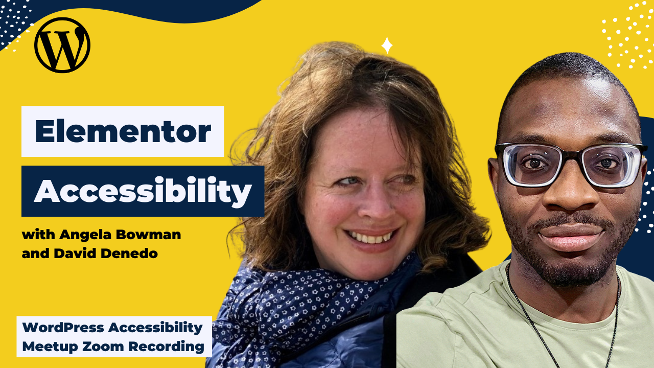
I am very excited today to introduce our two speakers. Let me add some spotlights and pop them up here, Angela and David. Angela is a web designer, a Meetup organizer in Colorado, and a co-host of a podcast. She works primarily with Elementor, building highly customized sites with dynamic content, loves traveling, outdoor adventures, and raising backyard chickens. David is a web designer. He is a content creator who puts out a lot of very fabulous videos on YouTube. He works primarily with Bricks and Elementor and is passionate about accessibility, dynamic content, and solving mathematical problems. He loves playing Scrabble and chess.
Welcome. We are excited to have both of you here.
>> DAVID DENEDO: Thank you.
>> ANGELA BOWMAN: Thanks.
>> AMBER: I thought I added a spotlight to Angela, but I did not. I failed. Sorry. There you go. I am going to let you two take over. For everyone who is watching, there is a Q&A module in Zoom. If you could please put any questions that you have there, it’s a little bit easier for us to keep track of them than in the chat. I will come back after their presentation to pass those along and do Q&A. Welcome, Angela and David, and we’ll let you take over.
>> DAVID: Okay, thank you. Today, we’ll be talking about building accessible websites with Elementor. This is going to be the outline. Like they already said, I love playing Scrabble and chess. The reason is it helps you do to think a lot and to look at problems from multiple angles. That’s one of the things I like to do. Today we’ll be talking about, first, why do we care about accessibility. Then we’ll talk about how to do your accessibility, so starting from the global level and then going down to the element level. We’ll go to the next slide.
Why should you care about accessibility? Well, the whole goal of accessibility is simple. We just want to remove barriers from our users. The users are coming to our websites, they want to access a certain content. Our job is how can we make it as easy as possible for the user to get access to the content. That is the whole goal of web accessibility. It is not really about doing any kind of mumbo-jumbo. It is all about trying to get people to get their content. Accessibility isn’t about fixing users. It is about fixing the systems that are preventing the users from accessing our content. That is what accessibility is about.
I am maybe blind or I am maybe visually impaired, or anything, that doesn’t mean that I am disabled. Just imagine one scenario, let’s say everybody in the world they cannot see. Wouldn’t we have created a system that would still work for us despite not being able to see? That is how we should look at it, that it is the system that has not been created properly to handle the disability, rather than thinking about it as the person having the problem. Think about your system. How can I improve my system? Once you’ve improved your system, you’ll be able to reach a wider audience.
You’ve removed all the barriers, so more people can get into your system and read your content and get access, and do whatever they want to do. It also shows that you care about the people. You care about people. That is the whole goal of being a web creator, being an accessibility specialist, is that you care about people, and you want people to get that content. Once people can get the content, then that will also give you increased revenue. All of these things work hand in hand. Finally, it is a legal requirement, but that’s just on the side, but make sure you are caring about people. That is all we need to really remember from the whole goal of accessibility is that we’re trying to care about people and trying to get people to get access to our content.
Now let’s look at how to build websites with Elementor in an accessible way. We’ll start with the first portion, which I’m going to hand over to my co-presenter, and she will take you through everything.
>> ANGELA: Thank you, David. As David said, we’re wanting to change our systems. One way we can do that is, from the get-go when we are building our Elementor sites, is to take advantage of Elementor’s global site settings. I’d love to see in the chat any of you who use the site settings regularly in Elementor, or if you haven’t used the site settings at all. To start, we need to disable Elementor’s default colors and fonts. I see this on a lot of the Elementor forums, where people don’t have this disabled and have a hard time using the site settings or overriding styles because these default colors and fonts are enabled.
To disable the default colors and fonts in Elementor, you need to go to Elementor settings, general tab, and check these two boxes. On every site, that’s the first thing I do is just check those two boxes. The next thing I do is start to analyze any designs that I’ve received. I’m using this Juiceito, [chuckles] the juice bar site kit from Elementor, because it presented a lot of accessibility challenges and presented an idea of how you need to approach your sites with accessibility in mind first, which is a systems approach.
I’m pretending that this design was given to me by a designer, and maybe I wasn’t involved in the initial iterations to head off some issues that I might immediately notice. I’m going to take a look at all the colors. Presumably, you’ve been given a brand, a guidebook, or if you’re even just designing this from scratch yourself, or if you have an existing site you’re remediating, these are some things I’d recommend you do. I’m going to look through this design and take note of all the hex values of all of the colors being used. We have an orange, a tan, a kind of purplish pink, and a dark gray color for the body text. Those are my colors. We have a specific heading font and a body font.
Then the next thing I’m going to do is to go to my global site settings and start to pop these things in. I’ve created a style sheet to document all of these colors and sample some of the fonts. How I started that style sheet was, first, to go to the site settings. You can reach the site settings. I prefer to go to the site settings from a page rather than from the top menu bar because there’s some refresh issues with site settings if you don’t go through a page first, just FYI. I’m going to edit this page that I’m calling my style sheet, and click on site settings up in the upper left toolbar.
It is called design system, the global colors and fonts. If you can put in all of your brand colors in the system colors, in any custom colors, in the custom colors area, that gives you a really great start to be able to apply these colors globally. If, for some reason, they need to be adjusted for accessibility, you just have to change them in one place, and it will change everywhere. I’ll show you how that works when we get into building the page. Define every color that you can think you’ll be using on the site under the global colors.
This is designed with this specific color names like light pink. Often it’s better from a design system standpoint to define it for the purpose of it, so that way you’re not tied to it being pink. You can always change the names of these, though, if this is just the “light, colorful background”. There’s different ways to approach naming your colors. This is just how I happen to do it here. I always include black and white as colors, as well as a transparent color, if I’m going to apply transparency to, let’s say, a button background.
You’ll define all your global colors first and then go to your global fonts and define your primary, secondary, body text, accent fonts, primary fonts, secondary fonts. People use these in different ways. It’s usually used for headings, subheadings, body text, of course, for body text. Accent text, people use that in different ways. Often it’s used for buttons, maybe for menu items. You can also define custom fonts. When I get into my page, I’ll show you how you can save custom fonts on the fly as you’re styling out your text. The custom fonts allow you to recycle any styles that you’ve predefined, so that if you ever need to tweak them, you just have to come to site settings to change them, and you don’t have to go touch every single page that you’ve made this styling adjustment on. You only have to change it here.
One thing that I want you to be aware of, though, when you’re working with your global fonts is to use REMs instead of pixels. REMs are based off of the main level body font size of 16 pixels and is a proportional font size to that. For example, if we have a 16– I love this converter, and that we have it in our resources at the end of the slides. A 16-pixel size equals 1 REM. 18 pixels is 1.125 REM. When we define our fonts in REMs instead of pixels, we’re able to proportionately resize the fonts and honor when people go into their browser settings and change the font size and it will dynamically resize. In a couple of minutes, I’ll show you what happens when I do that.
As you’re working through all of your global fonts and you also want to define your typography, you can choose one of the global fonts as your typographical style for your different headings or you can uniquely define them here. You just have to have your system of how you’re going to define and use your global fonts relative to your typography settings. You can choose colors for each of the headings and body color, text color. Here, I’ll want to choose my text color for the body font. I sometimes don’t set the color, especially if I’m using those styles in different ways on my pages, but I’ll always define my font sizes or use the global font here.
This is what I was talking about with REMs. To use REMs in any of your typography, you just need to switch from pixels to REMs. If you have a site, this is a good thing to do. If you’re remediating a site, go ahead and go to your site settings and start to make sure everything’s consistent, and just do this switch using this converter to change all your pixels to REMs. That’s one remediation strategy you can use, or what I do from now is just from the get-go, define everything as REMs and then things can proportionally resize. Then you can define your hover color as well here. The other things you can do in site settings are your button styles and your background of your site, your overall layout width, et cetera. We’ll save changes here, and then I can walk you through a little bit of my style sheet, style guide, brand guidelines. You call it whatever you’d like.
What I like to do with this page is try to take all of the recyclable design elements or components that I might use on a site and pop it into here, and then you have one page you can test for accessibility from the get-go from a perceivable standpoint. All of this is related to the WCAG guidelines around perceivability, and perceiving is about color contrast. We need to make sure that our text has enough contrast with the background to pass accessibility. This I find, for me, is a really easy way to have a conversation with the designer to say, “Hey, I can run a test on this page, show them what’s not passing accessibility, and then we can have a conversation about how are we going to adjust things for that to work better.”
In this case, I’ve added my buttons. Let’s say the designer gave me all these button styles. I went ahead and added these. I would also recommend adding some buttons to this page that show the hover style as well, the hover color. I’ve added a hyperlink. I’ve added a lot of these little icon boxes with backgrounds to show all the different possible color combinations that I’m seeing represented in the design file I’ve been given or that people think they may want to use. Then I can just test this one page for the accessibility of those. Then, before we even start designing the site, we can have headed off a lot of these contrast issues in advance.
If we go to view this page, and now I run the WAVE accessibility evaluation tool. You can go to the detail tabs. It’s just a Chrome extension. It’s available in different browsers. I’m going to hide just these other alerts because I’m not testing for that right now, but you could. You could potentially have your master page with all your components on it and test for everything. Then, as you use those components throughout the site, you might see like, “Oh, yes, I’ve tested that. I know that works. I can use that on multiple pages.”
Right now, I can see pretty clearly which of my text colors is not accessible. Then we start the conversation and we figure out, “What are we going to do? None of these button colors work. How are we going to redesign this to work? The orange is a real problem. I can’t use this orange text in a body size anywhere, though it works fine as a heading.” This is where the negotiation can begin to start when you’re talking with the designer of the company.
Maybe are we able to adjust the brand color for certain instances to be a little deeper, a little darker when we’re using it as a body font, that kind of thing, or we create some rules like, “Oh, we never use the orange background, period, because that just creates a lot of problems. Nothing seems to read on the orange background except for the big white heading, but the body text doesn’t, and it’s too limiting. Those are some quick wins in terms of the resizing that I wanted to show you.
Let me just change this. Let me make sure I’m at– I’m at 100% size right now. If we go here and I go to my Chrome settings and change from medium to large, we’ll see that everything got bigger. The heading one, heading two, body font, the buttons all got bigger because I defined them in REMs. If were defined in pixels, they wouldn’t have gotten larger. Now I can make them very large, and everything got really big. Then you want to see, okay, now that I’ve made these things big, do other things in my layout break when I go this big? Amber can speak, too, maybe at the end, how far in size we need to go. I’m usually just testing up to the– I sometimes have tested the very large. I often just go up to the large. This is what it looks like, small. Then we’ll go back to our medium.
That’s one of my big takeaways here. The other is around the global other font styles. Besides H1, H2, H3, I’ve also defined some other styles. What we see often when people are designing sites is that they’re using the headings to style text inappropriately, which is taking things out of order. On this example of this page, we have– Oops, where is it? This pull quote. When David gets to his part of the presentation, we’ll see that someone put this in a heading font, and it puts things out of order. It’s not really a heading. It’s just a pull quote. You can define a pull quote style and then choose that in your typography.
Here I have that global style that I’ve defined. If you’re doing this on the fly, if you’re just adding some text and you’re like, “Oh, yes, that looks about right, I want to use that as a global font and I’ll repeat using that,” you can click this plus button and make it a global font and then it will be available here. Then what you’ll be able to do is, instead of using an H2 inappropriately, you can use a paragraph tag.
Then, the last part of my little typography thing I wanted to mention is hyperlinks. By default, when we’re in Elementor’s site settings, we do have the option with links to do underline, and then that would underline all of the text, but it’s going to underline it everywhere. It’s going to underline it in our menu items. It’s going to underline it in our buttons. It’s kind of a drag. I don’t want to underline it everywhere, so I did have a little code snippet to share with you that is in our slides. That is this little style that you can pop into. Let me go, just change this.
Sometimes the site settings doesn’t refresh very well on the page, and sometimes you’ll need to refresh your page to get whatever your site settings have been. I don’t know why that suddenly got really large. Oh, maybe because I typed the link text, and I hit the styling, and it pulled something from the template. Anyway, I’m just going to view this page, ignore that bold text.
Under customize or in your site settings, I often use customize or in the site settings, it has custom CSS area for Elementor, that snippet that I have, you can paste here. Then, when we go to view the page, we’ll see now that our hyperlinks are now underlined. This isn’t really a hyperlink. This was just the hyperlink color. Now all our hyperlinks are underlined. I accidentally made that font huge. That is a style that I’ve set up where it underlines, whenever a hyperlink is detected in the text editor, it underlines, on hover, it goes away, and on post grids, it underlines on hover. Feel free to use that if you like.
I think that’s all that I had for this part of the presentation. I am going to send it back to David.
>> DAVID: Hey, thank you, Angela. The next portion, so now we’ve defined the global styles that we’re using for assets, now we have to start building out the structure. We’re looking at the layout and the structure of the page. One quote that I would like to use is that we wouldn’t design a house as one empty block, one empty warehouse. Typically, when you go into a house, most houses have a similar structure. You have the living room, you have the bathrooms, you have the toilets, you have the kitchen, the dining area, and they are quite structured and they are put in a logical way. The moment you get into the house, there’s one portion, so it’s easy for anybody to quickly go into a house and orient themselves to the house.
If it’s just one big block, then it’s become hard for any user to be able to access different parts, which is why we have the structure for our website as well. We have the landmark regions. They are basically structures that we can easily skip through, especially for screen reader users, they can quickly switch through all of these different regions and get to where they want.
Typically, we start with the header. The header contains our logo, our navigation. The navigation is also a landmark and our search. Then, if you have a sidebar, sometimes we assign the sidebar as an aside because usually it has content, but it’s not really related to the main content of the page, but it’s still tangentially related. We put it as an aside, and then we put all of our important information in the main content area so that a screen reader user can just know– “I don’t want to go through all of this boring header navigation. I just want the main content of the page.” They press the shortcut key, and it goes straight to the main content area. That is what we should do with our pages.
Then we can go ahead and look at other portions, which is how we can now fix the problems. One thing we’ve noticed in Elementor is that Elementor was built in an era where they wanted everybody to have freedom. In order to do that, they created a kind of a problem. Rather than designating a header landmark, because they know that they are a page builder, not a theme, they don’t really change anything, so they leave it as just regular divs, which you can see using the HeadingsMap. What we’re using here is the HeadingsMap to look at the landmark regions. The link to the HeadingsMap will be in the slides. You can go ahead and check it out, or you can just search for HeadingsMap on Chrome, and it will give you the Chrome extension.
Now we have a page that we built. This is taken from the style guide. It has the different layout structures, but when we look into the layout, we don’t really see any landmark regions. There are nothing there. It’s just direct to the page. The other landmarks that are there are, I will also talk about that later, it shows some other long text as part of landmarks, which ideally we shouldn’t have those texts there, but because of how some of the page was structured, it is adding some things as landmarks, which shouldn’t be there. The only thing that is important here is the main, but we need to have the full structure.
Let’s use a different tool to check the example. Let’s use the insights for the web, and it’s also in the resources. What you’ll notice is that if you look at the structure, the only thing that is in a landmark is the navigation that is called a menu, and we have the toolbar, which is from WordPress. The other part of the page, if you scroll down the page, you’d see that they are not contained in a proper structure. The footer, the other parts of the page are not properly contained. How can we fix this?
First, we’ll start by fixing the header. To fix the header, go to your header settings so that your templates, you can either use the theme builder or however you like to jump around. In the header settings, all you have to do is in the middle of the page. If you’re having the top bar experiment active, I think it should be active by default for all users, where you have the top bar with the icons, bold icons. If you go to the center portion, you would see a cog icon. When you click on that cog icon, it takes you to the header settings. The only thing you need to do there is just change the HTML tag to header.
Then I also like to name my templates, just so that I can remember the templates for later. I always like renaming them, either site header, header, not just elemental templates, XYZ. I like to give them nice names. We can now go ahead and publish it. That’s the first portion solved. Now, if you check it on the front end, you get our header, it will now be marked up properly as a landmark. Sometimes the tool has to reload multiple times before it works. That’s why the accessibility insights for the web can be a bit problematic but yes, we can always use other tools to check it. Like the HeadingsMap, we can always see- so now we can see the banner landmark.
The banner landmark is basically the header landmark. That is just the old term that it started using. Then we can also fix the other one, which is the footer. It’s the same principle. We’ll go to the template settings and then the footer. You go to the cog icon, which is at the center. Then you change the HTML tag to footer. That solves the footer landmark. Then the last portion, which tends to be theme-specific, is the main content area. You will notice that sometimes it shows up and sometimes it doesn’t, depending on whether you’re on a page or you’re on a single post template.
One thing that you need to do is always check yourself because any tip we give here it will work for some themes, but not other themes, so you have to test it yourself using some of these tools. One thing you have to remember is if you go to the page itself that you’re trying to edit, if you edit your page, make sure for the hello theme that the settings, which is the cog icon at the top center, make sure the page layout is set to the default from the site. Don’t set it to full width because what happens when you use full width is that it overrides any kind of semantic HTML that was there. Elementor will now take over and convert everything to a div. We don’t want that. We want the theme, which is the hello theme in this example, to be the one to assign the main HTML tag. Just make sure you make it to be not the full width or not canvas, but site default.
The tool is a bit wonky today, sorry. Yes, if you use the HeadingsMap, you will be able to see all of the structures. You can see that the main content is now structured into the main area. We have the banner landmark. Then we have the navigation landmark in the banner landmark. One other thing that comes into mind again is now we have created the layout and all of the structure, we also have to think about the naming structure, the name. Right now, we are using the banner landmark. Because it’s only one landmark there, we don’t really need to give it a name.
The navigation landmark, typically, we have multiple landmarks on the page. Right now, it is just calling the navigation landmark a menu. Menu is not really something that is– It’s too generic. We need something that really describes what that navigation is. How we do it is, first, I would advise that you take advantage of the new menu widget, not the old WordPress widget, the WordPress menu that Elementor had. Use the new menu widget. Use that to build your menu that is more accessible.
Then, to give the menu a name, just simply go over to your element settings, which is on the left side of your page, and you change the name to something more understandable. Typically, we like to designate the primary menu as primary so that people know that, okay, this is the primary menu. Then we can have the maybe the breadcrumbs. We have a menu in the footer. We have some other menus, but the primary one, we like to give it a name of primary. That’s all you need to do for the menu. Then you can go ahead and save it. That’s it for the main structure.
The last part we check is, like I said, once you’ve tested the page, you also need to test your single posts, so your blog posts. Now we have to go over to a blog post because what we have found that although it works well on a page, sometimes on a blog post, the landmarks disappear. On a blog post, you do the same thing. As you can see on the page, right now we’re using the accessibility insights for the web. It is highlighting that there is a toolbar, which is from the WordPress admin bar. There is a banner landmark, which is correct from what we did in our theme builder. There is a primary navigation landmark, which is what we solved, but now there is no main landmark again.
The main landmark has been removed because the Elementor, like I said, whenever you use Elementor theme builder, you always have to make sure you put the tag yourself because Elementor tries to not interfere. They always like to use divs, just leave it as divs, and then they expect you to fix it yourself. You have to go to your theme builder for Elementor. Then, unfortunately, there are two problems that are combined together when it comes to the main content area. We need what we call the skip to content link, which needs to target the main content area. That main content area should have an ID of content.
Unfortunately, if you use the settings of your template at the top center, you can change it to a main, but you’ll be missing the function, which is the ID of content. It will fix one problem, but then it will create a problem somewhere else. To fix both problems at the same time, what we like to do is we add a container or something you can easily do is just copy your entire container and put it into– You have to just basically wrap it in a blank container. You wrap all of your content in a blank container as the parent element. That container, you then go to the settings, which is on your left side of your screen, then you go under the advanced tab, make sure you zero out all of the paddings and margins. Make sure that everything is zeroed out so that it is the content inside that does all the work. That parent container is just acting as a wrapper.
Now we’ll come to the main container. Under the advanced tab, we’ve added the padding to be zero. Then you now add an ID of content. Just write content under your CSS ID portion. Finally, we now change the HTML tag to be main. You go under the layouts tab. Then at the bottom, you see advanced options. When you click on that, it will take you to HTML tag, and you set that to be your main. That’s it, you’ve solved all of the problems that have to do with the structure. You can go ahead and save it. We preview on the front end.
Like I said, you have to always test it yourself. These tools are just workarounds that we can use, but you need to test it out yourself to make sure everything is working. Right now on the screen, we have everything working. At the top, it is structured out. We have the toolbar from the WP admin. Then we have the banner landmark. Within the banner landmark, we have the primary navigation. Then we have the main landmark and the footer landmark. We’ve solved all of the layout problems.
The last thing that we may want to solve on our pages is the heading structure. Those ones you have to do it on your own basis. You have to look at it yourself. Headings, like we’ve seen from the beginning, if you want to style a heading, you have to break it up into two portions. There is style and there is the content. The HTML tags for the HTML elements are for content. The CSS and anything under the style tab are for styles. We are going to be using the HeadingsMap element to show the HTML structure of the headings.
As you can see on the page, right now we have the heading structure. The first one, which is the “all natural and fresh pressed juices”, that is our H1, which I believe that’s the main content of the page. Your H1 designates what is the main idea of the entire page. That’s what you designate at the H1. Then, any sub-section under the page it should go to the next heading level. That is an H2. You should also remember that if that content is not really breaking up the structure of another content, then it should probably not be a heading.
Like in our example, we have a section called “there is nothing more refreshing than starting your day with a Juiceito boost”. That doesn’t sound like a heading. It is more or less like a quote that was said by somebody. You can’t designate that as a heading because it is not breaking up the content underneath it. Ideally, you now go to your page and convert that to a paragraph. You go to the edit with Elementor. You edit your page. Just make sure that you are using it as a structure.
You go to your pull quotes and probably designate it as maybe a paragraph tag because it’s more like a paragraph. Then you can now use your style under your style tab from the global styles that you’ve created. Then you can now just designate the style. Use the style tab for your styles, but for the actual content, make sure that it is following in order. That is the main thing you need to do. Just use that HeadingsMap element to look at your structure of your page.
A heading breaks up content. That is what a heading does. It helps to break up content to be easy to read. If the text is not breaking up a content underneath it, then it most likely is not a heading. It is just a text. Think of it like that. Your headings should be in order. Starting with the H1, then any section underneath should be H2, any subsection underneath it should be H3, and so on. Sometimes, in some cases, you may want to add a heading to break up the content.
For example, we have our list of cards. Those cards are there, but what are those cards doing? What is their purpose? We need to have a way to break that card and tell people what is the purpose of all of the list of cards, so we add a heading to it. Then, sometimes we may have to use a hidden heading, which I will show later, but first, we add a heading to our product. This now gives us a better understanding of what our cards are doing. Those cards are showing our products, so we know that those cards are for our products. This is how you just continue going down the page.
The last part we look at is our footer, because sometimes we’re trying to break up the structure of our page, and it might not be structured properly. Let’s just open the HeadingsMap, and you see that- so we have different headings. Okay, so our footer doesn’t have any headings. We can ignore that. If our footer had some headings, then what I like to do is I’ll put a hidden text in the footer that is just called footer, so what when a screen reader user sees the heading structure, it still works out well for them that they know that okay. Any headings in the footer has a parent heading that breaks them up called footer. That is the main idea, so just put footer.
I think with WordPress, we just have the class name of, I think, it’s either– Some themes use sr-only. Some other themes use screen-reader-text to visually hide the text, but still allow it to be shown to a screen reader. Just test it out and see which CSS works for you, and basically that is it. We’re just going to add some extra headings visually on the screen just so that people can see how the headings work when you have other headings in your footer, so that the structure is still preserved. I’ve added a heading called footer. Then we’ve added some other random headings. Now, if you go to a page and we check it using the HeadingsMap widget, you can see now that the structure will be broken well. Once you have fixed all the other problems of your headings on the page, the headings now will look better.
Just try to go through your page step by step. Right now, we just skipped a lot of them, but basically, you will go through your page step-by-step and see the structure, make sure that our product has a heading. Our product is breaking up some structures. You see a section there that’s called San Diego’s first organic juice bar. That’s another structure. Just basically look at it and see, is it breaking up content underneath it? How does it relate to the next heading level? How does it relate to the previous heading level? Just keep that in your mind and use that to structure your page.
Yes, that is that for the layout. I’ll hand over back to Angela to talk about the next portion, which is about alternate media.
>> ANGELA: Thanks, David. I feel like for any one of these sections, we could do a whole meetup. [laughs] There’s all the details in the slides if you need to revisit that. True accessibility means providing alternatives, alt text, captions, transcripts, because text is the universal fallback, and text can be read either visually or by screen reader technology. When we have something that’s just an icon or an image, that can’t be read because it’s not represented in text. I’m sure if you have been following Amber’s meetups, you know that you need to use alt text.
There are special cases. That’s pretty easy. We go to our media library, we add alt text to our images, that’s descriptive. Then Elementor provides the ability also to add Aria labels to things that may need alternative text. One includes any hyperlink that you have on the site. If you have any images that are being linked to, you could use an Aria label, such as the site logo. The site logo always links back to the homepage. I’m going to pop out of this slide and just show you how you can adjust your header logo.
If I edit the header, I can go to edit the site logo. Right now, it’s just set to site URL. When that header logo is set to site URL, then– I don’t have any options to provide an Aria label for that to indicate what that link really is. What we recommend is choose custom URL, use dynamic tags, choose the site URL from the dynamic tags, and then in the link options, you can define an Aria label. Aria label, pipe symbol’s the formatting you need to use. Then I could type Juiceito homepage. That will read that link. When the screen readers are looking at that link will indicate what this link is actually going to, rather than being perceived as an empty link. That’s one tip we have.
Then another– You can use this technique on a lot of different areas of the site. You can use the Aria label in the exact same way on any of the icons that are linked, any of your linked icons, if you’re using the icon widget in Elementor, any of the social link icons. The social link widget has some screen reader text, but it’s not that great, so I like to use the Aria label on all those social link icons. Then the buttons, if you have any buttons, like learn more, download here, any generically labeled buttons. You’ll get that decremented on your accessibility report. You can use the settings on any links to set an Aria label to make it more user-friendly. I find that super helpful.
Then the other part of the accessibility is giving people control over things. We just wanted to note a few things in Elementor that will allow people to have control over things that move and auto-load, and that kind of thing. In general, with videos, we don’t want to autoplay them. We do want to show the player controls and captions. These are the options you have in Elementor for any of the video widgets is to set captions, the player controls, and not auto-play. You can also set the video options to stop the video after a certain number of seconds. That’s super helpful as well.
Background videos don’t include play-pause buttons, and background videos are, universally, can be a challenge. If you have a self-hosted background video, there is some discussion about that, and there’s some code snippets you can use to add a pause-play button to background videos. Just won’t work with Vimeo or YouTube, only self-hosted. User control for sliders, all of the sliders in Elementor would be technically considered inaccessible because there’s no way for people to just stop their playing if they’re turned on to autoplay.
There’s no ability for people to pause the slider from sliding, and a lot of people like to have the sliders autoplay. They have a logo carousel that they want to indicate. Yes, there’s more logos here. There is– Amber’s worked on a snippet. I’ve updated the script here, so you have a link to that. Yes, it works great. It adds an auto-play button to all of your sliders on the site, and so if you use this script on the site, you’ll be able to control those.
Then, controlling for motion effects. I created this little CSS snippet. I’ll show you how that works in practice. See. Copy this snippet. We saw in that juice bar site that– Let me go back to view the site. There were a lot of animations on that site. Things are flying in and animating this little bit of CSS. Give me feedback if it doesn’t work for you. I’m just pasting this into customize so you can put this in your custom CSS section of your Elementor settings. Should now, when I refresh, if I have motion control– Now I’m remembering where reduce–
Amber, can you tell me where the reduce–
>> DAVID: It should be your system settings.
>> ANGELA: Yes. I’m on– Oh, it’s in system settings. That’s why I’m not finding it here. Okay. Yes. This is a system settings that people can set on their computer to reduce motion. I am going to, I’m just looking at it in my.
>> DAVID: Unfortunately, we will not be able to see it on screen.
>> ANGELA: Yes. No, you can’t see it, so I am– Reduce motion. I’m in my– Oh, I’m trying to get- reduce motion. Oh, I got it. I found it. In my macOS system settings, I have a reduce motion setting, and this will be also in other operating systems as well. Now I’m going to refresh the page after I’ve set reduce motion, and you will– Oh, those are still animating. Why is that still animating? Huh. Well, it seems like that snippet is not working. I will test that again. I had just used it recently, and that snippet totally worked. I will work on that and update my gist for that. That was one thing that we felt like would be a helpful snippet. Sorry, that’s not working now, but I’ll get that fixed.
David, I’m going to turn it back over to you to talk about the complex modules.
>> DAVID: Okay, thank you. We’ve spoken about our site settings. We’ve spoken about the layout. We’ve spoken about control. The next portion is about complex modules. With great power comes great responsibility. That’s a famous quote from Spider-Man. What that just means is when you try to add a bit more complexity, then you also have to consider more things.
For example, if you have, let’s say, a sports car, or anything, the more features you add to the car, the more you have to calculate so many other things that work together, otherwise, everything will break down. You need to make sure everything is working together. What we have noticed is that a lot of the elemental complex modules, by complex modules, I mean, your tabs, your search, things that are comprised of multiple elements together to form one component, they tend to have some slight issues. This is talking about the version three elements. With the elemental version four elements, they are making things better, but I’m focusing on the version three elements because that’s what we have for now. We’ve noticed a lot of issues.
What you can do is that you can go ahead and check out some of our resources. What I like to do is, because none of us are good at everything, I like to rely on some proven techniques or tips and use that to work on my system. With complex modules, I like to use some patterns and libraries, and design systems. They are on screen. One of them is called WAI-ARIA APG patterns. Then we have the W3C design systems. Because I’m in the UK, I use the UK government design system as well. There was also one for the US, so the US government design system. Those systems basically allow you to understand how a component should work.
We’ll use one example and translate it to an elemental site and see how both of them are working. For the accordion, can we just go back to the description of the patterns of the accordion? When we now look at the link in the slides, the keyboard interaction– I like to use this pattern to explain exactly how the element should work. This gives me an idea of how the element should work. The HTML might change. There might be differences in the HTML, but the way it is expected to work tends to be universal. It tends to not change. You can see the keyboard interaction. It tells us that if we want to open or close, we use things like the Enter or space bar because it is performing an action. Whenever anything is performing an action, it uses the space bar or the Enter key to open.
The reason why we always use space bar is it started with when we have forms. With forms, when you are typing in your inputs in a form, you press the Enter key, it automatically triggers the submission of the form unless you use preventDefault. That’s why, for most things that have interaction, we tend to use another key, which is the space bar key, for those things. Any buttons, your check boxes, your radio buttons, any kind of thing that performs any action, you always have to make sure the space bar works because the keyboard user will be afraid to use the Enter key so that they don’t mistakenly submit something. They will press the space bar key to make sure the space bar is working. If it’s not working, then they press the Enter key, or at least that’s how I work.
Now, just look at the keyboard interactions. It tells us that we should use the Enter or space when we are focused on the accordion header. Then we use the Tab key to move focus to the next focusable element. All focusable elements, all of them should be included in the page. There should not be anyone hidden. All of the focusable elements should be in order in the page. Use Shift Tab to go back, Tab to go forward. Then it says optionally, so that is not a requirement, optionally, you can use the up and down arrow keys to navigate the headers. The accordion headers, if you want, you can use the up and down arrow keys.
Finally, you can also use the Home and End key, but those are just also optional. They’re things that you add as enhancements. They’re not requirements. Now that we’ve seen this, we can now go ahead and test one of the accordions from an Elementor website. We have one on our demo page at the bottom for FAQs. Now, if we try to use the Tab key to navigate to the next element, we’ll notice that it jumps from the first focusable element, it skips all of the other ones, and goes directly to the footer link, which is called call now. Ideally, the Tab key should just go in order of focusable element. It should not jump.
Elementor have mixed up two things. They’ve mixed up the patterns for tabs with accordions. Tabs use arrow keys to navigate the headers, and then they jump using the Tab key from the header to the content. If we try to open an accordion now, using either the space bar or the Enter key, that works. If we press the Tab key to go into the accordion, we get there. Ideally, a user would now expect that, “okay, I’m at the last link. If I press the Tab key, it should go to the next header,” but then that jumps out of it again to a separate section because there’s that mix-up between how it should work.
The reason why we don’t change the keyboard interaction for accordions, accordions should just follow in the order. The main reason is that it doesn’t actually have any designated special HTML tag. What I mean is that with things like your tab list elements, they have a role equal to tab list and a role equal to tab. That now tells assistive technologies that the keyboard controls is going to change. In case of your select button, it has a select and options. Once a user gets on the select element, it tells the screen reader user, “Okay, this is a select element.” They know that these are going to change.
In the case of an accordion, there is no really any special HTML. All that is exposed to a screen reader is that there is a heading, and then the heading contains a button. That’s all the screen reader user hears, which is quite disorienting because then they now try to use the Tab key to go to the next element, and then they jump and go completely to a different place. Unfortunately, if the screen reader user is non-visual, then he or she wouldn’t even know that they have skipped a lot of content on the page and gone to somewhere else because they are non-visual. They can’t see it. You can see it visually if you are a visual user, for a non-visual user would not even perceive that element.
Then, like I said from the beginning, we’re trying to remove barriers from accessing the content. Now we have added a barrier that will make some users to miss out on important information, which is the FAQs. For that, Elementor should just basically get rid of the whole keyboard interaction that they included, because– Let’s go ahead and just inspect the HTML using the DevTools. If you right-click on your element, you get the context menu that says Inspect. Once you click on that, it opens the DevTools. If you look at the DevTools– We might need to zoom in the DevTools a little bit so that it’s easy to see.
Elementor, they’ve actually started using the new HTML tag called the details and summary tag, which is being improved to act like an accordion. That tag is a custom HTML that has been created to be semantic. It doesn’t need you to perform any special JavaScript interaction with it. It is a HTML-only type of element that just needs maybe some CSS to style it. Unfortunately, Elementor have basically changed the interaction using JavaScript when the element already has the proper interactions that are given to it by HTML. All you just need to do is basically remove all of the JavaScript that they added and let it be as natural as possible.
There are HTML attributes that can perform the same action as JavaScript in this scenario because they are using a semantic HTML. The other thing that is there, which is not so obvious, is that Elementor also added an aria-labelledby, which creates some problems, but that is just on the side. Ideally, the aria-labelledby and role equal to region should also be removed because, like I said, we are using semantic HTML, which is the details and summary tag. That already gives us as much semantic HTML as we need. Everything that Elementor added as extra is actually causing a problem.
That’s one thing that we talk about as the first rule of ARIA is that no ARIA is better than bad ARIA. The idea is that when you start adding unnecessary ARIA, it creates some noise for screen reader users and assistive technology users, which can create more harm than good sometimes. They get to struggle and have problems. With the example on the W3C or any of the design systems that were added in the slides, you’ll see that accordions use the Tab key to navigate through all elements. It’s always the Tab key.
Other elements that have special roles, those ones can have a different keyboard interaction, but the accordion, especially, they should have just the Tab key. Do not add any other special thing. That might create some more problems. That is that about the example. The other example we want to see is on the UK government design system. You might want to check that out to learn about your forms. You can check the error messages on forms, that it gives you basically exactly what you should expect. It shows you how the error messages should be shown in a form.
Ideally, on a form, on screen is just showing the error message that appears when a user fills in the wrong information for a date field. It should have the label of the form input. Then it should have the error message after the label so that the user knows, “Okay, this is the name of the input I’m trying to fill in. Then this is the error that happened.” Then, after that error, is where they now change the actual input. It makes it in a logical way. First, you hear the label, then you hear what was the error, and then finally you can get to the input to fix it. That is it about the complex modules.
All we have to just do is once you compare the design system with what module you’re using, either the search module or any module at all, if there’s any discrepancy, then I would advise that you report it to the Elementor GitHub. Mostly, you report it as a feature request. If it is something that is completely breaking the site, then you report it as a bug. The link will be in the comments. It will be in the slides as well. It’s just github.com/O-R-G-S/elementor/discussions. That will take you to the GitHub repo, where you can add your feature requests and your bug reports for any Elementor issues. That’s it. Angela.
>> ANGELA: Thank you. I love that idea of using these design systems to see how it should work. I think that’s the big takeaway. Then, when you’re testing your sites in Elementor, if your accordion, slider, gallery carousel, whatever you’re using in Elementor, does not match how it is indicated in the design system would be a clue to you that you may have an accessibility issue that needs to be tested more thoroughly. I think that’s the big takeaway from having these design systems to compare against. It will help you to report that feature request to Elementor to say, “Hey, look at this design system. I’m not seeing my component operate in the same way.”
We do have a lot of other resources that you can take advantage of. Now we’re here and ready for your questions. I will stop the screen share.
>> AMBER: Thank you so much for that wonderful presentation. Very much appreciate all the detail you went to, the real-world examples, and showing how to make fixes. It is interesting with a lot of these builders how there’s a lot you can do in them that you might not even realize, you just have to know how to do it. It doesn’t require amazing code-writing ability or anything. You just have to figure out how to set it up in the right way. That is really great.
I am going to go through some of the questions, except for, you know what? I can’t see them. I had my Zoom bug out. I left and came back, and apparently, it would look like I can only see questions that have been submitted. Paula, are you around, and can you see questions? I’m wondering if she’s able to [crosstalk]–
>> ANGELA: I think I can see them.
>> AMBER: If you can see them, maybe you might just have to run your own Q&A. I’m [crosstalk] so sorry for that.
>> ANGELA: No, that’s fine. I’ll just start from the top, and there’s not a ton of them. Can one use a tile-textured image instead of a solid color? Yes. I would recommend assigning a color as well because when you do your accessibility testing, it’s actually going to read that background color and not see the tile texture. You may have to do some manual testing. What I often do is pixel sample that background so I have a good representation of my solid color that the accessibility tools are going to analyze for accurate reporting. I don’t want it to be white if my color texture background is on average a mid gray, so you know that it’s parsing accessibility. Just try to set a representative color of that, so you know.
Are there rules of thumb [crosstalk]–
>> AMBER: Do you use the TPGi’s color analyzer tool?
>> ANGELA: Will it pick up those background things?
>> AMBER: I love that tool because it’s totally free. It’s a desktop application, so it doesn’t rely on a browser. Basically, it opens a little window, it has color pickers, and you can pick the front and the back. You can use it when you’re putting text over an image on a website. I also use it in Figma all the time because Figma doesn’t have great color– There are some extensions for it, but they’re not super great. I just have that. It’s free desktop application. We can probably find a link for it real quick, but TPGi. Oh, yes. Of course.
>> ANGELA: I use the color picker extension. I pick some sample color and then I put it into the background color.
>> AMBER: Looks like June threw it in.
>> ANGELA: Awesome. Are there some rules of thumb to ensure the design doesn’t break when using REMs for the large? I’m not sure how large we need to go, but I just really adjust my designs. There are some CSS media queries that you can put in for that when the font size is a certain size and I’ve just adjusted my CSS to adjust the design so it doesn’t break, or it breaks gracefully or something. There’s different CSS you can do for that. It’s like when we had to start designing for mobile, we’re having to design on this responsive in a way on a whole new level.
>> AMBER: David, have you found issues with REMs, ever?
>> DAVID: Not really, because Elementor helps you out as well that once the system gets to a certain level, it converts to a mobile type of layout. That helps out because I tend to– If you look at my screen, these texts are usually quite large because I can see very well. I tend to always zoom in a lot on my own screens. I think as long as you use REMs, or nowadays people use these clamp functions that basically they are REMs but try to readapt to different screen sizes. There are also container queries that some people can use, but those are other extra CSS things.
As long as you use REMs, because you’re not really breaking the website, because some people prefer to see it extra large, massive large, you can’t predict everybody’s visual way of looking at your screen. As long as the text reflows, because that’s one of the WCAG guidelines, that the text should reflow once it gets bigger. Just make sure that your screen is mobile responsive. It should work out well.
>> AMBER: I would say the thing to watch out for is don’t set maximum heights on any containers. As long as you haven’t done that, then the text can go, but if you have a maximum height on a container, then any text in it when you zoom may get cut off.
>> ANGELA: This might be a question for Amber. Does the site need to have a header like that banner defines? What if you don’t? If you don’t have a header, then do you need the skip link?
>> AMBER: Technically, the bypass block success criterion requires that any repeated elements need to be able to be skipped, which most commonly applies to things in a header or navigation menus. It could also happen if you have a sidebar menu on the left or something that’s repeated on multiple pages. You might also have a separate skip link that allows you to bypass that, potentially.
>> ANGELA: Or if there’s a logo at the top.
>> AMBER: Let’s say you’re using Elementor landing pages to build a landing page for AdWords and you’re not going to have a navigation menu because you’re worried about leakage and you’re trying to make people fill out a form, then you don’t technically need a skip to content because when they arrive, they are at the content. There is nothing to skip. You don’t technically need a skip link on there. You also technically wouldn’t need a header tag or a banner landmark. It would be fine to just have a main. You might not even have a footer in that case because you also might not have your footer.
Now, if you have a small little copyright– The example that you guys were using on it had a small little copyright. That is still a footer. You would still want a footer landmark just for that. It doesn’t just have to be a big footer like we’re used to seeing with a whole bunch of links, address information, and other kinds of stuff. Yes, the landmark should respect what kind of content you have.
>> ANGELA: I’m going to throw this question to David from Jocelyn. I’m not sure I understand why Elementor full-width is an issue. I use that almost always building my space. Same. I’m right there with you. I’ve always used Elementor full-width until I was like, “Oh shoot, I’m not getting my main landmark in my content.” Just depends on the theme. David, can you answer that question?
>> DAVID: Elementor full-width is not really a problem. The problem happens that the Elementor full-width, what it does is that it overrides your theme. Whenever you have Astra theme or GeneratePress, they tend to box your content so that Elementor full-width overrides the theme. Basically, it removes every HTML that is a parent HTML of that Elementor full-width and then just makes their own div to become the parent element. That’s what it does.
In doing that, it now removes everything. It removed the main tag and every other tag. Unfortunately, on pages, you can’t assign a main through the theme settings. There is no way to assign a main. What you would have to do is, if you are going to use full-width, then you use the walk-around that we’ve put. You have to add a main container and set that to be having the HTML tag of main, and then the content as the ID, so that the skip link can find the main content area. That’s what you have to do. Mainly because Elementor are trying to solve a lot of problems at the same time, because they’re a page builder, not a theme, they have to always work with themes. It always creates some limitations, basically.
>> ANGELA: I think they [unintelligible 01:19:39]
>> AMBER: I did throw a link in the chat when you all were talking about that to a blog post that I wrote, because we had a lot of people asking us about this when accessibility checker was flagging their broken skip links. That blog post has a code snippet. What’s really helpful about that is, if you’re building new pages, it’s not hard to put them in a container, but if you have hundreds of pages on a website that are all built with that template, going and manually doing that would take a lot of time. The code snippet will do it for you, which is a good reference.
>> ANGELA: I’ll answer this one about the button styles. I don’t think the button styles have to be kept the same across all pages. You just want to test them all to make sure that they– because sometimes you’re using buttons on a dark background or a light background, and they’ll have different colors. I would definitely define the styles that you’re using so that if you do need to change the global color or the typeface for that, that you can do it under the global styles. Then, Amber, do you have an answer to that as well?
>> AMBER: No. I just realized I can see all the questions now. Zoom caught up.
>> ANGELA: Oh, okay.
>> AMBER: [unintelligible 01:20:53]
>> ANGELA: Let’s see. Oh, I like this question. David, maybe you’ll have an answer to this. I have a page using the Elementor gallery widget that’s giving empty link errors– I’m having the same issue on my sites– and an empty button error. I assume because clicking on each of the individual images it opens the lightbox, which is also not accessible, sadly, so I’ve been converting a lot of mine. Is there a way of fixing things like this with CSS, or would it be better to contact Elementor about the widgets’ accessibility directly?
>> DAVID: With the gallery widgets, I think there’s always been a debate of how it should even be, because most of them they’re basically acting as buttons that open up the lightbox. Some people give different opinions. I think I’ll let Amber answer that question because some people say to have ARIA hidden or something, some people do different tricks because the screen reader user has a different experience when they get to it than a visual user. I don’t know. Amber will answer that.
>> AMBER: I would say if you want to go inspect code and see good examples of this, two really good examples are the WordPress core gallery block, which now does have native lightbox functionality built into it. What it does is it has the image, and then it also has a button that, when you tab, will come. You can see this on our features page for accessibility checker on our website, or if you just go insert a WordPress core gallery block into any website and inspect it on the frontend.
WooCommerce has also done a lot of work on their product image, and the same thing. Really, in an ideal world, you want the image so that it can still have all of its alt text describing it, and a separate button, that it doesn’t necessarily have to be visible until it receives keyboard focus. It’s not like you have to put an ugly button in the middle of your image.
It can be hidden visually, just like a skip link is hidden visually. Then, when you tab, it shows up. Then they can hit the space bar or the return key to open it. That button would have something like expand image alt. Something like that. You don’t want them all to just say, expand image, expand image, expand image. They have to have unique. You’d reference probably the image alternative text and then to say the function of the button.
I haven’t specifically looked at the gallery widget in Elementor, so I can’t comment on how poor it is, but it does sound like if it’s got empty buttons, there’s issues. I would always say for any page builder or theme or plugin, the first thing is, can you go report it to them? Because if they can fix it, then that means it’ll be fixed for everyone. If they don’t fix it or they’re not prioritizing it, then I would say that the next best solution would be see if you can use JavaScript to modify it and add in names to those buttons that already exist.
If you can’t, then you might need to look at either alternatives, a different plugin that might have a better gallery, or coding your own Elementor widget, depending upon your flavor of building Elementor websites, how you approach that, or potentially don’t have them open in lightboxes. This is another thing that I see sometimes.
>> ANGELA: That’s what I’ve done.
>> AMBER: I would say, depending upon the webpage and what the images are, there are lots of– I’ve seen them on a conference where they want to have a strip of images or two rows. It’s really just more of a visual design separator. It shows you a little bit about what the conference is, but the reality is, do people need to make this full screen, all the different images, to get the information or the idea? Probably not. I would also sometimes assess and decide whether we actually need that functionality at all in order to achieve website users’ goals.
[crosstalk]
>> ANGELA: I think we’re good-
>> AMBER: Go ahead.
>> ANGELA: -right now. I wonder where people can go for more information. I’m certainly available via chat on the Meetup. Was there anything else that you thought we could address?
>> AMBER: I did see one question where someone had asked about Elementor’s Ally plugin.
>> ANGELA: Oh, I answered that one.
>> AMBER: I think it’s good to get it in the video. I think since we are talking about Elementor, it would be good to talk about that one a little bit. Do you want to share what your answer was to that?
>> ANGELA: I have it in the answered area there. The overlay won’t solve many of the issues we’ve discussed today. It’s more some cosmetic things that it might fix, but it’s not really going to solve many of these structural things. You’re still going to have the same issues with all those complex widgets things: forms, galleries. If that just fixed all the problems with all the things that we’ve just discussed, that would be great, but it’s not. It’s just providing some other options for some–
>> AMBER: Toolbar functionality.
>> ANGELA: Increasing font size, changing contrast, or something like that. It’s not really fixing the underlying structural issues or ARIA or HTML semantic issues and stuff like that.
>> AMBER: David, do you have any thoughts to add about that?
>> DAVID: Nothing.
>> AMBER: No. Okay.
>> ANGELA: Just in general overlay example.
>> AMBER: I would always err on the side of, don’t add extra toolbars if you don’t need them. A lot of times, screen reader users say they don’t like those, or other people with disabilities say they don’t use them. If a client really wants a font size toggle or a contrast toggle, I’d err on the side of just making that instead of adding a whole toolbar with 20 different options.
>> ANGELA: That’s right, because there’s a lot of quick, easy ways you can add that kind of functionality without an extra plugin and toolbar just to the header of the site, and one and done, so yes.
>> DAVID: In my last review of the plugin, I mentioned to them that typically we just want something in the header that just tells us maybe light mode, dark mode, something to increase the font, but not a pop-up or a floating icon that the user is not even sure, is it in the header? Where exactly is it? Because most floating icons, especially the ones from Elementor, you’re not really sure where they are in–
You can see them visually at the bottom of the page, but in the DOM, that’s in the HTML, they’re either somewhere at the bottom, somewhere in the middle, and then they add a tab index of one or something to make it go back to the top and some other things that the Elementor tends to do to try to remediate it. All of those, if they are going to use a toolbar, then it should just be something in the header, which is what I think the RNIB websites, that’s what they do. They just have some options for increase font size, decrease font size, all in the header.
The user knows he can see it visually, it’s in the header, and it’s not a whole bunch of things that they may never use, because– I was not going to say anything, but when I was testing out a lot of the features like high contrast mode and some other things, even on the Elementor website itself, there was a point where, if there was a pop-up that shows on the screen and you turn on the high contrast mode, then it makes the entire screen just go black, everything goes black because the JavaScript was running on the pop-up, but not the background, so it made everything in the background turn to black. It was now black text on a black background, and everything just broke.
>> AMBER: It caused more problems than it helped. Thank you both very much. Can you share where people can find you if they want to follow up?
>> ANGELA: I’m definitely available on Meetup. If you find my name under the presenters for today, you can send me a message on Meetup, and then I can follow up with you via email.
>> DAVID: For me, I’m on all social media with the same name, actually, D-A-V-E-D-E-N and the number two, so DaveDen2. Any social media is the same, even on YouTube.
>> ANGELA: I’ll take the slides. I don’t know if the slides were shared. David, were you able to share the slides in the chat?
>> AMBER: We did share them in the chat.
>> ANGELA: Awesome. Someone had a question about the animated headline, too. I’ll update my animation. Maybe I just need an important designation on that, then the stop, reduce motion, as well as someone asked about animated headlines in the Q&A. I’ll look into that.
>> AMBER: Great. Thank you so much, both of you. Thank you, everyone, for tuning–
>> [01:30:43] [END OF AUDIO]
About the Meetup
The WordPress Accessibility Meetup is a global group of WordPress developers, designers, and users interested in building more accessible websites. The meetup meets twice per month for presentations on a variety of topics related to making WordPress websites accessible to people of all abilities. Meetups are held on the 1st Thursday of the month at 10 AM Central/8 AM Pacific and on the 3rd Monday of the month at 7 PM Central/5 PM Pacific.
Learn more about WordPress Accessibility Meetup.
Summarized Session Information
In this session, WordPress educator Angela Bowman and accessibility advocate David Denedo provided a deep dive into the challenges and opportunities of making websites accessible using the popular Elementor page builder. Through detailed examples and live demonstrations, they showed how to identify and fix accessibility issues directly within Elementor’s interface—without needing to be a developer.
Angela emphasized the importance of understanding how visual design choices impact users with disabilities, demonstrating how to use Elementor’s typography and layout tools to maintain proper heading hierarchy, semantic structure, and accessible landmarks. David complemented this by focusing on real-world accessibility barriers in complex widgets like accordions and sliders, highlighting how keyboard navigation and screen reader support can break down when best practices aren’t followed.
The session also covered key strategies for testing and improving accessibility across an Elementor site, including using browser extensions like HeadingsMap, WAVE, and Accessibility Insights. Both presenters stressed the importance of community involvement in reporting bugs and feature requests to Elementor’s GitHub, and they shared helpful tips for building accessible templates, improving motion control, and using ARIA labels effectively.
Session Outline
- Why accessibility matters
- Building accessible foundations with Elementor’s site settings
- Structural accessibility: page layout and landmarks
- Alternate media and user control
- Accessibility in complex modules
- Practical testing & reporting issues
Why accessibility matters
The primary goal of web accessibility is to remove barriers, not to “fix” users. People visit websites to access content, and the job of designers and developers is to ensure that access is as smooth and effortless as possible. At its core, accessibility is about making content reachable for everyone, regardless of how they interact with the web.
Disability is a reflection of systemic failure, not individual limitation. Imagine a world where everyone is blind. In that world, systems would naturally evolve to accommodate blindness, and sight would no longer be considered a necessity. The problem, then, isn’t the person—it’s the system’s inability to adapt to a diverse range of user needs.
You should focus on fixing the systems—the websites, interfaces, and digital tools—that create barriers. By improving the system, you create an environment where more people can independently access content, complete tasks, and engage with your digital presence.
Accessibility has tangible benefits beyond ethical responsibility:
- Wider Audience Reach: Removing barriers allows more people to access and use your site effectively.
- Demonstrated Empathy and Care: Building accessible experiences shows that you genuinely care about your users and their needs.
- Increased Revenue: Accessible websites naturally open doors to more users, including those with disabilities, potentially boosting conversions and sales.
- Legal Compliance: While compliance with laws and regulations (like the ADA) is essential, it is also a secondary motivation. The heart of accessibility, he insisted, should be care for people.
“Accessibility isn’t about fixing users. It is about fixing the systems that are preventing the users from accessing our content.”
Accessibility is not just a technical requirement; it is a moral and design imperative grounded in empathy, inclusion, and respect for human diversity.
Building accessible foundations with Elementor’s site settings
Angela Bowman took attendees on a detailed walkthrough of how to lay a strong accessibility foundation using Elementor’s global site settings. Her goal was to help designers and developers embed accessibility into their workflow from the very beginning, rather than retrofitting accessibility after the fact.
Start with the system: disable defaults
It’s important to start by disabling Elementor’s default fonts and colors. These defaults can interfere with global settings and create conflicts when trying to maintain visual consistency across a site. Disabling them ensures that the global styles you define take precedence and can be applied consistently and effectively.
To do this:
- Navigate to Elementor → Settings → General.
- Check the boxes to disable the default colors and fonts.
This is the first step you should take on every Elementor site to prevent styling issues later on.
Analyze the design
For example, we can use the project using Elementor’s Juiceito site kit. Although it was visually appealing, the design presented numerous accessibility challenges, making it a valuable case study. Angela walked through how she’d analyze the design as if it were handed to her by a designer, taking a systems-based approach to accessibility.
You should gather all the hex values for colors and identify the fonts used in both headings and body text. Whether working with a brand guide or designing from scratch, this step helps ensure visual styles are well-documented and consistent.
Define global colors and fonts
Using Elementor’s Site Settings → Design System, you can:
- Input custom brand colors into the “Global Colors” section, including functional colors like “light background” or “button hover.”
- Define primary, secondary, accent, and body fonts in the “Global Fonts” section.
- Add black, white, and transparent as global colors to maintain control across various use cases, such as buttons or overlays.
There’s value in naming colors based on their purpose rather than their hue (e.g., “Accent Background” instead of “Pink”), which allows for easier updates in the future without breaking the design language.
A practical tip: access Site Settings through an actual page editor, not the top admin bar. This approach reduces the chance of refresh or sync issues while editing.
Use REMs for font sizes
A major accessibility enhancement is using REMs instead of pixels when defining font sizes. REM units scale relative to the root font size (typically 16px), which enables:
- Better scalability across devices and screen sizes.
- Support for user-defined browser font size preferences (important for users with low vision or dyslexia).
- Improved responsiveness and WCAG compliance.
You can use a pixels-to-REMs converter to convert all existing pixel-based font sizes during site remediation.
You can adjust your browser’s font size settings from medium to large, and if you used REMs, all headings, body text, and buttons will be resized proportionally without breaking the layout.
Create a style sheet page
It’s recommended to create a dedicated style sheet or style guide page in the Elementor editor. This page should contain:
- All recurring design elements (e.g., buttons, headings, icons, text blocks, links).
- All color and font combinations that may appear on the site.
- Hover states, background variations, and hyperlink styles.
This approach allows for pre-launch accessibility testing using tools like the WAVE accessibility evaluation tool. Developers and designers can collaborate early to identify color contrast failures and resolve them before full-page builds begin.
This helps initiate productive conversations with stakeholders. For example, if a brand’s primary orange doesn’t meet contrast standards on body text, it might still be usable in headings—or it may need a darker variation for certain use cases. Establishing style rules upfront can avoid accessibility problems later on.
Custom typography and hyperlink styling
You can:
- Create custom global font styles (like for pull quotes) that can be reused across pages.
- Apply these styles using paragraph tags instead of inappropriate heading levels, which keeps the HTML heading structure logical and accessible.
- Define font styles on the fly, then convert them into reusable global styles using Elementor’s plus icon.
For hyperlinks, Elementor’s default behavior lacks nuance—enabling underlines applies them uniformly, even to menus and buttons. To solve this, you can use a custom CSS snippet that:
- Underlines hyperlinks only in content blocks.
- Removes underline on hover.
- Adds hover underline effects on post grids.
This snippet can be added through Customize → Additional CSS or Elementor’s Custom CSS section.
Structural accessibility: page layout and landmarks
Just as homes are designed with a logical structure—such as a living room, kitchen, bathroom, and bedrooms—websites should follow a predictable layout that helps all users, especially those using screen readers, quickly orient themselves and find the content they need.
We wouldn’t design a house as one empty warehouse, or a company without departments. Why build websites without clear landmark regions?
At the core of structural accessibility is the use of semantic HTML landmarks, which enable screen reader users to skip directly to specific sections of a page, such as the main content or navigation, using keyboard shortcuts.
Why landmark structure matters
Without clearly defined landmark regions, assistive technology users are forced to navigate an entire page linearly, making it much harder to find what they need. It’s essential to mark up the following elements using appropriate HTML tags:
- Header (
<header>orrole="banner") — contains site branding, navigation, and possibly search. - Navigation (
<nav>) — used for menus, ideally labeled descriptively (e.g., “Primary Navigation”). - Main Content (
<main>) — holds the central content of the page and should be unique per page. - Sidebar (
<aside>) — for tangential or supplementary content like widgets or promos. - Footer (
<footer>) — used for site-wide links, legal disclaimers, or additional navigation.
Elementor, as a flexible page builder, doesn’t assign these landmark roles by default. Instead, it outputs plain <div> elements, which don’t communicate meaningful structure to screen readers unless explicitly configured by the site builder.
How to add proper landmarks in Elementor
To make Elementor output proper semantic structure, you have to make several adjustments:
1. Fixing the header
- Edit the Header template in Elementor.
- Click the cog icon in the top center of the editor to open settings.
- Change the HTML tag from
divtoheader. - Optionally, rename the template to something descriptive like “Site Header” for better manageability.
2. Fixing the footer
- Follow the same steps in the Footer template, changing the HTML tag to
footer.
3. Ensuring the <main> landmark is present
- This step is more complex because it depends on the theme and whether you’re editing a Page or a Post.
- For pages using the Hello theme, make sure the Page Layout is set to “Default” in the page settings (not “Elementor Full Width” or “Canvas”). Full-width layout often strips out semantic structure by replacing it with plain divs.
- If you must use Elementor Full Width, manually wrap your content in a container:
- Add a blank parent container and place all page content inside it.
- Set that container’s HTML tag to
main. - Assign it a CSS ID of
content(important for enabling skip links). - Zero out the container’s padding and margins to avoid layout shifts.
4. Checking landmark structure
You can test page structure using tools like:
- HeadingsMap Chrome extension to visualize headings and landmark regions.
- Accessibility Insights for the Web to see what assistive technologies detect.
Using these tools, the landmark structure can be validated after the header, footer, and main content areas are marked correctly. Ideally, the landmarks should appear in this order:
bannerlandmark (header)navigationlandmark (menu, ideally labeled)mainlandmark (primary content)contentinfolandmark (footer)
Descriptive navigation labels
Smply including a <nav> tag isn’t enough—navigation landmarks should be named using aria-label so that users can distinguish between them. For example:
- Use “Primary Navigation” for the main menu.
- Use “Footer Navigation” or “Breadcrumbs” for additional menus.
It’s recommended to use Elementor’s new Menu widget, which makes it easier to apply semantic structure and labels. In the widget’s settings, developers can update the label or accessible name directly via the left-hand settings panel.
Theme-specific considerations
Not all Elementor-compatible themes behave the same way. Some insert landmarks automatically, while others require manual intervention. The Hello theme (Elementor’s official starter theme) in particular strips semantic structure if Full Width or Canvas templates are used, unless the site builder manually reintroduces it.
You should always test pages and blog posts separately, since template behavior can vary. What works on a page may not be reflected on a single post template unless the correct wrapper and tags are applied again.
Visual and screen reader alignment: headings in footers
If the footer contains multiple sections with headings, it can be confusing without a parent heading to group them. It’s recommended to add a visually hidden heading (like <h2 class="sr-only">Footer</h2>) using standard screen-reader-only classes (e.g., screen-reader-text or sr-only) depending on the theme. This provides screen reader users with helpful context and preserves the semantic hierarchy, even when the heading isn’t visible on screen.
Alternate media and user control
Accessible media and user control are essential components of a fully accessible website. True accessibility goes beyond color contrast and heading structure—it means ensuring that all users, including those with visual, auditory, cognitive, or motion sensitivity needs, can understand and interact with content.
“True accessibility means providing alternatives—alt text, captions, transcripts—because text is the universal fallback.”
When content is delivered visually (through images, videos, or icons), those elements must have textual alternatives to be meaningful to screen reader users or anyone unable to perceive visual cues. There are several areas where alternate media and user control need to be thoughtfully implemented in Elementor.
Alternative text and ARIA labels
1. Images and alt text
Alt text should be added to every image in the WordPress media library. This step is straightforward but often overlooked. Descriptive, concise alt text helps users understand the purpose or message of an image.
2. Logos and linked images
Logos are a common accessibility pitfall because they often link to the homepage but lack meaningful context. In Elementor, the Site Logo widget defaults to linking with the Site URL, offering no option to add an ARIA label, which makes the link functionally “empty” to screen readers.
The fix:
- Change the link from “Site URL” to “Custom URL” in the widget settings.
- Use a dynamic tag to pull the actual site URL.
- Then, define an ARIA label—e.g.,
aria-label="Juiceito homepage"—so that screen readers can clearly announce what the logo link does.
This technique can and should be applied to any linked icons, such as social media icons or menu buttons. Elementor’s Social Icon widget provides some screen reader text, but it isn’t always sufficient or descriptive. Adding custom ARIA labels ensures users hear something meaningful, like “Visit our Facebook page” instead of “Link.”
3. Buttons with generic labels
Another frequent accessibility issue is generic button text like “Learn More” or “Click Here.” These don’t provide users with enough context, especially when read out of visual context.
It’s recommended:
- Elementor makes it easy to add these ARIA labels directly in the link options panel of any button widget.
- For example, instead of “Learn More,” use
aria-label="Learn more about our organic juice blends".
- For example, instead of “Learn More,” use
- Using ARIA labels to clarify the purpose of the button.
Accessible videos and motion control
There are accessibility challenges associated with videos and moving elements, as they can be disorienting or even harmful for users with motion sensitivity, cognitive disabilities, or attention-related conditions.
1. Embedded videos
In Elementor’s video widget, you can (and should) configure several settings:
- Disable autoplay — Videos should not play automatically, as this can overwhelm or confuse users.
- Enable player controls — Users should always have the ability to pause, play, or adjust volume.
- Enable captions — Captions are essential for users who are deaf or hard of hearing.
Elementor allows videos to be stopped after a certain number of seconds, which can help avoid persistent background media that disrupts the user experience.
2. Background videos
A common problem: background videos in Elementor do not include any play/pause controls. This means users have no control over motion, and this is particularly problematic when:
- The videos loop indefinitely.
- The videos autoplay without warning.
- The user is sensitive to motion or trying to use a screen reader.
Some code snippets exist that allow developers to add pause/play buttons for self-hosted background videos. However, this only works with self-hosted videos, not with YouTube or Vimeo embeds.
Sliders and autoplaying carousels
Elementor’s sliders and carousels are inaccessible by default—especially when set to autoplay.
Problems with sliders include:
- No built-in way for users to pause the autoplay.
- Important content may disappear before it can be read by screen readers or keyboard users.
- The slider may move while a user is interacting with it, causing loss of focus or disorientation.
To address this:
- Use a JavaScript snippet that adds a pause/play button to sliders.
- This script can be added to Elementor sites to make autoplay carousels more accessible.
This kind of workaround is necessary until Elementor provides native user control features for sliders.
Motion reduction preferences (reduce motion)
You can respect a user’s system-level “reduce motion” settings that are available on macOS, Windows, and mobile operating systems. These settings are designed for users with vestibular disorders, migraines, or sensitivities triggered by motion.
This CSS snippet disables animations and transitions when a user has “Reduce Motion” enabled at the system level. You can add this code in the Elementor Custom CSS panel or the WordPress Customizer → Additional CSS section.
Accessibility in complex modules
One of the most common and challenging aspects of Elementor accessibility is ensuring complex interface components (also known as composite widgets or modules) are usable and understandable for all users—especially those relying on keyboard navigation and screen readers.
The more advanced and interactive a widget is, the more accessibility concerns it introduces. Components like accordions, tabs, search bars, sliders, and galleries combine multiple interactive elements, and if they are not coded or configured correctly, they can create significant barriers to access.
Why complex widgets pose challenges
Many of these widgets in Elementor (especially those in version 3) were built during a time when flexibility and creative control were prioritized—sometimes at the expense of semantic HTML or accessible interaction models. As a result:
- Widgets often don’t use proper roles or landmarks.
- They mimic ARIA patterns but implement them incorrectly or inconsistently.
- Keyboard behavior often does not match user expectations, especially for screen reader users.
While Elementor version 4 is showing improvements, most users still work with version 3 widgets—and that’s where most of the problems lie today.
Use accessibility patterns and design systems
Since no developer or designer is an expert at everything, it’s important to lean on established accessibility standards and patterns.
It’s recommended the following resources to guide how widgets should behave:
- WAI-ARIA Authoring Practices Guide (APG): Provides detailed patterns for components like accordions, tabs, sliders, and modals—including expected roles, states, and keyboard interactions.
- W3C Design System
- UK Government Design System
- U.S. Web Design System (USWDS)
These design systems include documentation and working examples of accessible components that you can use as benchmarks when evaluating Elementor widgets.
Accordion example: keyboard & semantic issues
We are going to use as an example the Accordion widget from Elementor.
What should happen (according to ARIA patterns):
- Each accordion header should be a button inside a heading element.
- Users should be able to:
- Press Tab to move from one accordion header to the next.
- Use Enter or Space to open/close the accordion section.
- Optionally, use Up/Down arrows or Home/End keys for faster navigation among headers.
- All focusable elements should follow a logical tab order—users should never be “skipped ahead” or have focus jump unexpectedly.
What happens in Elementor:
- David tested a demo page using the HeadingsMap and keyboard navigation.
- Tabbing to the first accordion header works, and Enter/Space opens it correctly.
- But then:
- Tabbing skips the remaining accordion items and jumps directly to the footer.
- Keyboard users miss all intermediate content and lose context.
- This is because Elementor is mixing up two patterns:
- Accordion behavior (expecting linear Tab navigation).
- Tab widget behavior (which uses arrow keys and jumps to content).
This mishmash creates an accessibility failure, especially for screen reader users who rely on predictable navigation.
Semantic conflicts: details/summary misuse
Digging into the code, Elementor’s accordions are now using the native HTML <details> and <summary> elements, which is a great start—because these are semantic and natively supported by screen readers.
However, Elementor then overrides the native behavior with JavaScript, and adds unnecessary or conflicting ARIA attributes, such as:
aria-labelledbyrole="region"
These additions are redundant or harmful because the native HTML already provides sufficient semantic meaning. When extra ARIA attributes are layered on top incorrectly, it creates confusion or “noise” for screen reader users.
“The first rule of ARIA is: no ARIA is better than bad ARIA.”
Avoid overwriting native semantic behavior with unnecessary JavaScript and ARIA. Trust the HTML to do its job when using elements like <details> and <summary>.
How this affects screen reader users
Keyboard-only and screen reader users are often non-visual. So while a visual user might see when content is being skipped or manipulated, a screen reader user won’t realize they’re missing content when the tab order is broken or interactions are non-standard.
In the case of the broken accordion:
- The first item is reachable.
- Tabbing jumps straight to a link in the footer.
- The user misses all intermediate content—without realizing it.
This violates one of the core principles of accessibility: removing barriers to content.
Recommended fixes
Angela and David didn’t recommend completely replacing Elementor widgets unless necessary. Instead, they suggested a few strategies:
- Compare Elementor’s widget behavior to official design system examples.
- If it doesn’t match, it probably needs improvement.
- Use HTML semantic elements where possible (
<details>instead of custom divs with JS). - Avoid overriding native interaction patterns with JavaScript.
- Where fixes aren’t possible, consider:
- Using JavaScript snippets to correct issues (e.g., custom tab order).
- Replacing broken components with custom or third-party accessible versions.
- Reporting issues to Elementor’s GitHub under “Feature Requests” or “Bugs.”
Other complex modules to watch
While most of the section focused on accordions, David also called out other Elementor widgets that need scrutiny:
- Tabs
- Sliders/Carousels
- Search forms
- Galleries
- Forms with error messaging
He briefly showed a good example of accessible form error handling from the UK Government Design System:
- The label comes first.
- The error message follows the label.
- The input comes after, allowing the user to understand the issue and fix it in context.
This structure ensures that screen reader users receive clear, contextual information in a logical order
Practical testing & reporting issues
Learn how to find and report them effectively—a key part of creating lasting change when working with Elementor.
This section was grounded in practical strategies for everyday WordPress users, developers, and accessibility advocates who may not be coding experts but still want to ensure their websites are accessible and contribute meaningfully to product improvement.
Start with the tools you know
You don’t need to be a developer or accessibility expert to identify accessibility problems. You just need the right tools and a willingness to explore.
Here are the tools and practices they recommended:
HeadingsMap Chrome extension
- Shows a visual outline of heading structure and landmarks.
- Helps identify heading level skips, missing headings, or improper use of semantic tags.
- Especially useful when testing templates, headers, footers, and content created in Elementor.
Accessibility Insights for the Web
- A Chrome extension from Microsoft that includes:
- Fast automated testing (color contrast, alt text, labels).
- Manual test guides based on WCAG criteria.
- A landmarks tab that shows the page’s semantic structure (main, navigation, banner, etc.).
- This is perfect for non-developers who want to understand what a screen reader might experience.
WAVE Evaluation Tool
- Provides visual annotations on a webpage to highlight accessibility issues.
- Easy to use and interpret—useful for pointing out problems to clients or teammates.
Running tests with screen readers (like NVDA or VoiceOver) is ideal, but can be intimidating for beginners. These visual tools provide a solid starting point.
Know what to look for
It’s recommended to look for patterns of issues, not just isolated problems. For example:
- Are all your buttons missing descriptive labels?
- Is there a repeated lack of headings in templates?
- Do sliders autoplay with no pause button?
Rather than treating accessibility like a checklist, look at how the overall experience flows—especially for keyboard-only or screen reader users.
How to report issues to Elementor
You should actively report accessibility bugs and feature requests to Elementor’s development team. While Elementor has made some progress on accessibility in version 4, many sites are still built with version 3 widgets, and user input is vital to push further improvements.
Angela explained that Elementor maintains a GitHub Discussions page, which includes:
- A “Bug Reports” section for issues that are clearly broken or incorrect.
- A “Feature Requests” section for things that are missing or need enhancement (e.g., adding ARIA label fields or semantic tags to certain widgets).
Including:
- A link to a page demonstrating the issue (a live URL or test environment).
- Screenshots or screen recordings showing what’s happening.
- A clear description of:
- What the expected accessible behavior is (according to WCAG or ARIA specs).
- What actually happens.
- How this affects users with disabilities.
When reporting issues, you don’t need to be an expert—you just need to describe what you’re experiencing and why it creates a barrier.