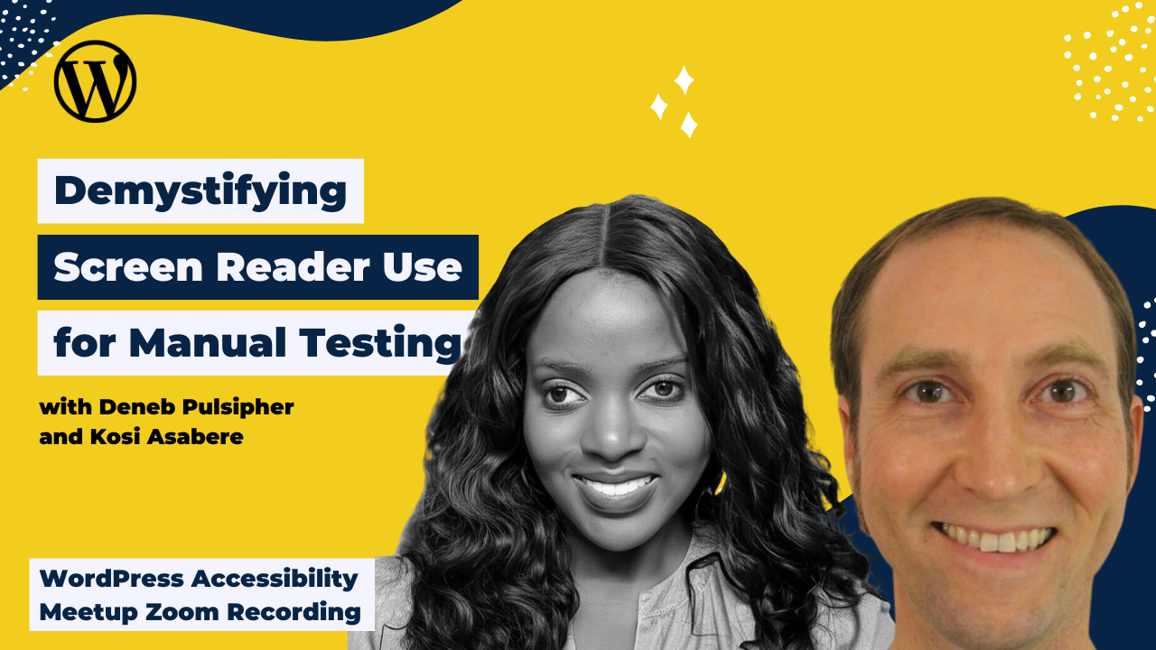
Accessibility professionals all know screen reader testing is important, but the barrier to entry is fairly high: before you can test with a screen reader, you have to know how to use a screen reader. Wrapping your mind around all those keystrokes and what they do can be difficult.
In this meetup, Deneb and Kosi break it down for you and show you how to use the free screen reader of your choice to go through our Screen Reader Ropes Course, which, by the way, you should return to again and again to practice.
Thanks to Our Sponsor
GoDaddy provides a Managed WordPress experience that is as easy as it is effective. The latest version of WordPress comes pre-installed with exclusive themes, plugins, and tools to get you up and running quickly, with automated backups, updates, and malware removal so our Pros can spend less time on monotonous maintenance and more time building their businesses.
Watch the Recording
If you missed the meetup or would like a recap, watch the video below or read the transcript. If you have questions about what was covered in this meetup please tweet us @EqualizeDigital on Twitter or join our Facebook group for WordPress Accessibility.
Read the Transcript
>> DENEB PULSIPHER: Here we have our title slide, Demystifying screen reader use for manual testing, with a subtitle of Introduction to Screen Reader Ropes Course-
>> AMBER HINDS: Can you turn it up a little, Deneb?
>> DENEB PULSIPHER: -which we’re going to be talking about later in the presentation.
>> ?DENEB: Maybe. Oops.
>> DENEB PULSIPHER: The most important thing is actually the link to our online version, our web version-
>> DENEB: Is that better?
>> AMBER: -of the presentation, which you can get to by going to [crosstalk] bit.ly/sr-ropes-pres, which will take you to the web version of our presentation. Enjoy. Next slide.
>> DENEB PULSIPHER: Hi, I’m Deneb, and I was a high school English teacher before getting into web development. To make the transition, I took a coding boot camp, which featured one lecture on accessibility in the entire 12 weeks. When I started my first development job at SeaMonster Studios, my boss assigned me to make sure all the websites we put out were accessible, using any of the several tools he suggested, or anything else I could figure out to do it on my own.
In working to figure it out, I soon fell in love with making sites accessible. I got accredited as a web accessibility specialist with the International Association for Accessibility Professionals, and was given the only slightly tongue-in-cheek job title of Captain Accessible at SeaMonster Studios. Now, I still get to check all our sites for accessibility, but also get to write blog posts, and give presentations on accessibility, and create WordPress plugins and other tools to help our clients, and others with accessibility.
Now, I’ve participated in the Accessibility Internet Rally for the past four years, and I’m mentoring a great team this year, as they work to produce a fully accessible site for a deserving nonprofit. I love accessibility, and I love sharing what I know about it. Now, I’m not a native screen reader user myself, and I found it pretty challenging to figure out, at first, how to use it to start testing with it.
I put together the Ropes course to create a place for some guided practice. I’m excited to introduce you to it, and I hope that you find it helpful.
>> AKOSUA ASABRE: Good morning. My name is Akosua Asabre, but most people call me Kosi. I am a Digital Accessibility Engineer, and currently the Head of Accessibility at a small design startup. A little bit more about me, I bring a unique blend of technical expertise, and also lived experience as someone who uses a screen reader in my day-to-day. I previously worked as an accessibility specialist at the W3C, an accessibility manager at the Lighthouse for the Blind Incorporated, and as an IT accessibility specialist at the University of Maryland, College Park.
A lot of the work I do is informed by my experiences working as an accessibility trainer. Over the years, I’ve had the opportunity to train hundreds of assistive technology users of all levels on screen readers like JAWS, NVDA, VoiceOver, TalkBack, and magnification like ZoomText and Supernova. In this section, I’ll be sharing my experiences as a native screen reader user, and how you can learn to test effectively even without that native screen reader experience.
>> DENEB: All right. This slide, Learning Goals and Objectives. Let’s talk about why this topic matters. We touched on it briefly, but can’t be stressed enough that screen reader testing is essential to verify the accessibility of WordPress sites, but it does require specialized skills that most professionals lack. Kosi says that manual testing with a screen reader is a required part of any serious accessibility evaluation.
I like that, because it really highlights the fact that, if you’re serious about accessibility, you’ve got to test with screen readers. It’s the only way. In this session, some things you’ll gain. You’ll get a method to gain the basic screen reader skills for testing WordPress sites. That’s through our introduction to the ropes course. You’ll also come to understand some different navigation approaches taken by native screen reader users. This will help you get into the mindset of a native screen reader tester, so that you can be more effective.
We’ll also give you some resources to communicate accessibility issues effectively based upon the insights that you get in your screen reader testing.
Next slide. Session overview slide. Okay, let’s talk about what you’re going to get from this presentation. We’ve got basically seven sections that you’re going to get. We’ll go over some screen reader usage stats. We’ll talk about the native visual versus native screen reader users experience. We’ll talk some screen reader basics and cheat sheets, and then get to the most exciting part, the introduction to the screen reader ropes course, which can help you build up some of those skills that you need.
We’ll talk about the visual and screen reader disconnect, which is a very interesting topic that I think you’ll find illuminating, and we’ll point you at some documentation and remediation resources, and then release you into the world. Say the world is your oyster to do some screen reader practice.
Next slide. All right, let’s talk about some screen reader usage statistics per the WebAIM survey on screen reader usage back in 2024, which is the most recent one, actually. That revealed that between the– That revealed that about 83.5% of the respondents were either blind or low vision, which isn’t surprising. That’s the largest portion of the respondents, but the other respondents were not an insignificant level either.
Deaf and hard of hearing were 6.8%. Cognitive and learning disabilities, people who had those, were about 5.2%. People with motor disabilities, 2.2%, and with other disabilities were 4.9%. The one that surprised me was respondents who use screen readers who had no disability at all, or associated with no disability was 10%, so that’s quite a large number of screen reader users not associating with any disability.
This just says, let’s help them all by making sure that we’re testing all of our WordPress sites and other sites with a screen reader to make sure that this technology can be used effectively.
Next slide. All right. Let’s talk about the Visual Surfer Experience. First off, some dwell-time statistics. Back in 2023, there was a study that showed that the average time spent on a website was just 53 seconds. What that highlights to me is that, we visual surfers are not really great readers, but we are great at deciding whether it’s worth it to read. In those 53 seconds, we take in mostly the vibe of the site.
We may skim the headings, may glance over some images, but we decide in 10 seconds or less, according to the Norman Nielsen group, whether we want to stay on that site, or bounce, and go to a different one.
Next slide. The way that visual surfers decide so quickly whether to stay or go, is they categorize everything into either informative, or interactive elements in their minds. With informative elements, their goal is to get the information as quickly as possible. They’re going to read through the headings real quick. They may glance at the images. They may read the pull quotes or not, but they’re going to get the information as quick as possible.
Then, they’re going to look at interactive elements, which their minds are going to group according to past interactions. They see a form, and they’re going to immediately know whether they want to fill it out or not. They’re going to see a slider. They’re immediately going to ignore it, because everybody ignores sliders. They’re going to look at a video and consider quickly whether they’re going to play it or not, and look at other elements like accordions or tabs, like headings. They may read them.
They may decide to interact or not with them, but very quickly decide these things. Kosi, as a native screen reader user, could you talk us through how you approach a web page? Next slide.
>> AKOSUA: When I first arrive at a web page, the very first thing the page is going to alert me to is the page title. This gives me my initial clue about what the page is about. Sometimes I immediately hear alerts like modal windows, or cookie notices asking me to sign up for something, and I have to address these first before getting to the rest of the page. The screen reader then announces document or page loaded, and that lets me know that the content is still there.
Okay. The screen reader’s focus is automatically placed at the top of the page, which means if I start to arrow down, I’m going to experience everything sequentially from top to bottom. In this next part of the journey, I get my bearings by exploring the structure. The first thing I typically do is start using my heading navigation keys. I press the H key. This gives me an outline of the page’s main sections, and lets me know how things are organized.
I also navigate by using my screen reader’s landmarks or regions. I use R to locate navigation regions, main content, and footer areas. In the third step, I take stock of what’s on the page. After understanding the structure, I then select the keystroke, which allows me to pull up my list of links to see where I can go. I review buttons to see what actions are available. I then identify form fields.
I check for text fields, check boxes, and drop downs. Sometimes I go back and open up my list of headings. It provides a good overview and outline of the page. To navigate content, I use the Tab key to go through all the interactive elements in order. This helps me understand the flow, and ensure that everything is reachable via keyboard. Now, if the structure is confusing, or I need to understand details, I’ll use my arrow keys to navigate line-by-line, sometimes even word-by-word.
My screen reader tells me what kind of element I’m on, whether it’s a link, button, image, or something else. I rely heavily on proper labels for form fields, and appropriate alt text for images in order to understand what they are. Without them, I’m left guessing. For interaction, I use the Enter key to click links and buttons, Spacebar for check boxes, and I type directly into edit fields.
After I perform an action, I listen for any messages that let me know if the interaction was successful, if there are any errors on the page, or if something changed on the page. For complex components like tabs or accordions, I have to figure out the specific keyboard commands. Sometimes I have to just cross my fingers, and hope that the website is using appropriate accessibility standards and guidelines.
These are some of the steps I take in my head as I’m navigating a website, especially, if it’s a website that I am unfamiliar with. This is a good blueprint, but I want you to keep in mind that when you’re out in the wild, wild west and you’re exploring websites, think of the commands and keystrokes that you learn as tools in your toolbox. If one command doesn’t work, maybe you try another. Sometimes it’s trial and error.
As you spend more time using a screen reader, you get better at making those judgment calls when it comes to navigation. As I’m using a screen reader on a website, for example, these are some questions that I’m always asking. Throughout the process, I’m asking myself, what’s this page about? What are the different parts? Where can I go from here? What can I do? How is the information organized? How can I move through interactive parts? What information do I need to provide? What is this image showing me? Did that Click button work? Is this site actually making sense to me?
What’s the goal of this? What am I trying to achieve? Well, at the end of the day, I want to be able to understand the website’s purpose and content, understand what my options for navigating are. As I mentioned before, I want to be able to create a mental model of the layout in my head. At the end of the day, just like everyone else, I want to be able to perform tasks effectively.
Now, I want to talk about themes that have emerged over my years of working, and training people to use the screen reader. First one, structure is key. Well-organized content with proper headings is crucial. Next, words matter. Clear labels with good alt text make a huge difference. For the next one, the ability to operate with keyboard only is essential for someone like me.
The next one, response and feedback after an action is vital. For me, usability is directly impacted by a company deciding to design for accessibility. If a website does not have accessibility in mind, it’s very challenging, if not impossible, for me to use. The final one, solving for accessibility issues, or finding workarounds for inaccessible content is constant. One thing about someone that uses a screen reader well, they know how to problem solve, because you’re always trying to work, find your way around some sort of inaccessible component.
>> DENEB: Well, let’s get ready to ascend to the screen reader ropes course. Before we do that, let’s talk a little bit of history and context. Next slide.
As far as history goes, just really briefly, a history of the screen readers. In 1984, the first screen reader came out. It was called the IBM Screen Reader. Five years after that, Job Access With Speech, JAWS, was developed for Windows. That was the only screen reader there was available for quite a long time, 11 years.
In 2000, Narrator came out for Windows 2000, came included with Windows 2000. That was your first free screen reader. Through all of this time, Mac didn’t really have a screen reader until 2005, when VoiceOver came out, pre-installed with the Mac OS, and has been ever since. The year after that, 2006, Nonvisual Desktop Access, or NVDA, was developed as an open source program for Windows. Finally, Windows got a fully functional free screen reader.
Today, Narrator keeps getting better, but JAWS is still the most popular, though it is expensive, with NVDA as a runner-up, and VoiceOver is still Macintosh’s only option. On the mobile side of things, mobile devices have had a screen reader pre-installed since about 2009. VoiceOver comes on iOS devices, and TalkBack comes on Android, so everybody has access to screen readers, one way or the other.
Screen reader basics and cheat sheets. To give you just a really, really high-level overview of how screen readers work, the basic navigation with a screen reader, you could go element-by-element. To do this with NVDA, you use the up and the down arrow for VoiceOver with the quick nav enabled, which is what I recommend. You use the left and the right arrow keys. That’s one way to go in screen readers.
You can also navigate by element types. That’s where you just push a single letter, and that will jump you either to the next element of that type, or if you do shift, and that letter, it’ll go to the previous one of that type on the page, so it’ll look through the page, and it’ll find the very next element. That’s header, for example, if you use H. You can jump around by element type. You can also interact with the Tab key, which will jump you to the next interactive element, and then you can interact with that element by using the Enter or the Space key.
Those are the high-level ways of using a screen reader. You can go through the specific keystrokes and such on our cheat sheets, which we have online at bit.ly/sr-cheats. That’s for the online cheat sheet, or there’s also a QR code on the screen that, if you just point your phone at that, it’ll pull up the cheat sheet. You can look at it on your phone, while you are navigating your screen reader on whatever page you’re practicing on, so we think that’s pretty helpful for starters.
We hope you find those cheat sheets helpful in your practice with your screen reader. Even before you start using them, what we encourage you to do is set your screen reader up for success. Now, this is an important step, because the default setup of most screen readers may derail you. They maybe have some things that won’t work quite right. Maybe the screen reader will be too verbose, so it’ll say too much, or maybe it won’t say enough. It won’t tell you all the things that you need to know.
It may be that without some setup steps, the keystrokes won’t work quite as recommended. There are some other things too. Perhaps, you’ll find the voice annoying, or hard to understand, too fast or too slow, and so there are just a whole bunch of things that will make your screen reader use a lot more enjoyable if you set it up well in the front end. Unfortunately, this process of setting up can be complicated, particularly for someone who is new to a screen reader.
I certainly found it hard when I first started playing around with screen readers. That’s because I didn’t know what everything was called. Didn’t know what everything was, and so trying to navigate that setup screen, it was just like a bunch of things that I didn’t understand. Fortunately, however, Kosi knows everything. She has a few slides in the appendix at the end of this presentation, that will go through some key setup steps, and some key settings that you can use to really fine tune the setup of your screen reader, and so we encourage you to use those.
You can point your browser at bit.ly/sr-setup. That’s bit.ly/sr-setup. That will take you to the part of the presentation, the web version of the presentation that goes over those steps. We don’t have time right now in this presentation to go through those things. Definitely, if you have questions with it, hit us up, and we can answer any questions that you have on it. Also, there is a QR code in the bottom right of this screen that will take you to that part of the presentation as well. Please do make use of that, and get your screen reader set up for success.
>> AKOSUA: Let’s talk about why screen reader modes are important. Screen readers switch between different ways of interacting with a webpage. Users must understand when they are reading a page versus when they’re interacting with a page. This distinction affects how accurately you can test forms, buttons, inputs, menus, and interactive content. Okay, so screen readers operate using two different interaction modes, because reading content and entering in information require very different keyboard behaviors.
The first mode I’m going to talk to you about is Browse mode, but you might also hear Reading mode or even a Virtual mode. These are all the same thing. Now, this mode is for reading and navigating content. In this mode, keys are used as navigation shortcuts, and not for typing. A good example of this is when you jump by headings, move through links. Think of this mode, as I am exploring and understanding what’s on the page.
Now, we’re going to talk about Forms mode, which is often referred to as interaction mode or focus mode. This mode is for entering information, or interacting with controls. Keys tend to behave like a regular keyboard. An example of this is when you type into a text field, select a checkbox, or radio button, or when you use arrow keys inside a dropdown. Think of this mode as I’m actively filling out a form, or controlling an element.
Again, to review, Browse mode is your reading mode. This mode, your keyboard is used to help you browse, or move around the page, so you’re jumping by headings, different sections, different landmarks, different links. This is where you can use the H key to jump from heading-to-heading. Now, imagine you want to type into an edit box, and you’re typing H. If you meant to type the letter H, but instead it started to jump from heading-to-heading, that’s why we have Forms mode.
In this mode, you can start to type into text boxes and edit boxes, and navigate form fields and other interactive elements. Most screen readers try to switch back and forth between these modes automatically, but sometimes that doesn’t happen cleanly. If you ever feel stuck, and feel like the keys aren’t doing what you expect, ask yourself, “Am I trying to read, or am I trying to type?”
Remember, Escape is your friend. It always takes you back to reading mode. Users forget they’re in Forms mode. They often think the screen reader is broken, because the arrows and the different keys don’t work as expected. If you don’t know how to switch back and forth between modes, you’re going to have a lot of trouble reproducing, or troubleshooting any issues related to combo boxes, edit boxes, radio buttons, menus, and other interactive content.
>> DENEB: We have a few more slides on modes in the appendix of our presentation, which you can go to at bit.ly/sr-modes. There’s also a QR code on this page. You can point at the lower right-hand corner of the page to go to those slides in our HTML version of the presentation.
>> AKOSUA: What should users understand for learning and testing? I’ve already said this many times, but I can’t stress this enough. Understanding the different screen reader modes is so critical, because you can’t test interactive content, unless you know what mode you are in. Incorrect mode leads to incorrect test results. If you’re going through our screen reader ropes course, and you run into issues like, for example, the edit field won’t take text, you can’t select a dropdown, or nothing is happening when you tab. Come back to our appendix and brush up on the different modes. Chances are that’s probably your issue.
To evaluate accessibility, testers must confirm whether the screen reader announces whether it’s entering Forms mode, or interact mode, whether it exits correctly, whether instructions or labels are available, and whether keyboard interaction is predictable. Without an understanding of modes, learners could assume that the screen reader isn’t working while it’s actually just waiting for interaction.
>> DENEB: All right, and now it is the moment you’ve all been waiting for. Introducing the Screen Reader Ropes Course. This ropes course, I think, is pretty helpful. Let me tell you about some of its features, and then I’ll tell you how to get there. First, on the ropes course, you can activate a mini crash course on how to use the screen reader of your choice. It goes through the very fundamental basics pretty quickly.
There’s also a way to activate some built-in cheat sheets, so it’ll pop up on the screen, so you can look at that as you’re practicing on this page. There’s also a series of 15 tasks that will help build your experience with that screen reader, help you practice, and develop, perhaps, some muscle memory, as well as some comfort with what it sounds like. I think just that familiarity in a safe environment can go a long ways.
Another thing you can activate with these tasks is some on-screen guidance. Directly after the task, there will be instructions, or can be instructions if you want them, for how to perform the task on your screen reader of choice. You can also leave this off, so you don’t practice without the guidance. Also, on this ropes course, there’s a timer, so for those of you who like to compete, you can check your time, see how long it takes you to complete these 15 tasks, or individual ones.
At the end, there’s a form that you can fill out, which will include your score, and that can go onto a leaderboard. This leaderboard is a way to challenge yourself, challenge other people, to see who can get through this ropes course most quickly, and also the most time. Really, ultimately, the best way to use the ropes course is however works for you. If you want to do the tasks, fantastic. If you want to submit the form, great.
If you want to try to get on that leaderboard, the top 10 scores, wonderful, but none of that is necessary. All that’s necessary is that you have this ropes course that you can practice time and time again. The way to get there is follow the link seamonsterstudios.com/screen-reader-ropes-course. Additionally, you could just Google screen-reader-ropes-course, and I believe this is the only thing pretty much that will show up, but it’s hosted here at seamonsterstudios.com. I hope you enjoy it. Now, to get a little more theory, next slide.
>> AKOSUA: At the end of the day, screen-reader users and visual users may have different paths, but they have the same goals. Both groups of users want to get information, and perform interactions successfully. I would say that the experience happens on a different plane. One is visual, one is auditory, but both are valid and important. It’s important to point out that varied fluency equals vastly different experiences, even for screen-reader users.
A screen-reader power user is going to navigate very differently from a beginner. There’s this saying in the blind community, “When you’ve met one blind person, you’ve met one blind person.” What that essentially means is, every user is different. In this training, I’m giving you tips and tricks and common themes, but the reality is, every screen-reader user is different. There is no single screen-reader user experience.
There are many individual experiences shaped by preferences, habits, and expertise. This is just one reason why paired testing is the best case scenario. What I mean by paired testing is maybe having a screen-reader user work side-by-side with a visual user. Bringing together visual and screen-reader perspectives can create a more complete understanding. Again, a variety of pairings is optimal. Different screen readers, different levels of expertise, and different navigation techniques.
>> DENEB: On this slide, we have a little image, graphic to represent this disconnect between visual surfers, and screen-reader users. This graphic has an orange circle on the left, and a purple triangle on the right. These two are connected with a black line that has kind of a squiggle in the middle, illustrating the fact that they’re very different experiences, and sometimes it’s difficult to work together. As you will see in the next slide, we think it’s very much worth your while to embrace this disconnect. Next slide.
Now, what do I mean by embracing the disconnect? Well, so having a paired tester who is looking at things from a different perspective than you, gives you the chance to experience the site as a whole. Really, to experience it from a different perspective. This gives you a chance to hammer out between the two of you what would be the optimal experience for both. This is a great benefit.
The question arises, what happens if you don’t have a native screen-reader user to test the site alongside you? Well, that’s why you’re here. We hope to give you some level of proficiency or expertise, ideally, for when you don’t have somebody to test the site with. On this slide, we have the same orange circle, and purple triangle connected with a squiggly line, but on this slide, there is a blue square above them representing the website. This graphic is meant to illustrate that the two different perspectives can be used to get a fuller understanding of the website.
>> AKOSUA: How long until it clicks? What’s the estimated learning time? If you’re just getting started, you can assume that might take you two to three hours to learn the layout and basic commands. Now, to become a functional beginner, it could maybe take you 10 to 20 hours. At that point, you might be comfortable with simple tests and navigation. Now, I estimate that intermediate might be 40 to 60 hours.
At this point, one could be comfortable across many layouts and niche types. To get to proficient, I’d say maybe about 100 to 250 hours. At this point, you would probably have strong pattern recognition, and pretty solid testing fluency. Now, how about the native user? I would say maybe over 2,000 plus hours. When I say native, I mean someone who has lived expertise through full-time use, so they’re using it all the time, day in and day out for years.
How long does it actually take to get good at this? The reality is, it’s probably longer than we’d want to admit, but it’s absolutely worth it. In summary, you can get started with just a few hours to feel like you are somewhat functional, maybe about 10 to 20 hours, but building true fluency, and being able to handle a wide range of layouts, probably takes more time, and that’s okay.
Native screen readers build their fluency over thousands of hours of daily use, but that’s not our goal. Not trying to match that. Our goal is to learn enough to test with accuracy, with empathy, and clarity.
>> DENEB: On this slide, we also have a graphic set of triangles similar to the other slide that had the triangle representing a screen reader user. The first triangle at the top is a dotted line, indicating that getting started, you’re just mimicking that experience, but as you move down through these different steps, functional beginner, and intermediate, proficient, the line on the triangle gets darker, so it’s solid in the next step. Then, it’s even more solid in a light purple background in the inside. Then, finally, at the native user, it’s that solid purple triangle that we had before. It is a series of steps, but we can get there eventually.
>> AKOSUA: At this time, I’m going to get into some screen reader tips. I sometimes call these Kosi’s Contextualizing Tips. These are some practical tips to get you into the screen reader testing mindset, even you’re not a native screen reader user. First, turn off your screen, and rely solely on audio. This forces you to experience the site as a screen reader user would.
Next, embrace keyboard-only navigation. You’re going to put away the mouse and navigate by using only the Tab keys, the arrow keys, the Enter and the Spacebar. Work on building a mental map using headings and landmarks. This is how screen reader users create spatial understanding of a page. Okay, so it’ll be really helpful for you to understand the difference between Browse mode and Forms mode.
These are different interaction states in screen readers that change the way the different keystrokes function. Browse mode is going to be used when you’re reading content and gathering information. Forms mode is going to be used when you’re interacting with any kind of form or edit field, or just interactive content. It’ll be important for you to be patient with yourself, as you learn to build a mental model in your head.
You’re going to have to practice mental rehearsal. Sometimes you might even have to speak out loud what you’re hearing with the screen reader. This is because as you’re learning to use a screen reader, it requires more cognitive processing. Pay close attention to dynamic content and focus management. How are updates announced? Where does focus move after actions? Lastly, generally, pay attention. Pay attention to what the screen reader is announcing, and how different elements are presented.
On this slide, we’re going to talk about common screen reader blockers. These are the common barriers preventing effective access. Visible content without text alternatives. Images and charts without all text are invisible to us. Functional elements without keyboard control. Basically, if I can’t tab to it, I can’t use it. Excessive or unwieldy content can sometimes overwhelm, especially when it’s delivered sequentially.
The next blocker is navigation barriers. Without proper landmarks, finding content is like searching for a needle in a haystack. Additional barriers include unstructured content. Without semantic markup, I’m forced to hear everything linearly. The next blocker is inconsistent navigation. That forces me to relearn the pattern and the layout of the page on every page. Time limits on web pages tend to be known blockers as well.
Next one. Unexpected actions like a redirect can really disorient a user, especially someone using a screen reader. The last one is multimedia without descriptions. This leaves critical visual information inaccessible. In the absence of a native screen reader tester, here’s what you need to keep in mind. Again, if you’re not a regular screen reader user, your experience with the screen reader is going to be different, because of your expertise, and your ability to create these models.
Still, do your best to put yourself in the shoes of a native screen reader user. Sometimes even an imperfect simulation can be valuable. Remember, it’s better than not trying at all. Some screen reader testing is vastly better than none. For every site you test for accessibility, you should test with at least one screen reader. Remember, this is a non-negotiable. Ideally, in a perfect world, you should test with two screen readers.
Sometimes different screen readers can behave differently, even with the same content. Even with thorough testing, it’s important to remember that it’s still not the full picture, and that’s okay. Accessibility is a journey of continuous improvement, not a one-time achievement.
>> DENEB: We’ve got another image on this page of, once again, our orange circle, and now a solid bordered purple triangle, but with just the gray interior, indicating this is you after you’ve spent significant time learning screen reader. With the blue box above that both are, I guess, contemplating. Even in this scenario, so in the absence of a native screen reader tester, we still get a fuller view of that website, the blue box, even though it may not be as perfect as with a native screen reader user.
>> AKOSUA: As you’re navigating with a screen reader and listening to the output, you should hear three key pieces of information. Number one, role. What is the element? Is it a button, a heading, a link, or something else? Number two, name/label. What is its purpose? Does it have a clear label like search, or continue? Number three, state. What condition is it in? Is it selected, checked, disabled, or another state? If you’re hearing all three when appropriate, the element is likely coded excessively.
Now, let me give you examples of what appropriate screen reader output should sound like, and what better way than to actually hear a screen reader.
>> SCREEN READER: For headings, heading level 1. Welcome. For links, link, Contact us. For buttons, button. Add to cart. For images, graphic, woman walking with cane. For checkboxes. Checkbox. Subscribe to newsletter. Object. For tabs, Tab, Details, selected. For dropdowns, combo box, choose a country. United States. For dialogs, Dialog. Are you sure you want to delete this item? Apostrophe. For table cells, row 2 column 1, Monday.
>> DENEB: We have a fuller list in table form of all of these at bit.ly/output-table. There’s also a QR code in the bottom right of this slide that will take you directly there.
>> AKOSUA: Now, let’s look at warning signs that indicate accessibility problems. If you hear the following, the element might be inaccessible. You’re out there looking at websites in the wild. If you hear something like link with no label, that is going to indicate empty or no link text. Say, if you’re on a site and you hear heading level 2, blank, that means there’s no heading content, or it’s an improperly styled heading.
You get to an image and it just says, “Graphic”, with no additional information. That signals an image missing its alt attribute. A button with no name means that there’s a missing label or aria label. What if you get to a form field, and there’s no context? Well, that could indicate that there is no label, or aria-led by being used. Say if you get to a toggle state, and you get no feedback after you have selected the toggle. This suggests missing aria-pressed, aria-expanded, or similar attributes.
Silent interactions where you expect feedback, but hear nothing usually means missing roles or states. Remember, that wording may vary among the different screen readers, but essential information, role, name, state should always be present.
>> DENEB: We have, again, the full list at bit.ly/warning-table with the QR code on the site as well.
>> AKOSUA: Now, it’s time to talk about going beyond keystrokes or cheat sheets, and building actual screen reader fluency. The keystrokes are just the starting point. These cheat sheets are a great tool to have in your toolbox, but learning to test with a screen reader goes beyond that. Becoming fluent with your screen reader goes beyond memorization. You need to build an instinct for when and how to use each command.
For example, jumping by heading is great if the page is properly structured. If it’s not, you may need to fall back to reading line-by-line, or even using tab navigation to find interactive elements. Fluency means knowing how to switch strategies based on what you encounter. Just like a sighted tester uses their eyes to scan. I’m going to leave you with a quote to reinforce this concept. “It’s not just about knowing what key to press, it’s about choosing the right key, at the right time, in the right context.” This, I feel, really sums up our approach.
It’s not about memorizing shortcuts. It’s about developing a flexible, responsive mindset. You’re learning to navigate dynamically based on what’s on the page, what your testing goals are, and what information the screen reader is giving you. What’s our ask here? What is our call to action? Well, we would like you to use our screen reader course to develop fluency through practice. The ropes course is a great way to start.
It walks you through tasks using a screen reader, so not just learning commands, but you’re also applying them. Use the cheat sheets to help you stay oriented, but don’t worry about memorization. At least, not up front. You’ll start to recognize patterns the more you practice. The most important thing is don’t wait, jump in, make mistakes, listen closely, and learn to trust your instincts.
Screen reader testing is a skill, and like any skill, fluency comes with time, exposure, and practice. I just want to remind everybody to go to the appendix of the presentation, and check out some of our resources. We have a lot there, and we think you’ll find it to be helpful. This concludes our presentation on the introduction to the screen reader ropes course. Thank you so much.
>> DENEB: If you have further questions, we would love to connect with you. My email is deneb@seamonsterstudios.com, and my LinkedIn profile is linkedin.com/in/deneb/pulsipher. Kosi’s email is asabe20a@gmail.com. Her LinkedIn is linkedin.com/in/kosi-asabere. Please do connect with us if you have any questions. Now, we’ll open the time up for questions.
>> AMBER: There we go. We’ve been doing these meetups for a couple years now, three years. I still sometimes learn something about Zoom. Like someone said, apparently, they can’t change the view settings. I thought the attendees could set their own view. [chuckles] I am learning new things every time, or Zoom changes on me. I don’t know.
>> DENEB: Well, yes, I think that’s the thing. Zoom changes a bunch.
>> AMBER: Yes. Thank you so much for that presentation. I know there were a lot of folks who asked in the chat about whether they would actually see a screen reader. Then, Deneb and I were side-chatting, and Kosi, you’re on an iPad, is that right? You can’t really share right now?
>> AKOSUA: Yes, correct. I’m so sorry about that. We’d be more than– I’m happy to come back, and do a part two, and make sure we build in some of those on-screen shares, and be on demo.
>> AMBER: I think that would be great. We’ll definitely plan that. Just in case anyone missed it, we did also– I posted a link to all of our recordings. If you want to go see one right now, what I would recommend is, you can go to those recordings list and just search for Alex Stine. Any presentation with him is him sharing his screen, and he’s a Windows user, and NVDA, and he is totally blind. He and I do like paired testing, so if you want to see some of the stuff that Kosi and Deneb were talking about today, you could go see that as well, if you don’t want to wait.
Of course, we’ll definitely have your back. Let me go through some of these questions that we got from folks in the Q&A. I want to start with, though, someone was having trouble, so they DMed me one, so I want to ask this before I forget it and it gets buried. Kosi, they were wondering, do you have any recommendations or resources on how to test PowerPoint presentations with screen readers?
This person says, “I have found resources about creating PowerPoints with a screen reader, but nothing really helpful about how to assess a presentation’s accessibility from the consumer side.”
>> AKOSUA: That’s a great question. I do have some– I can send over some of the resources that I have. It’s more so from a consumer standpoint. Learning, I think it’s JAWS based, but learning JAWS, and how to test with a screen reader, but I’d be more than happy to send that over.
>> AMBER: Okay, yes, if you don’t mind sending that link, and then we can make sure we put it up with the recording, that would be great. Thank you.
>> AKOSUA: Great.
>> AMBER: Lauren asked or said, “I’m interested to learn Kosi’s thoughts on images and alt text. Specifically, does she agree with decorative images being left without alt text to reduce screen reader noise, or should all visual elements have alt text?” I think I would ask a follow-up question as you answer that. Where’s your line between what’s decorative and what’s not? Because I know even myself, and our accessibility specialist, Maria, sometimes disagree. Can you share some thoughts on alt text?
>> AKOSUA: Right. Here’s the way I view alt– I mean, well, I guess a screen reader. You want to know the content on a page, but there is a point where there can be too much noise, right? If the image is there and it serves a– If it’s there for a– I’m sorry. I do stutter, so that’s what you’re hearing right now. What I was trying to say is, sometimes there’s a reason that image was put there.
You really want to think about like, “What am I trying to convey?” If it is purely there just to look cute, I don’t really need to know about it. If maybe, for example, you’re on a campus website for a college, and students are smiling, they’re sitting under a tree, and they’re working as a group, there’s a reason that that is there. I implore you guys to look. Take a deeper look, why is that image there? Sometimes it’s there for like a vibe, for a feel, and it adds to that website.
>> DENEB: I love that.
>> AMBER: Yes, I love that too. I think that makes a lot of sense. Then, of course, if it is empty, the correct way would be that empty alternative text if you think it should be ignored?
>> AKOSUA: Absolutely.
>> AMBER: Yes, perfect. Okay, so this next question is from Amy Lee. Amy says, “This intro information is amazing.” Amy is an instructional consultant focusing on accessibility of course materials for university students, and has always struggled to explain how screen reader users think about and use web-based content. Amy is wondering if they’re able to borrow, or purchase your intro material for their faculty.
I will say, and you can certainly respond to this as well. The recording for this will be available in about two weeks, and it’s just going to be public, no registration required, so you can share this video and the blog post, and everything that will go with it. I don’t know if you have any other materials that you can send them, Deneb. Obviously, you put a lot of links in the chat as well, and those are all free for people to share out.
>> DENEB: Yes, I think probably the best would be just to share them a link to this recording when you get it. Also, just send them right to the ropes course. That’s what it’s there for, helping people get up to speed with that sort of thing. Also, my push to send people to the ropes course also answers some of the concerns in the chat. They said, “I was hoping to get to see it in action at this time, and I wanted to see an actual demo of the screen reader, and that’s why I came.” Well, that’s good.
We did a lot of theory today. I do want to come back. I think it’d be fun to do more experiential. At the end of the day, if you go to the ropes course, it’ll tell you, okay, what’s your screen reader you want to do? Here’s how you turn it on. Next step, next task. Here’s how you look at that. It walks you through step by step by step exactly what you have to press on your keyboard to do it, and so I’d say that’s a great thing to do.
>> AKOSUA: I’d also like to add on, we also do workshops, and typically, they are three hours or more, so that’s a plug to maybe, I guess we will make our rounds. This won’t be the last time you’ll hear us speak. It might even be an actual half-day workshop, so stay tuned.
>> AMBER: Great. Someone asked, “If you test a web page, or other content with NVDA, or another screen reader, and find it accessible, will the content generally also be accessible in JAWS, or another screen reader?”
>> AKOSUA: Sure, I can take that. If you test it with NVDA, the odds of it working with JAWS are much higher. Because what NVDA does is it’s– You’re going to– What– It depends on how clean the code is. If the code, it’s using a proper– If you’re using proper semantics, you’re using aria, and you’re coding things the right way, NVDA is going to be able to pick that up.
JAWS will too, but JAWS does have a way of trying to fix code that maybe isn’t encoded in the best way. For the cleanest screen reader, you really do want to test with NVDA, but it should likely work with JAWS as well. I still think that it’s good to test with both. It’s good to test with as many as you can, at least one, but two is probably better.
>> AMBER: Yes. I know we, at our company, we test– We’ll always test with NVDA and VoiceOver, so we have different operating system coverage. I do frequently see things that sound okay, in particular, aria alerts in VoiceOver, but not in NVDA, because if there’s too many things in there, or within the alert container, or too many alerts that change on the page, then NVDA doesn’t queue in the same way that VoiceOver does, and it might not read an alert, or some other component that also changed will get read instead of the alert you want read, like Product added to Cart [chuckles] or something like that.
I know we always say, “You can’t only test with VoiceOver, you also have to test with NVDA.” Then, we’ll sometimes bring in a native JAWS user, if we have someone in particular say, like, “We really want to make sure that it works with JAWS.”
>> AKOSUA: Absolutely. That’s the right approach. I mean, that’s how we do it as well.
>> AMBER: This is a good follow-up question, which is, Israel had asked, “If you are a Mac user, how do you test NVDA or JAWS?” Because for people who are listening that might not know this, NVDA and JAWS only work on Windows, they don’t work on Mac. Do you use a virtual machine, or a dedicated Windows machine to test screen readers that are Windows only?
>> AKOSUA: For me, I have a separate machine that is a Windows machine with NVDA. I do have a Mac as well. I know that some people try to have– They use like a partition, and they try to test NVDA on the Mac, but there are some issues with the mapping. I just like to make sure that NVDA is on my Windows, and my Mac is on my Mac. It keeps it simple.
>> DENEB: Yes, I tried to test with NVDA at first, but on my Mac with a separate partition and stuff and Windows. It was– It didn’t work so well, so I ended up just buying a–[chuckles] I mean, Windows laptops can be very inexpensive. Just find a cheap one and you can install NVDA on anything. It’s super widely available and it’s free. It’s great for that, I think.
>> AMBER: I’ll say I also have a separate Windows machine. My daily computer is a Mac, but I have just an old laptop that I kept around that I literally only get out when I want to test. [chuckles] Or sometimes during WordPress Accessibility Day when I’m running the stream and I want to have a separate computer just to watch it. The other thing that we’ve done is we’ve decided who in our company has to have a Windows machine. Our accessibility specialist, because we really want to make sure we have coverage, we’ve said she has to have Windows. That’s the computer that our company provided her with because we think it’s really important to have that NVDA coverage as the primary tester. That could be something is maybe your organization could decide some people get Macs and some people get Windows. That is how we ensure full coverage.
Let’s see. A follow-up on the alt text. Someone asks, when alt text is used, what is most helpful, a literal description of the image or a description conveying the purpose or feel of the image? Which I know you had referenced, Cozy. Could you talk just a little bit more about what you meant with the feel?
>> AKOSUA: For purpose and feel, imagine you’re on a phone and somebody is describing maybe something that’s right in front of them. The literal may not be as important as what it’s supposed to convey. A lot of times, certain things don’t mean as much to me because I can’t see, but I want to know about what’s the point of it? What am I supposed to get from this image? I would say not the first thing you said, but the latter is probably more important.
>> AMBER: Okay, great. Thank you. Leslie had asked, they said, I know it depends on the size and content of the web page, but could you give a ballpark estimate for how long it takes to do a screen reader assessment of a single web page?
>> AKOSUA: [laughs] It depends. It depends on the size. I’m going to throw it to you, Amber. You have a team, you do this all the time. Do you find that there is a general range? What would you say?
>> AMBER: I would say if you think about a typical home page where there’s a lot of different sections and sometimes there’s things like sliders, really complex components. Deneb did a thumbs down to the slider. We don’t like the sliders, but the reality is is they show up on a lot of the web pages.
>> DENEB: Sliders [unintelligible 01:02:21].
>> AMBER: Many sections of different content, that could potentially be a three- to four-hour test. Depending on how complex the navigation menu is, if you have [unintelligible 01:02:34] menu, that in and of itself could be like two hours. If it’s bad and you have to also– This is a weird thing, it can take us a few seconds to be like, “Oh, here is some problems.” If you also have to document them and explain how to fix them, even when you have– We have a library of issues that we can– We have a whole process that we go through that– maybe it would be worth me presenting at some point, where we can fill out, and it helps us move faster, but you still have to customize.
I feel like three to four, maybe five hours if it’s got a mega menu. If it is a page that’s like, I don’t know, a blog post, you’ve already done the header and the footer on the homepage. You don’t need to redo it, assuming nothing changed. It’s just a blog post with mostly texts and headings and that stuff. It might be, it would only take like 30 minutes. I don’t know if that’s a helpful range. Deneb, on your testing, would you say that that aligns, or do you see something different?
>> DENEB: No, that’s about what I would guess. If you’re trying to test, do an in-depth test of all the components, and there are a lot of components. It could take some time. I watched someone like Alex Stein go through a page and he can fly through it just because he knows what he’s doing and he’s so good at it. He can get a sense of what’s there and what’s working, what’s not working super fast. I can’t do that. [chuckles] It takes me a lot longer.
For somebody, one of our participants, if they’re going to try to go through a web page, and let’s say they’re in that intermediate level. They’ve spent 10 hours and they’re getting pretty okay at a screen reader. I think you probably test a page in 20 or 30 minutes if it’s not a very complex page. Especially, like you said, if they don’t have to do a mega menu or anything like that.
>> AMBER: I’ll say, too, maybe as another example, we also do user testing sessions as one of our services where we bring in native screen reader users and we’ll do it on Zoom. We’ll not necessarily audit a whole page, but we’ll audit processes or a user journey that is important for this website and touch on multiple things, or we’ll give them a challenge like, can you buy hiking boots in size eight? That kind of thing, just to see what they do. Usually those last an hour-and-a-half on the Zoom call. Then me actually writing the report from the call and being like, “Here are all the things that were identified and all that,” could another three hours.
If you’re doing your own testing and you don’t have to document or explain in the same way– When I test stuff for our team and our devs, it’s much easier because I can just real quick be like, “Oh, this thing needs already expanded or something.” I don’t have to explain why. I don’t have to say what WCAG violates. All this stuff I don’t have to do. I just open a GitHub issue. It’s like, “Add our expanded to this button.” They know what that means and they know what to do. It goes much faster when you’re doing your own testing.
I do feel like if you start doing it for clients or for other people who don’t understand and you’re trying to teach them, then it takes a lot longer. I’m going to try and go fast because we have only got about 10 minutes left. Let’s see. Kosi, I think this question might be for you. Is there any way you could give us a little more information on how you conceptualize the overall structure of a webpage?
>> AKOSUA: In my head, I generally form a mental map. It’s like a model. Typically, you look at the patterns of an average webpage or website. I’ll know that, for example, the navigation is likely going to be at the top or maybe first. The footer and the contact us, those things are going to be towards the end or at the bottom. The body is going to be in the middle. Maybe there is a menu or there’s maybe accordions. They’re all somewhere in the middle, the main part of the page. For me, having a mental map that I have in mind helps me set things up in my head.
Now, when I get to an actual page, whether it has those things or not, I guess if it doesn’t follow that pattern, then I have to employ other tools. Maybe if there aren’t headings or there aren’t landmarks, then maybe I start going line by line. Maybe I use the search. When things start to break down and they aren’t using proper semantic markup, then I have to be more creative. I’m not sure if that answers your question.
>> AMBER: I’m curious. I’ve noticed with the testing, when I do paired testing with folks, that different people have different approaches. I’ve seen some people, they’ll open the the elements list or the rotor and they’ll hear all the headings on the page to try and understand what the page is. I’ve seen some people be like, “I’m just going to navigate by headings.” They’ll hit the one key to jump to the H1, and then from there they’ll just jump through headings. Or other folks that are like, “If I’m really looking for something,” they’ll just open do a control F or command F and they’ll just do a search for a specific word.
Do you have a way that you typically– if you’re going to a brand new web page– or I’ve seen other folks be like, “I’m just going to let it read for a minute and have it just read to me so I can sort of hear what’s at the top.” What do you typically do when you first get to a new web page you’ve never been to before?
>> AKOSUA: It depends if it’s task-based. What’s the goal of me being on the site? Is it for testing? Is it to buy boots? It will depend. I do like to pull up the list of headings, the list of links, the form fields and get a feel. Sometimes I just press H and just see what’s the first thing I land on. I am a fan of landmarks. If it’s a website I know or even a site I don’t know, I really do like to jump by the main and things like that. If the goal is to really go through the website and just look for different bugs. If the goal is to test, I’m going to take more time to– I will maybe tab, but that’s not the first thing I’ll do. I’ll pull up that list of links, that list of form fields, the list of headings. It depends on the website, too.
>> AMBER: That is helpful. Let’s see. I’m trying to figure out what the best order, if there’s anything that falls out. This might be a fast question. Which web browser, Firefox, Chrome, or Edge do you recommend for testing websites on Windows with a screen reader and why?
>> AKOSUA: NVDA with Chrome right now. That’s just what people tend to use most right now. Edge is fine, but Chrome, I think, is the most widely used browser right now, and that’s paired really well with NVDA. If I’m testing with a Mac, I’m going to use Safari and VoiceOver. I would say right now Chrome first and maybe Edge.
>> AMBER: We always reference, and maybe Paula can find the link and throw it in the chat. There’s a screen reader user survey that WebAIM puts out every year, and you can actually see combinations of browsers and screen readers and how popular they are. I always recommend test with what the most people are using. We test with Safari, but I don’t frequently. I also test in Chrome on Mac because more people use that than Safari. Safari is a lame browser. Every time my friends tell me they use it, I’m like, “Why?”
>> AKOSUA: Why do you use Safari? I guess it’s supposed to apparently work best with Safari.
>> AMBER: You still need to test with it.
>> AKOSUA: Right.
>> AMBER: Let’s see. “Are Mac’s accessibility tools, VoiceOver, and other touch features on iPad and iPhone becoming the preferred platform for users?” Asks Lauren. Lauren said, “I have learned that several users like that Mac ships with so many tools built in.” Lauren asked for current data on market share. I would definitely look at– It looks like Marcia found the link for us to the screen reader user survey because that’s going to give you that data you want. Do you have any opinions about Mac versus Windows and usage?
>> AKOSUA: I don’t have the data right in front of me, but I am a junkie. I love Macs. I love iPads. I love the watch. I love the iPads. I’ve probably already said that because it’s built in, and that is a big deal. The fact that Apple has invested in making sure these products ship with these things, not just a screen reader, the magnification, the assistive touch, the tracking eye, et cetera, as well. If I wanted to, I can make sure it– It can learn my voice and speak for me if I want. It’s a little creepy, but that is an option. For me, that is a big deal.
>> AMBER: I think what I’ve seen that’s really interesting, if you look at that screen reader survey is, most screen reader users are on Windows, not Macs, but on the phone, it flips. There’s a strong preference for iPhone over Android. Deneb, maybe you could share this. Do you have a favorite example of a moment when something finally clicked for you when learning to test with a screen reader?
>> DENEB: Let me see. That moment came to me after I started putting together the ropes course. I just couldn’t figure it out. I said, “There’s got to be a way for me to figure out how to use a screen reader just so that I can test. How do I do this thing? How do I do that thing?” Lust getting it started was just impossible for me. I said, “If I’m going to learn this, I need a resource, so I better create a resource.”
I started creating it. Then I figured out all the tips and tricks. Going through my own site to try to figure out how to create it helped me to figure out how screen readers work. Then once you get it, it does click. That’s a good metaphor to use. It does start making sense at some point after the four or five hour mark of just going through stuff, I’d say.
>> AKOSUA: When I work with clients or students, the moment that it clicks is generally when they actually find out about the forms mode and the browse mode. Up until then, maybe it’s just unclear that there are actual modes. It’s like, “I thought I’d just to type it, but then it jumped and now it’s jumping down here.” It’s all over the place. They’re just like, “You know what, I don’t think this works. Once you really grasp the different modes and the different types of cursors, that’s the main aha moment.
>> AMBER: I think the big thing for me at the very beginning was learning how to use just a bunch of the keyboard shortcuts and arrow keys. In the beginning, as a sighted person, your first thought is, “All I need to do is tab to stuff and just test all the buttons and links.” Then realizing, “No, you got to listen to how things read.” Being able to use the arrow keys to navigate really made a difference for me.
We are at 11:31, so we need to wrap up. I want to thank you both again for this great presentation. Definitely, I will follow up with you about scheduling a follow-up that includes more actual demonstrations. I will give a shameless plug right now. If anyone is interested in learning VoiceOver or NVDA, I did create two courses on this last year. They have hours of content. Some of the videos not only show my screen, but they show my hands on the keyboard, and they have the actual keys that I’m pressing. Put on the video so that you can-
>> DENEB: Awesome.
>> AMBER: -also read it as well. They show a whole bunch of different components in the component sections, tabs and accordions and carousels and forms, and all kinds of things. It includes websites that looked visually the same, but one is really bad and one is really good, but they look almost 99% identical. Most of them, even the bad one, if you were just to test it with the tab key — or sorry, without a screen reader, but just keyboard testing, you’d think it would be okay. I created it that way intentionally because you really do have to do the screen reader testing. If you don’t listen, you miss things. You can’t just keyboard test. Those are on our website. I did share the link earlier, but I would recommend if you want to really dive deep into some of this. I created them.
>> DENEB: You’ve [unintelligible 01:18:44], Amber. [unintelligible 01:18:45].
>> AMBER: Of course I’m going to say they’re great. laughs] Thank you both. Again, LinkedIn is the best way to get ahold of you on social?
>> AKOSUA: Yes.
>> DENEB: Email is a little better for me. I check it more often, but LinkedIn will work.
>> AMBER: Okay. Thank you both. Everyone, we will be back here in a month for a live accessibility remediation, so you can watch remediation in progress. Please do consider applying to speak. We are putting together our speakers for the year, and we would love to have everyone come share their expertise. Thanks so much.
>> [01:19:28] [END OF AUDIO]
Links Mentioned
- Slippy Sliders: the best place to hide things from your visitors
- Screen Reader Cheat Sheets
- Screen Reader Setup Guides
- Modes: Browse Mode vs Forms Mode
- Screen Reader Ropes Course
- Cookie Banner Accessibility Testing: Alex Stine
- ARIA for Beginners: Maria Maldonado
- Screen Reader User Survey #10 Results
- Equalize Digital Screen Reader Courses
About the Meetup
The WordPress Accessibility Meetup is a global group of WordPress developers, designers, and users interested in building more accessible websites. The meetup meets twice per month for presentations on a variety of topics related to making WordPress websites accessible to people of all abilities. Meetups are held on the 1st Thursday of the month at 10 AM Central/8 AM Pacific and on the 3rd Monday of the month at 7 PM Central/5 PM Pacific.
Learn more about WordPress Accessibility Meetup.
Summarized Session Information
This session focused on making screen reader testing feel less intimidating and more achievable for people who want to evaluate WordPress sites but don’t yet have screen reader fluency. Their own path into accessibility started with very little formal training, then quickly turned into a passion for building and testing more inclusive websites. Kosi added the perspective of a native screen reader user and accessibility engineer, explaining what effective testing looks like from lived experience and from years of training others on screen readers.
Session Outline
- Why screen reader testing matters
- Visual users vs. screen reader users: different paths, same goals
- Key themes Kosi sees in real-world screen reader use
- Screen reader basics: how navigation actually works
- The critical concept: screen reader modes (Browse vs. Forms)
- Introducing the Screen Reader Ropes Course
- Embracing the “disconnect” and why paired testing helps
- How long does it take to learn?
- Practical testing mindset: Kosi’s tips and common blockers
- What good output sounds like: role, name, state
- Building fluency: beyond memorizing keys
- Closing takeaway
Why screen reader testing matters
Screen reader testing isn’t an optional “nice-to-have,” it’s essential for verifying real accessibility. Serious accessibility evaluations require manual testing with a screen reader, because you can’t fully confirm the experience for screen reader users without actually using one. The session set out to provide a practical method for building baseline screen reader skills specifically for testing, along with insight into how native screen reader users navigate and interpret pages, and how to communicate issues clearly once you find them.
Visual users vs. screen reader users: different paths, same goals
Sighted “visual surfers” often make fast decisions, skimming headings, scanning layout and images, and quickly sorting page elements into “informative” versus “interactive.” In contrast, Kosi explained that a screen reader experience is sequential and audio-based, starting with cues such as the page title, alerts (such as cookie notices or modals), and an announcement that the page has loaded. From there, focus typically begins at the top of the page, and the user builds understanding by exploring structure and available navigation options rather than visually scanning.
A repeatable “get your bearings” approach:
- Start with structure: navigate by headings (e.g., pressing H) to understand major sections.
- Use landmarks/regions: jump to navigation, main content, footer, and other regions (she referenced using R for regions).
- Take inventory: pull up lists of links, buttons, form fields, and headings to understand what actions and destinations exist.
- Navigate the content: use Tab to move through interactive elements in order and confirm everything is reachable by keyboard; use arrow keys when details or context are needed.
- Interact and verify feedback: activate controls (Enter for links/buttons, Spacebar for checkboxes, typing in fields), then listen carefully for confirmation, errors, or updates that indicate whether actions succeeded.
The mental questions screen reader users constantly ask: What is this page about? Where can I go? What can I do? How is information organized? Did that action work? Does this site make sense? The goal is always the same: understand the content and complete tasks effectively.
Key themes Kosi sees in real-world screen reader use
Patterns that consistently affect usability:
- Structure is key: headings and organization determine whether a page is navigable.
- Words matter: clear labels and meaningful alt text make a huge difference.
- Keyboard operation is essential: if it can’t be used by keyboard, it’s effectively unusable.
- Feedback after actions is vital: users need clear confirmation and status changes.
- Problem-solving is constant: experienced screen reader users often develop strong strategies to work around inaccessible content.
Screen reader basics: how navigation actually works
A high-level framework for how screen readers are commonly used for navigation during testing:
- Element-by-element reading (e.g., moving through content sequentially).
- Jumping by element type using single-letter shortcuts (like jumping to the next heading with H, or going backward with Shift + letter).
- Tabbing through interactive controls, then activating them with Enter or Space.
The default screen reader setup can derail new testers; verbosity, speech rate, voice clarity, and configuration can make practice much harder than it needs to be. Learners should adjust settings so the screen reader is usable and understandable from the start.
The critical concept: screen reader modes (Browse vs. Forms)
A major instructional section focused on screen reader “modes,” as misunderstandings of these modes can lead to incorrect test results and frustration. Screen readers typically switch between:
- Browse/Reading/Virtual mode: for reading and navigating content; keys act as navigation shortcuts (jumping by headings/links/regions).
- Forms/Focus/Interaction mode: for typing into fields and interacting with controls; keys behave like a standard keyboard (typing, arrowing within dropdowns, selecting radio buttons, etc.).
When a tester expects to type, but the screen reader interprets keystrokes as navigation (or vice versa), the experience can feel “broken.”
A practical troubleshooting prompt is: ask yourself whether you’re trying to read or type. She also called out a key recovery strategy: Escape is a reliable way to return to reading mode if you feel stuck. This is especially important for reproducing issues in menus, combo boxes, edit fields, radio buttons, and other interactive widgets.
Introducing the Screen Reader Ropes Course
The Screen Reader Ropes Course is a guided-practice environment Deneb built to help testers build confidence and muscle memory. The course is a safe place to practice real tasks without having to guess what to do next. Key features include:
- A mini crash course for the chosen screen reader.
- Built-in cheat sheets that can appear on screen while practicing.
- 15 structured tasks designed to build familiarity and comfort.
- Optional on-screen guidance after each task (or the option to practice without hints).
- A timer for people who enjoy measuring progress.
- A score submission form and leaderboard for those motivated by friendly competition.
The “best” way to use the course is whatever keeps you practicing. Leaderboards and scores are optional; the real purpose is repeated practice over time.
Embracing the “disconnect” and why paired testing helps
Visual and screen reader experiences can feel disconnected: different inputs, different mental models, and different ways of locating information. Screen reader users are not a monolith: beginners, power users, and different screen reader users may approach the same page differently.
Every individual experience is shaped by preference, habits, and expertise. Because of that, you should use paired testing when possible, combining visual and screen reader perspectives to uncover issues and improve the experience for both.
When paired testing isn’t available, the session’s goal was to help visual testers reach enough proficiency to test with accuracy, empathy, and clarity, recognizing that it won’t replicate “native” experience, but it’s still far better than skipping screen reader testing entirely.
How long does it take to learn?
Realistic expectations for learning time:
- 2–3 hours to learn layout and basic commands.
- 10–20 hours to become a functional beginner who can do simple tests.
- 40–60 hours for intermediate comfort across many layouts.
- 100–250 hours for stronger fluency and pattern recognition.
- 2,000+ hours as “native” level, built through daily lived use.
The message isn’t “you must become native,” but that testing skill improves with practice, and the goal is to build enough competence to test accurately.
Practical testing mindset: Kosi’s tips and common blockers
Concrete strategies to help non-native testers simulate a more authentic experience:
- Turn off the screen and rely on audio to reduce visual bias.
- Use keyboard-only navigation (Tab, arrows, Enter, Space).
- Build a mental map using headings and landmarks.
- Keep Browse vs. Forms mode in mind and switch intentionally.
- Be patient and practice mental rehearsal, even speaking out loud to process output.
- Watch dynamic updates and focus management: what gets announced, and where focus moves after actions.
- Pay close attention to how elements are presented and announced.
Frequent “blockers” that prevent effective access:
- Images/charts with no text alternatives.
- Controls that can’t be reached/operated by keyboard.
- Overwhelming sequential content (too long or unwieldy).
- Missing landmarks/headings (navigation becomes “needle in a haystack”).
- Unstructured content without semantic markup (forces linear listening).
- Inconsistent navigation, time limits, and unexpected redirects.
- Multimedia lacking descriptions, leaving key information inaccessible.
Non-negotiable baseline: test every site with at least one screen reader, and ideally two, because different screen readers can behave differently with the same content.
What good output sounds like: role, name, state
To help testers evaluate output, it’s recommended listening for three key pieces of information:
- Role (what it is: button, heading, link, image, etc.)
- Name/label (what it’s for: Search, Continue, Add to cart)
- State (selected, checked, expanded, disabled, etc.)
Building fluency: beyond memorizing keys
Kosi closed by reframing learning as more than memorization. Cheat sheets and keystrokes help, but fluency is about choosing the right strategy based on what you encounter, jumping by headings when structure is good, switching to line-by-line reading when it isn’t, and using Tab strategically for interactive controls.
Closing takeaway
Screen reader testing is required for meaningful accessibility work, and while native-level fluency takes years, testers can build practical competence through guided practice, mode awareness, flexible navigation strategies, and careful listening for role, name, and state. The ropes course is a repeatable training ground to help testers move from “I don’t know where to start” to “I can test with accuracy, empathy, and clarity.”